Pink room ideas – 34 versatile and soothing designs
Blush shades are blossoming in the home. Discover how pink room ideas are surprisingly timeless – from hints of rose to on-trend setting plaster
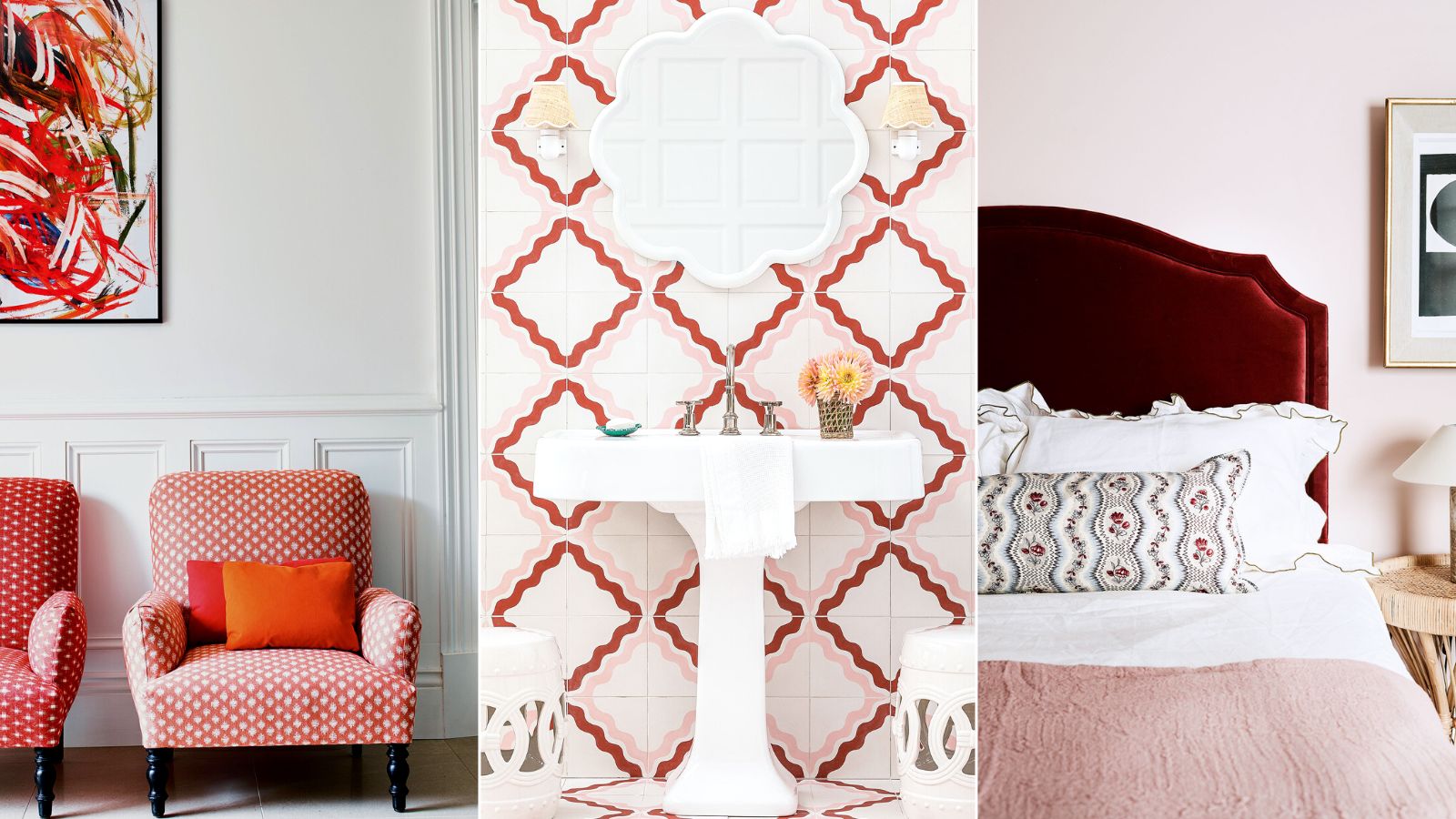

Charis White
The renaissance of this color is not surprising – from the softest blush to the hottest fuchsia, every one of these pink room ideas is sublime
From the palest of confetti through setting plaster and deeper terracotta tones, pink can form a reliable background color that channels anything from a contemporary to a classical country-house spirit. Unsurprisingly, it has been named the most beautiful color for a room.
When decorating with pink, you must consider the light conditions of the space. ‘Pink is perfect for warming up north-facing rooms where soft, pale shades with just a hint of apricot look amazing, but cooler blush pinks can look a bit chilly,’ says Marianne Shillingford, creative director of Dulux. ‘If you have plenty of good natural or warm LED artificial light, all pinks will work beautifully.’
Pink room ideas
Whether you are browsing for inspiration for pink bedroom ideas, bathrooms or even pink living room ideas, know that this is a color that can be used across a whole house, and not just girls' rooms. Cocooning and pretty, pink room ideas are the essence of grace, purity and elegance, while the color also has significant historical provenance.
Below, we showcase the best pink room ideas so that you can create a warm, welcoming home.
1. Use pink to bring a playful feel to a kitchen
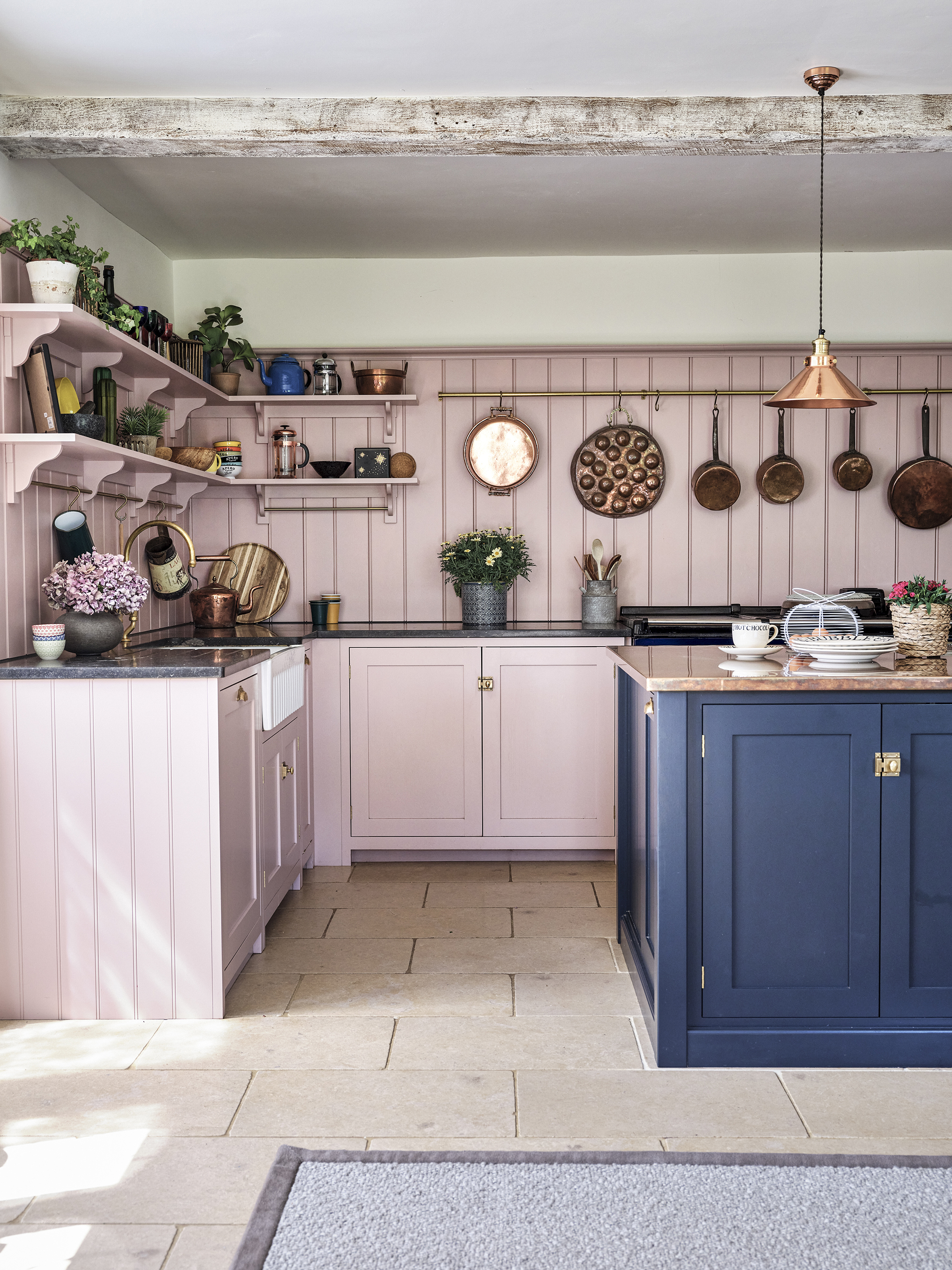
Warm and joyful yet still light, soft pinks are a fabulous way to inject fun into everyday spaces like kitchens. To spark joy in her historic Cotswold home, and bring a modern twist to the space, interior designer Lisa Bowcott chose a Devol kitchen painted in Old Rose and Pantry Blue.
'I want every room to make me 'feel' something. I like it when people smile because they love the pink kitchen,' she says.
2. Turn heads with a warm, vibrant pink
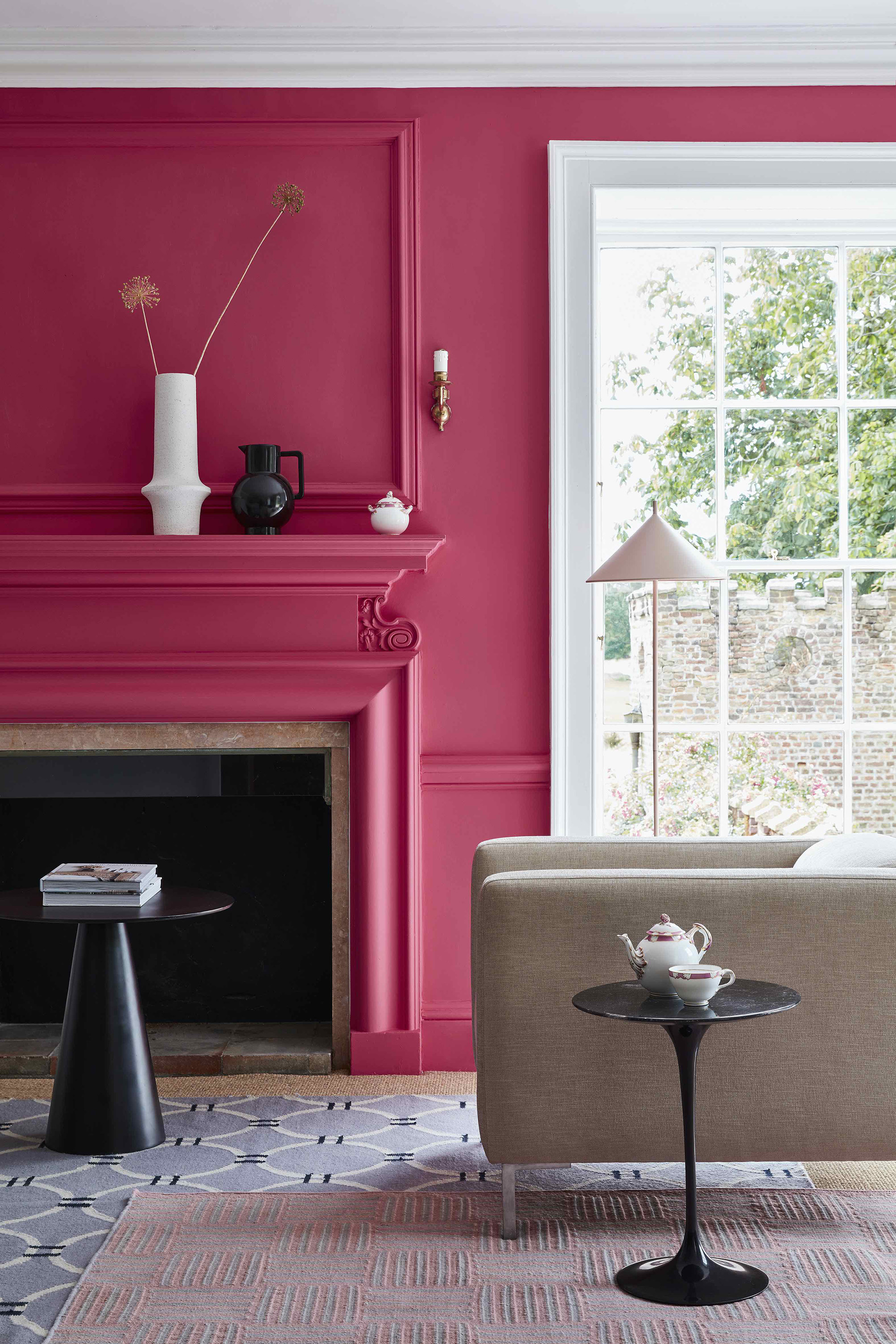
Bold pinks are a fabulous way to create interiors with impact. With it's red undertones, this Leather shade from Little Greene brings wow-factor to this living space while also keeping it feeling warm and inviting. Streamlined black side tables and boxy neutral seating gives the space a sophisticated and contemporary edge.
3. Bring an element of surprise to a bathroom
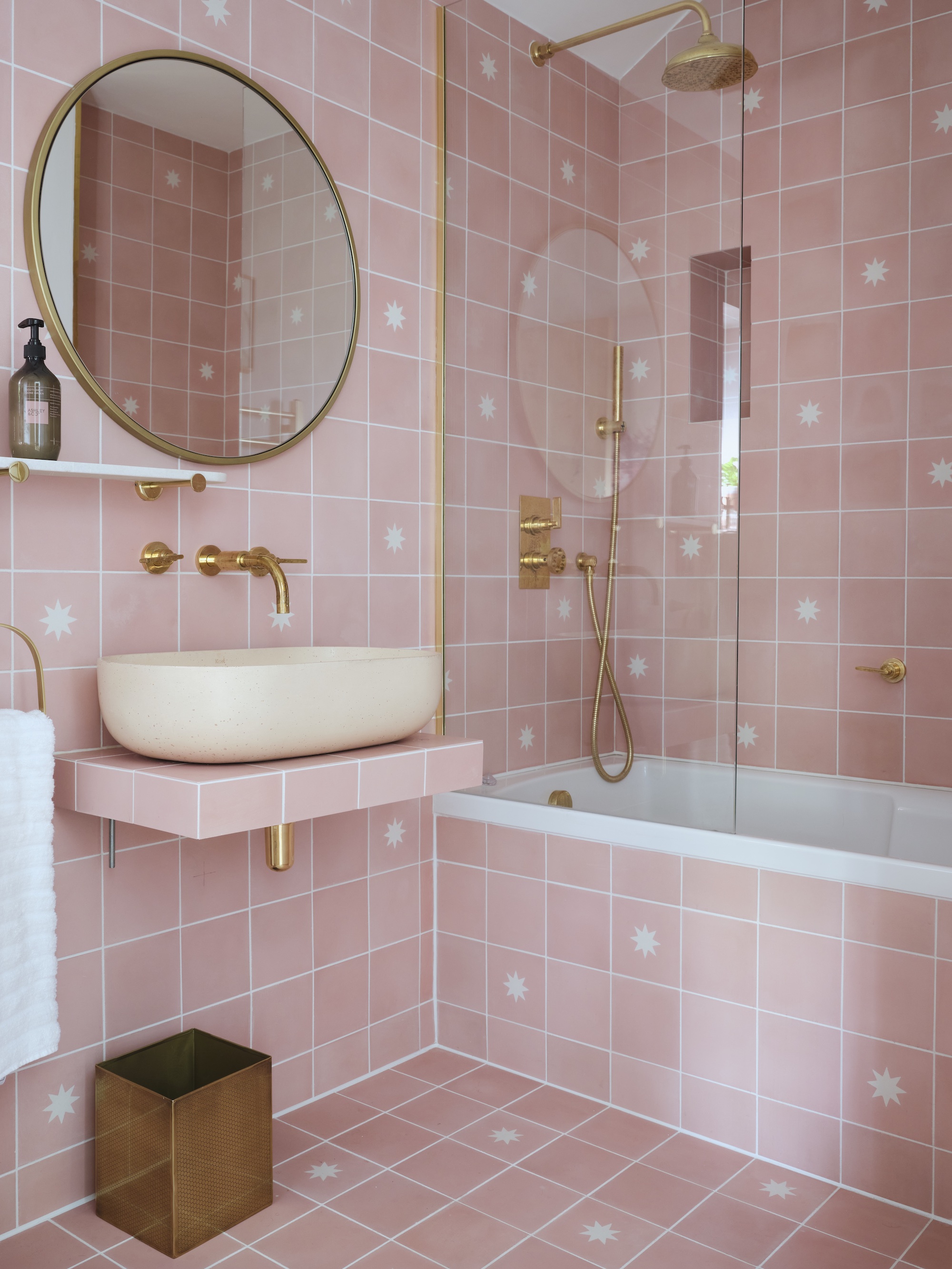
As private and often small spaces, bathrooms are a great place to be playful with color. For Lee Thornley, these pink Luna Rose bathroom tiles were the perfect choice when designing his daughter's bathroom. 'We wanted a feminine and age appropriate bathroom, but also not a space she would tire of with age,' says the founder of tile company Bert & May.
4. Choose soft pink for a country look
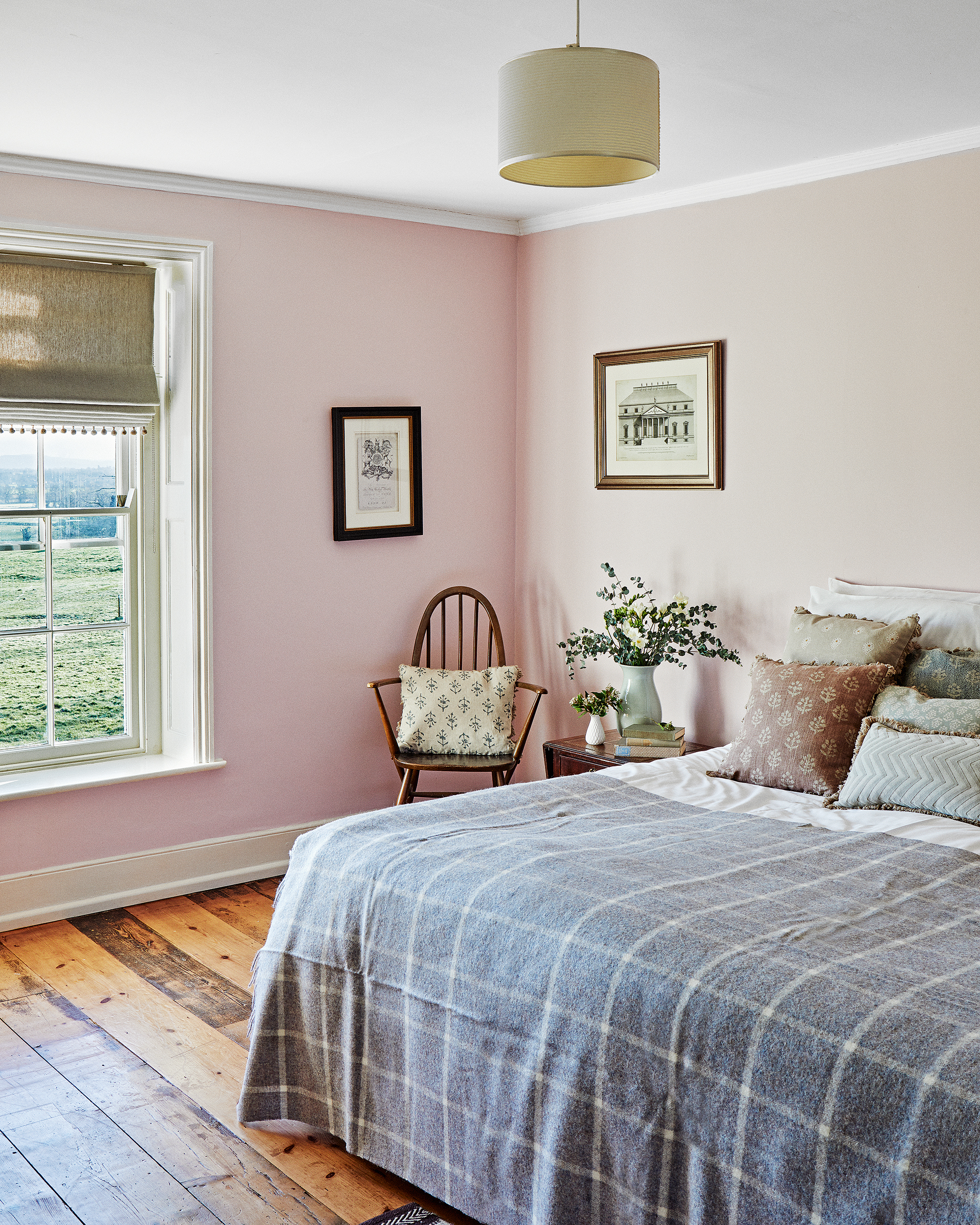
If you're looking for a wall color for a tranquil country bedroom then you can't go wrong with a soft pink.
'Soft Pinks are really rising to the fore, as they provide warmth to a space whilst remaining light and welcoming. They can be used in multiple spaces because they are warm enough to make us feel cosy and playful enough to not be taken too seriously,' explains Ruth Mottershead, creative director of Little Greene.
In this scheme the delicate pink brings gentle color without distracting from the beautiful rural vistas and characterful period features including the original wood floor.
5. Create a focal point with a pink sofa
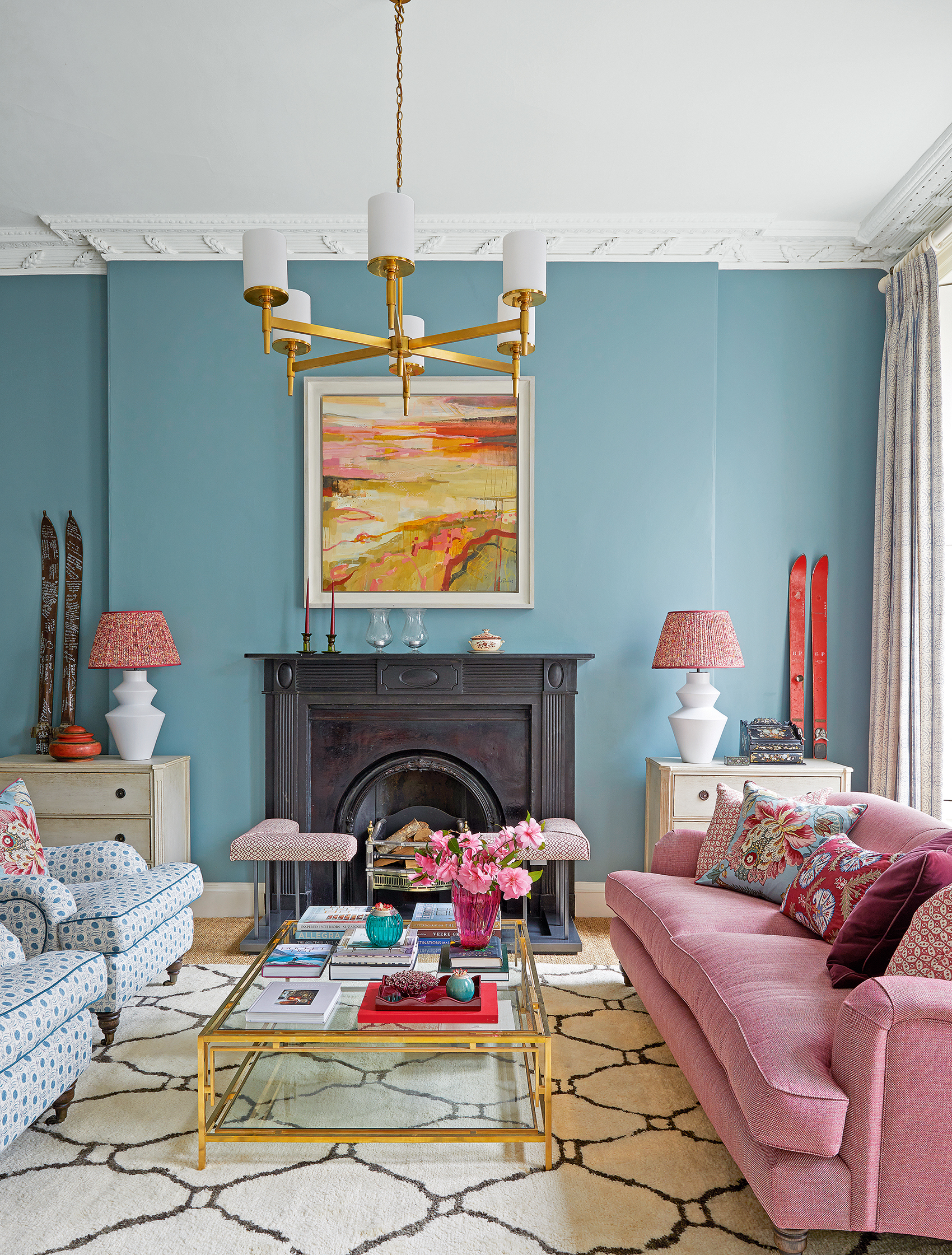
Introducing bold, contrasting color combinations is guaranteed to bring life to a living room. Sitting opposite blue and green on the color wheel, pink makes a great accent color for those thinking of decorating with these shades, and was the color of choice for interior designer Jessica Buckley when it came to creating a focal point in this blue living room.
‘The clients wanted a relaxed and welcoming family home with nothing too shouty or standout. They love blue and pink as much as I do, which was fortunate, but they were generally drawn to a very soft palette. I felt that it would need a bit of punctuation so I wanted to inject some darker blues, greens and raspberry tones to counterbalance the pale, pretty colors,’ explains Jessica Buckley.
6. Create drama with pink and black
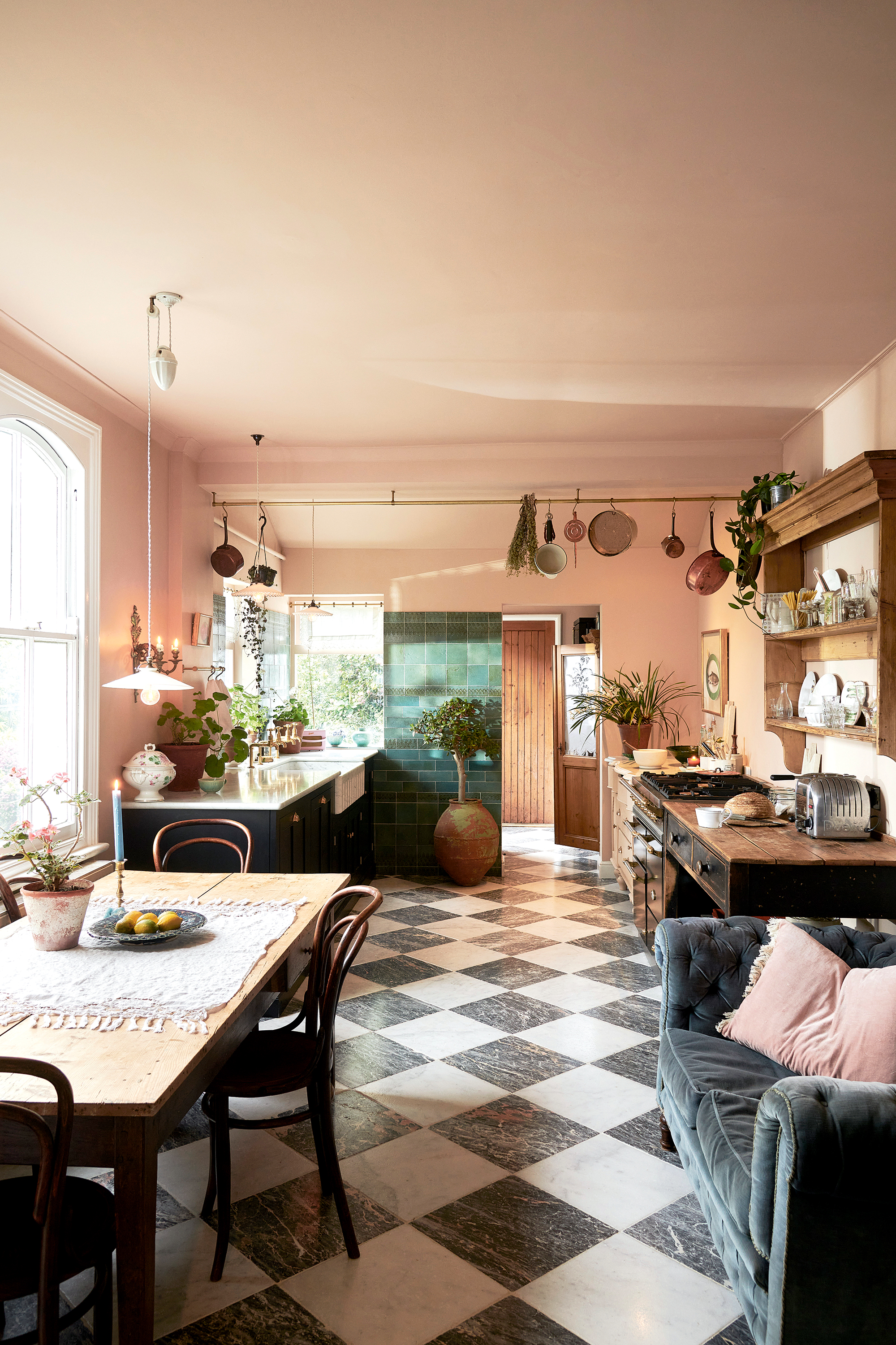
If you're thinking of decorating with black then pink makes a wonderful partner, as it helps to soften and bring warmth to black room ideas.
'Black is our new love, we introduced it a few years ago here at Devol and I think people were a bit scared, but it’s in full flow now,' says Helen Parker, Devol's creative director. 'Add a touch of blush pink to the walls and you instantly get a softer look whilst still keeping the drama.'
7. Use pink to bring life to a neutral bedroom
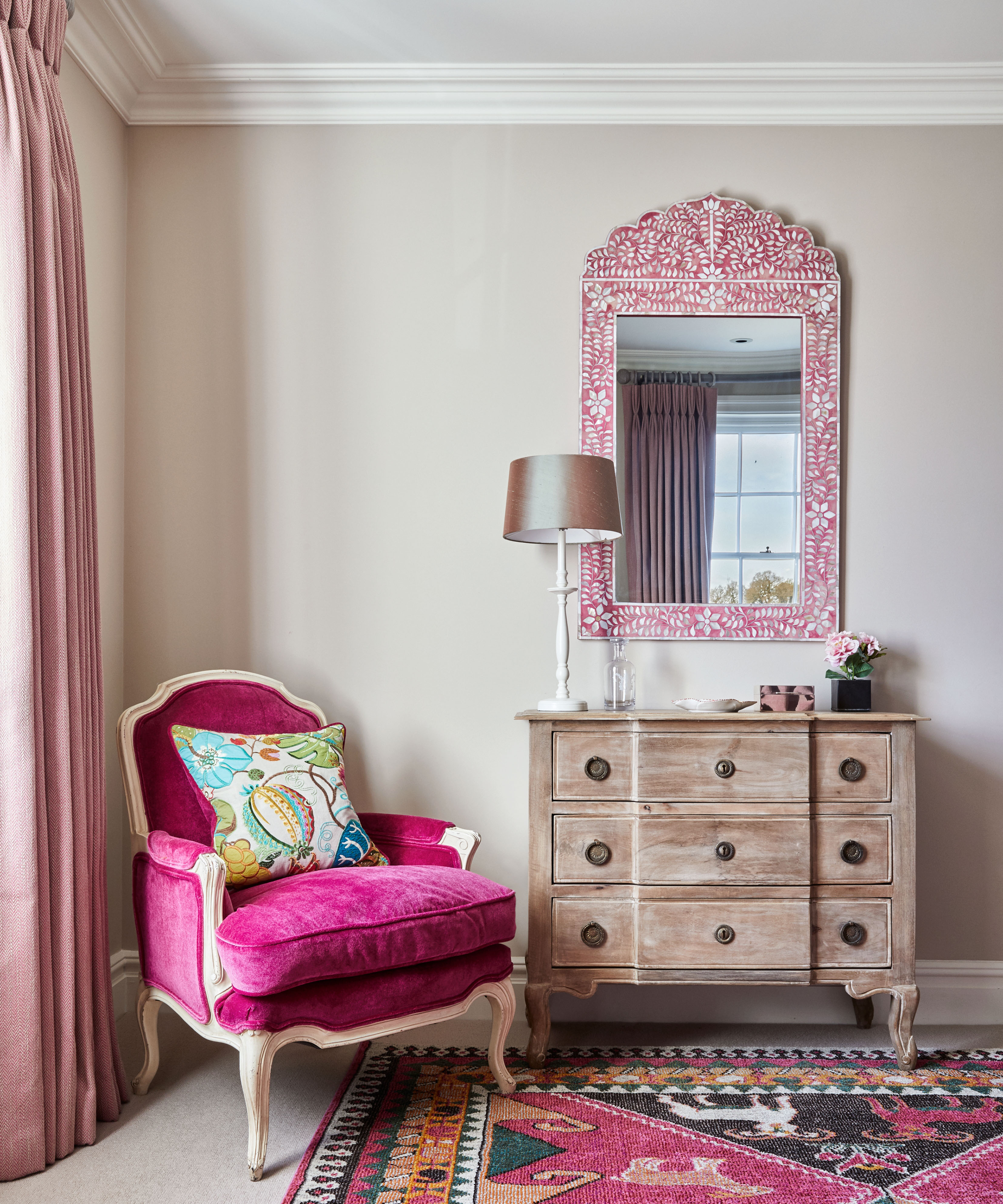
Decorating with neutrals like beige in a bedroom is a great way to create a calming space conducive to sleep, plus it offers a neutral backdrop for introducing colorful furniture and accessories. When it comes to finding accent colors for beige pink works particularly well as both shades have warm undertones. Here, the velvet chair, and a pink inlaid mirror bring a welcome dose of pattern and color to an empty corner of this beige bedroom.
8. Bring warmth with a delicate pink-toned white
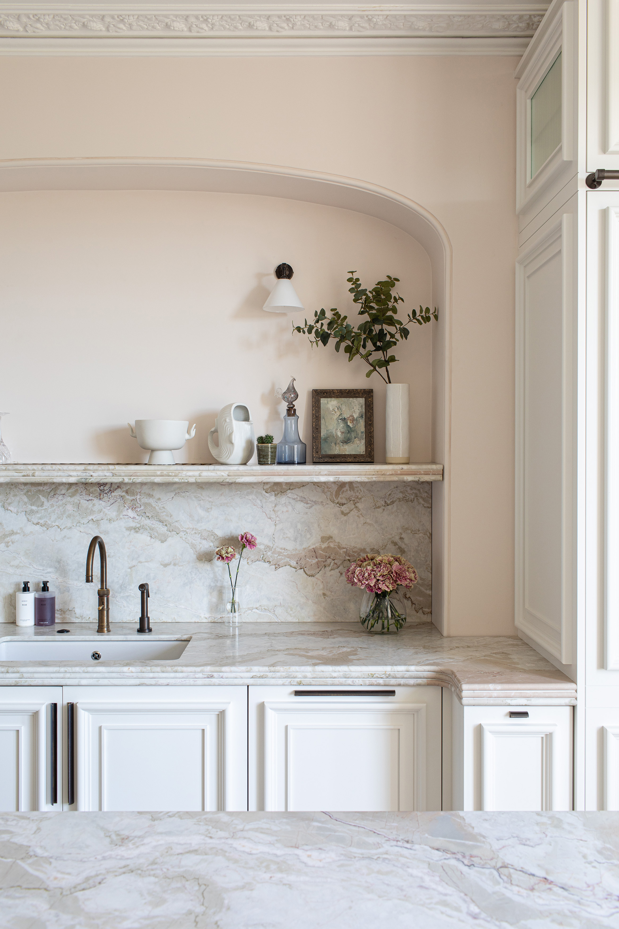
Decorating with white is guaranteed to keep kitchens feeling bright and airy, however, often bright white and cool whites can leave spaces feeling cold. Opting for white with subtle hints of pink is a a lovely way to bring warmth. 'South-facing rooms with plenty of light can take cooler whites with their undertones of blue or green, but we recommend warmer whites for darker, north-facing rooms,' explains Dominic Myland, director of Mylands Paints.
'This kitchen is painted in Mylands Kensington Rose™ No. 22, a soft white with a hint of red ochre, and Holland Park™ No.5, a versatile off-white; the colors work cohesively with the natural marble surfaces. The soft pink tone dictated the color scheme for the whole kitchen and introduces distinctive color without taking over the room,' add the team at Mylands.
9. Go for abstracts to add dimension
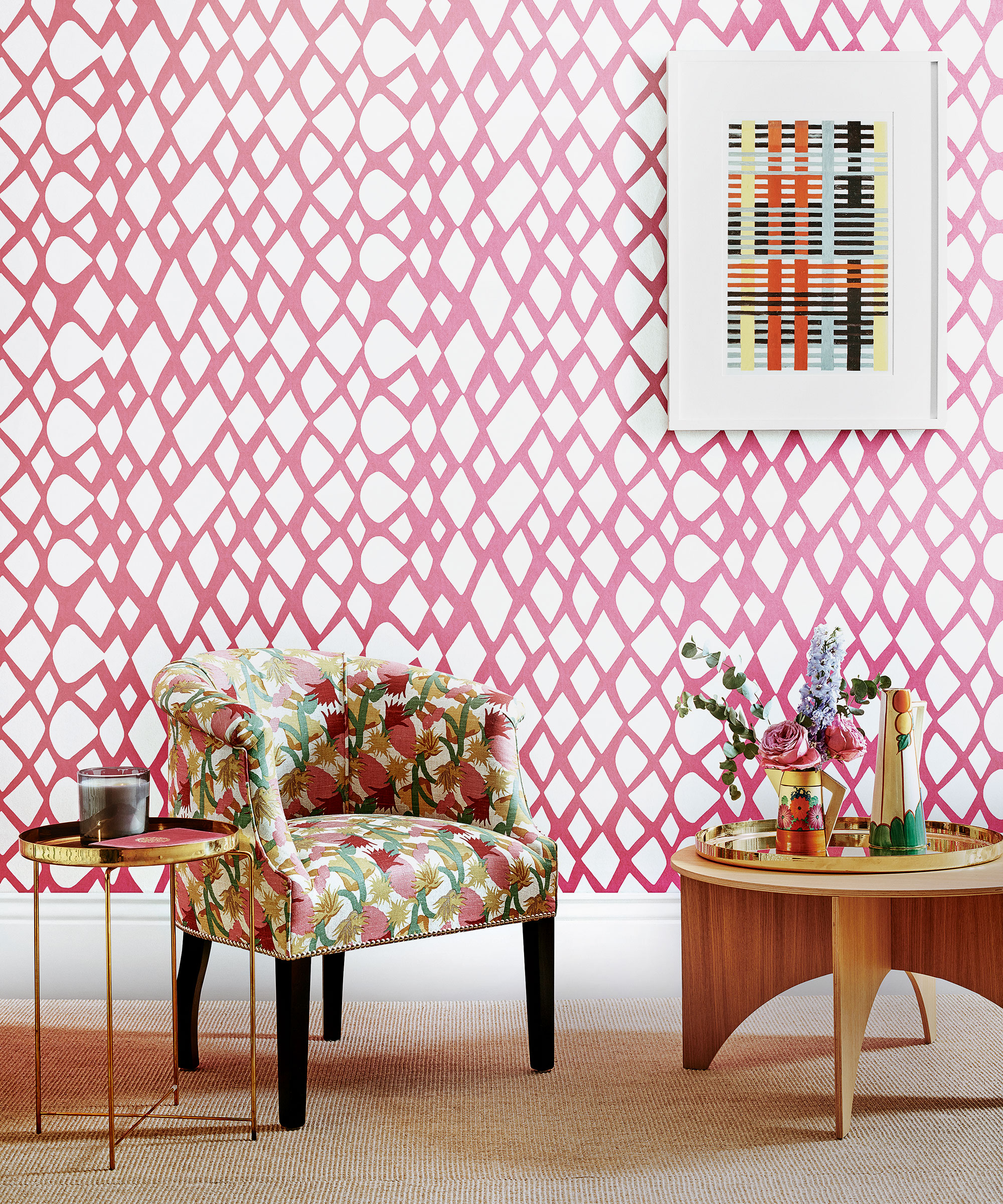
This striking Tesserae wallpaper is part of the Sandra Blow archive collection at Christopher Farr Cloth. Known for her large-scale, geometric and organic shapes and collage effects, Sandra was also a true colorist. This fuchsia colorway works especially well with its crisp white ground, emphasising the dramatic shapes and linear patterns of Sandra’s work
10. Think about tone and texture
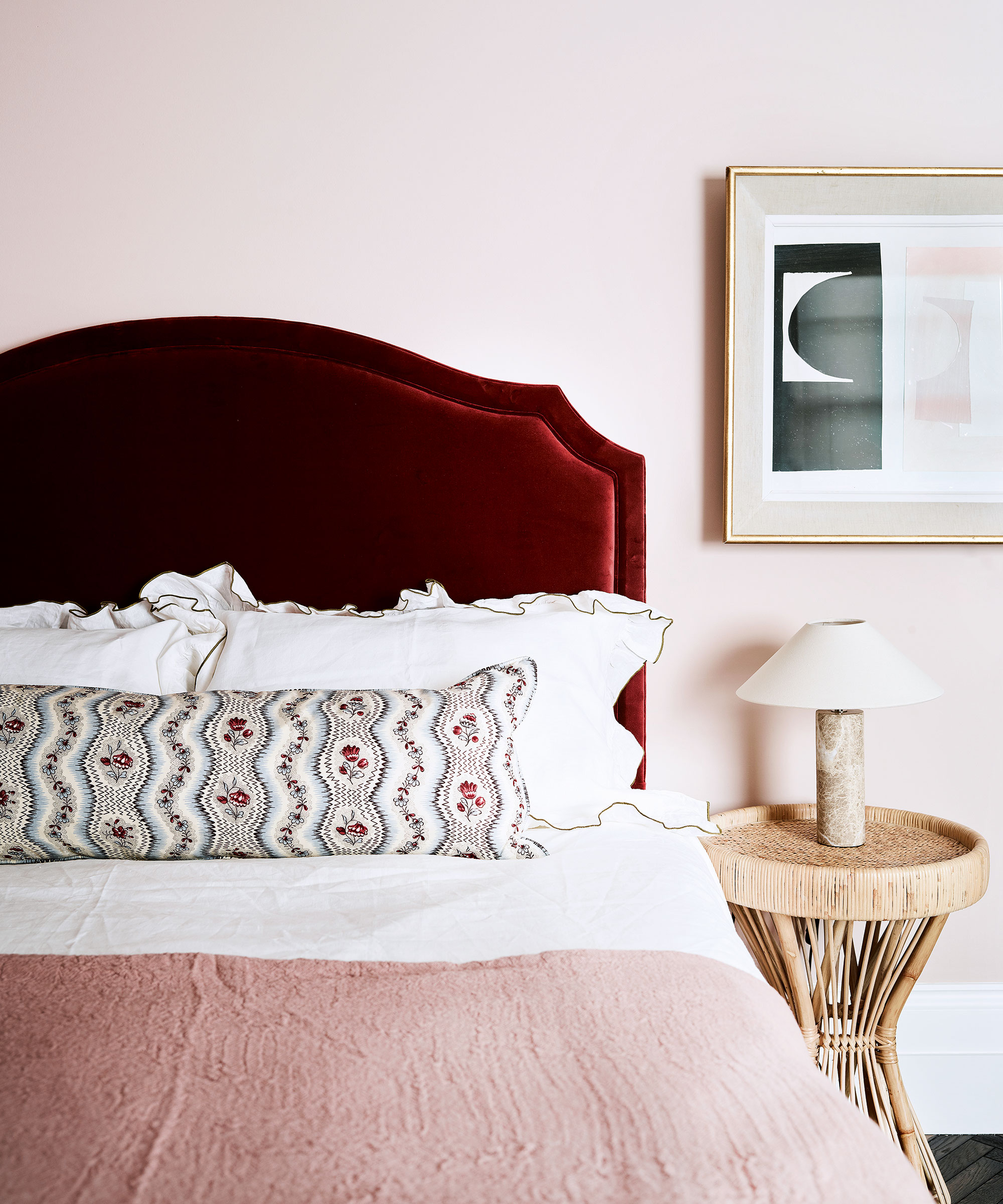
Pink is an excellent choice for a bedroom as it doesn’t distract or stimulate the brain. ‘Choose a warm and cozy hue,’ recommends Irene Gunter of Gunter & Co.
Could there be a more sensual choice for a curvaceous headboard than this deep wine red velvet number from Trove? Combined here with the softest blush bed cover and Setting Plaster pink wall from Farrow & Ball. A match made in heaven from Studio Spiteri.
11. Create a joyful family space
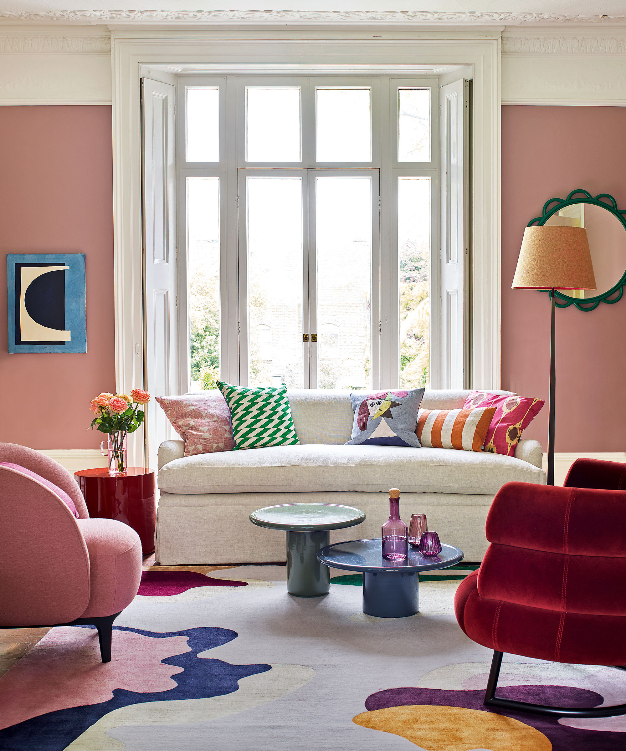
Rose pink is a joyful wall color for a vibrant living space; seen here is Farrow & Ball’s Sulking Room Pink. It’s a surprisingly accommodating backdrop, sitting happily alongside the multitude of other shades in this colorful scheme – from emerald and cobalt to deep burgundy and gold – all tied together in this painterly rug from The Rug Company.
12. Use pink as an accent color

A crisp white wall, like the blank canvas of an art gallery, allows these Jane Churchill upholstered chairs to draw the eye and be the focus of attention along with the artwork. A white space allows lots of freedom to introduce color and pattern through furniture, accessories and artwork.
13. Don't be afraid to use pink in a bathroom
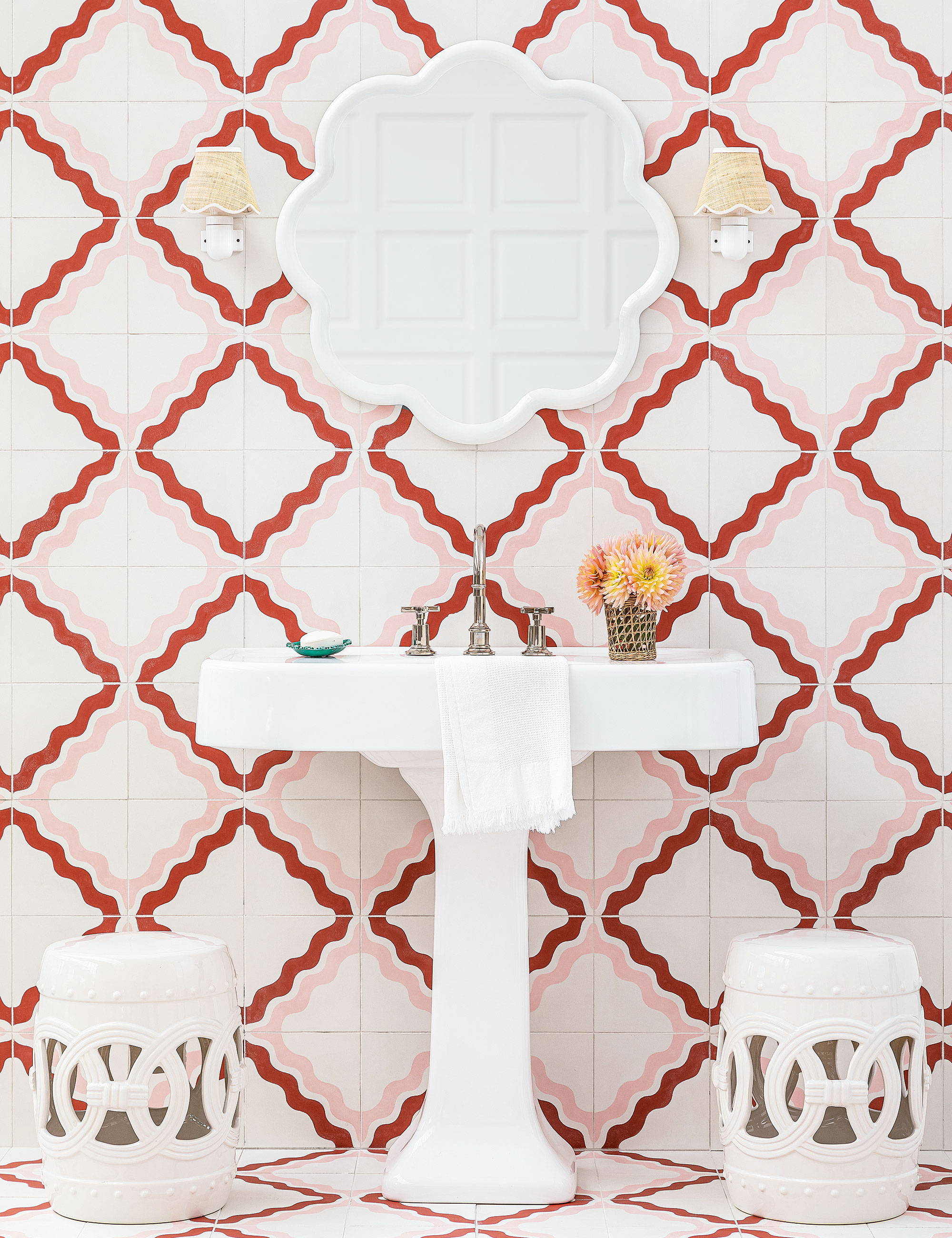
This whimsical Ric Rac tile design by Samantha Todhunter for Bert & May is inspired by the Spanish dancing skirts that Samantha used to make as a child. Used here in a diagonal design to create a pretty lattice, in what is described as Bubblegum: a witty clash of color with a chalky red contrasting soft pink. It is a confident look that adds a joyful character to the pink bathroom, working equally well on the wall and floor.
14. Have fun with pattern and color
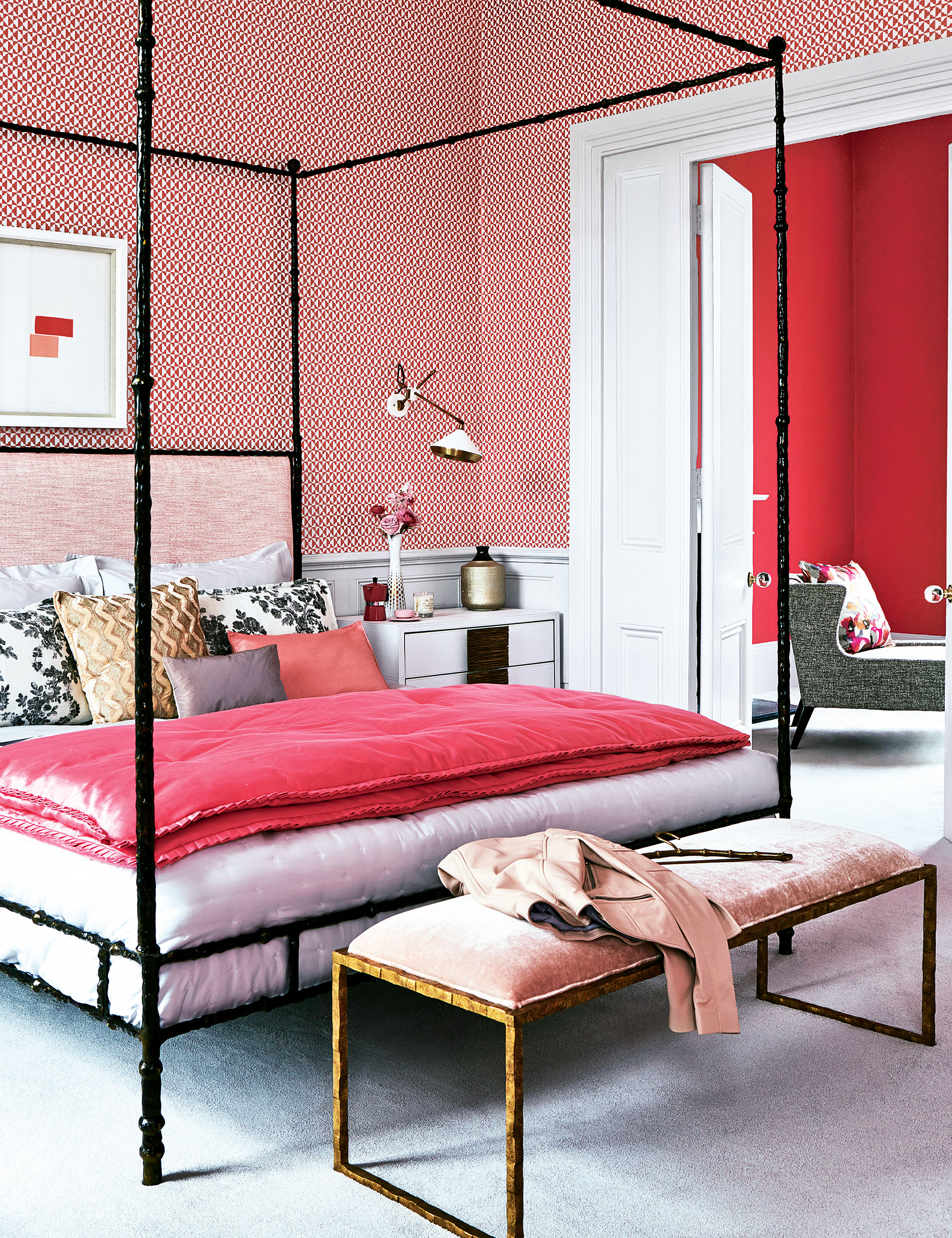
A bedroom with adjoining dressing room allows you to have fun playing with two different shades in a palette. The separate dressing area can afford to be drenched in a vivid hot pink while the bedroom, wanting to feel more restful, is more suited to a gentler small-scale pattern.
15. Double up on pink to add warmth to the kitchen
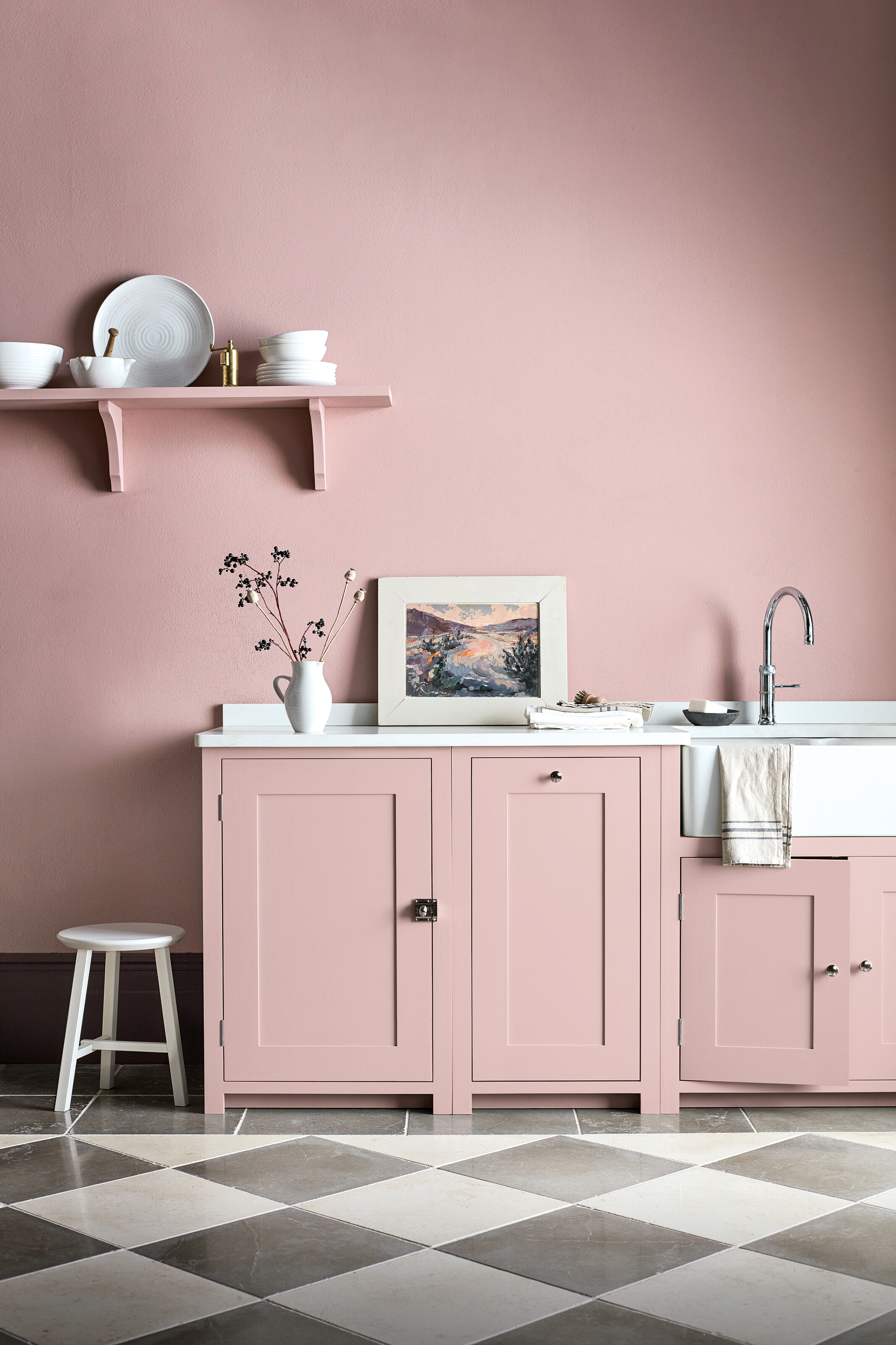
The atmosphere of a kitchen can be greatly influenced by the color you choose. ‘There’s so much to consider when designing your kitchen, and color is one of the most effective tools you have when it comes to creating atmosphere and character,’ says Stephanie Nix, kitchen designer at Neptune.
‘Pinks work beautifully with the undertones of Carrara marble, and mix with pale or darker greys to create a calming cooking space. You could also introduce black accessories through lighting or black-bronze handles to keep the look chic and sophisticated.’
For a seamless, uncluttered look, use the same rosy pink hue across both walls and kitchen cabinets. Where space allows, keep cabinets to floor level only to give your kitchen an airy feel. This Suffolk kitchen in Old Rose paint is by Neptune.
16. Pair pink with soft grey for an elegant dining space
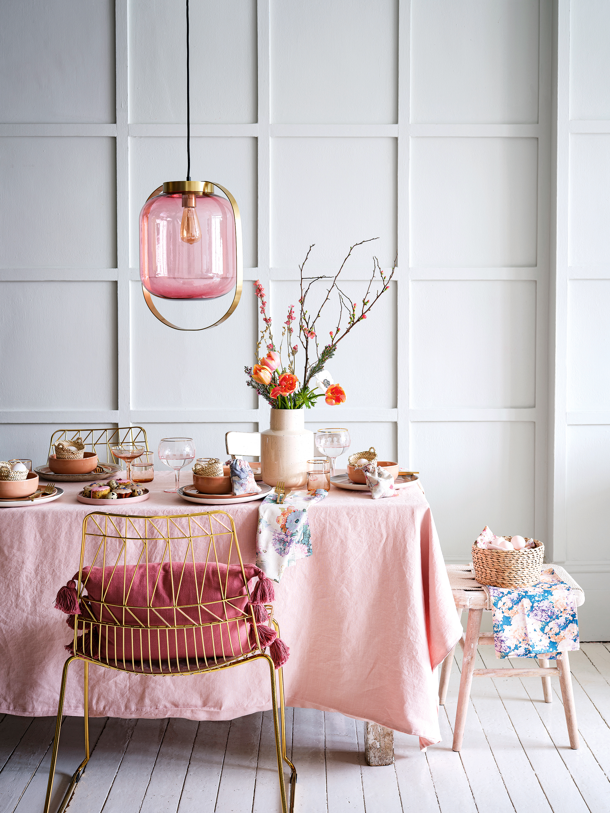
Set against soft grey – which is a beautiful paneling paint idea – pink is surprisingly sophisticated, and this classic combination is a good way to minimize the color's sugary undertones.
‘Blush pink has a very alluring quality. It draws you in, is welcoming and easy on the eye. But you have to be really careful not to get too sickly sweet,’ says interior designer Samantha Todhunter. ‘To dial back the sugary nature of some pinks, look to use shades with tones of grey.’
This elegant table setting combines plain cloths with painterly patterned napkins and glass and metallic accents. A blush linen table cloth lends a relaxed look, while an Art Deco-inspired light fitting adds a hint of glamor.
17. Add character with pink and white stripes
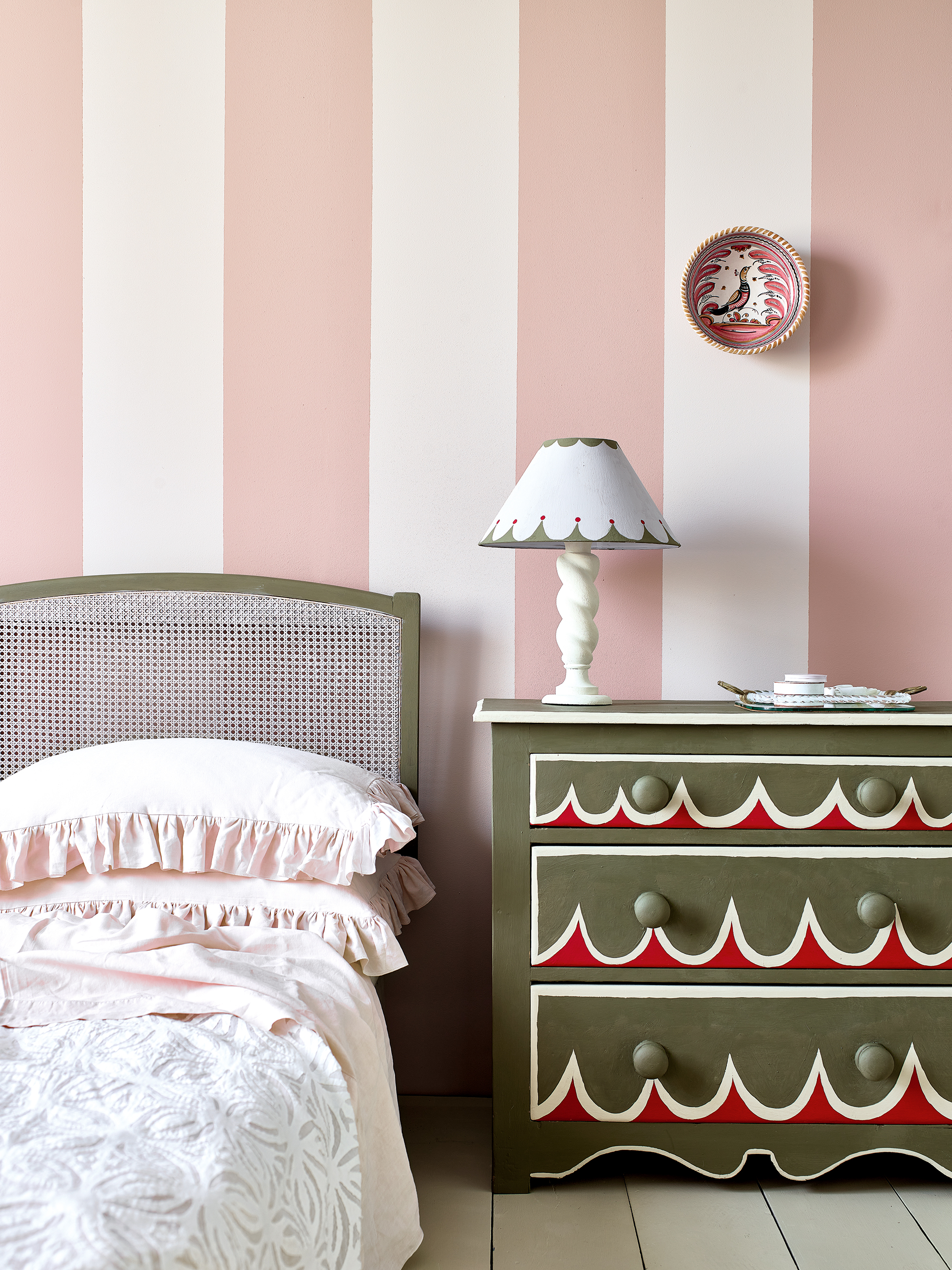
Painting wide vertical stripes is one of the most creative pink room ideas – not only does it give the illusion of height but it is an easy way of adding character to a room that lacks original features. Here, Annie Sloan’s Piranesi Pink and Pointe Silk wall paint have been used to create an elegant scheme.
Named after the seminal Italian printmaker and architect Giovanni Piranesi, Piranesi Pink is ‘a dusty, peach-leaning pink which includes yellow pigments that give it a real softness,’ says Annie. ‘Almost flesh colored and suggestive of setting plaster, it is timeless and universally complementary.’
In a classic color contrast, Annie has also given new life to a vintage chest of drawers with Chalk Paints in Olive, Emperor’s Silk, Old Ochre and Paloma.
18. Design a soothing bathroom sanctuary with blush pink
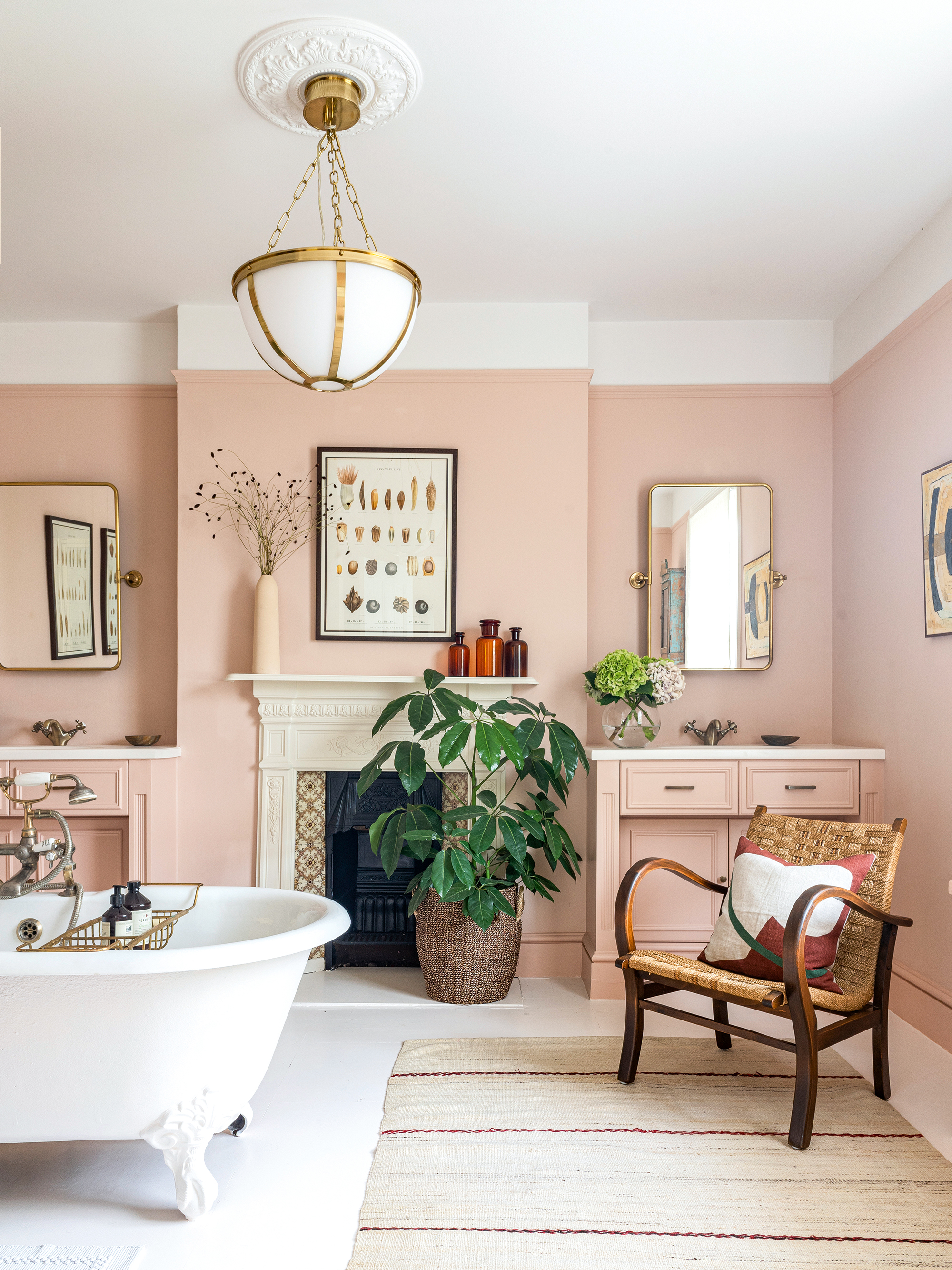
Blush pink has a quiet inner strength that can hold a room without being overly theatrical.
In this generously proportioned Victorian bathroom with symmetrical basin consoles and original fireplace, interior designer Anna Haines has used Cuisse de Nymphe Emue paint from Edward Bulmer.
Applying the paint from skirting board to picture rail has created an overall effect of a balanced, soothing sanctuary.
Pink is a particularly good choice for older homes, as Edward Bulmer explains: ‘Pinks have been used throughout history and ranged from the plaster pinks, based on red ochre, to the blossom pinks from crimson lakes,’ he says.
‘The latter were expensive and much loved as a tinting color on ornamental plasterwork from the 18th century onwards. They are a perennial favourite as they flatter both building and occupant.’
19. Create calm with the softest of pinks
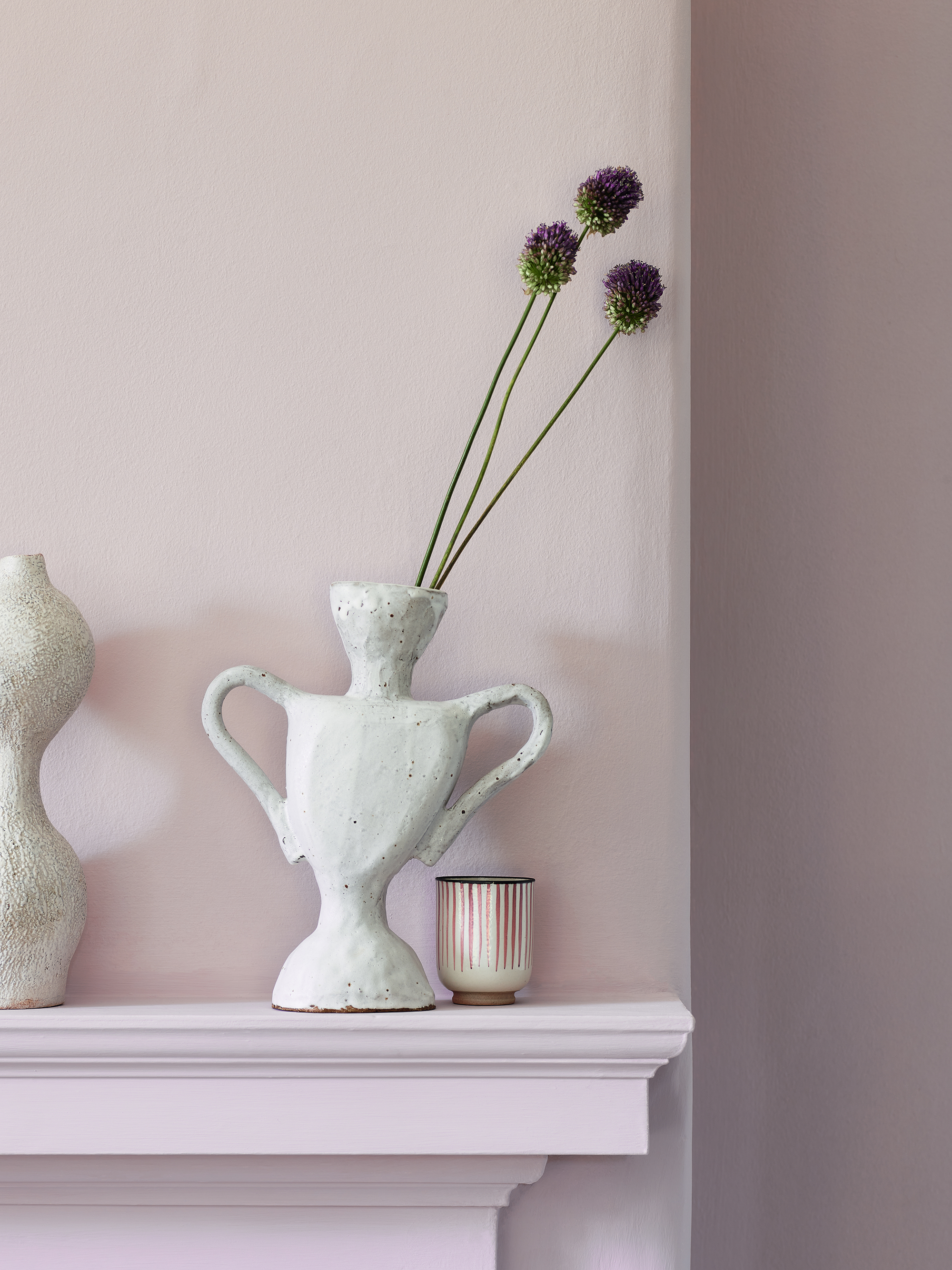
With its ability to provide a warm base for different materials, blush pink can inform the mood in a room. Think about the energy and atmosphere you want to create and how you are going to use the space.
For a sense of calm, choose paler shades, such as this Heritage Potters Pink matt emulsion from Dulux.
Using such a soft shade of pink is one of the most versatile pink room ideas as it means the color acts almost as a classic neutral, transcending both room and gender preconceptions.
Painting a fireplace in the same pink as the walls enhances the sense of calm.
20. Use pink curtains as a foil to botanical prints
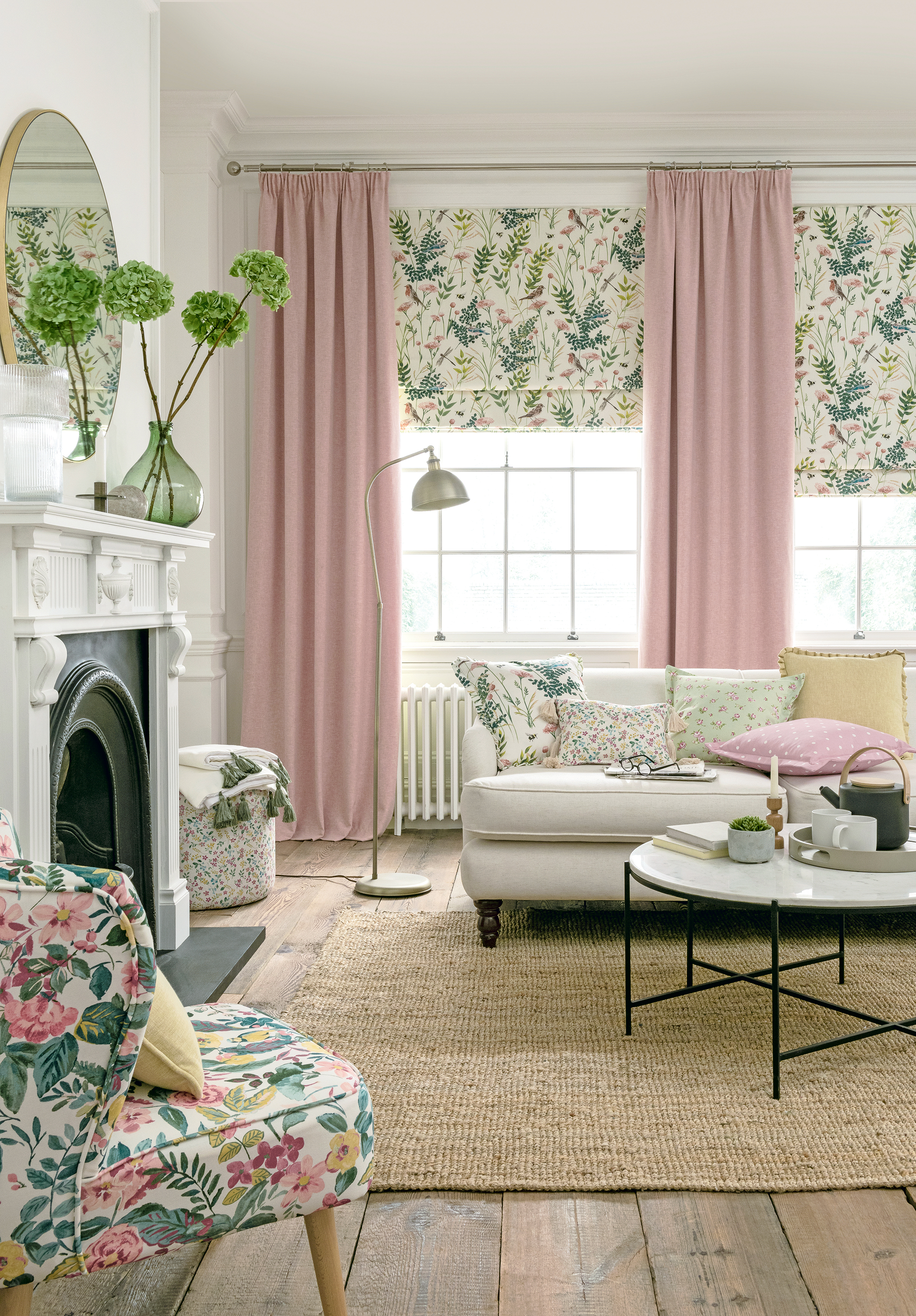
For a relaxed and balanced living space, use plain blush pink curtains as a canvas to offset botanical prints and enhance the sense of light in the space.
In this scheme by Clarke & Clarke, sash windows lend themselves to an elegant combination of Roman blinds in Gardenia in Blush, and sumptuous full-length curtains in Kelso in Blush.
An accent chair and mix-and-match cushions tie the scheme together.
21. Design a romantic bedroom with setting plaster pink
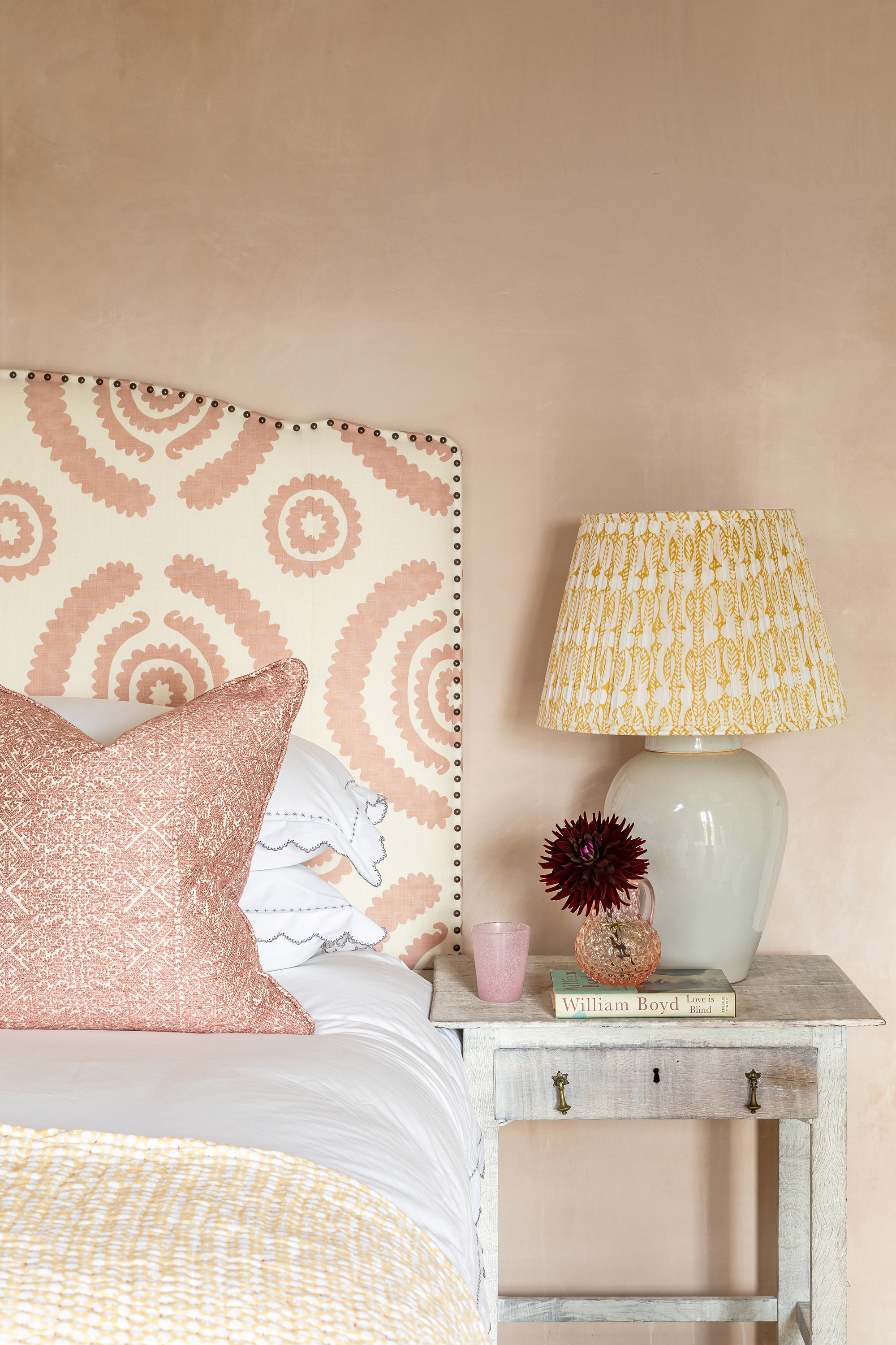
Create serenity in a guest bedroom with a textural design of bare plaster walls combined with muted blush pinks in complementary scales, as in this design by Samantha Todhunter.
A headboard in a larger scale pattern – Haveli Pink by Penny Morrison – contrasts beautifully with an accent cushion in Fez Putty, a small-scale weave by the Guy Goodfellow Collection.
While bare plastered or limewashed walls create a beautiful character to a room, for a smarter finish, emulate the look with a setting plaster pink paint.
22. Create the prettiest nursery with delicate pink
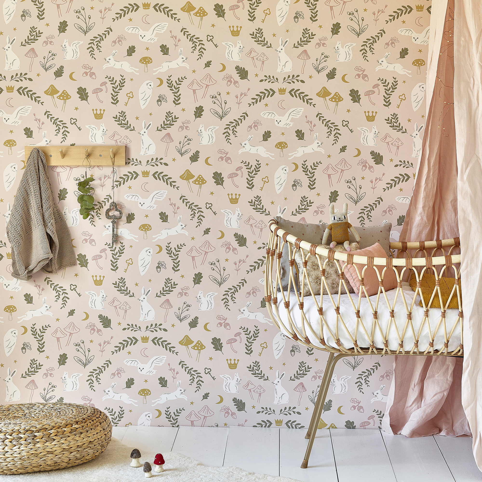
Finding a decorating scheme that grows with a baby into childhood is a sustainable option that saves time too.
While often thought of as being just for girls, pink is a surprisingly gender-neutral color. However, if you want to go all-out feminine, then there is no better choice than pink room ideas for a nursery.
With a palette of dusty pink and olive, this Woodland Wonders wallpaper from Hibou Home features woodland creatures, toadstools, acorns and golden keys to create a magical backdrop for a nursery.
23. Use pink to create a haven for home working
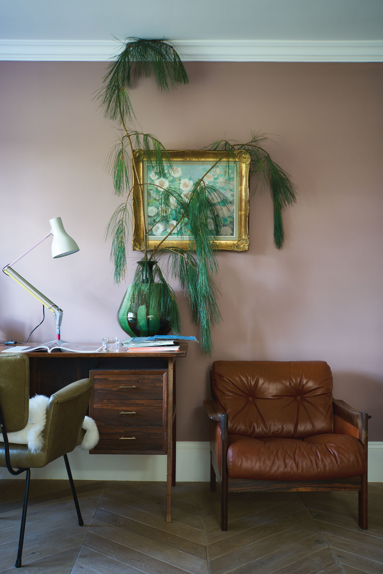
Farrow & Ball’s Sulking Room Pink is the ideal shade to create a calming feel in a home office as it’s such a versatile colour, as Joa Studholme, the brand's color curator, explains.
‘Sulking Room Pink should not be seen as overtly pink, but rather a muted rose with enormous warmth; its powdery feel making it incredibly soft and easy to use with complementary darker tones. This color has its roots firmly in the past but is the perfect tone for furniture and walls alike.’
It works particularly well with mahogany tones and crisp white.
24. Use dark furniture and accessories for contrast
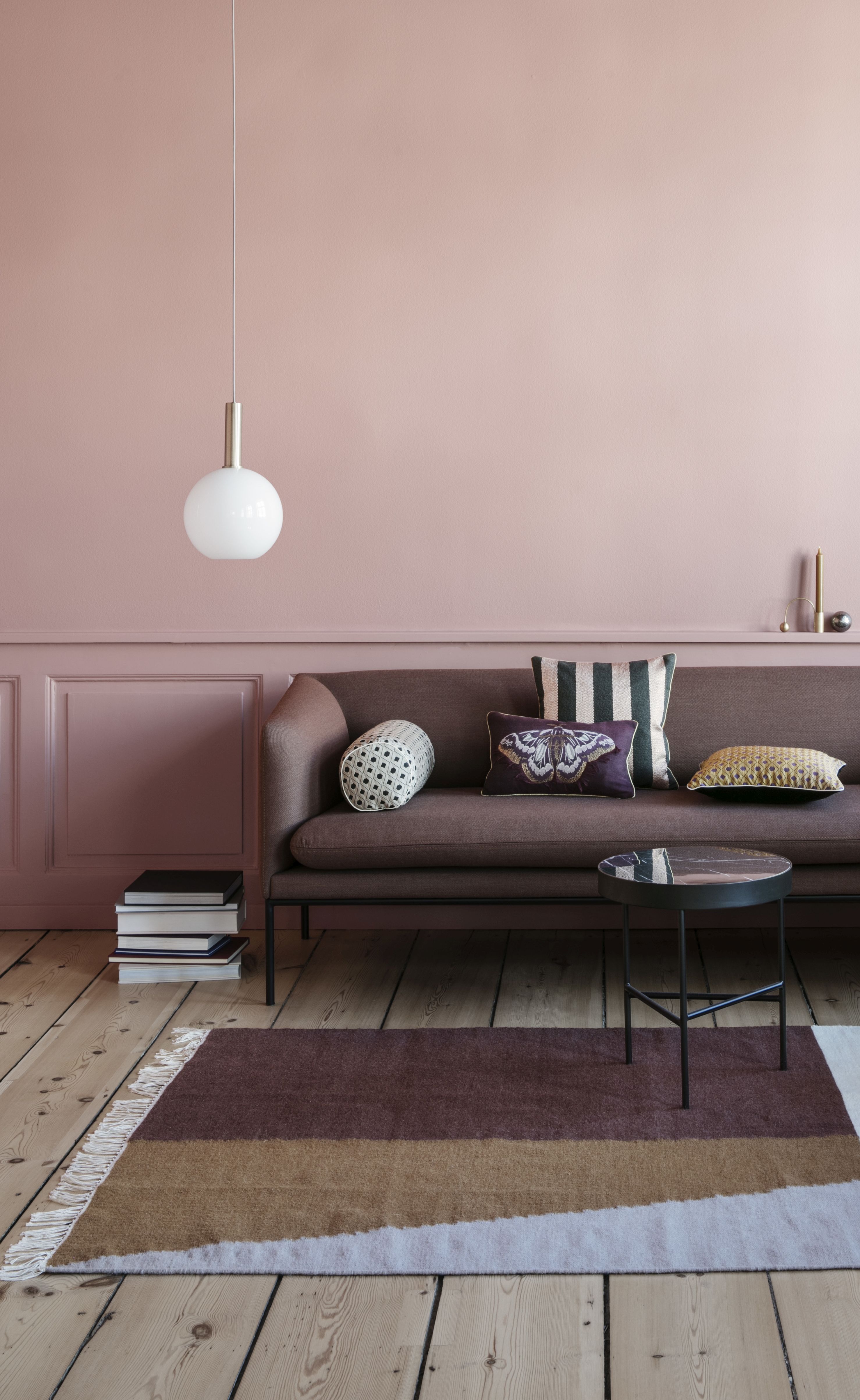
When you’re using a light shade of pink on your walls and woodwork you can go darker with the rest of your scheme, as Ben Stokes, founder and interior designer at KAGU Interiors , explains:
‘Balance blush pink walls with dark and warm furnishings and accessories. Complete the palette with rusty browns, burnt oranges and soft neutrals for a scheme that feels timeless and sophisticated.
'Add texture with a striking floor covering and eclectic cushions and finish the look with contemporary lighting solutions and brass finishes.’
25. Opt for more than one shade of pink
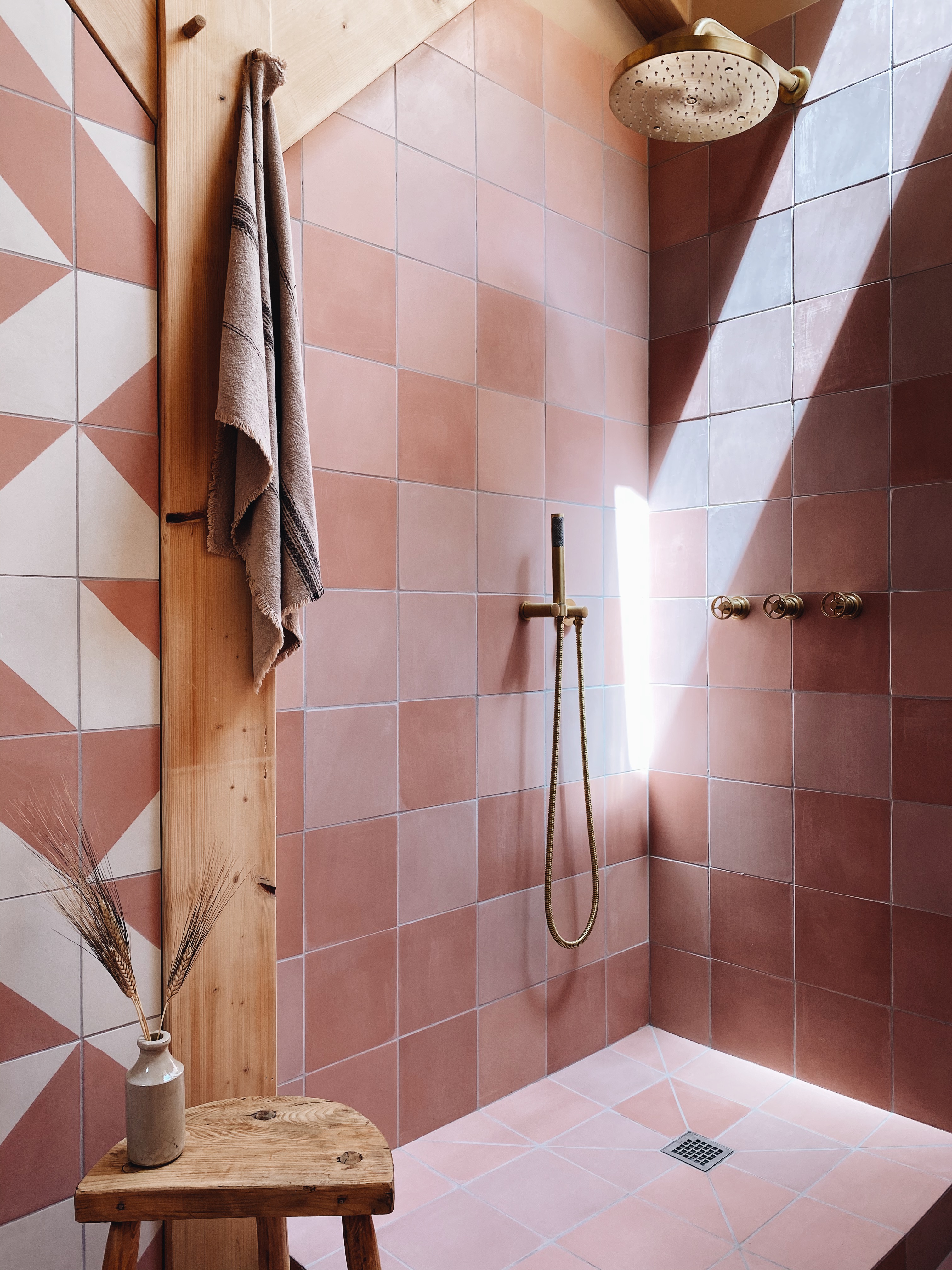
Walk-in showers are a great place to experiment with color and pattern, and if you can’t decide on one shade of pink, then go for three – odd numbers always work best.
Break the rules and ditch a regular tiling pattern too, be random – who says you need a specific layout?
The irregularity of these Alalpardo and pink plain tiles makes it more striking and individual. Bathroom designed for The Landscape Lodge.
26. Use pink wallpaper to add more than a hint of pink
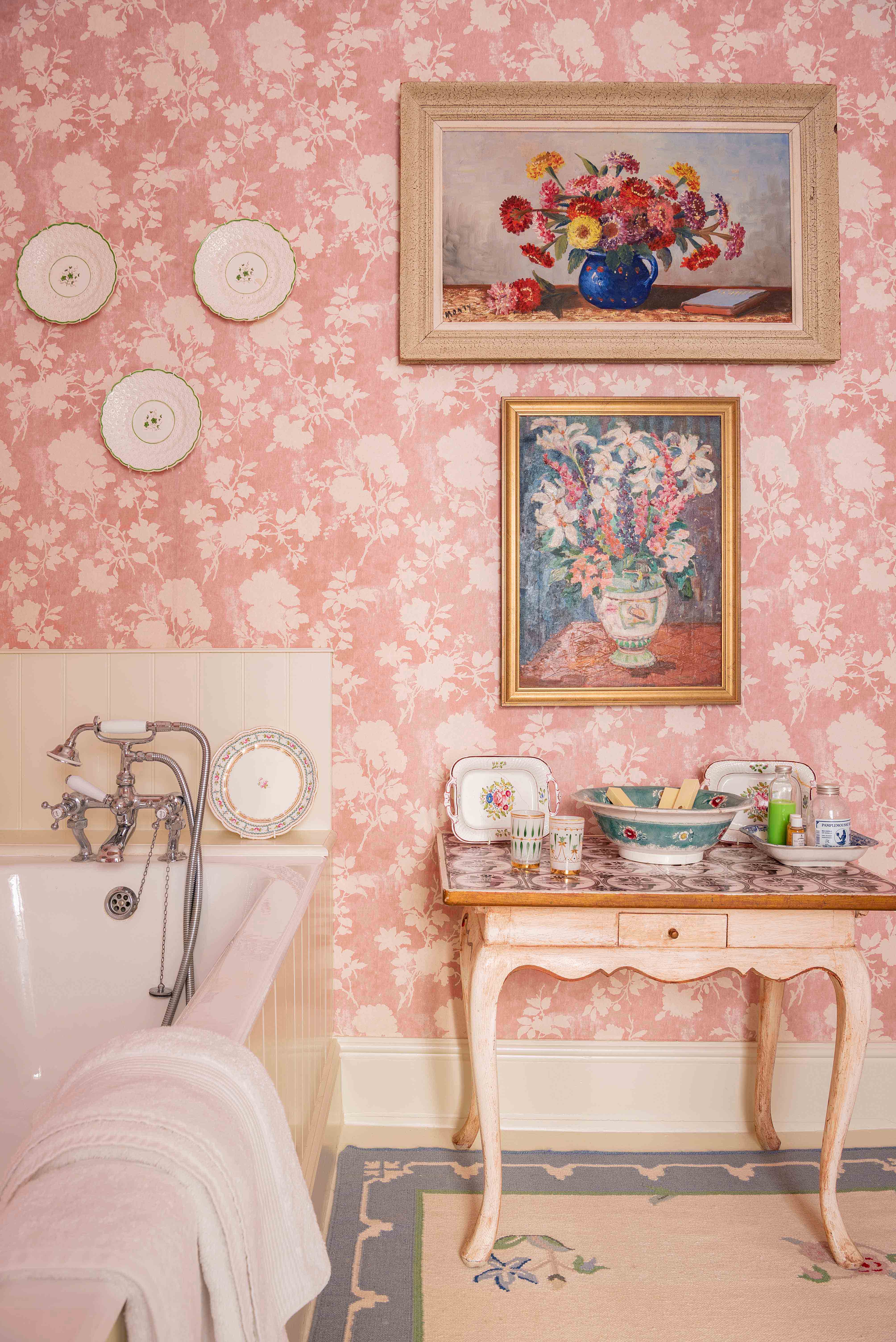
For a country cottage look, opt for a pretty wallpaper and keep it simple by choosing a two tone design – then it can act as a background for vintage paintings and decorative plates.
This Flowerberry Pink wallpaper is from a selection designed by Penny Morrison. Its floral silhouettes sit perfectly on the slightly worn pink background.
27. Add depth with two shades of pink
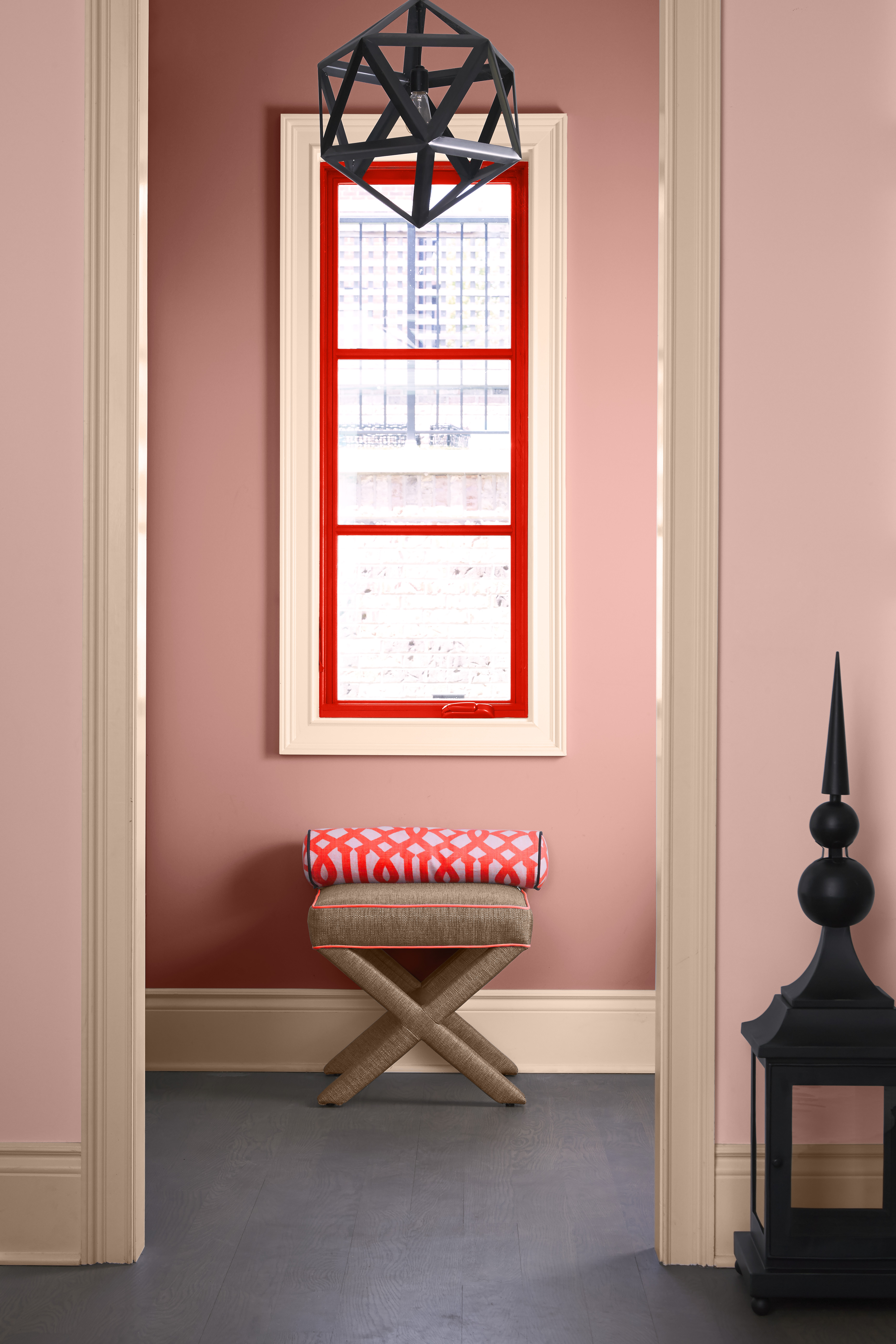
Create interest through a doorway by using a darker tone behind the paler tone. It works really well and adds a contemporary feel to a space. Will Thompson at paint company Valspar shares his thoughts on how fabulous pink can be.
‘Pink is a really versatile color; you can opt for bold and bright shades like Cactus Flower and Magenta Manicure to make a real statement and express your personality,' he says.
'Alternatively, opt for blush or muted tones, such as Strawberry Parfait (shown) and Dusky Zinnia, to create a more subtle, cozy atmosphere. The variety of pink tones also mean you have flexibility when it comes to compatible colors; pair it with deep blues to add coolness to a room, choose lighter shades for pops of ice cream pastels or pair with grey for a classic feel.’
28. Give pink a contemporary edge
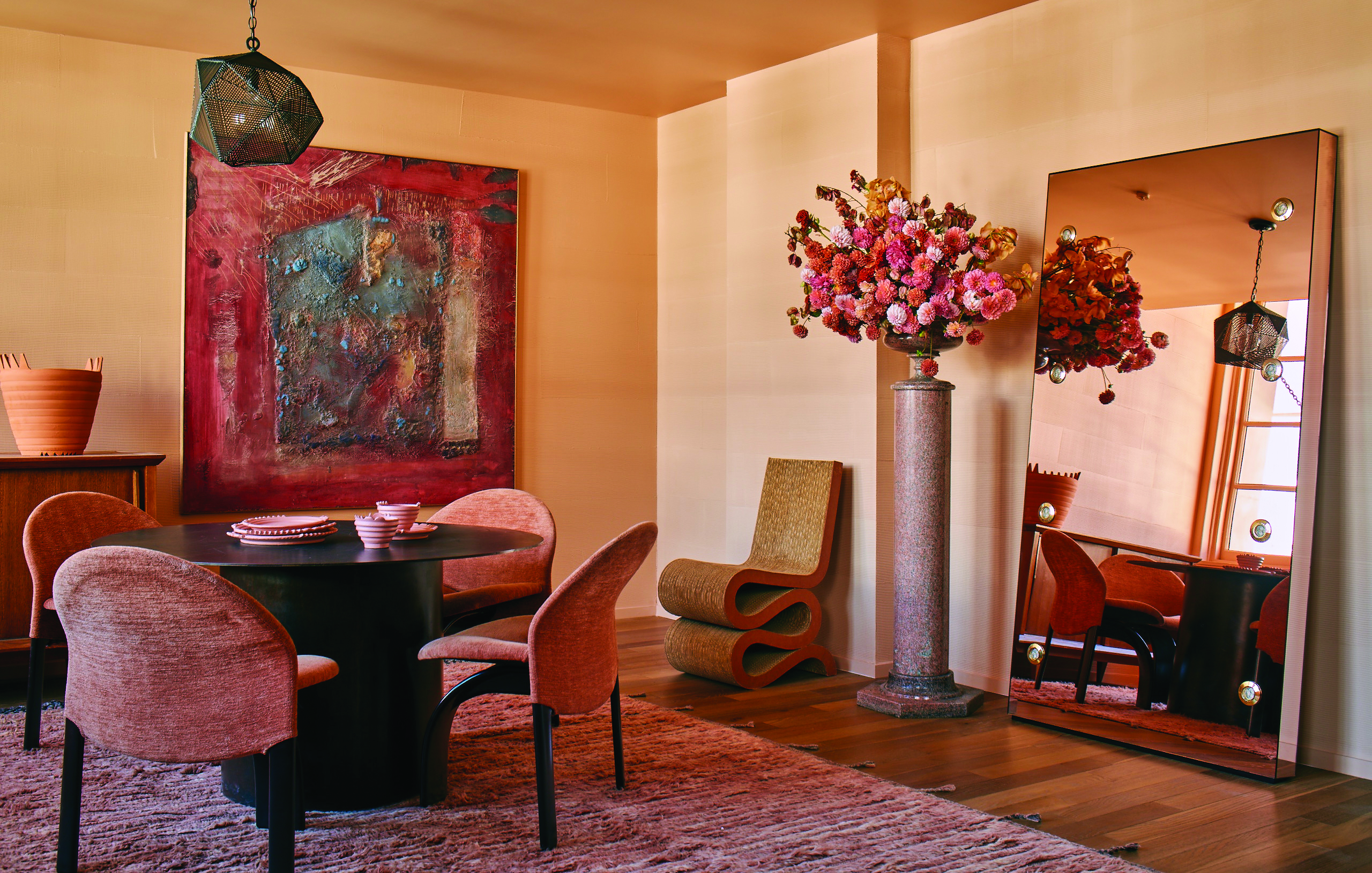
While pink room ideas are often dismissed as being for more traditional schemes, pink can be a perfect choice for contemporary spaces, too, as in this pinky terracotta room designed by Kelly Wearstler for Farrow & Ball.
‘Color is the spirit of a room, and provides expressive power to transform a space with your personal voice, whether you’re painting all of your walls, or just one,’ says Kelly.
29. Pick a yellow pink for warmth
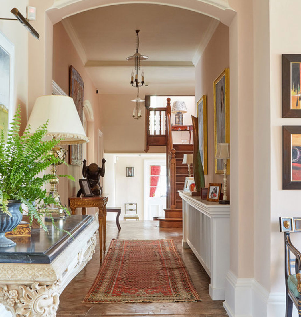
'A well-judged pink is a far more useful color than you might think. It has always struck me how many serious-minded Grecian interiors employed it two centuries ago,' says Edward Bulmer.
'This is because it can be serious and architectural as well as soft and inviting. It’s crucial to avoid the shade being too fragrant and our Jonquil – which has a soft hue that hovers between pink and yellow/beige – is now one of our bestsellers, being used in halls, living rooms and bedrooms.'
30. Pick a grown up shade of pink
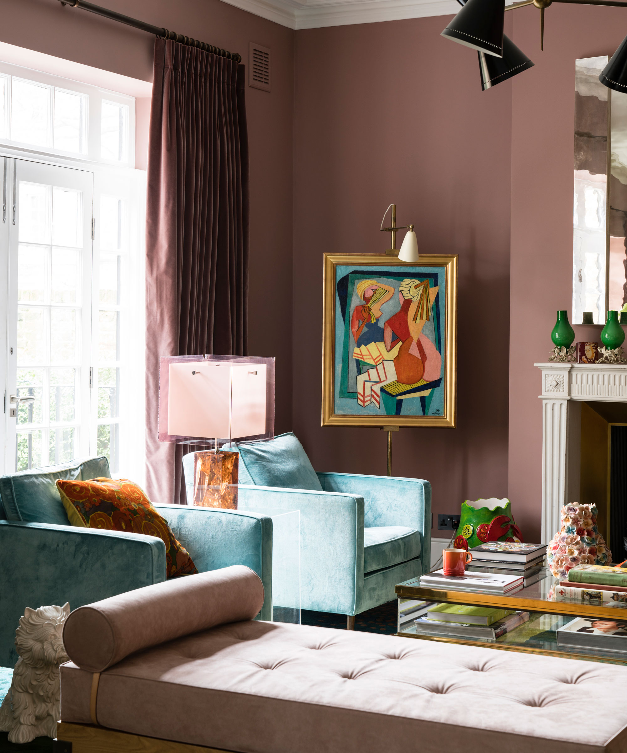
'I enjoy using pink in its many forms, dull, blush and even an orange-y pink,’ says Charu Gandhi, director of Elicyon.
'Our projects are often quite tailored and chic so we find pink is very adaptable and fits well, it can be striking but also romantic and gives a real sense of soft glamour – almost a romanticism. Pink works very well with metals and even champagne gold trim fabrics.'
31. Ground pink with dark blues
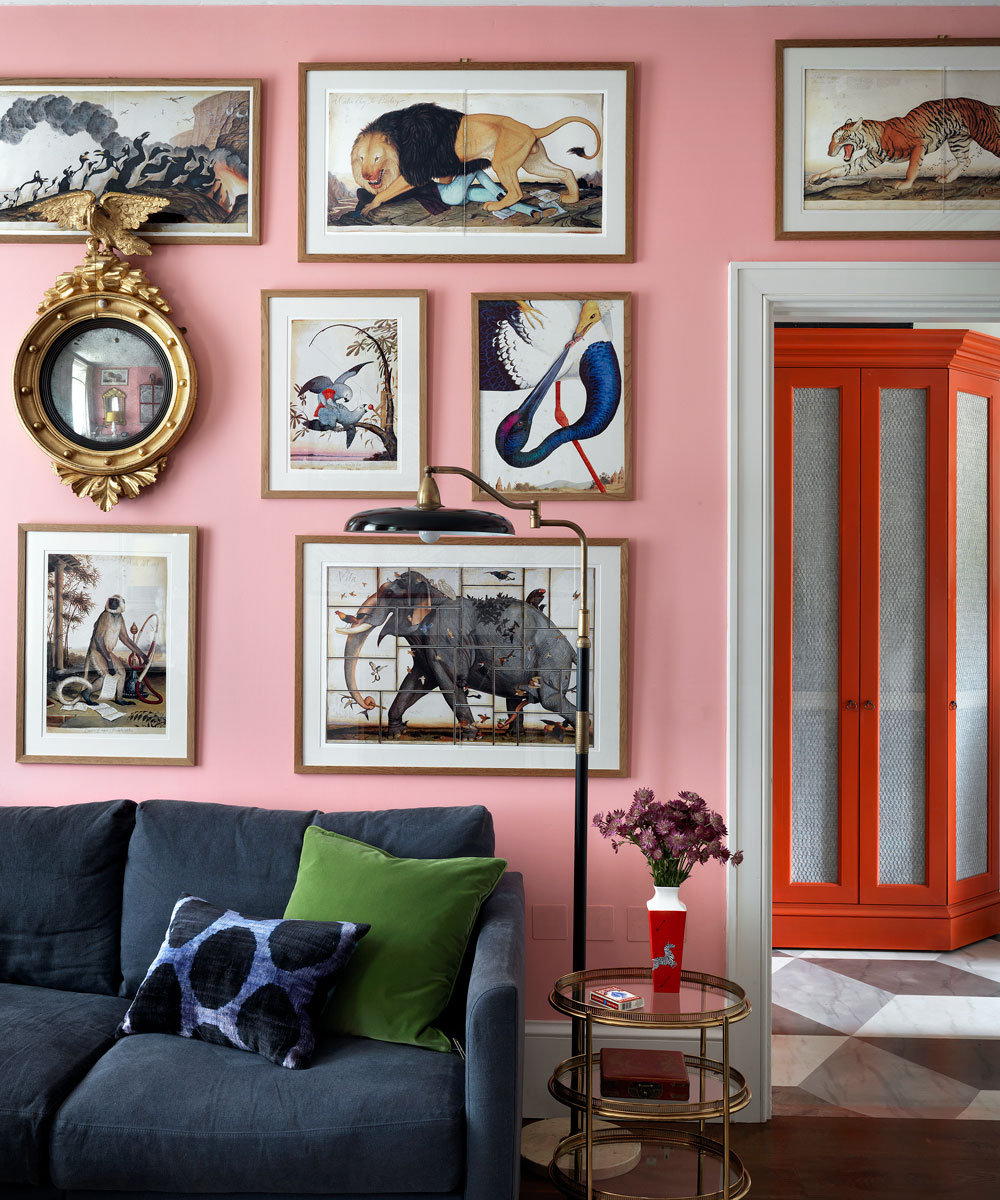
Not everyone would risk using such a deep pink on the walls of a living room, but use the right shade and instead of boudoir brash it will make any room look fresh, modern and very grown-up.
Guests will be pleased too; the decorator Nicky Haslam is a long-term believer in pink being the most flattering color for walls. This dark calamine lotion hue creates a perfect backdrop to set off the plentiful art works and mirrors in gilded frames highlighting, rather than distracting from, the colors within.
Interior designer Beata Heuman, who specialises in creating rooms that are at once cozy, eclectic and chic, further grounds the living room space by using a more conventional navy blue plain on the sofa and chairs. This color is then carried to the very edges through the use trimmings, lending a tailored and modern look to the scheme.
32. Contrast pink with navy for a restful bathroom
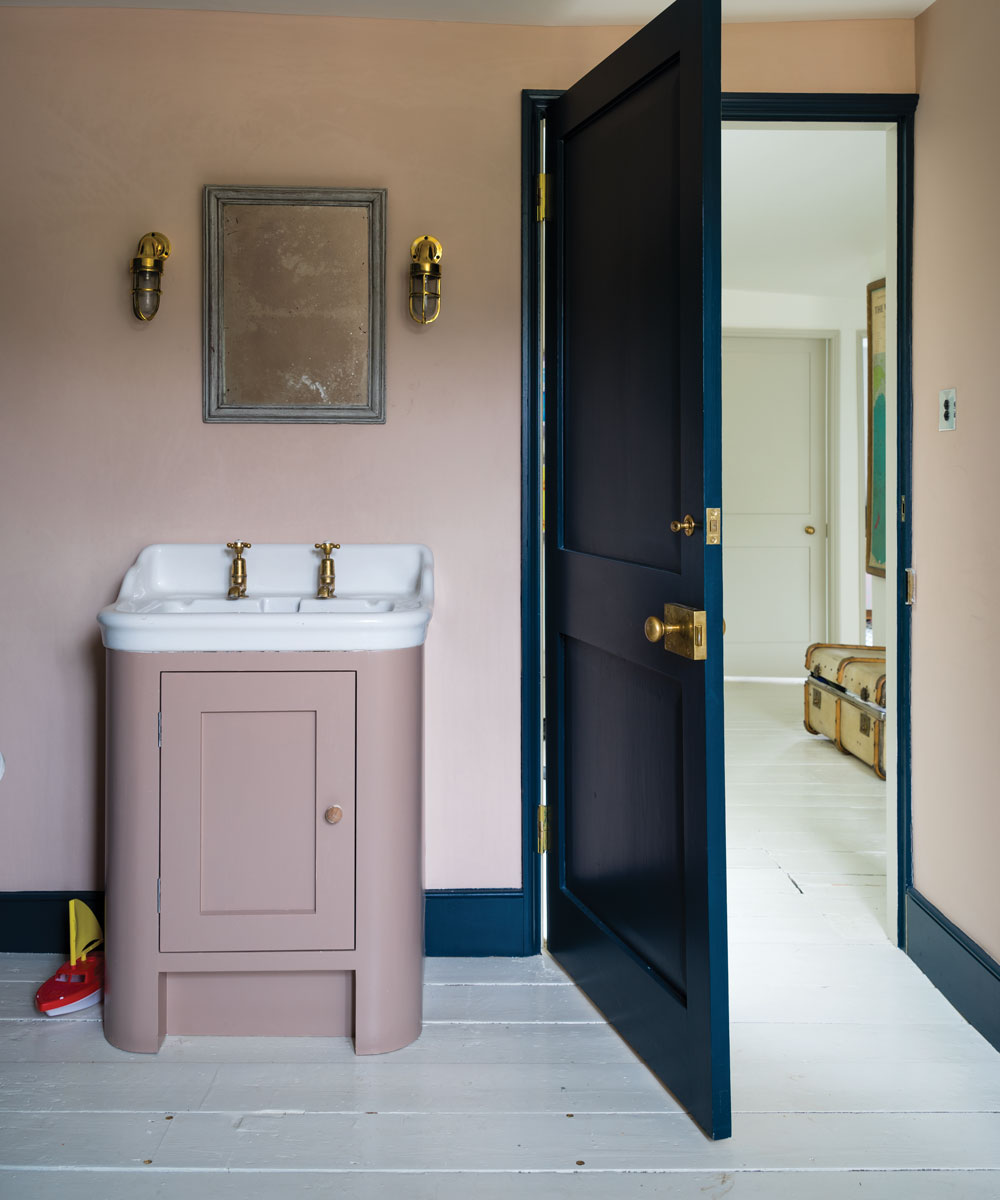
For years, the unwritten rule was that woodwork should be painted in high gloss with ceilings in a clean matt white, but finishes can be creatively used to make and accentuate architectural features – worth a thought in period buildings which are blessed with plenty of these details.
Create a tonal statement not only by pairing two different colors – a pale pink and a dark navy are an unusual combination which nevertheless works well together (as fashion designers have long recognized).
Then use another contrasting technique by painting the walls in matte emulsion against the door and skirting boards in glossy eggshell – it will help to frame the room. In this scheme by Farrow & Ball, the walls are covered in Pink Ground modern emulsion while the door and woodwork are highlighted in an eye-catching Hague Blue eggshell.
33. Warm up a cool room with pink window treatments
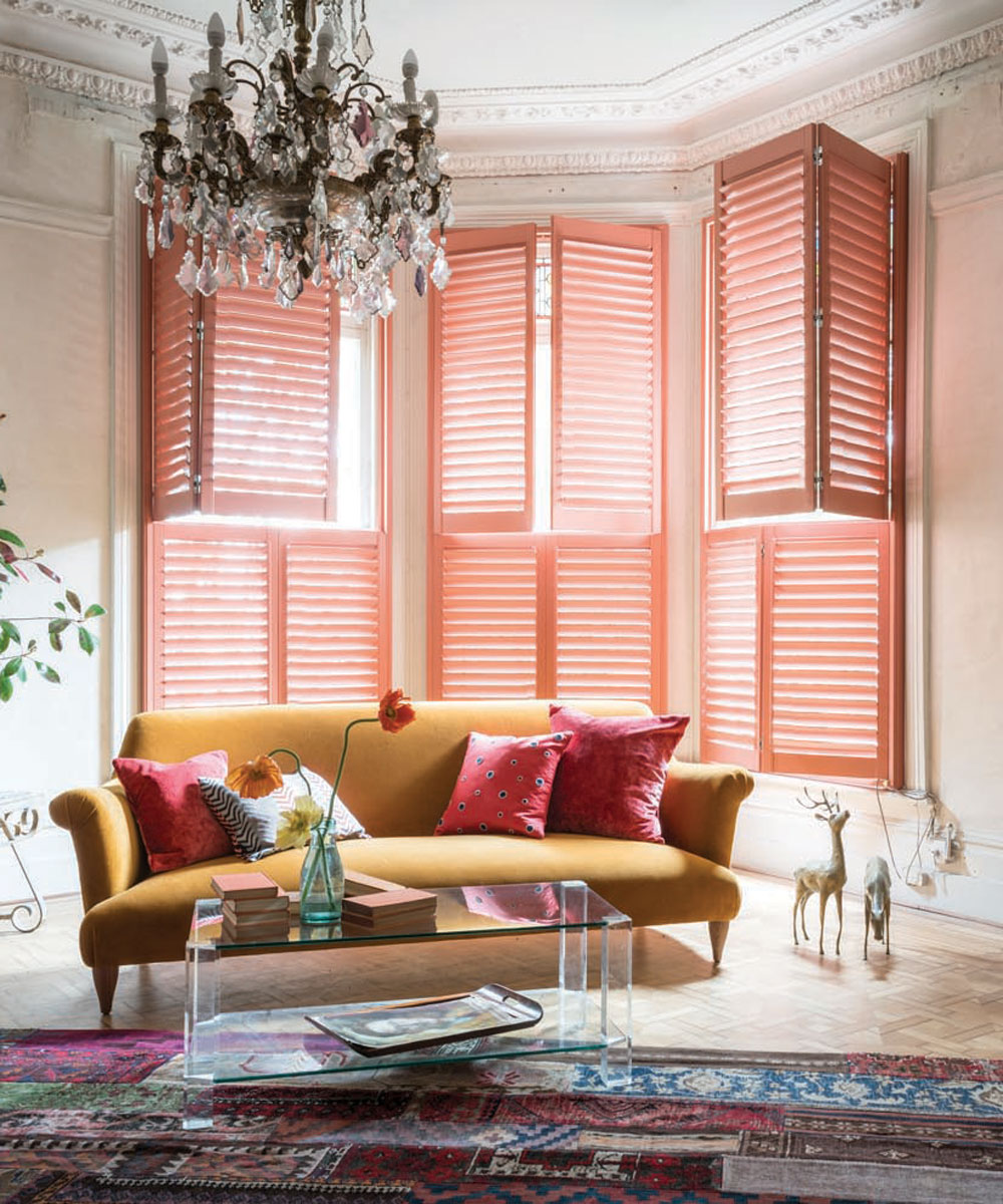
The play of light and color at a window has an unrivalled effect on our homes. Bold, colorful curtains and blinds, such as on-trend coral, will lend a room a sense of adventure, infusing it with character so that the window becomes a dashing highlight.
Exercise a little restraint and gentler palettes of easy-living light pinks or blush will allow windows to take on the vital background role in a soothing, harmonious scheme.
34. Soften the impact of dramatic pattern with pale pink
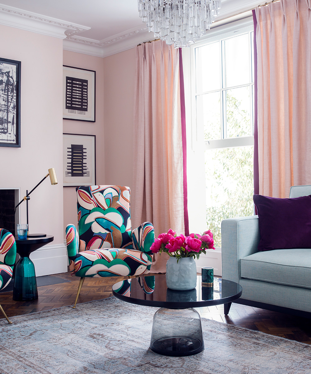
The concept of light and shade works well. ‘While an all-enveloping color throughout can work brilliantly, a subtler approach is to cut through bright or dramatic hues with softer colors,’ says Kate Bradley from Neptune .
‘Try combining a deep navy with a rose pink, such as our Old Rose, or a neutral linen for example.’
How do you make a pink room look elegant?
Making a pink room look elegant relies on it being used alongside other colors that suit it. You can paint all four walls of a room pink and get an elegant result, just as you can add accents of pink to liven a neutral space.
To create a pared back look, match pale pinks with white and other pale colors; for a richer scheme, put deep, musky pink alongside really earthy tones, like honey and beige.
Pink of all tones can also look wonderful alongside black. The key is balance – but neutrals next to pink will always make it look elegant.
What should I put in my pink room?
Mixing up numerous prints and patterns makes for an interesting scheme and don’t forget to throw in a few sumptuous textures too.
How about a room that has more shades of pink than any other color? ‘Gentle pinks are here to stay,’ says interior designer and creative director Birdie Fortescue.
‘A color that was once reserved for bedroom schemes can be used to add freshness and give a cheerful warmth to other areas of the home. Here, muted rose pinks make a statement without being too bold or overbearing.’
Sign up to the Homes & Gardens newsletter
Design expertise in your inbox – from inspiring decorating ideas and beautiful celebrity homes to practical gardening advice and shopping round-ups.

Jennifer is the Digital Editor at Homes & Gardens. Having worked in the interiors industry for several years in both the US and UK, spanning many publications, she now hones her digital prowess on the 'best interiors website' in the world. Multi-skilled, Jennifer has worked in PR and marketing and occasionally dabbles in the social media, commercial, and the e-commerce space. Over the years, she has written about every area of the home, from compiling houses designed by some of the best interior designers in the world to sourcing celebrity homes, reviewing appliances, and even writing a few news stories or two.
- Charis WhiteContributing Editor
-
 Barack and Michelle Obama's neutral accent chair is the perfect living room focal point – you can recreate their serene style in any-sized home
This designer-approved essential fits into every modern living room – it's beautiful enough to stand alone, while pairing well with your favorite cushion
By Megan Slack Published
-
 Should I choose a kitchen island or a kitchen table? This is the expert advice that helped me decide
It's all about how you use your space
By Molly Malsom Published