Design house: A traditional mixed-period manor house in Wiltshire
Living in a property with a rich history does not mean compromising on the demands of family life, insists the homeowner of her mixed-period home in Wiltshire

An 11th-century manor house once gifted by William the Conqueror to one of his favourite noblemen may not seem the most obvious place in which to raise a modern family. However, this is precisely the choice that the homeowners’ made when they moved from London to Wiltshire last year.
See: our spaces section for more inspiring featured homes
- See some of the world's best homes – beautiful properties from around the globe
The property
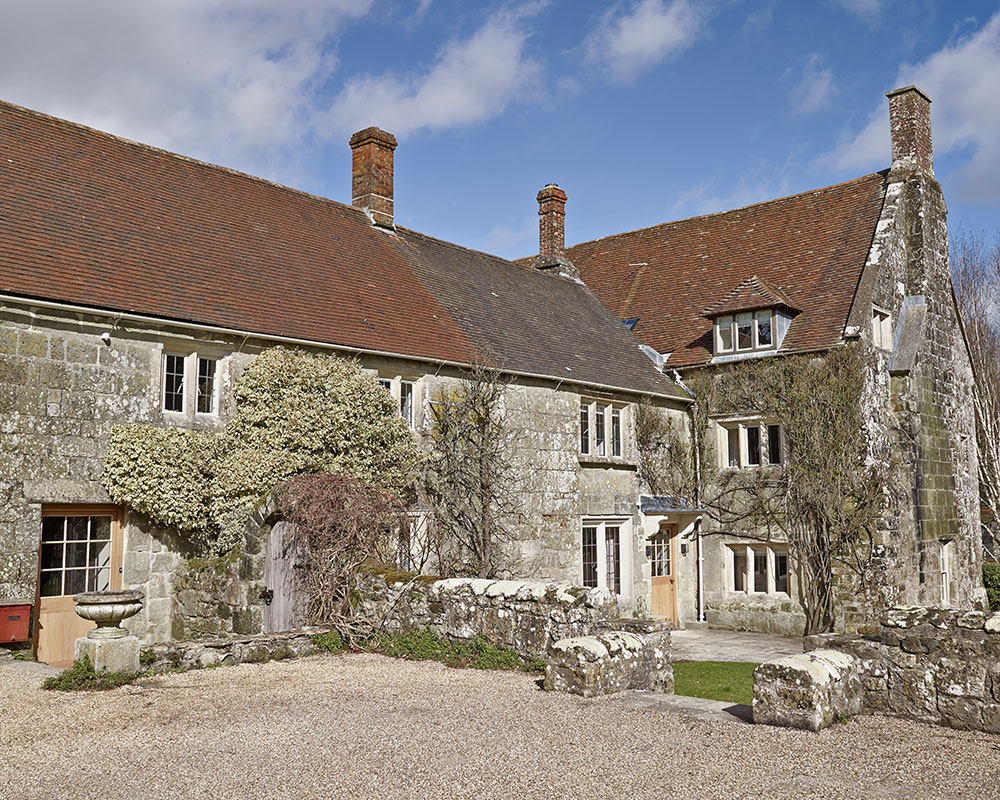
Hankering for the peace and quiet of the countryside, they left their Edwardian town house in search of something with ‘plenty of character’, and they certainly found it in their new home. Perched by a lake on the edge of a quaint village, the building is something of an historical jigsaw puzzle, including Norman, Georgian and more recent architectural additions. ‘We really wanted to live somewhere with lots of history,’ says the owner. ‘There’s a sort of a charm about an old building that you just can’t get with a new one, no matter how you decorate it.’
However, with two young children and another on the way at the time of buying, the couple knew that the house would need serious updating to meet their needs.
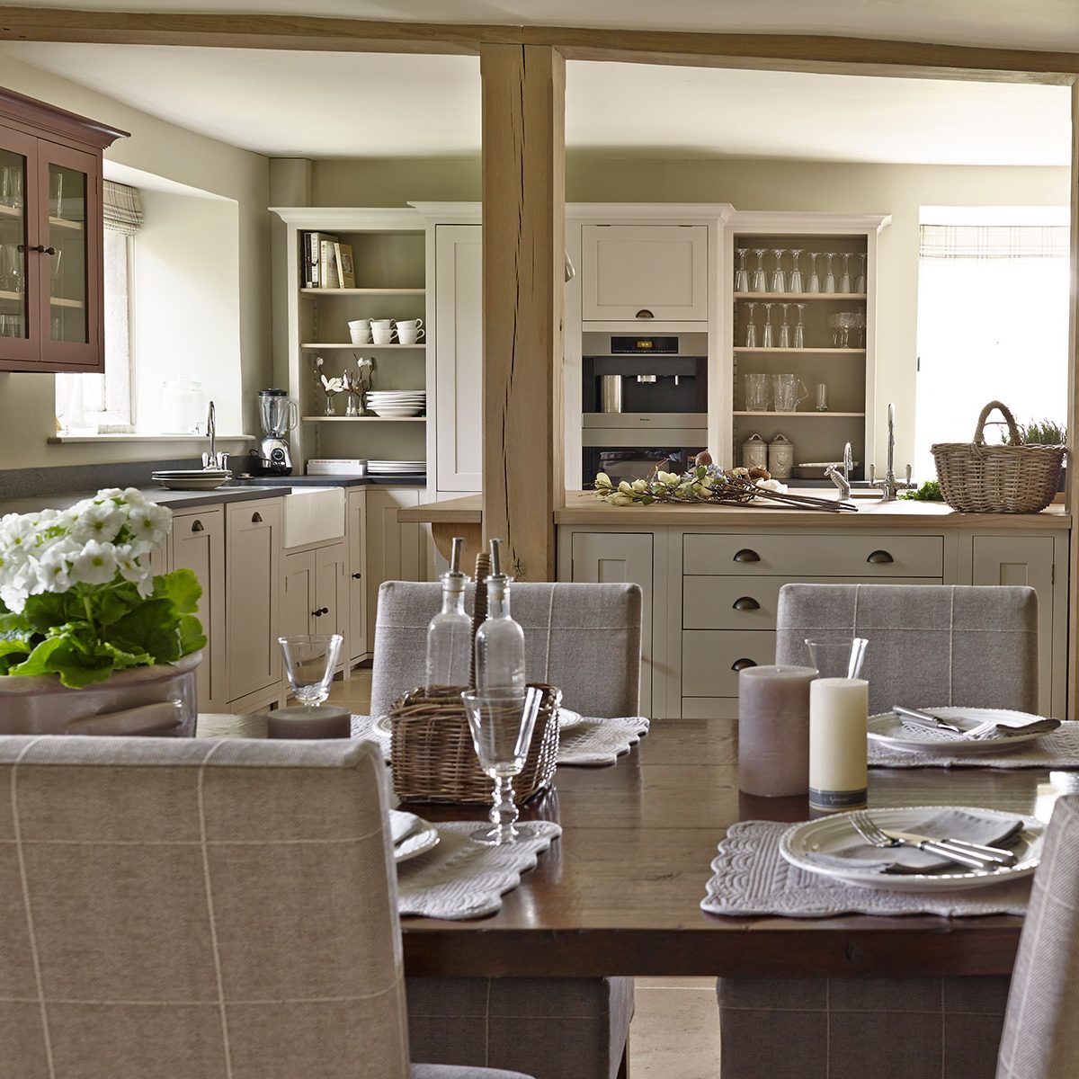
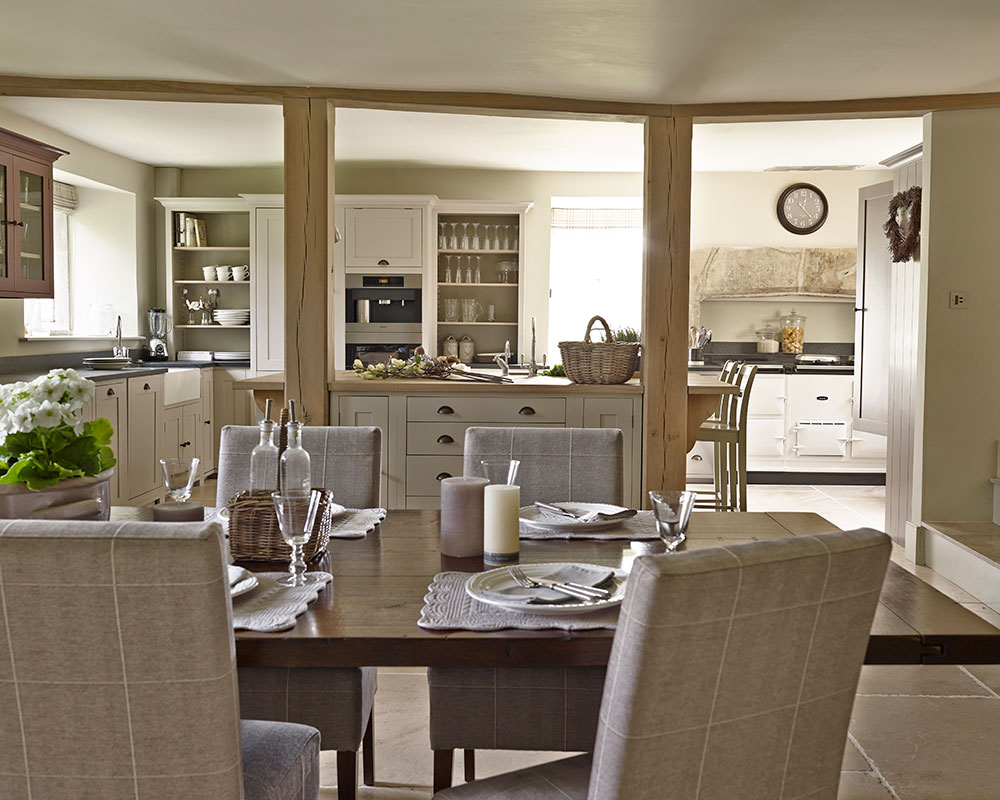
The kitchen was tiny and felt tucked away, while the Georgian wing accommodated an underused dining room. Extending the kitchen beyond the building’s original boundaries was not an option, as the property is Grade II*-listed. Fortunately, interior designer Emma Sims Hilditch, whom the homeowner had discovered through a story in this magazine, hit on the idea of transforming the vast sitting room on the ground floor into an open-plan kitchen-dining room, complete with a bespoke larder. Meanwhile, the former dining room became a family sitting room filled with plush sofas.
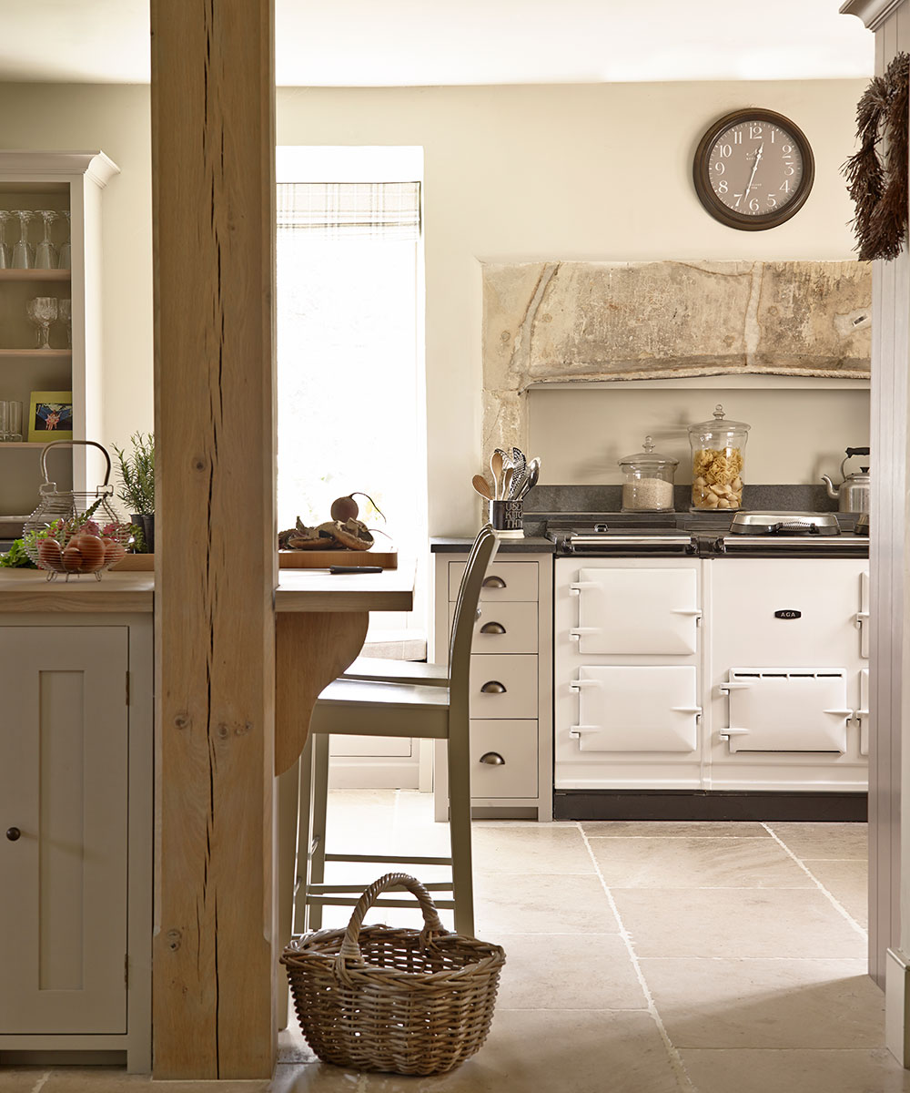
In choosing the color scheme, the couple were keen to steer away from the dingier hues of yesteryear in favour of the soft, warm tones associated with 21st-century country living. Meanwhile, contemporary features such as the in-ceiling speakers in the kitchen are much appreciated by the children – as it allows them to play music to accompany their impromptu dance sessions on the flagstone floor. The new boot room is another practical addition and since the children spend lots of time outdoors, it gets plenty of use.
Despite the modern comforts, you do not have to look hard to find traces of the building’s past. In one of the two guest bedrooms, 18th-and 19th-century visitors have etched the date into the stone window frames, while the flagstones in the entrance hall have been worn down by footsteps over centuries.
Sign up to the Homes & Gardens newsletter
Design expertise in your inbox – from inspiring decorating ideas and beautiful celebrity homes to practical gardening advice and shopping round-ups.
Kitchen-dining room
To create a sense of warmth and depth, the cabinets have been painted in a variety of subtle shades of grey. The huge cracked wooden posts enhance the relaxed feel while cleverly breaking up the expanse of space.
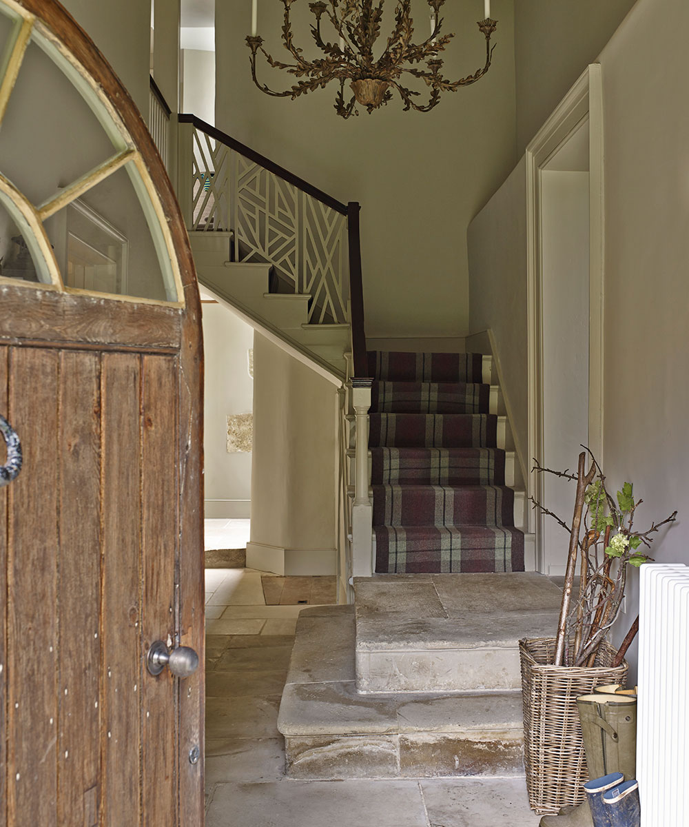
Entrance hall
This stair runner inspired the colors throughout the house. The stone steps, worn down over generations, are one of the best-loved features.
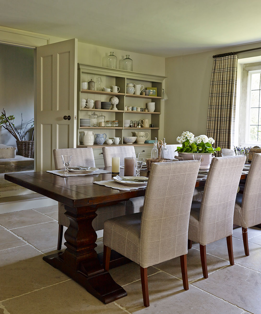
Dining room
A 16th-century-style dining table was chosen as a nod to the property’s historic past.
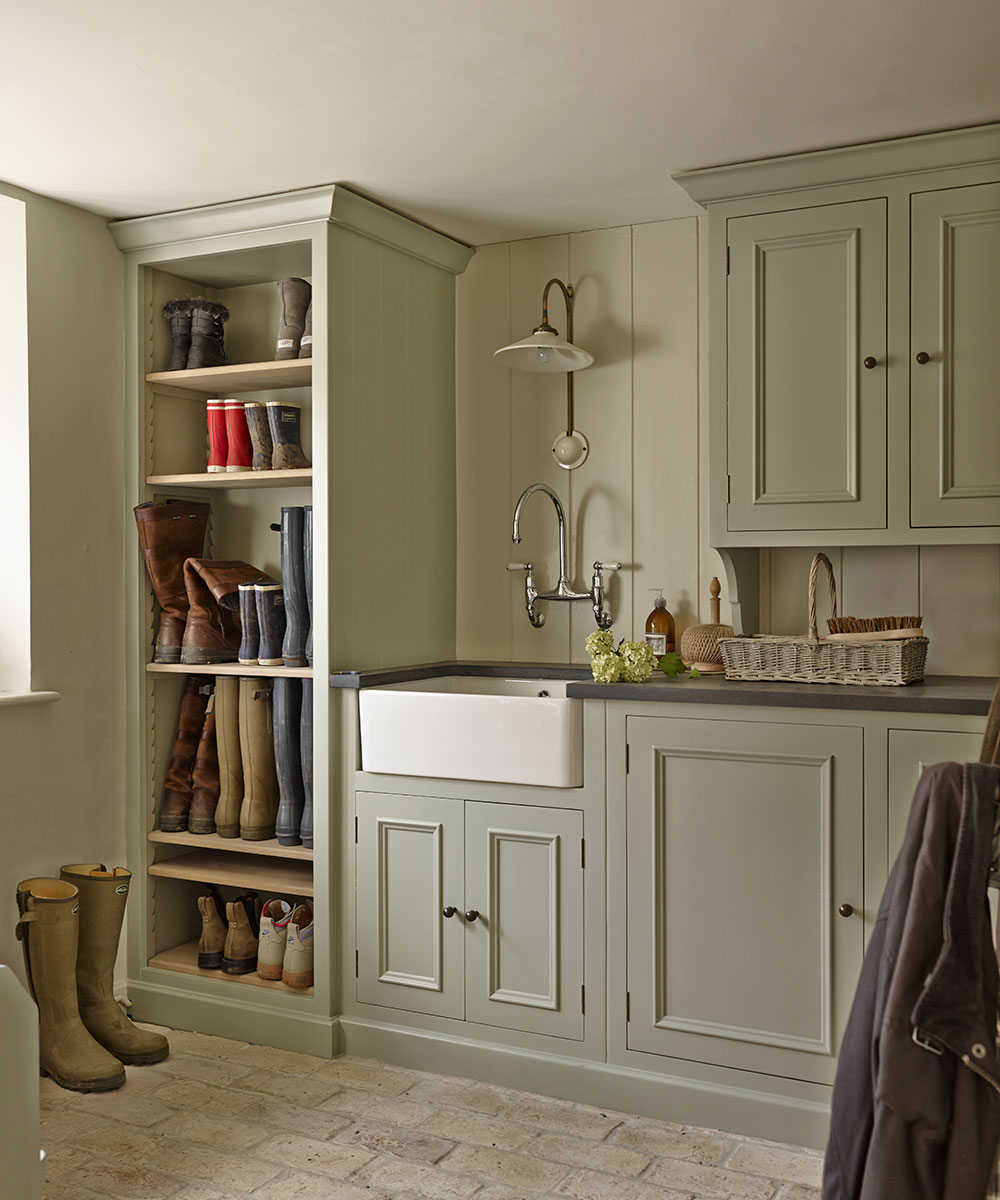
Boot room
‘Every good country home should have a boot room,’ says interior designer Emma. This one replaced the laundry room, which was moved to the top of the house.
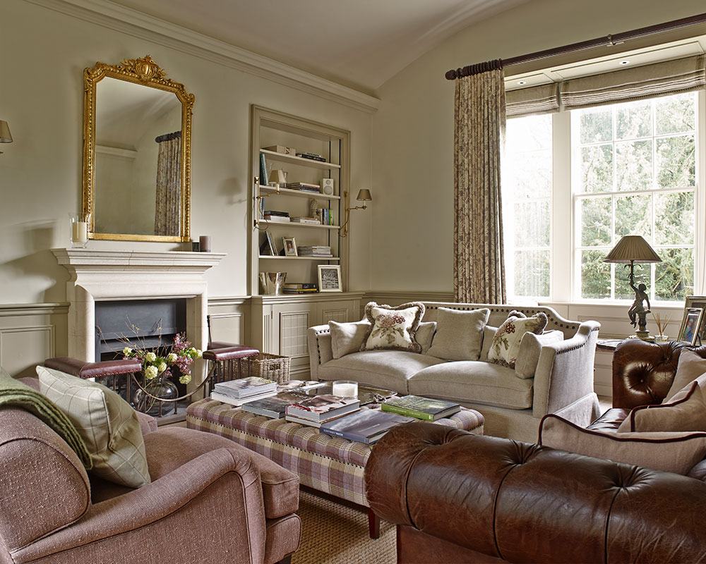
Living room
The former dining room in the Georgian part of the house is now filled with generous sofas for all the family to enjoy.
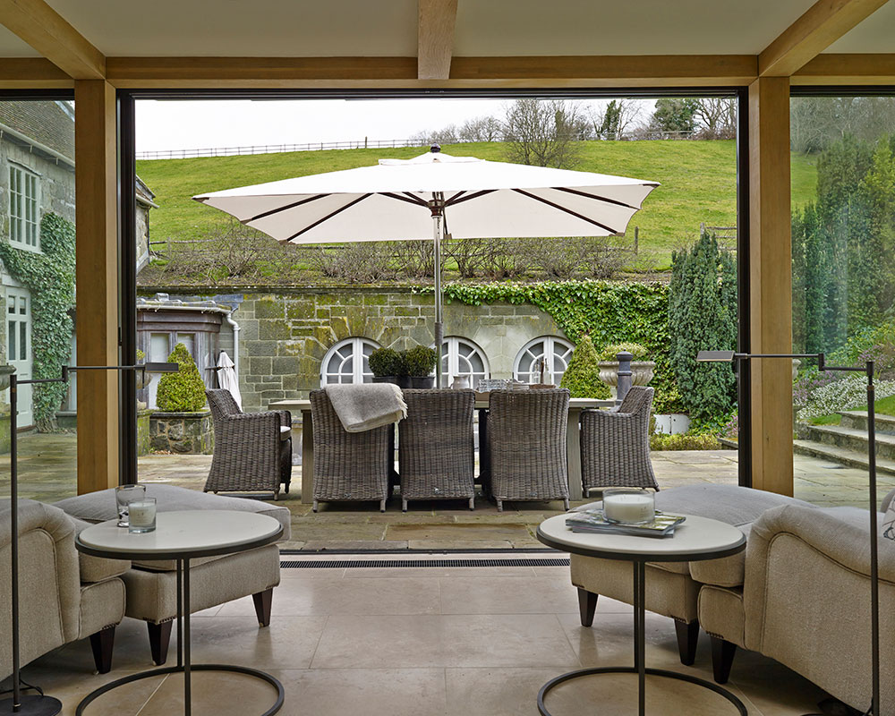
Garden room
This glass box-shaped design replaced an extension built by the previous owners. ‘It is impossible to match a building of this age,’ says the homeowner, ‘so we felt it would be better to do something completely different.’
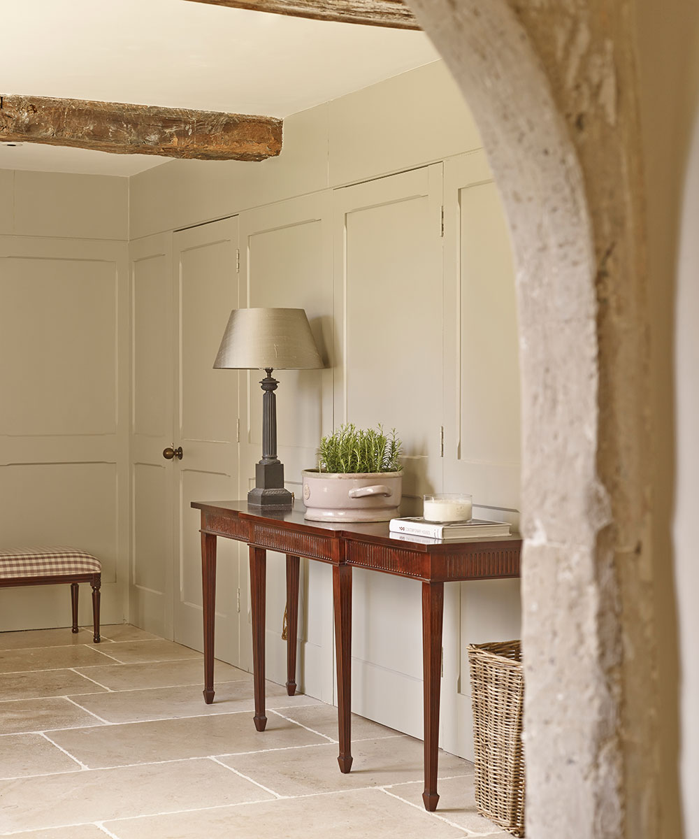
Hallway
The textured limestone, chosen to match the original flagstones, mimics the wear and tear created by generations of footsteps.
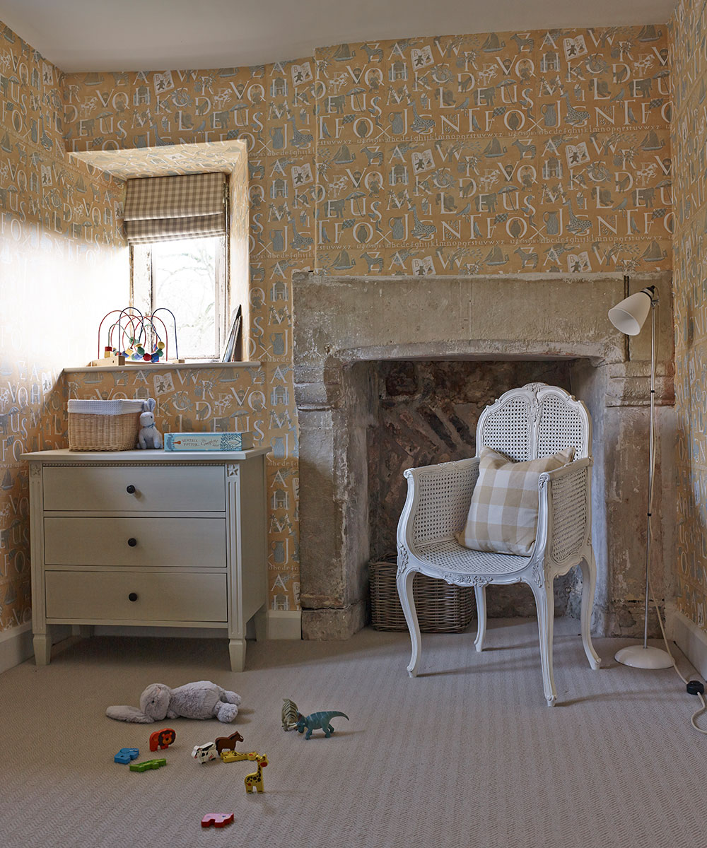
Children's room
The hand-blocked wallpaper in nursery bedroom was one of the owner’s favourite finds for the house.
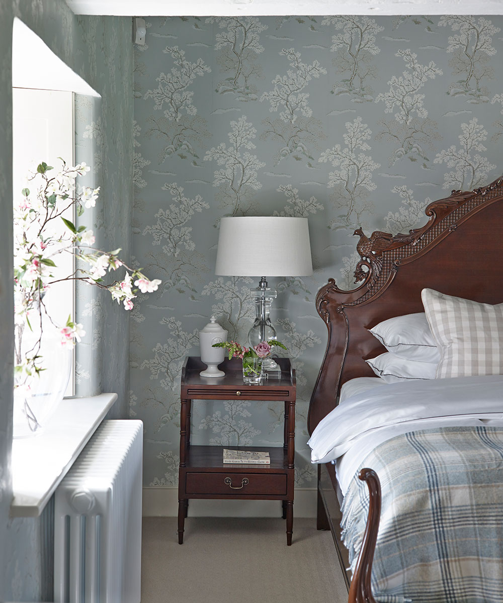
Main bedroom
The ceiling was raised to create a loftier space that befits the opulent French bed.
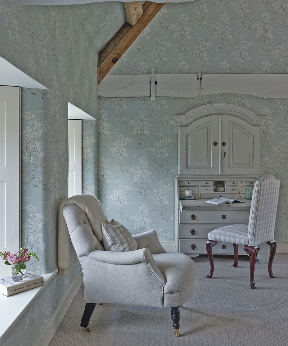
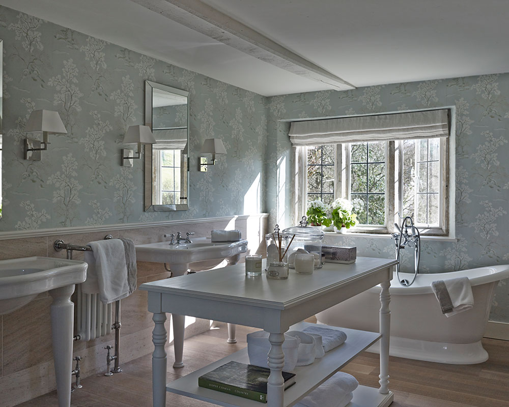
Bathroom
This is the homeowner’s favourite room in the house: ‘It’s so pretty, but in a way that isn’t overpowering.’
Photography/David Cleveland

Jennifer is the Digital Editor at Homes & Gardens. Having worked in the interiors industry for several years in both the US and UK, spanning many publications, she now hones her digital prowess on the 'best interiors website' in the world. Multi-skilled, Jennifer has worked in PR and marketing and occasionally dabbles in the social media, commercial, and the e-commerce space. Over the years, she has written about every area of the home, from compiling houses designed by some of the best interior designers in the world to sourcing celebrity homes, reviewing appliances, and even writing a few news stories or two.
-
 Do cleaning products expire? Professional cleaners warn time could make them ‘less effective, and in some cases, irritating to use’
For the best results, it pays to stay on top of the timeline of your cleaning products
By Chiana Dickson Published
-
 7 of the best tomatoes for growing in pots - expert growers pick their top varieties ideal for large harvests from containers
You can enjoy bumper homegrown harvests in small spaces
By Drew Swainston Published