Design house: A reworked Victorian townhouse that is twice as nice
Finding creative solutions to joining two Victoria properties together has resulted in one inspirational family home that sings with character and charm
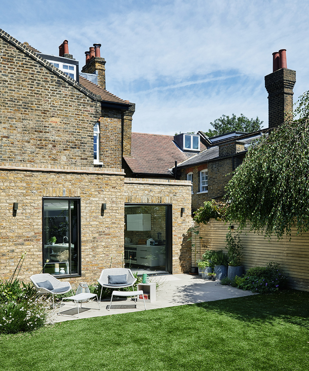

The transformation that the owner and her husband imagined imagined for their Barnes, south west London home (which was, at that point two separate Victorian houses) was spectacularly ambitious. The overhaul –to combine the properties – would be dramatic and, not surprisingly, they needed an interior designer in which they could put their wholehearted trust. In time, they found Ali Robinson and Carolyn van Noort, of Robinson van Noort Design Studio and, 18 months later, the family settled into their unique home.
See: our spaces section for more inspiring featured homes
- See some of the world's best homes – beautiful properties from around the globe
The property
We bought the original house twelve years ago and then, two years later, the neighbouring house was put up for sale. It was a perfect development opportunity. We rented out the second house for ten years, while getting the funds together to combine it with ours to accommodate our growing family of four children and a menagerie of pets.
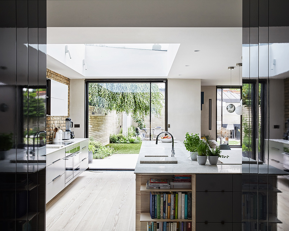
The couple wanted to create a family home that would honour the fact it was once two buildings, but also felt like a complete entity. The houses had been built by the same architect so, from the outside, are easily seen as one building. We originally applied for planning consent to remove the internal wall between them, but this was refused so we had to come up with another way to connect the buildings. This new plan included a double rear extension for a large open-plan kitchen, nook and study, removing one staircase to create a triple-height void with a skylight and adding an aperture in the sitting room wall - as this party wall could not be taken down - to ensure a sense of flow. Conversely, because of restrictions on the project, we were able to create these peculiar, charming spaces.
Explore a happy family home in London

Living room
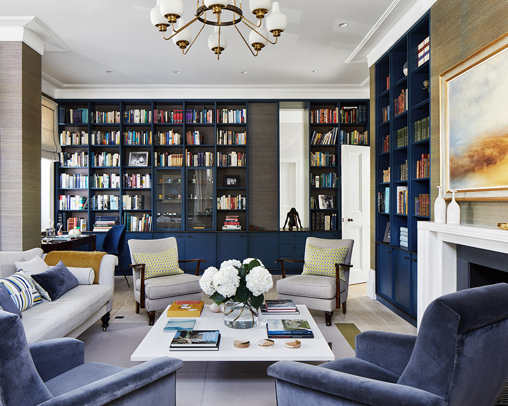
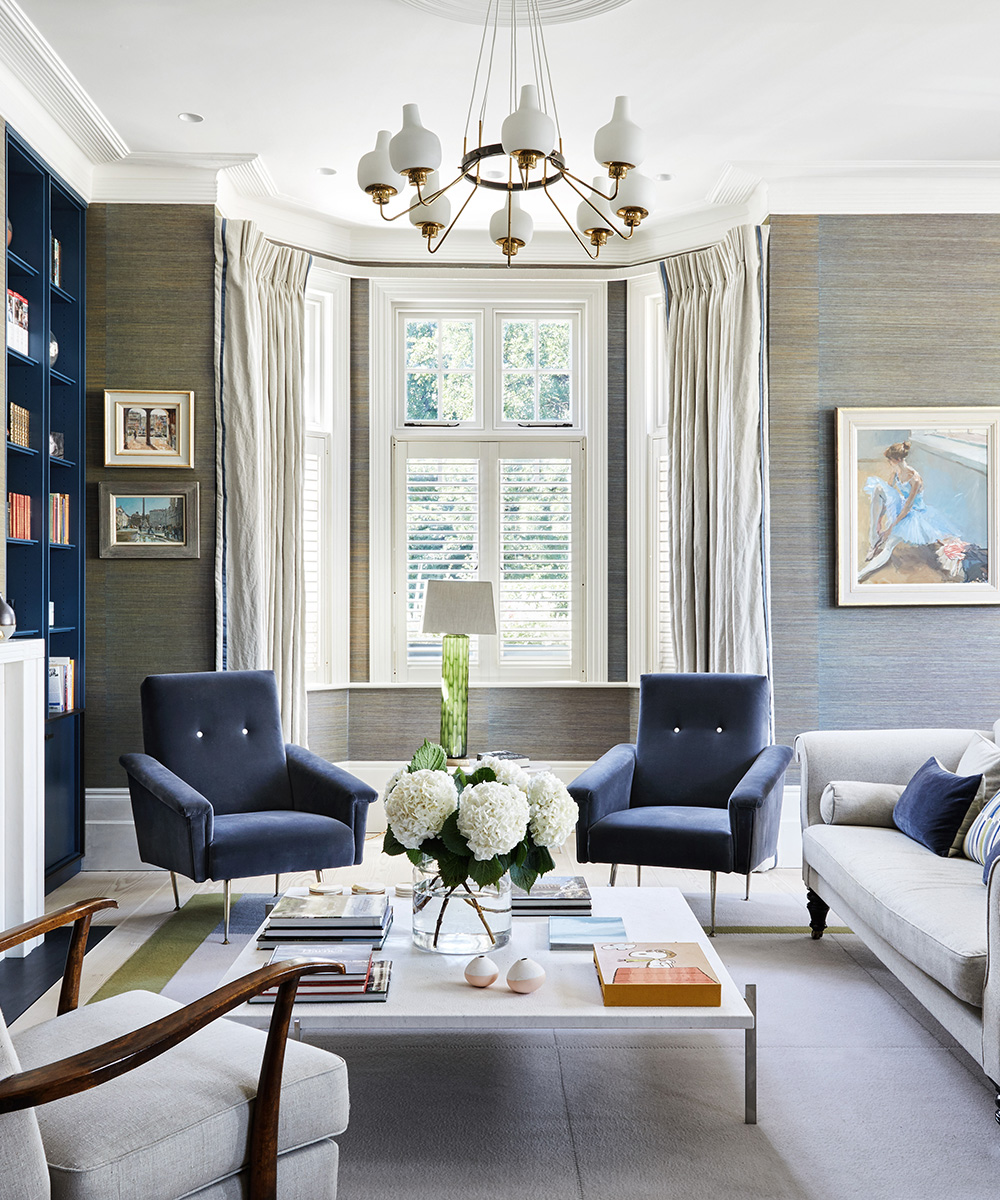
The choice of wallpaper was the starting point for this elegant scheme. As the owner says, ‘It is extraordinary; it makes the room look different from every angle, depending on the light and the time of the day.’The owner wanted to retain original features, but she also wanted strong contemporary elements and to have furniture from a wide range of periods.‘The rooms had to be liveable and welcoming. I did not want a show home where people would be afraid to sit down. I wanted a neutral base that was also warm, and I was clear that there should be no chrome. I also asked for a mix of fitted and freestanding furniture,’ she explains.
Kitchen
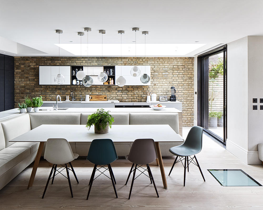
This spacious kitchen is part of a larger living area that was made by extending and combining the ground floor rooms at the back of both houses. A huge new pivot door and windows (above right) offer views of the garden, while light streams in through the skylight above. Instead of a chandelier or three pendant lights over the table, Miranda chose a more unique design. 'It took a long time to arrange this piece as the lights are not in a line and hang at varying heights.’
Sign up to the Homes & Gardens newsletter
Design expertise in your inbox – from inspiring decorating ideas and beautiful celebrity homes to practical gardening advice and shopping round-ups.
Entrance hall
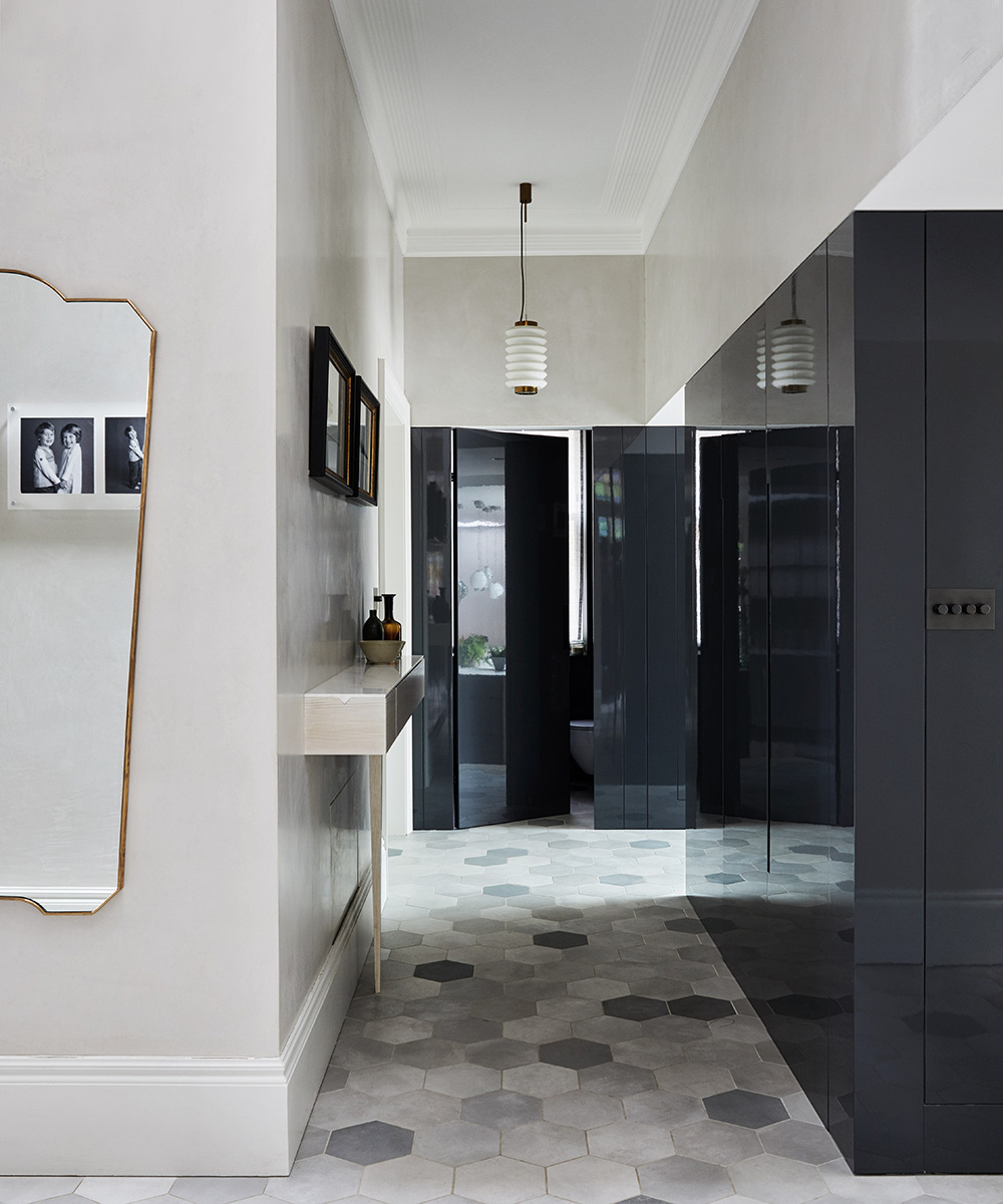
This lacquered cupboard backs onto a matching row of units that houses the oven at the far end of the kitchen. A push-touch door at the end of the hall leads to a cloakroom.
Nook
'I wanted somewhere I could relax and have coffee with friends or read and this space, with its low seating, is ideal,’ says the owner.

Study
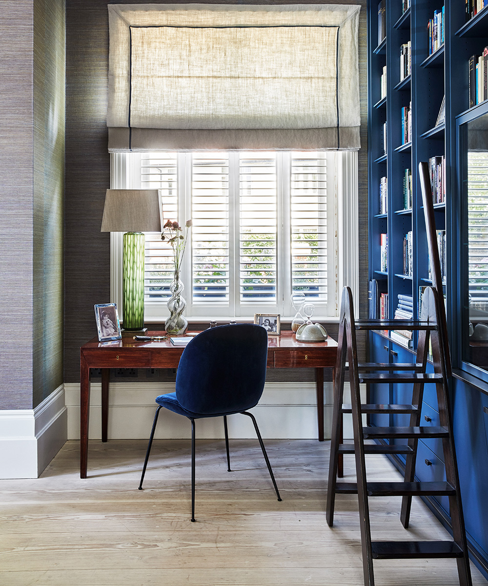
A window and glazed cabinet were added to what was once the party wall between the two houses, so that the family could use the spaces separately but not feel cut off from each other. 'I was inspired to use the soft greys and citrus hues of my inherited rocking chair as the starting point for the color scheme,’ says the owner.
Garden
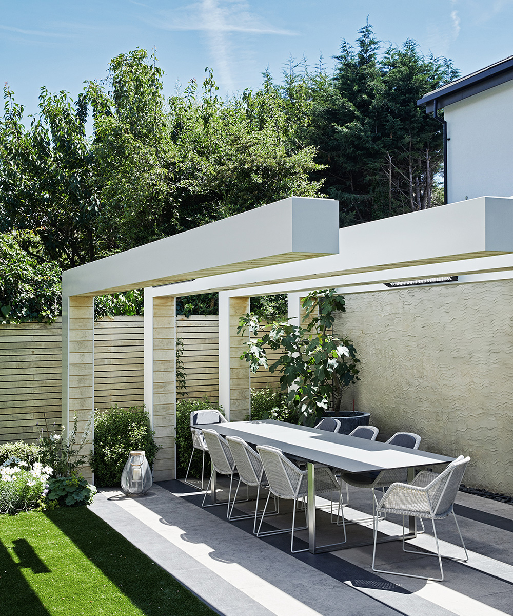
Inspired by a pergola designed by Hay Joung Hwang for the 2016 RHS Chelsea Flower Show, Miranda asked her builder to work with garden designer Virginie Vallée to create a similar feature. The result is a garden that complements both the pergola and the house.
Main bedroom
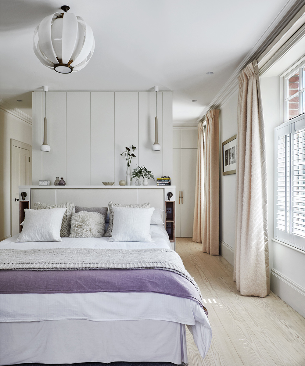
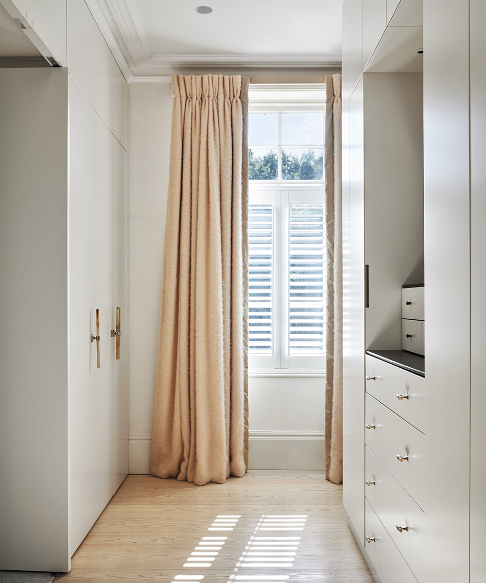
‘We had to retain the chimney breast, but we removed the walls on either side, opening up the room so storage could be added behind the chimney breast,’ explains the interior designer.
Main bathroom
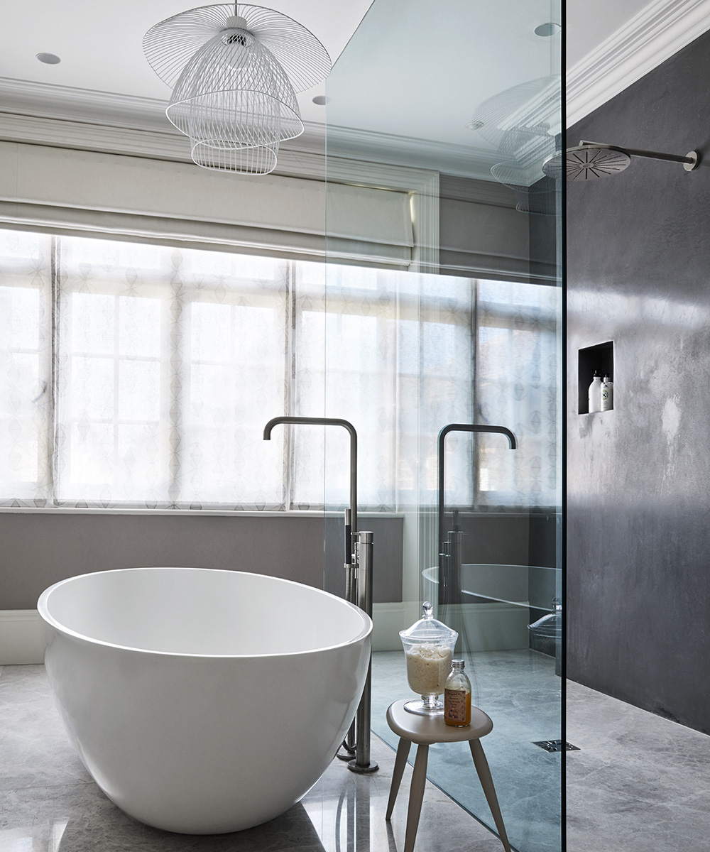
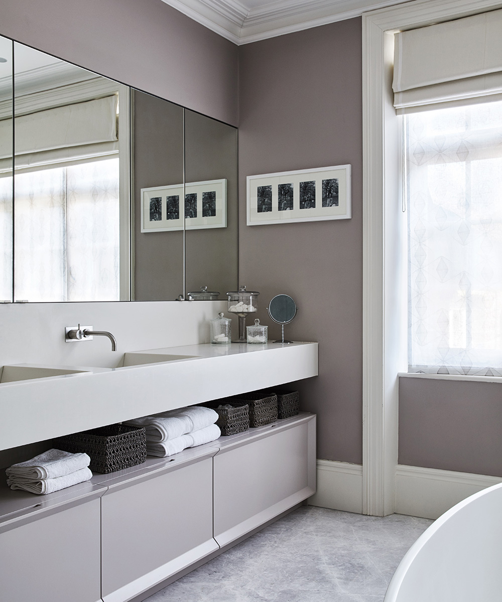
The polished plaster shower wall is waxed for a fully waterproof finish, while the cabinetry's chamfer rim adds an architectural quality to this understated space.
Child's bedroom
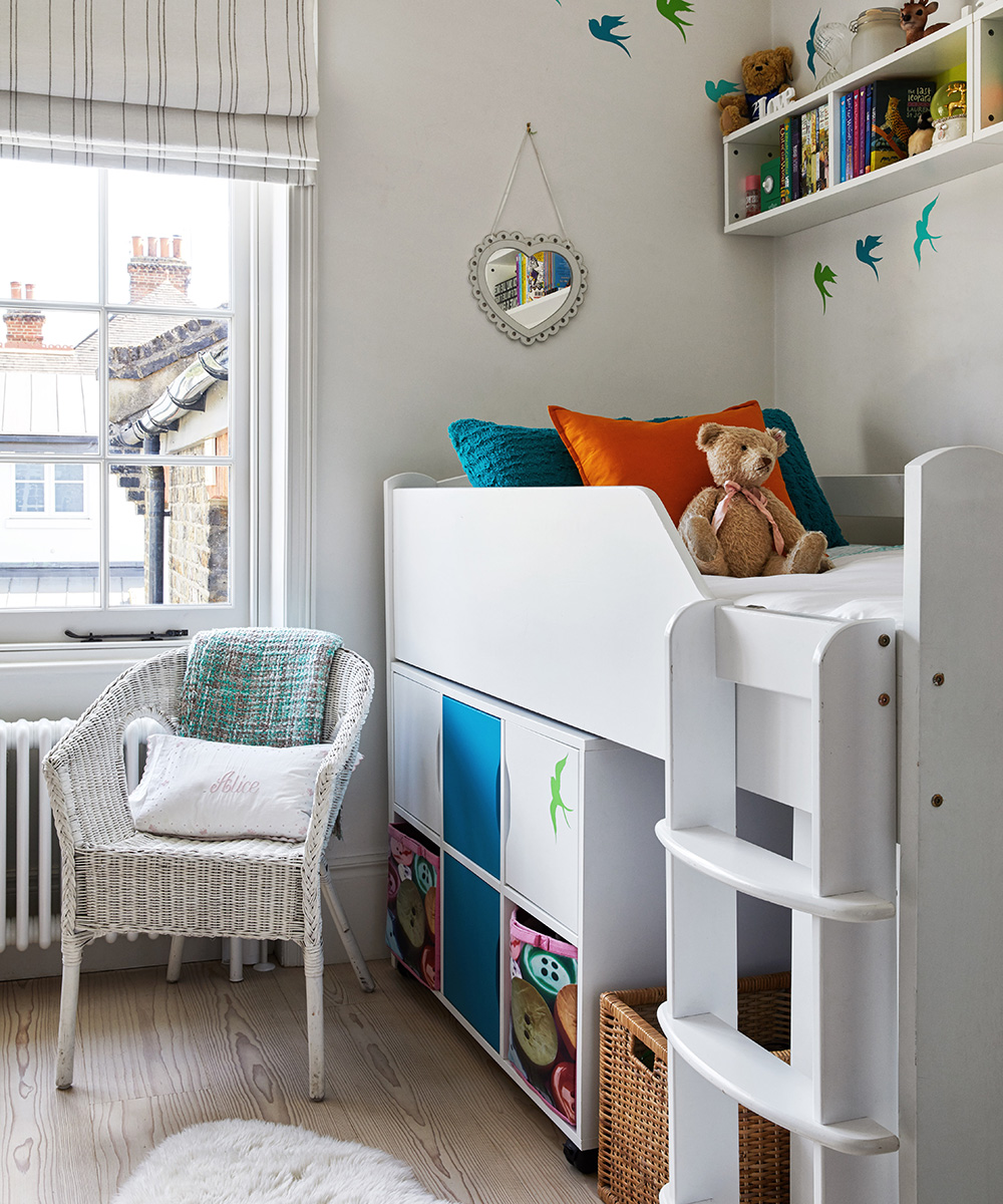
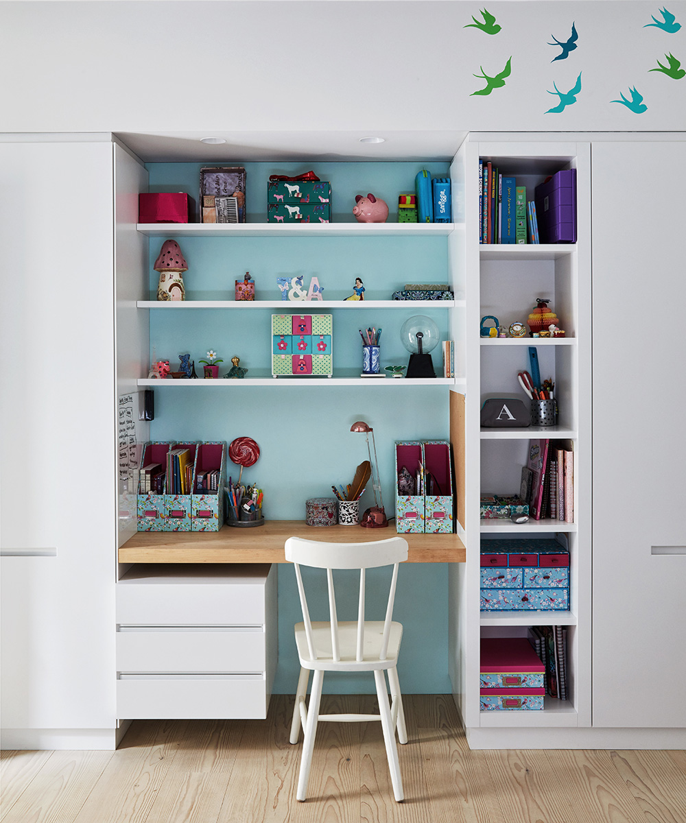
'My daughter was eight when we completed the work on the house, so I made her room neutral enough so that she won't grow out of it too quickly; says the owner.
Children's bathroom
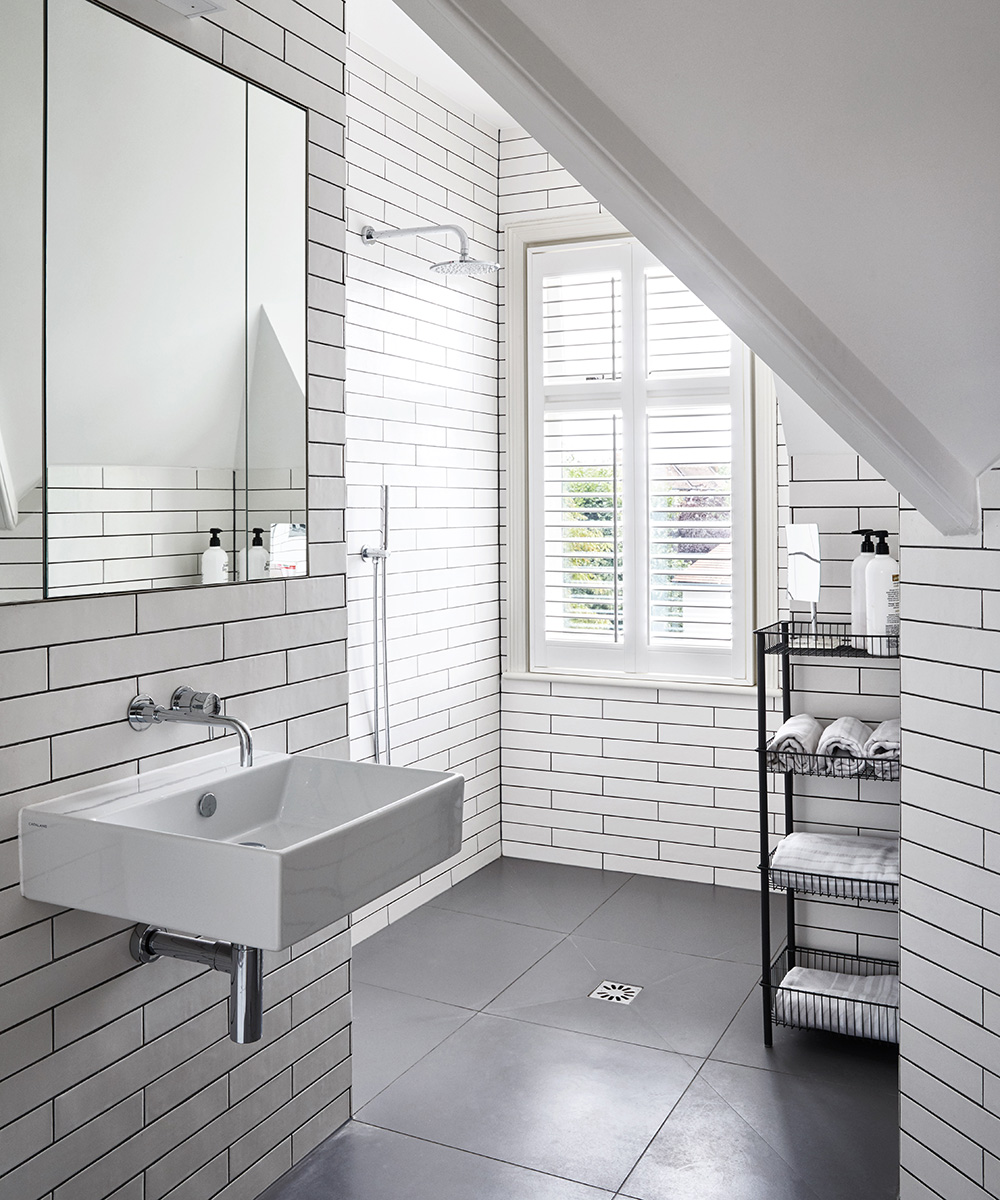
'This wet room is resilient enough for all the showers my teenage girls take; says the owner. The grout was chosen to match the flooring.
Photography/ Davide Lovatti

Jennifer is the Digital Editor at Homes & Gardens. Having worked in the interiors industry for several years in both the US and UK, spanning many publications, she now hones her digital prowess on the 'best interiors website' in the world. Multi-skilled, Jennifer has worked in PR and marketing and occasionally dabbles in the social media, commercial, and the e-commerce space. Over the years, she has written about every area of the home, from compiling houses designed by some of the best interior designers in the world to sourcing celebrity homes, reviewing appliances, and even writing a few news stories or two.
-
 It’s a concept straight out of a fashionista's playbook, but I used the Sandwich Method to organize my kitchen shelves – it’s never looked sleeker
It transformed messy to mesmerizing in a matter of seconds
By Punteha van Terheyden Published
-
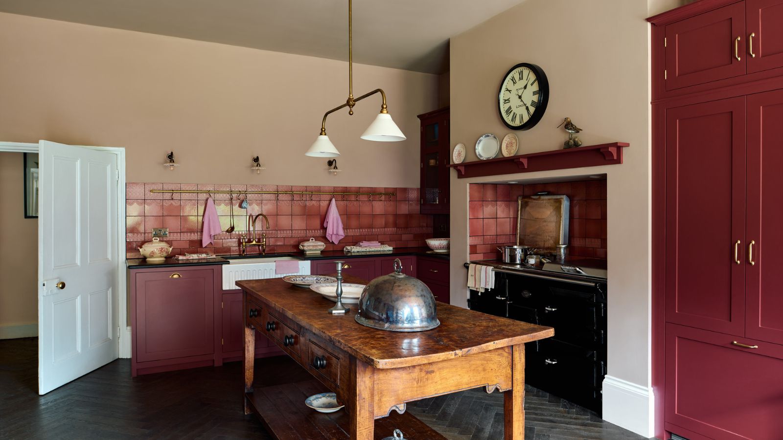
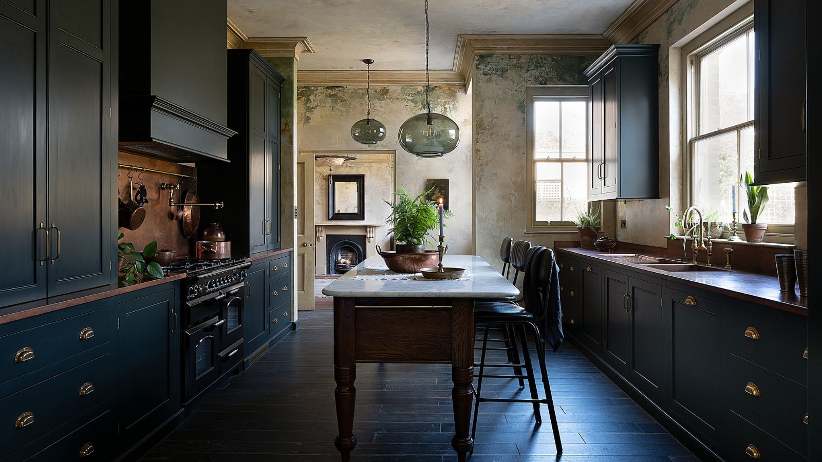 The moody kitchen in this Victorian home has the most unique wall design I've ever seen – it's the perfect way to bring an elegant, aged feel to the space
The hand-painted feature has brought a sense of history and patina back into the remodeled kitchen
By Molly Malsom Published