Design house: An urban London home that is smart, contemporary and bold
Statement pieces and a contemporary palette create an interior that reflects the vibrant location of this urban home

Bringing a Georgian townhouse in London into the 21st century and giving it a large dose of personality was the challenge facing interior designer, Anna Hewitson. The property had been an office for many years and was then converted back into a house by a developer, so Anna virtually had a blank canvas to work with.
'I became involved in the project when the owners approached me in early 2017,' she says. 'They love the area as it's surrounded by restaurants, and they wanted to live in a house with an eclectic feel that epitomised the cool London vibe.’
See: more inspiring house tours in our Spaces section
- See some of the world's best homes – beautiful properties from around the globe
The property
The house is Grade II* listed, which made life more complicated as any work done had to comply with strict planning regulations. 'It couldn't be altered structurally. Even changing the floors or fireplaces required planning permission,’ says Anna. 'And because the building is old, we never quite knew what we would discover. We had to bring in a structural engineer to examine the fireplaces, with the result that concrete lintels had to be inserted to support two of them.’
Top of the priority list was storage. 'We installed custom-built wardrobes in the bedrooms and a large bespoke vanity unit in the master bathroom,’ says Anna. 'A built-in dresser and an island were built to match the existing cabinets in the basement kitchen, while a pantry room, utility and wine room were also created.’
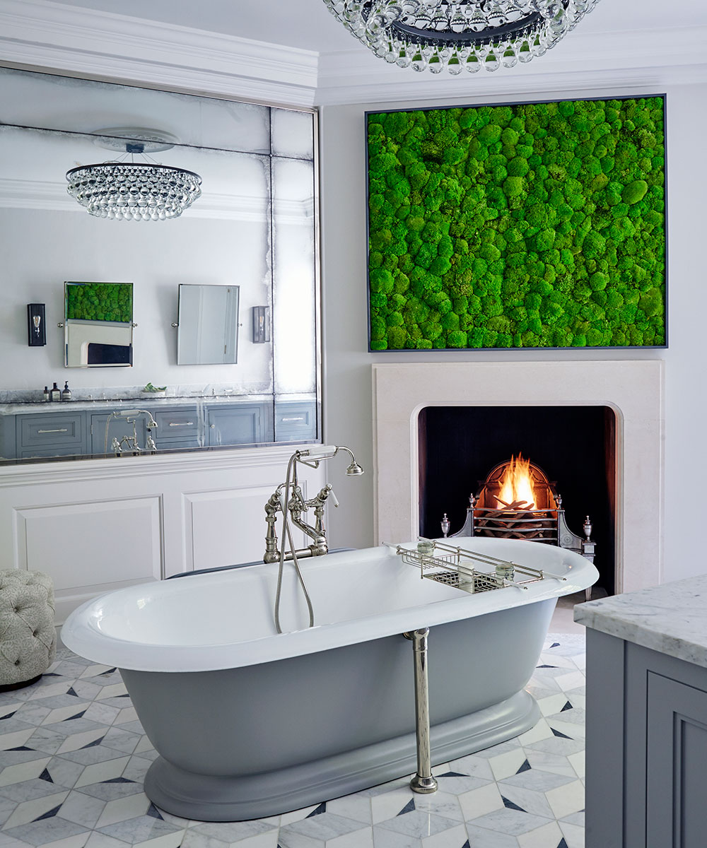
Anna used themes throughout the house to provide continuity. As an antidote to the urban location, an artificial living wall in the courtyard can be glimpsed from the rooms at the rear. The nod to the outdoors continues with plant displays throughout the house, and a statement artificial moss wall in the bathroom.
For a cohesive look, Anna also stuck to key materials and accessories. 'I used brass ironmongery and detailing throughout the house,’ she says. 'I also added antiqued mirrors on each floor to maximise the light and give the illusion of more space.’
Sign up to the Homes & Gardens newsletter
Design expertise in your inbox – from inspiring decorating ideas and beautiful celebrity homes to practical gardening advice and shopping round-ups.
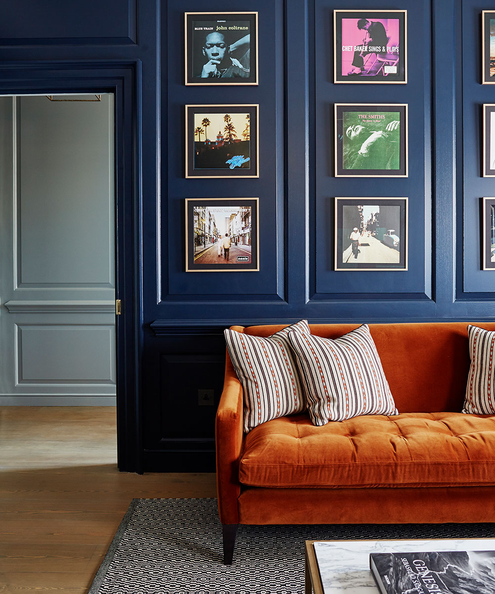
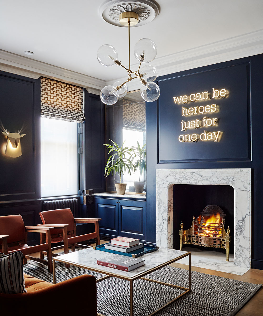
The function of each room dictated the colors she used. 'The owners wanted a dark, atmospheric space for the music room, where they could hang out with friends. I incorporated burnt orange accents to lift the blue scheme and added gorgeous fabrics that you want to touch, such as velvet, then I used the same color palette in the dining area beyond.’
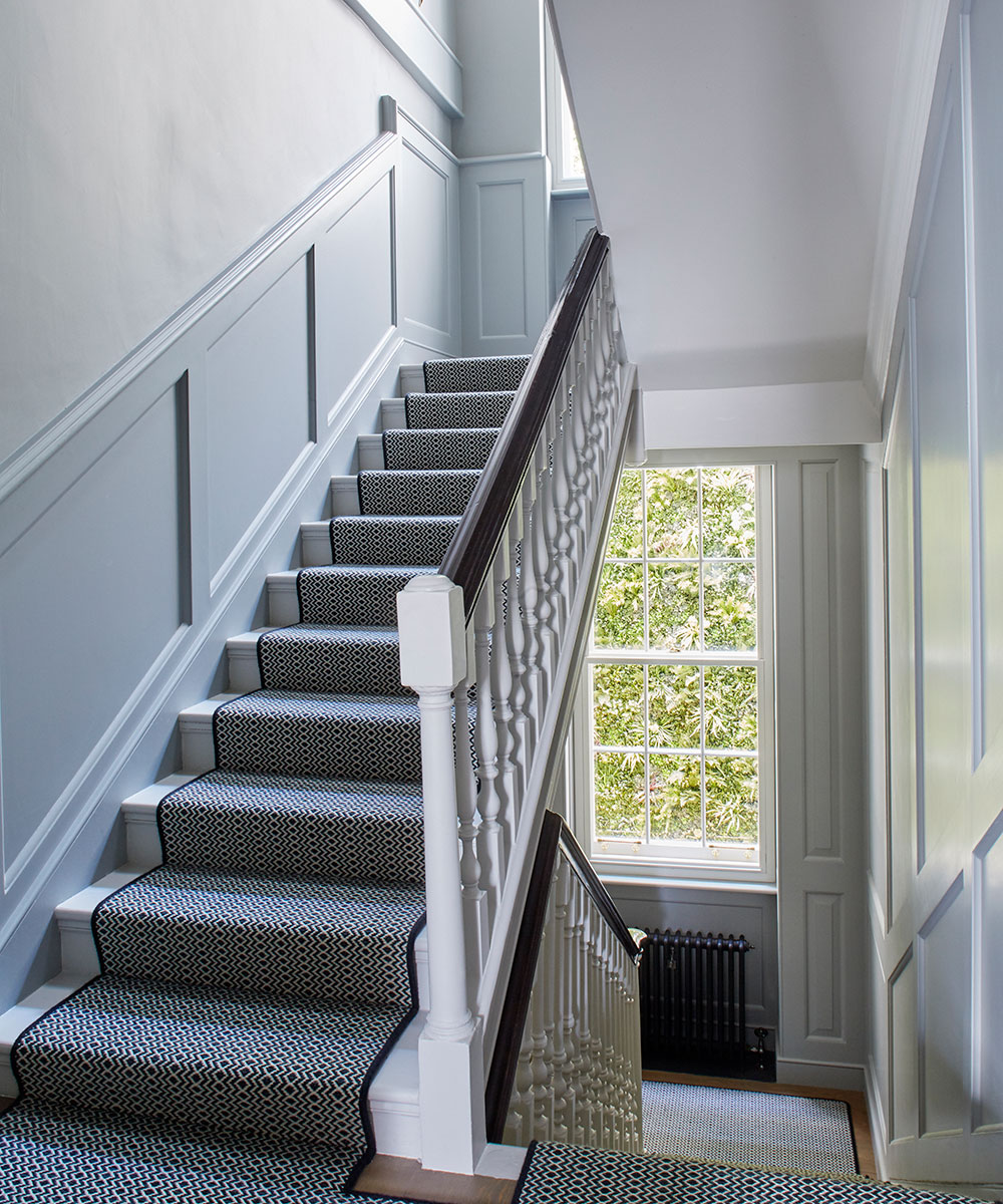
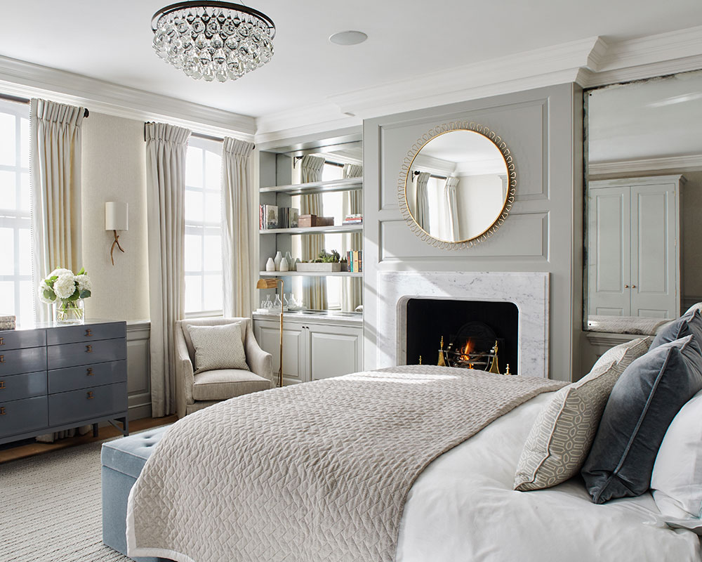
The blue and grey palette continues up the stairs in varying shades. The master bedroom at the top of the house is a blend of soft blues and greys. 'The brief was to create a haven,’ says Anna. We wanted it to be gentle and calm - an elegant, restful room to chill out in.’

Despite the owners' love of urban life, once you are inside the house, secondary glazing ensures that the sounds of city life fade away and it's so quiet you could (almost) believe you were in the countryside.
See: A perfectly peaceful mid-Victorian terrace in London
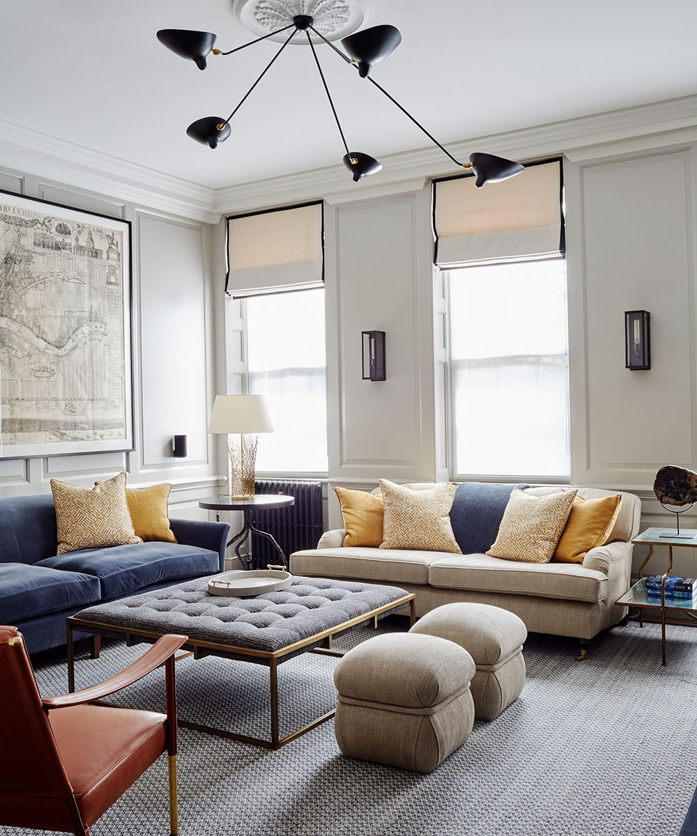
Living room
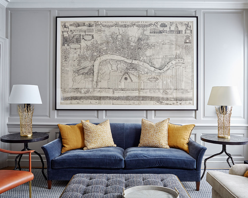
An Edwardian lithograph takes centre stage. The emphasis here is on texture with layering of fabrics and hints of pattern, such as gentle geometricsand small abstracts.
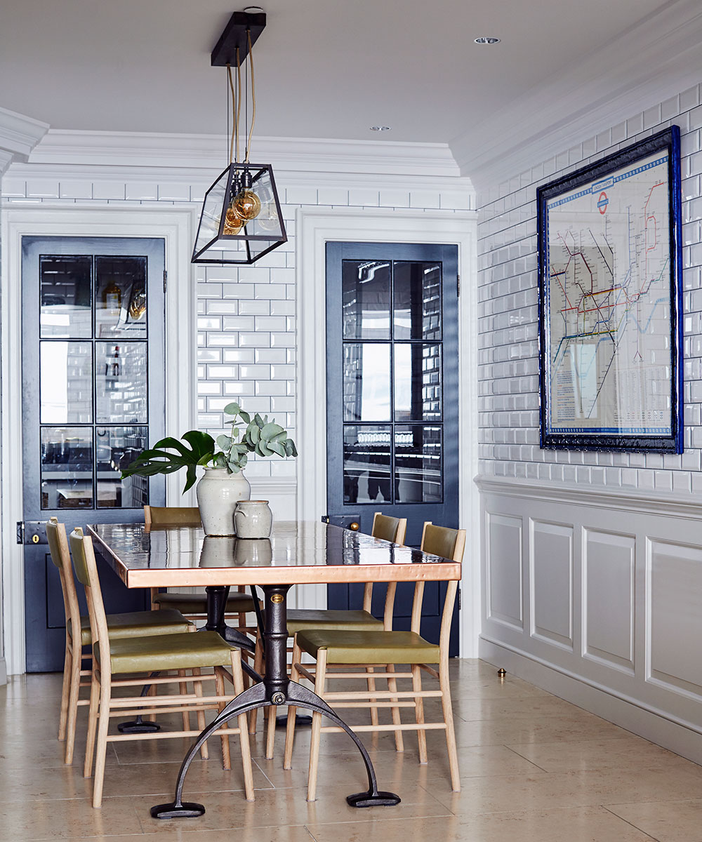
Dining room
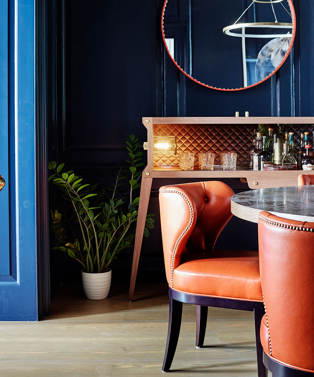
The owners had seen similar rounded, comfortable dining chairs in a restaurant, so interior designer Anna Hewitson had these made and upholstered in the same advent color as in the adjoining music room.
Music room
Dark blue walls create a moody space punctuated by accents of burnt orange to lift the scheme.
Kitchen
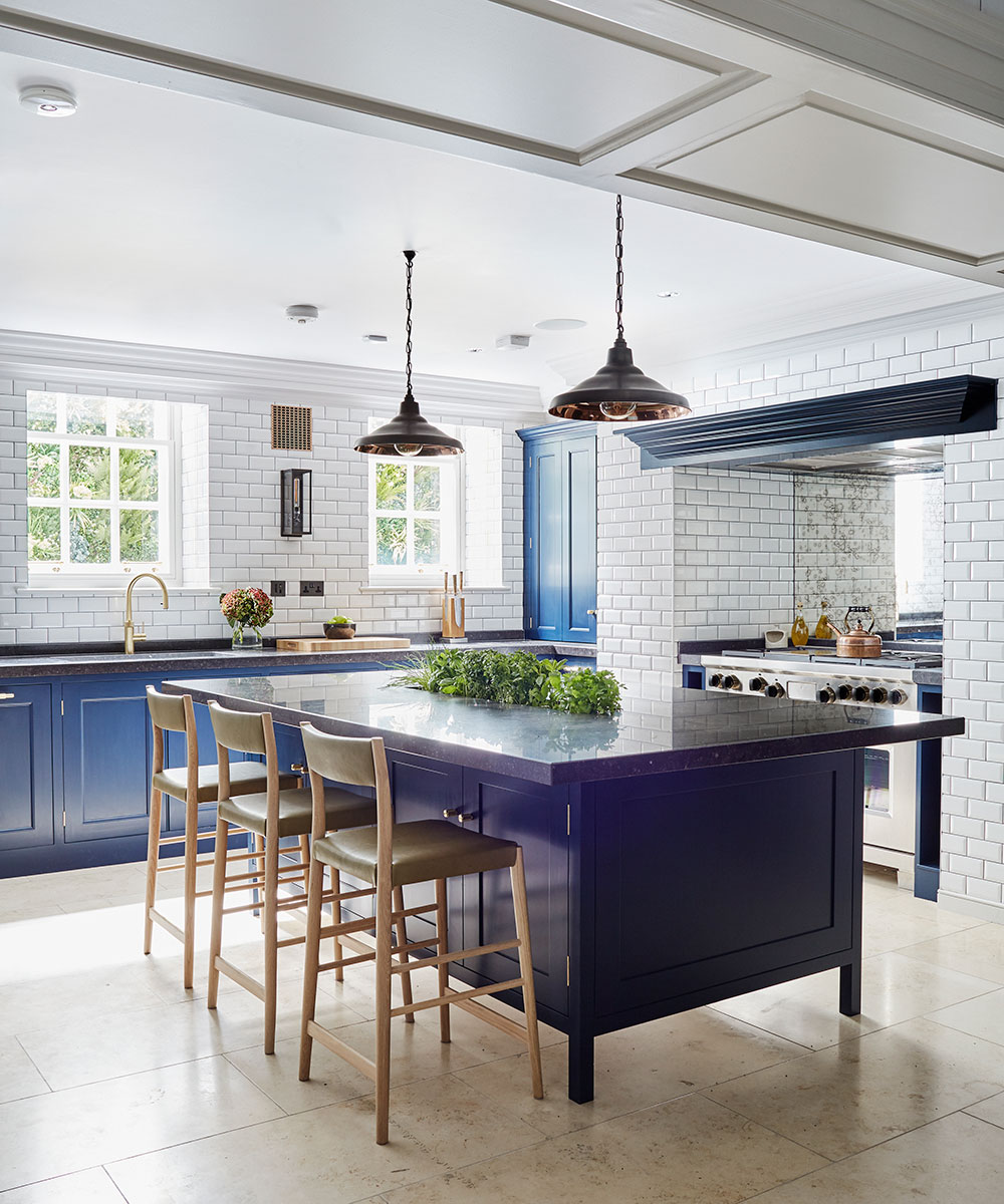
The large island was built to match the existing units. The limestone worksurface has an ingenious cutout tohold a range of herbs.
Master bedroom
Gentle tones and a variety of textures create the desired ‘haven.’
Master en suite
The statement bath, along with the dramatic chandelier, inject period elegance.
Photography/ Brent Darby

Jennifer is the Digital Editor at Homes & Gardens. Having worked in the interiors industry for several years in both the US and UK, spanning many publications, she now hones her digital prowess on the 'best interiors website' in the world. Multi-skilled, Jennifer has worked in PR and marketing and occasionally dabbles in the social media, commercial, and the e-commerce space. Over the years, she has written about every area of the home, from compiling houses designed by some of the best interior designers in the world to sourcing celebrity homes, reviewing appliances, and even writing a few news stories or two.
-
 April is the ideal time to prune beautyberry shrubs – for a stunning display of vibrant berries this fall
Whether you choose to trim gently or hard prune, cutting back in spring promotes healthy and productive growth
By Drew Swainston
-
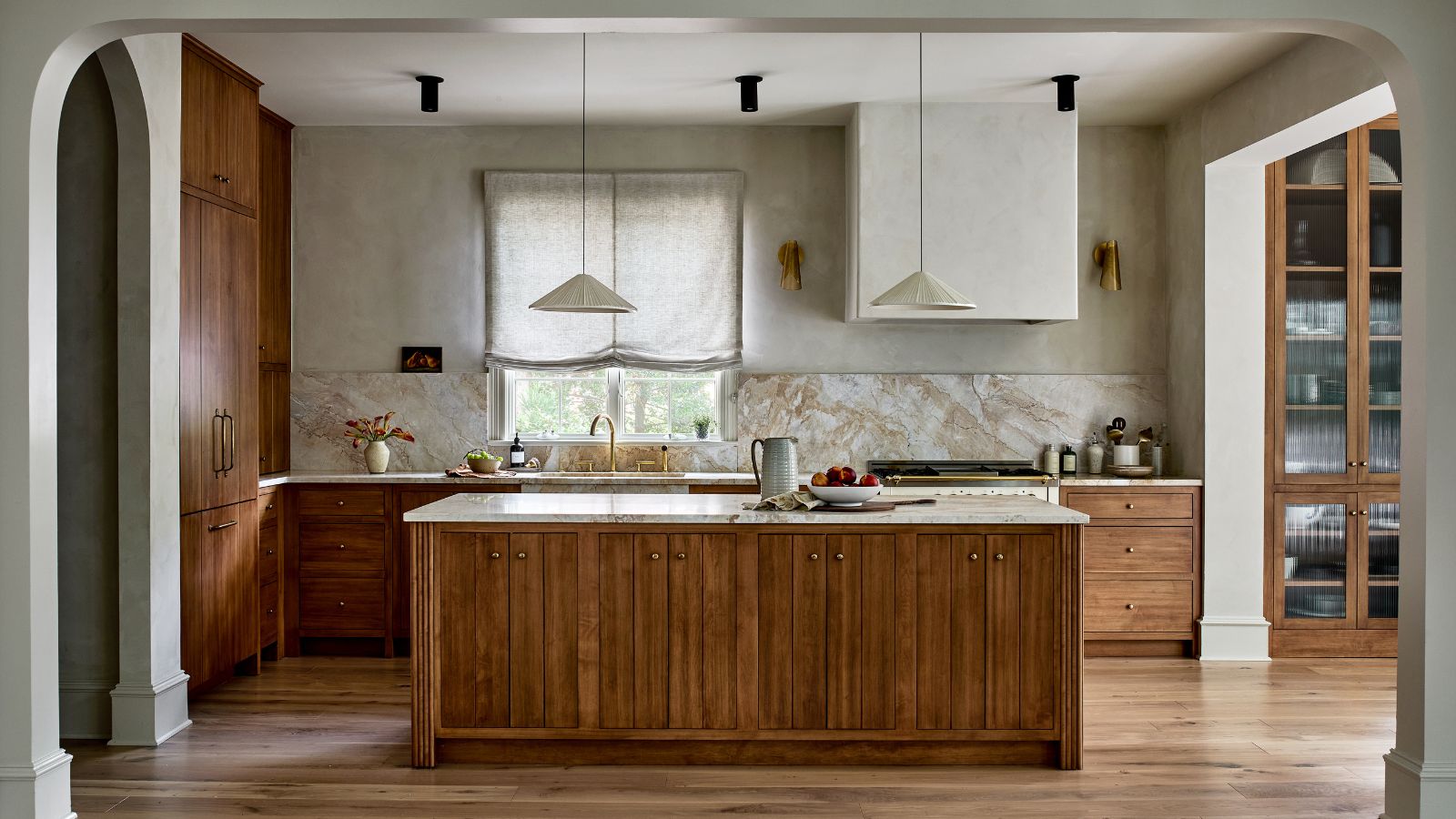 This kitchen has been transformed from cramped and outdated to warm and welcoming – and it's all thanks to a few thoughtful Japandi-style features
Warm wood tones, textural designs, and considered contrast are key to this beautiful transformation
By Molly Malsom