Design house: A traditional London home with a slice of the American South
Traditional English décor marries beautifully with hints of the American South in this spacious and welcoming family home
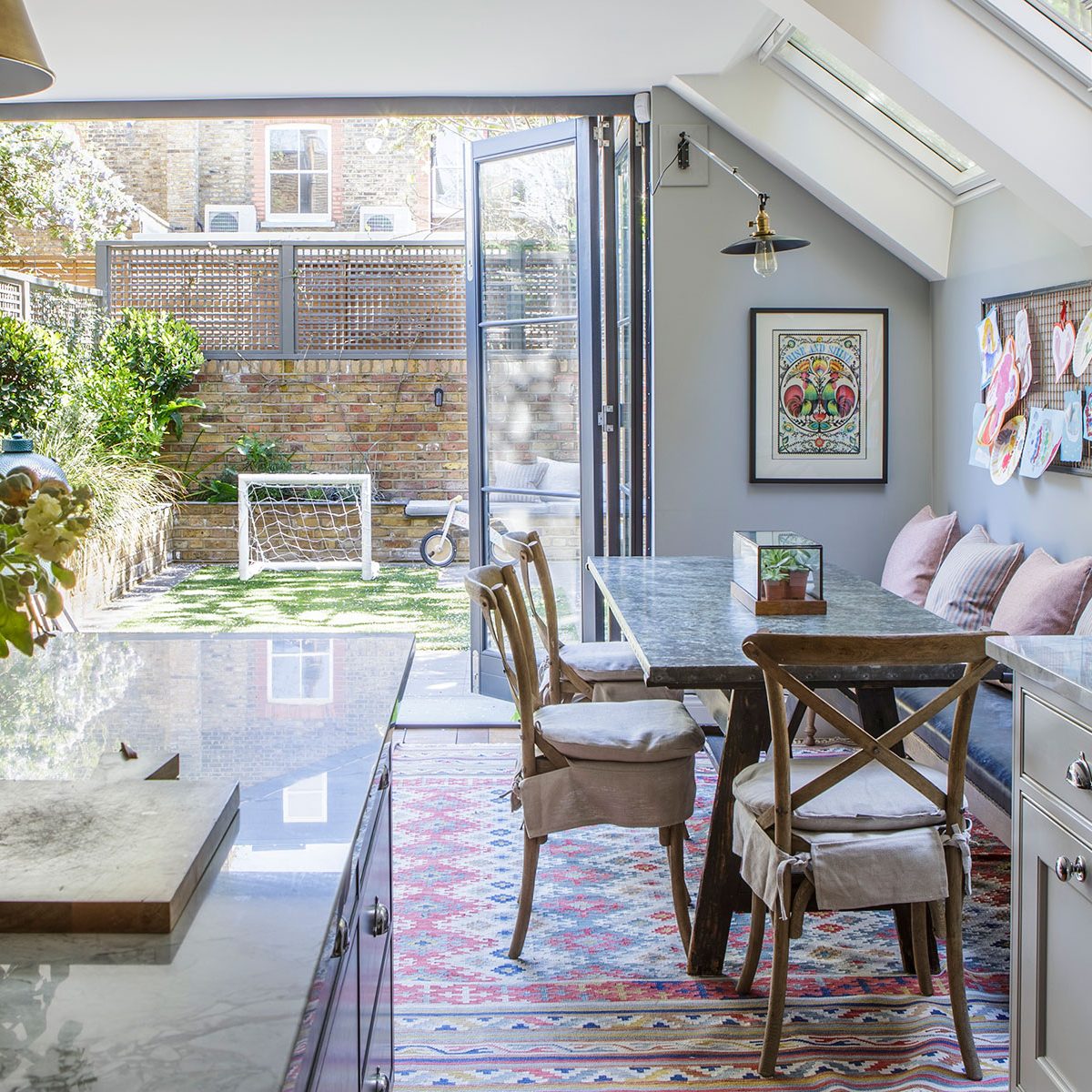

Being confronted with a blank canvas can make your heart sing at the possibilities, or sink at the prospect. For this particular couple it was a mixture of both. The south-west London home that they bought at the end of 2013 was a repossessed property that was, in estate agency-speak, 'in need of work throughout'.
See: our spaces section for more inspiring featured homes
- See some of the world's best homes – beautiful properties from around the globe
The property
It was an opportunity, the couple realised, to create a home that would be large enough for them and their three young children, and for them to work and entertain comfortably. There was scope not only to extend upwards, backwards and sideways, there was also an opportunity to go down. It was a project that required an expert, however, so the couple turned to Iconic Architecture and in the hands of Mark Sylvester, the cellar was dug out, front and back, the kitchen side return filled in and the loft extended.
With the building work complete, the owner turned to a close friend, hospitality interior designer Summer Williams, for help with the interior decoration. 'Summer is from Morgan's home town in Georgia, they went to kindergarten together. Initially, we bounced ideas off her, then we asked her opinion on changes to the floor plan, and it evolved into taking on the project together.'
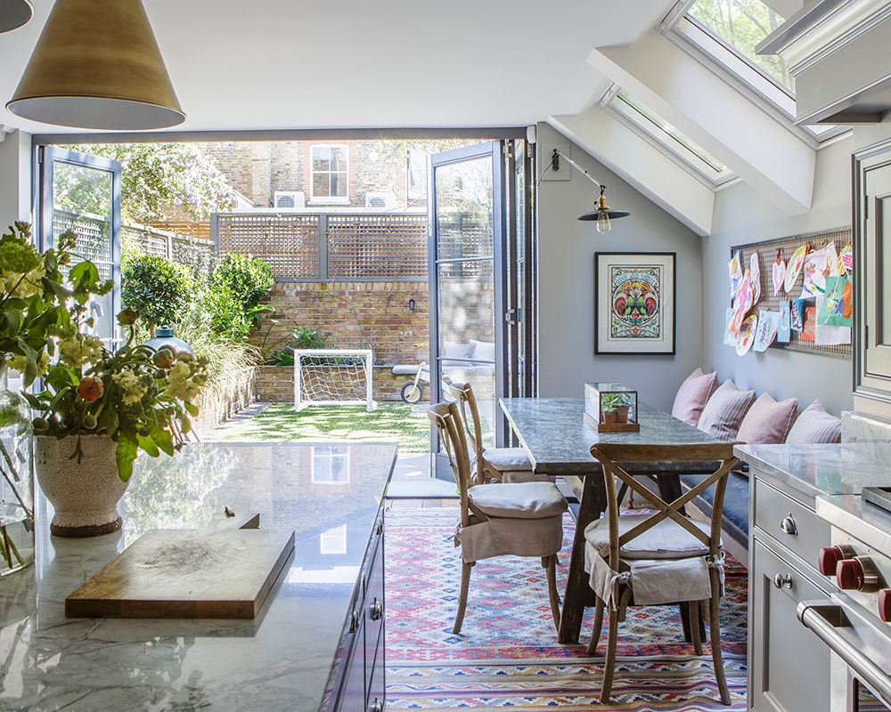
Summer's brief was to create a comfortable home suitable for the family, with style and practicality being equal considerations. “'esthetically, the family wanted a fairly traditional look but they weren’t afraid of some modern touches that incorporated American and English elements. It was quite a rare scenario in that we all have Southern American roots but we've all lived a good portion of our lives in London.'
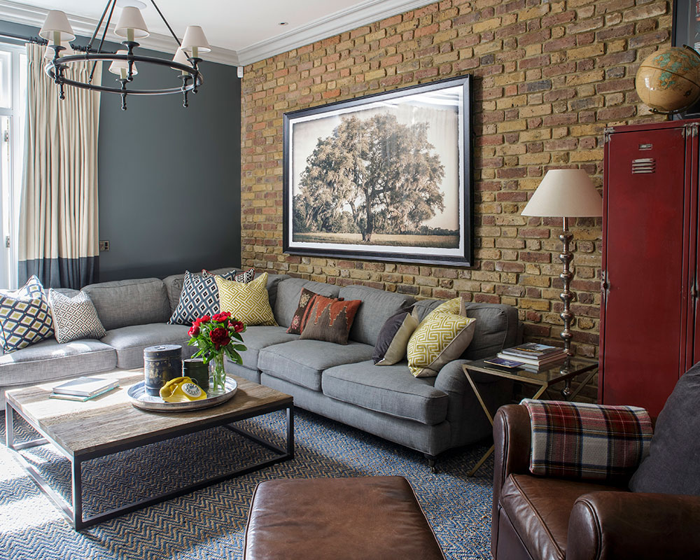
Photographs of the owners' wedding in South Carolina were vital inspiration for Summer. One of them, of a Spanish Moss Tree, played such a key role in the decorative scheme for the family room in the new basement that Summer had the image enlarged and it now hangs in prime position in that room. The bathroom at the hotel where they married inspired their own here, while the butterfly print that hangs in the sitting room was bought from a shop close by to the hotel
The couple's respective tastes shine throughout; His love of industrial style is clearly evident while her penchant for blue, orange and geometric patterns comes through as accents. This house is as true to them as if they had designed it themselves, a testament to Summer's skill and the trio’s lifelong friendship.
Sign up to the Homes & Gardens newsletter
Design expertise in your inbox – from inspiring decorating ideas and beautiful celebrity homes to practical gardening advice and shopping round-ups.
Kitchen
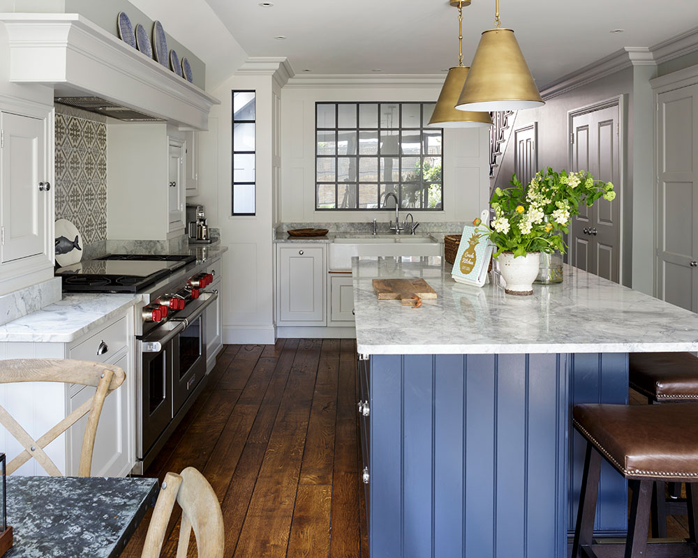
Summer’s ingenious idea of installing windows behind the sink allows the owners to keep an eye on the children in their play area in the basement, and helps flood what has been the darker end of the kitchen with light.
'I didn't want the kitchen to be too stark so rather than white, I went for grey tones. We particularly liked Bianca Eclipsia for the worktops and this became the benchmark for all the other materials,' says the owner.
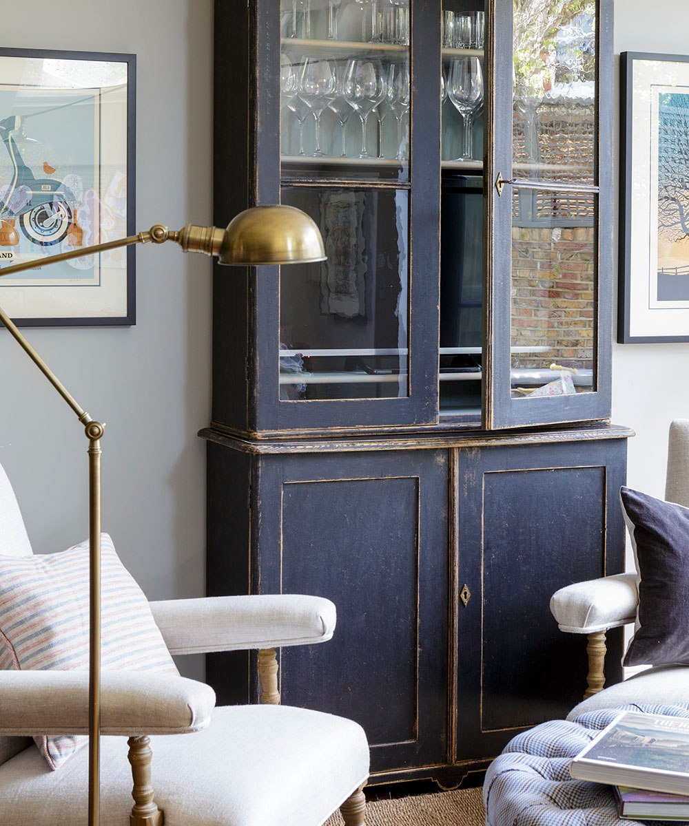
The antique bookcase was converted to house the television as well as the wine glasses and fine crockery. 'We thought about having a table here but an ottoman is more child friendly,' says the owner.
Guest bedroom
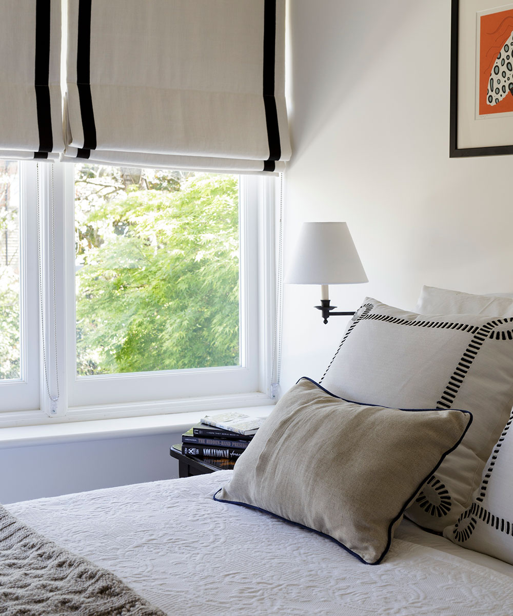
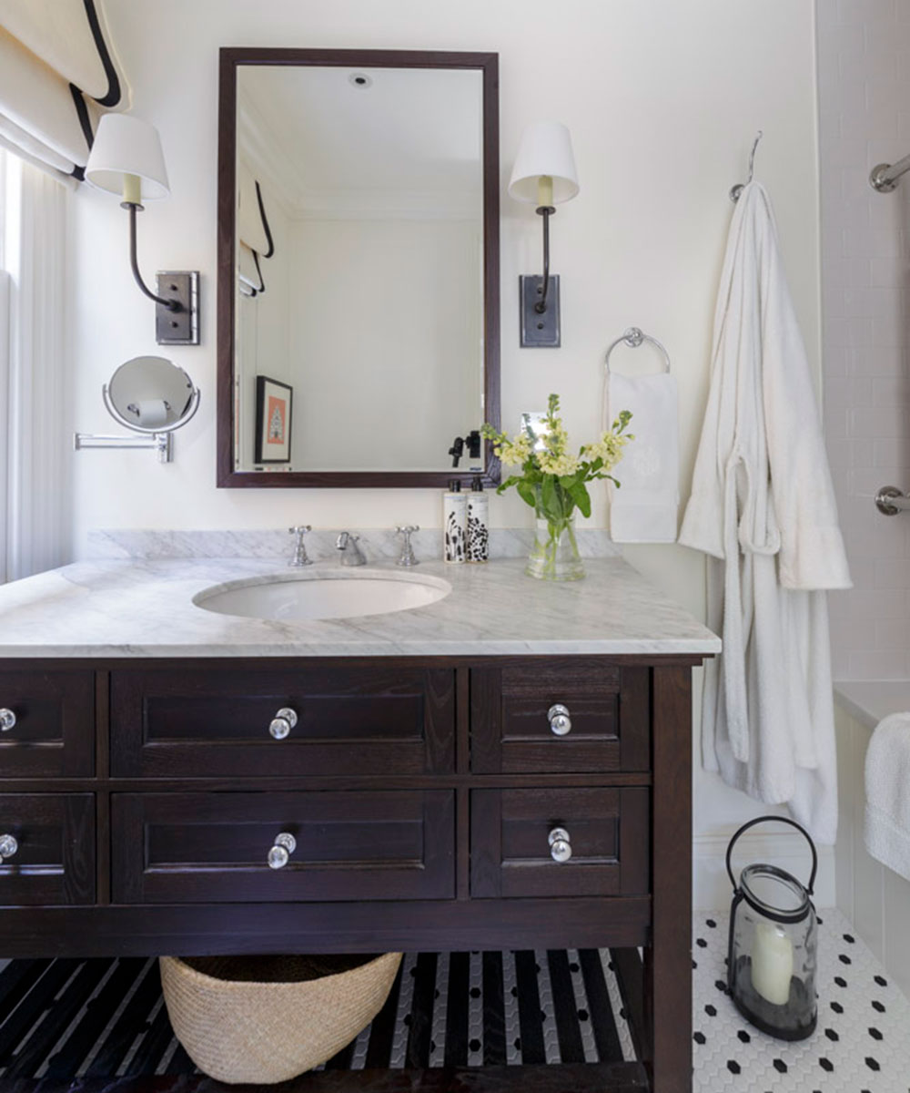
The distinctive hexagonal bathroom floor tiles were the inspiration behind the monochrome color scheme for this compact guest bedroom and adjoining bathroom. 'Summer really helped with the whole process by saying "It can be one little thing that inspires a whole room",' says the homeowner.
Guest bathroom
An old photograph of a bathroom was the guiding force behind the design for the bathroom cabinets, made by local joiner and topped with Carrera marble.
Owen's nursery
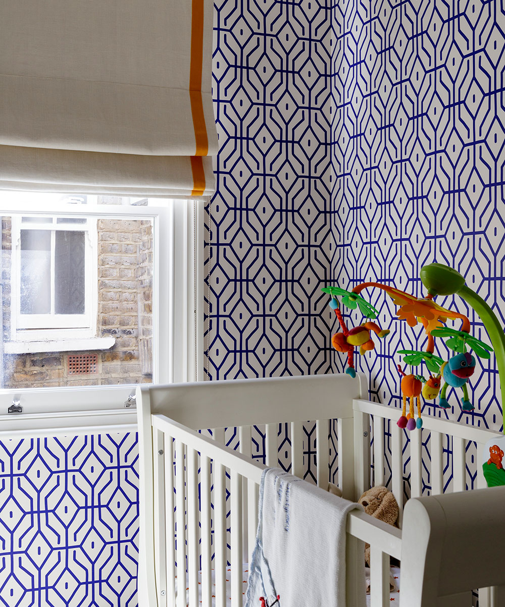
'This will be my study when our youngest moves into a larger room,' the owner explains, 'and I wanted a wallpaper that I would like myself and would work whether he was a boy or girl, so we went for a bright blue and orange. As it happens, he seems to like the bold pattern very much.'
Main bedroom
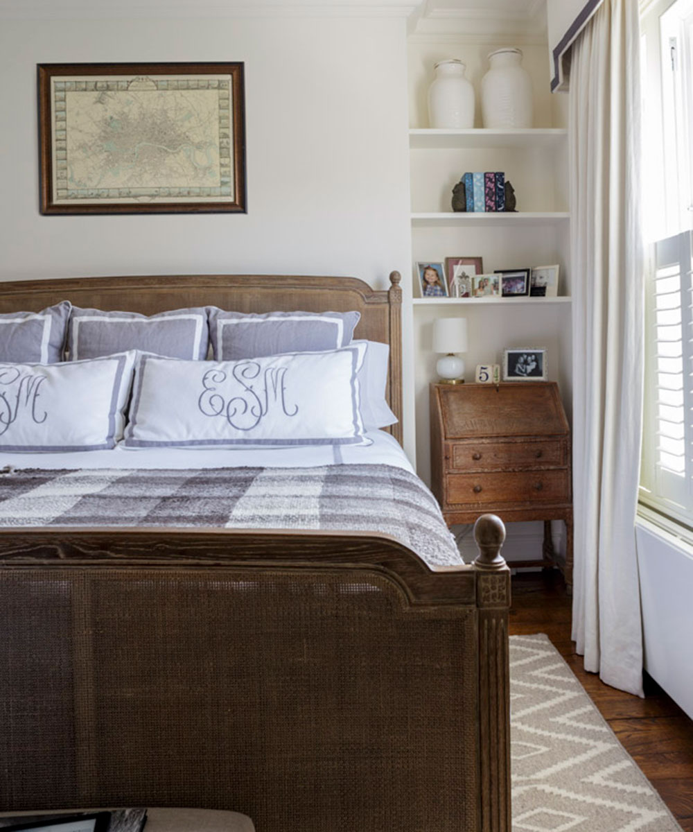
The generous size of the window meant that a blind would have been rather cumbersome and obvious so the couple opted for a smartly trimmed pelmet and curtains, in keeping with the monogrammed linen, a particularly Southern design feature.
Walk-in wardrobe
The far room was originally another bedroom but the couple has turned it into their own bathroom, replacing the dividing wall with two stud walls with space for a walk-in wardrobe and dressing table in between. Summer designed the mirrors for the bathroom: 'The rooms have fabulously high ceilings and I wanted to accentuate the vertical lines and add a curve for softness.'
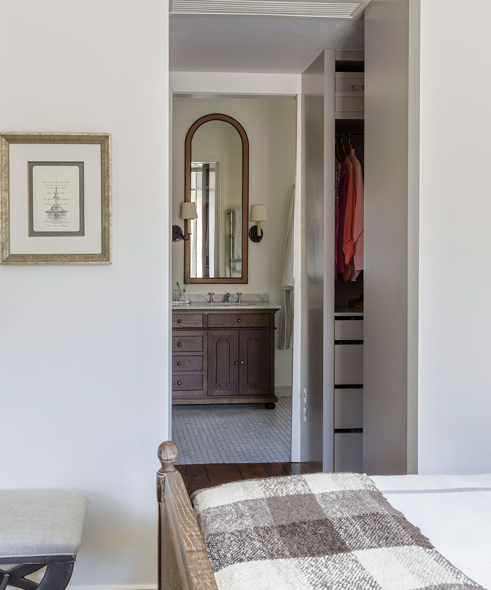
Main bathroom
'This bathroom is inspired by those in the hotel at Palmetto Bluff where we were married,' says the homeowner. In true American fashion, the couple did not want a bath, preferring to have a luxurious shower with seating instead.
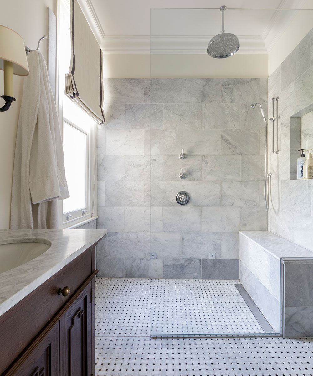
Sitting room
Candy twist armchairs are a common sight in the American South and this pair brings a flavour of Atlanta to Parsons Green. Summer sourced them from a shop in Atlanta, and shipped them over in a container together with the couple’s wedding presents, which the owners' mother had been storing for them, and other pieces bought for the house.
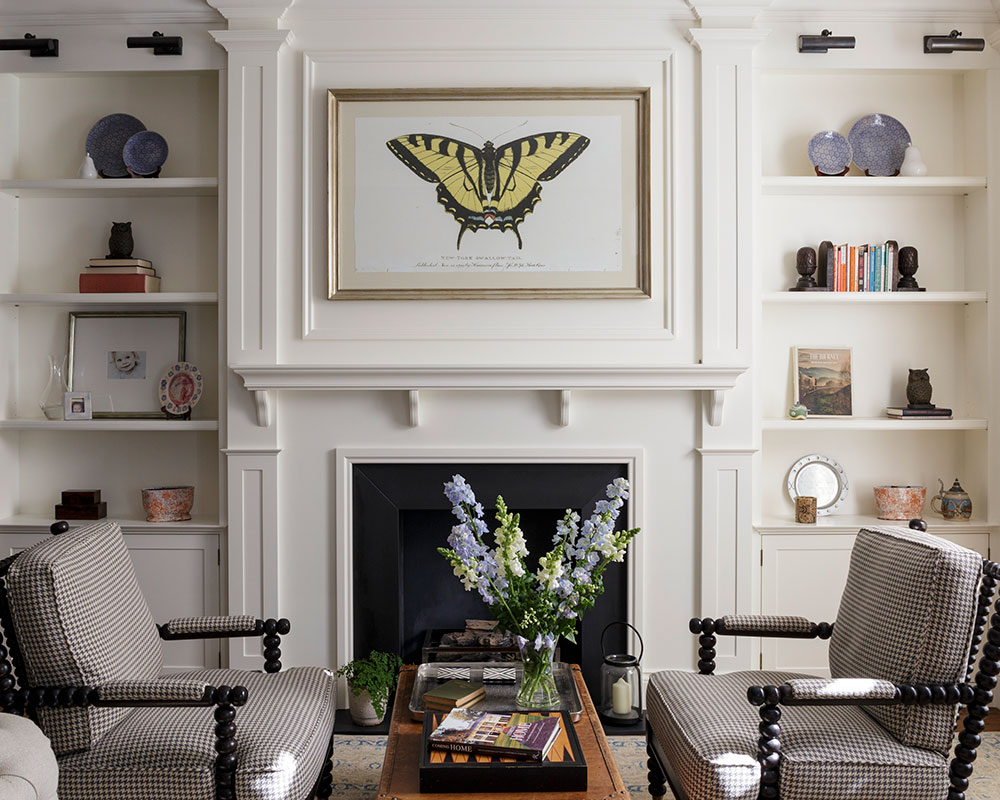
Dining area
A pair of 19th-century mirrored windows attract light into the darker end of the open plan dining-cum-sitting room whilst at the same time helping to emphasise the sense of being in the American South. An eclectic mix of modern art, casual linens and dining furniture from the couple's old flat, provides a more formal, less child-focused space.
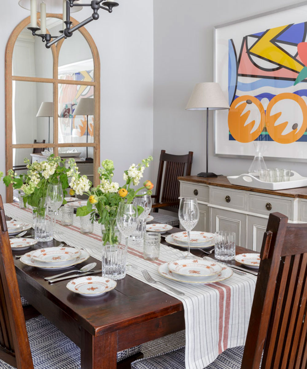
Family room
'Summer suggested the dark grey walls based on her experience of restaurant design,' says the owner. 'I was worried it would feel like a cave but instead it's warm and cosy.' The dip-dye effect curtains are in fact two fabrics sewn together to create a darker band at the bottom. Summer says: 'The design was incorporated to bring the vertical volume to a more human scale.'
She added: 'We wanted this to be a mixed adult-child space. You can see my husband's influence in here in the more industrial feel. The brick wall was his idea, too.' The photograph of the tree was taken at the couple’s wedding in South Carolina.
Play area
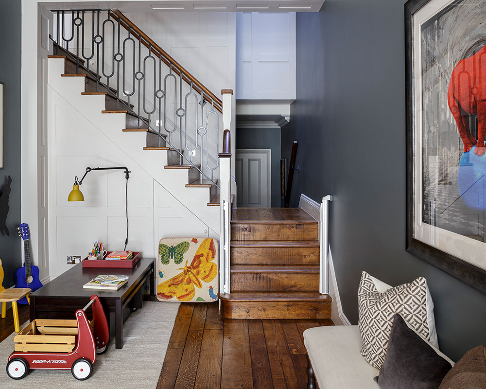
The children’s play area is perfectly placed so that they can be watched over from the kitchen above, or play while their parents relax on the seating near by. Mark Sylvester, the architect, put the stairs in the middle of the house so as to use up as little floor space as possible. The couple found the rhino picture at the Affordable Art Fair: 'It's by Lars Tunebo, a Swedish artist – he was so much fun, and we liked the image,' says the homeowner.
Photography/Mark Bolton

Jennifer is the Digital Editor at Homes & Gardens. Having worked in the interiors industry for several years in both the US and UK, spanning many publications, she now hones her digital prowess on the 'best interiors website' in the world. Multi-skilled, Jennifer has worked in PR and marketing and occasionally dabbles in the social media, commercial, and the e-commerce space. Over the years, she has written about every area of the home, from compiling houses designed by some of the best interior designers in the world to sourcing celebrity homes, reviewing appliances, and even writing a few news stories or two.
-
 Zooey Deschanel and Jonathan Scott's breakfast nook is an innovative, effective use of kitchen space – it turns a 'dead area' into a cafe-style corner
Jonathan and Zooey have situated an eccentric yet elegant dining area in what may have been an otherwise underused corner
By Hannah Ziegler Published
-
 6 things you should never throw in the trash – and what to do for safe disposal instead
From batteries to space heaters, experts reveal what not to throw
By Andy van Terheyden Published