Design house: This traditional home in California has been given a modern update
Modern meets classic in this expertly designed Californian 'dream home.'

This traditional Hillsborough estate in California got a contemporary update with Nest Design Co. at the helm.
Founding designers Heather Brock and Jennifer Wundrow established Nest Design Co., Inc. in 2009. Their affinity for mixing objects of different styles and eras, attention to detail, and adventurous use of colour and texture are hallmarks of their fresh take.
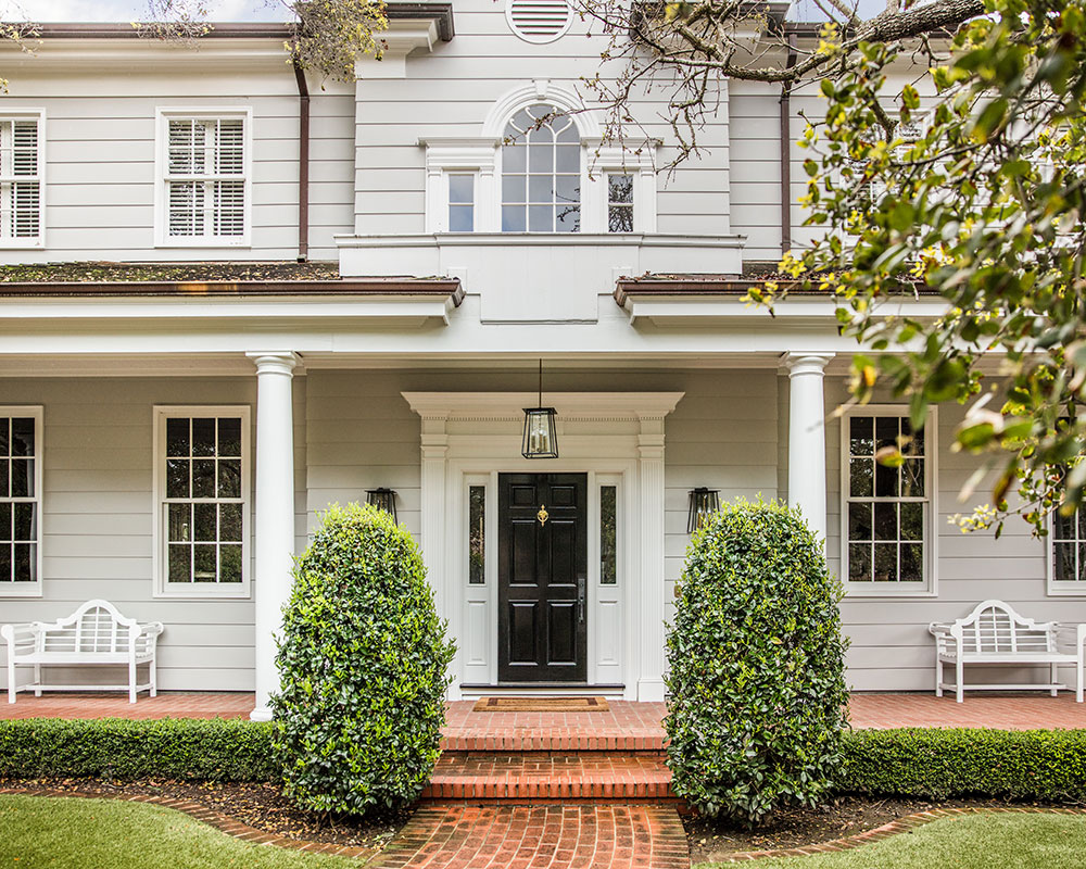
Farro Essalot, the famed Bay Area architect, created this 5,700sq ft home in 1988. The overall layout and feel of the home was there, but it was in much need of cosmetic updating.
'Our clients, a young family moving from San Francisco, needed something that would function well for them. We wanted to leave the beautiful bones of the traditional Georgian exterior and create a more playful, cool, contemporary California interior,' say Nest Design Co.
HALLWAY
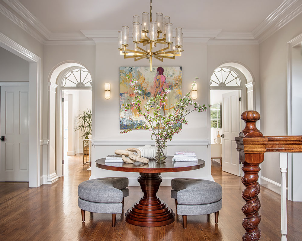
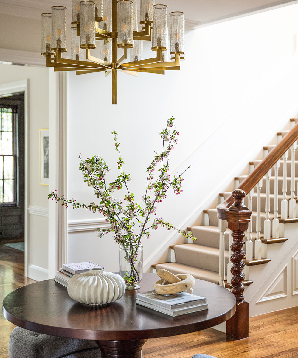
This gracious hall is the axis point for the home. Upon entering this space, there are five doorways leading to the other main spaces of the house and the staircase leading to the second floor. Because of this, we opted for a circular center table from Brownstone with a pair of moon-shaped upholstered benches. The Jylian Gustlin mixed media artwork is the focal point of this room flanked by Visual Comfort wall sconces.
KITCHEN/BUTLERS PANTRY/BREAKFAST NOOK
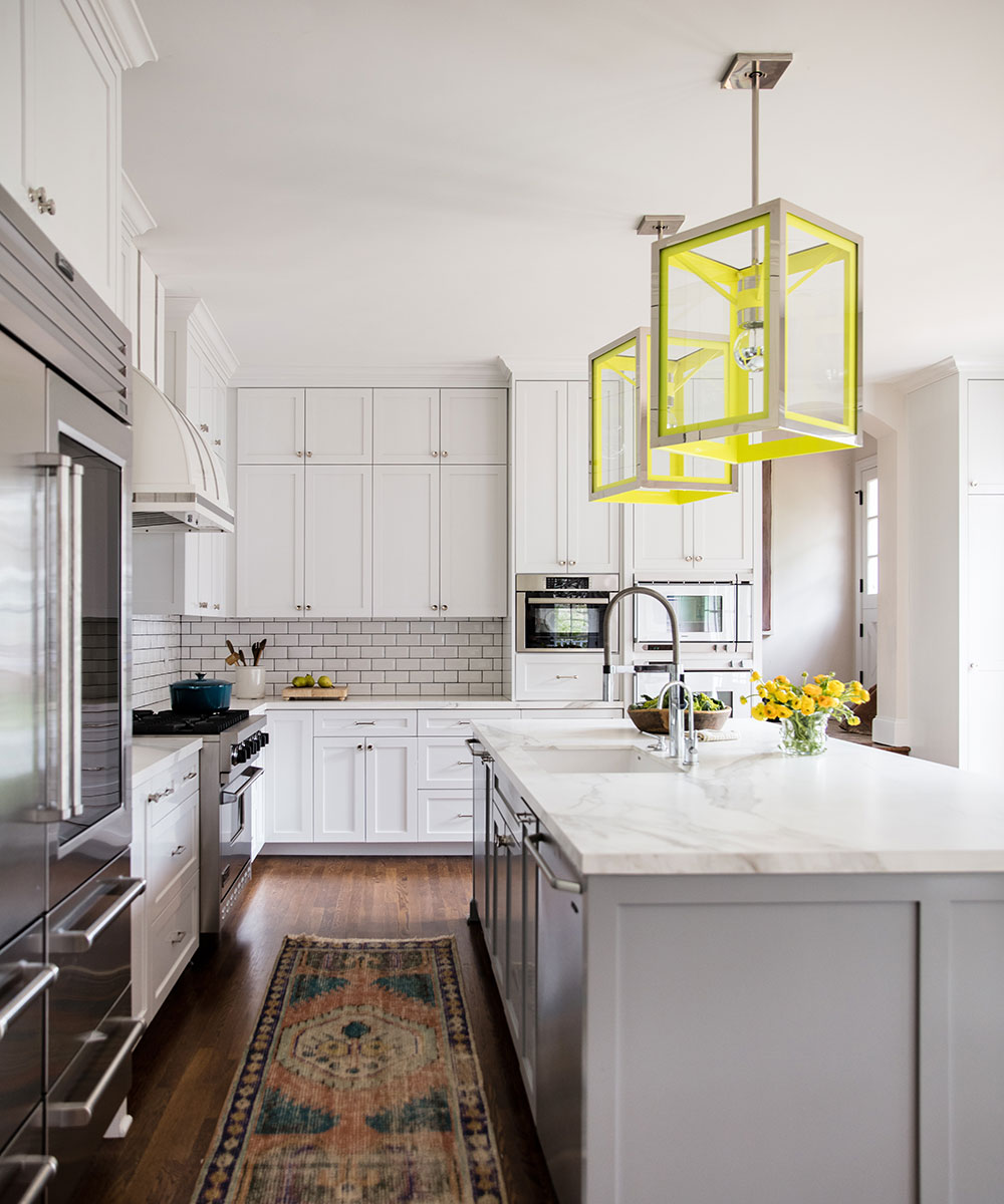
The kitchen was original and had a formal feel that did not suit the new young family that was moving in. The finishes felt out-dated, and while the room had a lot of beautiful windows, it still somehow felt dark. We discussed the options which were to either do a facelift (painting the existing cabinetry, new countertops and splashback, etc.), or we would gut the entire space giving them a kitchen to their exact specifications. When they looked at these options and weighed the costs associated with them, they ultimately decided they wanted to build the kitchen of their dreams and not put a bandaid on what was already there.
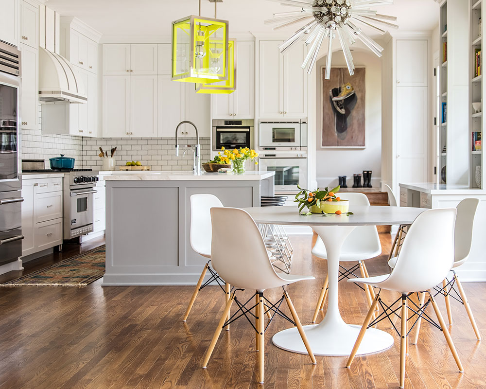
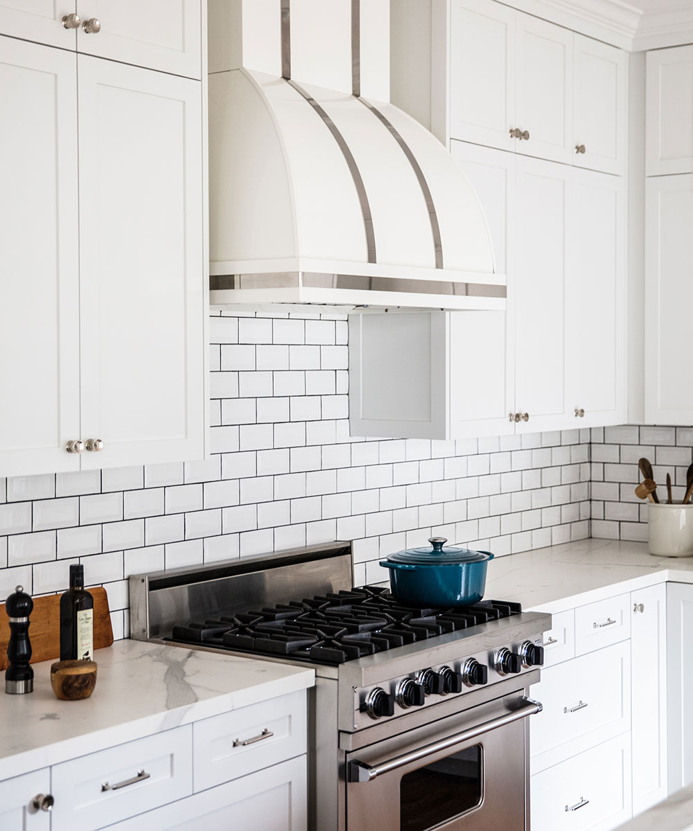
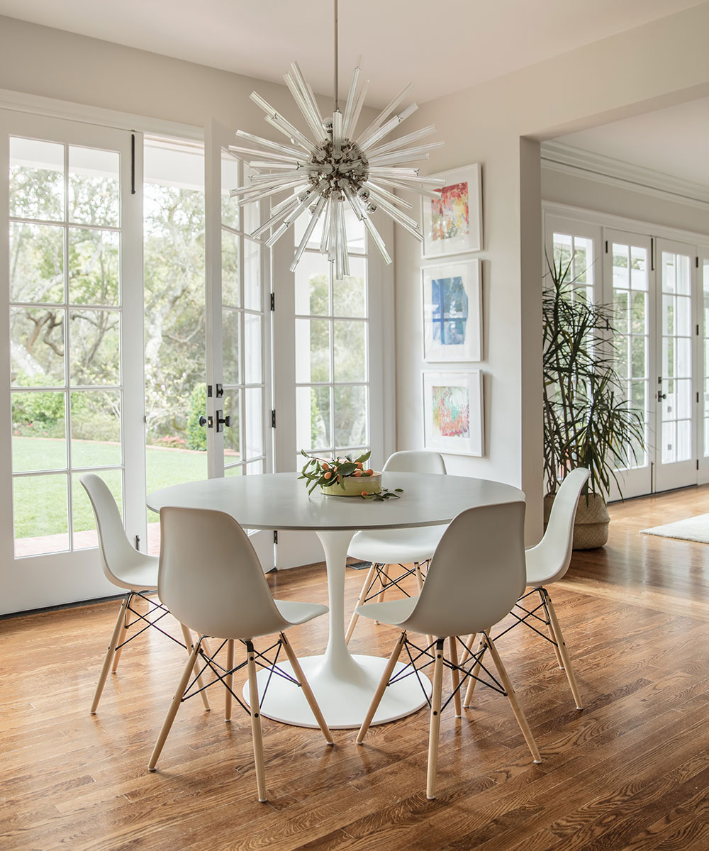
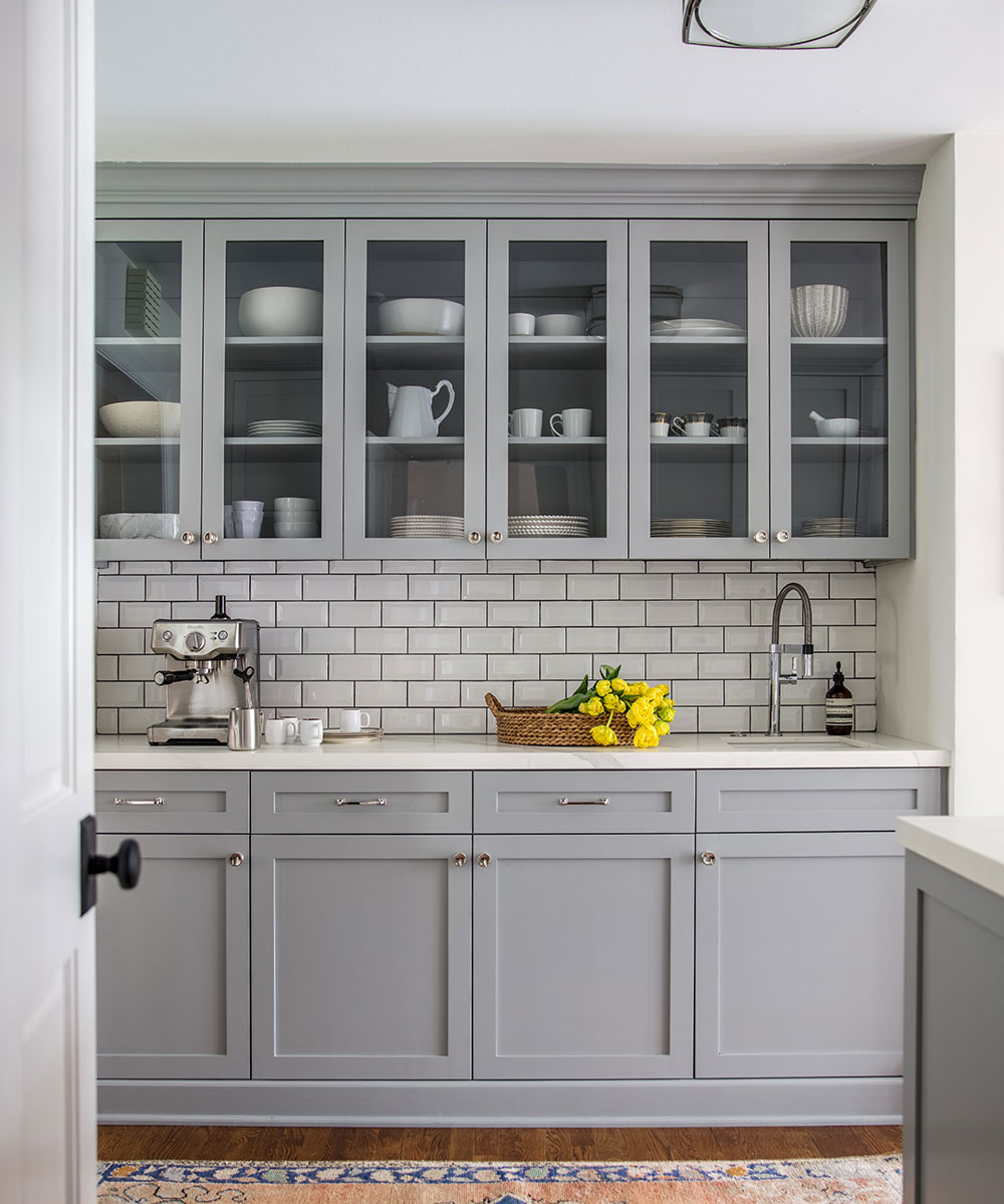
The cabinetry and hood were custom designed and the island was painted a beautiful grey colour to help offset the white kitchen. The pair of Urban Electric pendants hanging over the island were finished in a custom citron neon color which gave the space the great contemporary punch the room needed. The classic Saarinen table (with a custom top by NDC) adds a gathering space for sunny morning breakfasts and cosy family dinners. The Butler’s Pantry is an offshoot from the kitchen and mimics the island colour with its grey cabinetry and matching countertop and splashback.
Sign up to the Homes & Gardens newsletter
Design expertise in your inbox – from inspiring decorating ideas and beautiful celebrity homes to practical gardening advice and shopping round-ups.
SeeDesign house: Extraordinary home in California, designed by Richard Beard, FAIA
FAMILY ROOM
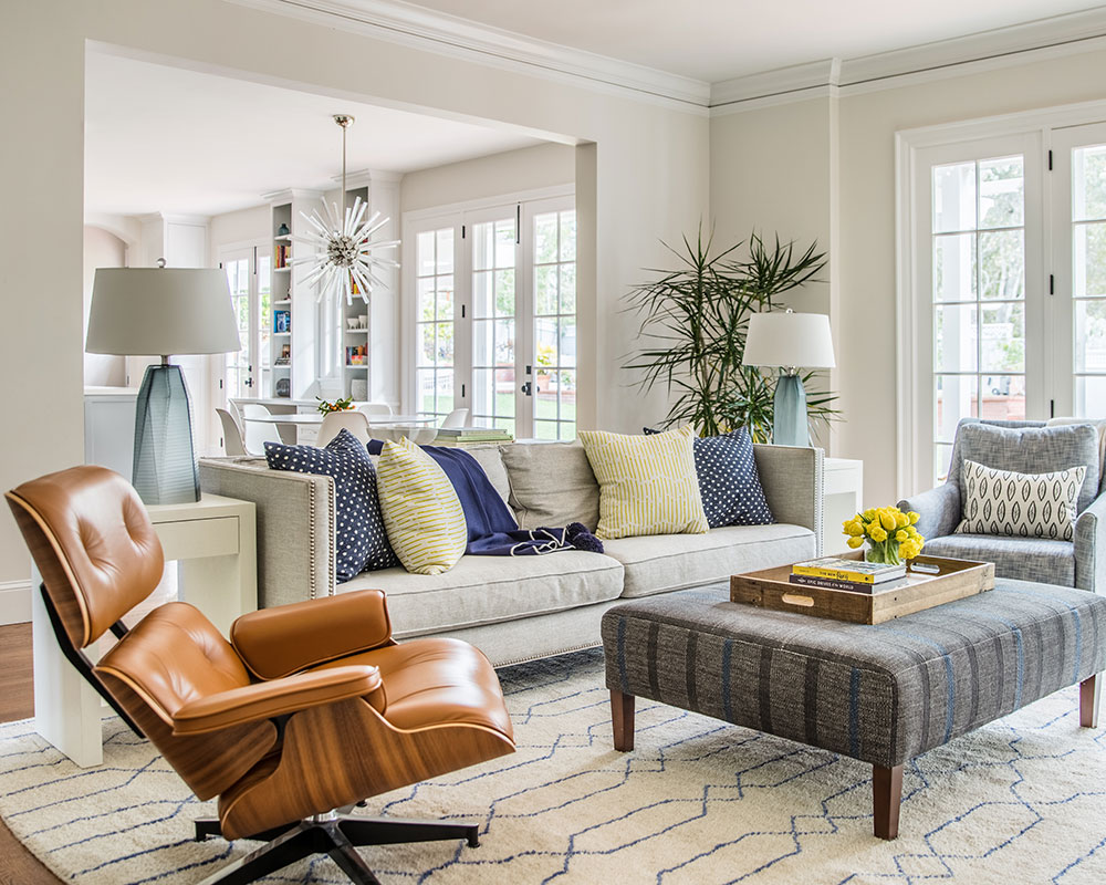
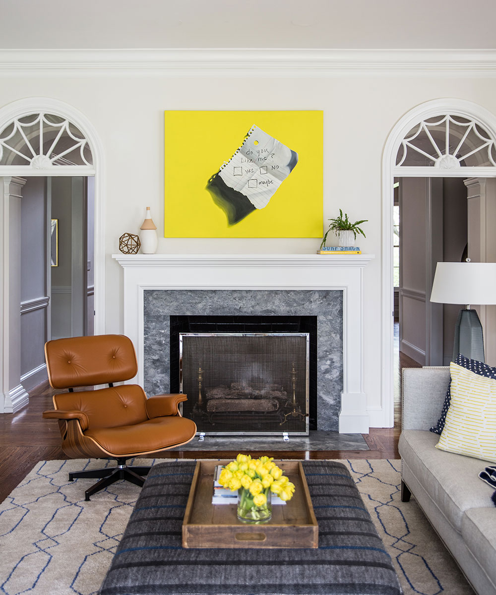
The family room adjoins the kitchen and breakfast nook and features an Eames chair from Design Within Reach. The custom ottoman being used as a coffee table was a must with their two small children – we didn’t want there to be any sharp edges that they might hit their heads on.
A commissioned painting by Jeanne Vadeboncoeur (from Simon Breitbard Fine Arts) adds a little whimsy to the room.
LIVING ROOM
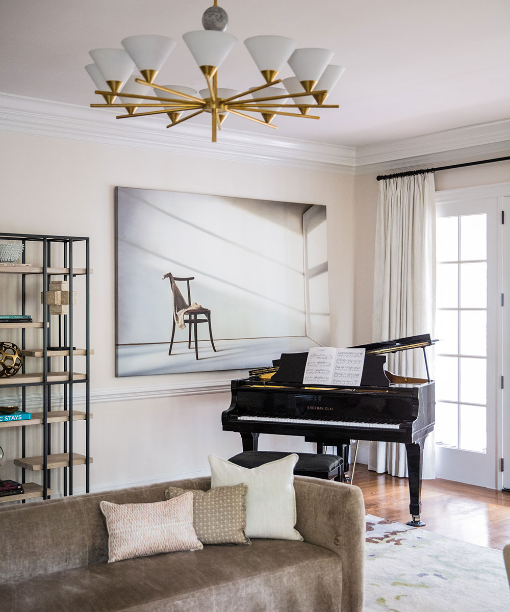
This large room was one of our biggest challenges, and yet became our favourite room in the house.
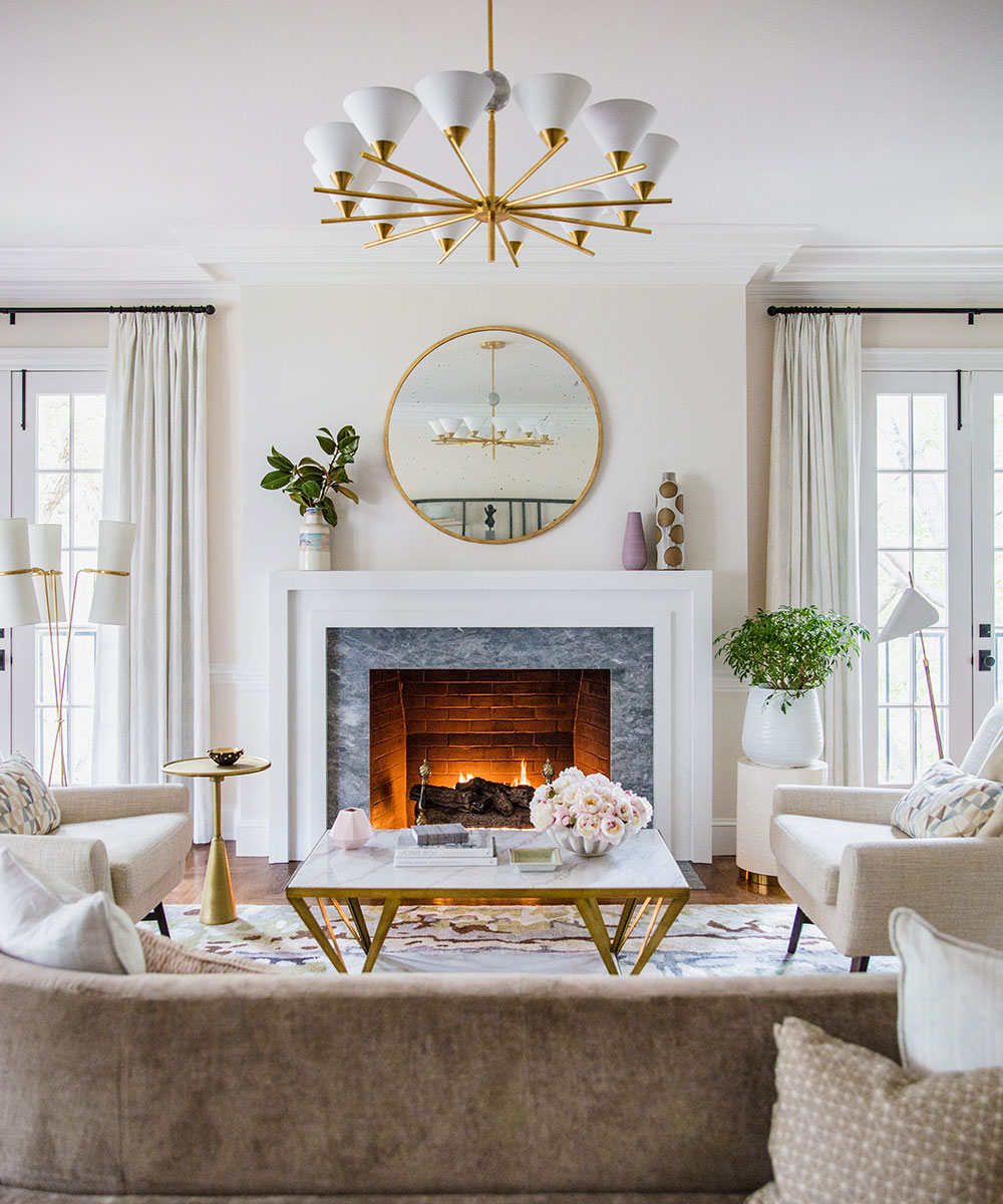
We wanted to create a space that felt intimate for smaller gatherings, but also be able to be a room you could entertain in. When we found the double-sided sofa by Henredon, we knew we had found the solution. This sofa enabled us to create two seating areas that still felt connected. The side table was made to fit the curves of the sofa, while still offering ample storage space.
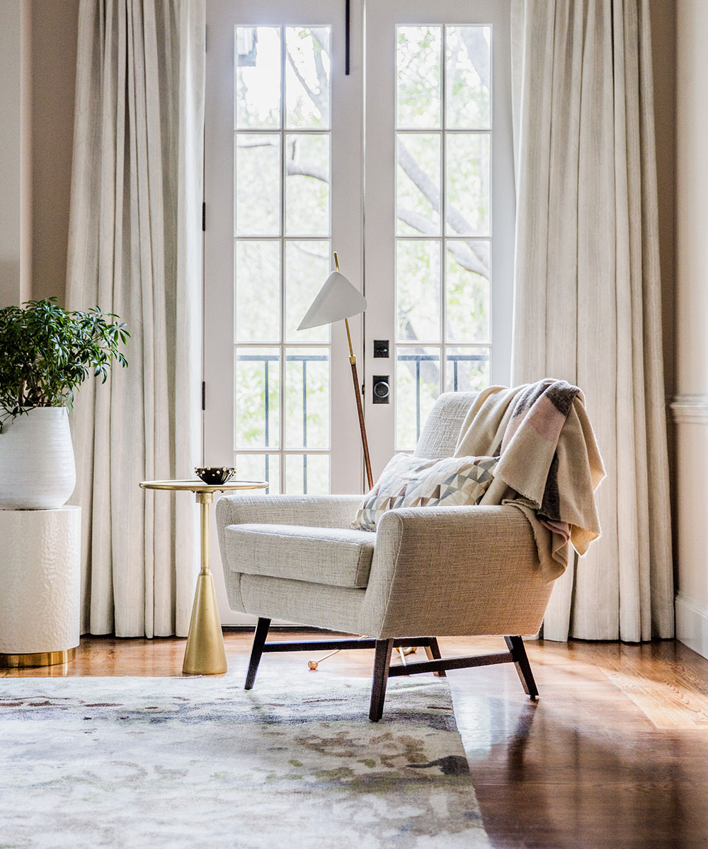
To ground the space, we designed a custom rug from The Rug Company. The lighting is from Visual Comfort, including the chandelier. This room is both contemporary and sophisticated without feeling too stuffy and when the evening light filters through the windows, it’s pure magic.
SeeDesign house: A cool Californian new build designed by Kate Lester
DINING ROOM
The dining room is an offshoot of the hallway and sits opposite from the living room.
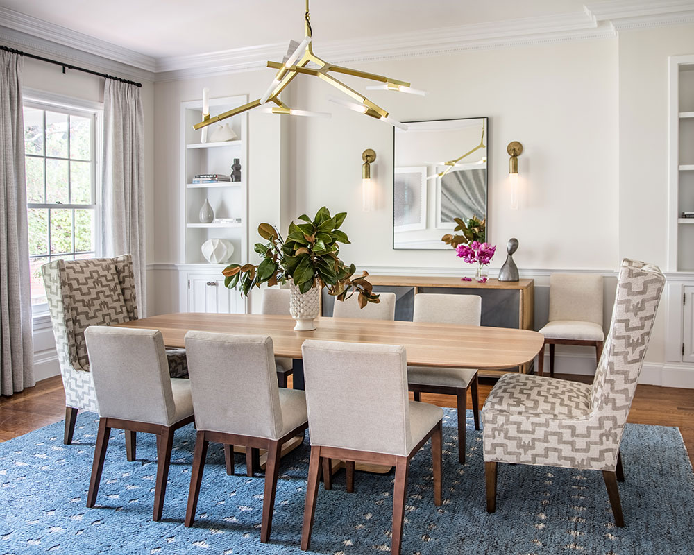
The showpiece of this room is the Skram dining table – simple yet beautifully graceful lines. The client had existing side chairs they wanted to use in this space, so we added tall wing-back chairs to add a bit of drama at either end of the table. These head dining chairs are from Lee Industries and are upholstered in a graphic Zak & Fox fabric.
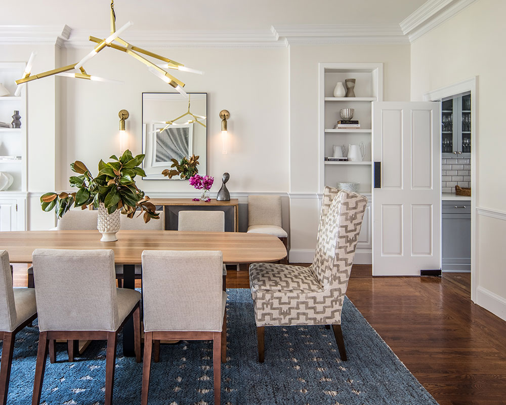
The modern chandelier by France & Son is a far cry from the old crystal chandelier that used to hang in its place, and the wall sconces that flank the Oly console, are from Apparatus. Artworks by Yossi Ben Abu and Suzy Barnard (from Simon Breitbard Fine Arts) adorn the walls and the rug by Jaipur adds a splash of rich indigo to the space.
HOME OFFICE/LIBRARY
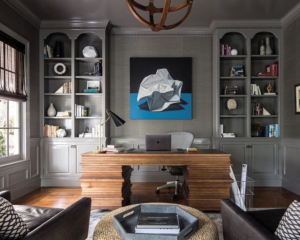
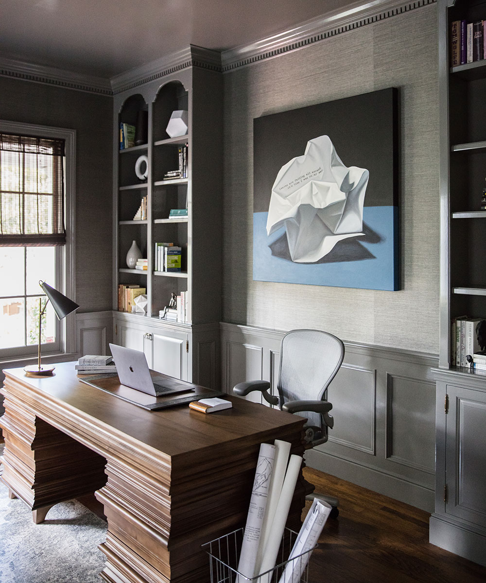
The home office was originally adorned with stained oak woodwork and a deep green floral striped wallpaper. That had to go. However, we didn’t tear anything out of this room – the cabinetry and wainscot is all original.
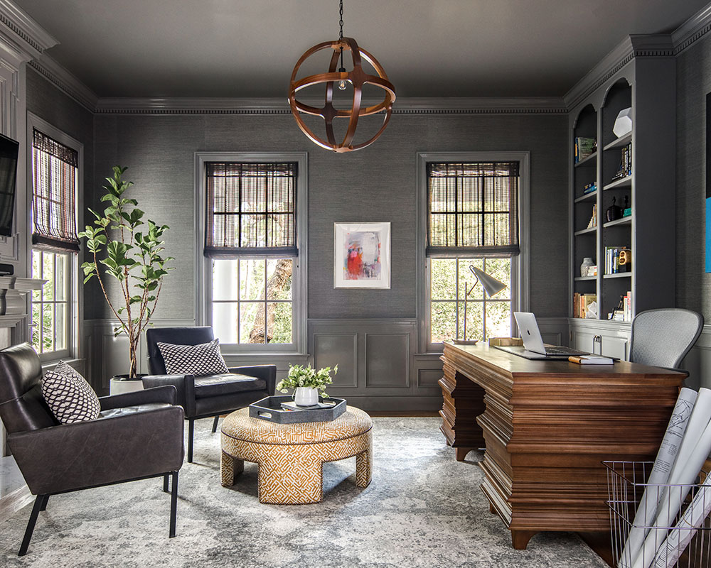
We gave this room a new life and created a rich textural space by lacquering the woodwork with Benjamin Moore’s 'Asphalt' and installing a coordinating Phillip Jeffires grasscloth wall-covering on the walls.
A pair of Mid-century inspired chairs by Cisco flank a custom ottoman designed by NDC and face a dramatic desk by Noir. The painting by Jeanne Vadeboncoeur was commissioned by the client through Simon Breitbard Fine Arts.
MASTER BEDROOM
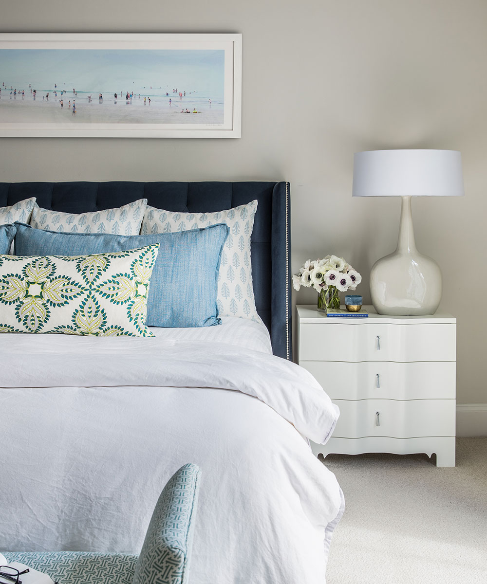
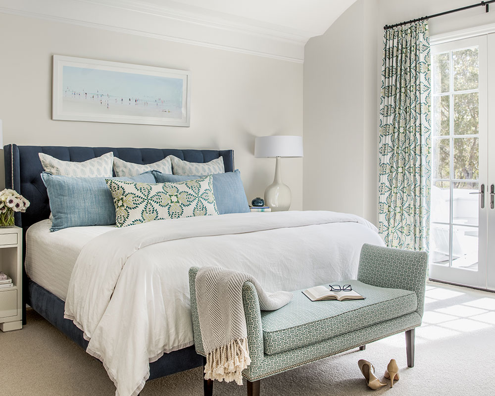
The master bedroom is located on the second floor and is a true retreat for this couple. The room gets beautiful natural light and the custom French doors flanked in Lee Jofa’s 'Aztec' linen fabric lead out to a balcony that overlooks the client’s gracious back garden.
The custom upholstered bed from Cisco anchors the room. Serene blues and greens help bring the outdoors in while creating a soothing backdrop for our clients to start and end their day.
SeeDesign house: An oceanfront home in California, designed by Brandon Architects
MASTER BATHROOM
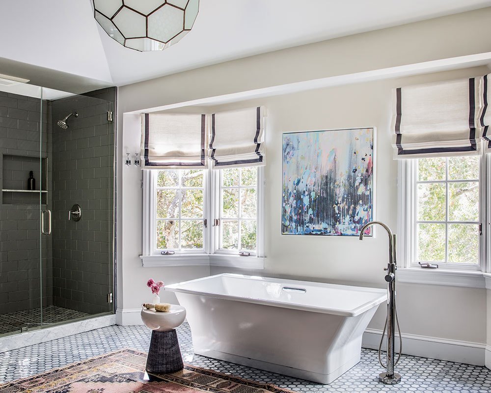
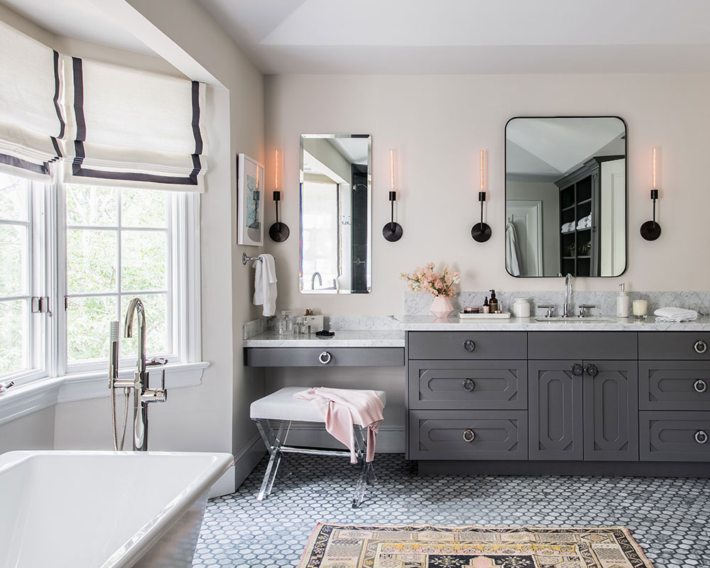
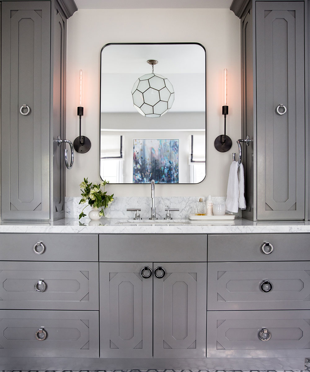
A Kohler soaking tub is the showpiece floating in this large bathroom. The dark grey and white tile offer a graphic contrast on the floors while the custom vanities and built-ins create maximum storage.
CHILD'S ROOM
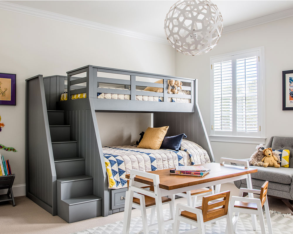
Classic bunk bed translates to a fun space for their two kids who love sharing a room. The bamboo pendant was a great choice since it is durable for a kids room where footballs might fly through the air.
Photography/ Thomas Kuoh
Interior design/ Nest Design Co.

Jennifer is the Digital Editor at Homes & Gardens. Having worked in the interiors industry for several years in both the US and UK, spanning many publications, she now hones her digital prowess on the 'best interiors website' in the world. Multi-skilled, Jennifer has worked in PR and marketing and occasionally dabbles in the social media, commercial, and the e-commerce space. Over the years, she has written about every area of the home, from compiling houses designed by some of the best interior designers in the world to sourcing celebrity homes, reviewing appliances, and even writing a few news stories or two.
-
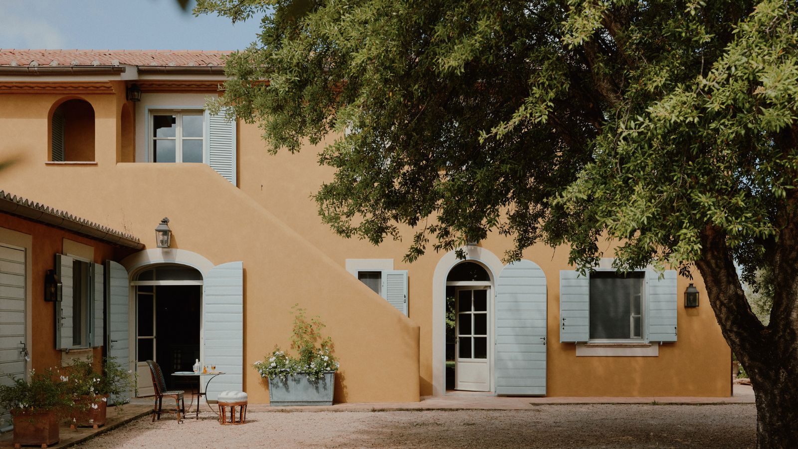 How a British designer brought together the different tastes of a couple wanting to create the dream future-proofed home in the idyllic Italian countryside
‘They wanted a house that would feel immediately like home the minute they arrived, and somewhere relaxing to spend time together as a family and entertain friends.’
By Fiona McCarthy
-
 What is your birth month herb? Discover the symbolic meaning behind yours
Herbs offer symbolic wisdom, and play to the natural rhythms of the season
By Lola Houlton