An elegant and stylish London townhouse
Seemingly endless planning applications, a dramatic reconfiguration and the installation of a show-stopping staircase have all been worth the upheaval in the case of this undeniably stylish townhouse

The immaculate interiors of this double-fronted, mid-19th-century London townhouse are a far cry from the tired family home that its owners bought five years ago. The transformation is no complete, but it required clear heads and brave hearts as everything but the four exterior walls had to be stripped away to reconfigure the internal space, and the new rooms painstakingly decorated.
- See some of the world's best homes – beautiful properties from around the globe
The property
The journey began long before so much as a skip could be brought on site. Planning applications numbering well into double figures were submitted for the creation of an additional basement level, and the installation of a car-lift and skylights. Such was the intricacy of the project that, when the builders were finally able to move in and start work, the couple found themselves having to make decisions on an almost hourly basis. With busy working lives to manage at the same time, the couple decided to appoint interior designer Rebecca Hughes to help them.
See: our interior design section for more inspiring featured homes
Sitting room
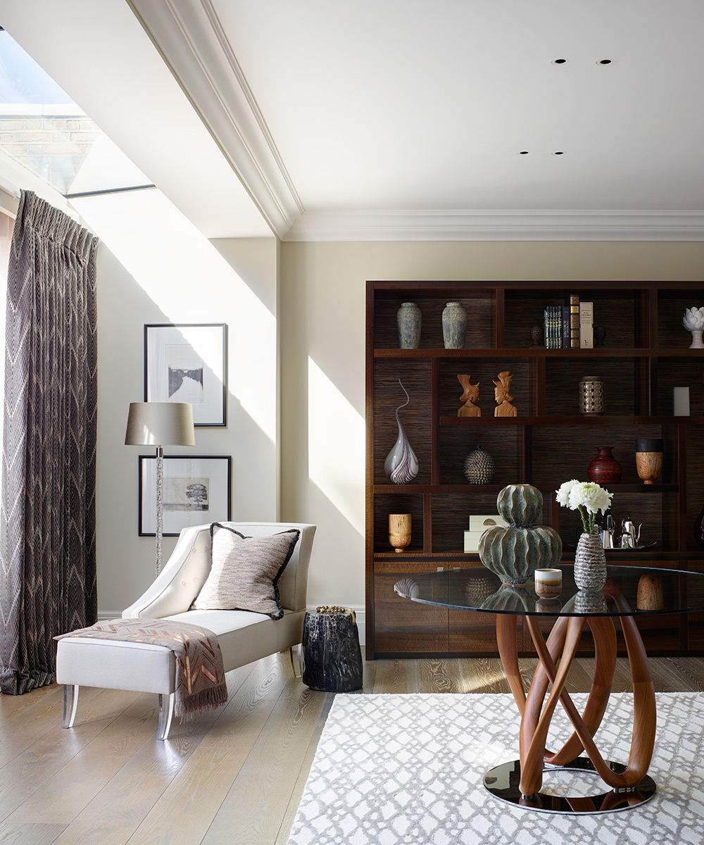
The essentially neutral palette sets a formal tone here with character provided by the scattering of books and artworks. The sofa gently divides the space, allowing for a more relaxed seating area beyond with a chaise longue, which is beautifully complemented by a bespoke bookcase.
Landing
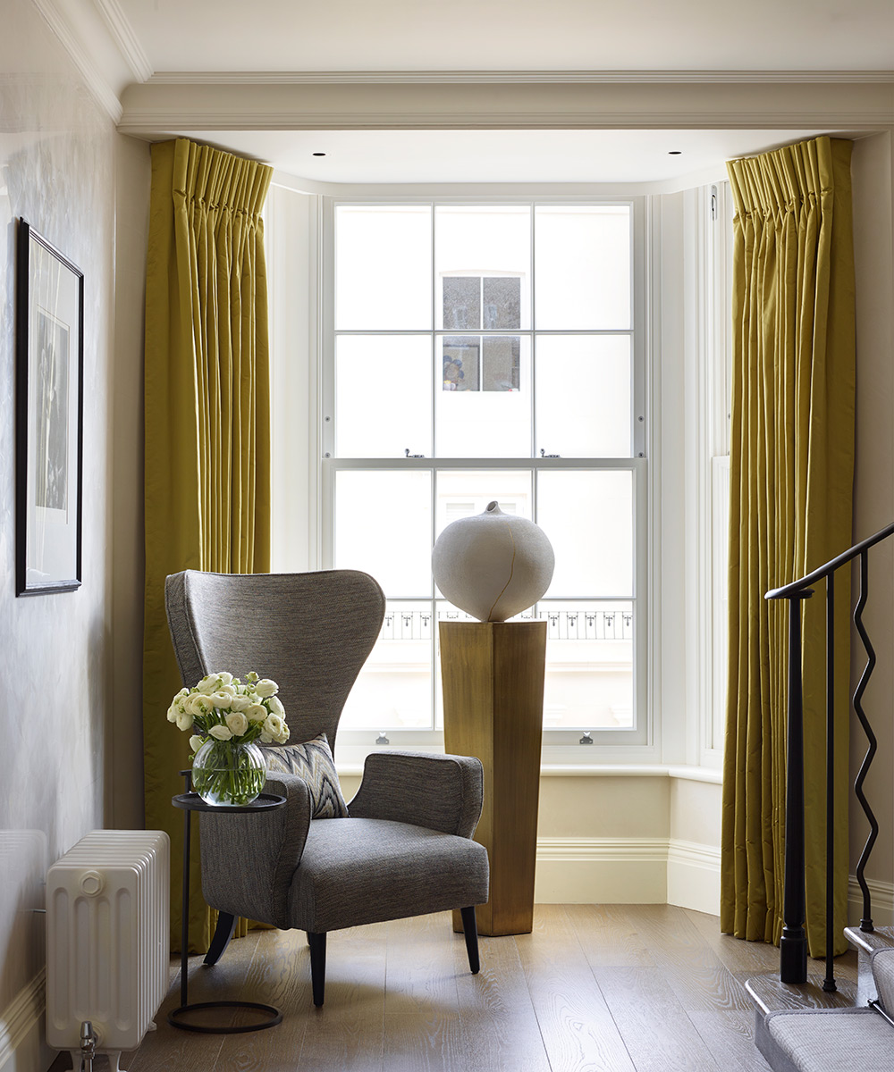
One of the benefits of the new staircase was that the homeowners were able to feature a spacious landing on each floor, ideal for displaying favourite pieces of art.
Dining room
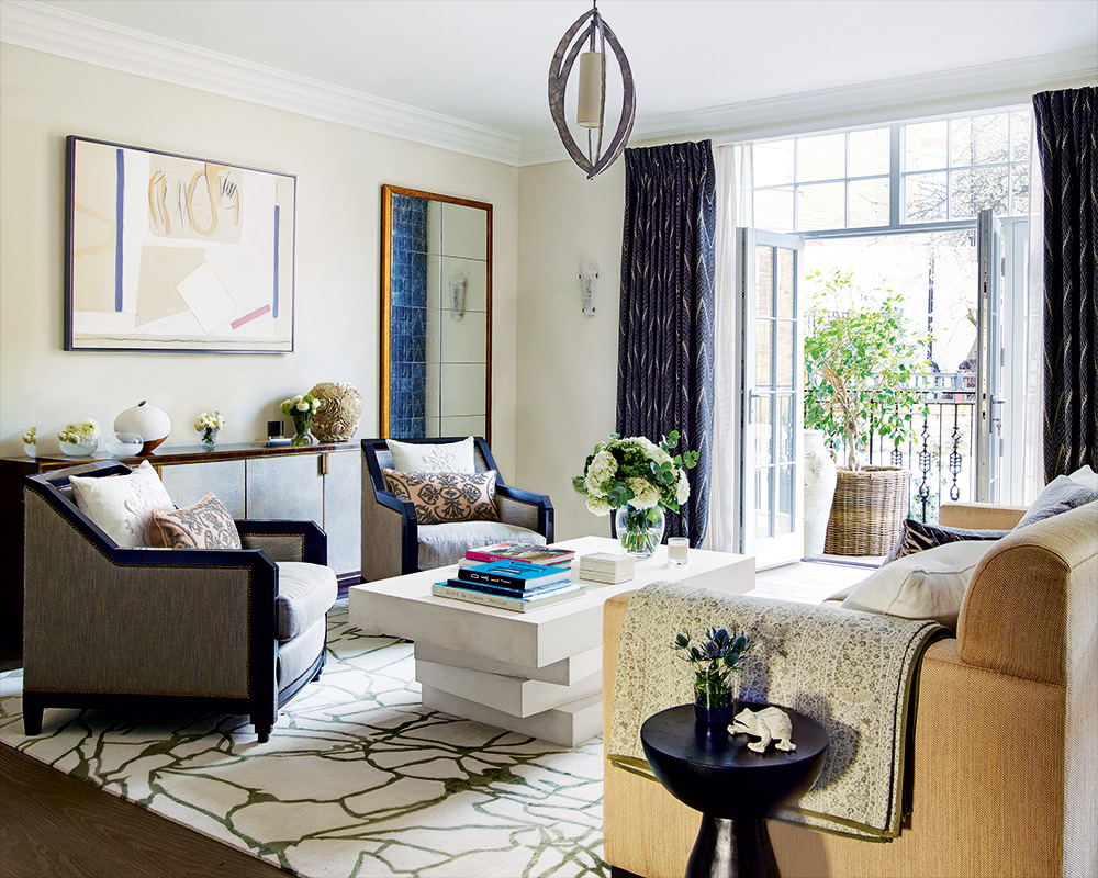
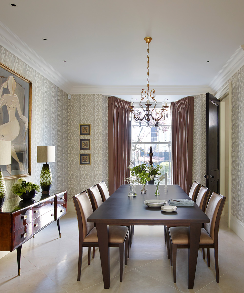
Striking pieces, from the eye-catching mid-century Italian walnut cabinet to the contemporary console table and decorative mirror, introduce a note of understated glamour.
Media room
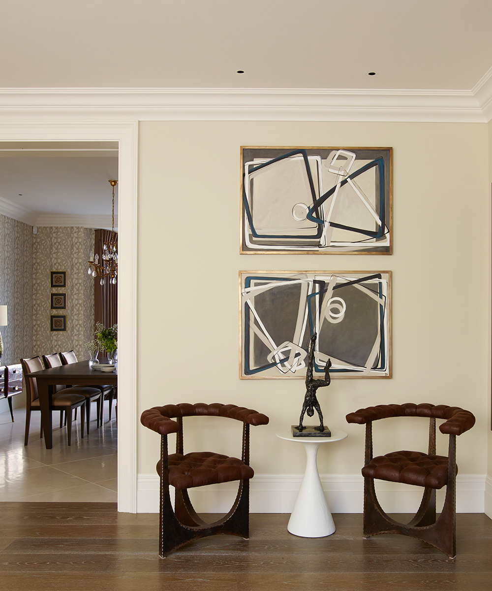
‘Mixing and matching styles of art and periods of furniture creates a sense of depth and makes a scheme look more organic,’ says interior designer Rebecca Hughes. ‘Bianca Smith's paintings are incredibly versatile as they are strong but also quite neutral.’
Sign up to the Homes & Gardens newsletter
Design expertise in your inbox – from inspiring decorating ideas and beautiful celebrity homes to practical gardening advice and shopping round-ups.
Stairwell
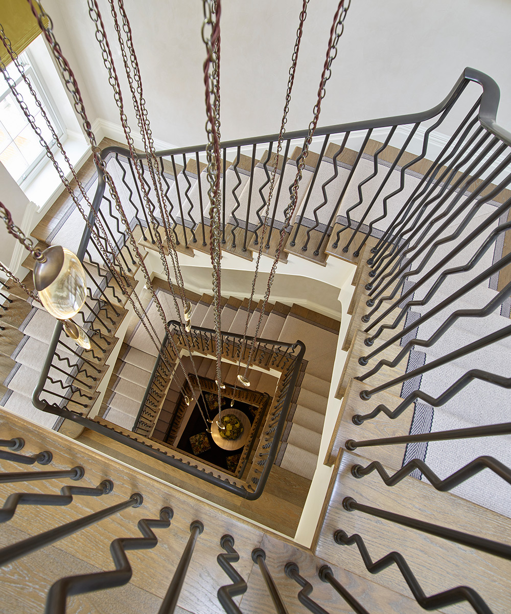
The interior designer worked with the homeowners to tailor the design of the 14 solid glass drop lights, which are suspended from a ceiling canopy by brass chains.
Kitchen
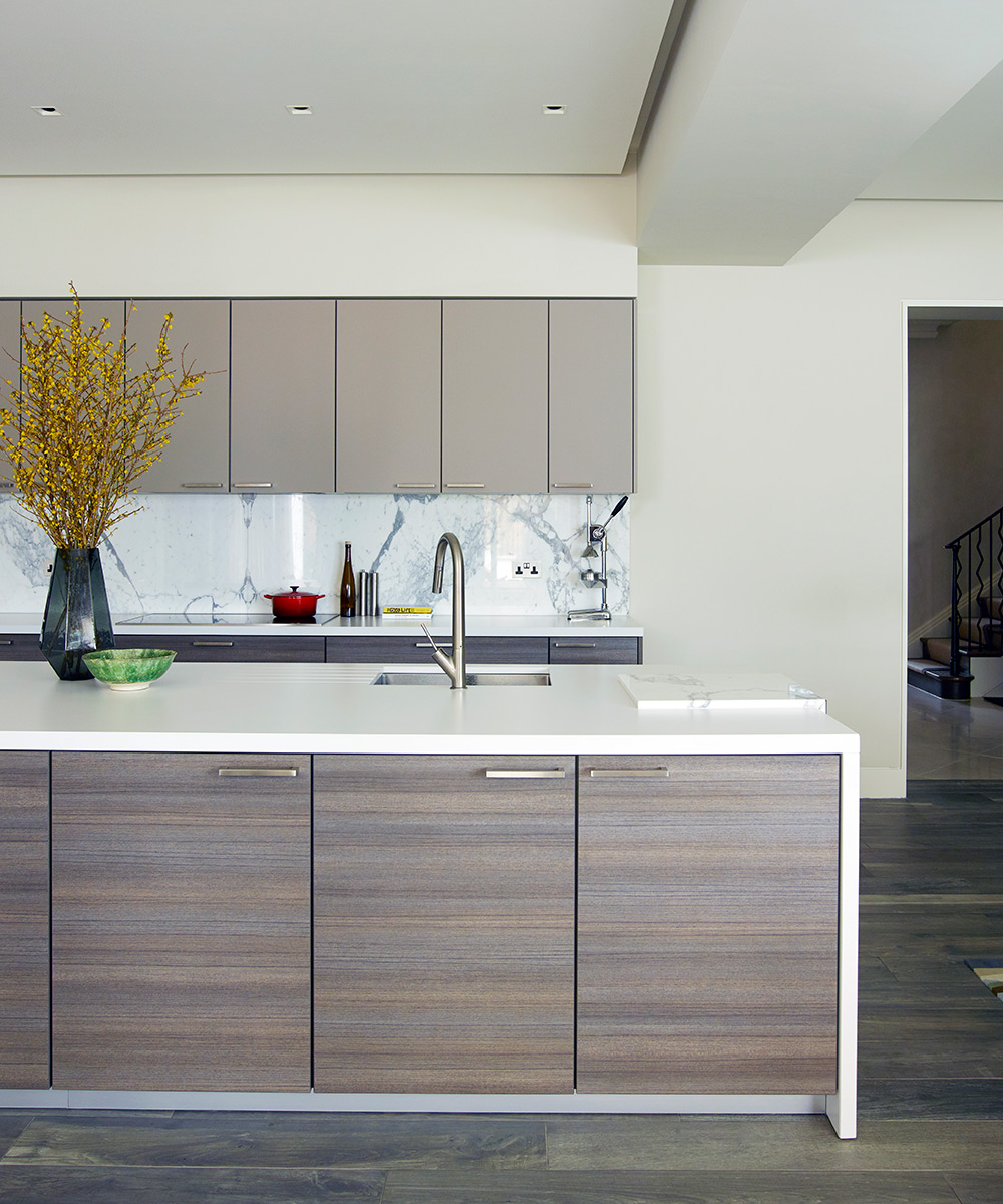
The designer opted for a minimalist look, where the irregular veining of the book-matched marble splashback provides a pleasing contrast to the linear style elsewhere.
Living area
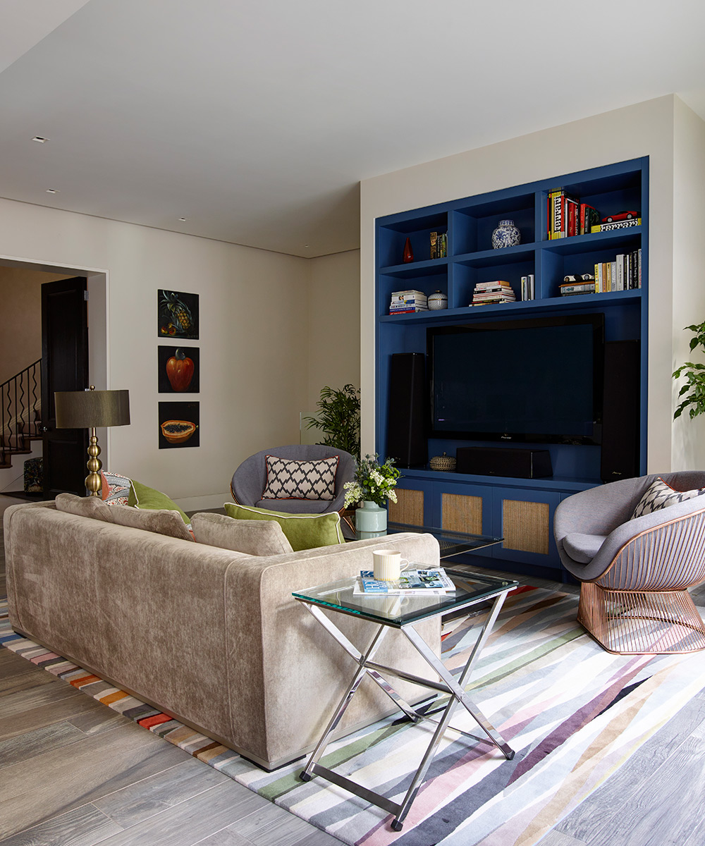
One end of the kitchen is home to a more relaxed space. ‘It needed a splash of color, so the designer suggested the Paul Smith rug,’ says the owner.

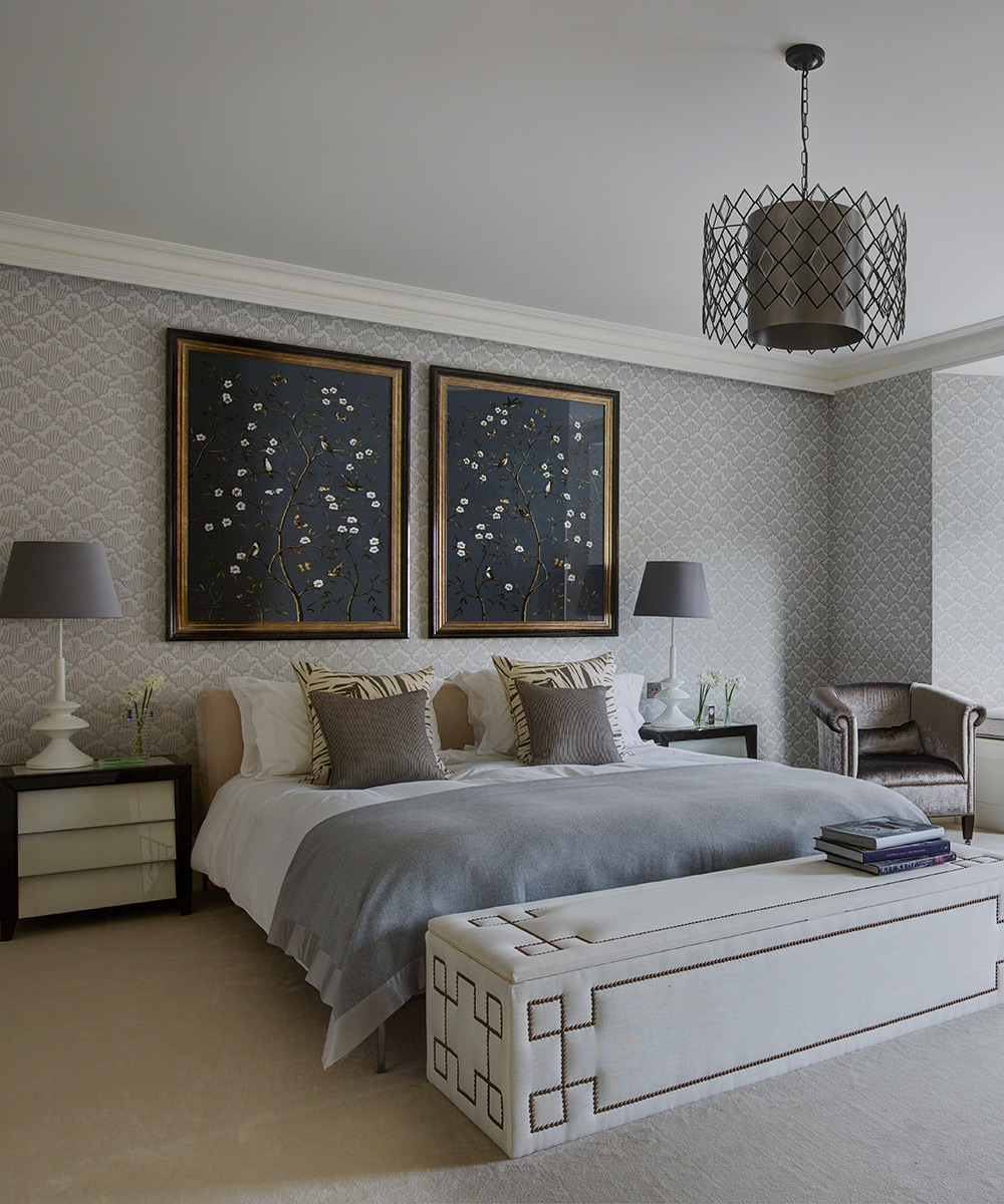
Main bedroom
Layering shades of grey and different textures has created a sense of calm and peace. However, as the interior designer explains, ‘It is important to introduce bolder elements, such as the distinctive pendant light, to bring definition.’
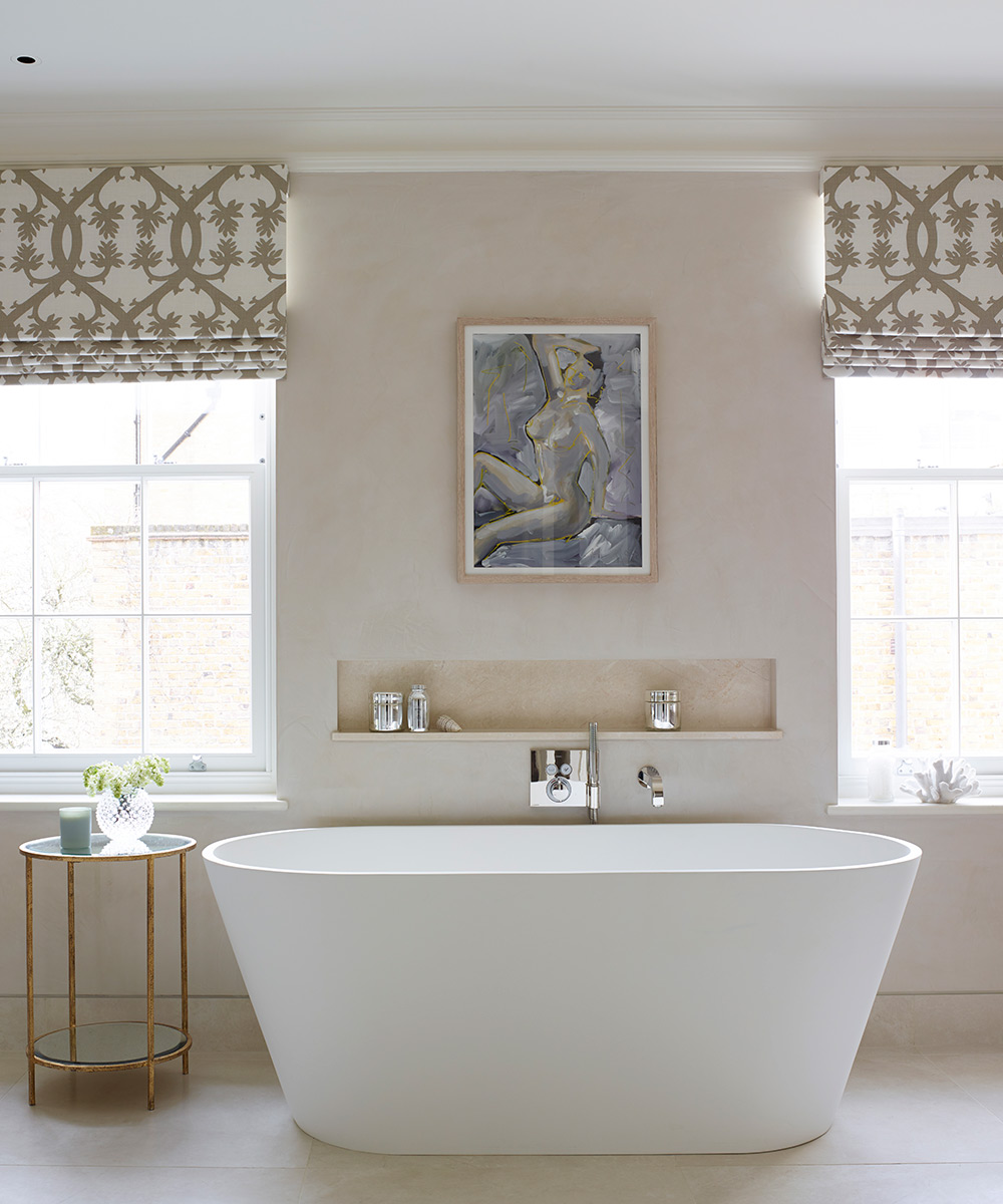
Main bathroom
‘I much prefer showers,’ says the owner, ‘so it was the architect who persuaded me to add the bath. ‘He was adamant that a main bathroom needs one because it provides a focal point for the room and future owners of the house might require it.’
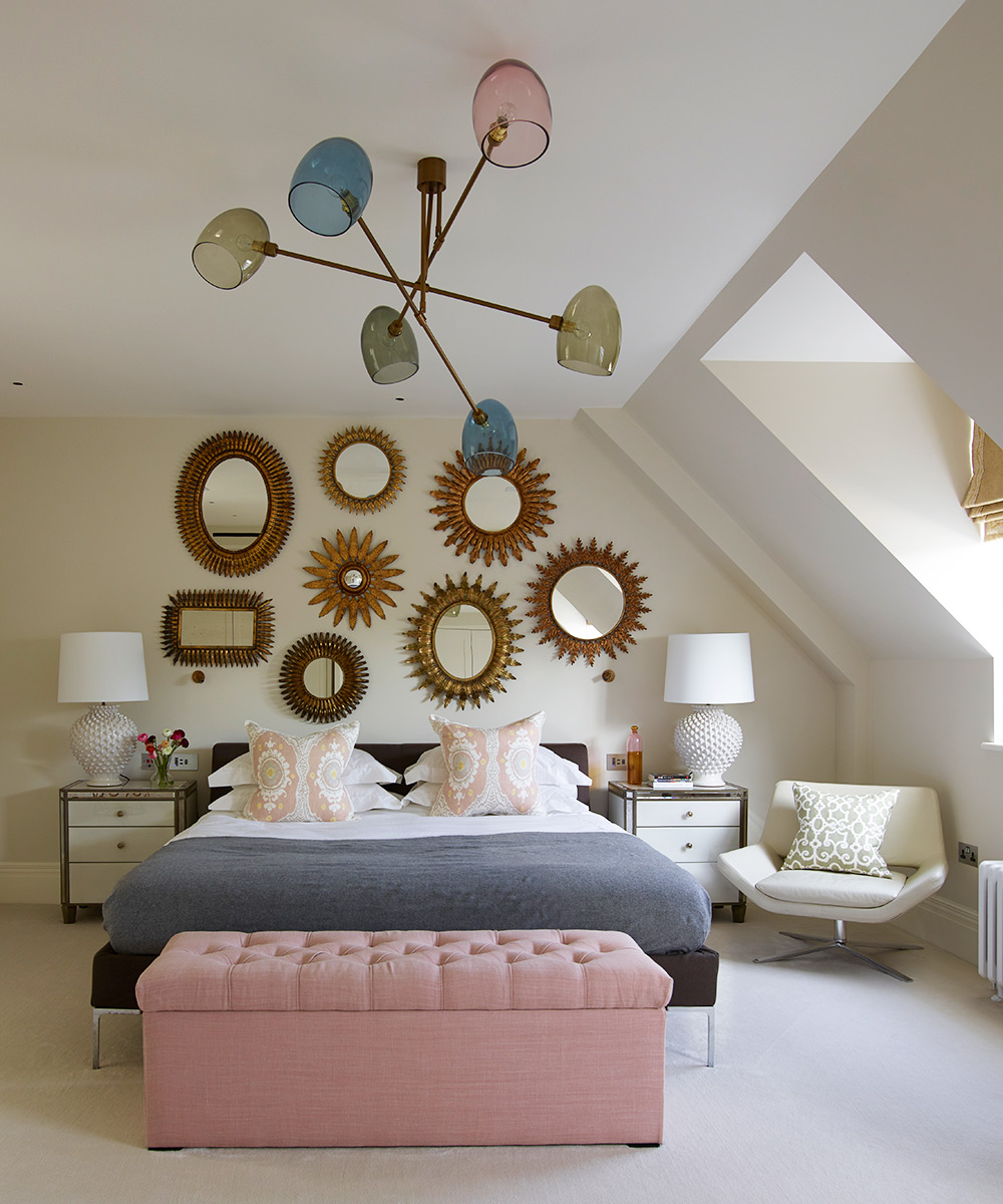
Guest bedroom
The mid-century-style ceiling light with glass shades in smoky hues was only possible to hang because of the room's amazing ceiling height. Adding interest to the far wall is a collection of antique Spanish mirrors. ‘I especially like them for their uneven forms – each one is different,’ says the designer.
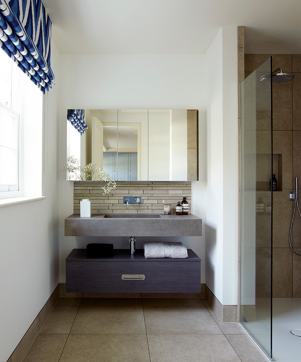
Son's bathroom
The homeowner chose the wall-hung vanity unit for its contemporary good looks and practical design, with handy shelving and shaver sockets hidden in the cabinetry.
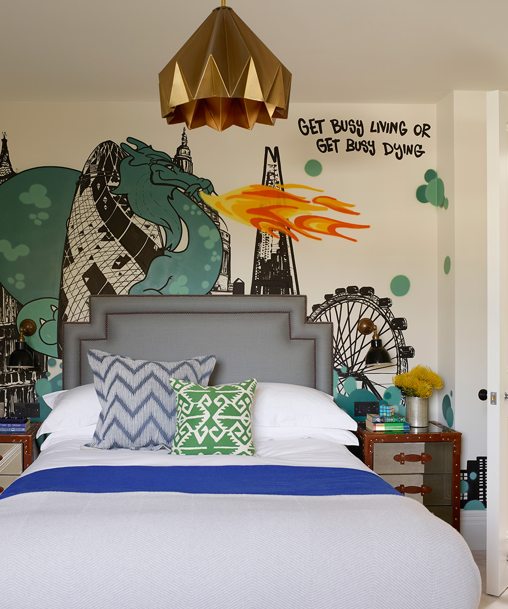
Son's bedroom
Eschewing wallpaper and plain paint, the designer suggested that a graffiti artist ‘tag’ the main wall with elements that particularly resonate with the couple's teenage son.
Photography/ Richard Powers

Jennifer is the Digital Editor at Homes & Gardens. Having worked in the interiors industry for several years in both the US and UK, spanning many publications, she now hones her digital prowess on the 'best interiors website' in the world. Multi-skilled, Jennifer has worked in PR and marketing and occasionally dabbles in the social media, commercial, and the e-commerce space. Over the years, she has written about every area of the home, from compiling houses designed by some of the best interior designers in the world to sourcing celebrity homes, reviewing appliances, and even writing a few news stories or two.
-
 Charred little gem with saffron dressing
This recipe with charred little gem is both easy to make and sure to impress guests. It's the perfect side for fresh spring menus
By Alice Hart
-
 Grilled asparagus with herb and pickled red onion
This grilled asparagus couldn't be easier, and it's a wonderful way to get the best flavor from our favorite spring veg. It's perfect alongside fish or lamb
By Alice Hart