Design house: A laid-back six-storey Georgian home in southwest London
This London-meets-Scandi-cool home is surprisingly practical, despite its pale tones and minimal canvas

Moving out while your home is being renovated is a great way to avoid the mess and stress, but moving to the South of France while the builders are in? That's the dream, isn't it? Well, that's exactly what the owners and their sons did –with fabulous results. 'We took a sabbatical as a family,' explains the owner. 'We realised this was a unique chance to have time together, and we'd always fancied a "year in Provence"!'
- Some of the world's best homes – beautiful properties from around the globe
The project was a tired, five-storey home in southwest London, which the couple planned to radically redesign, through a series of rear and side extensions, clever glazing and the addition of an extra floor in the basement. 'It was a major endeavour; not for the faint-hearted!' says the owner. 'They had to dig down six metres to create the basement. It was like an open-cast mine here!'
While many homeowners prefer to pop in daily on a job of this scale, the homeowners relished the hands-off approach. Being so far away from the site helped. In fact, compared to previous projects the pair had tackled, this was a breeze. 'We could fly back to Nice, get off the plane and it was all palm trees and sunshine!' says the owner, laughing.
The property
Once a tired, five-storey house in southwest London, this home had a radical redesign, through a series of rear and side extensions, clever glazing and the addition of an extra floor in the basement.
Architect Jo Cowen came on board to manage the project.To achieve an open, flowing space, herecommended the floors be levelled and to lose the returns and half-staircases typically found in properties of this age.Now the house is Tardis-like – its contemporary interior a glorious surprise hiding behind a period façade.
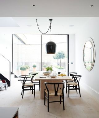
The levelling out made a massive difference to how it all looks. There isn’t an old bit at the front and a new bit at the back – the house is a whole.The dining table was made with the floor planks. The table top then flows in the same direction as the boards on the floor. creating a seamless effect.
Hallway
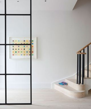
A Crittall partition separates what was formerly a dark hallway from the reception room, while allowing light to flood the space.
Dining room
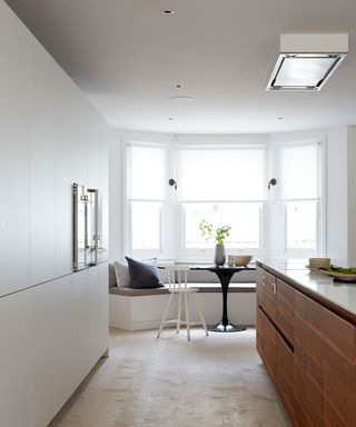
An informal dining nook is tucked into the bay window at the front, much used for family meals. The table is a bespoke creation made using an Eero Saarinen Tulip base.The staircase to the lower floors changes direction. Rather than following the pattern of the stairs on the upper floors, it travels towards the contemporary extension at the back.
Kitchen diner
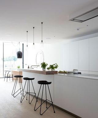
This home's flowing layout and light and uncluttered vibe make it a haven from busy city life. London shouts at the top of its voice all the time. Here, everything is softly spoken.
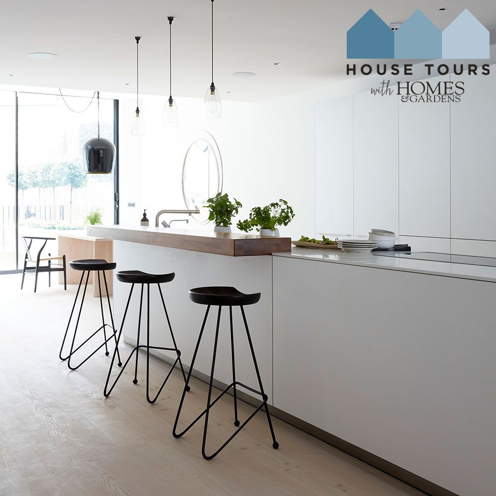
A beautifully sleek white kitchen stretches along the centre of the lower-ground floor. The island is 4.5m long – but it doesn’t really look it.
Reception room
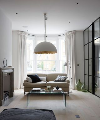
It isn’t the architecture alone that helps six storeys function as one flowing home. It’s the décor too.The pale wood flooring brings the whole space together.In addition, a monochrome palette forms the backdrop and a tactile mix of natural materials, including linen, sisal and marble, features throughout.
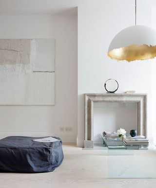
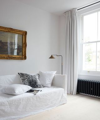
In the reception room, a classic sofa is teamed with a funky pendant and a sleek glass table. It makes sense to mix old with contemporary here.While this recipe may seem Scandi in flavour, it's seasoned with French finds.There’s a mix of contemporary and antique furniture too and lots of art. Yet behind the gorgeous look runs a stream of practicality.
The fireplace was custom-made from blue limestone in Turkey.
Study
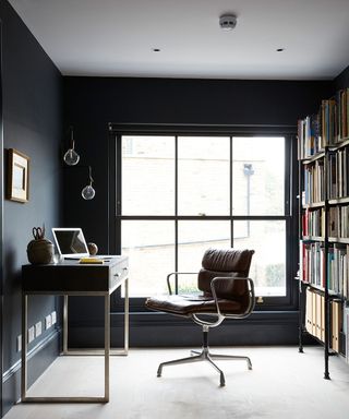
Raised up from the main reception room, the study is painted a striking black. It has a great bird’s-eye view of the reception room from up here.
Master bedroom
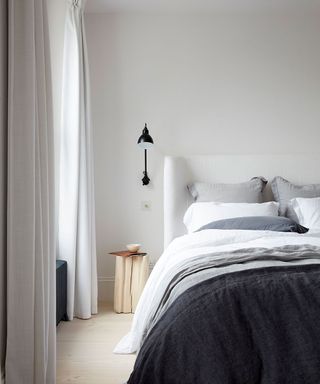
Natural materials are found throughout the house and, here, linen bedding and a rough timber bedside table reflect the look.The landscape is by the late Oliver Hall.
Dressing room
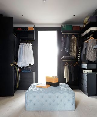
The bespoke dressing room and walk-in wardrobe is laid out so you can see all the clothes, rather than having everything stuffed in cupboards.
Master bathroom
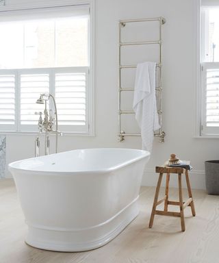
The bathroom is very large, making it instantly feel luxurious. There's also a TV is mounted into the wall near the bath (not seen), perfect for watching Netflix while having a long soak.
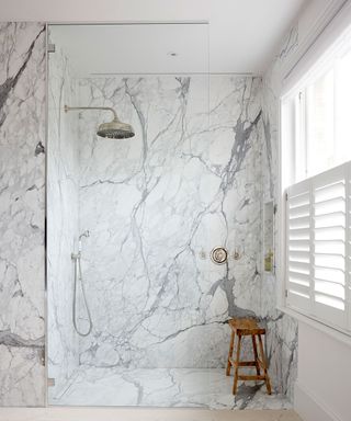
The generous walk-in shower is faced with Calacatta marble.
To see more of architect Jo Cowen’s portfolio, visit jocowendesign.com
Photography ⁄ Paul Massey
This home was part of our House Tours Event 10 & 11 October 2019, sponsored by Heals, Roger Oates, Thomas Sanderson and Yves Delorme.
Sign up to the Homes & Gardens newsletter
Design expertise in your inbox – from inspiring decorating ideas and beautiful celebrity homes to practical gardening advice and shopping round-ups.

Jennifer is the Digital Editor at Homes & Gardens. Having worked in the interiors industry for several years in both the US and UK, spanning many publications, she now hones her digital prowess on the 'best interiors website' in the world. Multi-skilled, Jennifer has worked in PR and marketing and occasionally dabbles in the social media, commercial, and the e-commerce space. Over the years, she has written about every area of the home, from compiling houses designed by some of the best interior designers in the world to sourcing celebrity homes, reviewing appliances, and even writing a few news stories or two.
-
 Reimagining this Texas farmhouse brought life and color to a tired scheme and highlighted the original 1930s charm
Explore a transitional farmhouse that effortlessly blends a traditional feel with the freshness of a modern color scheme
By Karen Darlow Published
-
 Now is the time to divide dahlia tubers that are planting ready – discover how to multiply your exquisite summer blooms for free, before it's too late
Multiply your dahlia collection for free with this step-by-step guide
By Holly Crossley Published