Design house: A relaxed beachside retreat in Sussex, designed by Sophie Ashby
Having been reconfigured by designer Sophie Ashby, this Sussex beachside retreat is lighter, more open and, most important, now feels connected to its seaside setting
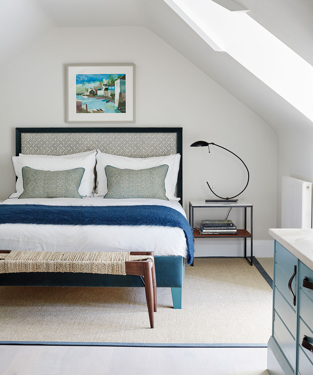

It would be easy to miss this beachside house. It is a low, white slab Thirties cottage set modestly at the end of a meandering track. The interior too, won't make you stop and stare. But that's precisely the point of this seaside home which, thanks to a skilful overhaul by Sophie Ashby, of Studio Ashby, feels as calm as a schooner on a millpond-smooth sea; an inviting, maritime retreat of azure, indigo and cerulean blues where deep sofas beckon and light floods through wide windows.
See: more inspiring house tours in our Spaces section
- See some of the world's best homes – beautiful properties from around the globe

The property
Lured by the beachfront location, the homeowner, who was 'brought up on boats; bought the former gardener's cottage in 1990. 'Since then, I've extended it as funds allowed, in a piecemeal fashion. But the way we live has changed,’ says the homeowner, who runs an investment fund. 'This is a very sociable house and I wanted more open spaces, so it was time for a major reconfiguration.’
At which point the owner turned to Sophie. The pair have collaborated before after he spotted her work in a London showhome, and they have formed an empathetic partnership. 'Sophie quickly understood my style; we're on the same wavelength,’ he says.
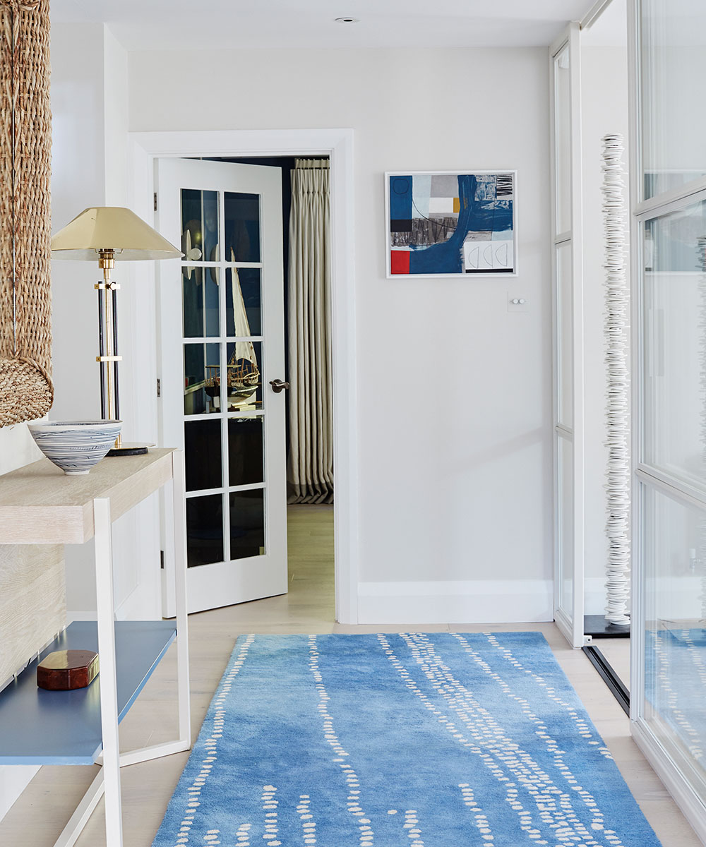
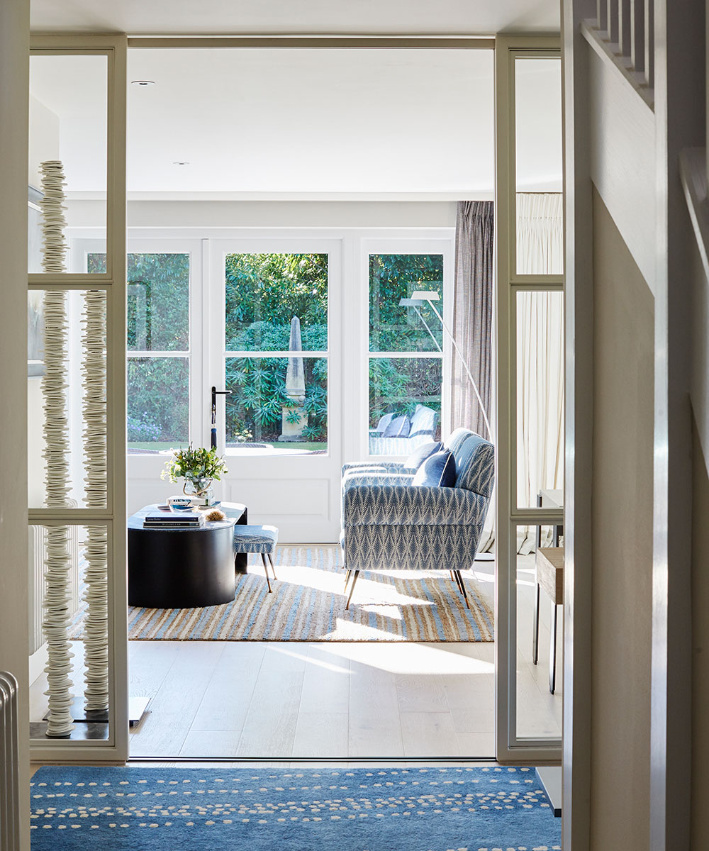
Armed with tape measure and notebook, Sophie strode in and immediately spotted the property's key flaw: 'Instead of looking onto the gardens, the focal point of the living room was the fireplace,’ she says. That early discussion led to a raft of changes that have transformed the two-storey interior from a series of smaller introverted rooms into a flowing space. The changes are most apparent downstairs where a bathroom was jettisoned to create the wide, welcoming hallway. Instead of solid walls, glazed screens have brought light to the living areas and new windows open on to the half-moon shaped lawn: 'The house now feels connected to the outside,’ says the owner.
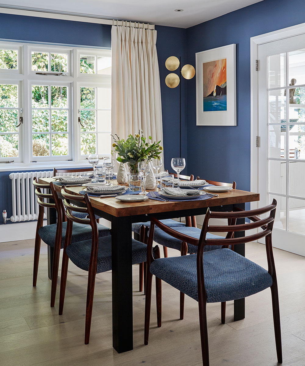
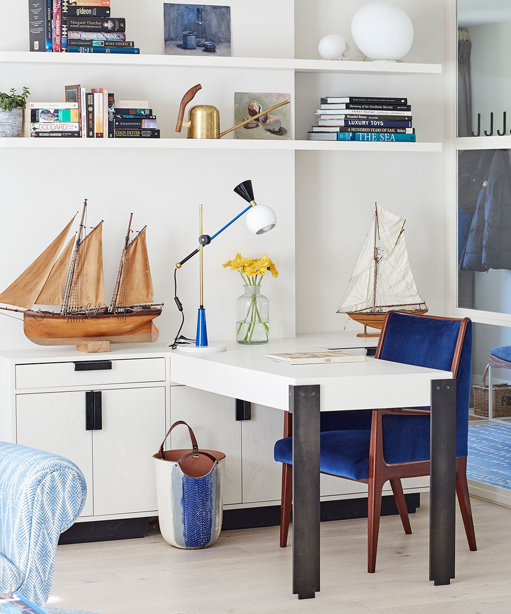
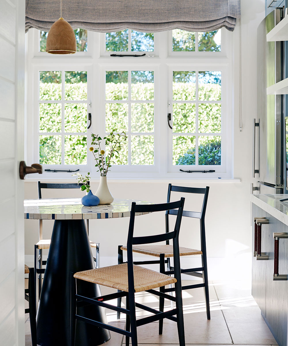
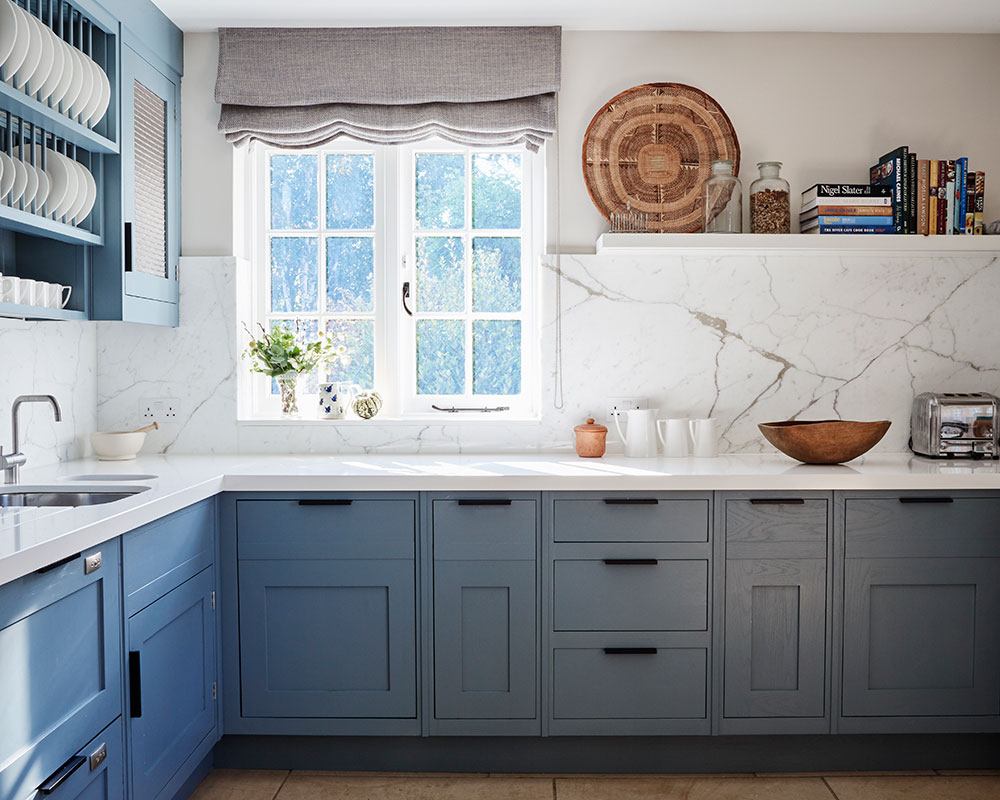
Another part of Sophie's brief was, she says, to make the Sussex house 'more considered and inviting'. Now you can drift, Martini in hand, from living room to informal dining room where open shelving, bright with glass and ceramics, creates a vivid division between spaces. In the kitchen, where the cabinetry was updated in soft blues offset by a marble splashback, a sociably round table, studded with Jesmonite, is positioned for views of the garden. Even the desk, once squirrelled away in a separate room, has joined the convivial throng in a mini office, framed by asymmetrical shelving, in a corner of the living room.
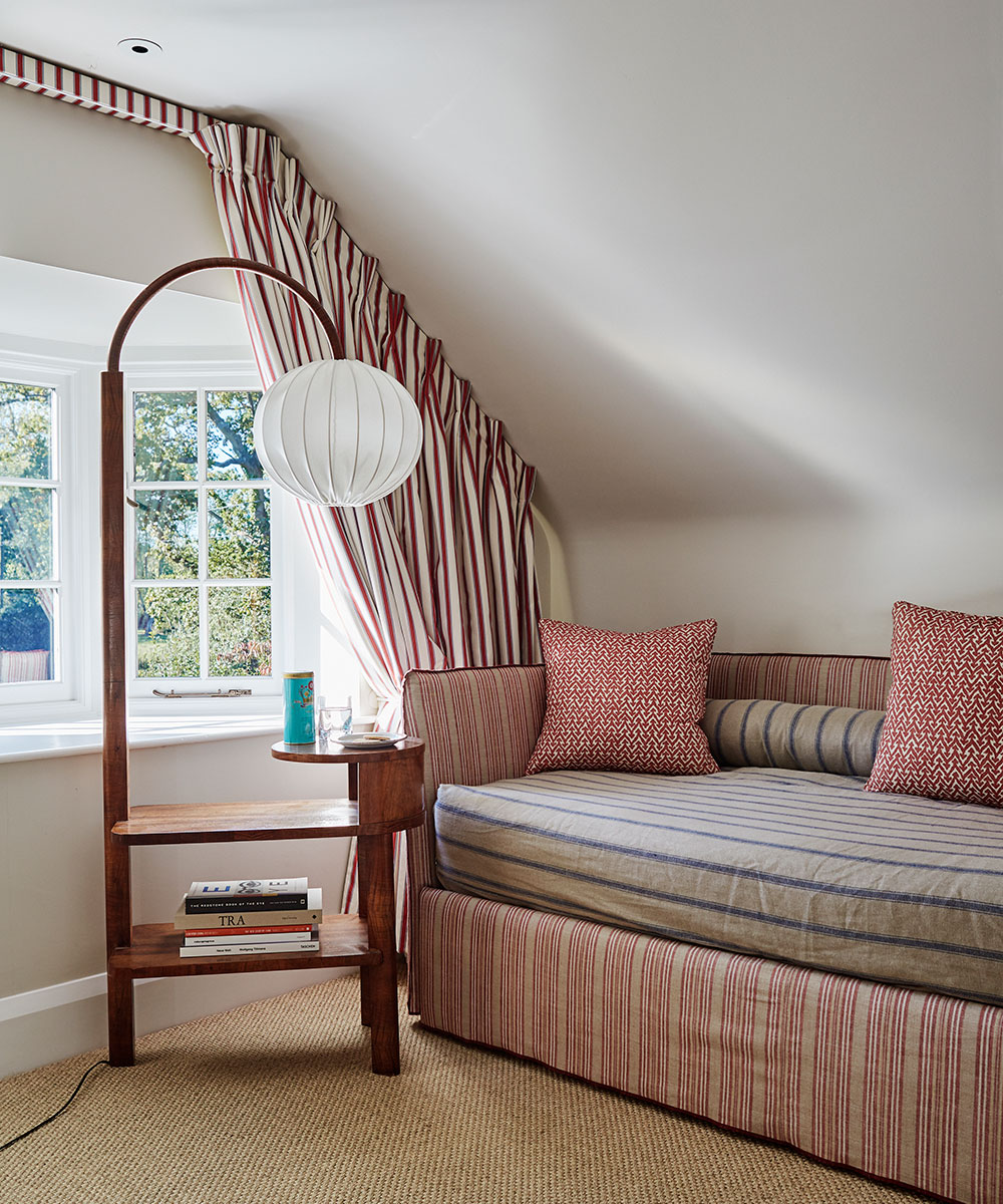
Re-jigging the floorplan also provided an excuse to reassess furniture and furnishings. 'It was a chance to create a fresh, contemporary look mixed with antiques,’ says Sophie. Now a sprinkling of saleroom finds reside with bespoke pieces, like the Perspex console, a sandwich of Yves Klein blues, or a shapely coffee table; fluid designs that don't detract from the lightness of the rooms. 'This house has always been a refuge but I enjoy it even more now: I've fallen back in love with my home,’ says the homeowner.
Sign up to the Homes & Gardens newsletter
Design expertise in your inbox – from inspiring decorating ideas and beautiful celebrity homes to practical gardening advice and shopping round-ups.
Living room
New glass screens have helped to open up the ground floor space and allow for views through to the garden.
See: A harmonious Georgian retreat in Norfolk
Home office
The study was integrated into the living room, reflecting the convivial feel of the house.
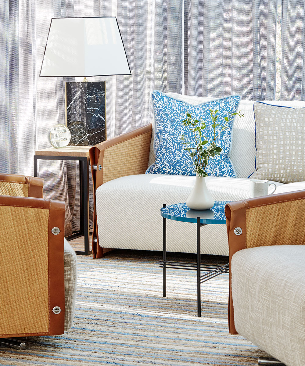
Sun room
Previously a conservatory, this area now flows into the rest of the living space.
See: A sophisticated, modern country barn in the Cotswolds
Dining room
Custom shelving with integrated LED lighting punctuates this reconfigured space.
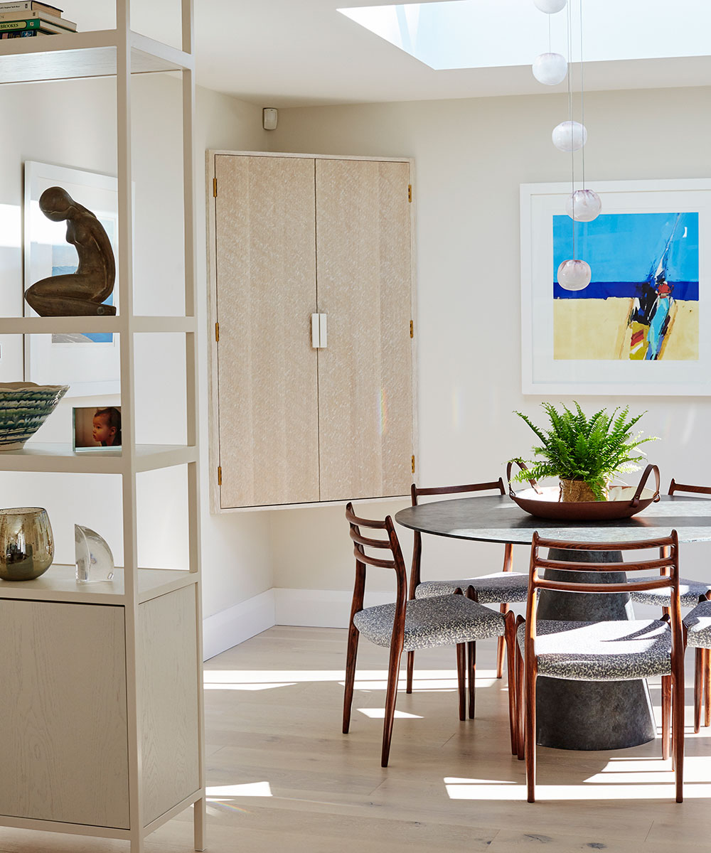
Breakfast area
A new table, made from resin and inlaid with Jesmonite, was designed to suit the space and contrast with the other bespoke tables.
Kitchen
Existing joinery was repainted to echo the marine blue palette of the rest of the house.
Cloakroom
On the ground floor, a bathroom was removed to allow for a large hallway, as well as this compact space.

Guest bedroom
Built-in joinery has been updated in new colors and overhead lighting swapped for the gentler glow of low-level lamps.

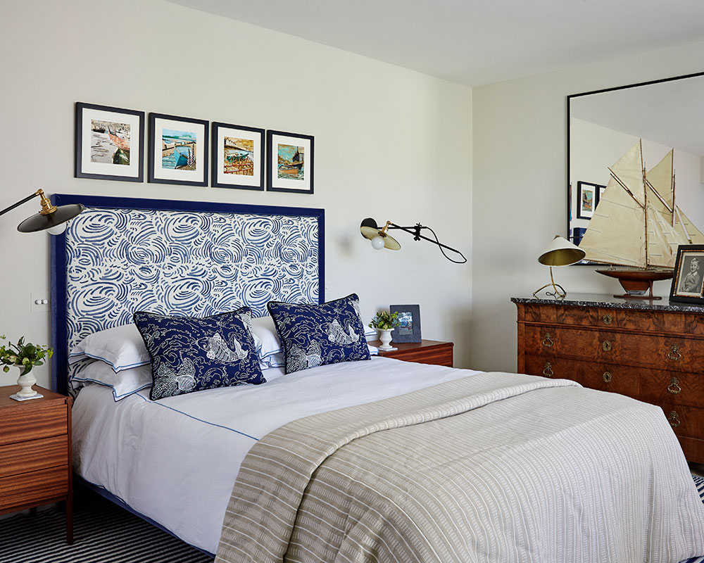
Mater bedroom
Favourite maritime paintings inspired the cohesive color scheme of the room, which overlooks the garden.
Photography/ Brent Darby

Jennifer is the Digital Editor at Homes & Gardens. Having worked in the interiors industry for several years in both the US and UK, spanning many publications, she now hones her digital prowess on the 'best interiors website' in the world. Multi-skilled, Jennifer has worked in PR and marketing and occasionally dabbles in the social media, commercial, and the e-commerce space. Over the years, she has written about every area of the home, from compiling houses designed by some of the best interior designers in the world to sourcing celebrity homes, reviewing appliances, and even writing a few news stories or two.
-
 These are the 6 must-have colors to decorate with in April 2025
What do retro-inspired yellows and beautiful blues all have in common? They're on our hot list for the season ahead
By Sophia Pouget de St Victor Published
-
 Plants never to grow next to fruit trees
Expert advice on which plants to keep away from fruit trees to encourage a healthy harvest
By Jacky Parker Published