Design house: A perfectly peaceful mid-Victorian terrace in London
A carefully composed paint palette and sophisticated decorative details have given this London home the sense of harmonious calm its young owners desired

Design expertise in your inbox – from inspiring decorating ideas and beautiful celebrity homes to practical gardening advice and shopping round-ups.
You are now subscribed
Your newsletter sign-up was successful
Want to add more newsletters?
For the owners of this home, moving house was a matter of practicality. ‘With three children, the house we had bought when we first married had begun to feel too small,’ they explain. But with schools and family nearby, the couple did not want to go far, so they began looking for a suitably sized property in the same area of London, hoping to find something they could turn into an elegant family home.
See: our Spaces section for more inspiring house tours
‘We viewed thirteen houses; this was the thirteenth,’ say the owners. The mid-Victorian, white-stuccoed terraced property had been owned for 30 years by a couple whose children had grown up and moved away, so they wanted to rent or sell the house. ‘Everything was being decorated white to make it more marketable, but in spite of this it had a lovely feel and the space that we needed.’
Article continues below- See some of the world's best homes – beautiful properties from around the globe
The property
Knowing that they wanted to put their own mark on the property, the couple asked the owners to put a stop to the works. They then sought the advice of their trusted interior designer, Georgina Scott.
‘One of the things we find difficult is paint,’ say the owners. ‘You try a little on the wall and think “That looks fine” and then, of course, it isn’t when applied to a larger area.’ They asked Georgina to devise a color scheme for the house. ‘We wanted a calm blend of greys and blues to make the most of the abundant natural light,’ they said.
‘The palette is quite tight, to give a feeling of flow and cohesion,’ says Georgina. ‘As the house is tall and thin, it was essential to pull everything together, to make all the floors look consistent.’
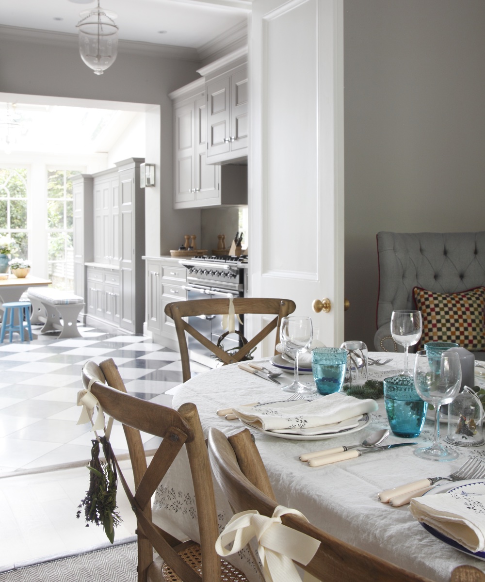
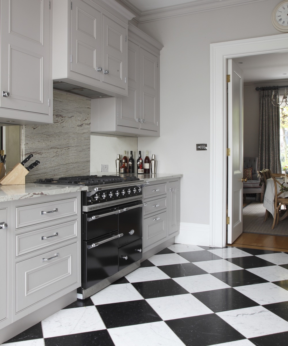
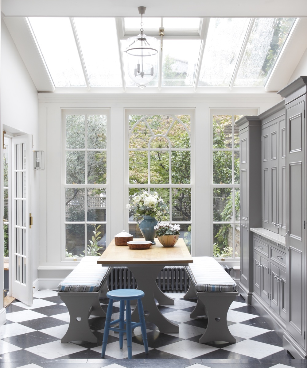
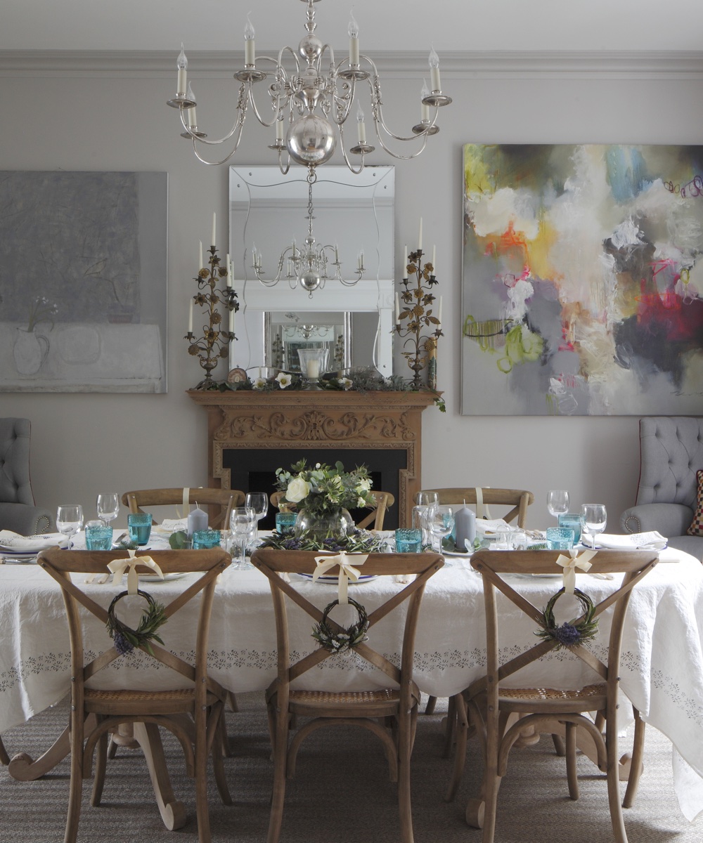
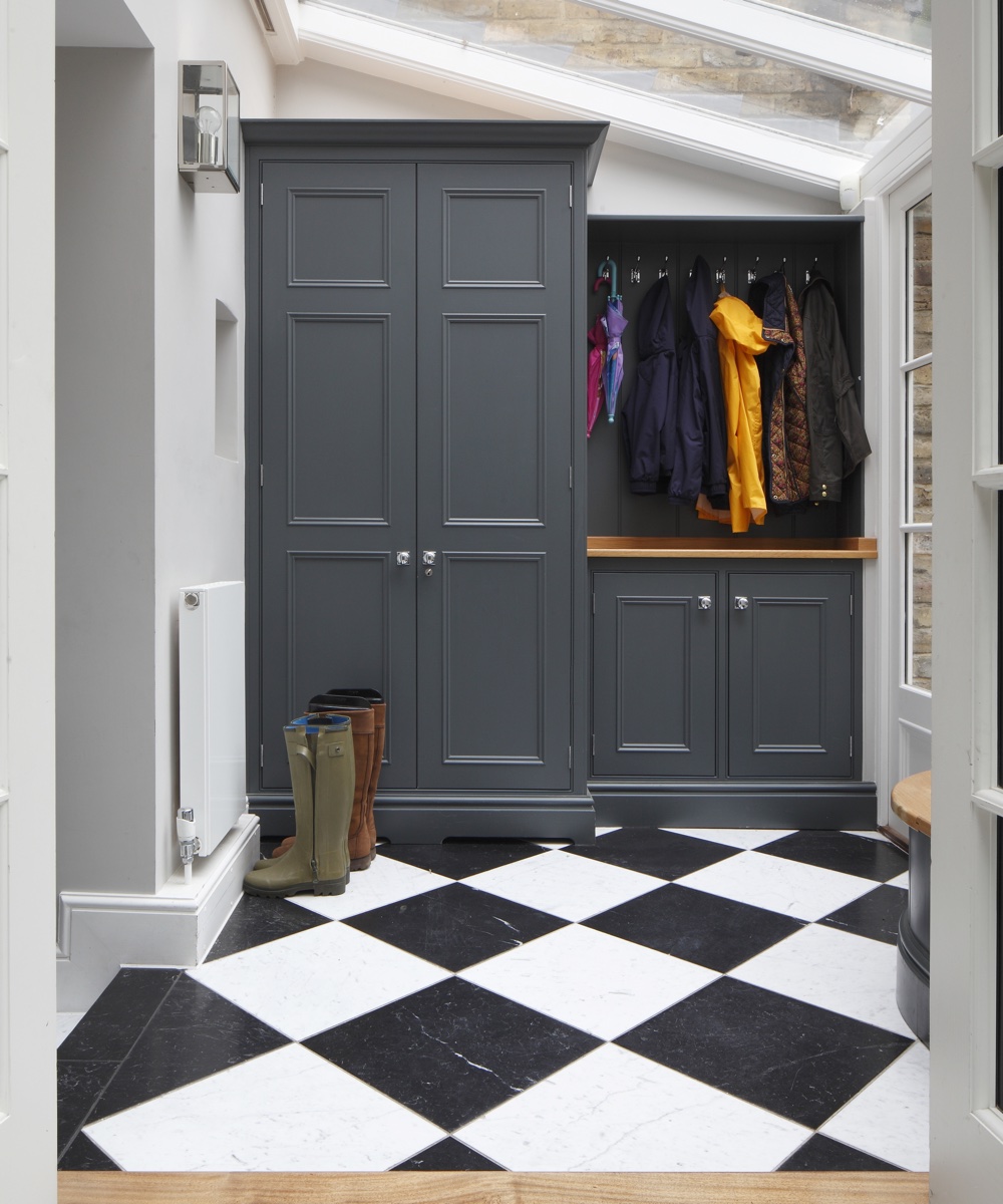
It was the owners' idea to have a black-and-white floor in the kitchen. ‘We saw something similar in one of those free property magazines that are always coming through the door, and we thought it looked amazing.' The owners also chose the dining table and chairs. ‘Upholstered chairs would have been lovely, but they’re not practical with three children. Maybe later though.’
Design expertise in your inbox – from inspiring decorating ideas and beautiful celebrity homes to practical gardening advice and shopping round-ups.
Kitchen
‘This house called for a tailored, glamorous look,’ says the owner, who opted for mirrored splashbacks for a light, spacious feel.
Conservatory
The conservatory was rebuilt to be more in keeping with the style of the property.
Dining room
The same paint has been used here and in the kitchen, so the two rooms sit comfortably together when the double doors are open.
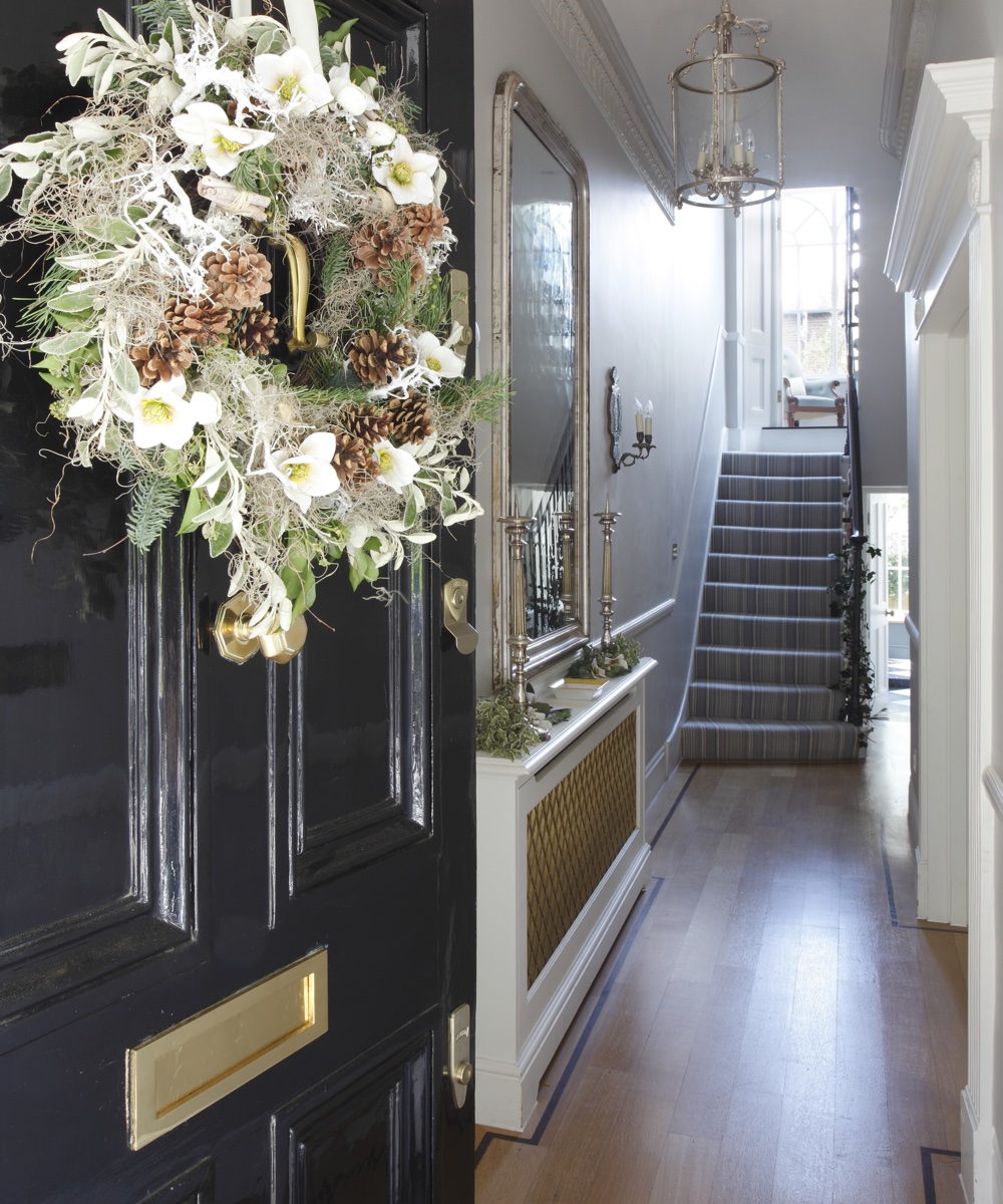
Entrance hall
The striped carpet on the stairs makes an appearance on each floor, a unifying thread through the house.
Boot room
The fitted cabinets by Lewis Alderson & Co were designed to complement those in the kitchen.
Drawing room
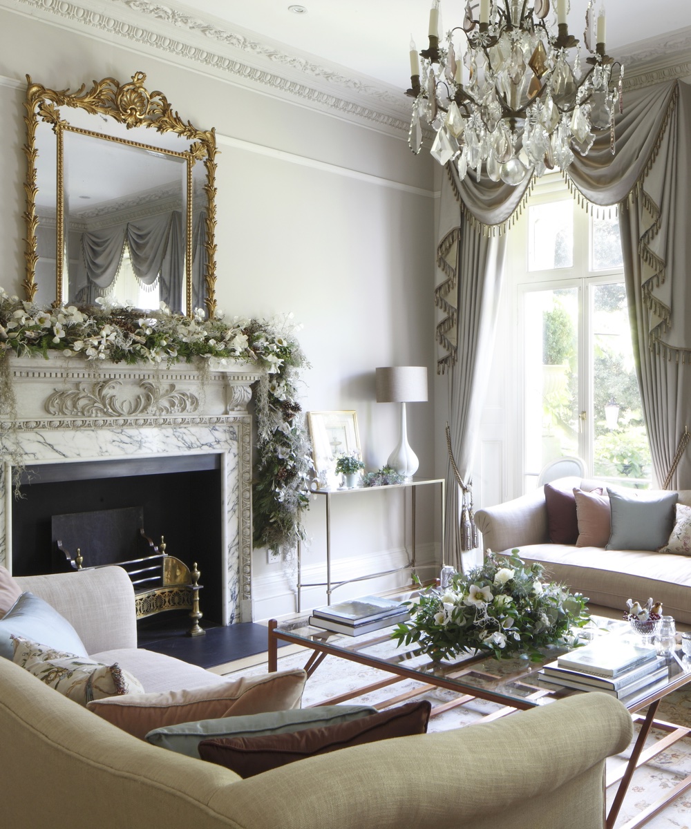
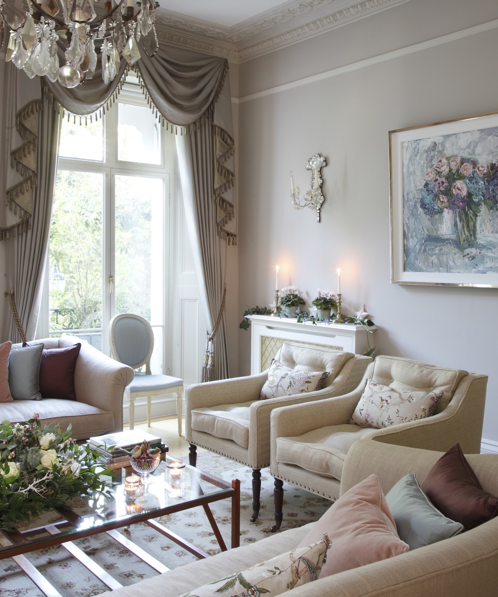
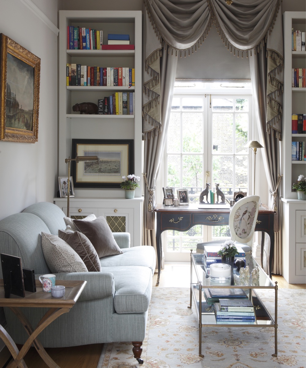
‘When we moved in, the house had horrible fireplaces that were obviously not original,’ said the owners. These have now been replaced with antique designs from Matthew Upham, who also supplied many of the lights and mirrors around the house. ‘We weren't entirely sure about the idea of dressing the windows with swags and tails, but it proved to be a very good solution. As well as framing the fine windows, the silk fabric lends a lovely touch of opulence.’

Library
To create a pleasing sense of continuity, the window of this first-floor space has been dressed in the same manner as the adjacent drawing room.
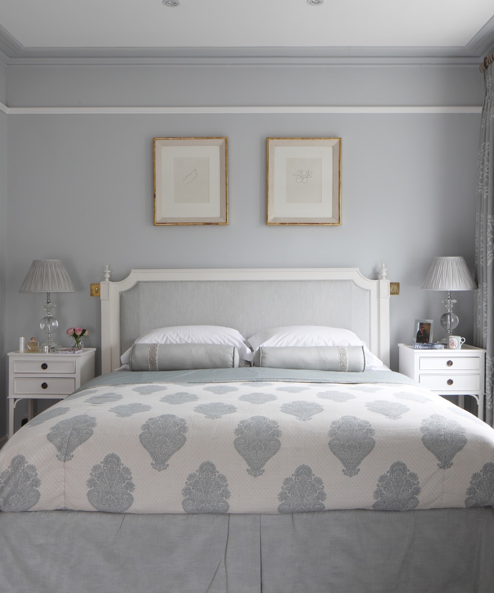
Main beroom
The large-scale paisley motif on the bedspread adds interest without compromising the restful atmosphere.
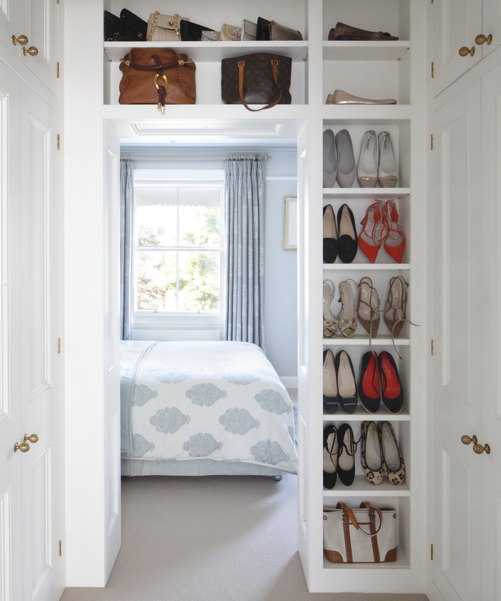
Dressing room
Floor-to-ceiling storage keeps this room between the main bedroom and bathroom organised.
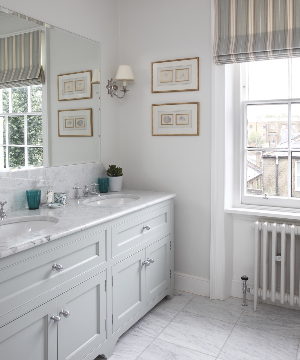
Main bathroom
A marble vanity top lends understated luxury to this refined scheme.
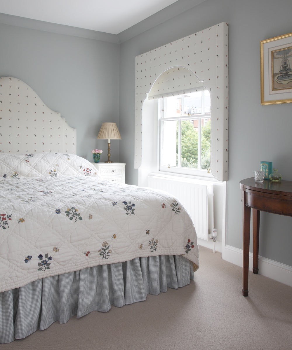
Guest bedroom
A window treatment in the same delicate sprigged fabric as the headboard makes a strong focal point.
Photography/James Balston

Ruth Doherty is an experienced digital writer and editor specializing in interiors, travel and lifestyle. With 20 years of writing for national sites under her belt, she’s worked for the likes of Livingetc.com, Standard, Ideal Home, Stylist and Marie Claire as well as Homes & Gardens.