Design house: A new-build family home rich with meaning
Colours inspired by their honeymoon and accessories given as anniversary gifts have enabled the owners of this rooftop apartment to create a family home filled with personality
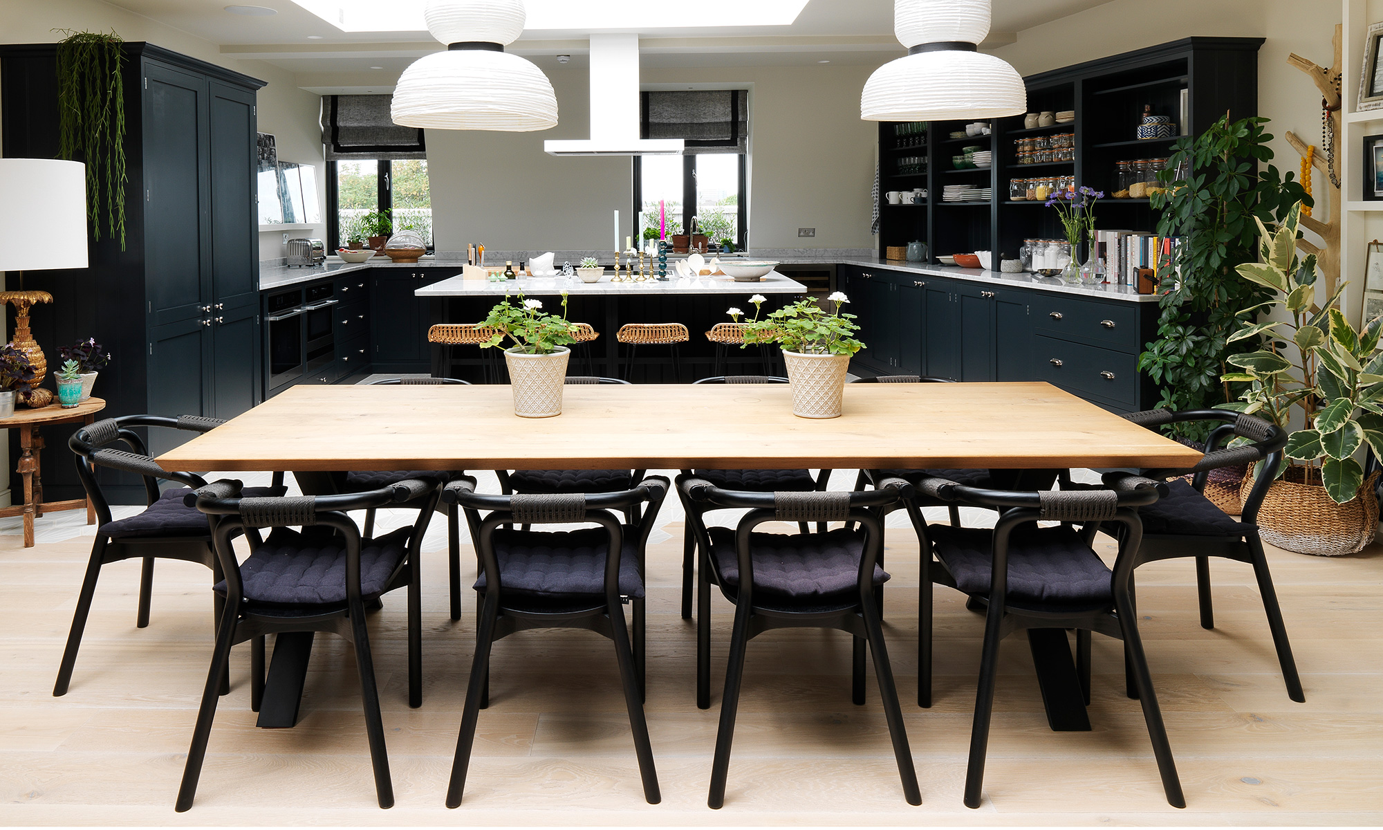

There is much to be said for being in the right place at the right time, as the owners discovered several months into a frustrating property search. They were seeking a 'quirky fixer-upper' when they happened to stumble upon a new development in west London. The partition walls had already been put in but a series of serendipitous delayed allowed the owner, who is an interior designer, to swoop in and work alongside the developers in order to tailor the property to their exact requirements. The glorious light-filled penthouse that the couple now share with their 10-month-old son, is full of personality thanks to the creative use of colour, texture and family collectables.
- See more: World's best homes – our page dedicated to fabulous properties
Experimentation is a recurring theme in the apartment. Within the parameters of their chosen palette, tantalising layers of pattern and texture have been used to provide stimulation and surprise. 'It's not an enormous apartment and too much colour would have been overpowering,’ she says. 'Instead, I opted for a visually laden but tonally consistent look.'
When it came to selecting a colour palette, the owner was inspired by the natural finishes in her home. 'The shade for the walls in the open-plan space comes from the sandy tones of the wood, black door frames from steel, and whites and greys from the marble worktops. It's an organic relationship,’ she says.
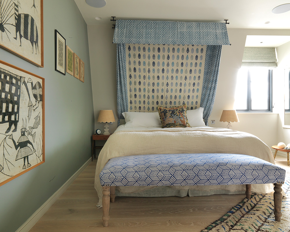
Navy kitchen cabinetry and the steel-blue hue in the entrance hall were chosen to evoke twilight tones, while the grey-green shade in the main bedroom is reminiscent of olive groves in Provence, where the couple got married. Association and meaning, be it in her choice of colours, objects or artworks, lie at the heart of the owners decorative scheme for her family home, giving it a personal style that can evolve comfortably over time.
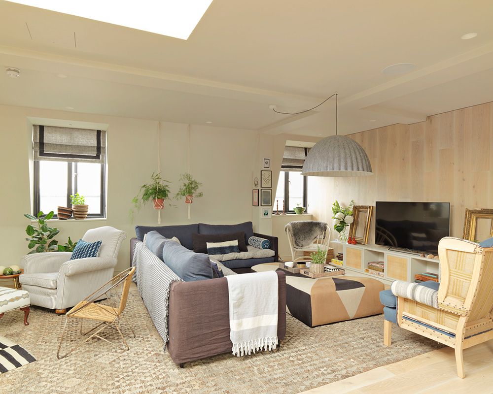
Media Room
The homeowner has used this eye-catching and noise-absorbing felt pendant light to help limit sound from the television on the rest of the room and to give this area a distinctive focal point.
Study area
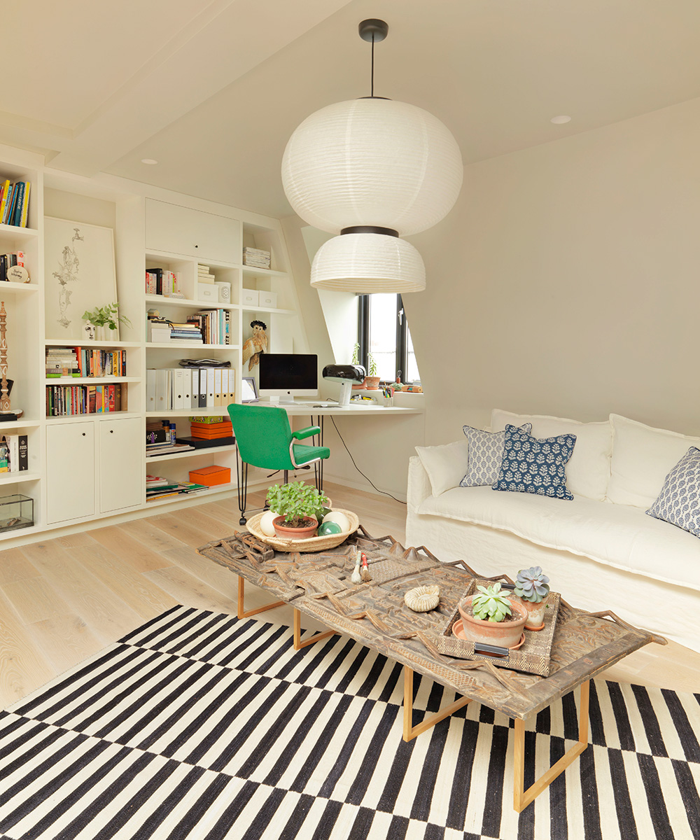
The large proportions of the main living space appealed to the sociable couple, but working out how to use it meaningfully posed a challenge. ‘We wanted an office area, more than one place in which to eat and somewhere to curl up and watch a film, so zoning was the natural solution,’ explains the owner. The objects we collect tell a story,’ she says, who bought the Dogon tribe door coffee table at auction and the green office chair from eBay.
Kitchen
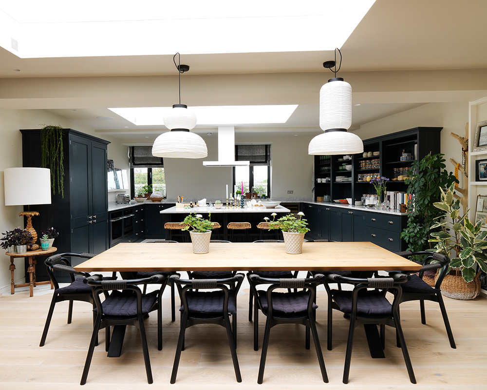
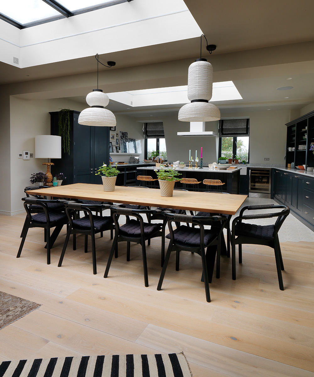
A bespoke deVol kitchen, which has become the foodie couple's culinary playground, was the starting point for the scheme, with a dining area close by to encourage convivial conversation with guests.
Sign up to the Homes & Gardens newsletter
Design expertise in your inbox – from inspiring decorating ideas and beautiful celebrity homes to practical gardening advice and shopping round-ups.
The rest of the space has been thoughtfully arranged into areas that reflect the various aspects of the couple's lives, with a number of carefully chosen and positioned accessories helping to bring the entire space together. The triptych of sculptural Jaime Rayon pendants in contrasting shapes is a focus not just for the dining table, which is positioned below two of them, but for the whole room, while bespoke cabinetry, which spans an entire wall, acts as an anchor for all the different elements.
In the kitchen area, hexagonal floor tiles have been painstakingly integrated with limed oak floorboards. The timber flooring continues up the wall in the media area and this unexpected use of the material further focuses attention on its natural beauty.
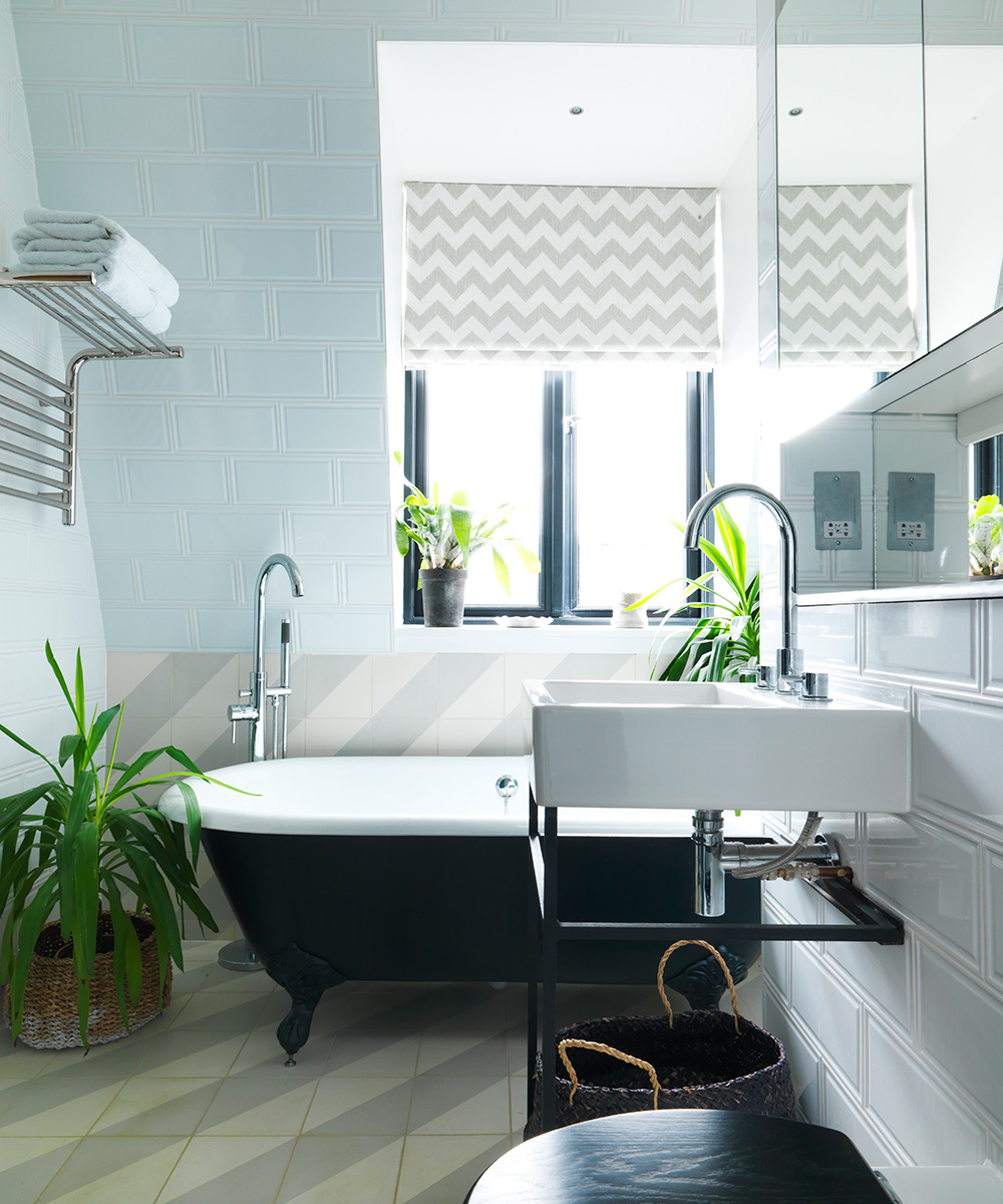
This creative approach is repeated in the bathroom, where striped tiles on the floor have been taken up the wall behind the bath to collide with polished brick-style tiles in crisp white. ‘We perceive things differently when they are on an unexpected plane,’ says the owner. 'Playing with how we experience something gives it an entirely new identity.’
Kitchen dining room
Large skylights and a collection of verdant houseplants give this space a conservatory-like feel. Limed oak flooring was chosen to complement the abundance of natural light. 'Its almond tones provide a pleasing contrast to the monochromatic hues,’ says the homeowner. The bespoke cabinetry helps to unify the open-plan living area, while neatly concealing two air-conditioning units.
Entrance hall
The screen-printed rug on the wall was an anniversary gift from her husband.

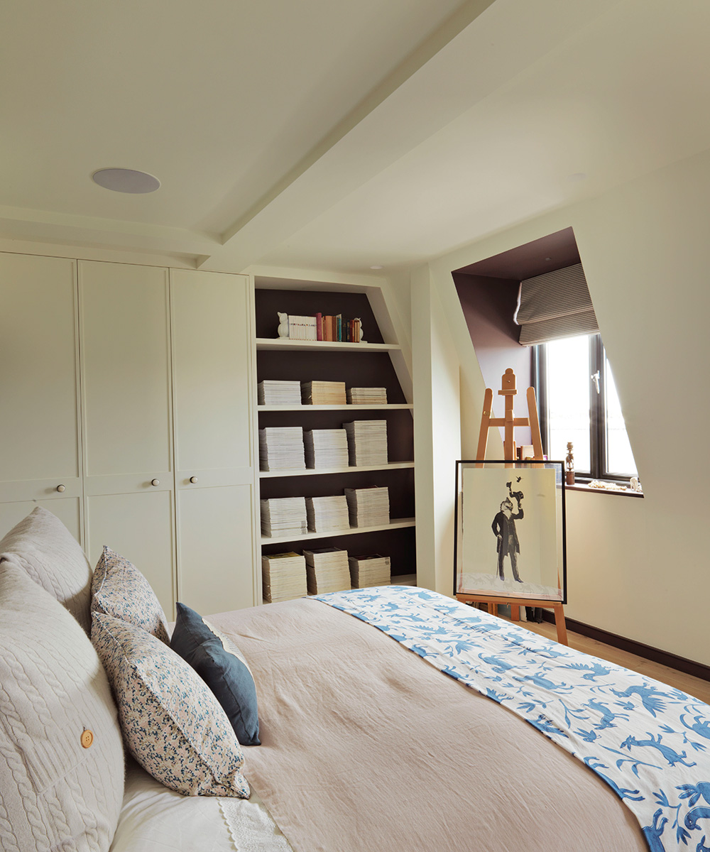
Guest bedroom
Architectural details are painted in contrasting shades for emphasis.
Main bathroom
'I liked the idea of referencing the striped floor tiles in the chevron patterned blinds,’ says the owner.
Nursery
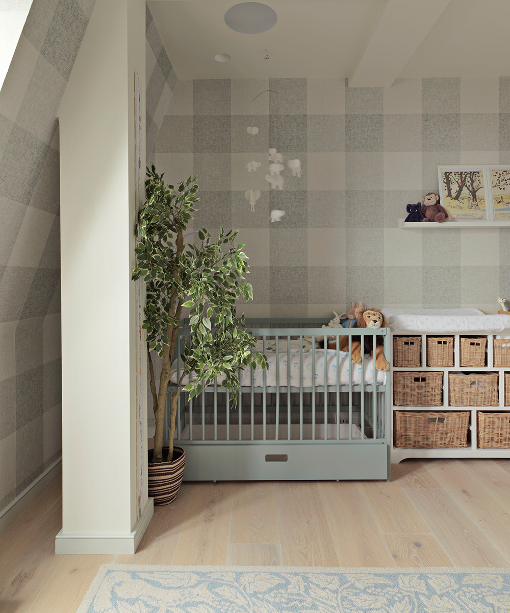
The owner chose a bold checked wallpaper to decorate her child's bedroom.
Dressing room
The door panels of the built-in wardrobes have been inlaid with cane as a nod to her love of classical furnishings. It also adds warmth and textural complexity to the space.
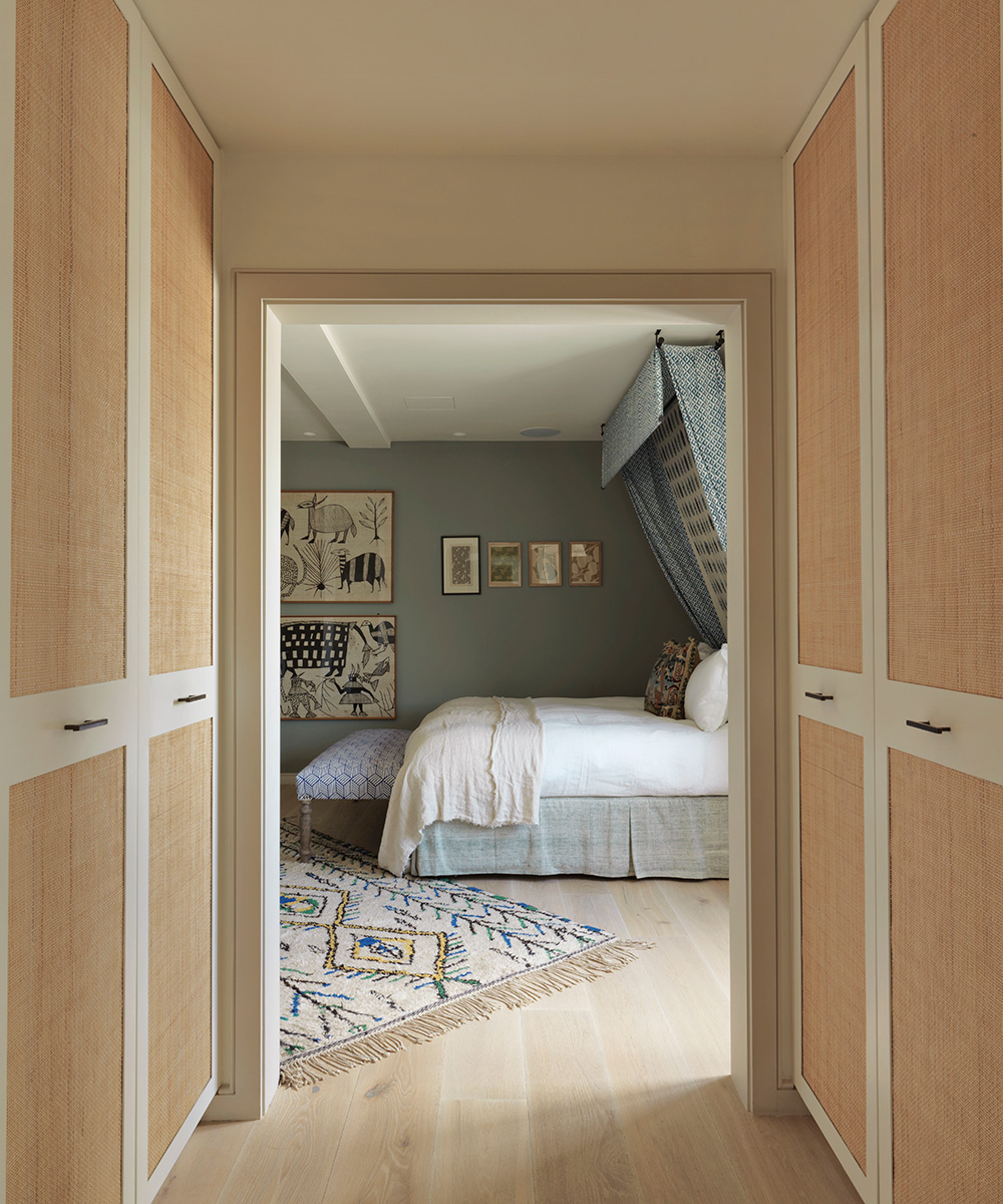
Main bedroom
The owner decided to work with the sloping wall to create a cocooning canopy for the bed. 'The room overlooks the street, so bringing in more fabric has acoustic benefits, helping to minimise noise,’ she says.
Photography/ Alex Sarginson

Jennifer is the Digital Editor at Homes & Gardens. Having worked in the interiors industry for several years in both the US and UK, spanning many publications, she now hones her digital prowess on the 'best interiors website' in the world. Multi-skilled, Jennifer has worked in PR and marketing and occasionally dabbles in the social media, commercial, and the e-commerce space. Over the years, she has written about every area of the home, from compiling houses designed by some of the best interior designers in the world to sourcing celebrity homes, reviewing appliances, and even writing a few news stories or two.
-
 Should you dry your clothes outside if you have hayfever? Allergy specialists warn sufferers to steer clear of this 'major trigger'
Doing so can trigger asthma, coughing, itchy eyes and more
By Sophie Warren-Smith
-
 Lenny Kravitz says design is 'just like music' – and the stunning materials of this bedroom embody this laidback luxe approach
Rich textures and opulent finishes come together in a Los Angeles bedroom designed by the musician – it's ultra-chic, but relaxed
By Sophie Edwards