Design house: A modern townhouse in Vancouver, designed by Karin Bohn
An all-white or one-tone scheme is a brave choice, as it requires careful editing and a strong design eye.

Owner of Vancouver-based design firm House of Bohn, Karin is a talented interior designer who creates both residential and commercial spaces.
Notably, Karin is a lead cast member of the new design-meets-travel Netflix show, Restaurants on the Edge, for which she traveled around the world helping restaurant owners transform their businesses into beautiful food and travel destinations.
We talk to Karin Bohn about the design process.
THE PROPERTY
'My home is a 1,400 sq ft, two-level townhouse located in North Vancouver,' says Karin. 'I bought it almost four years ago because I love the location and I was looking for a renovation project. The building itself is about 30 years old and had been completely untouched. It still had all of the original fixtures, mint green carpets and pink laminate kitchen countertops. I lived in it for two years before I took a sledge hammer to it.'
'I fell in love with this location as soon as my husband and I pulled into the street because its located in a townhouse complex that's tucked away along a street lined with blossom trees and a nearby park. It's a charming, quaint and quiet area of North Vancouver, and the landscaping is full of trees and flowers.'
'The home was very well-kept, but it was in original condition. Along with the mint green carpets and pink laminate counters, there was carpet in the master bathroom. Standing on carpet while I brush my teeth is not my idea of luxury,' explains Karin.
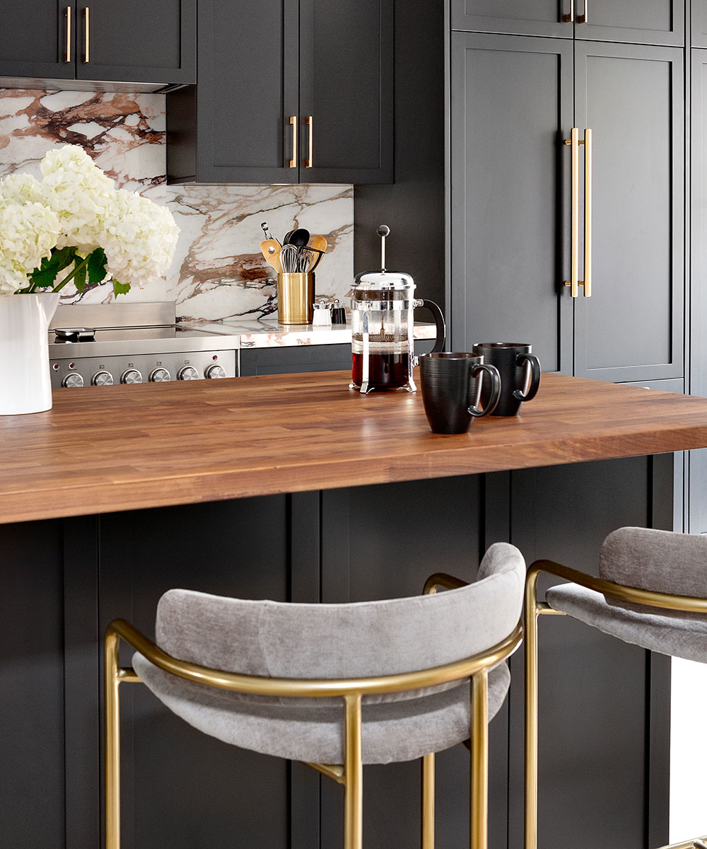
'When I took on the renovation, I knew that I wanted my home to feel elevated and glamorous, while still being inspired by the surrounding area. North Vancouver is known for its mountains, parks and an outdoorsy lifestyle, so having elements like wood beams, a butcher block island top, rustic white-washed floors, and a cosy fireplace were of utmost importance to me.
Sign up to the Homes & Gardens newsletter
Design expertise in your inbox – from inspiring decorating ideas and beautiful celebrity homes to practical gardening advice and shopping round-ups.
I wanted my home to feel more elevated than a typical townhouse, so I incorporated details like moldings, marble countertops, and touches of gold to make sure it was still glamorous.'
KITCHEN
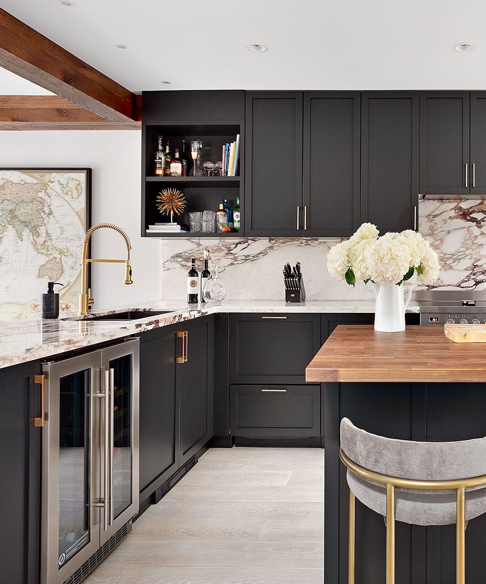
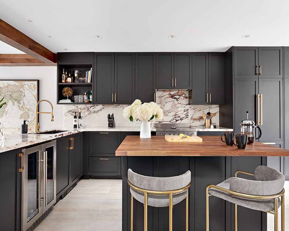
The kitchen is the very first thing that you see when you walk into my home, so I completely opened it up and reconfigured it. Originally the kitchen was closed in, didn't have an island, and had white laminate millwork with pink counters. I gutted it, took out all the walls and opened it up. I transformed it into a big, full-sized kitchen, like what you'd see in a single-family home, incorporated all-black millwork, and integrated all the appliances. It was a bold move, but I don't regret it at all.
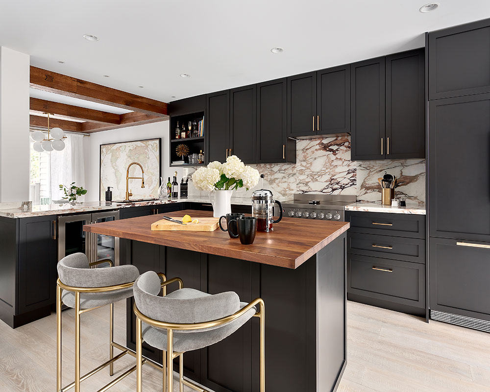
The biggest risk was opting for an all-black kitchen. The truth is, I've just been tired of seeing all-white kitchens for so long, and while white is beautiful and airy, I wanted a kitchen that had more drama, so I opted for all-black. I was a little worried that the black might feel dark or overwhelming once it was installed, but to be honest, it feels so elegant and edgy at the same time, and I don't regret it at all.
SeeDesign house: A sophisticated Seattle home, designed by Terry Hunziker
DINING ROOM AND LIVING ROOM
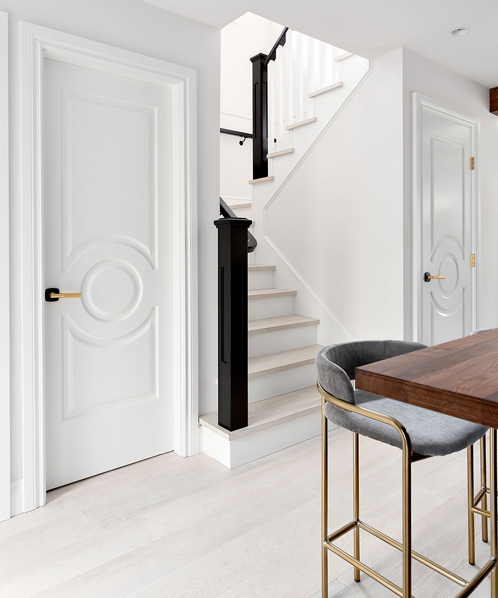
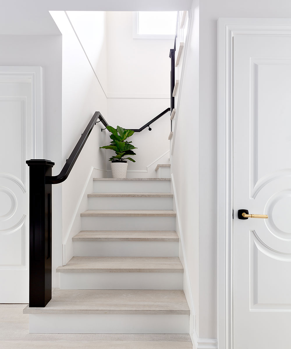
I installed a wide-plank, rustic white-washed oak floor throughout the main floor. Because the main floor is an open concept now, the floors run from the kitchen throughout the dining and living room. I'm so happy with that decision, because it keeps the space feeling light and airy, and the white floors are a nice contrast to my black kitchen, which is visible from both the dining and living room.
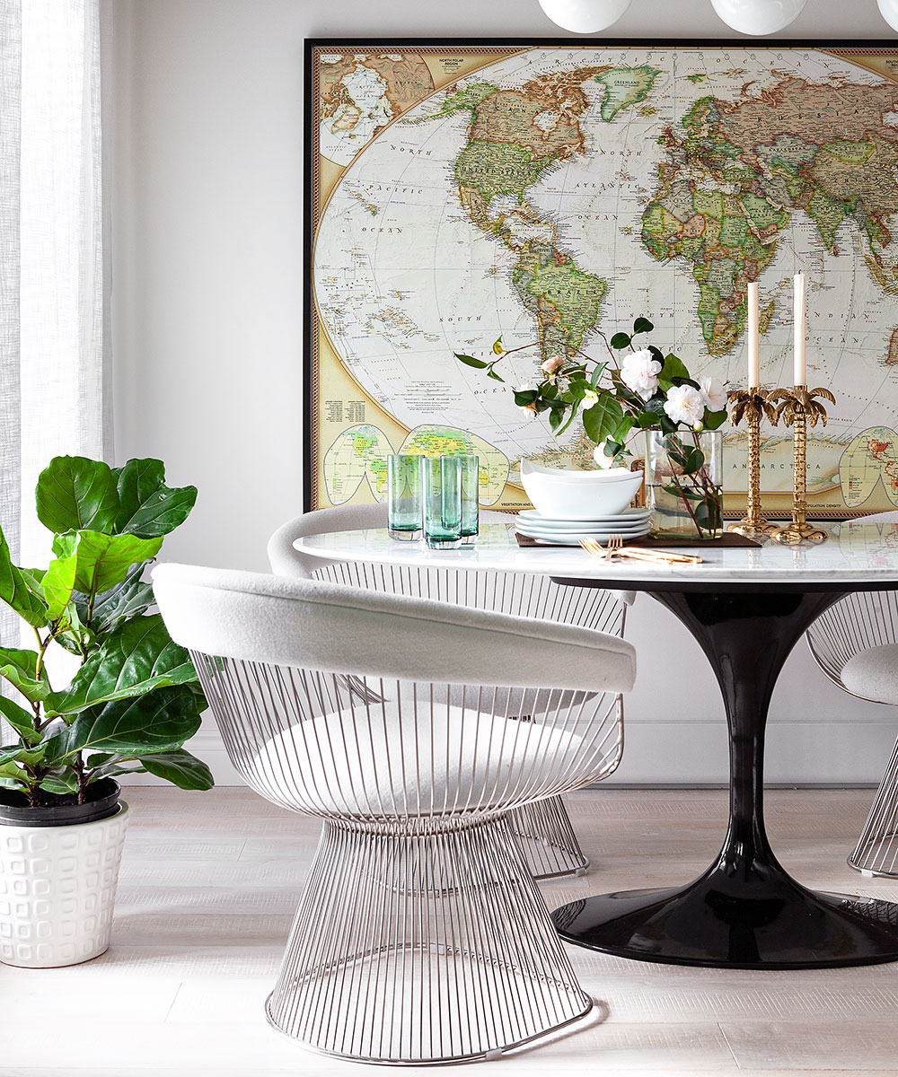
I have a new marble oval table in my dining room so that I can seat six when needed, and I also added a touch of retro glam with a mid-century gold chandelier from West Elm above the table.
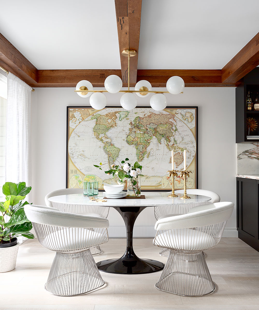
The ceilings have big, chunky wood beams that run across the main floor from the dining room to the living room. What I love about the beams is that they unify these two spaces, and I absolutely love how much character the beams give this space.
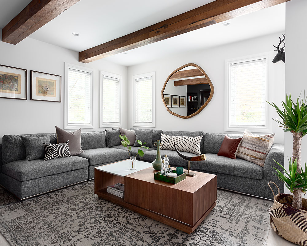
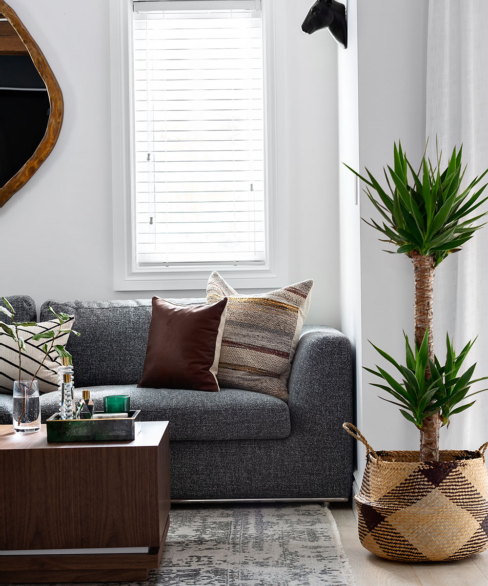
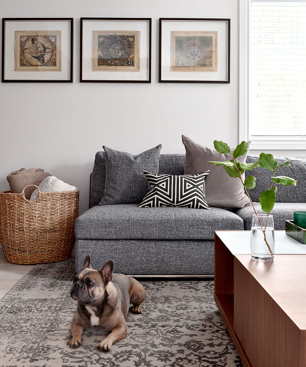
My living room was also completely reconfigured. First, I moved the fireplace from its original location on the exterior wall to the interior wall of the living room. This created an opportunity to have a huge section along the exterior walls. My sectional can seat up to eight people comfortably and it's open to the rest of the room. I love this configuration so much more because it feels spacious and inviting.
The new, long linear fireplace adds a touch of cosiness to the room and it's also the main feature in the living room, which I love because it's finished in a beautiful grey marble that complements the rest of the finishes on the main floor.
SeeDesign house: Modern family home in Montana, designed by Elizabeth Cooper Interior Design
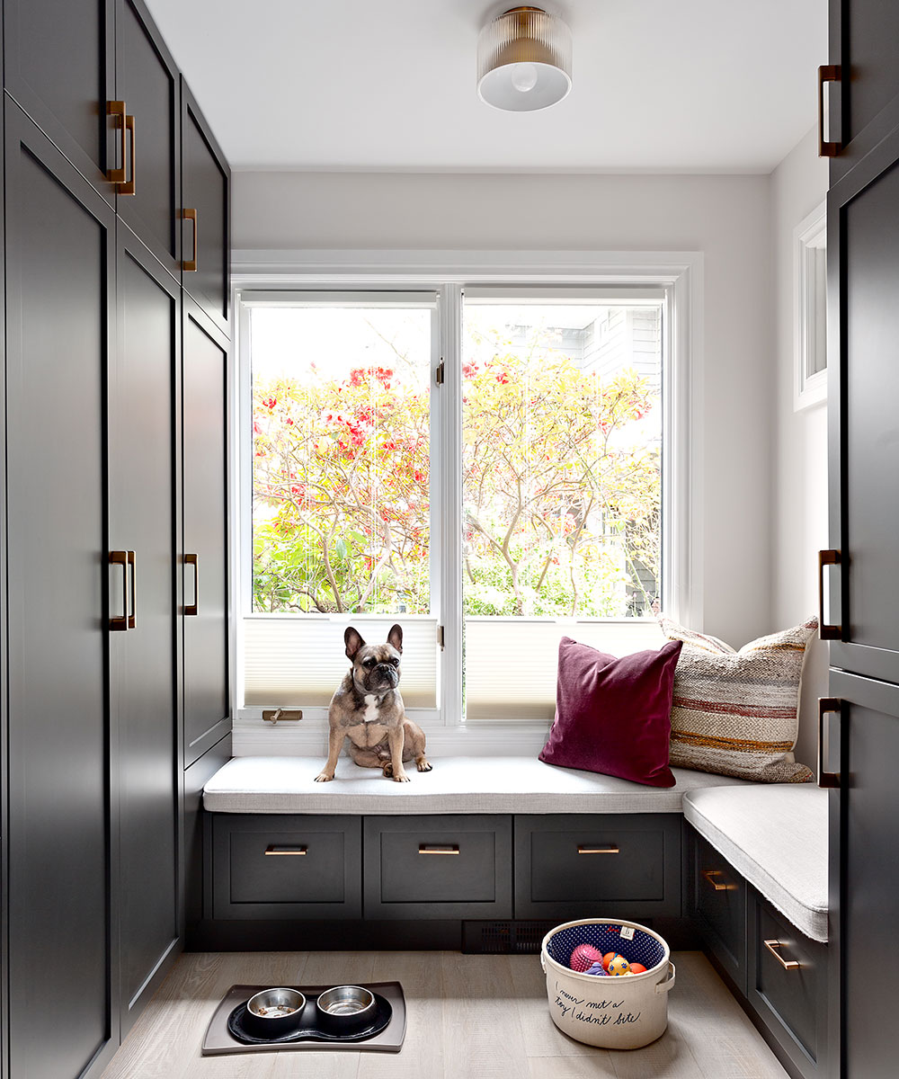
HALLWAY
POWDER ROOM
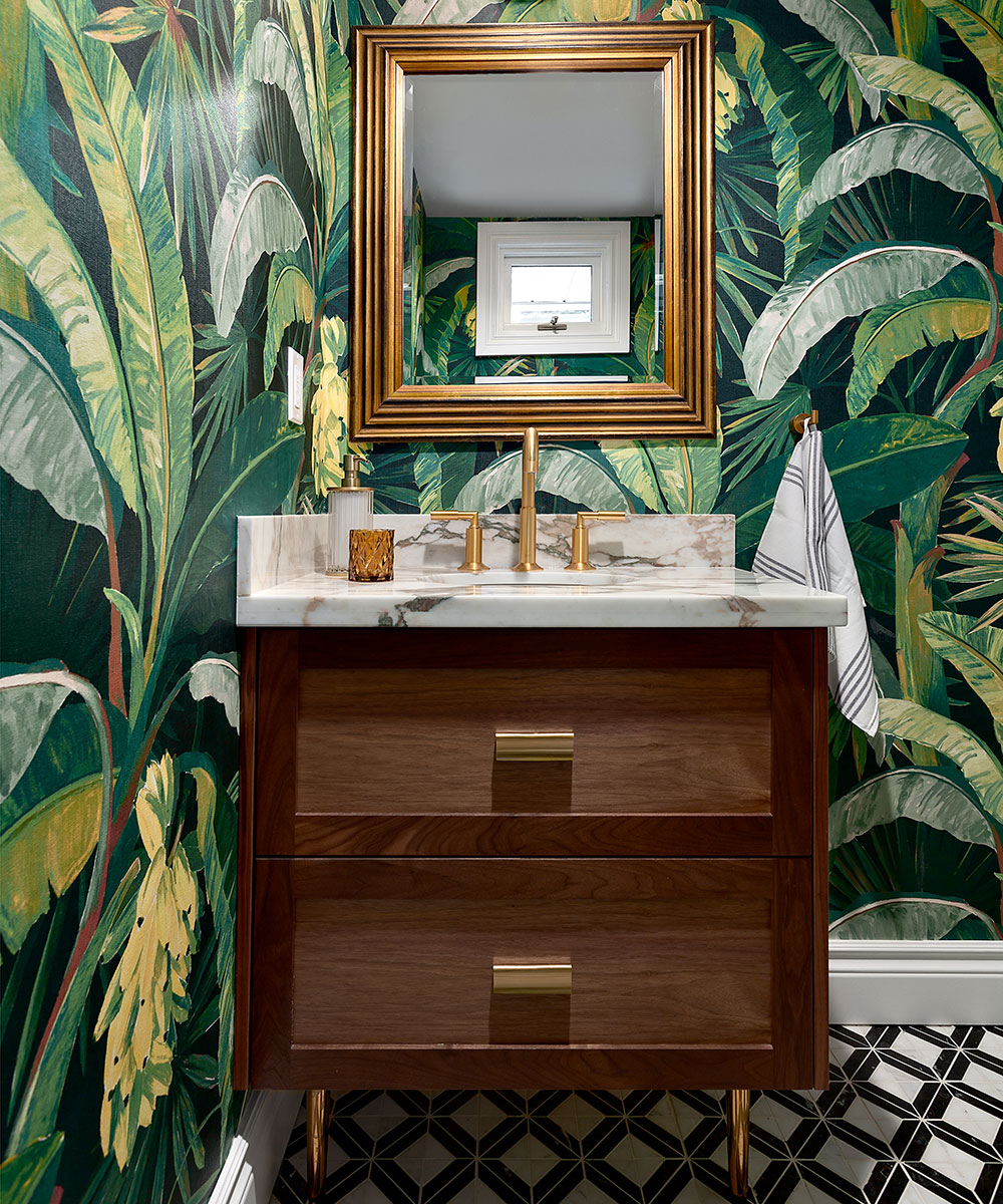
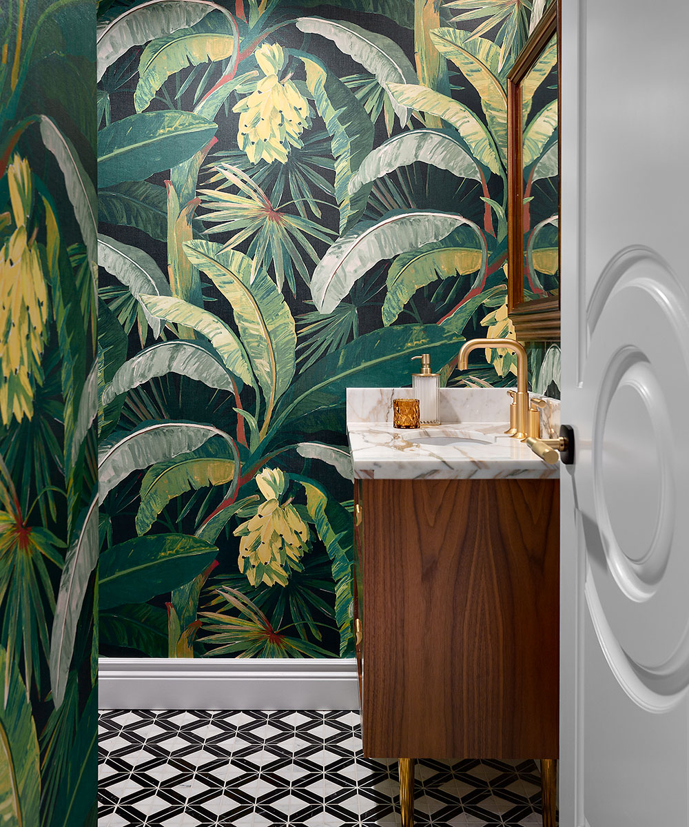
Lastly, on the main floor, I gave my powder room a ton of personality. This is probably one of my most favorite bathrooms that I've ever designed, because of the bold emerald green palm wallpaper from Mokum. When you're in this space, you feel like you're in a completely different world, and I love that. The wallpaper is complemented by an equally bold black and white mosaic tiled floor, and gold accents help finish off the space.
MASTER BEDROOM AND EN SUITE
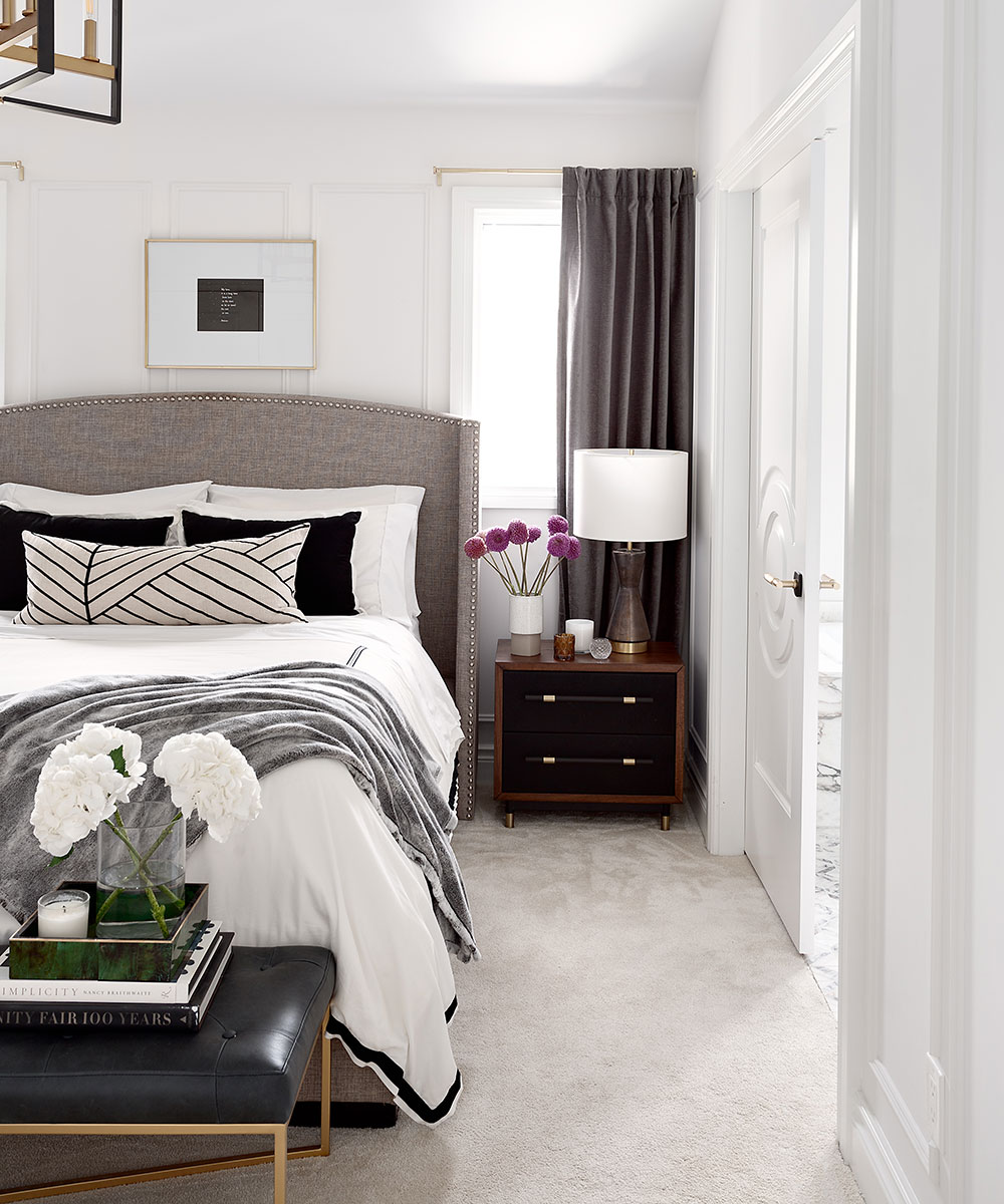
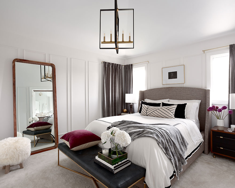
My master bedroom is bright, airy, and spacious. I love the tall, vaulted ceilings in my master bedroom and I accented that height with an over-scaled black and gold geometric chandelier.
I also created an elevated and sophisticated feeling in the master bedroom by installing applied moldings to the walls. This adds a sense of history and tradition to the home, while the heavy grey velvet drapery is both a practical and luxurious touch. To create even more of a luxury bedroom/en suite layout, I flipped the locations of the old closet and bathroom and added double doors in the bathroom. The double doors give the space a sense of grandeur and scale and I just love that the en suite feels so elevated.
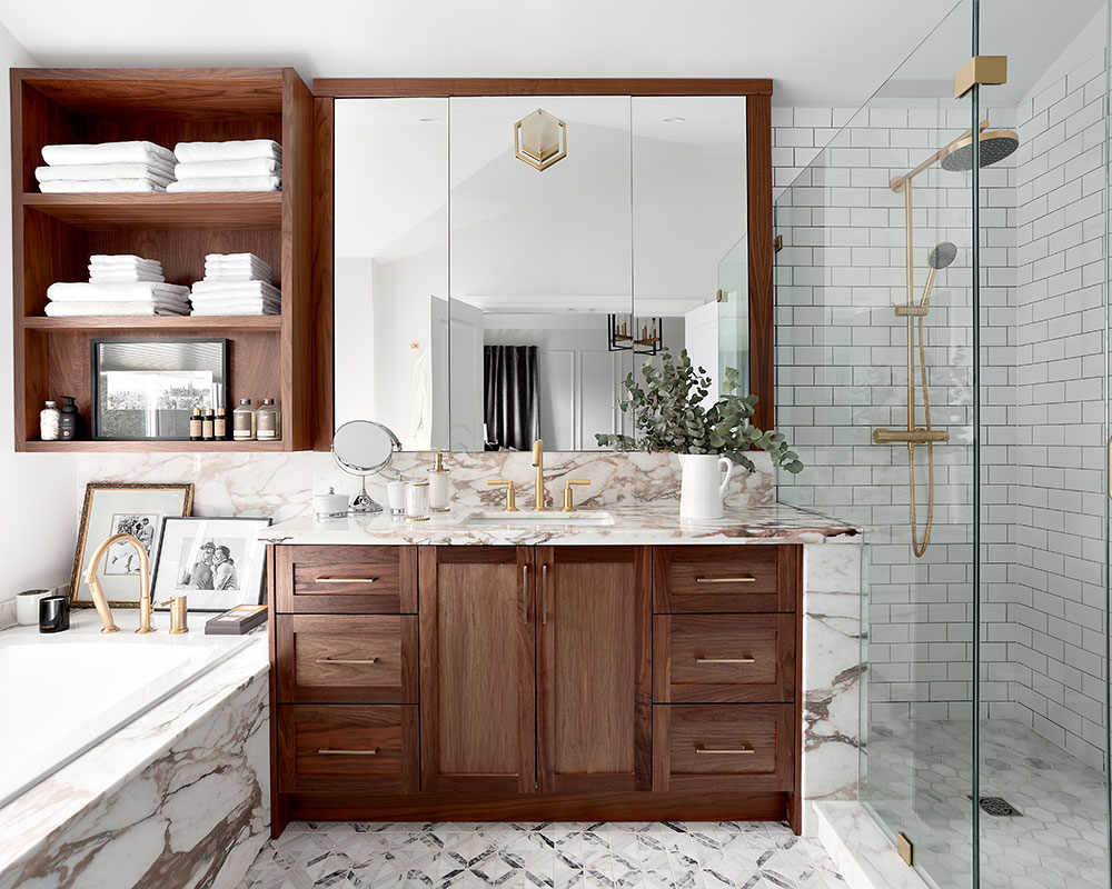
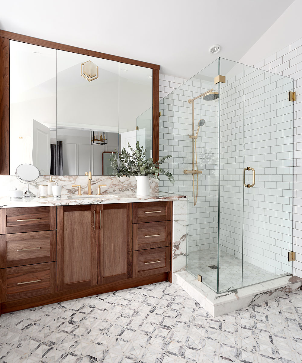
My master en suite has a separate soaker tub, with a separate walk-in shower. The floors are marble mosaic, while the tub surround and vanity countertop are also finished in a beautiful marble that has a slight pink veining. Now that the master ensuite has a window, it gets flooded with light and with its high, vaulted ceiling, the master ensuite is definitely one of my favorite rooms in the house.
From the start of planning to the time that we moved in, it was about a year and a half. Now, when I look around, I don't even need a single piece of art, so all of the rooms are completely done.
Photography/ Amanda Oster / Provoke Studios
Interior design/ Karin Bohn

Jennifer is the Digital Editor at Homes & Gardens. Having worked in the interiors industry for several years in both the US and UK, spanning many publications, she now hones her digital prowess on the 'best interiors website' in the world. Multi-skilled, Jennifer has worked in PR and marketing and occasionally dabbles in the social media, commercial, and the e-commerce space. Over the years, she has written about every area of the home, from compiling houses designed by some of the best interior designers in the world to sourcing celebrity homes, reviewing appliances, and even writing a few news stories or two.
-
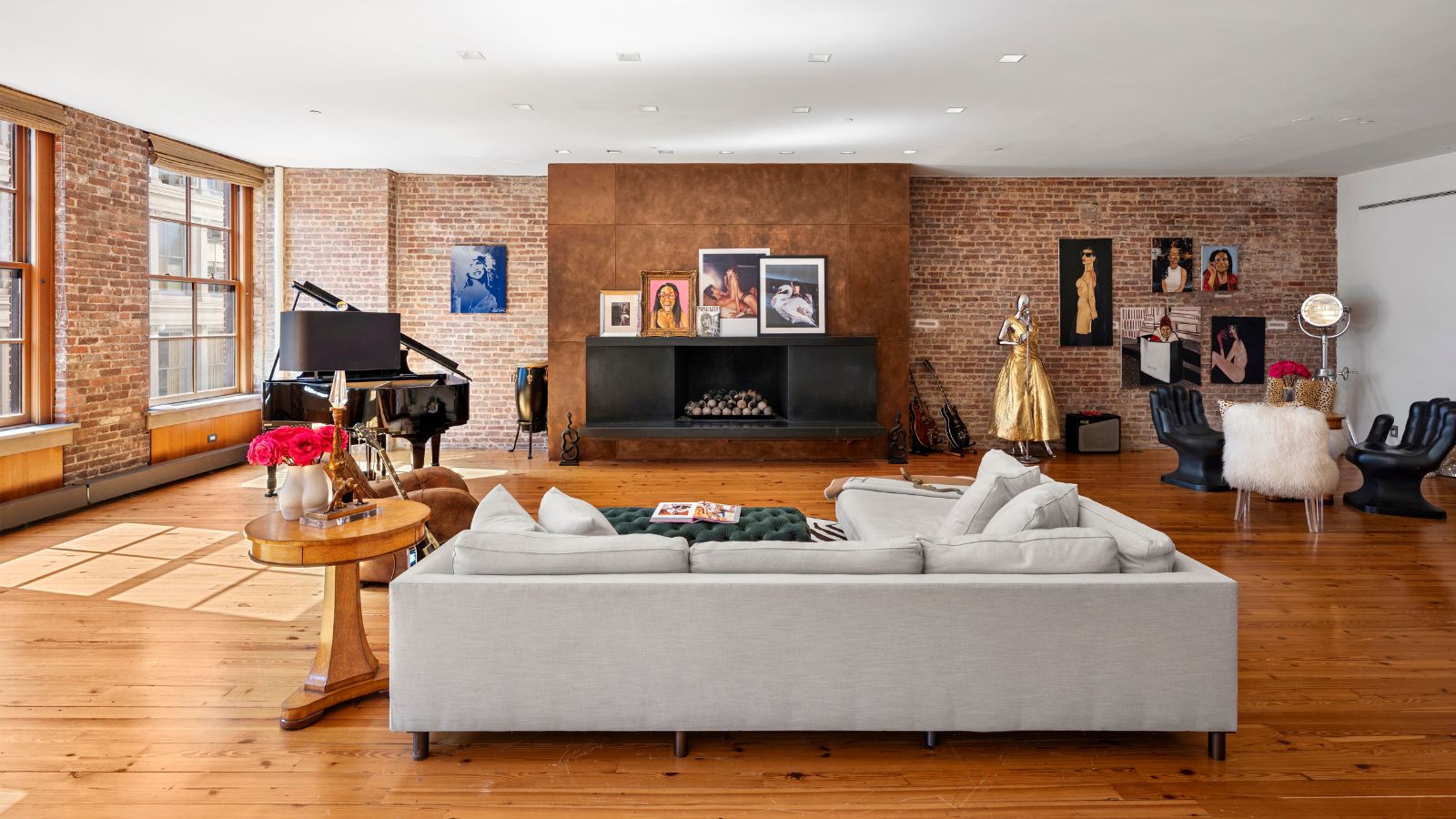 Courtney Love's historic loft combines rock star luxury with raw New York bones – it's on the market for almost $9.5 million
The singer's former SoHo home features exposed brick walls, original wooden columns, a gas fireplace, and high ceilings – take the tour
By Hannah Ziegler
-
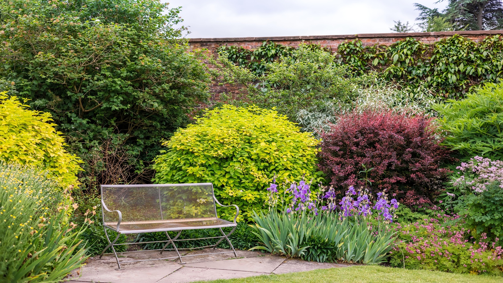 Triangular shaped garden ideas – landscape designers share 9 ingenious ways to redesign your corner plot
Expert tips for planning, planting and finessing a triangular shaped plot, so you can savour the space year round
By Jill Morgan