Design house: Modern, minimalist home in San Francisco, designed by JDP Interiors
If you’re minimalist at heart and love a clutter-free home then this is the look for you.

This modern home in the Russian Hill neighbourhood of San Francisco is a minimalists dream. There’s nothing cleaner or crisper than a pure white scheme, whether that’s a high gloss design or a traditional country one, it’s a look that lasts, no matter what the latest craze is.
THE PROPERTY
The existing property was modern which can sometimes lean slightly cold so the goal was to warm the space and infuse personality. This look takes its lead from loft-style living making it ideally suited to large open-plan apartments flooded with natural light and modern urban boltholes with an inherently minimalist feel.
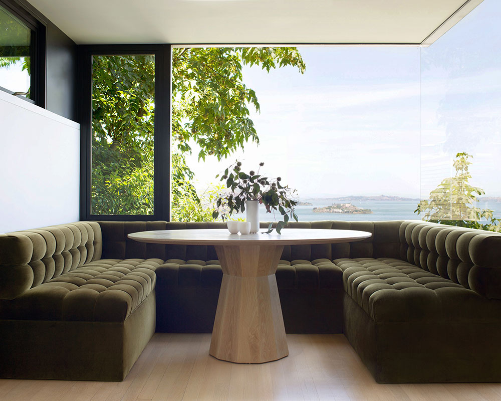
'What caught my eye was the location including the wrap-around views of the San Francisco bay and Alcatraz Island,' says the interior design team at JDP Interiors. 'The windows and the view just beyond them are what was so incredible about this space but was also what made this project tricky.'
We talk to Joyce at JDP Interiors about the design project.
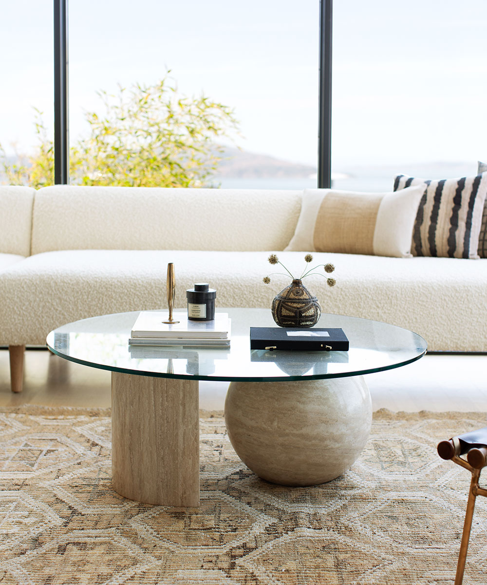
My clients are young professionals in the Bay Area who often entertain. They requested a serene colour scheme while keeping it young (infusing hip and funky furniture items) and aimed at providing plenty of seating for entertaining.
They were interested in a modern Scandinavian vibe but they also loved a previous project I did and the high contrast it allowed for.
SeeDesign house: A modern townhouse in Vancouver, designed by Karin Bohn
Sign up to the Homes & Gardens newsletter
Design expertise in your inbox – from inspiring decorating ideas and beautiful celebrity homes to practical gardening advice and shopping round-ups.
LIVING ROOM
The existing property is very modern, so we needed to take this into account while warming up the space and infusing some sophistication. I was hugely inspired by the colours that were peeking through these giant windows at the time of my initial visit; especially from Alcatraz island – greens, browns, creams and tans, while infusing pops of black for a dramatic effect.
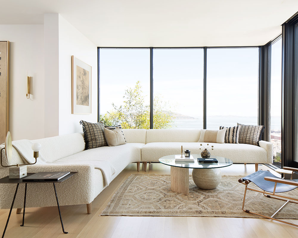
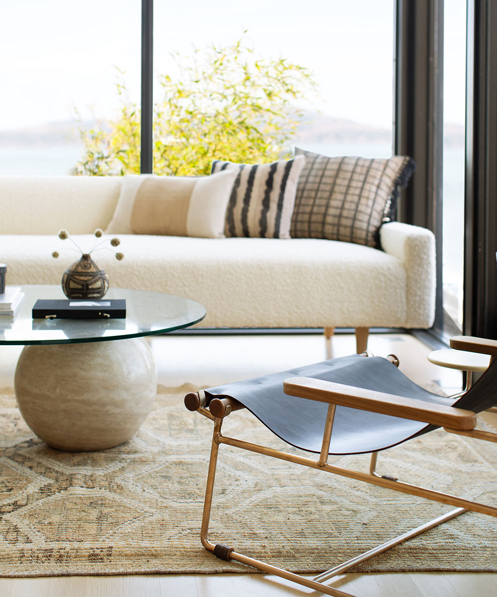
Every main wall was a window, so we were stuck with the dilemma of trying to configure a furniture plan without blocking the view –we ended up opting for low, open seating that wraps around the windows instead of avoiding them altogether (which would have resulted in less seating and more cramped living quarters).
KITCHEN
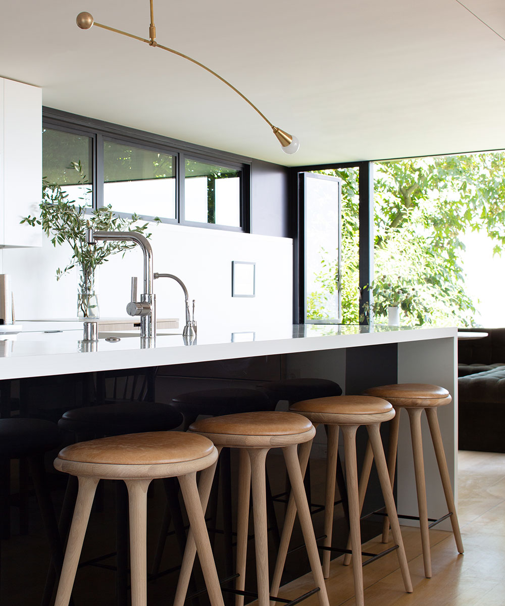
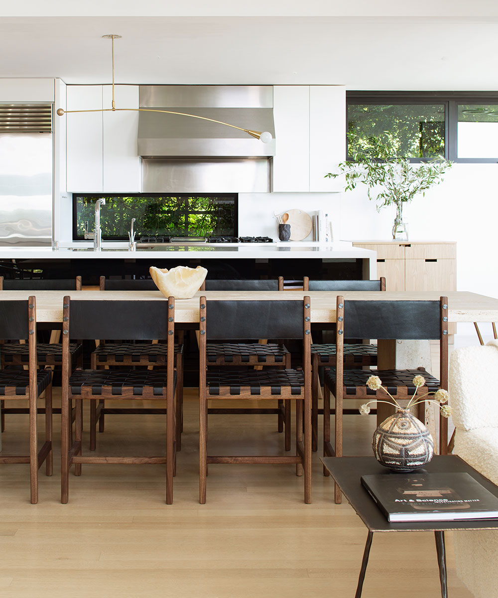
If there’s one thing that works beautifully with a white kitchen scheme, it’s warm wood and plenty of texture. Keep accessories neutral and minimal, with beautiful tea towels, chunky wooden worktops and simple gadgets. This is a look that’ll work in any interior scheme, whether contemporary or traditional.
SeeDesign house: A sophisticated Seattle home, designed by Terry Hunziker
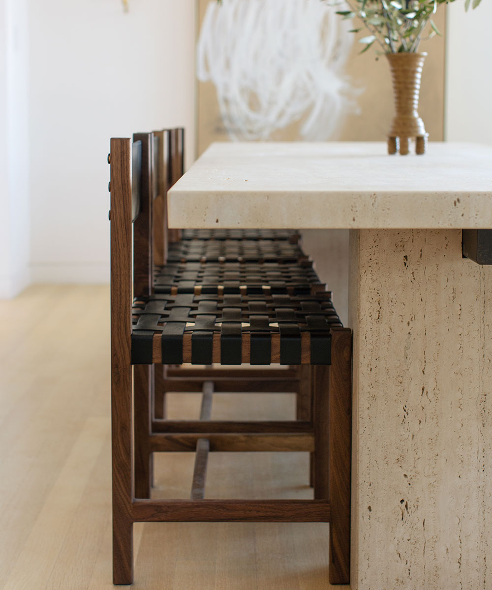
DINING ROOM
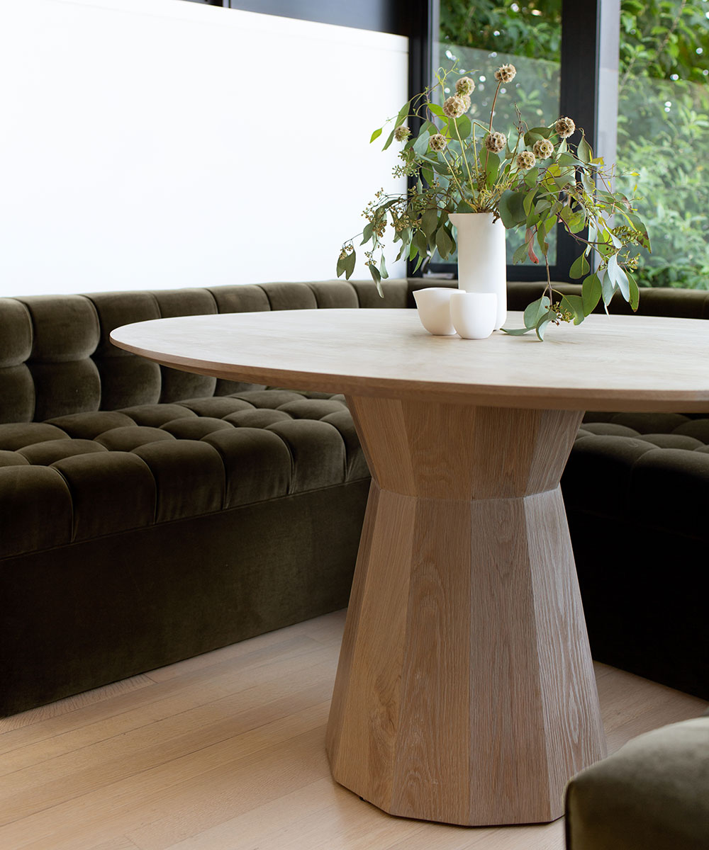
BREAKFAST AREA
SeeDesign house: Tudor-style detached house in Oklahoma, designed by Mel Bean Interiors
BEDROOM
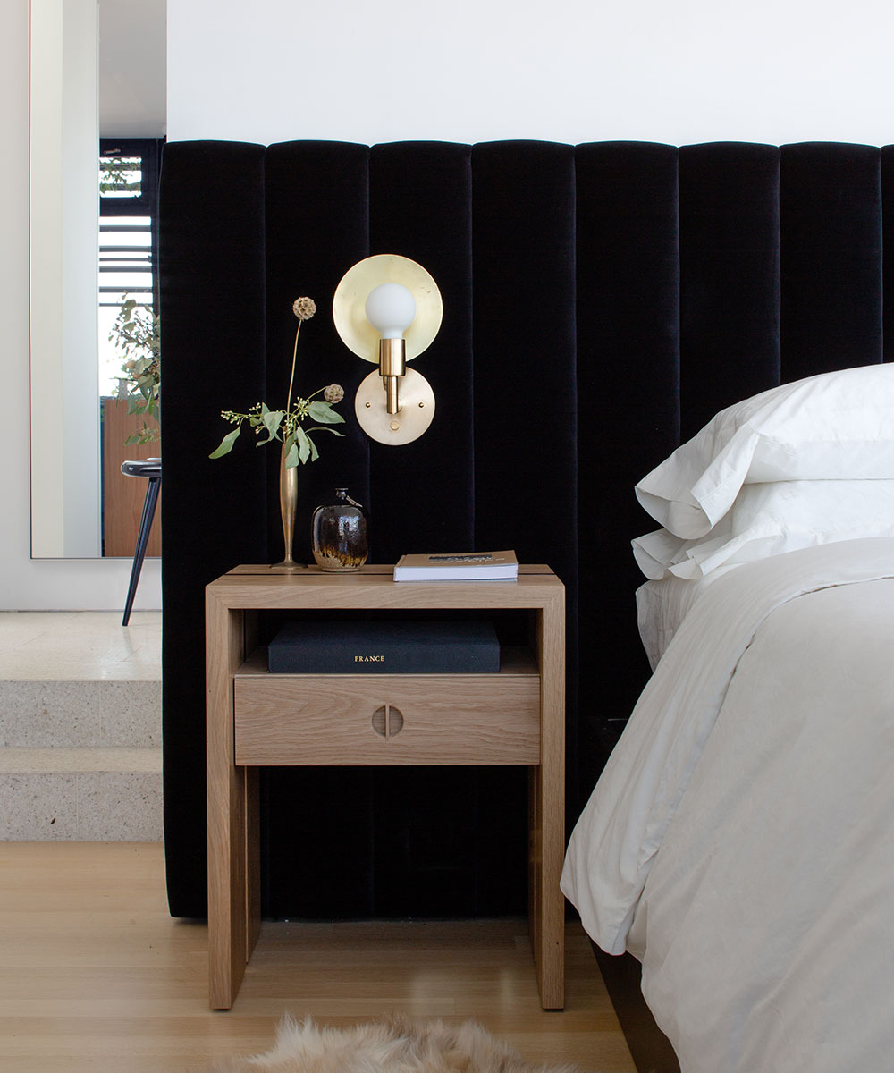
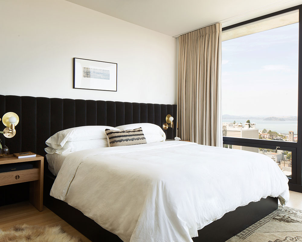
This elaborate padded, velvet headboard has a deeply romantic quality, and is all this is needed to elevate a restrained scheme into something special. The walls and bedlinen are white to give the piece the attention it deserves
BATHROOM
Photography/ Bess Friday
Interior design/ JDP Interiors

Jennifer is the Digital Editor at Homes & Gardens. Having worked in the interiors industry for several years in both the US and UK, spanning many publications, she now hones her digital prowess on the 'best interiors website' in the world. Multi-skilled, Jennifer has worked in PR and marketing and occasionally dabbles in the social media, commercial, and the e-commerce space. Over the years, she has written about every area of the home, from compiling houses designed by some of the best interior designers in the world to sourcing celebrity homes, reviewing appliances, and even writing a few news stories or two.
-
 Courtney Love's historic loft combines rock star luxury with raw New York bones – it's on the market for almost $9.5 million
The singer's former SoHo home features exposed brick walls, original wooden columns, a gas fireplace, and high ceilings – take the tour
By Hannah Ziegler
-
 Triangular shaped garden ideas – landscape designers share 9 ingenious ways to redesign your corner plot
Expert tips for planning, planting and finessing a triangular shaped plot, so you can savour the space year round
By Jill Morgan