Design house: A contemporary family home with a designer edge
How do you mix cool contemporary design with living with four young children? The secret is in the storage

'I can tidy my home in ten minutes,' says the homeowner. It’s not your typical claim to fame, but when you learn that she and her husband have four children, and both work full time, suddenly it seems like a ‘surely- not’ achievement! The owner’s house is way more than just tidy, though. It’s a study in elegant family living, or ‘looking good while being practical too,’ as she puts it. So much so, that as a home designer and project manager, she is routinely sought out by people with kids. ‘I was worried I might freak clients out when I was pregnant with number four,’ she recalls with a laugh, ‘but they love that I have a big family. They know how super-organised I have to be, both in my personal life and at work, and I understand how to make a house function for a family.’
- Some of the world's best homes – beautiful properties from around the globe
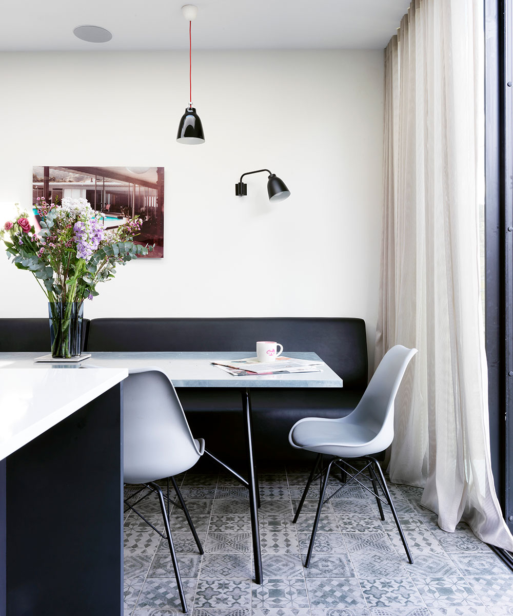
Storage is essential, and in the owner's west London home, the pièce de résistance is a bank of six tall cupboards on the ground floor. ‘One of my specialities is optimising space with storage, and making it so well-designed and practical that you can tidy up fast,’ she says. ‘This is so important with four children.’ Other practical touches include the bespoke banquette bench in the kitchen, covered in faux leather. ‘It takes up less space than chairs, which was the main reason I put it in,’ says the homeowner. ‘But I love how the kids crash around on it, without having to worry about them damaging it.’
The property
A four-storey Edwardian terrace in west London. In the basement is a living space/bar area, utility room, shower room and guest bedroom. The ground floor comprises a living/dining area, a kitchen/breakfast room and cloakroom. The first floor is home to the master bedroom, the kids' bedrooms and a family bathroom, while in the loft are two further kids' bedrooms and a bathroom.
The family moved to this house in 2015, but only after the homeowner had more than doubled its volume, turning a two- storey wreck into a four-storey triumph. ‘We stripped out the entire house, removed every chimney breast, extended the ground floor, built into the loft and dug out the basement,’ she says. ‘The house was 130 sq m when we first saw it. Now it’s 285!’ The project took almost a year. ‘I found it much scarier than when I work for someone else,’ says the owner. ‘When it is your entire life and work at the same time it’s hard not to become obsessive about it.’
Living space
Since moving to the property, the ownersmore than doubled its volume, turning a two-storey wreck into a four-storey triumph. The entire house was stripped, every chimney breast was removed, the ground floor extended, and both a loft and basement were added. The house went from 130 sq m to 285 sq m – and it took just shy of a year.
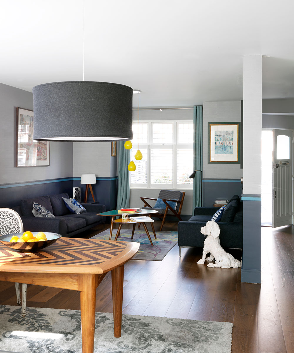
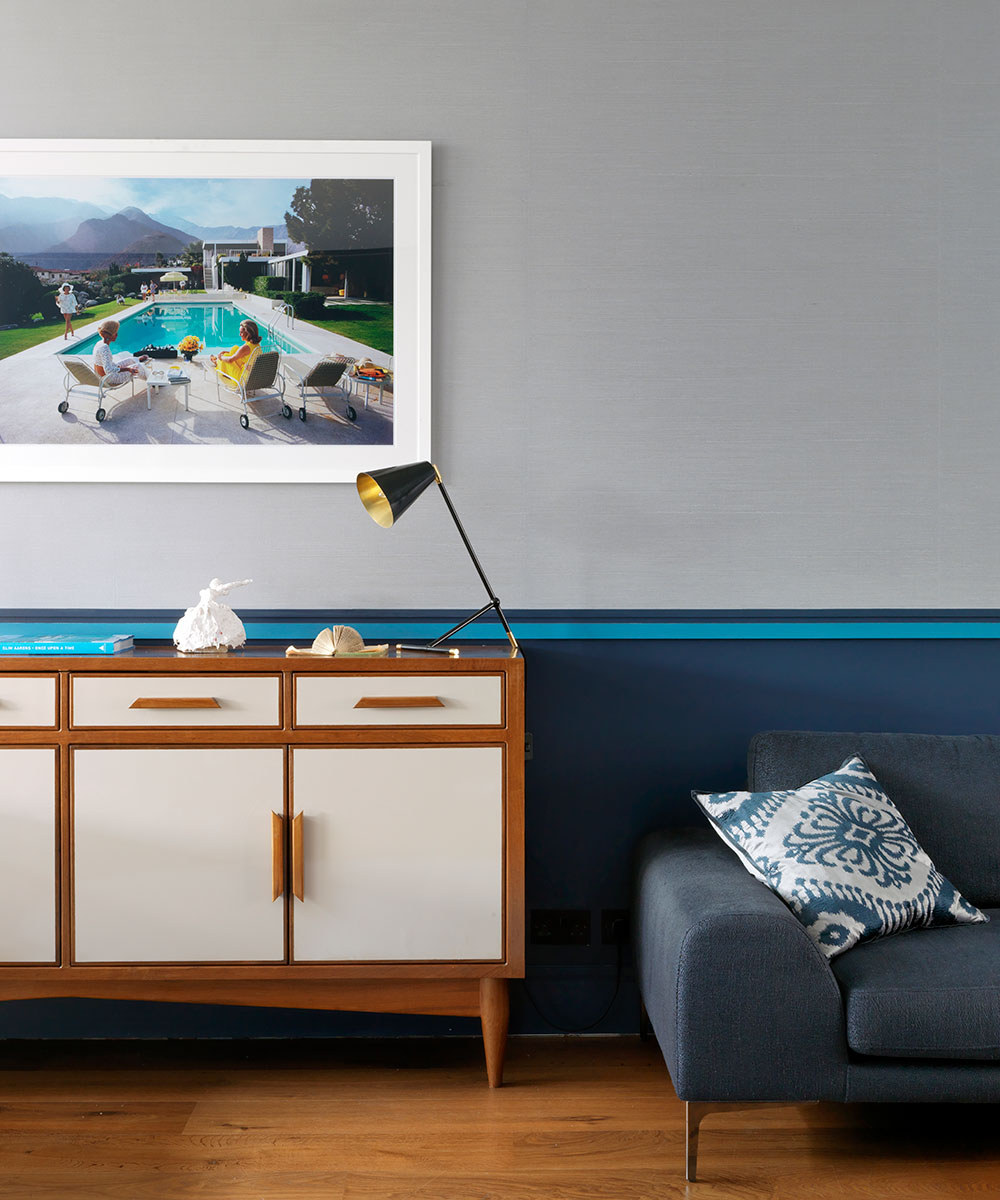
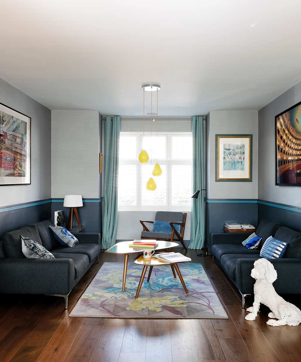
An elegant, clean-lined sofa and fresh colors suit the ground floor living space perfectly. Indigo adds brightness, but to have a room painted all over with it would be too heavy.
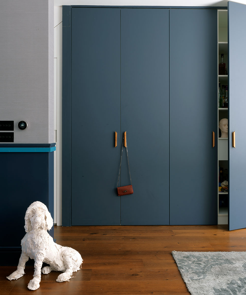
This house is a study in elegant family living, or looking good while being practical too. Storage is essential in a family home, and in this west London space the pièce de résistanceis a bank of six tall cupboards on the ground floor.When space is optimised with well-designed storage, you can tidy up super fast – essential in a bustling household.
Six large built-in cupboards face the dining area opposite. They're used for housing coats, shoes, admin, food storage. A deep indigo anchors the lower half of the room, with a textured wallpaper above and a strip of blue as a zingy divide. The look was inspired by French interior designer Sarah Lavoine who is known for the way she divides a room with a stripe. The same effect was achieved here by separating a dark shade at the bottom and using textured wallpaper above.
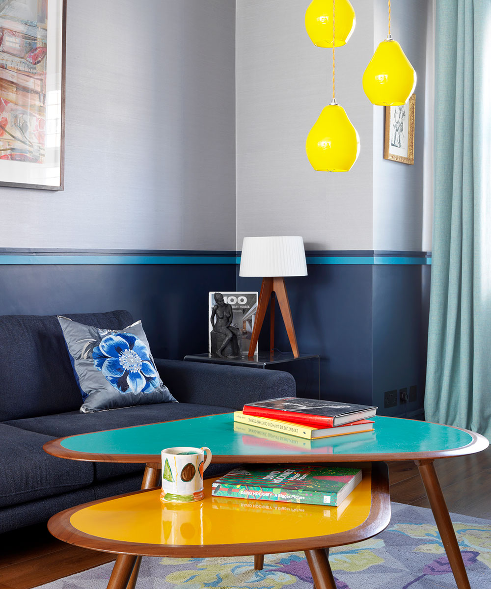
The coffee tables were made bespoke in India. (woodndesign.in). Yellow pendant lights were chosen to complement the blue and yellow in the coffee tables.
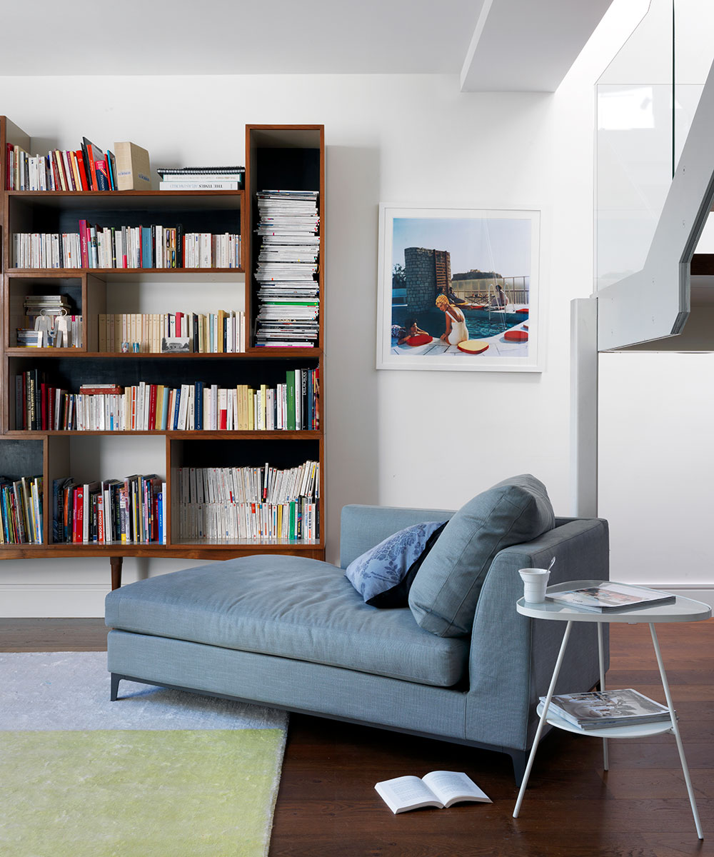
Slim Aarons photography has a way of making you feel like you're jumping inside a story.
Kitchen
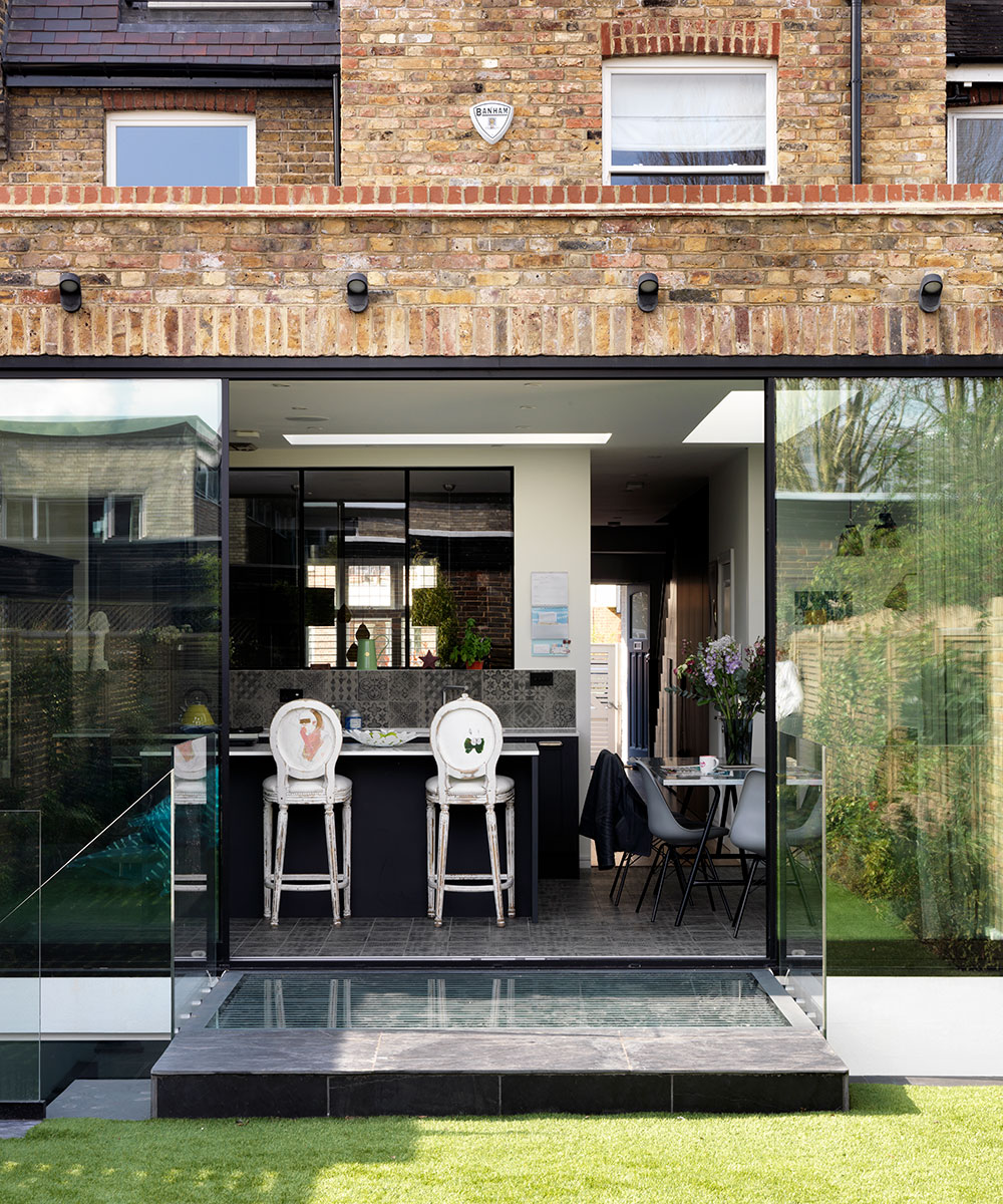
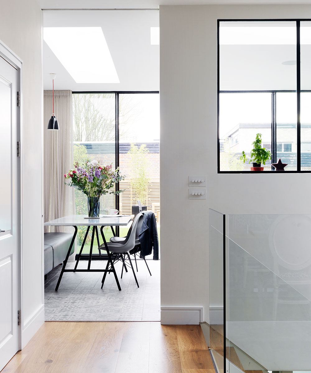
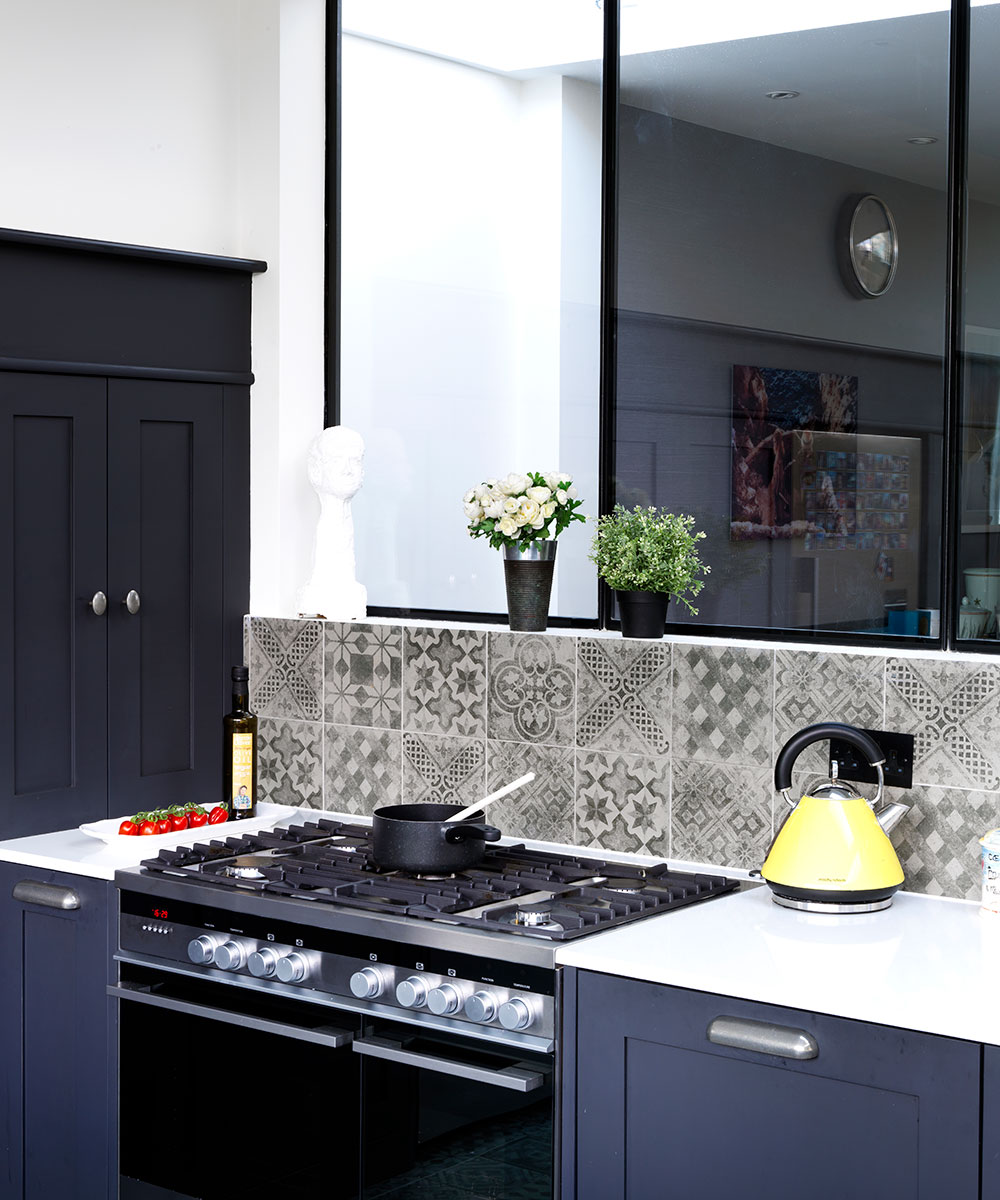
Glass features prominently on the ground floor, with an internal window pulling light from the south-facing garden (pictured top of this page) into the dining and living rooms. It means you can keep an eye on the children while cooking, and enjoy the garden from the living area, without seeing kitchen mess.
The kitchen was made bespoke by the builder. It is painted a deep greyish black and treated with a matt varnish. The tiles have the look of old cement tiles but are actually porcelain.There's a kitchen island / breakfast bar, perfect for hanging around during cooking, or for baking on. The kitchen table and bench is used for everyday breakfast, lunch and dinner.
Other practical touches include the bespoke banquette bench in the kitchen, covered in faux leather. It takes up less space than chairs, plus kids can crash around on it, without the worry of any damage being done.The dining bench was designed as space-efficient seating; you need around 90cm behind a chair, so you can pull it out, so with space lacking a bench was installed instead.
Dining area
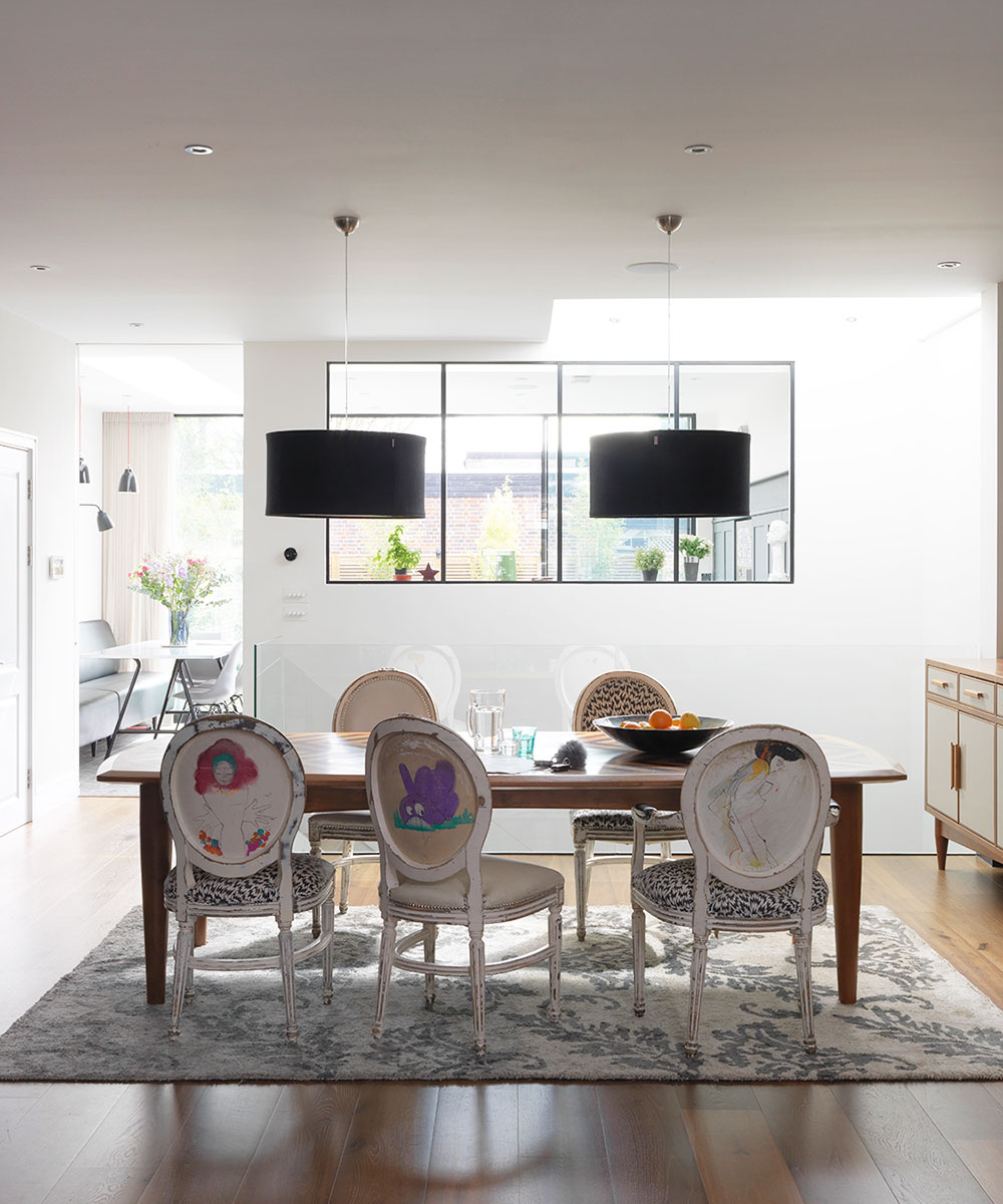
A larger dining table is used for entertaining, while the kitchen table takes care of everyday meals.
The chairs were from the restaurant Sketch in Mayfair and the owners were lucky to get them in a sale, when they were redesigning the space. The dining table is made from 300-year-old teak from Burma.
Basement
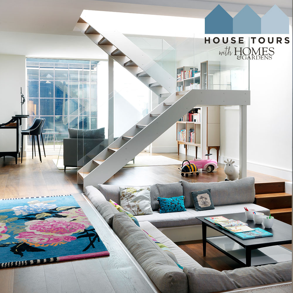
Basement access is often from the front, so you usually have stairs under stairs. In order to help make the basement feel part of the house, the stairs are in the middle of the ground floor and sit on dainty legs with glass balustrades.This was crucial in order to bring in lots of light.
The sunken sofa idea was originally spotted in architect Ian Hogarth’s house. Here the sunken area has become a cinema corner, complete with ceiling projector. As the basement is a big 60 sq m room, this is a great way to make an informal division of the space.
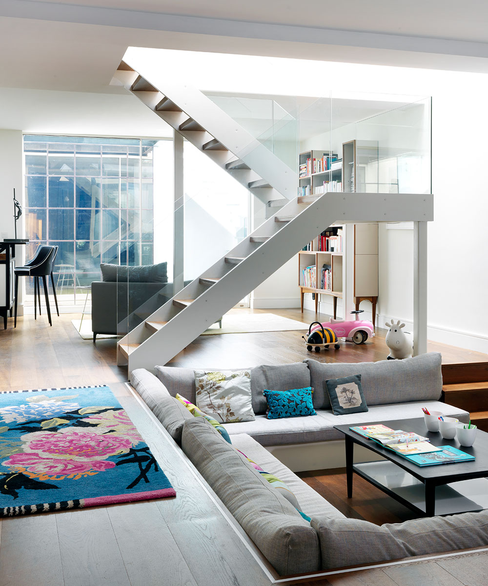
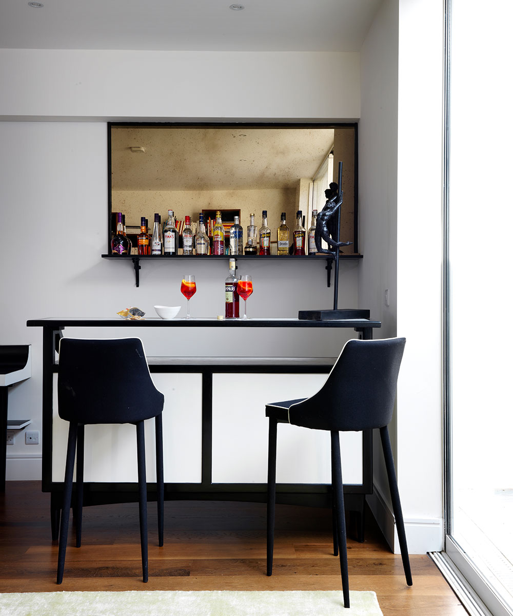
The generous basement is the perfect venue for entertaining. The sunken area can be transformed into a dance floor and there's even a bar.
The bookshelf was originally designed to sit on top of the console on the ground floor, but when wallpaper was chosen the owners knew it wouldn't work.The shelves were given a new pair of legs and it now works really well as a freestanding piece.
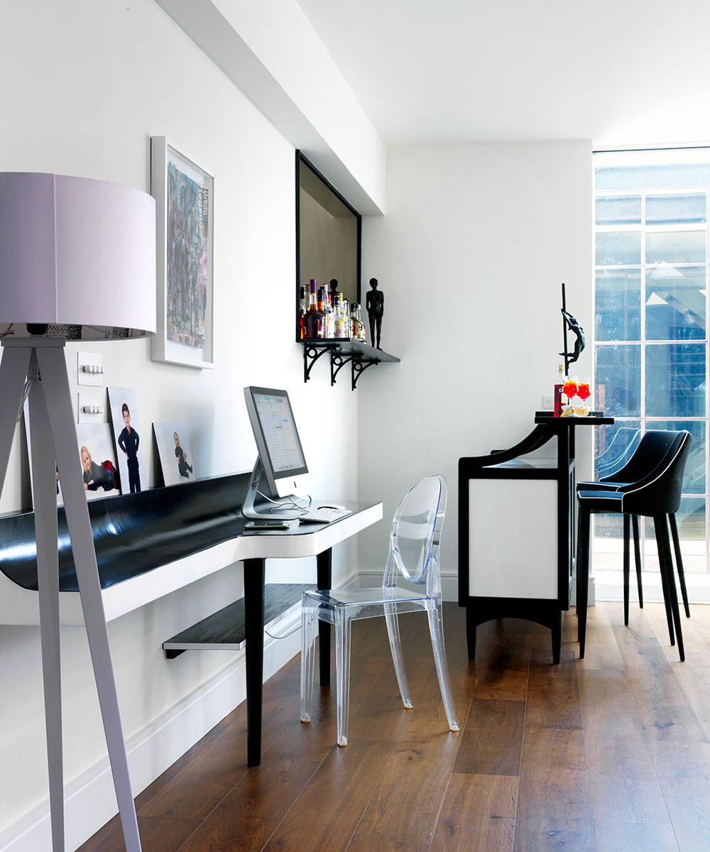
A study corner is perfect for those work-from-home days or for getting much-needed admin done.
Master bedroom
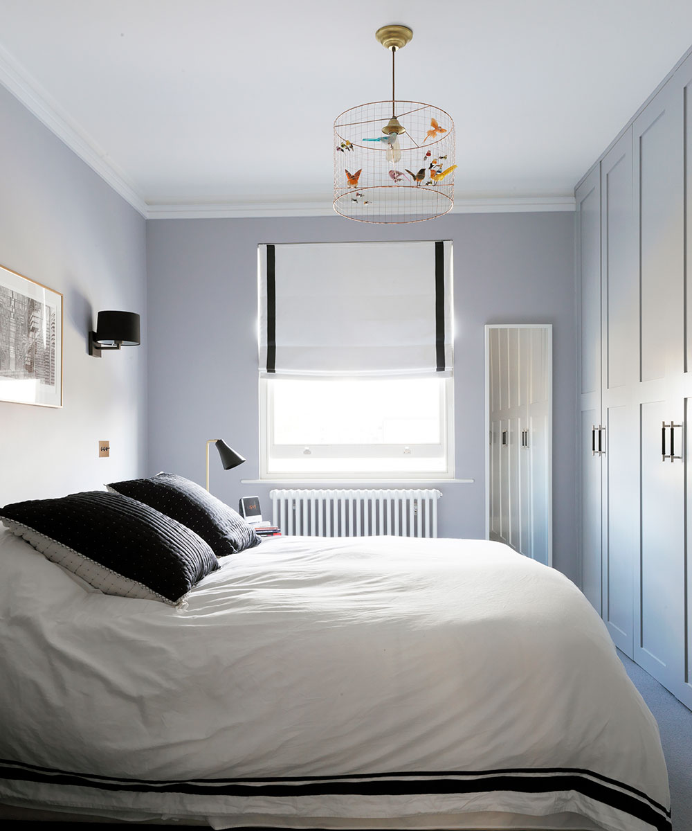
The master bedroom is relatively small in order to make room for all the other bedrooms, but the plan is to extend this room and to give the childrens' rooms bunk beds.
A neat dressing table tucks into an alcove in the master bedroom.
Master bathroom
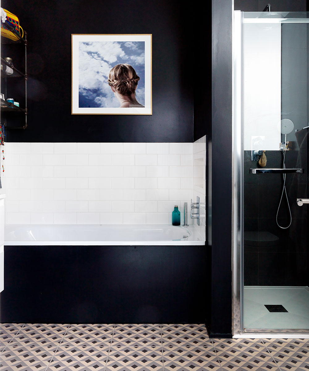
This bathroom has no natural light apart from a frosted glass window onto the landing. It can be a mistake to think you need to paint a dark room in white, it often works well to just embracethe darkness! Dark can be bright and warm.
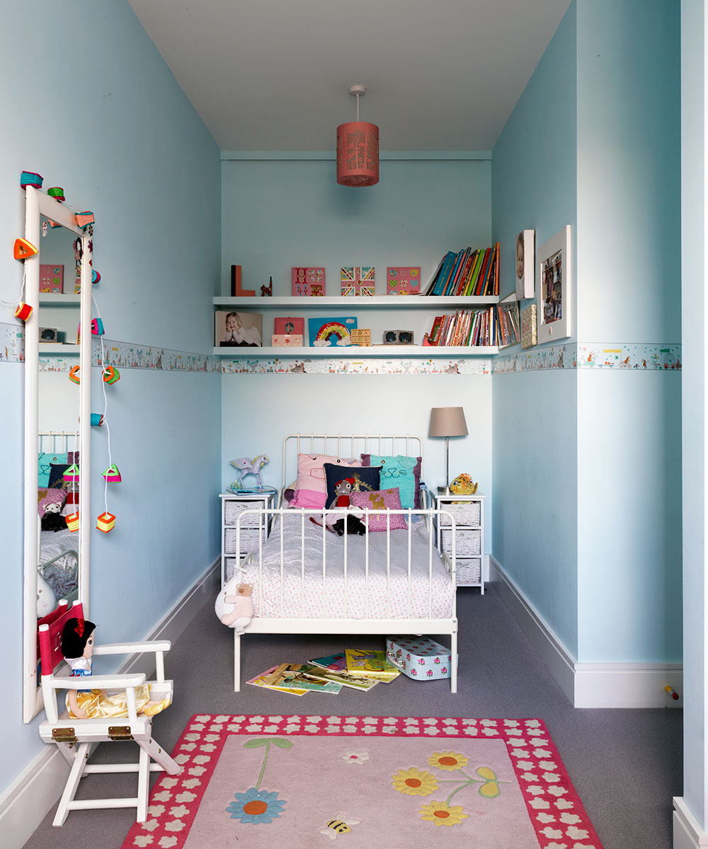
Girl's bedroom
Blue is a great color in bedrooms. It creates a calming effect, it’s joyful and is a great color base for all sorts of other colors and accessories.
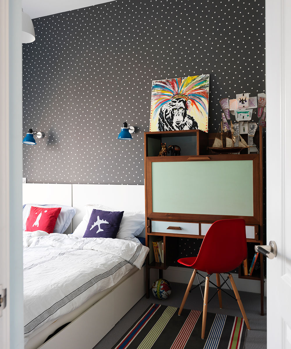
Boys' room
The boy's room boasts a bespoke unit that opens up to become a desk.
Check out more of this interior designer's work at emrdesign.co.uk
Photography / Simon Brown
This home was part of our House Tours Event 10 & 11 October 2019, sponsored by Heals, Roger Oates, Thomas Sanderson and Yves Delorme.
Sign up to the Homes & Gardens newsletter
Design expertise in your inbox – from inspiring decorating ideas and beautiful celebrity homes to practical gardening advice and shopping round-ups.

Jennifer is the Digital Editor at Homes & Gardens. Having worked in the interiors industry for several years in both the US and UK, spanning many publications, she now hones her digital prowess on the 'best interiors website' in the world. Multi-skilled, Jennifer has worked in PR and marketing and occasionally dabbles in the social media, commercial, and the e-commerce space. Over the years, she has written about every area of the home, from compiling houses designed by some of the best interior designers in the world to sourcing celebrity homes, reviewing appliances, and even writing a few news stories or two.
-
 Charred little gem with saffron dressing
This recipe with charred little gem is both easy to make and sure to impress guests. It's the perfect side for fresh spring menus
By Alice Hart
-
 Grilled asparagus with herb and pickled red onion
This grilled asparagus couldn't be easier, and it's a wonderful way to get the best flavor from our favorite spring veg. It's perfect alongside fish or lamb
By Alice Hart