Design house: A renovated London home with color and style
Within the space of a few months, this London terraced home was totally transformed with an extensive renovation creating light, open interiors now filled with the owner's treasures and personality

Design expertise in your inbox – from inspiring decorating ideas and beautiful celebrity homes to practical gardening advice and shopping round-ups.
You are now subscribed
Your newsletter sign-up was successful
Want to add more newsletters?
In 2015, the homeowner was running her photographic prints company, Lumitrix, from her apartment in London's West Kensington. Then, as if a fairy godmother had waved her wand, the owner’s life completely changed within the space of a few months.
'I was fed up with the company stock taking over my guest bedroom, so I bought a larger place a bit further north. By the time I moved, in April 2016, I had totally revamped it and acquired a boyfriend, a baby and a dog,' says the owner.
- See some of the world's best homes – beautiful properties from around the globe
See: our spaces section for more inspiring featured homes
Article continues belowThe property
‘My mother's maxim is ‘Never buy a house that doesn't face south or east’, as it will be too dark. Mothers should be listened to, but on this occasion I ignored her. This property is split level, with a floor coming off each half landing, which makes it much larger inside than it appears from the outside.
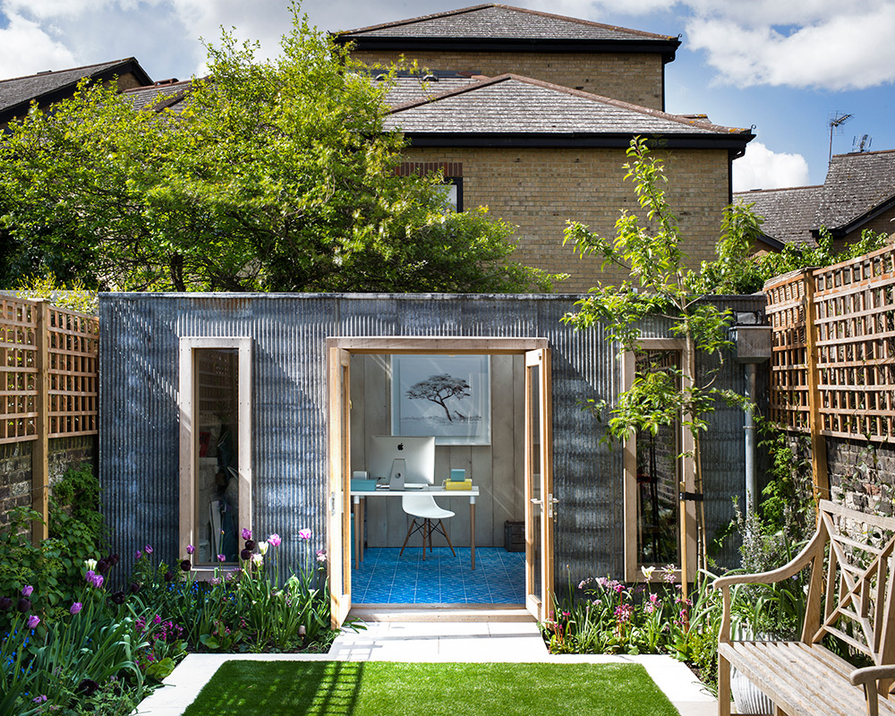
‘The garden, at around thirty-two feet, is large for London. At least, it was, before I extended the kitchen at one end, and put in a studio at the other. Buying the property was not an easy decision, though, because of its dark aspect. When I briefed my architect, Ahmad Abu-Ghaida, I told him everything we did would have to let in light and create an impression of space.’
Kitchen
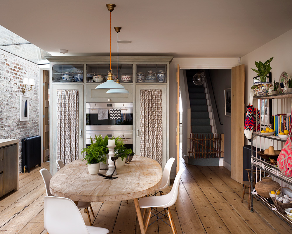
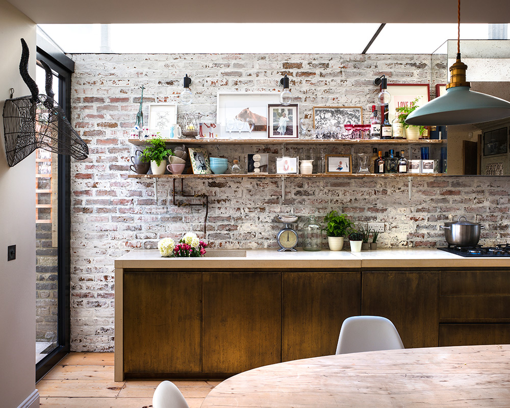
The brickwork is an inch-deep facade with a white paint effect. Its textural quality sits perfectly with the reclaimed pine floorboards and aged brass cabinetry. The homeowner asked architect Ahmad Abu-Ghaida for an extension large enough for her dining table, which is crafted from the same tree used to make the sitting room shelves.

See: a London home with an eye for design
Design expertise in your inbox – from inspiring decorating ideas and beautiful celebrity homes to practical gardening advice and shopping round-ups.
Studio
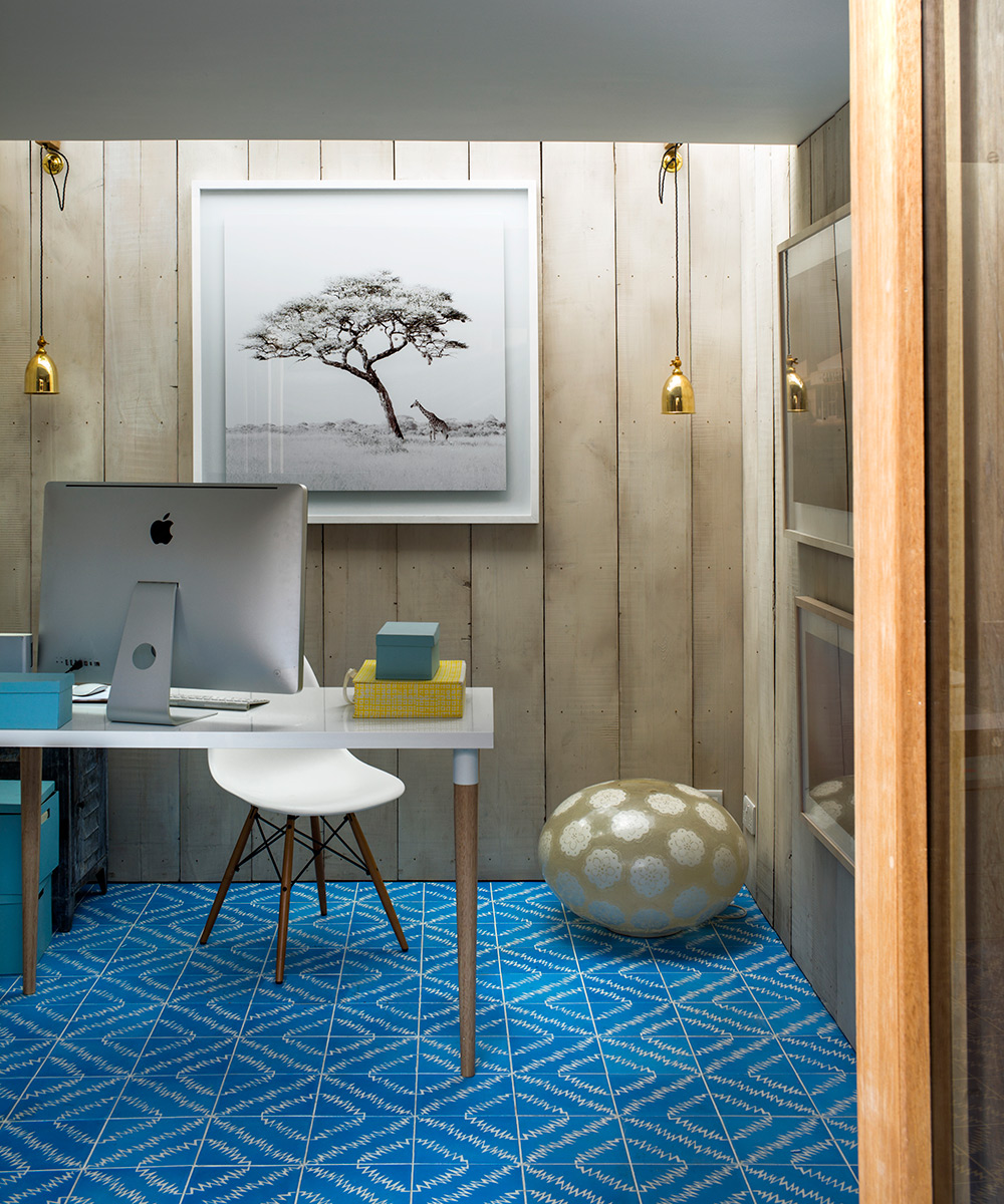
‘One side of the studio is for business, the other is a man wing for my husband,’ says the homeowner.
Sitting room
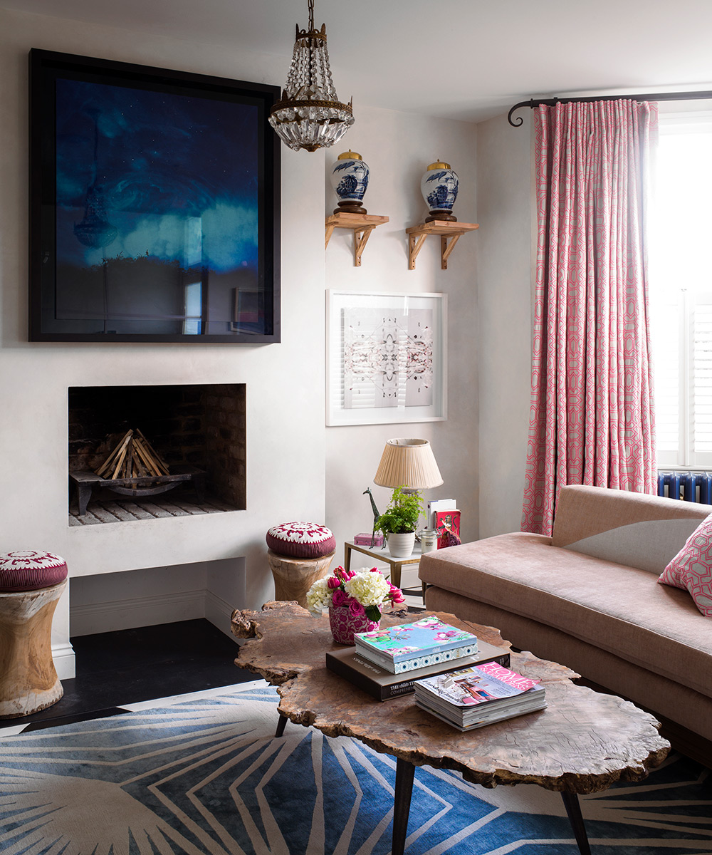
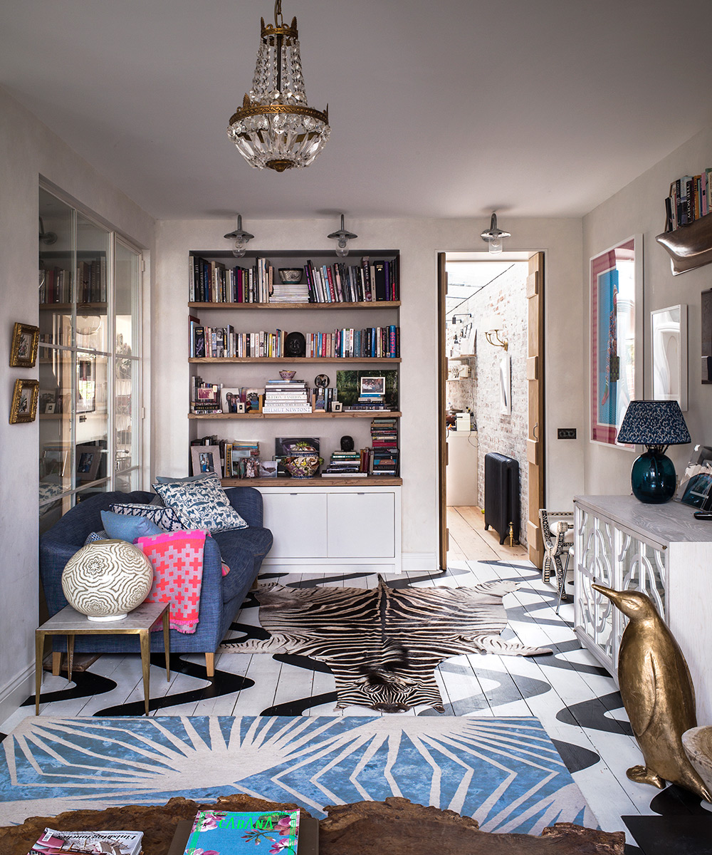
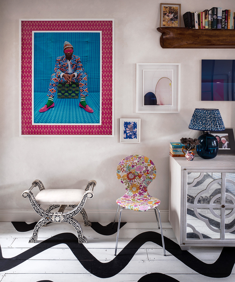
The homeowner decided this room needed something a bit crazy so she had wavy lines painted on the floor. The colorful image above is by Moroccan photographer Hassan Hajjaj.
‘I use my home as an art gallery for my business, Lumitrix,’ says the owner, but at least half of the pieces on display are from her private collection of photography. The work above the fireplace is by Susan Derges, who specialises in cameraless photography.
Staircase
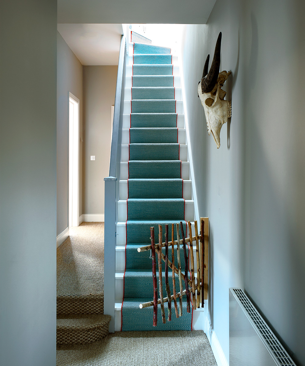
During the refurbishment, the owner gave birth to her son and her builder said she would need a stair gate. ‘I didn't want a plastic one so I got him to make a rustic design using thin branches of birch,’ she explains.
‘The staircase originally ended in the middle of the attic, which meant there was little space, not even enough for a desk. I wanted to have a room in the roof, so we flipped the staircase around to make that possible. That meant that the layout on each floor had to change, too. At one point, there were no internal walls left in the house. It was worth the upheaval, though; as well as freeing up space in the attic room, the stairs now open onto the kitchen, which gives a lovely feeling of airiness,’ the homeowner explains.
Main bedroom
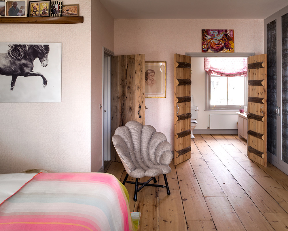
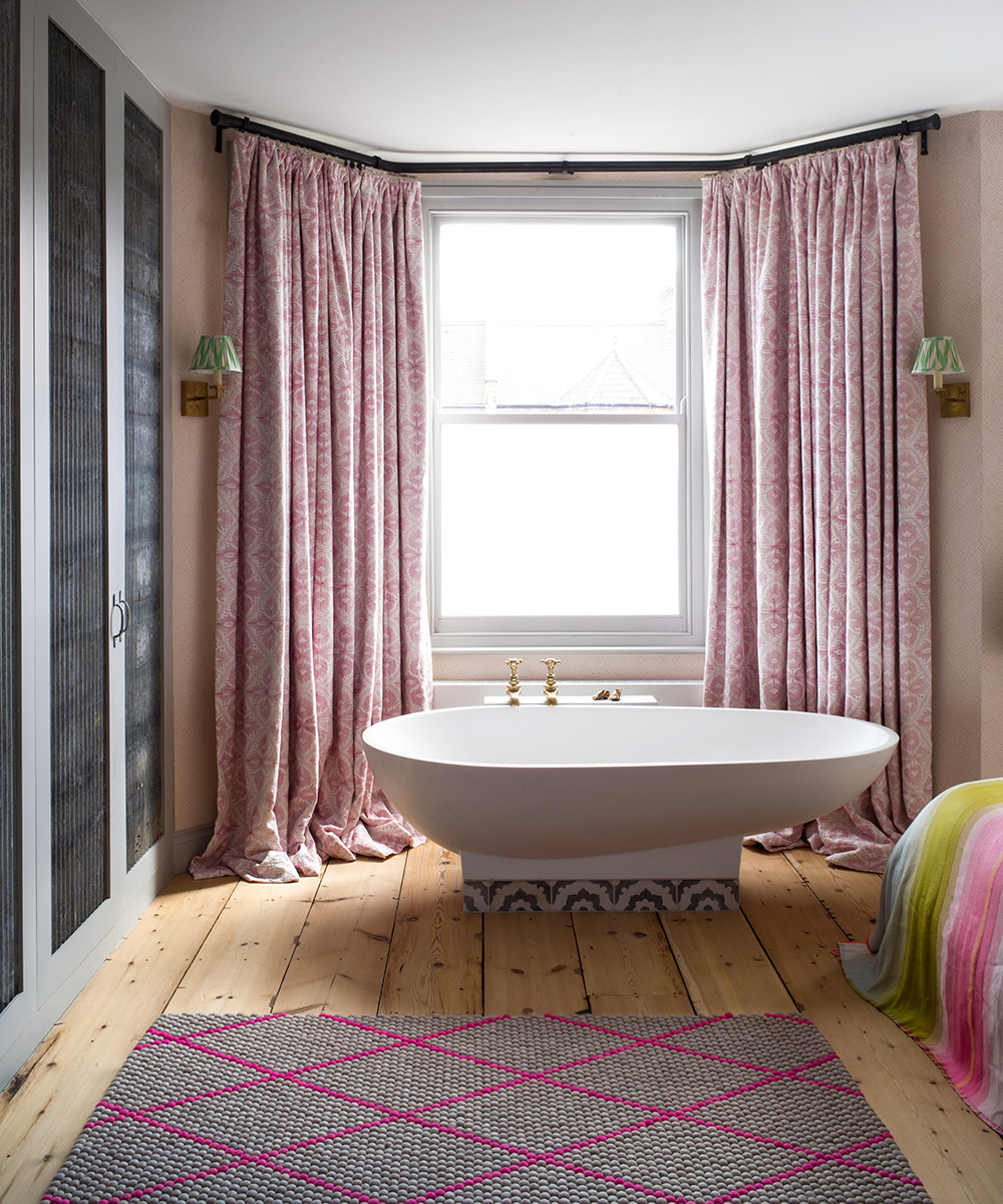
‘The bath is very heavy,’ says the owner, ‘but it goes wherever I do because I love it so much.’ The photograph of a horse, entitled Sindri, by Astrid Harrisson, enjoys pride of place in here.
Main bathroom
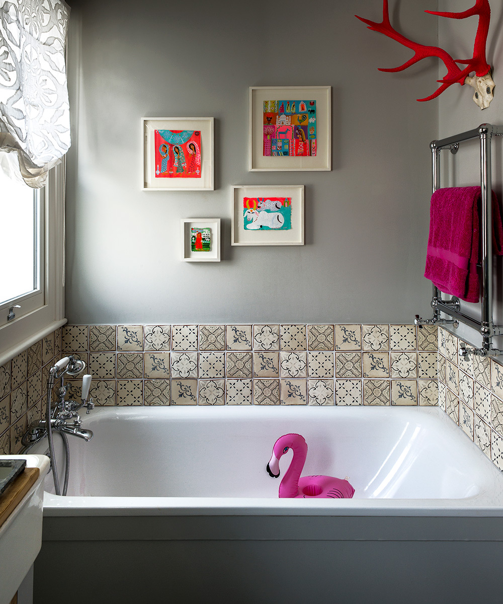
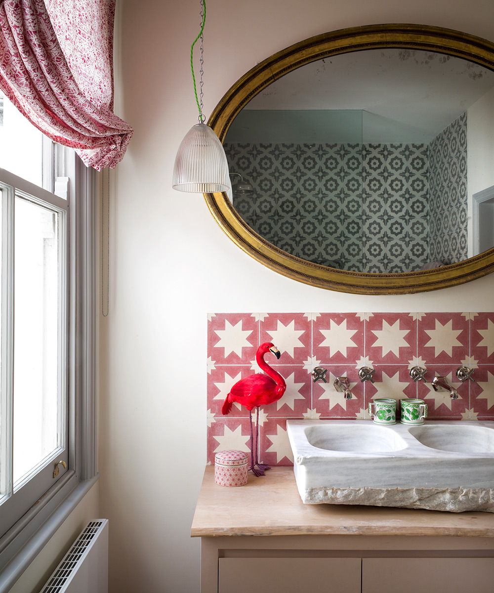
‘I love the vivid palette of Christopher Corr's Indian scenes,’ says the owner of the artworks. ‘I found the antlers, which had been shed naturally, in Scotland and painted them neon pink. I just love the color.’
See: a harmonious park-side home
Guest bedroom
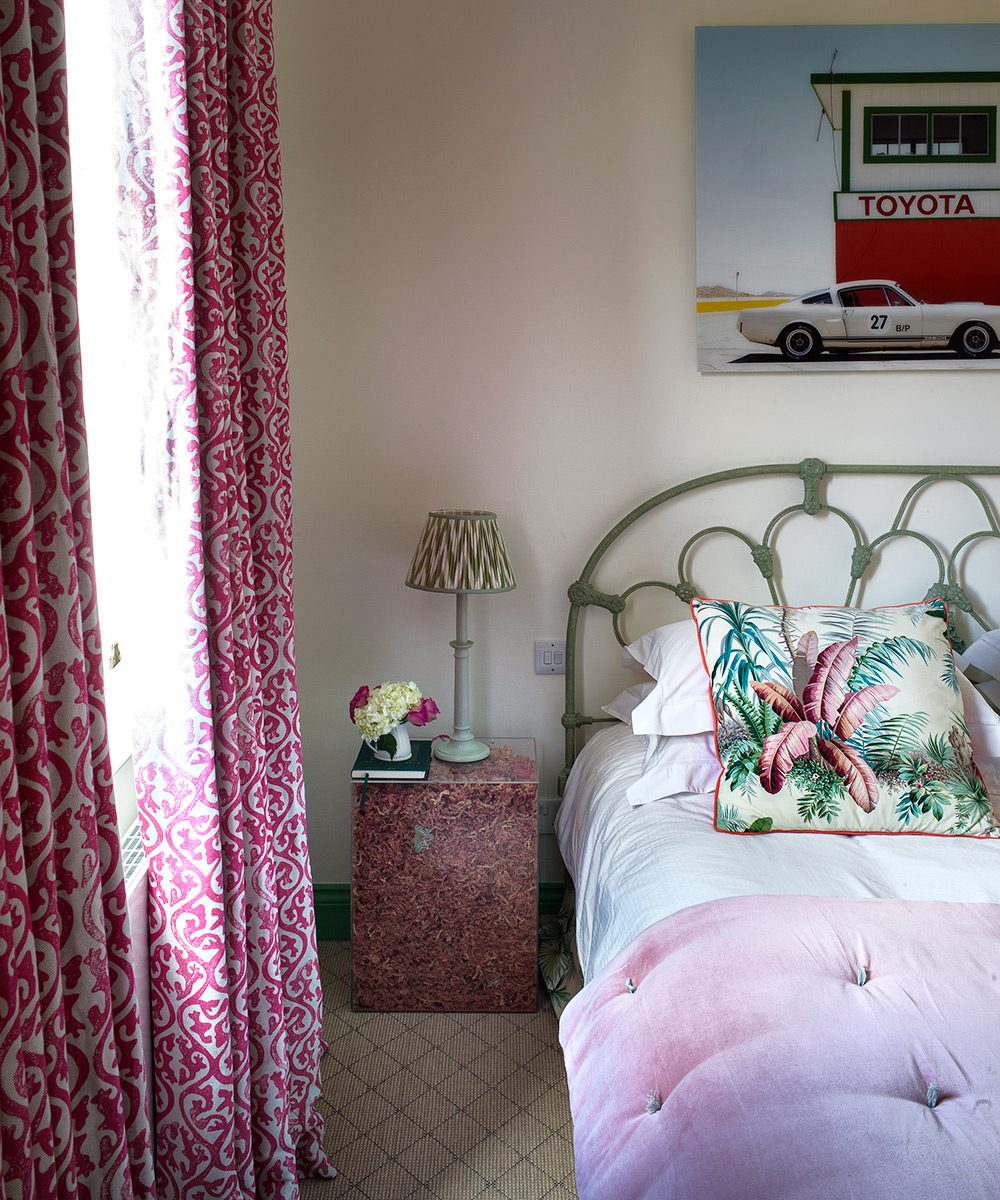
This color scheme was inspired by one of Molly Mahon's Instagram pictures featuring the curtain fabric used here.
Nursery
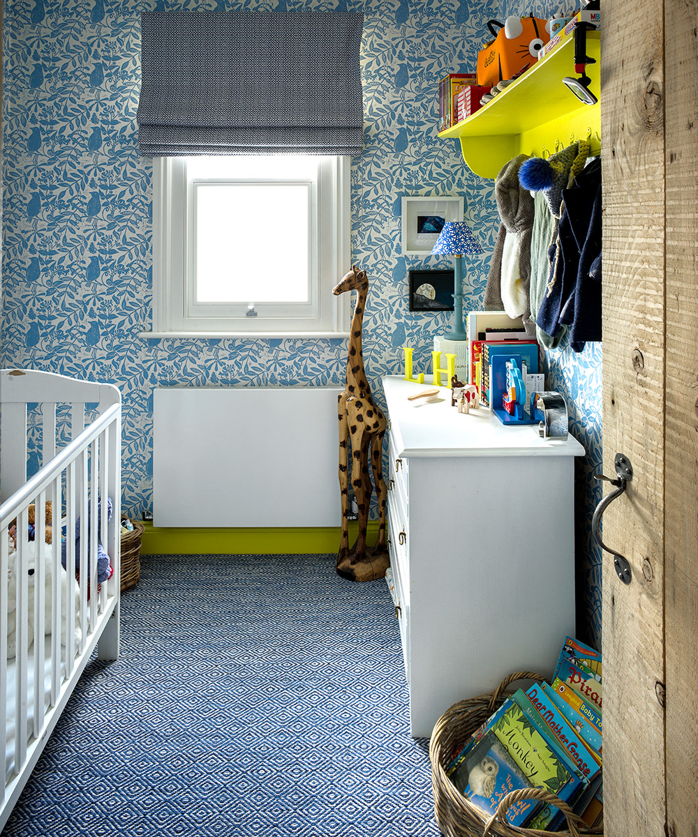
‘My son's room is my favourite. I'm obsessed with yellow and I love its conflict with the blues,’ says the homeowner.
Loft bedroom
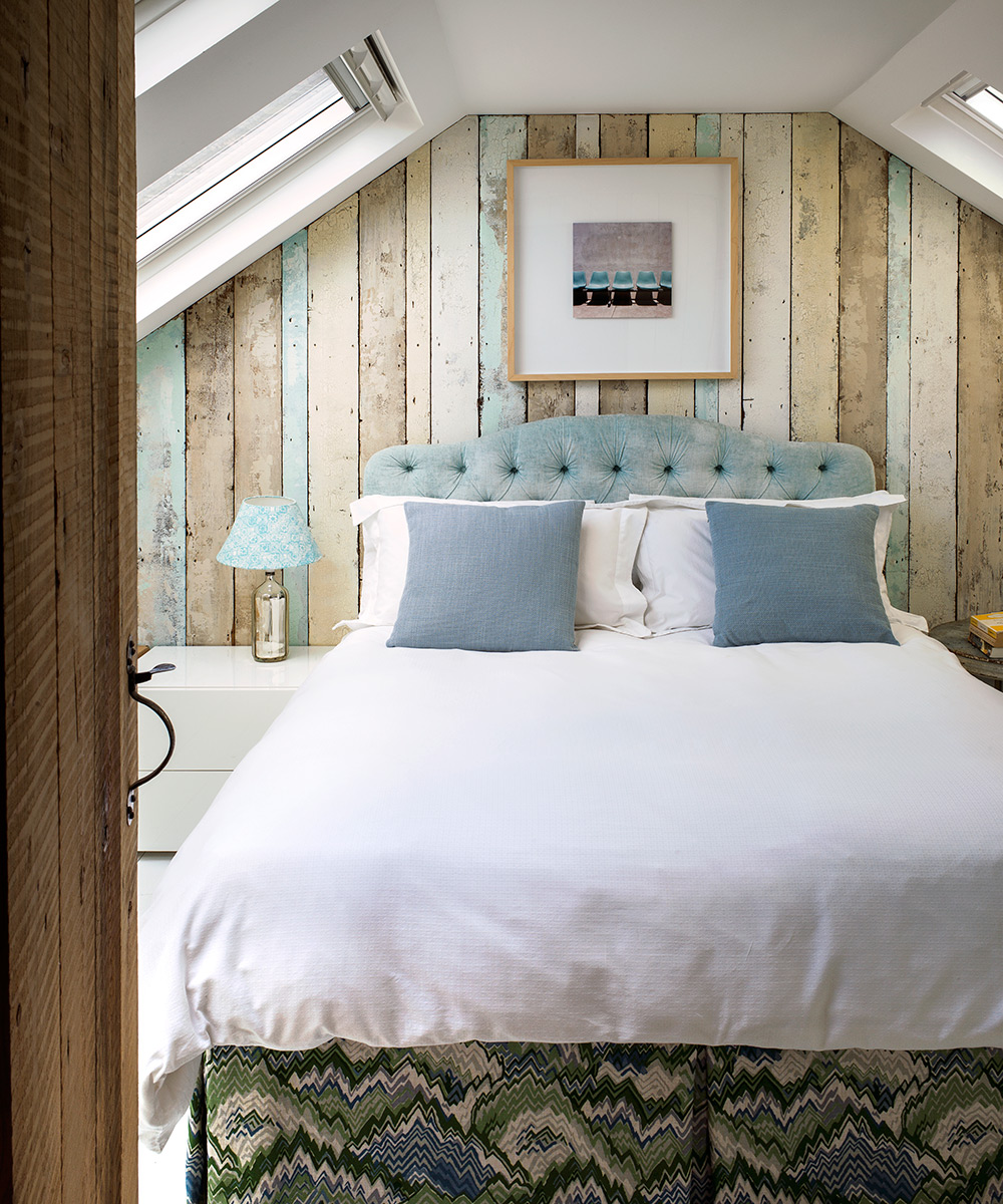
The walls are lined with pine boards, which were once on the kitchen floor. They have now been treated with a pale turquoise paint effect by John Harragan.
Photography/ Paul Raeside

Jennifer is the Digital Editor at Homes & Gardens, bringing years of interiors experience across the US and UK. She has worked with leading publications, blending expertise in PR, marketing, social media, commercial strategy, and e-commerce. Jennifer has covered every corner of the home – curating projects from top interior designers, sourcing celebrity properties, reviewing appliances, and delivering timely news. Now, she channels her digital skills into shaping the world’s leading interiors website.