Design house: An intriguing and unusual seven-storey townhouse in Kensington
With owners who delight in the unusual, this townhouse's interior designed by Studio Indigo now has more than a touch of the theatrical

The house was very intriguing; says Studio Indigo's Mike Fisher of the seven-storey townhouse in Kensington that the company were asked to renovate five years ago. 'I was familiar with the property as I had lived opposite it for many years. The previous owners had begun renovating it but a change in circumstances meant they had to put it on the market unfinished. Our client, who has four children, purchased the house with a view to creating a more substantial family home and we were asked what we thought we could do to it. As we had already worked on several properties in the local area, we knew exactly what improvements to make.’
See: more inspiring house tours in our Spaces section
- See some of the world's best homes – beautiful properties from around the globe
The property
The main challenge that Mike and interior designer Fleur Liversidge faced was the positioning of the principal rooms - whether they should be at the front of the house, which faces north or at the rear. In the end, they decided to orientate the main rooms to the beautiful street at the front. 'What is lovely about the property is that you can stand in the centre of the house and look to the street at the front or you can look through to the garden. Light comes in from front to back,’ says Mike.
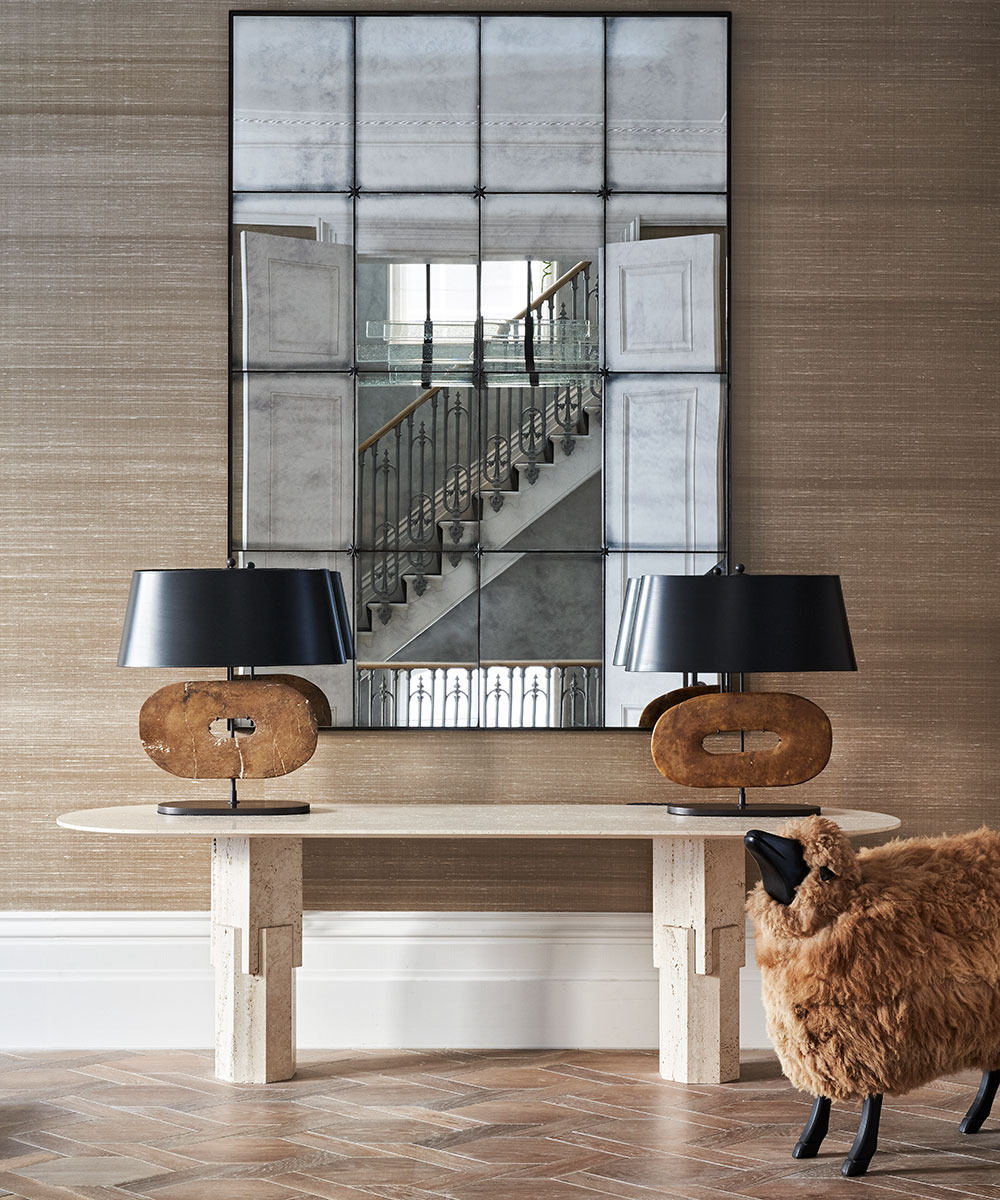
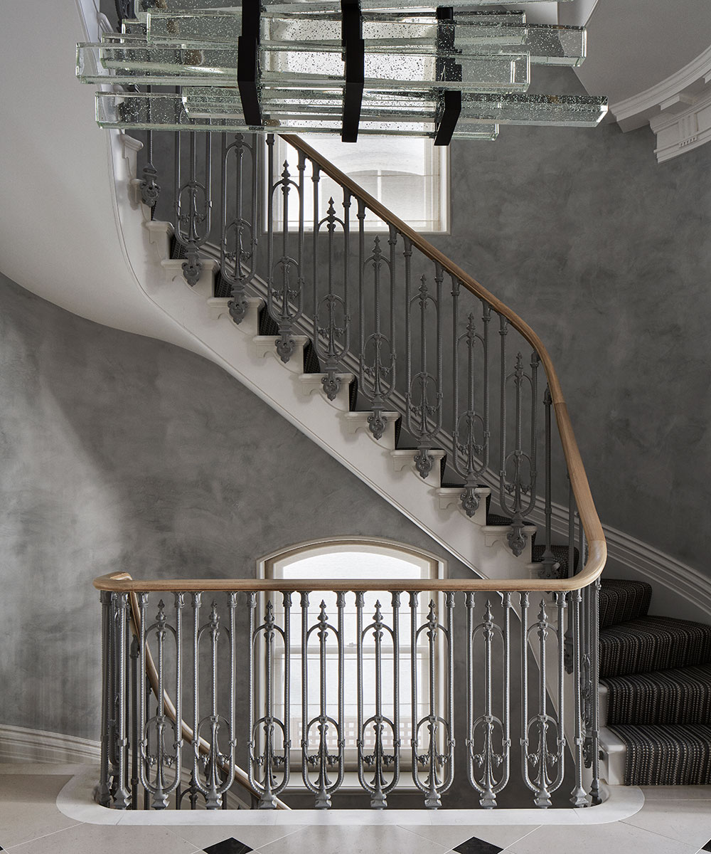
As the house is seven storeys high, the installation of a lift was essential, in addition to the staircase. However, Studio Indigo's plan was to make the staircase a central feature. The original Victorian design was the inspiration but it was made grander, more elegant and less steep. Other major structural work included the building of a double basement to house a swimming pool and a gym.
For Mike, the project was about the journey his team went on with the owners. 'I love how sophisticated their taste became,’ he says. 'They developed a passion and interest in contemporary art and furniture, and had a desire to seek out the unusual, fascinating and cutting edge.’
Mike and Fleur wanted to make the interior interesting and distinct, incorporating colors from an elegant palette. 'We aimed to make it an inward-looking house with eye-catching furniture and art,’ says Mike. 'Each room has its own sense of identity and character.'
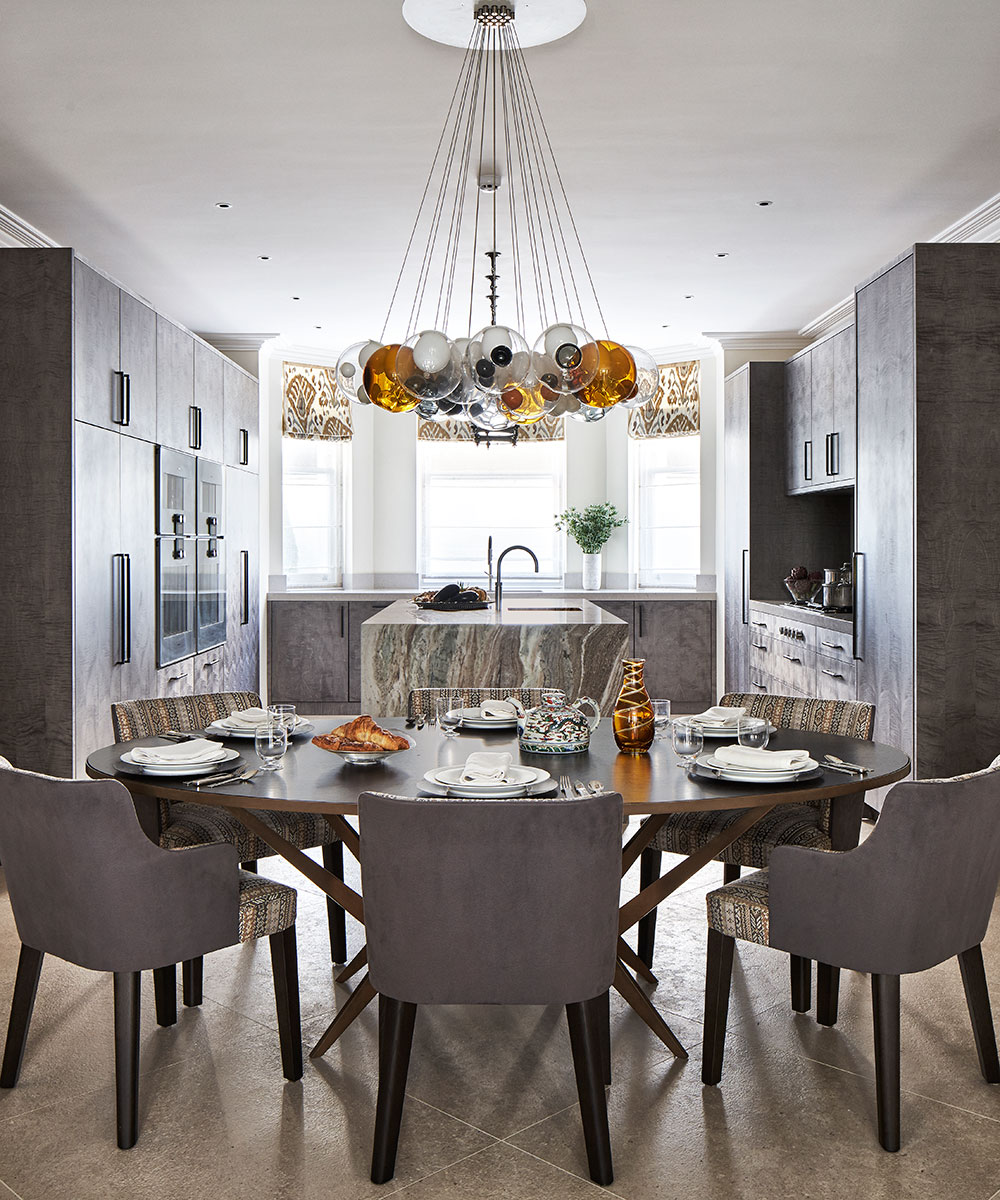
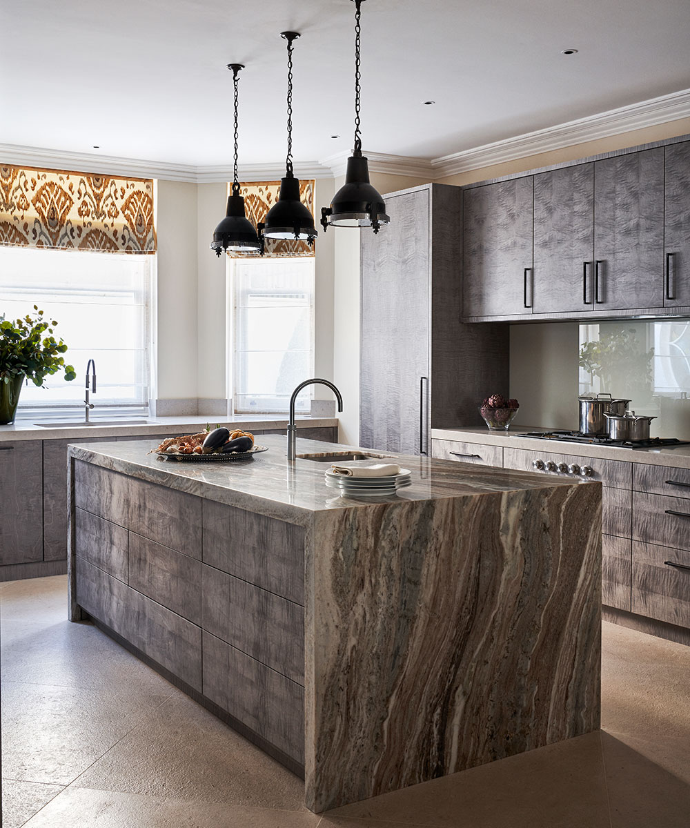
Inevitably, the kitchen/breakfast room is the heart of the home. 'We wanted to create something interesting using rich, warm colors, so we incorporated sycamore veneer cabinetry with marble worktops. We love color - not bright primary colors but more muted tones. We like to use paints by Zoffany and Papers and Paints as the colors look different as the light changes.'
Sign up to the Homes & Gardens newsletter
Design expertise in your inbox – from inspiring decorating ideas and beautiful celebrity homes to practical gardening advice and shopping round-ups.
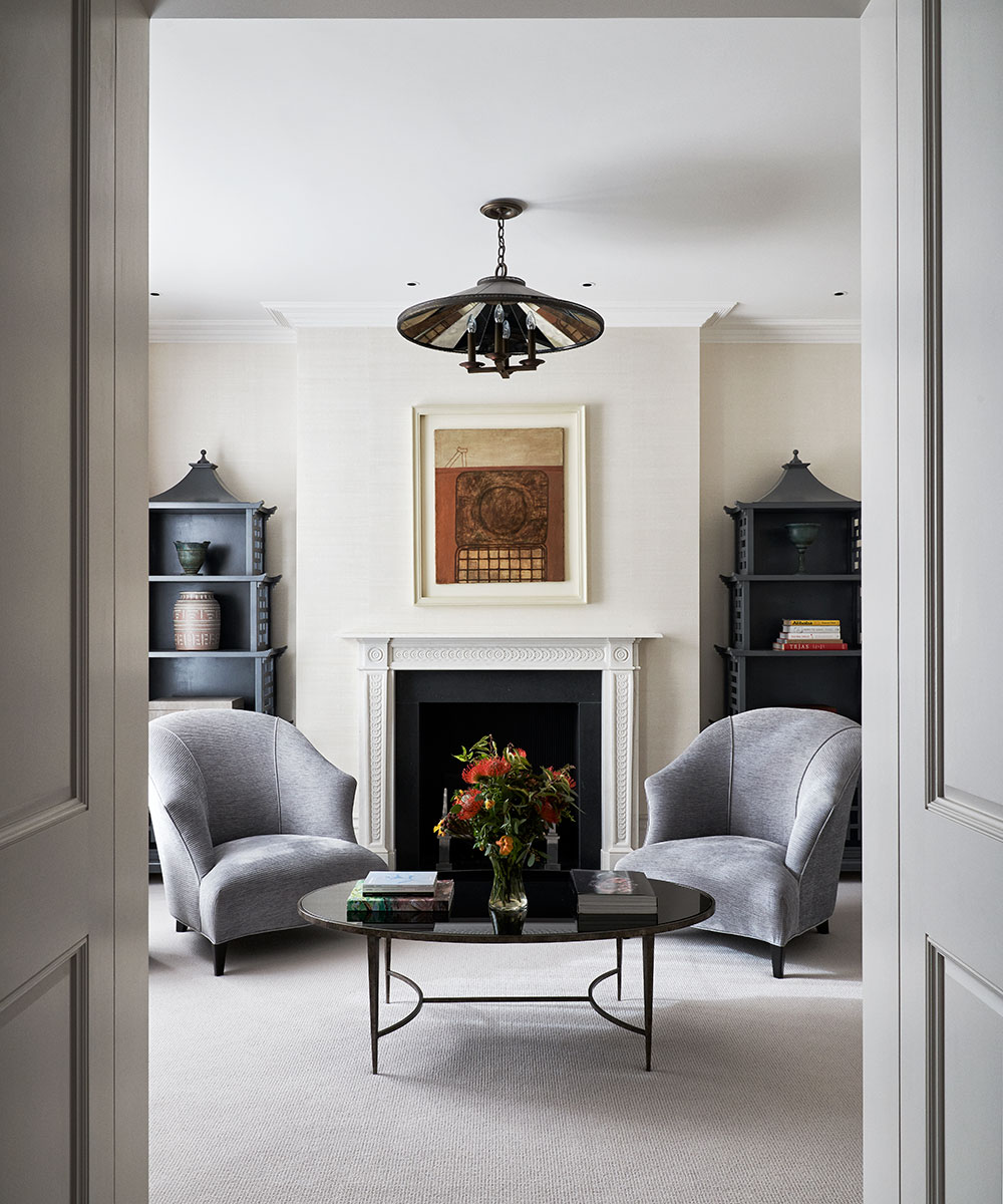
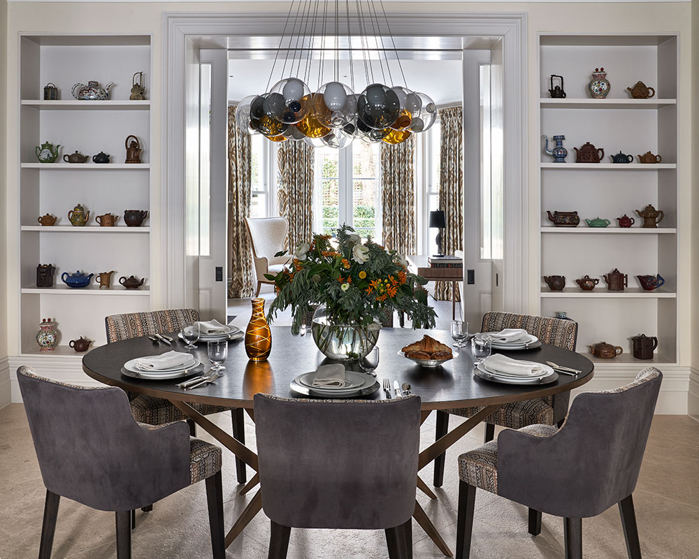
The formal sitting room was very challenging. 'We restored the original proportions and cornicing. It's a north-facing room and we opened it up to the south with two double doors leading into the dining room. The two rooms are meant to be read together so that there's a sense of living in both spaces,’ says Mike.
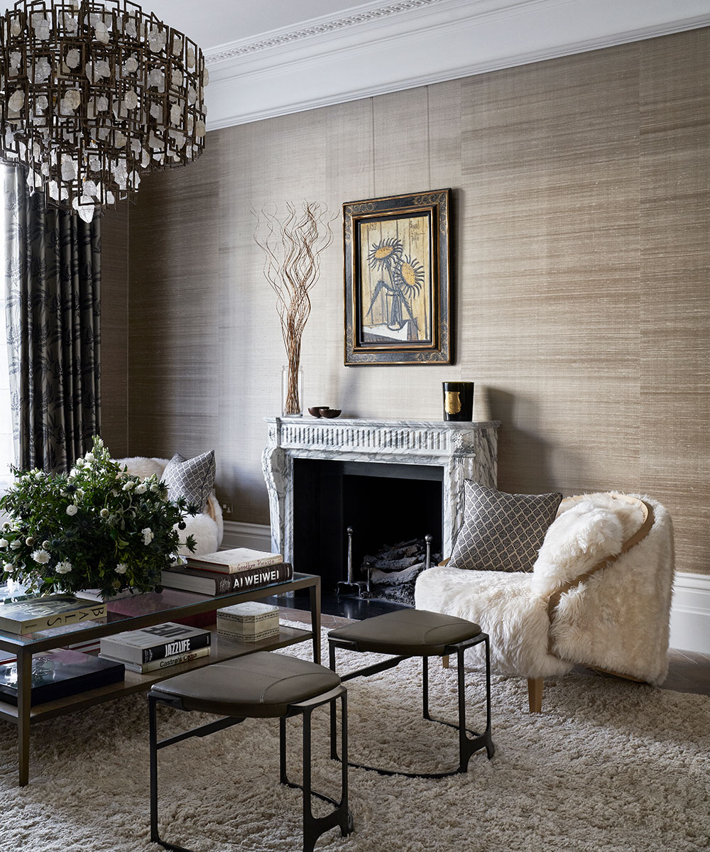
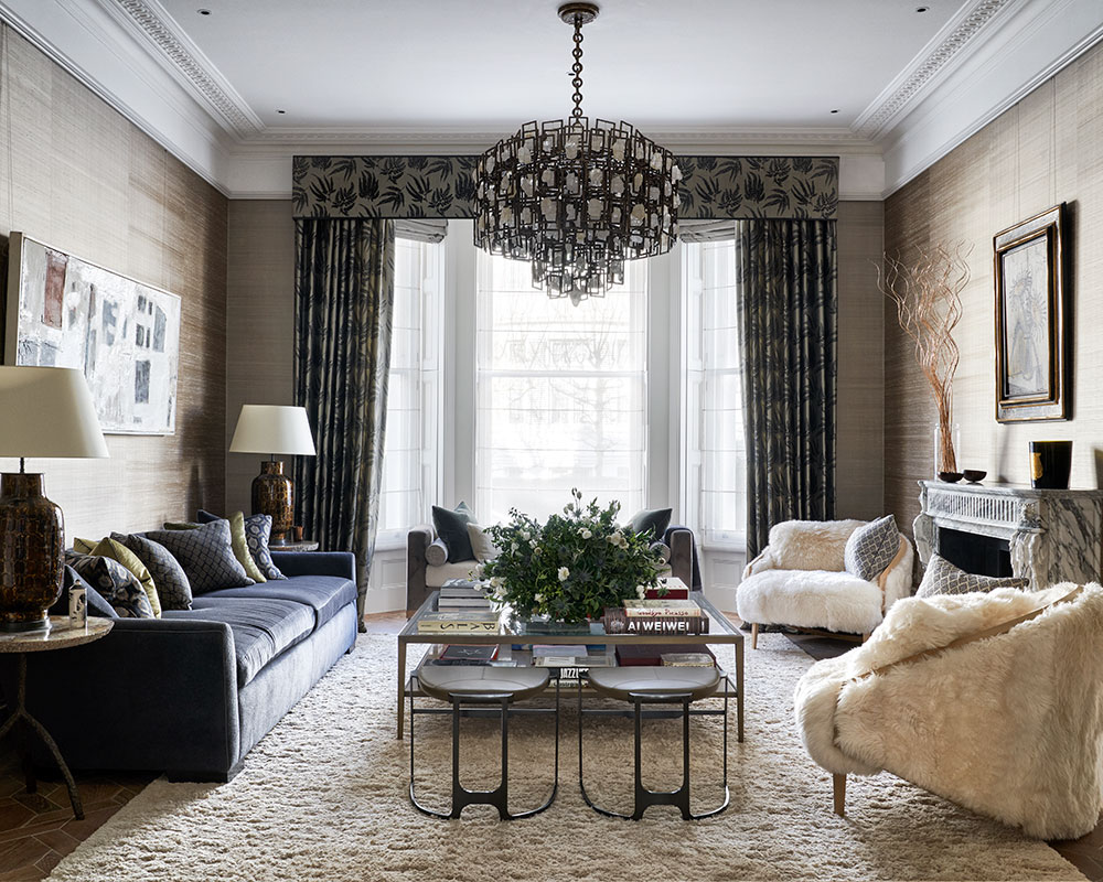
Silk wallpaper on the sitting room walls introduces reflectivity to make the room appear lighter. For a large family, ensuring there was enough seating was important, so as well as a sofa, there are fabulously tactile sheepskin chairs and a chaise longue in the bay window. A rock crystal chandelier and fascinating pieces of art add to the sense of drama.
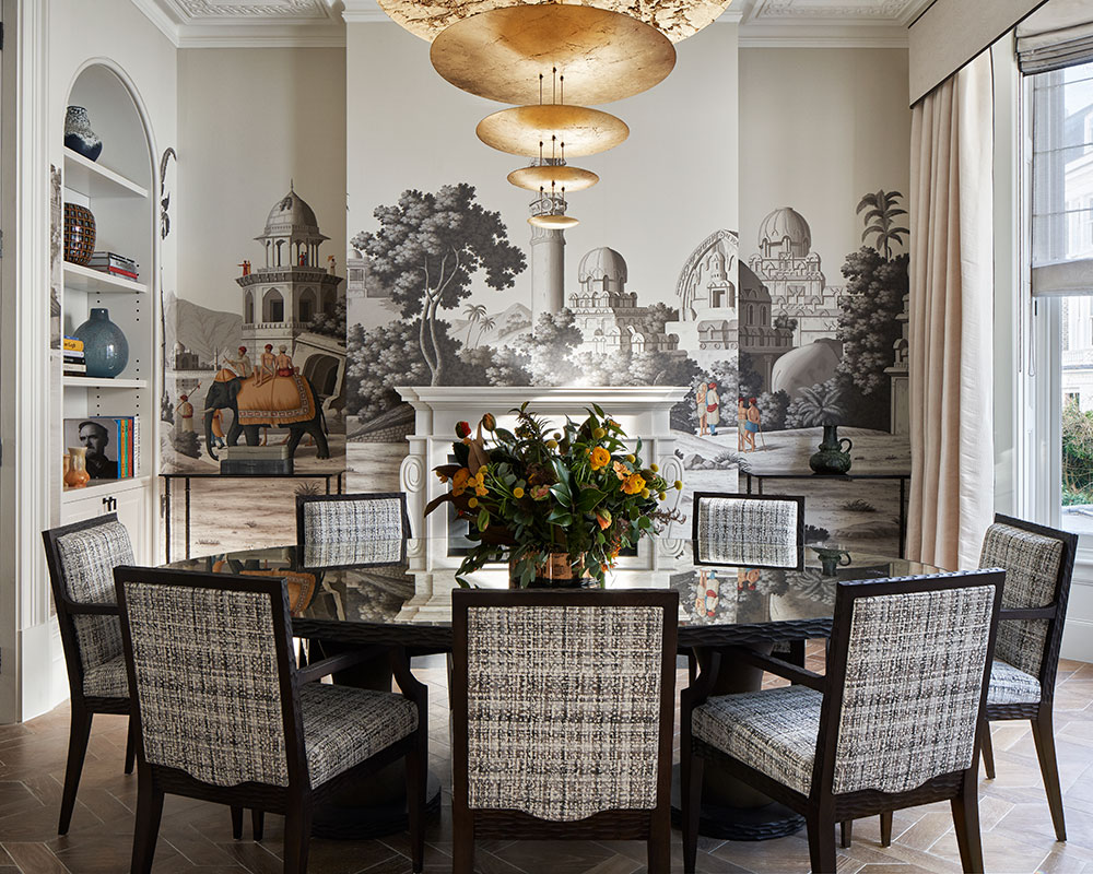
Next door, the spectacular dining room with its Sir John Soane arches has bespoke de Gournay wallpaper with scenes of India. The largely monochromatic design comes to life with unexpected bursts of color.
'We chose the glass-topped table to reflect light,’ says Mike. 'It's about making a space feel bigger and creating illusions – is what you are seeing real or a reflection?
'You can't be in every room at the same time but you should enjoy the entire house visually - things should draw your eye from one room to the next. We wanted to create an open feel but with the ability to close each room off. There is theatricality in it and practicality, too.'
Dining room
A statement India-themed wallpaper makes an eye-catching backdrop for formal entertaining.
Formal living room
Tactile fabrics and textures wallpaper are layered in this sophisticated scheme.
Guest room
This large space has a generous seating area.

Kitchen room
Wood, stone and glass are combined here in warming hues.
See: An urban London home that is smart, contemporary and bold
Main entrance
The original Victorian design was the inspiration for the new staircase, but Studio Indigo made it grander and less steep.
Child's bedroom
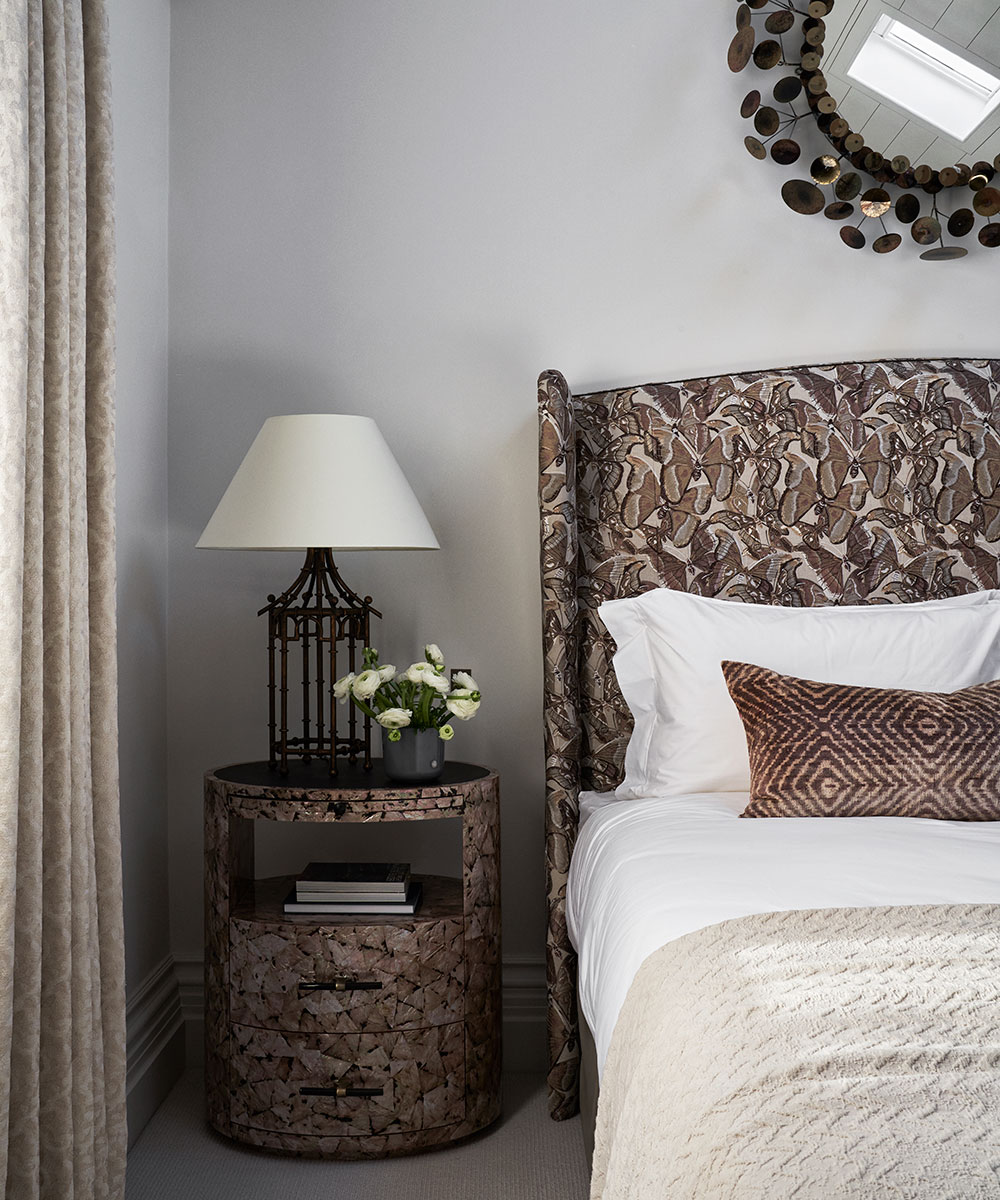
Metallic accessories create a grown-up look.
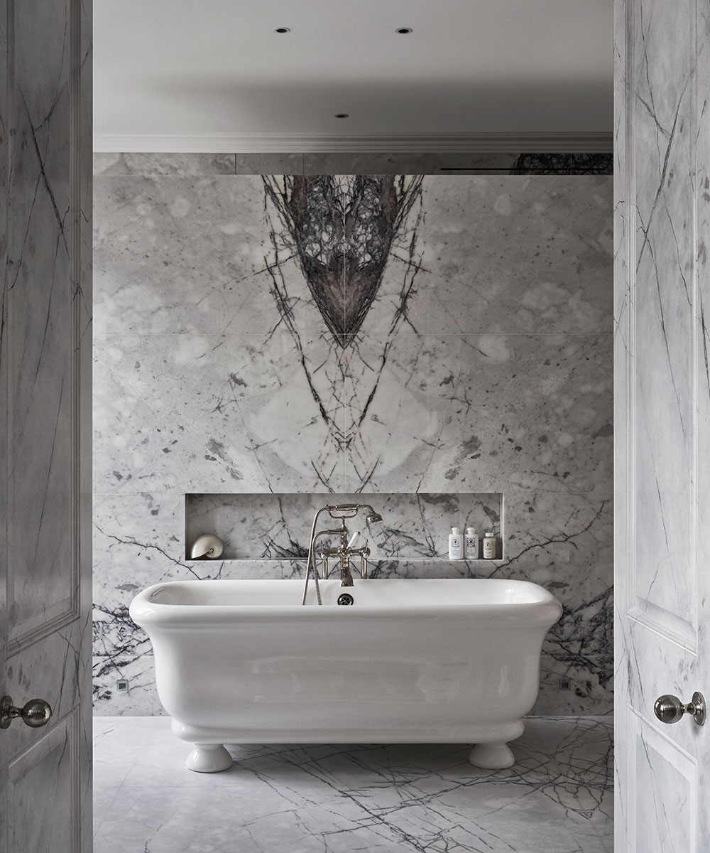
Master bathroom
A paint effect on the doors matches the marble.
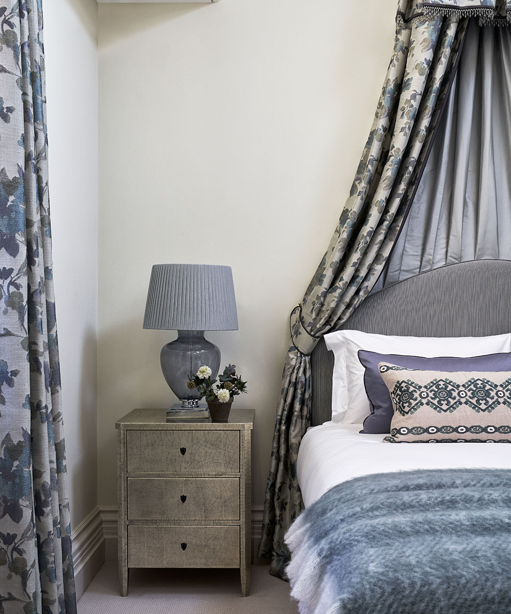
Child's bedroom
The floral canopy injects a fairy-tale feel.
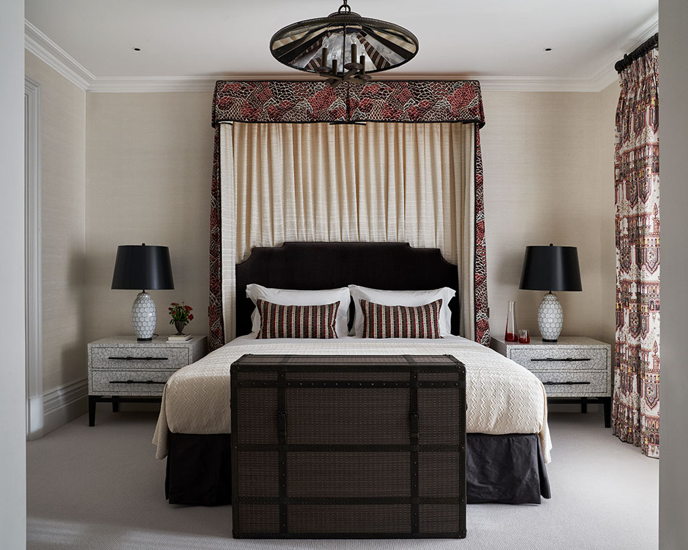
Curtain and canopy in (outer fabric) Marisol by Weitzner and (inner fabric) Diva in House by Chase Erwin. Cracked silver bedside table, Simon Orrell Designs. Lamp, Oka. Walls painted in Polar Bear by Zoffany.
Photography/ Davide Lovatti

Interiors have always been Vivienne's passion – from bold and bright to Scandi white. After studying at Leeds University, she worked at the Financial Times, before moving to Radio Times. She did an interior design course and then worked for Homes & Gardens, Country Living and House Beautiful. Vivienne’s always enjoyed reader homes and loves to spot a house she knows is perfect for a magazine (she has even knocked on the doors of houses with curb appeal!), so she became a houses editor, commissioning reader homes, writing features and styling and art directing photo shoots. She worked on Country Homes & Interiors for 15 years, before returning to Homes & Gardens as houses editor four years ago.
-
 ‘It leads to more headaches than it's worth’ – 4 reasons you should never store things in your oven, including fire risks and serious illness
Your oven is for cooking, and cooking only, experts urge
By Chiana Dickson
-
 Urban gardening ideas – 7 creative ways to grow in small spaces, balconies, containers, indoors, and more
Make the most of your space with these innovative ways to garden
By Tenielle Jordison