Design house: A harmonious Georgian retreat in Norfolk
When the homeowner and her family moved to Norfolk, they took with them treasured antiques, which she has judiciously paired with modern pieces to make the most of old and new
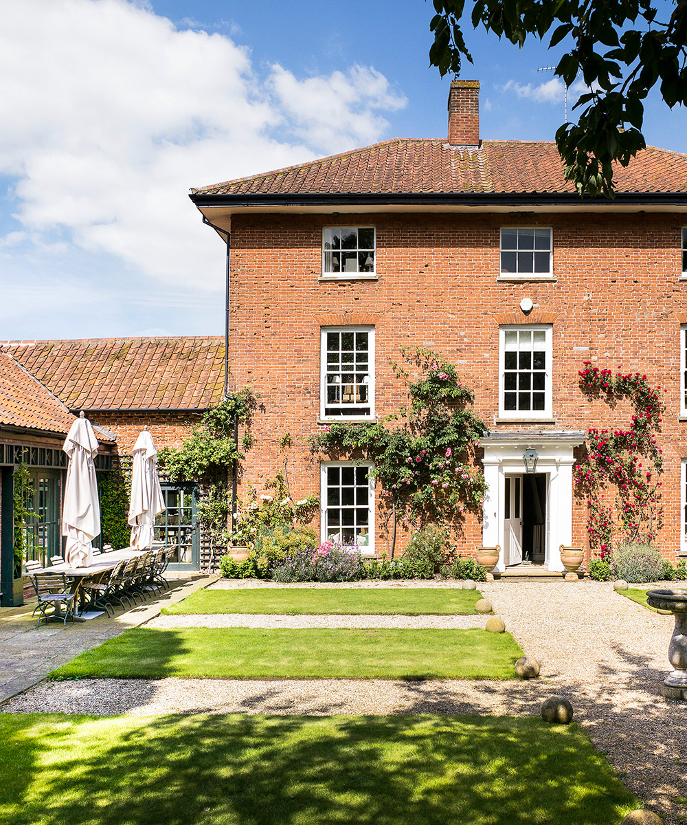

As a child, the homeowner spent many a holiday on the north Norfolk coast. Further visits with her husband rekindled her affinity with the area, so when looking for a second home this was the obvious location.
‘Although much larger than the property we originally had in mind, we fell in love with this late-Georgian house that belonged to the former estate manager,’ says the homeowner.
See: our spaces section for more inspiring featured homes
'We spent six years coming to the house during school holidays but, four years ago, when the children left their local schools, we decided to move here from Suffolk for a more rural lifestyle. This house was the right size and it felt like the right time.’
- See some of the world's best homes – beautiful properties from around the globe

The property
As the homeowner explains, ‘Our previous property was larger and more traditional in style, while this house had been a holiday home and was decorated in casual beach house style, with painted furniture that I had picked up on regular trips to Europe. The layout worked well, though, so what I needed to do was make it cosier and give it a more lived-in family feel. In the end, I chose favourite items from both the houses, which has led to a mix of traditional polished pieces partnered with painted ones, helping to create the relaxed, informal look we wanted.’
This is where the owner’s experience as an interior designer (she trained with Percy Bass and Colefax and Fowler) followed by 15 years as a specialist dealer in continental antiques becomes clear. ‘Elegance and a strong sense of comfort and calm are key to all my design schemes,’ she says. ‘It's important to live surrounded by the possessions you love, but the trick is to balance these using subtle and discreet interior design.’
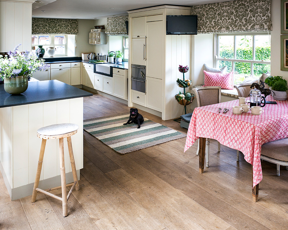
Exterior
To the left of the main house, what was originally a garage built in the 1950s has been turned into a comfortable drawing room that overlooks the garden. To conceal the modern brickwork, garden designer George Carter placed trellising around the four sets of double doors leading on to the sheltered terrace.
Sign up to the Homes & Gardens newsletter
Design expertise in your inbox – from inspiring decorating ideas and beautiful celebrity homes to practical gardening advice and shopping round-ups.

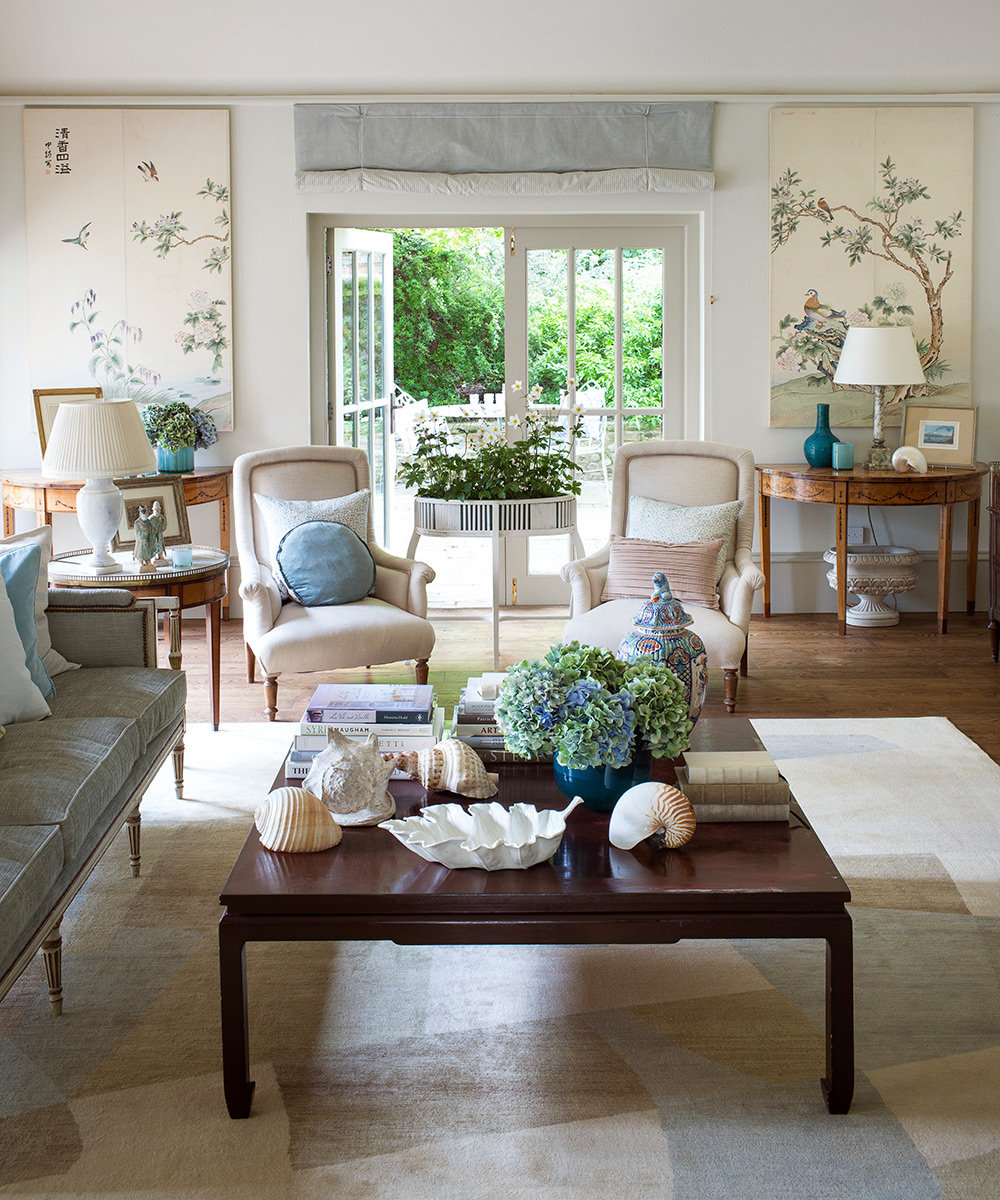
Drawing room
Simple blinds were chosen for the windows as the owner felt that acres of curtain fabric would have spoiled the clean look: ‘The blinds make the room appear taller and more elegant,’ she says. The Chinese panels, found in a flea market in Paris, provide the decorative interest that wallpaper would other have done.
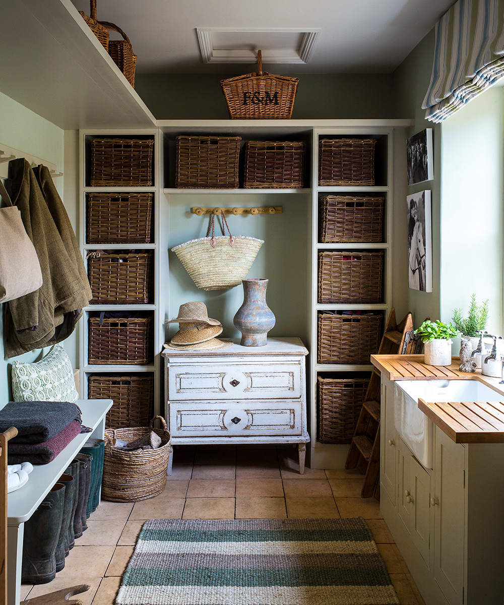
Boot room
An antique Swedish commode forms the focal point in this enviable storage space that was once the laundry room.
Sitting room
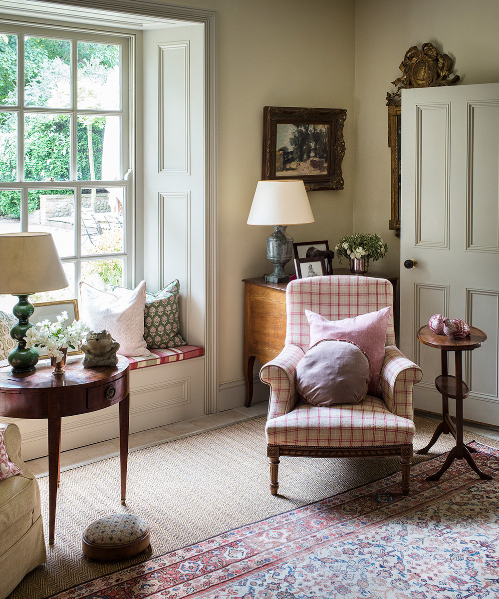
The owner’s own fabrics on the cushions and armchair give new life to the fine antiques that came from her previous home.
Drawing room
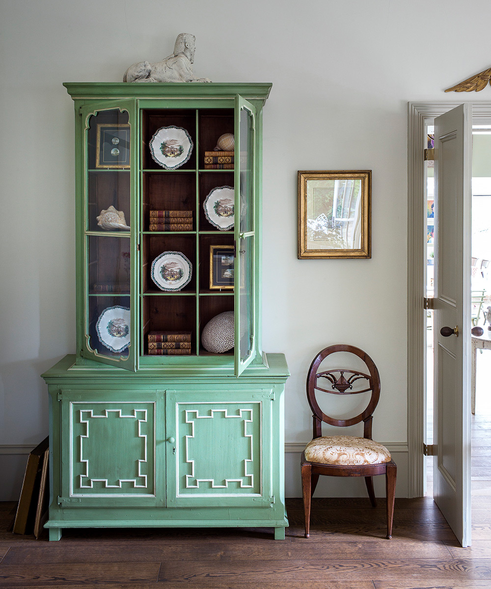
Having a plain backdrop enables bold color, as on this celadon green dresser, to sing out while still keeping the look calm.
Dining room
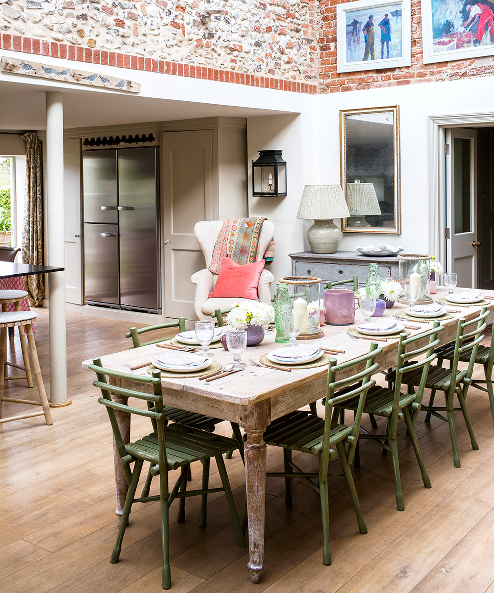
The previous owner connected two farm outbuildings with a glass roof to create this light-filled space. When Birdie and her husband Frank moved in ten years ago, they decided to choose work by local East Anglian artists, and the owner’s color schemes were devised to complement these pieces.
Living room
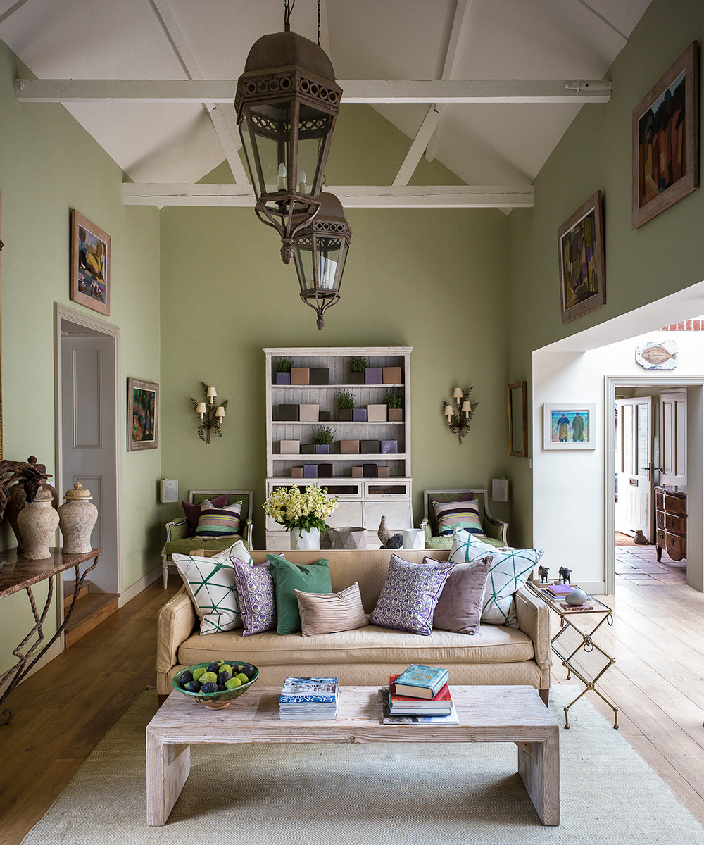
Adjoining the kitchen and dining area. this comfortable space, filled with an artful combination of French antiques, contemporary works and painted furniture, is where the family likes to gather.
Just as the owner has an instinctive flair for choosing the perfect piece for a specific spot, she also has a natural eye for creating a harmonious palette. ‘I hadn't intended to use as much green as I have, but it's a color I'm naturally drawn to and it turned out to be the perfect base for the whole house,’ she says.
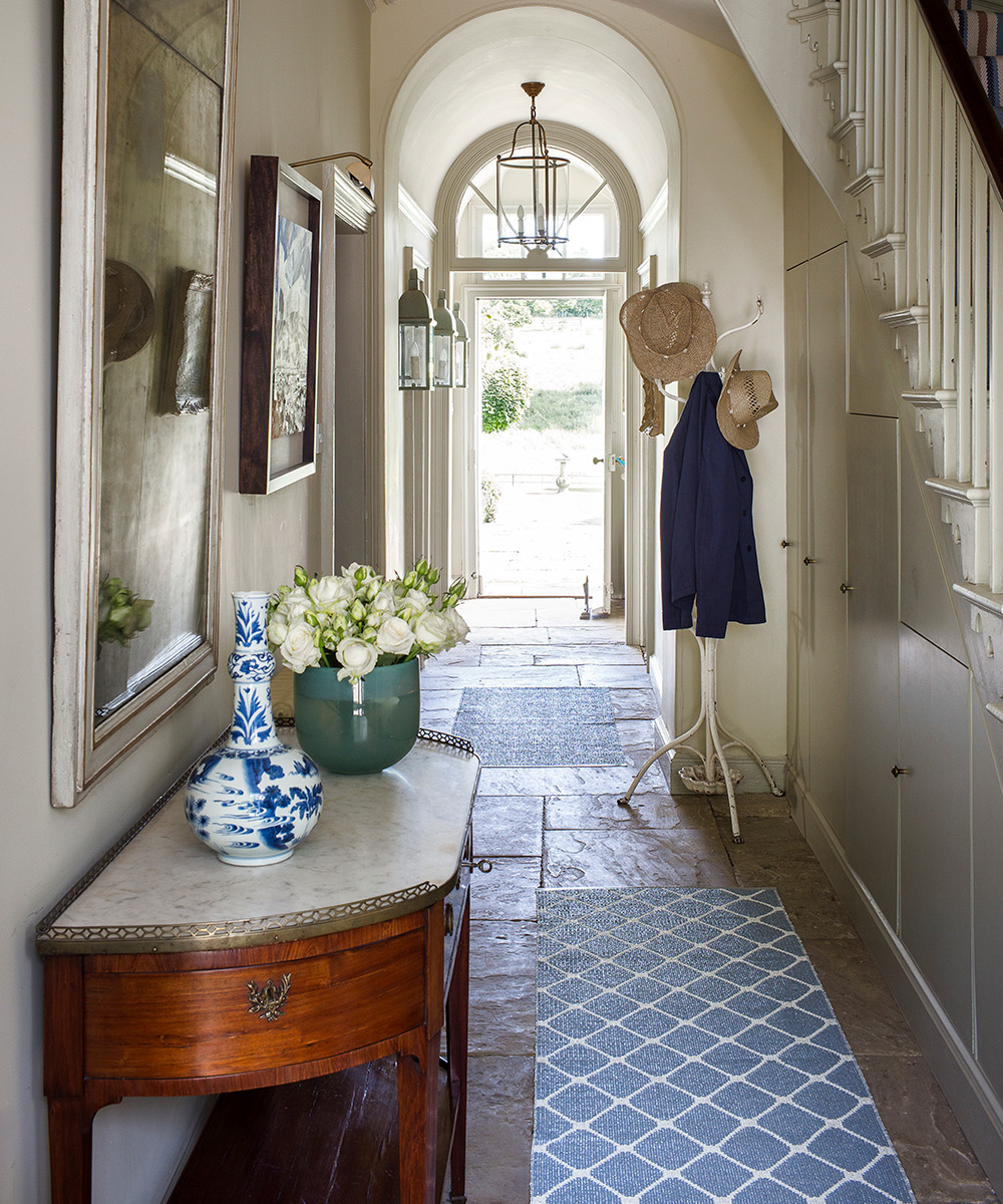
Entrance hall
When the owner took up the ceramic tiles that ran from the front to the back door, she was delighted to find the original flagstones underneath.
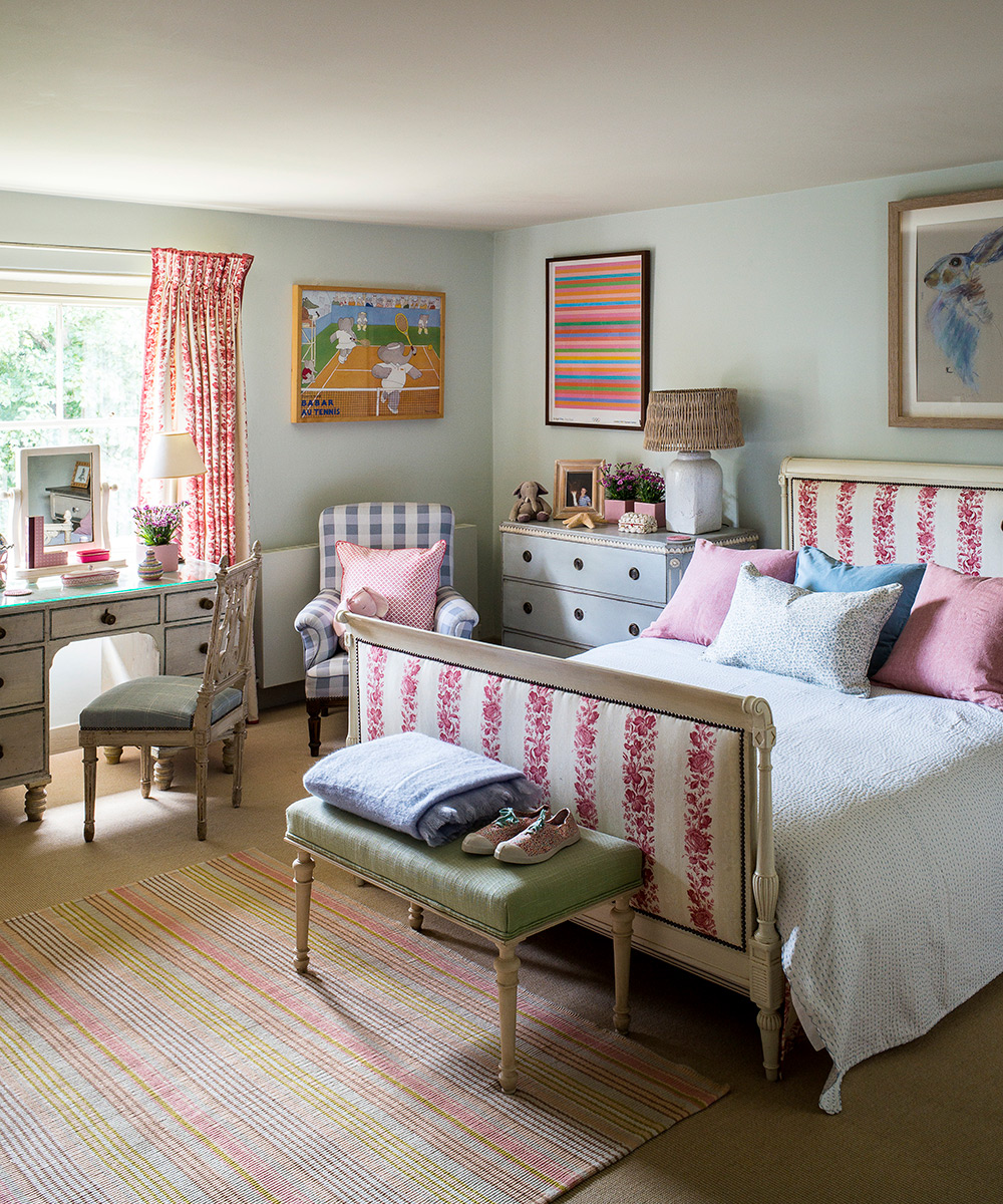
Child's room
The bunk bed was the first thing to go when her daughter redecorated her room with her mother's help. ‘We wanted to combine elements from her childhood with a more teenage feel,’ says the homeowner.
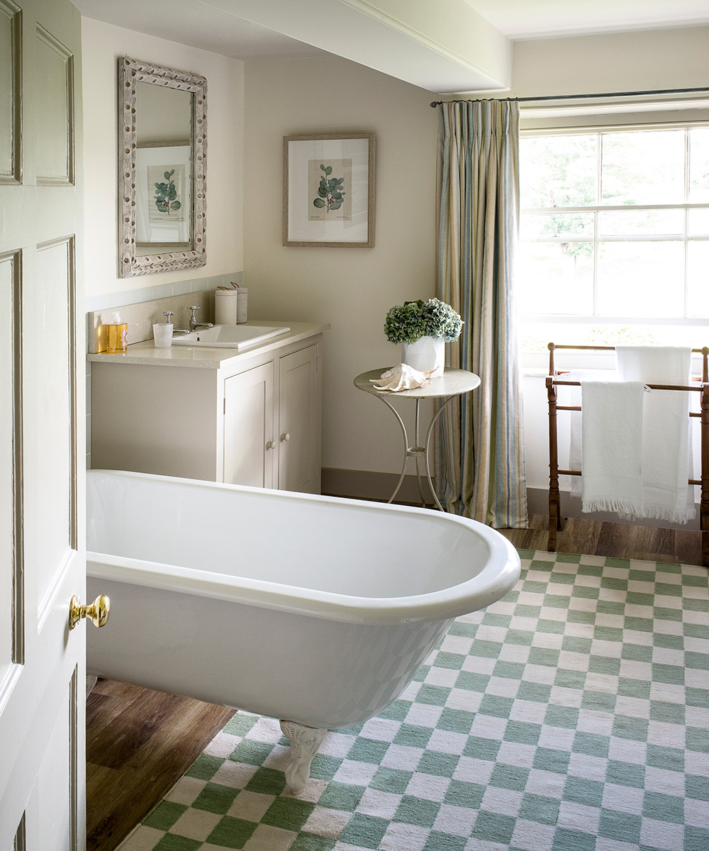
Guest bathroom
The subtle, contemporary cast of the vanity unit, which was designed by the homeowner, prevents the guest bathroom from being quaint.
Photography/ Paul Raeside

Jennifer is the Digital Editor at Homes & Gardens. Having worked in the interiors industry for several years in both the US and UK, spanning many publications, she now hones her digital prowess on the 'best interiors website' in the world. Multi-skilled, Jennifer has worked in PR and marketing and occasionally dabbles in the social media, commercial, and the e-commerce space. Over the years, she has written about every area of the home, from compiling houses designed by some of the best interior designers in the world to sourcing celebrity homes, reviewing appliances, and even writing a few news stories or two.
-
 I thought I was over white kitchens, but Brooke Shields' cabinets reminded me why it's a truly timeless color choice
The actress' cabinets pair seamlessly with a blue-painted accent wall, proving that this neutral shade is ever-versatile
By Hannah Ziegler
-
 I'm an expert vacuum tester, and no, you really don't need a mattress vacuum – here's what to use instead
Before investing in a new gadget, the tried-and-true methods still work
By Dan Fauzi