Design house: A family home in London with two different aesthetics
One-off pieces and ethnic antiques are set against a modern and minimal backdrop, effortlessly bringing together the two different styles of its owners
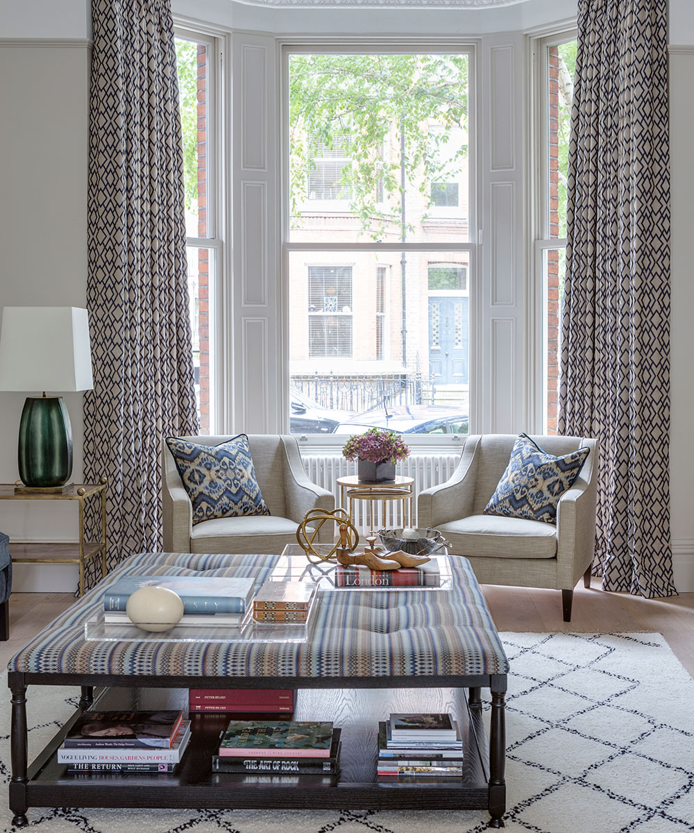

How do you reconcile two different aesthetics in one family home? That was the challenge the owner’s faced when they bought their terraced house in west London.
‘I grew up in Turkey and spent my childhood surrounded by ethnic antiques. So, from an early age, I’ve been drawn to one-off, artisan pieces,’ says the homeowner, whose family later moved to America, where she met her husband.
‘He likes open, uncluttered spaces and clean edges; he doesn’t like anything detailed or folksy.’ What might have become the basis for a domestic rift has, instead, with the guidance of interior designers Liz Moloney and Rachel Fayman, inspired a home where hand-crafted heirlooms and modernity happily co-exist.
See: our spaces section for more inspiring featured homes
- See some of the world's best homes – beautiful properties from around the globe

The property
‘We were fortunate that the previous owner, a developer, had converted the building from three flats, back into a whole house,’ says the owner, as she leads us in to the sitting room, a well-lit space that fills the ground floor. At the back of the room, the floor is cut away and a glass balustrade reveals a vast family living area and kitchen below. ‘My husband instantly liked the openness,’ says the owner, ‘but it felt a bit cold and featureless to me.’
Reconnecting the house with its heritage, using appropriate features, was a priority. ‘One of the first things we did was to design the cabinetry; we have three small children – so I wanted practical storage units that didn’t feel built in,’ says the homeowner. The resulting cupboards are huge but cleverly mounted on the wall so they appear to be free-standing.

Kitchen
Featuring a wide island and plenty of kitchen storage ideas, the kitchen faces onto an informal family living area with one of the owner's Turkish rugs overlaid on a neutral one. It is overlooked by the cocktail area of the sitting room.
Sign up to the Homes & Gardens newsletter
Design expertise in your inbox – from inspiring decorating ideas and beautiful celebrity homes to practical gardening advice and shopping round-ups.
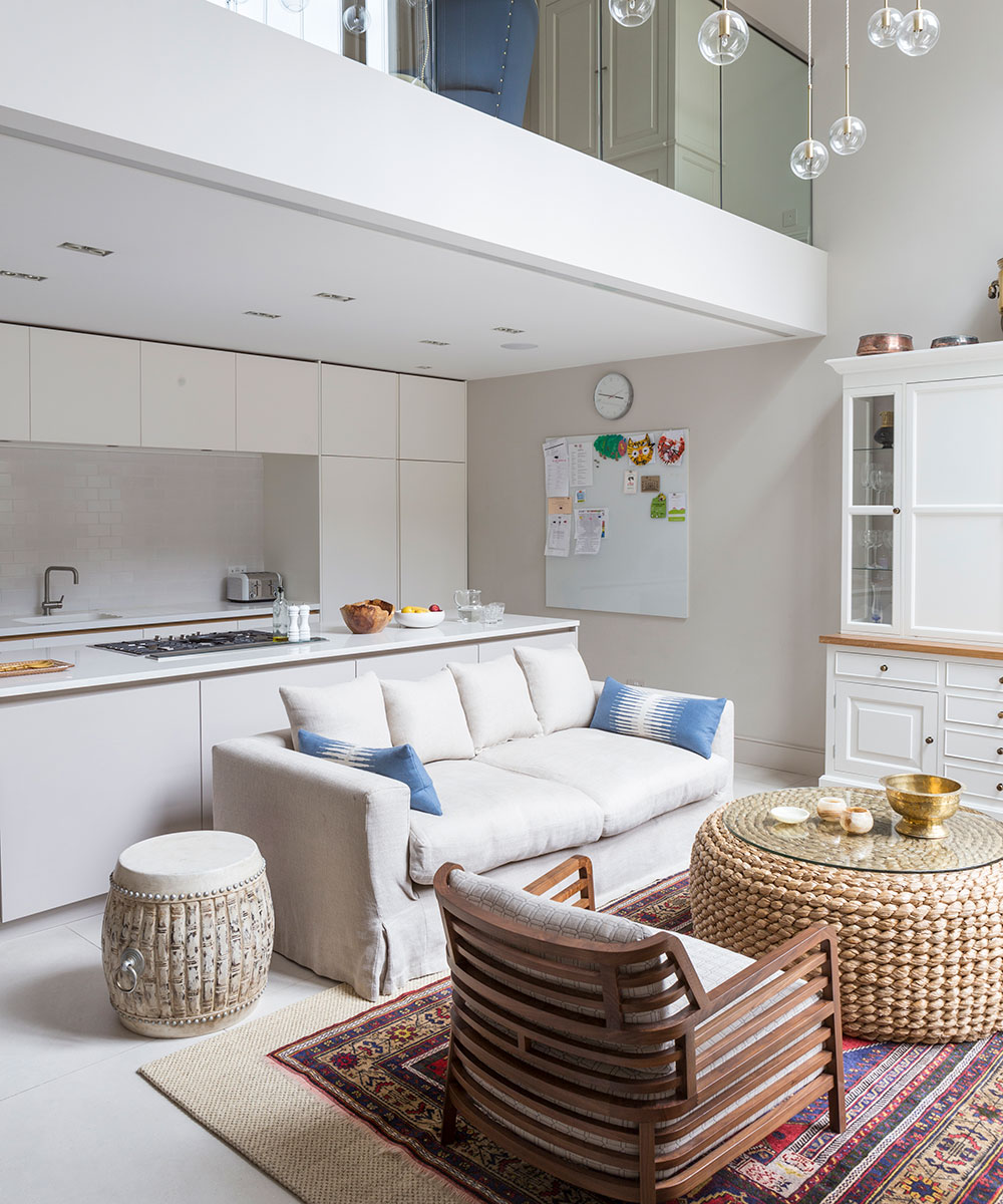
Family living area
A double-height glass wall floods the lower ground floor with light, where the owner has used her collection of antiques to add hits of texture and color.
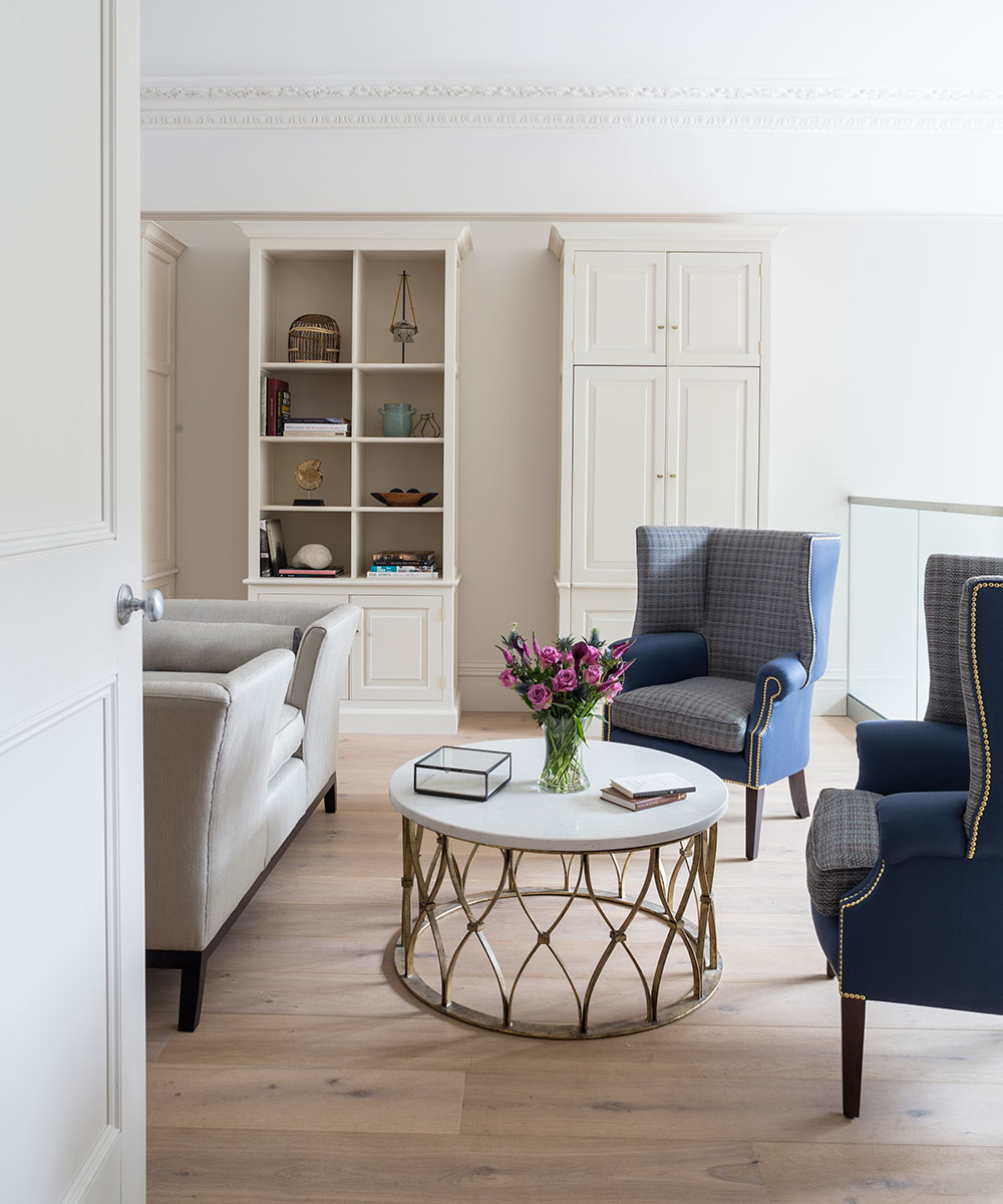
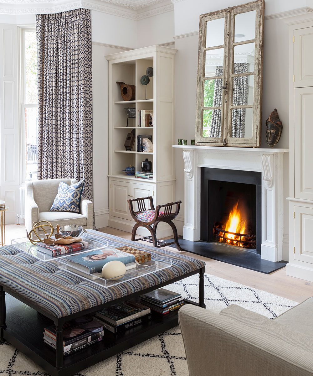
The scale of the 30-foot-long sitting room presented another challenge. ‘We wanted to divide the space into two seating areas without compromising the grandeur,’ says the interior designer. The solution was a sofa with the middle of the back cut away. It divides the room into two spaces, one with rangy sofas and a large ottoman surrounding the fireplace, while a pair of dramatic wingback chairs and a marble-topped coffee table furnish the cocktail area (the bar is hidden in the cabinetry on the wall behind). To complete the arrangement, bespoke lighting – the result of intense deliberations – fills the airy space beyond the balustrade.
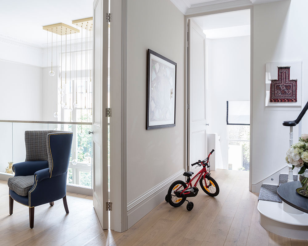
Entrance hall
The couple’s daughter Sadie sits by the doorway that leads down to the kitchen and family living area below.
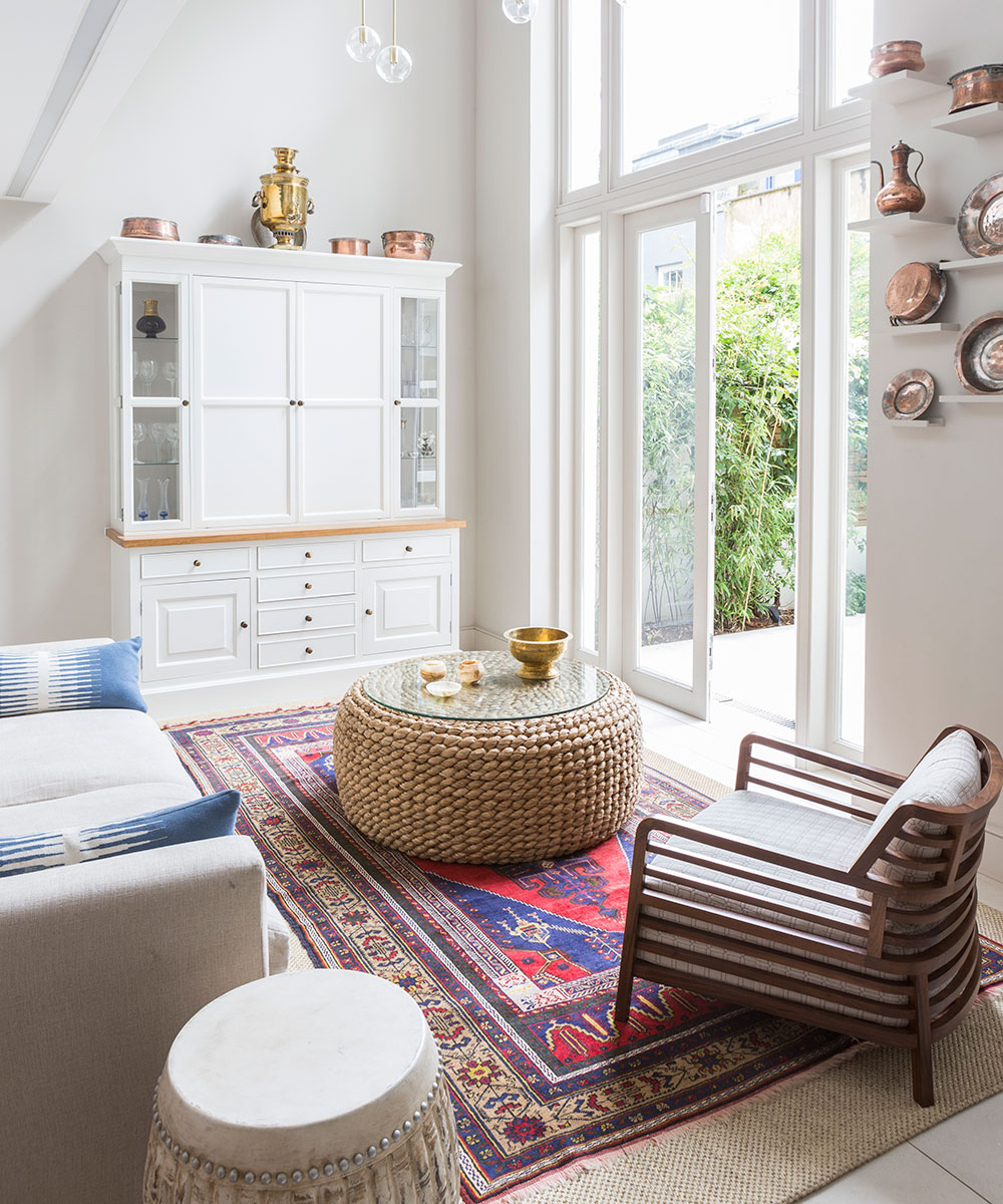
Living room
Although the bespoke cabinetry is built in, it has been designed to look free-standing for a more relaxed, informal effect.
Garden
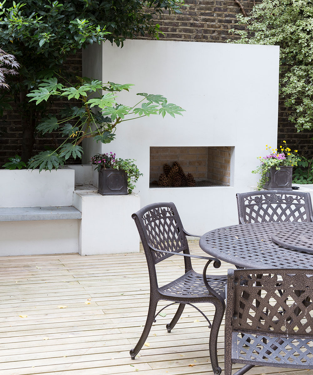
Clean lines and an outdoor fireplace give this space the feel of an extra room. The foliage is in striking contrast to the pale timber decking.
See: an artistic garden in Oxforshire
Cloakroom
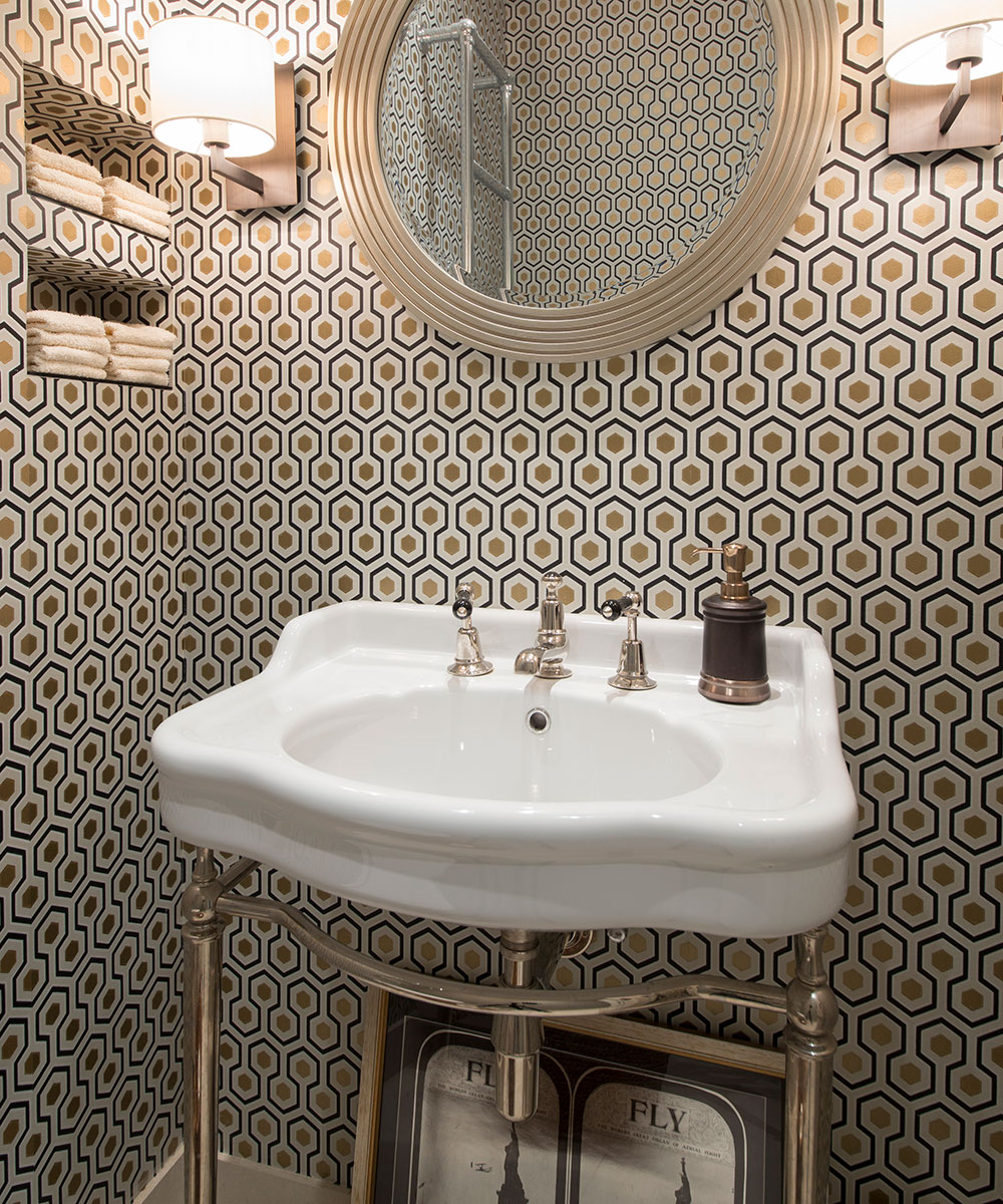
A metallic wallpaper adds drama to this small room; it even lines the cubby holes that were specially createdto hold hand towels.
Dining area
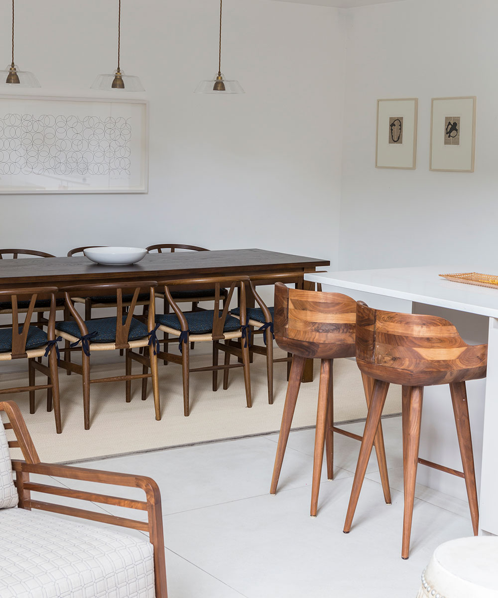
Rich timber hues add warmth to the pared-back dining room scheme.
Sitting room
Showing the homeowner’s tailored style, the expansive ground floor sitting room is brought to life with a clever mix of graphic patterns and accessories that are regularly updated.
Main bedroom
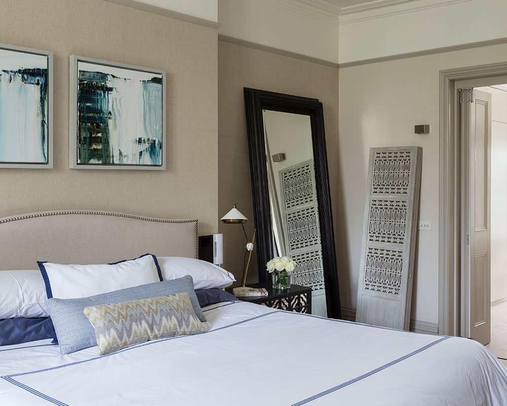
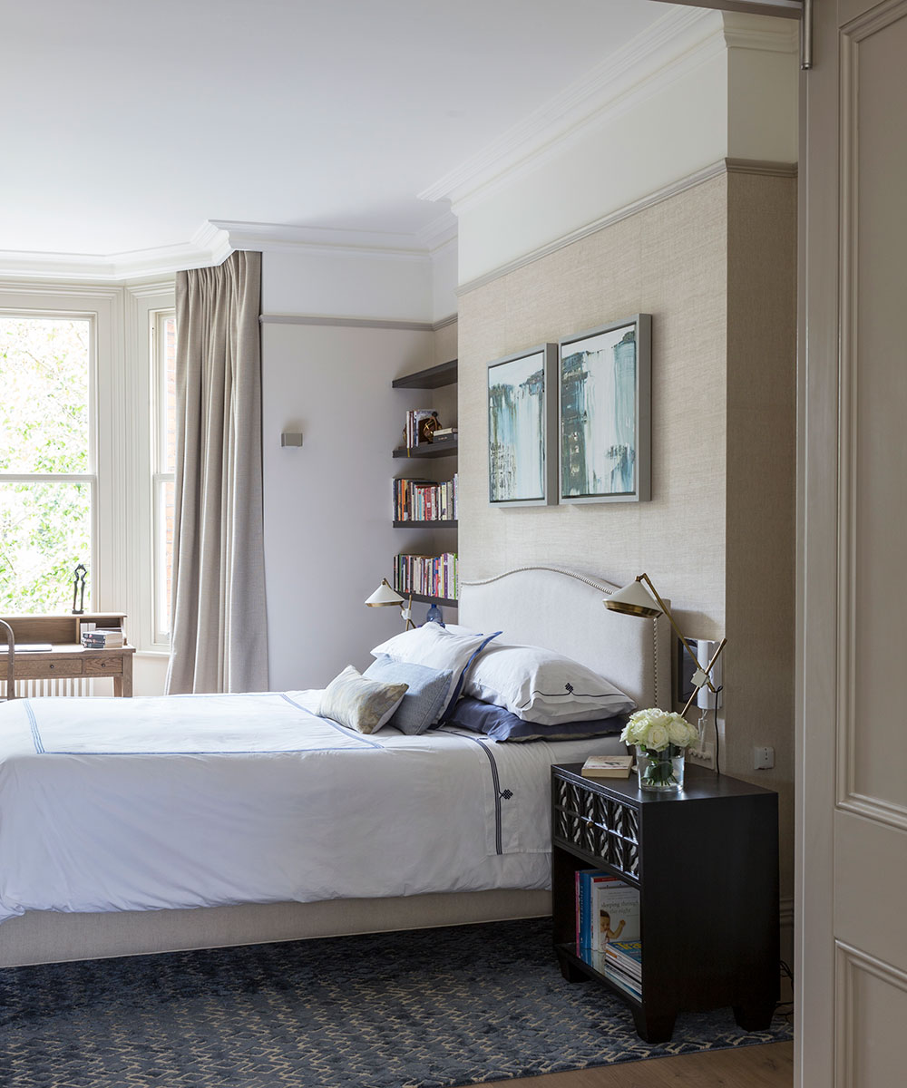
As elsewhere, this bedroom is treated to a touch of ethnic detailing. Here a folded screen is casually propped against a wall.
Home office
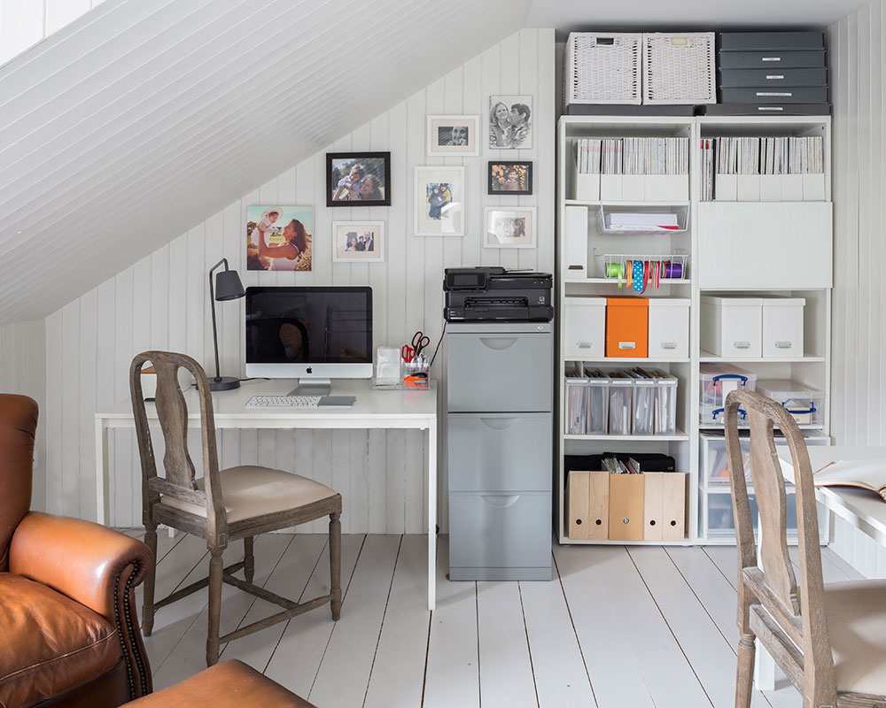
Well-organised storage keeps this office-come-guest room in the leaves satisfyingly tidy.
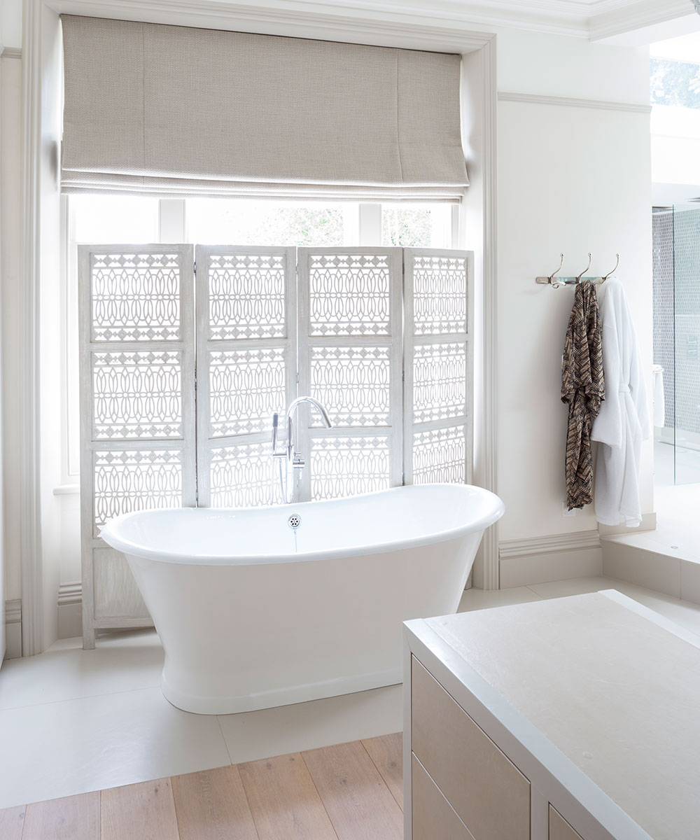
Bathroom
This decorative screen, the twin of the one in the adjoining bedroom, provides privacy in lieu of curtains.
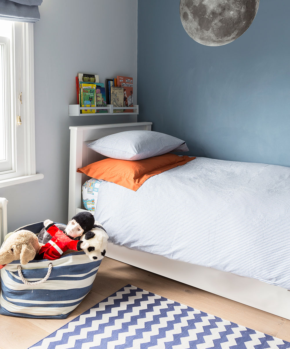
Children's bedroom
Imagination is encouraged to run free here, with books kept to hand in the small shelf above the bedhead.
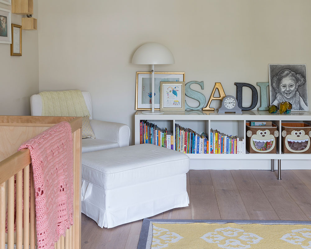
Decorated with an eye for the future, this room mixes classic furniture and practical storage.
Photography/ Mark Bolton

Jennifer is the Digital Editor at Homes & Gardens. Having worked in the interiors industry for several years in both the US and UK, spanning many publications, she now hones her digital prowess on the 'best interiors website' in the world. Multi-skilled, Jennifer has worked in PR and marketing and occasionally dabbles in the social media, commercial, and the e-commerce space. Over the years, she has written about every area of the home, from compiling houses designed by some of the best interior designers in the world to sourcing celebrity homes, reviewing appliances, and even writing a few news stories or two.
-
 Courtney Love's historic loft combines rock star luxury with raw New York bones – it's on the market for almost $9.5 million
The singer's former SoHo home features exposed brick walls, original wooden columns, a gas fireplace, and high ceilings – take the tour
By Hannah Ziegler
-
 Triangular shaped garden ideas – landscape designers share 9 ingenious ways to redesign your corner plot
Expert tips for planning, planting and finessing a triangular shaped plot, so you can savour the space year round
By Jill Morgan