Design house: Luxurious and elegant family home in southwest London
With drama in her design DNA and a bucketful of smart decorating tricks, it’s no surprise that this once ‘long and thin’ semi is a now a super-roomy, stylish family home
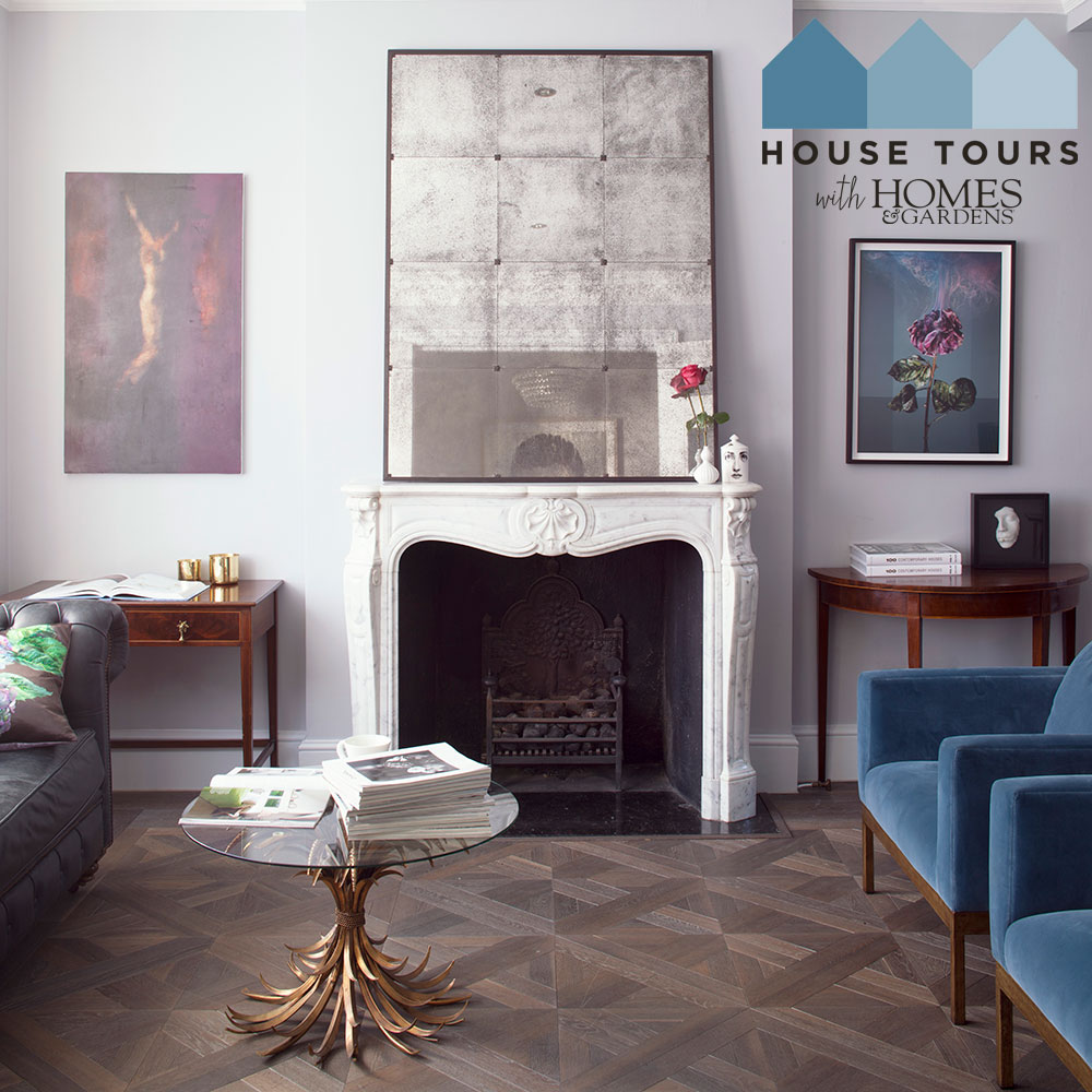

'Don't cramp my style, mum'. It’s an often-heard cry in a home with three teenage children – but not in Veronica Lucey’s southwest London Victorian semi. Thanks to a major overhaul, the house has morphed into a serene and elegant home that gives everyone room to breathe. ‘We’ve now got a massive basement, which we use as a movie-cum-music room, where the kids entertain their friends,’ says the homeowner. Lucky them – they also have spacious bedrooms and her eldest has his own ensuite.
It wasn’t always this way. The owner lived in the house for 20 years before attempting any major renovation. ‘I was working full time in advertising and raising three children, so although I dreamt of making massive changes, the reality of doing so was fairly far off my radar,’ she says.
- Some of the World's best homes – beautiful properties from around the globe
The property
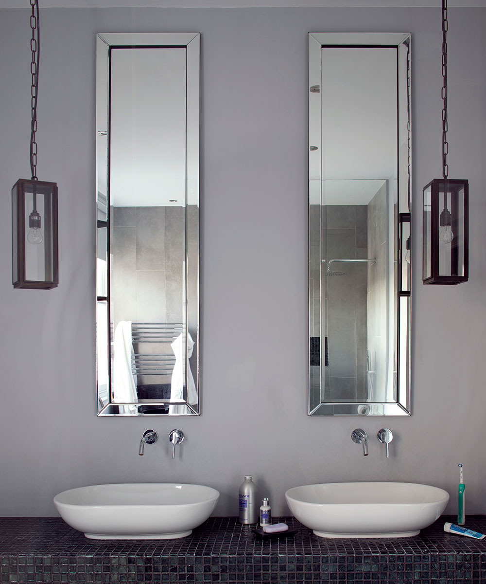
'This house was my first major project – so now I’ve had the experience of being both client and contractor – an interesting learning curve!' says the homeowner. Creating a sense of space and drama was her key objective. ‘These Victorian semis are long and thin, so I wanted to create the illusion that it was wider and grander than it actually is,’ she says. Clever tricks included installing double doors on the ground, basement and first floors. Floor-to-ceiling sliding doors add light, width and height in the kitchen and in the master bathroom, unexpected full-length mirrors are set above the basins to take your eye right up to the ceiling.
Reception room
Thanks to a major overhaul, this house has morphed into a serene and elegant home that gives the whole family room to breathe.Creating a sense of space and drama was the key objective. These Victorian semis are often long and thin, so the owners wanted to create the illusion that it was wider and grander than it actually is.
Clever tricks included installing double doors on the ground, basement and first floors.The ground floor was reconfigured so that an old snug and L-shaped kitchen were incorporated to create one large, light space, linked with an opening to the front reception room. Beautiful original details – the Victorian tiled hallway, stained-glass front door and cornicing – were preserved to live on in their new environment.
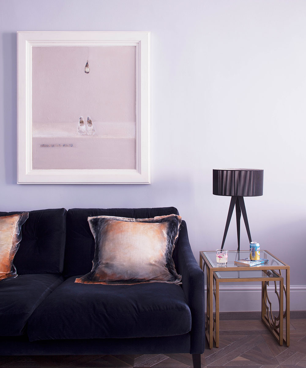
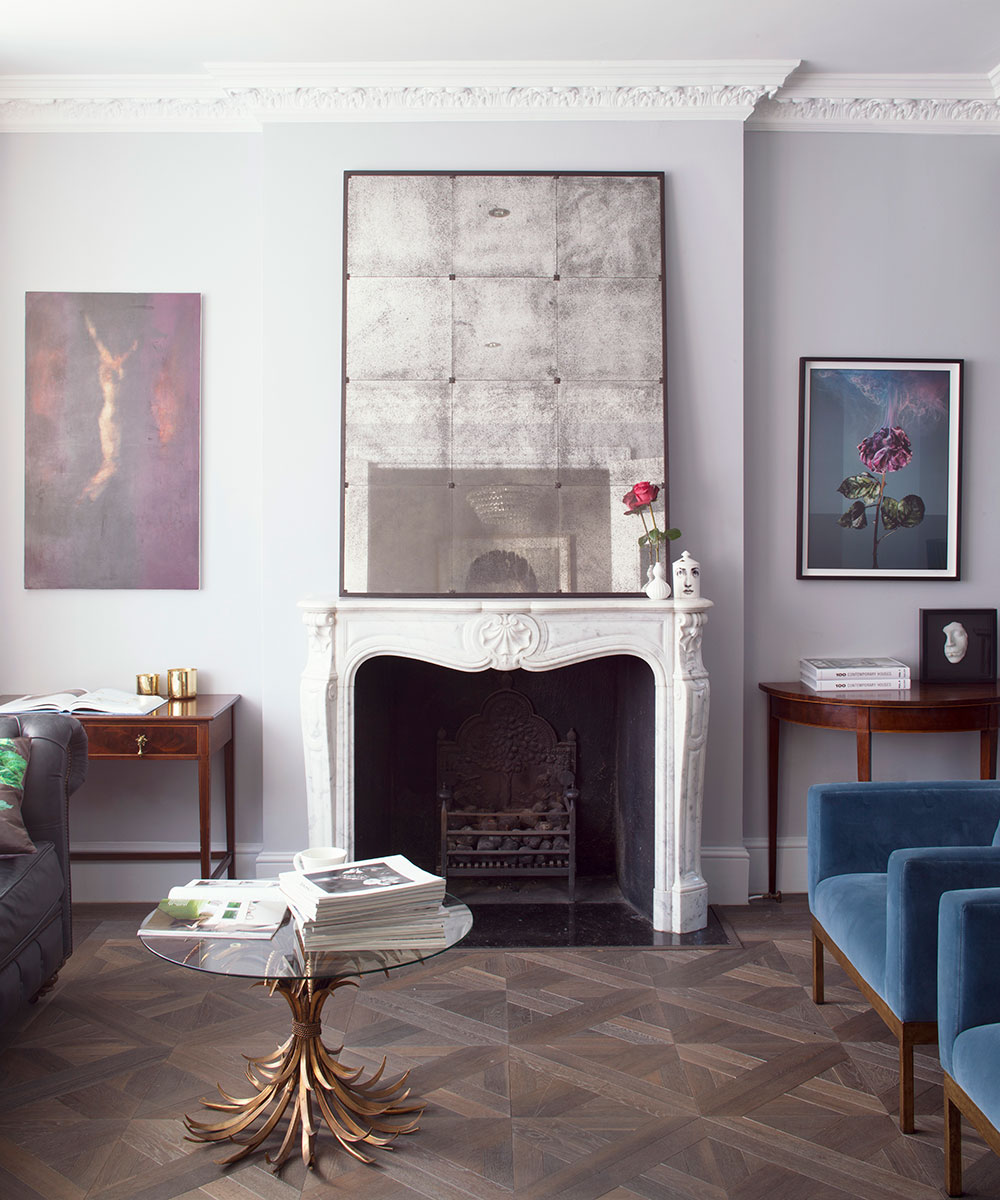
An elegant palette of soft greys and chalky blues unites the rooms and shakes up the period bones of the house with unexpected pops of industrial lightingand edgy art. The style may look upmarket, but there’s plenty of high street mixed in with high end.
The French Regency-style fireplace, which was inthe house when it was bought, goes nicely with the new parquet.
Ground floor hallway
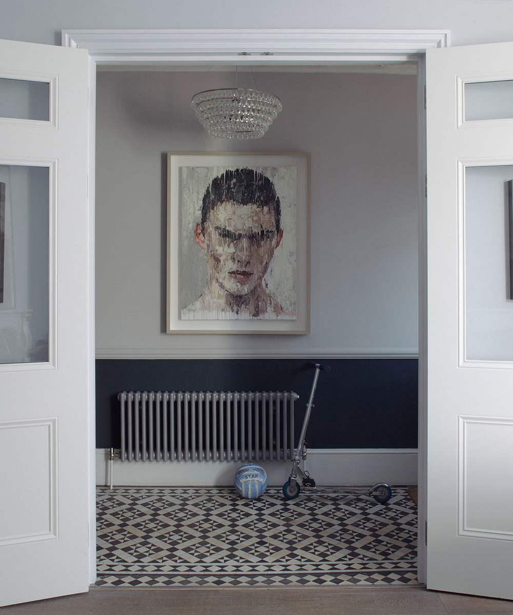
The narrow hallway was opened up with tall double panelled doorsthat lead into the reception room. The originalVictorian floor tiles have been restored, and the big double doors givethe wholehouse a grander scale.
Kitchen
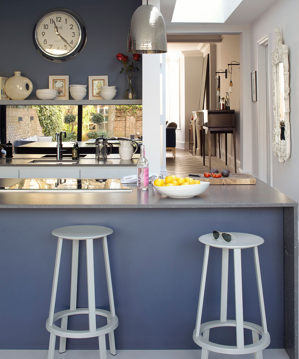
The kitchen is painted blue to set it aside from the rest of the house, but cabinetry was kept white to keep a balance.
Dining area
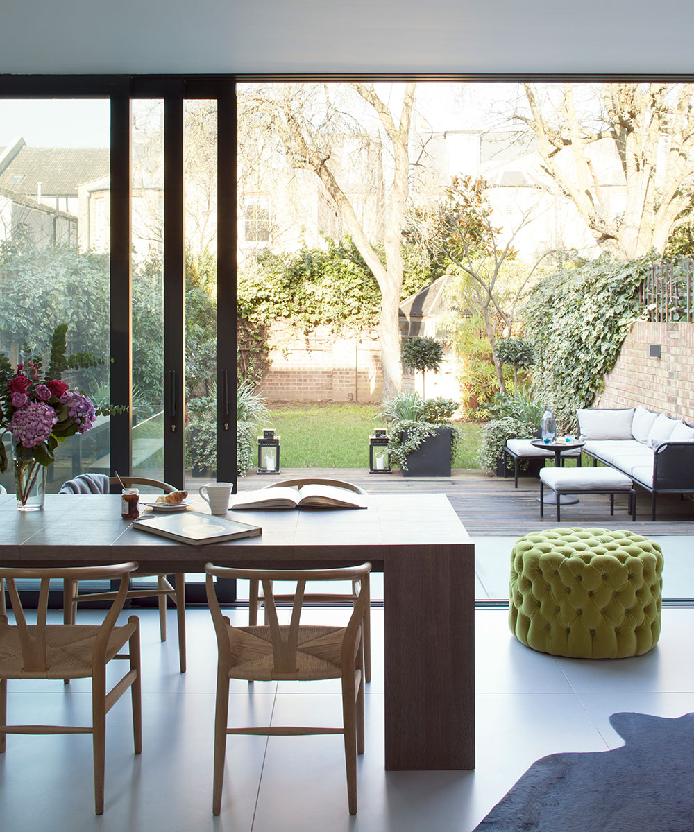
Floor-to-ceiling sliding doors add light, width and height in the kitchen and dining area, making the whole space feel like part of the garden.
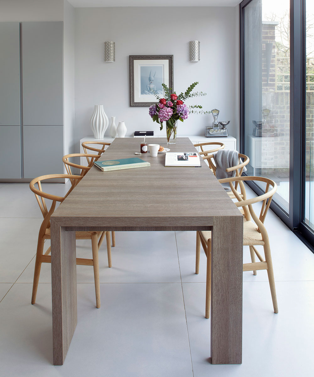
Light wood Wishbone chairs and a modern dining table add to the crisp and bright aesthetic.
Basement hall
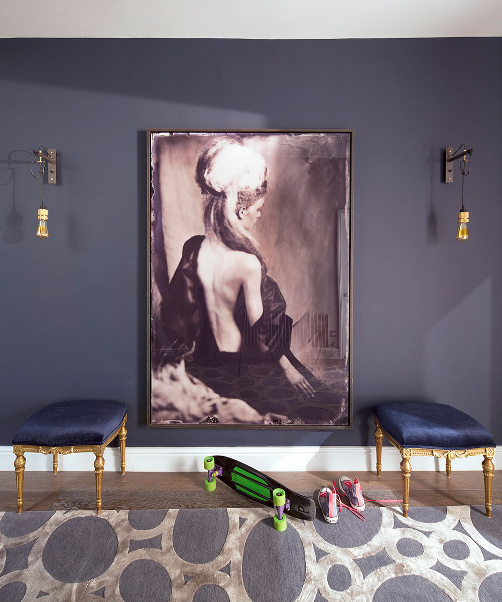
The basement is unusually tall as it’s the same height as the ground floor, and spans the whole width of the house. Its dark grey hallway, theatrically hung with an oversized photograph shipped over from Amsterdam, sets the tone for the rooms.
The walls are purposefully painted dark – it’s often better to go dark than totry to lighten up a space that will never be thatlight in the first place.
Media room
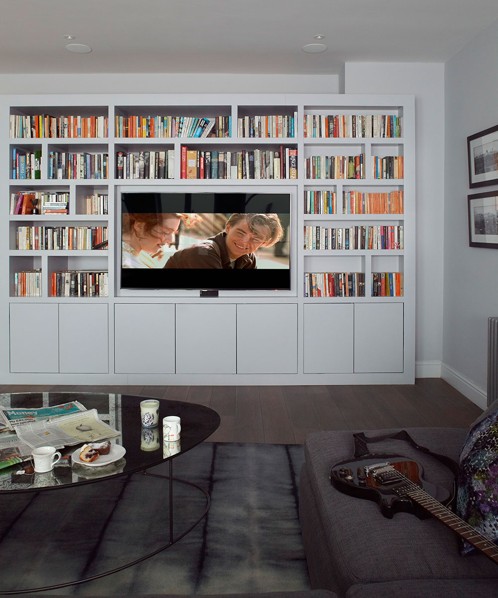
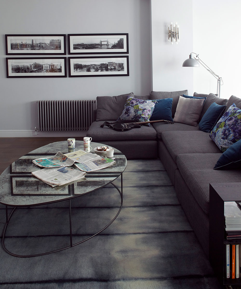
The house now has a massive basement, which is often used as a movie-cum-music room, where the kids entertain their friends.
Master bedroom
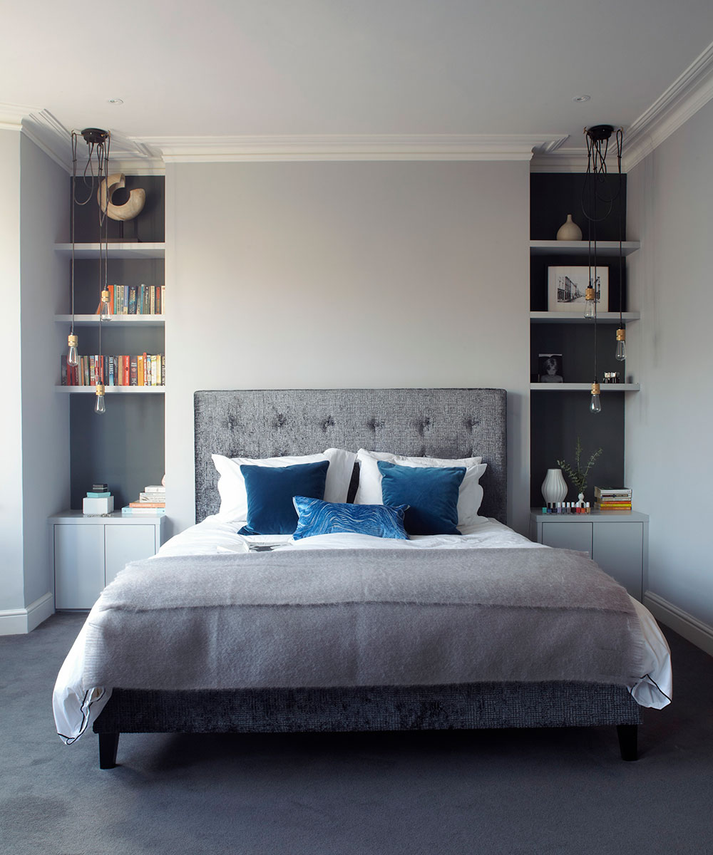
Upstairs, rooms were reconfigured so that the master bedroom is larger, with a dressing room and en-suite bathroom.
A palette of soft greys and steely blues makes for a peaceful environment.
Master en suite
In the master bathroom, unexpected full-length mirrors are set above the basins to take your eye right up to the ceiling.
Check out more of thisinterior designer's workat magentapinkinteriors.co.uk
Photography / Logan Irvine-MacDougall
This home was part of our House Tours Event 10 & 11 October 2019, sponsored by Heals, Roger Oates, Thomas Sanderson and Yves Delorme.
Sign up to the Homes & Gardens newsletter
Design expertise in your inbox – from inspiring decorating ideas and beautiful celebrity homes to practical gardening advice and shopping round-ups.

Jennifer is the Digital Editor at Homes & Gardens. Having worked in the interiors industry for several years in both the US and UK, spanning many publications, she now hones her digital prowess on the 'best interiors website' in the world. Multi-skilled, Jennifer has worked in PR and marketing and occasionally dabbles in the social media, commercial, and the e-commerce space. Over the years, she has written about every area of the home, from compiling houses designed by some of the best interior designers in the world to sourcing celebrity homes, reviewing appliances, and even writing a few news stories or two.
-
 Martha Stewart's intelligent cabinets 'take every inch into consideration' – their 'visually light' style will solve your small kitchen storage problems
'Every kitchen can be beautiful and functional, no matter what the size': 9 years since sharing her clever storage, Martha's cabinets are just as beautiful
By Megan Slack
-
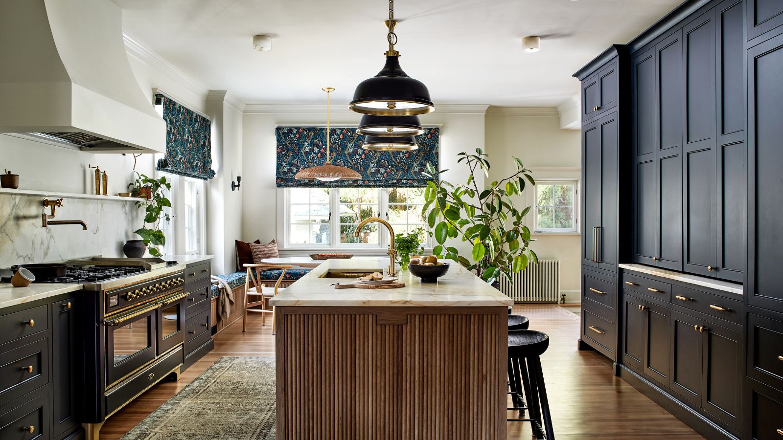 This once-dated kitchen is now a timeless space with the coziest details – and its the classic color palette that's made it a chic, welcoming space
Warming colors and natural materials combine to create this enduringly classic kitchen scheme
By Molly Malsom