Design house: An elegant 'dream home' with a timeless appeal, designed by Sims Hilditch
Thanks to an unexpected opportunity, the homeowners have built an elegant home that reflects their love of order and eye for detail

There are two types of new build homes. The first sort is shiny and soulless; the ceilings are too low; the joinery is skimpy and everything feels, well, just a bit too new. Then, firmly in the other camp, there are places such as the couples' bandbox-fresh Hertfordshire home; the type of thoughtful, considered house which, despite being less than a year old, manages to pull of that tricky balancing act of being both new and yet timeless in its appeal.
So how did they do it? Surprisingly, not by using using salvaged materials, antiqued fabrics or slavishly following a period style to evoke a bygone era. Instead, the reason why this house works is due, quite simply, to an exhaustive attention to detail combined with the use of top-notch materials. The cantilevered Bath stone staircase with its graceful oak balustrade, for example; or the discrete panelling and the subtle interplay of tone and texture; a dash of linen against velvet; dove-grey against charcoal; bronze against mirror. All these meticulous accents reflect the couple’s ideal of a house that is, as the owner puts it, 'not too modern, hard-edged or cold; we like subtlety and warmth; the sort of home that feels instantly welcoming'.
See ourAn elegant Cape Dutch-style house in the heart of Hampshire
The property
The five-bedroom house sits on the fringes of a quiet Hertfordshire village and is built where once stood a derelict 1950s house. 'The previous owner had put in planning permission for a new house but then pulled out and put the house up for sale,' says the owner, who, with the canny timing of someone who works in property, put in a successful bid for the house in 2011 when the market was still languishing in the doldrums. The couple then commissioned Eastabrook Architects to design a new house. 'We’d initially planned on having two-storey house but as that would have restricted the ceiling heights, we dug down to create a basement, which allowed us to have more generously proportioned rooms on the ground and first floors.'
Newly-weds with decidedly grown-up tastes, the couple also commissioned Emma Sims Hilditch and Garry Meakins, of Sims Hilditch, to fashion the 7,000-square-foot interior into what the owner describes as 'a house for life, where we can put down roots and ideally start a family'. The firm has designed houses for other members of the owners family 'so we were on safe ground', says the owner, as Garry adds: 'The homeowners knew exactly what they wanted – and didn’t want.'
Entrance hall
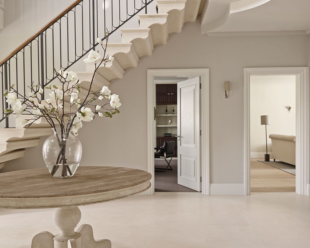
Large square panelling and beautifully pared back detailing help inform the classical cast of the lofty entrance hall.
Boot room
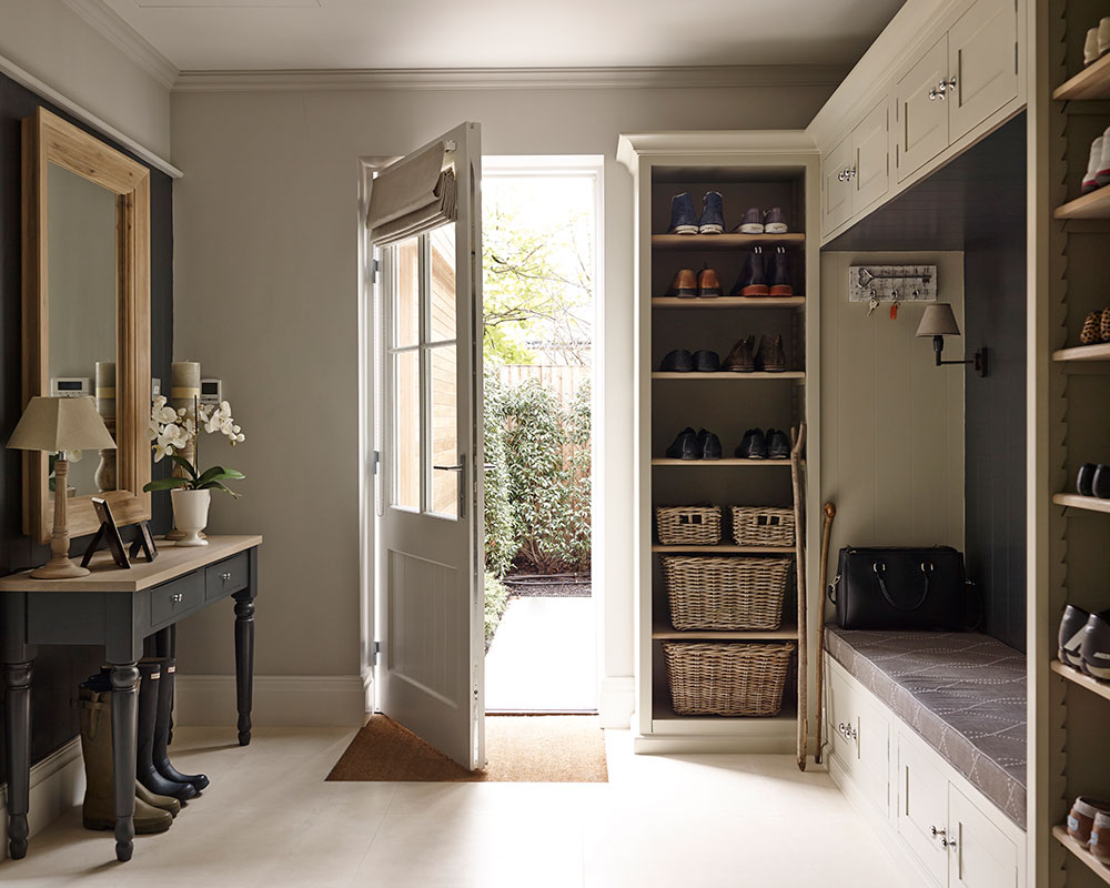
The footprint of the newly built home was carefully planned to the very last detail, including this immaculate but highly practical boot room where a built-in banquette makes it easy to take boots on and off.
Sign up to the Homes & Gardens newsletter
Design expertise in your inbox – from inspiring decorating ideas and beautiful celebrity homes to practical gardening advice and shopping round-ups.
See this elegantly renovated 17th-century farmhouse in Dorset, designed by Sims Hilditch
Kitchen
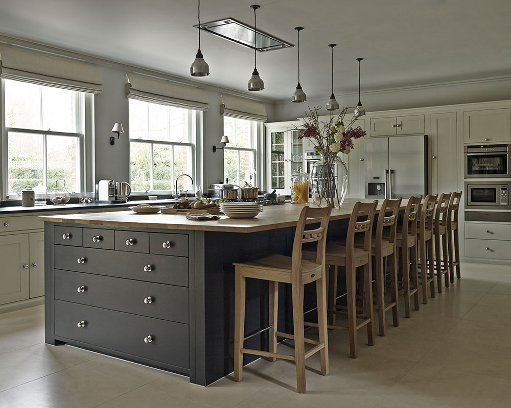
The kitchen is dominated by a huge island, complete with an elegant extractor tucked in to the ceiling above, is sited so that Mark and Monica can chat to guests while they cook.
Dining area
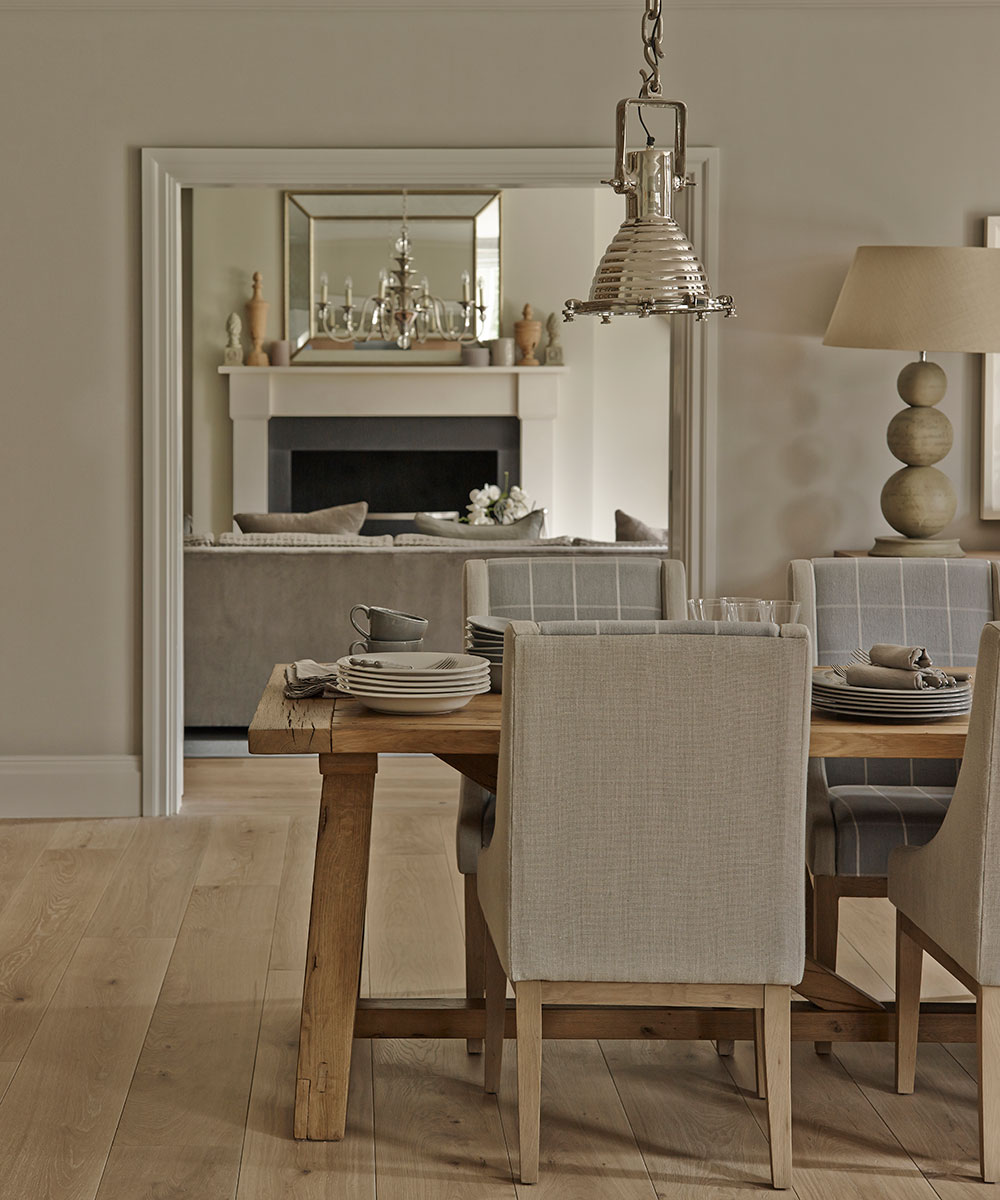
Flanked by the kitchen and drawing room, the dining room was designed to capitalise on views of the garden.
Drawing room
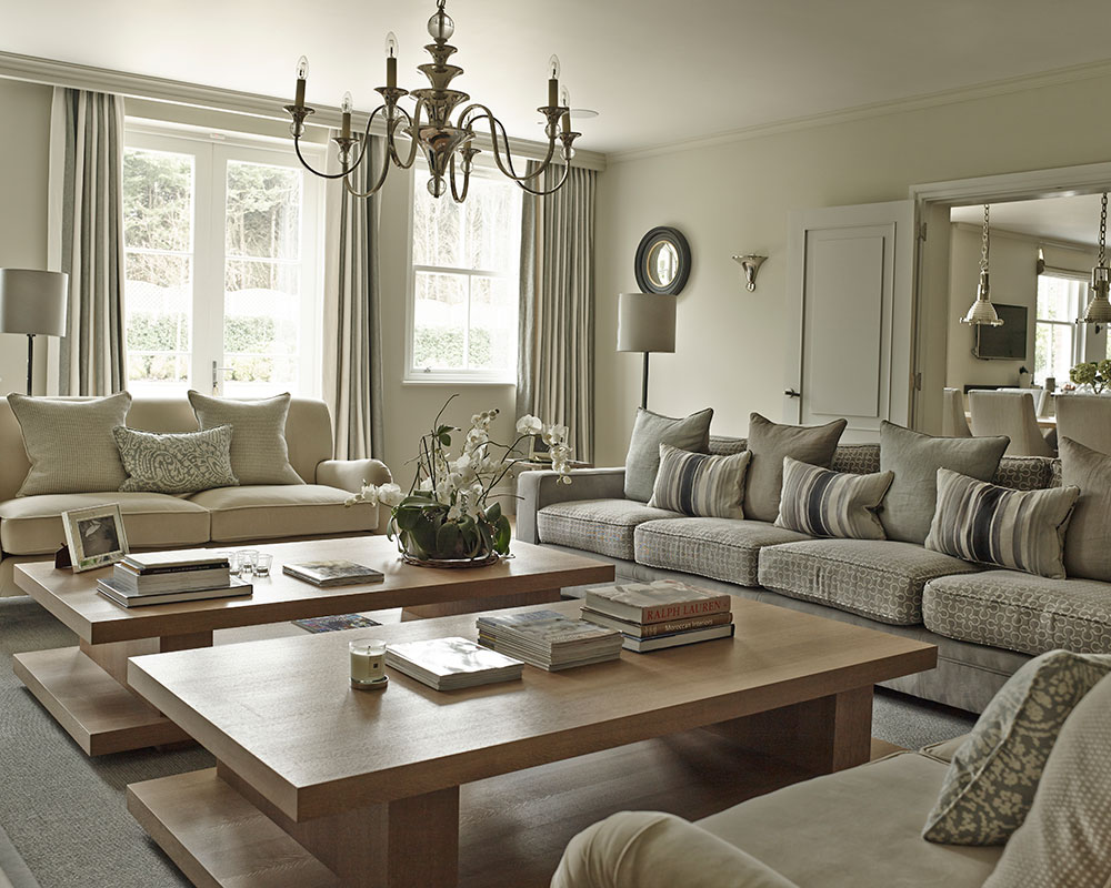
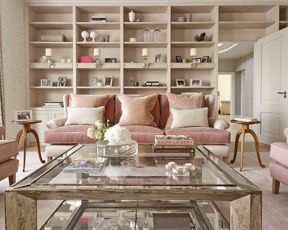
Designed to be both comfortable and timeless, contrasting fabrics and textures inject interest into the understated drawing room.
Main bedroom
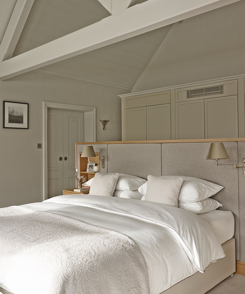
Cleverly designed to be both restful and practical, the couples bedroom is cleverly designed to screen the bed from the door curtesy of a freestanding bedhead-cum-storage wall, while a pair of tall wingback chairs provide a spot for quiet reading overlooking the garden.
Main bathroom
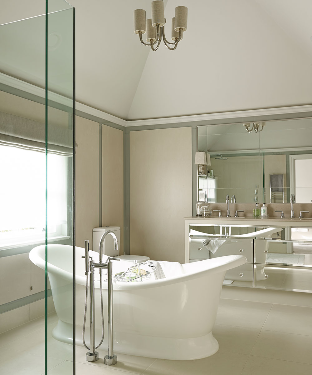
Large slabs of porcelain framed by slivers of colored glass provide definition in the lofty bathroom.
Main study
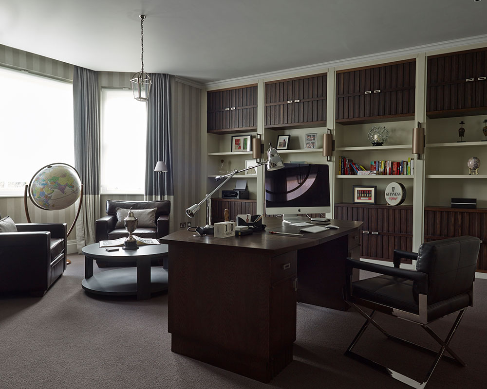
study was designed as a masculine retreat where gadgetry and paperwork is concealed by bespoke cabinetry.

Photography/David Cleveland

Jennifer is the Digital Editor at Homes & Gardens. Having worked in the interiors industry for several years in both the US and UK, spanning many publications, she now hones her digital prowess on the 'best interiors website' in the world. Multi-skilled, Jennifer has worked in PR and marketing and occasionally dabbles in the social media, commercial, and the e-commerce space. Over the years, she has written about every area of the home, from compiling houses designed by some of the best interior designers in the world to sourcing celebrity homes, reviewing appliances, and even writing a few news stories or two.
-
 9 things you can clean with glycerin – this cheap and natural cleaner is perfect for indoor and outdoor use
From patio furniture to silverware, this hydrating and gentle cleaning agent will work miracles
By Ciéra Cree Published
-
 Martha Stewart's houses – inside her most iconic properties, from Cantitoe Corners to Turkey Hill
The lifestyle guru built her legacy around her homes, some of which are the most recognized homes in modern American history – we explore her portfolio
By Megan Slack Published