Design house: An Edwardian apartment in London with a Parisian feel
Interior designer Katie McCrum reworked the layer of this once-stuffy apartment and gave it a chic new look
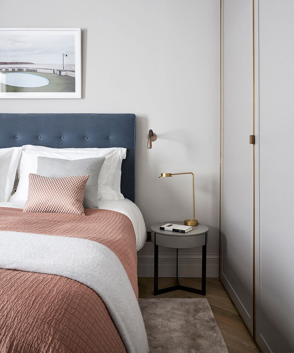

The Edwardian mansion block was the height of modernity when it was first built. The wide spaces, lifts and 24-hour porterage appealed to the professional classes, who also appreciated the central city location. By the Seventies, however, these dwellings had fallen from fashion. Their traditional layout of a corridor flanked by a separate kitchen and dining room seemed out of sync with the shift towards brighter, more open-plan living.
See more inspiring house tours in our Spaces section
- See some of the world's best homes – beautiful properties from around the globe
Yet as the homeowners will testify, fashions have a habit of coming full circle. 'Since we came back from Hong Kong, we've lived in Surrey, and we wanted a second home in central London,’ says the husband, a corporate lawyer. 'It had to be a place with enough room for us to be together as a family but where our grown-up children could also have their own space.’
The property
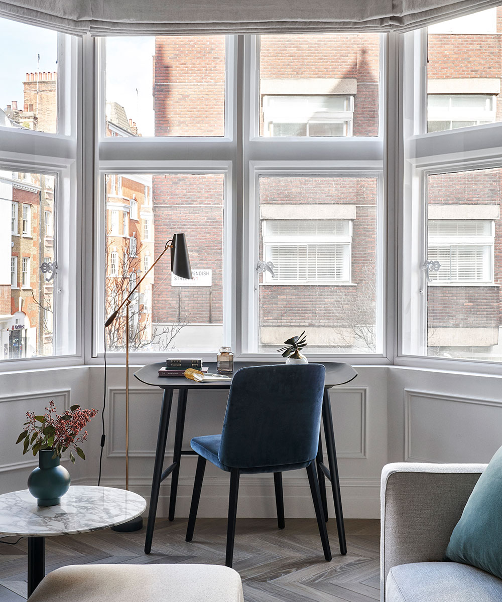
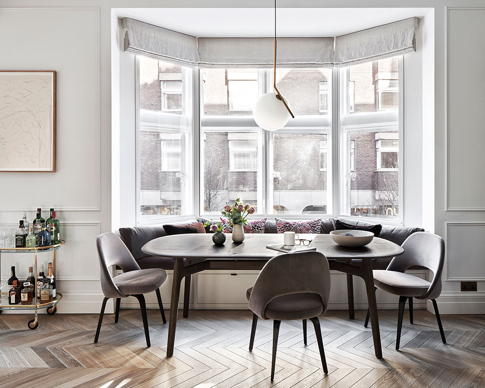
Almost as an afterthought, an agent showed them this flat. Set on the second floor, it was the double-fronted reception room with bay windows overlooking the street that piqued the couple's interest. 'We'd previously viewed mews houses but this gave us the large living area we wanted,’ says the owner.
The rest of the apartment was, however, decidedly frowsty. 'The bathrooms were tired and the kitchen had almost no light,’ says the owner. In the Eighties, the original cornices, fireplaces and architraves had been ripped out. Everything presented a challenge. At which point their agent introduced them to interior designer Katie McCrum. The couple's brief was ambitious: 'We envisaged a luxurious apartment with a Parisian feel and an open-plan living area,’ says the owner.
The predictable solution, says Katie, might have been to position the kitchen at one end of the long room. Instead, a chunk of space was 'stolen' from the bedroom next door so that the kitchen sits in a recess echoing the shape of the bay window opposite. To bring definition to the room, Katie designed a pair of cabinets painted navy to mirror the fireplace opposite.
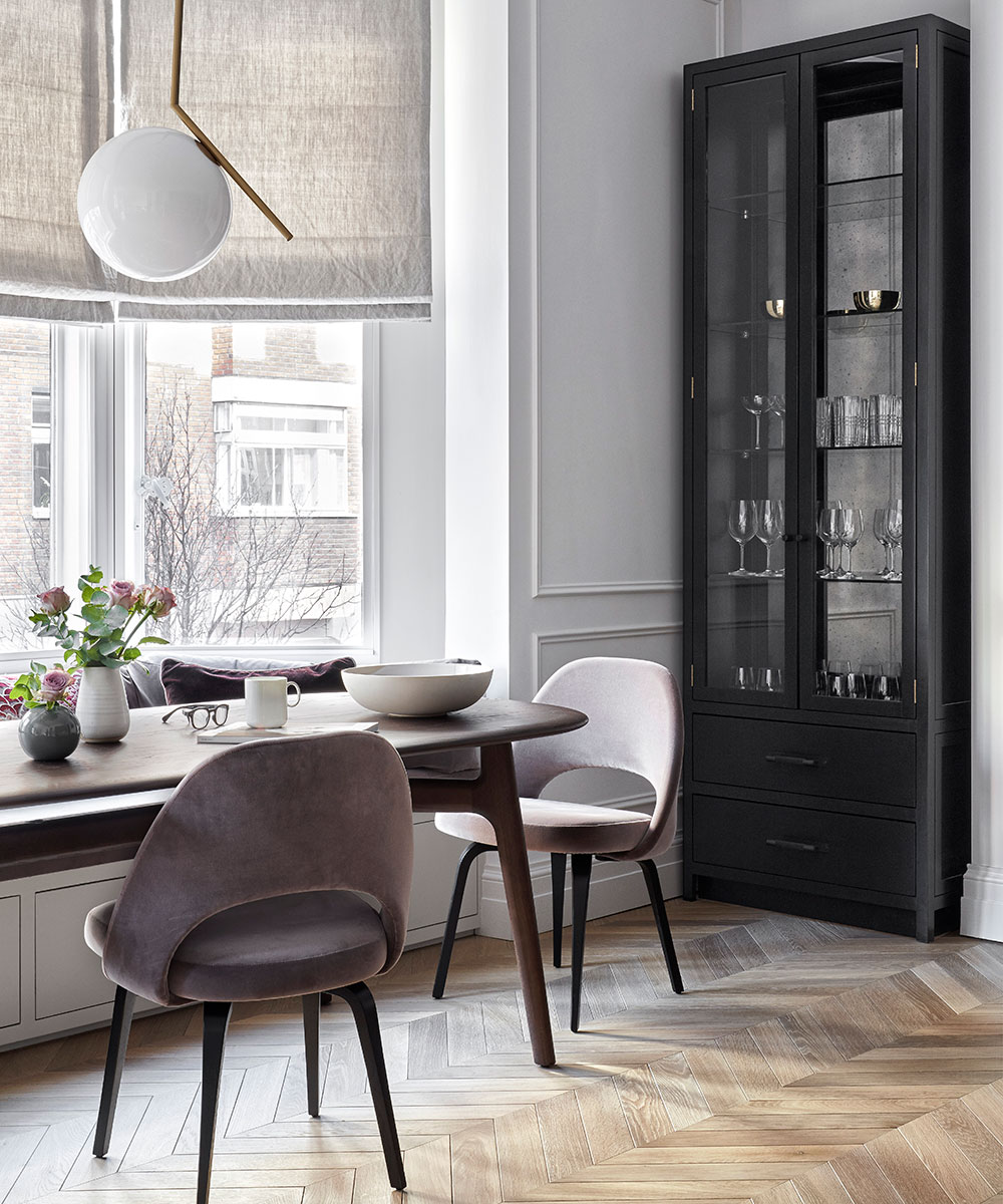
‘All the other rooms involved a series of debates about light or storage to make sure everyone had a place of their own,’ says Katie. Starting again, every wall was removed and the layout reshuffled. Now there are three bathrooms and three bedrooms.
Sign up to the Homes & Gardens newsletter
Design expertise in your inbox – from inspiring decorating ideas and beautiful celebrity homes to practical gardening advice and shopping round-ups.
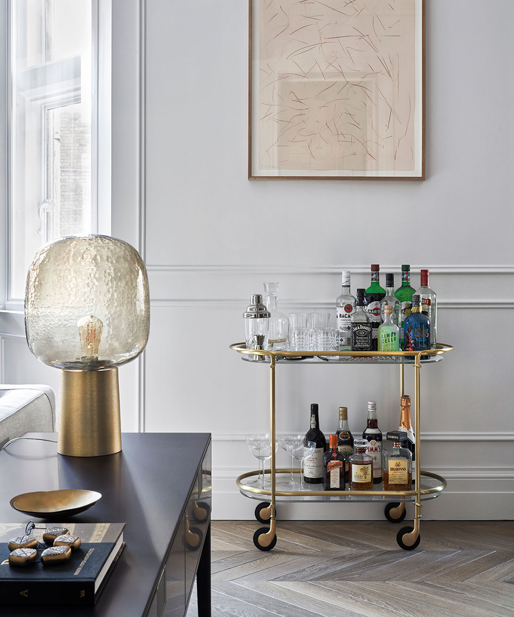
Throughout the flat, a brace of design tricks enhances light and space. Mirrors illuminate dark corners and tall, glazed doors bring light to the sitting room, where the oak parquet floor adds an illusion of width. Traditional details – cast-iron radiators and wall panelling – have been reinstated sealing the result: a mansion-block apartment adroitly reinvented for 21st-century family living.
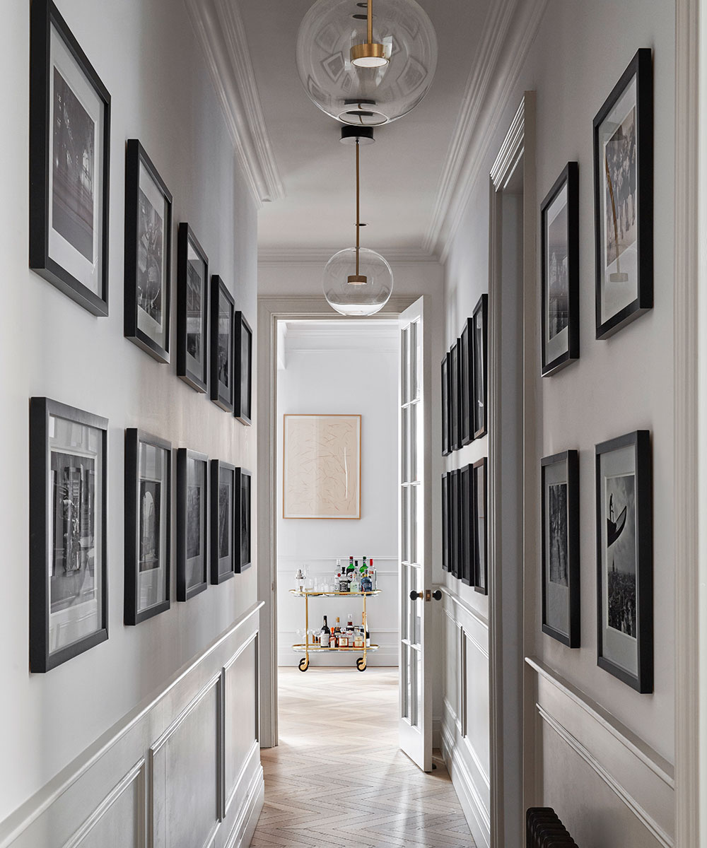
Hallway
The utility area is hidden behind cupboards on the right, while glazed doors leading to the sitting room bring in natural light.
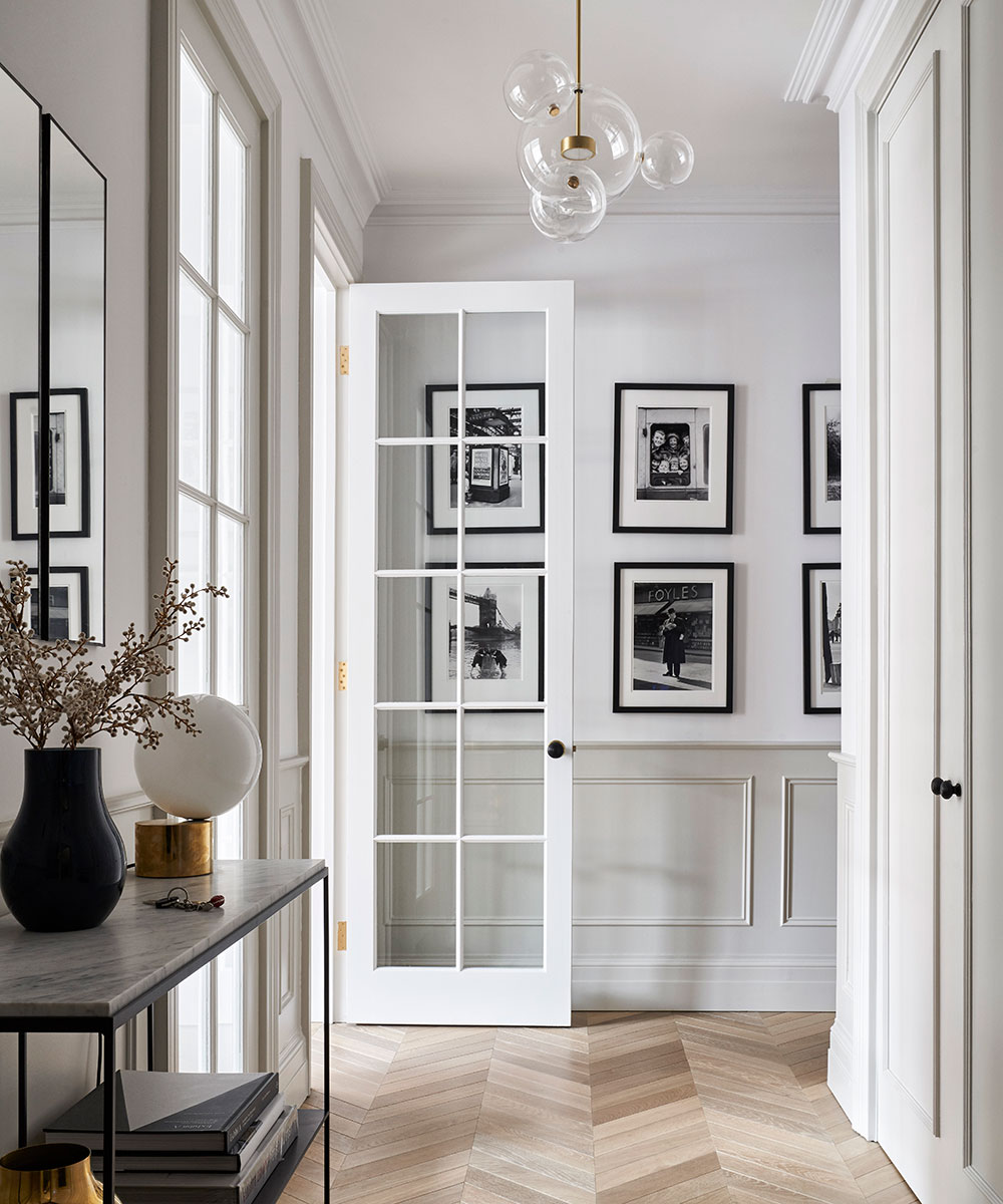
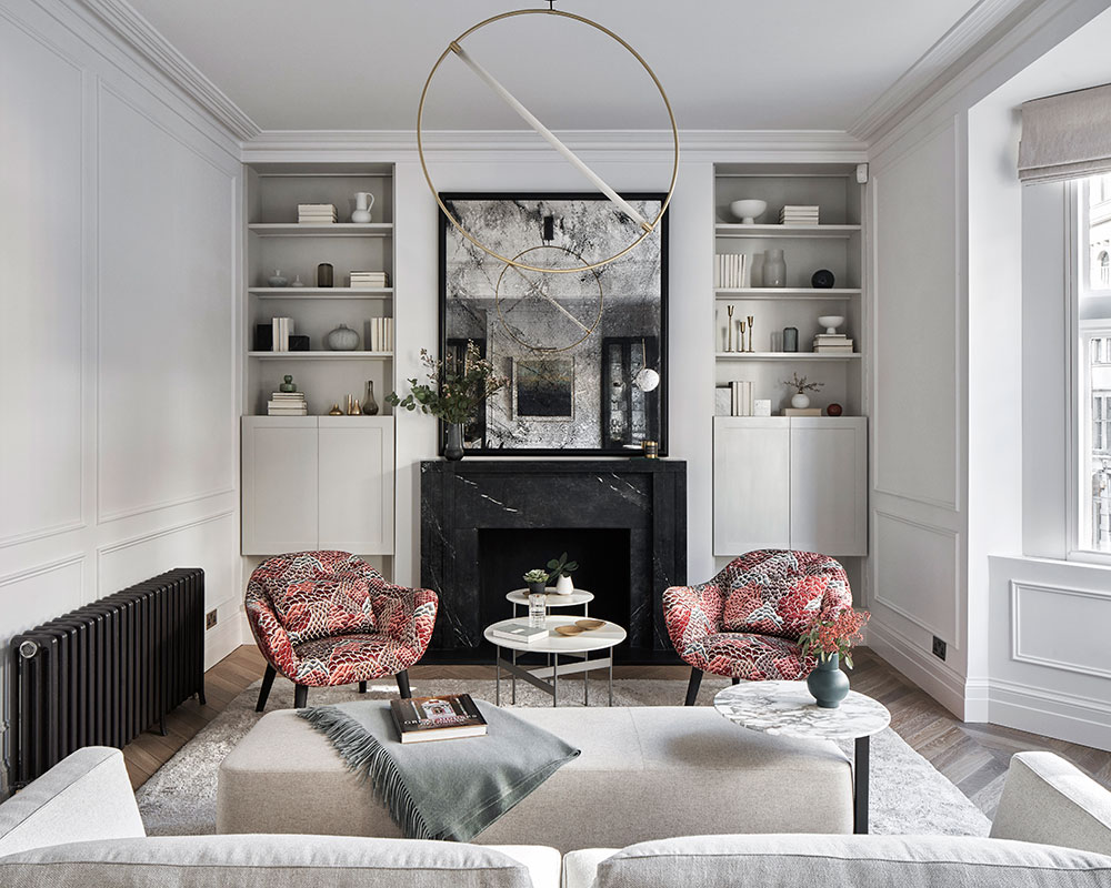
Living room
The Belgian black stone fireplace mirrors the deep blue of the new units at the opposite end of the room.
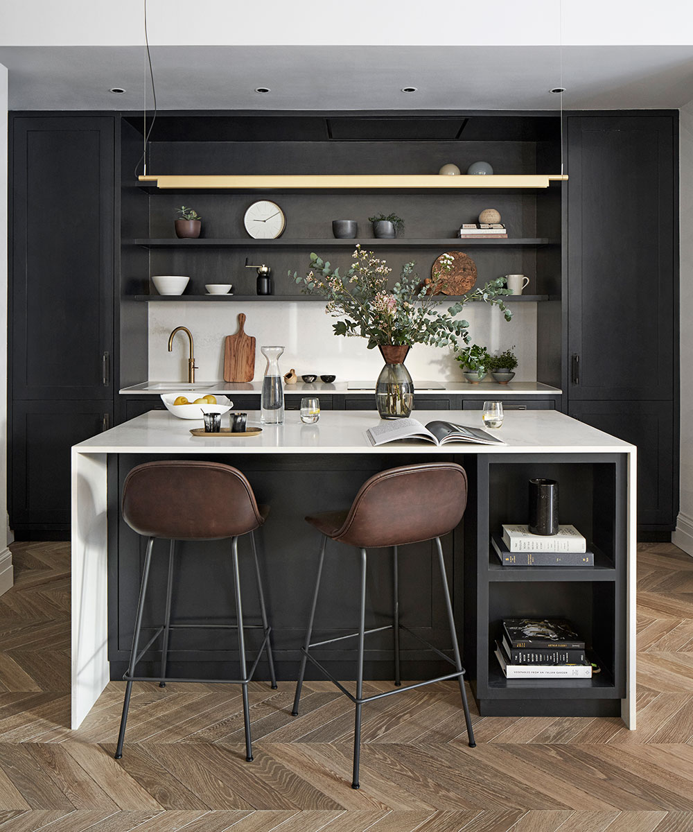
Kithen
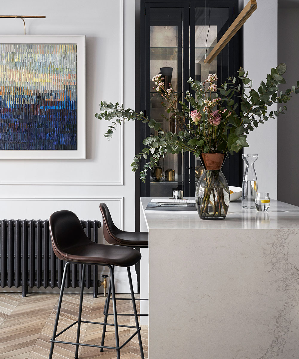
Bold black cabinetry creates a calm, atmospheric feel in this contemporary kitchen.
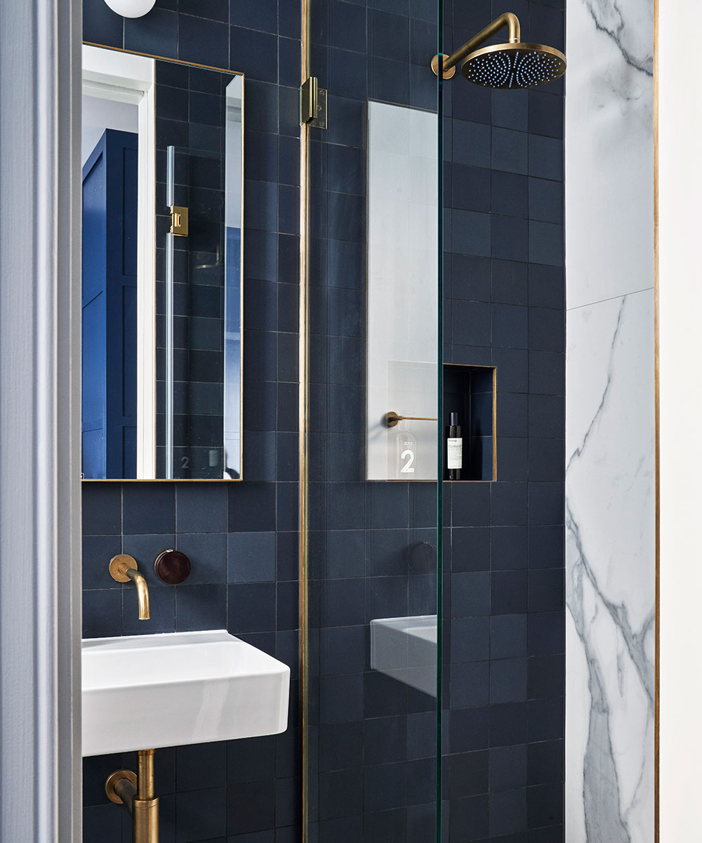
En suite
In this new space next to the couple’s son’s bedroom, floor-to-ceiling storage was designed to conceal the boiler, with smart brass detailing enhancing the deep-blue theme.
See:A beautifully renovated Georgian home in London
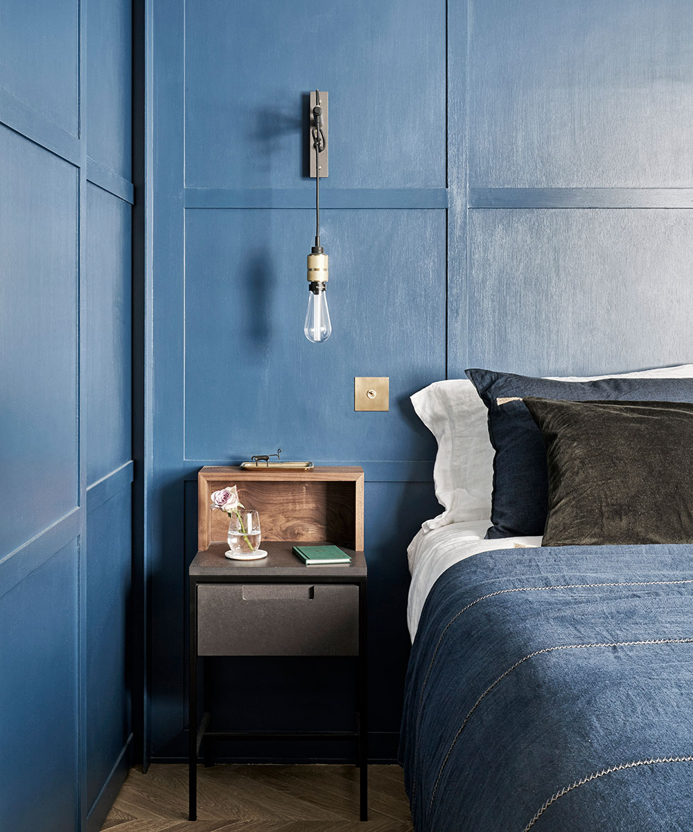
Son's bedroom
Sliding doors have been painted in the same color as the wall panelling for a cohesive, streamlined feel.
Daughter's bedroom
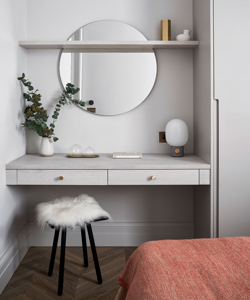
A floating desk doubles as a dressing table, while a circular mirror hung behind the shelf adds an unexpected element.
Bathroom
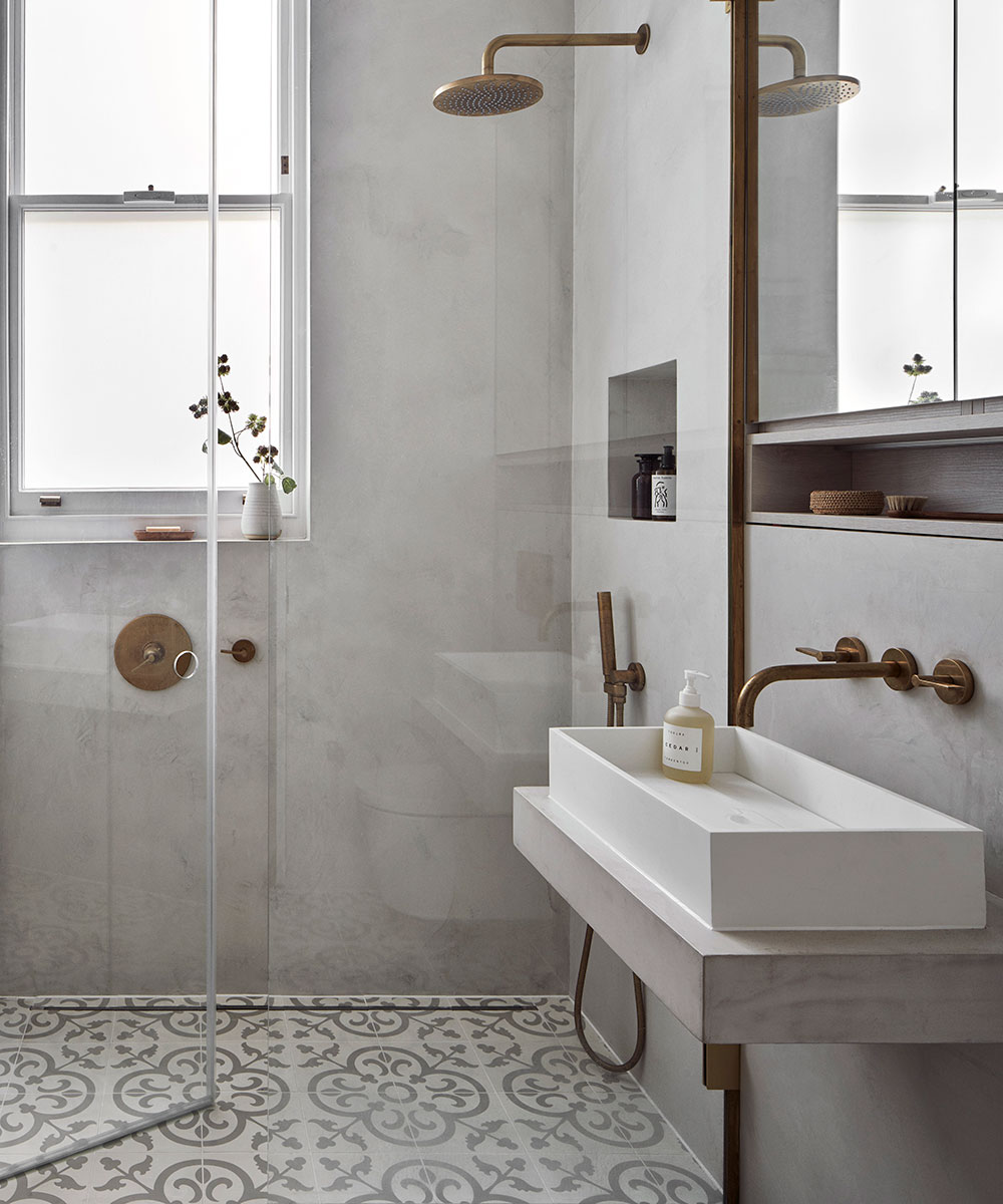
The walls are clad in smooth Microcete offset by the traditional patterned floor tiles.
Master bedroom
Wardrobes screened by sliding doors trimmed in brass – a recurring motif of the flat – enhances the room’s seamless feel.

Bathroom
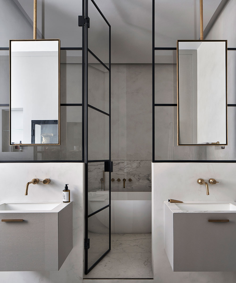
Once a dark, awkwardly configured kitchen, this space was redesigned by Katie into this elegant room where a glazed wall and floating vanity units to maximise the light.
Katie McCrum, mccruminteriordesign.co.uk
Photography/ Davide Lovatti

Jennifer is the Digital Editor at Homes & Gardens. Having worked in the interiors industry for several years in both the US and UK, spanning many publications, she now hones her digital prowess on the 'best interiors website' in the world. Multi-skilled, Jennifer has worked in PR and marketing and occasionally dabbles in the social media, commercial, and the e-commerce space. Over the years, she has written about every area of the home, from compiling houses designed by some of the best interior designers in the world to sourcing celebrity homes, reviewing appliances, and even writing a few news stories or two.
-
 5 freezer cleaning mistakes you must avoid – or risk compromising your food quality and shortening the lifespan of your appliance
Avoid these blunders for a safer kitchen
By Seraphina Di Mizzurati
-
 What is an island bed? This clever garden design trick can add privacy and drama to any backyard
Create a long-lasting, low-maintenance and visually appealing island bed that also serves a purpose in the garden
By Sarah Wilson