Design house: Family heirlooms, vintage treasures and antique finds make this house a home
'Styles have come and gone more than once since I began. At the end of the day the magic and balance is in how you mix those things you treasure.'

'I spent most of my adult life in antique stores and flea markets,' says Mary T. Miller. Her eclectic home in Charlotte, North Carolina is awash with quirky curios and interesting objets.
My design philosophy revolves around how you mix the colours, textures, patterns and most importantly periods of furniture and collectibles to achieve a balance. In other words, I believe, “It’s all in the mix.” If you think about it, there’s really no such thing as a period room—except in museums depicting a point in time. Even back in the day of Queen Anne furniture, people had their Aunt Beatrice’s chest or their grandfather’s chairs.'
'My design style is light and airy, and in the transitional style, but peppered with collectibles from the 18th-century forward. My home serves as an example of how I like to mix old and new. Trends come and go, but family heirlooms – along with some modern touches – should reflect the layers of people’s lives. I think that is true of my home.'
'I have collected art and antiques since I first lived in New York working for Suzie Frankfurt. She had a passion for Russian antiques, and she exposed me to the collectible’s world through Sotheby’s.
THE PROPERTY
Mary T. Miller sourced many of the treasures in her home from her travels to England, France and Italy. 'The hunt with a flashlight at 5am at Bermondsey market or a day at the Puces at Clignacourt in Paris is like cat nip to me,' she recalls fondly. 'I just can’t get enough,' she says. 'Each treasure is a cherished memory.'
Some of my pieces have a provenance, and others simply caught my attention in a pile at a flea market, but I love them all equally. Things I consider when choosing a piece include colour, texture, whether it isvintage, antique or a reproduction; does it have curvilinear qualities or straight lines, and is the proportion correct. These differences should be considered carefully when putting together a successful room and home. I love to mix abstract with naturalistic and I think gathering rooms need to be arranged in a conversational way with comfortable seating options. The goal is to look inviting and to draw people in, visually and physically.
We talk to Mary T. Miller about the design project.
Sign up to the Homes & Gardens newsletter
Design expertise in your inbox – from inspiring decorating ideas and beautiful celebrity homes to practical gardening advice and shopping round-ups.
HALLWAY
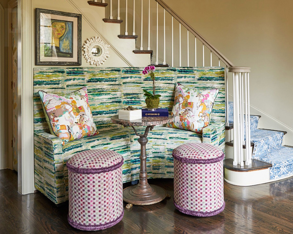
The hall here is small, but nevertheless the entrance to the home. It needed to have some pizazz. The custom banquette was built to fit the curve of the stairs. The fabric works nicely with the pattern of the stair carpet to give the room some energy, while the marble and bronze French bistro table dovetails nicely in the curve of the banquette. The two pull up ottomans are more for decoration than practicality, but in the time of sheltering in, it has recently become a destination and you can’t have too many.
SeeDesign house: A chic and colourful home in California, designed by Fiorella Design
HOME OFFICE / DRAWING ROOM
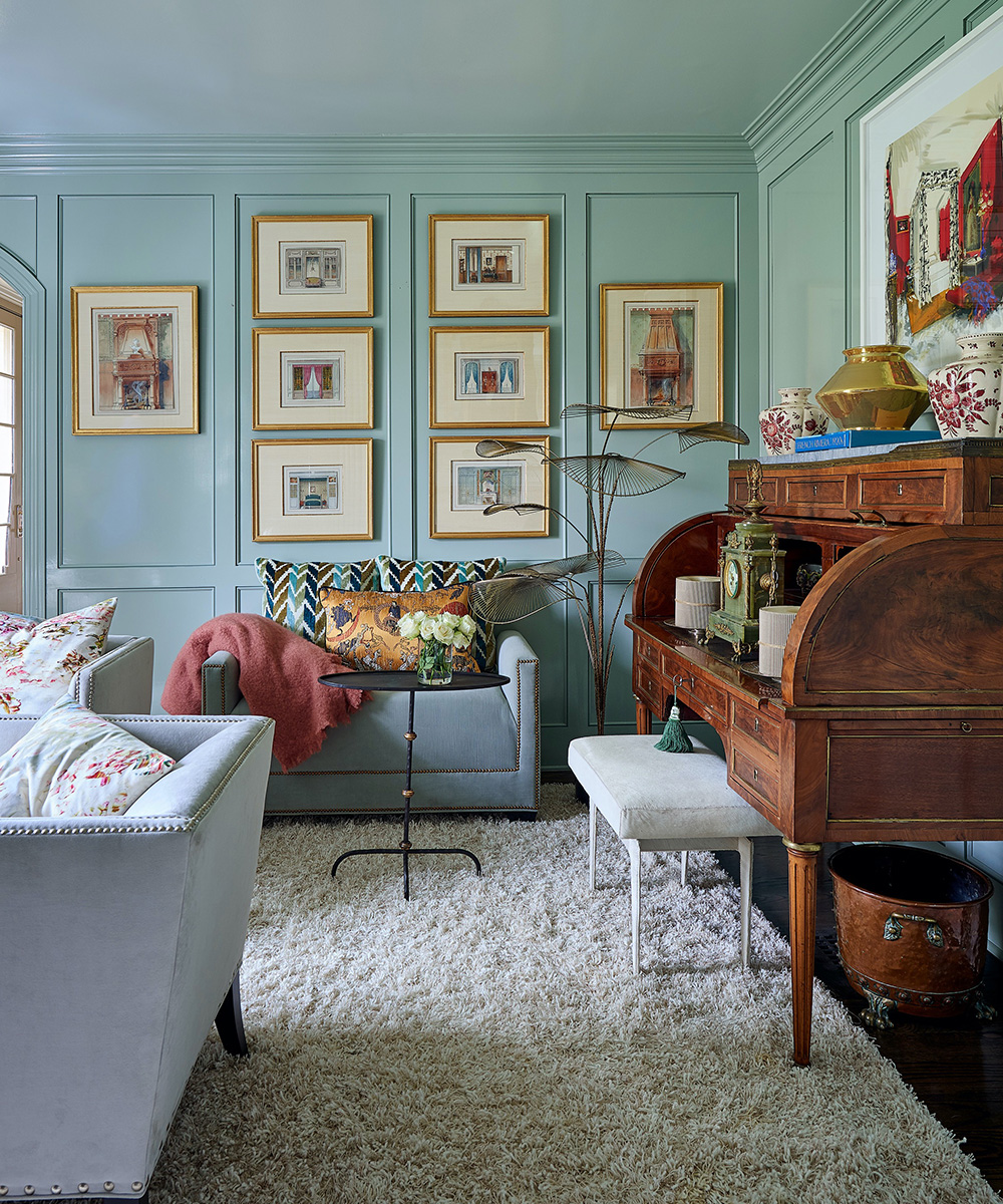
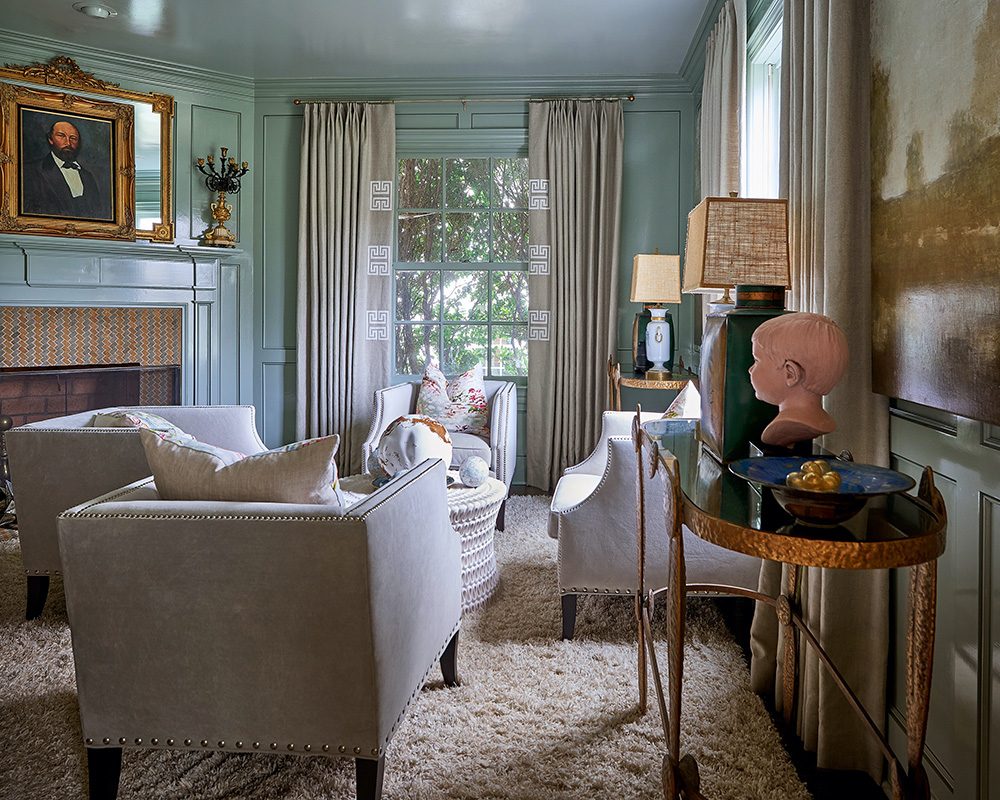
This room has recently become the home office though it doubles as the sitting/card room. The walls are Farrow and Ball light blue in a gloss finish – used to create a light and airy feel in this space.
The linen drapery mimics the wall colour but is adorned with a Greek key appliqué. Centre stage here is the large 19th-century Louis XVI style roll top desk with the Jeremiah Goodman Goya Bedroom above it. To the left is a collection of original watercolors depicting vintage interiors. This is a great room to have a private conversation with a cup of coffee or tea.
DINING ROOM
I wanted our dining room to be centre stage for the more festive and formal dining for the holidays and special occasions. The dark Benjamin Moore Kendall Charcoal wall colour creates the perfect backdrop for elegant gatherings. The colour really enhances the wood tones of the 18th-century English Chest and the antique French tall chest that houses the table linens.
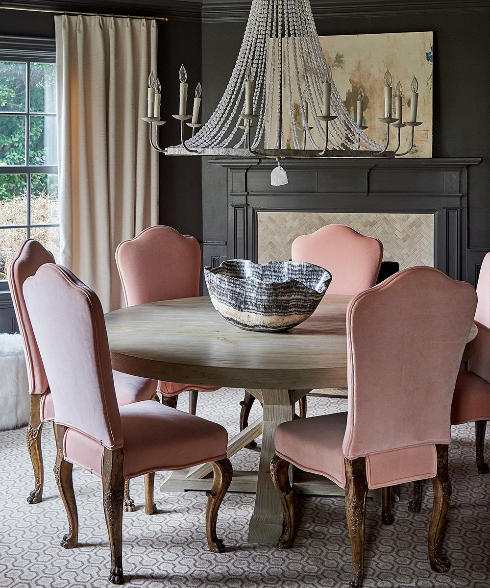
Chandeliers should always be on a dimmer and serve only as a soft supplement to candlelight. I added the chunky rock crystal to the light fixture to dress it up a bit. The ceiling is reflective with bronze mirror that enhances candlelight – it virtually doubles it.
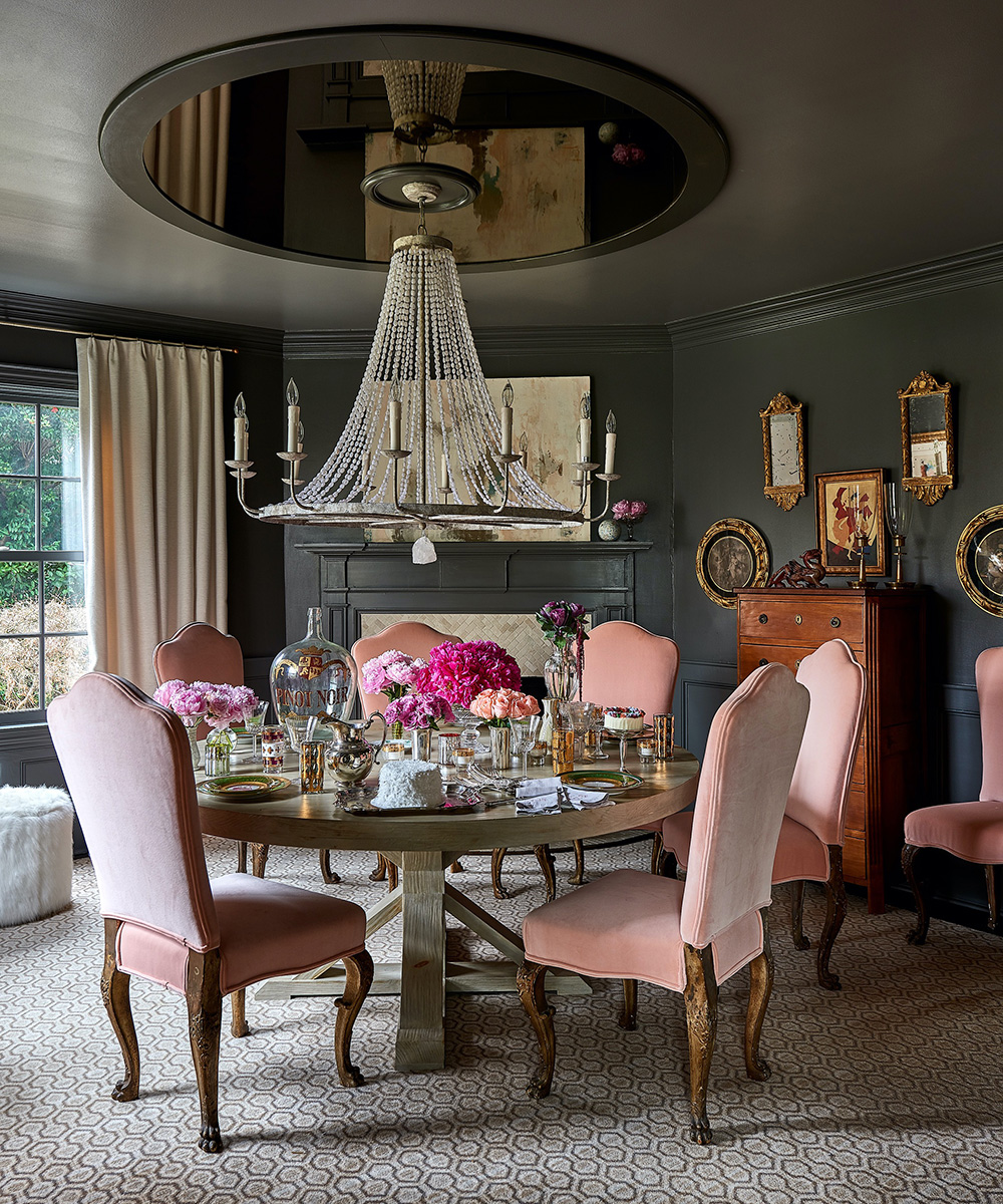
The round white-washed dining table is the anchor of the room. The Continental antique dining chairs are upholstered in a soft coral velvet that lends a little romance to the colour palette. Bring on the crystal, china and silver.
SeeDesign house: Tudor-style detached house in Oklahoma, designed by Mel Bean Interiors
KITCHEN
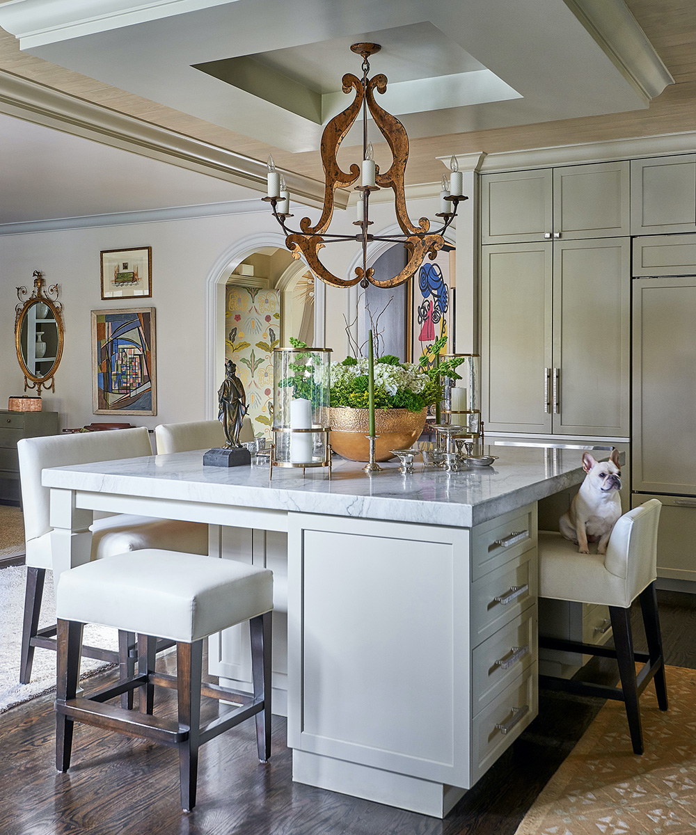
The kitchen is open to the living room and is part of the big open space that we so desired when starting this project. It is the heart and centre of our home.
Everything is built in so it looks more buttoned-up than a traditional kitchen. There’s a formal chandelier from Niermann Weeks and Italian Sconces flanking the space.
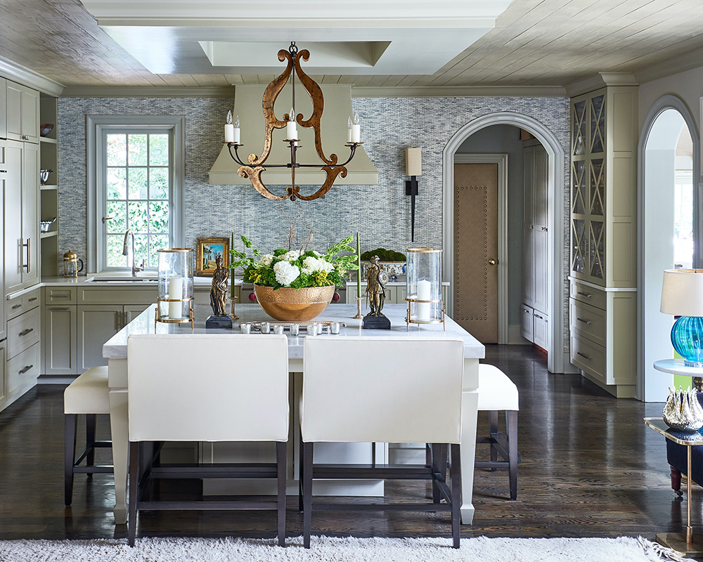
I like to dress up the kitchen island with pieces of my grandmother’s silver and etched, gold leafed votive holders. The French Faience centrepiece is flanked by my favourite matte brass hurricane lanterns.
Candlelight is everything when you’re entertaining – whether it’s family or a big group. The large island is the perfect place to put out the appetisers amidst a sea a of candles.
SeeDesign house: Characterful, art-filled house in Nantucket, designed by Tim Button
LIVING ROOM
The inspiration for this room is based on this hand-painted screen of a port in France. I love everything about it, the colours, the season, and the location most of all. It takes me away to a happy place. I designed the cabinetry around it to make it the star of the show.
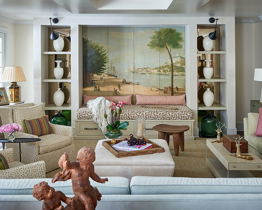
The deep day bed underneath and the ample seating with two Lee Chairs, the hair on Hyde ottoman and the two large sofas make this the perfect place to gather. The conversational seating is a draw for a crowd when we have casual dinners.
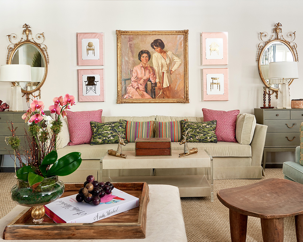
A vintage Baker sofa resides under the long wall of a Robert Bruce Williams portrait of my mother and I. The traditional art is offset by the four modern gold leaf chairs in acrylic shadow boxes.
I found the long wood hand hewn table at a flea market. I fell in love with its rustic construction. I use it as a room divider between the living room and the kitchen. It’s the resting place for a beautiful sculpture of children; dogs and a bird that was my mother’s and is flanked by a pair of amethyst rock crystal lamps by Karen McCoy.
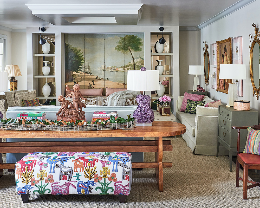
When my entire family comes for the holidays, we clear it off and use it as a dining table for everyone. It is very narrow, so it makes for a more intimate dining experience.
FAMILY ROOM
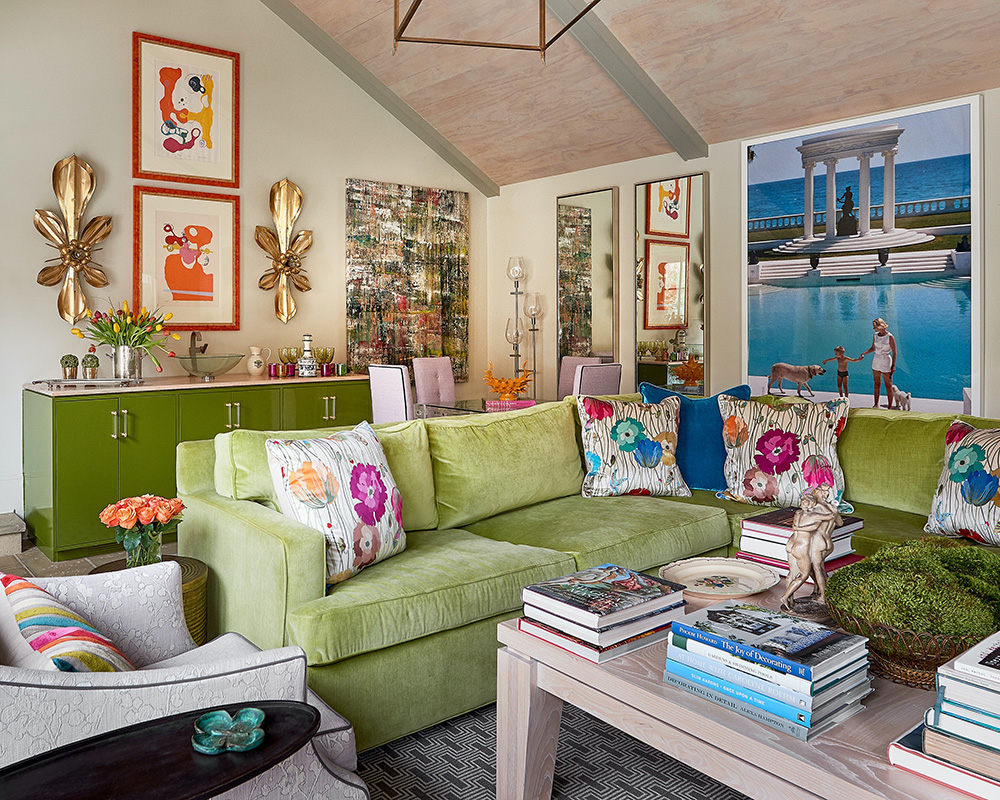
The family room cleverly doubles as the pool room. A sunny room by day, and an entertainment centre by night. It’s where the family watches television. It is glorious when the sun shines through on a warm day.
The green lacquered cabinet is really a wet bar in disguise. When we entertain, we set up the cocktails there. There is a small refrigerator, dishwasher and ice maker hidden inside the cabinet.
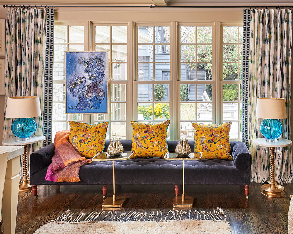
The splatter canvas to the right is an original painting from Belgium. It serves as the backdrop to the vintage acrylic games table. In my family, the focal point here has to be the big flat screen television, but luckily for anyone who’s put off by that – there’s a beautiful photograph of an allée of trees above.
SeeDesign House: An original 1915 carriage house in Seattle, designed by Heidi Caillier Design
MASTER BEDROOM
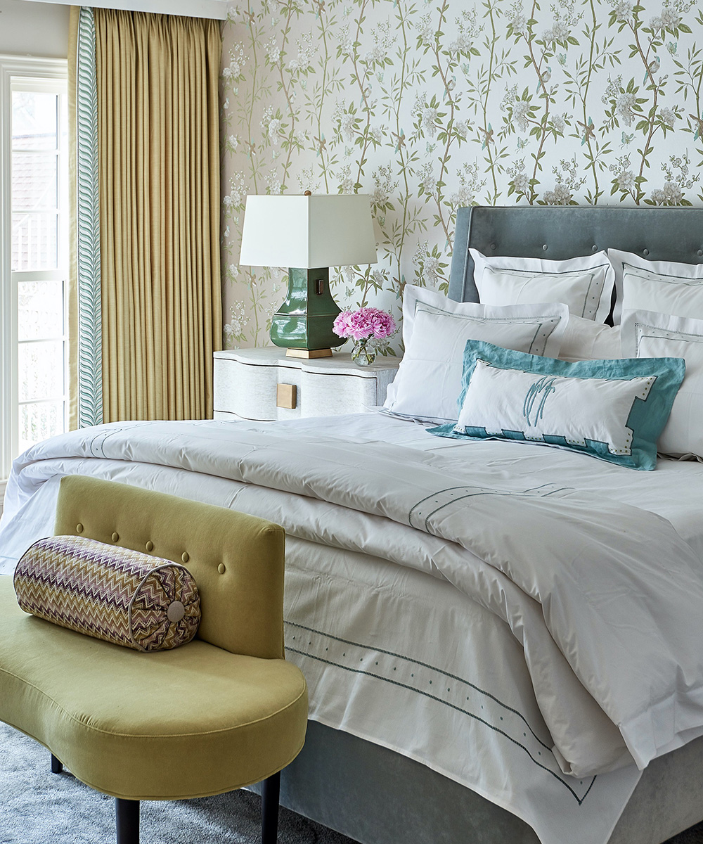
The floral wallpaper sets the tone for this peaceful and comfortable retreat. The soft palette is restful and punctuated by the distinguished green lamps and curved bedside chests.
BATHROOM
GARDEN
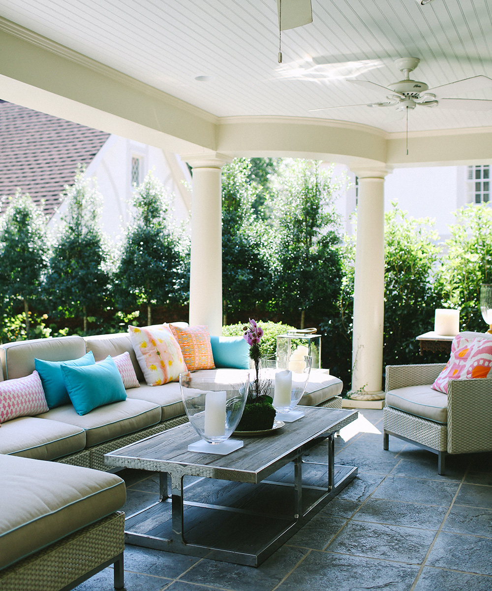
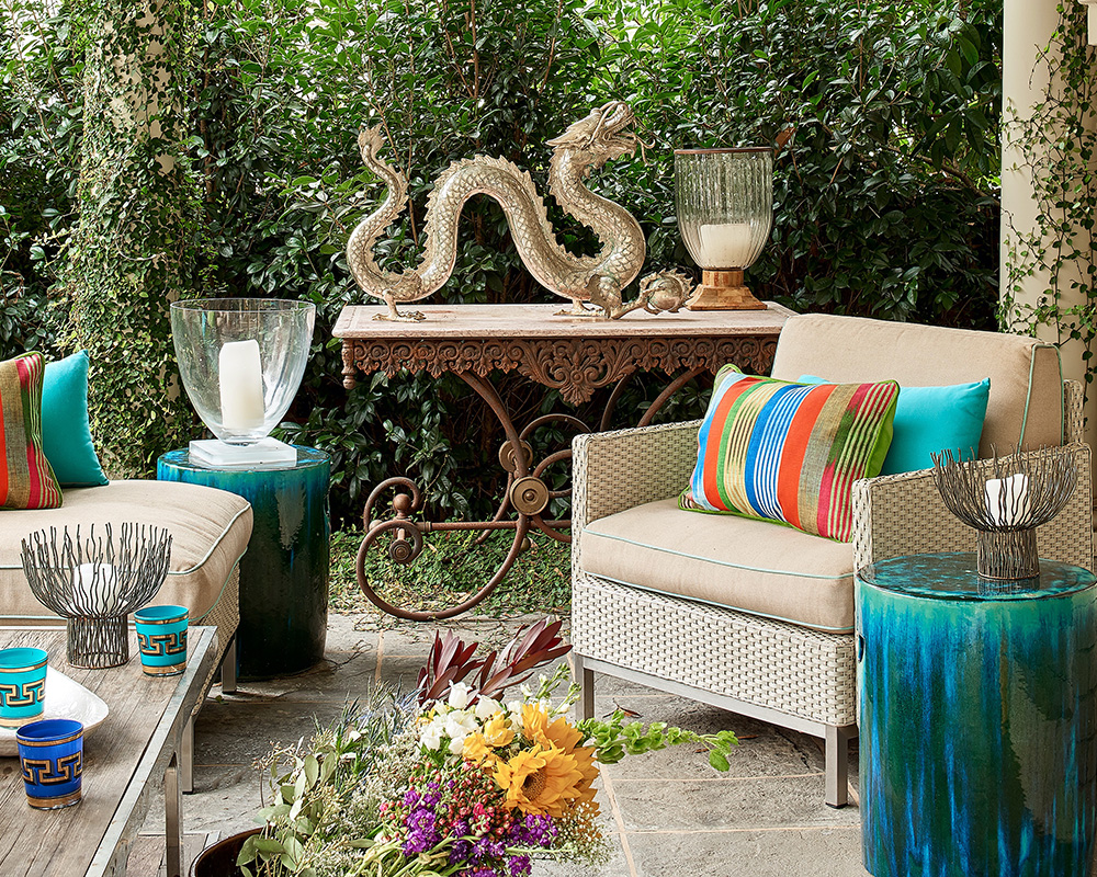
The garden is a breath of fresh air. The comfortable seating and the private of the greenery just nestles you in. We use this space to stretch out after a swim, or to grab an afternoon nap.
POOL
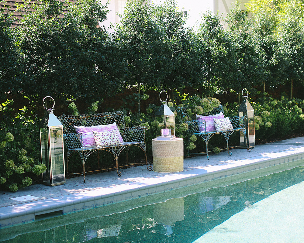
My husband wanted to fill in the pool when we were looking at the house. My daughter and I looked at each other and said, “that’s the thing we like the most!” I will tell you that I’m not quick to put on a bathing suit and dive in though – I think I’ve been in it maybe once. However, when I look outside the kitchen or pool room windows, I feel like I am at a resort.
Photography/ Dustin Peck
Interior design/ Mary T. Miller Interior Design / Abode Home Design

Jennifer is the Digital Editor at Homes & Gardens. Having worked in the interiors industry for several years in both the US and UK, spanning many publications, she now hones her digital prowess on the 'best interiors website' in the world. Multi-skilled, Jennifer has worked in PR and marketing and occasionally dabbles in the social media, commercial, and the e-commerce space. Over the years, she has written about every area of the home, from compiling houses designed by some of the best interior designers in the world to sourcing celebrity homes, reviewing appliances, and even writing a few news stories or two.
-
 How to get rid of bean seed flies – a pest control expert reveals how to keep crops safe from these seed munchers
As their name implies, these insects primarily feed on bean crops
By Tenielle Jordison
-
 Sarah Michelle Gellar's kitchen cabinets are moody yet elevated – I've always used dark paint with caution, but they make bolder tones accessible
The actress's black kitchen cabinets are bold yet palatable, proving that this dark shade is a trendy yet timeless color pick
By Hannah Ziegler