Design house: This eclectic home in London is a mix of dark and dramatic furnishings
Drawing on their cinematic backgrounds, the homeowners have used a darkly brooding palette and Mid-Century-modern furnishings to create a home rich with melodrama

A sweep of claret-red curtain screens the entrance to the homeowner’s north London home. Part the velvet hangings and you find yourself plunged into a thrillingly Gothic atmosphere.
Antique mirrors, silvery with age, soar towards 19th-century cornicing while a stuffed bear, its jaws frozen in a grin, stands guard. On another wall, a parade of suspended glowing lanterns by designer Alex Randall casts flickering shadows across the interior, like Victorian night watchmen prowling the city streets.
Part Edgar Allen Poe with a dash of Film Noir, here is a house that confounds contemporary expectations. Ask most homeowners what they value most about their interiors and the word 'lightness' usually tops their decorative list. But the homeowners have taken a defiantly different tack, shunning sun-saturated modernity for a brooding palette of plum-dark velvets, burnished bronzes and ebonised furniture.
See:An urban-chic home in Somerset with a clever color palette
'We didn’t have an overarching plan... we just wanted somewhere different: a house for entertaining. It’s a bit dark and enticing with random surprises, not at all matchy-matchy,' says the owner, as he meets us at the top of the staircase, where giant, faintly sinister iguanas prowl across the Timorous Beasties wallpaper.
To pull off this idiosyncratic look, the owners commissioned interior designer Monique Tollgård of the Staffan Tollgård Design Group, who was quick to grasp her client’s (albeit loose) brief for a 'house where the original architecture is infused with drama, detail, and eccentricity'.
- See some of the world's best homes – beautiful properties from around the globe
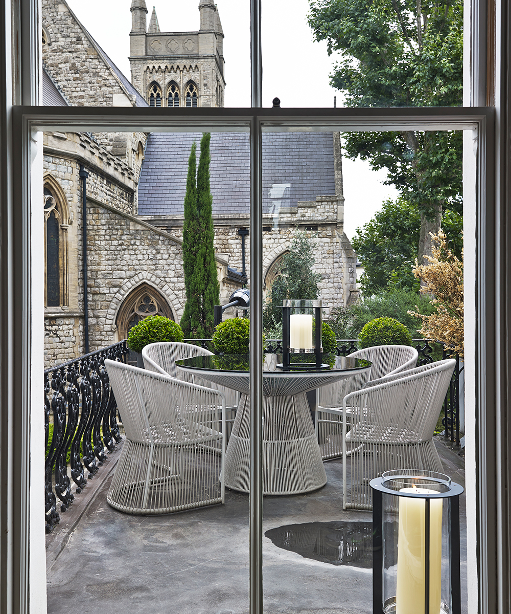
From the start, original details were meticulously restored: Portland stone was sourced to repair the sonorous staircase, and the graceful metal balustrade repaired while windows gleam with bronze fittings commissioned from Joseph Giles. Incongruous features installed by previous owners – a château-esque fireplace and rustic flagstones among them – were removed in the owners’ quest to restore a Victorian aura to the interiors.
Sign up to the Homes & Gardens newsletter
Design expertise in your inbox – from inspiring decorating ideas and beautiful celebrity homes to practical gardening advice and shopping round-ups.
Yet, as the owners (who, unsurprisingly, both work in the film business) point out, there is nothing traditional or here.
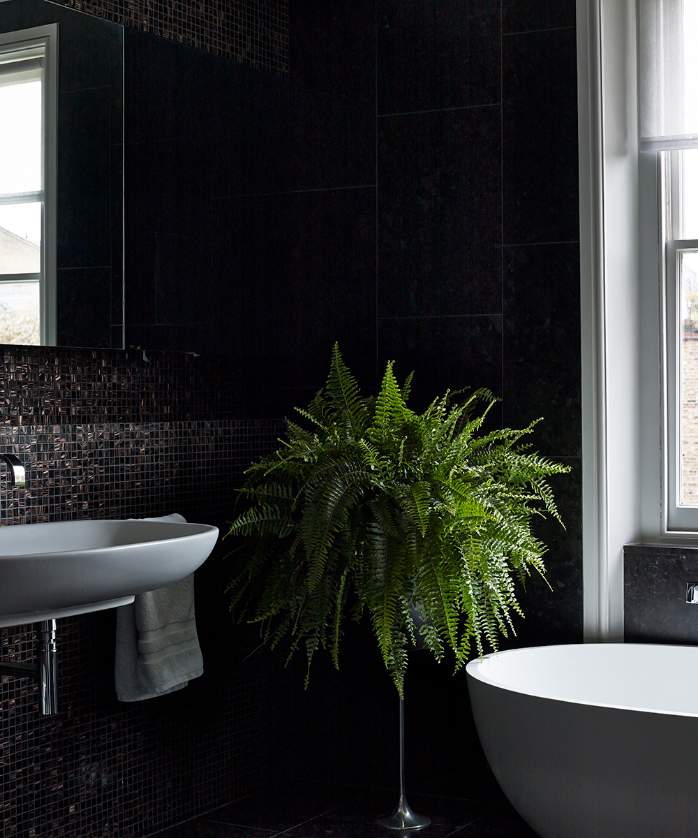
On the first-floor landing you encounter a giant fish tank, which took 'ten men to install'. It then took another year before the micro-marine environment was ready for the piscatorial inhabitants that flit around it in dazzling shades of Cadmium yellow and Cobalt blues. Nearby, a sliding door opens on to a loo replete with black walls, potted plants and guttering candles. 'We sacrified a bedroom and bathroom to create this space. An impractical but satisfying move,' says the owner, drily.
Unabashed glamour was also achieved by removing walls in the main reception rooms to create open-plan spaces for entertaining although the L-shaped room on the first floor, Monique admits, 'presented a challenge as we had to find a way to tie the different areas together'.
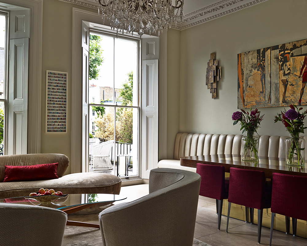
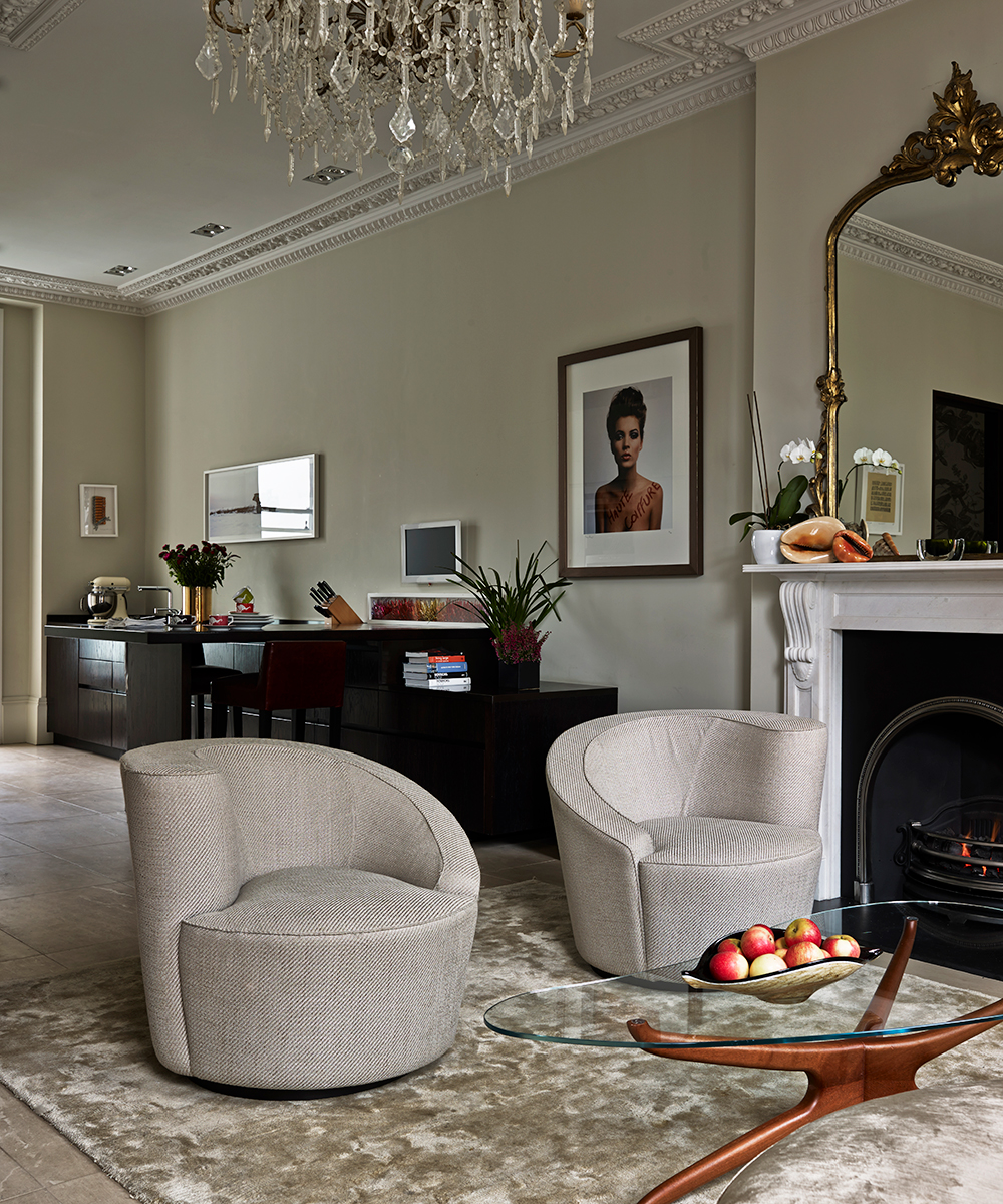
This was managed in the end, however, by deploying clever links: in the kitchen, pale lacquered storage is contrasted with a sequence of low stained-wood units that link the kitchen with the seating area. Here, vampishly curvaceous sofas by Vladimar Kagan contrast with the linear feel of the dining area, where an ivory leather banquette is offset by burgundy leather chairs, and a weighty, 1950s table by American designer Paul Evans. To strengthen the link further, the table’s bronze pedestal inspired the choice of lustrous lights on the wall above.
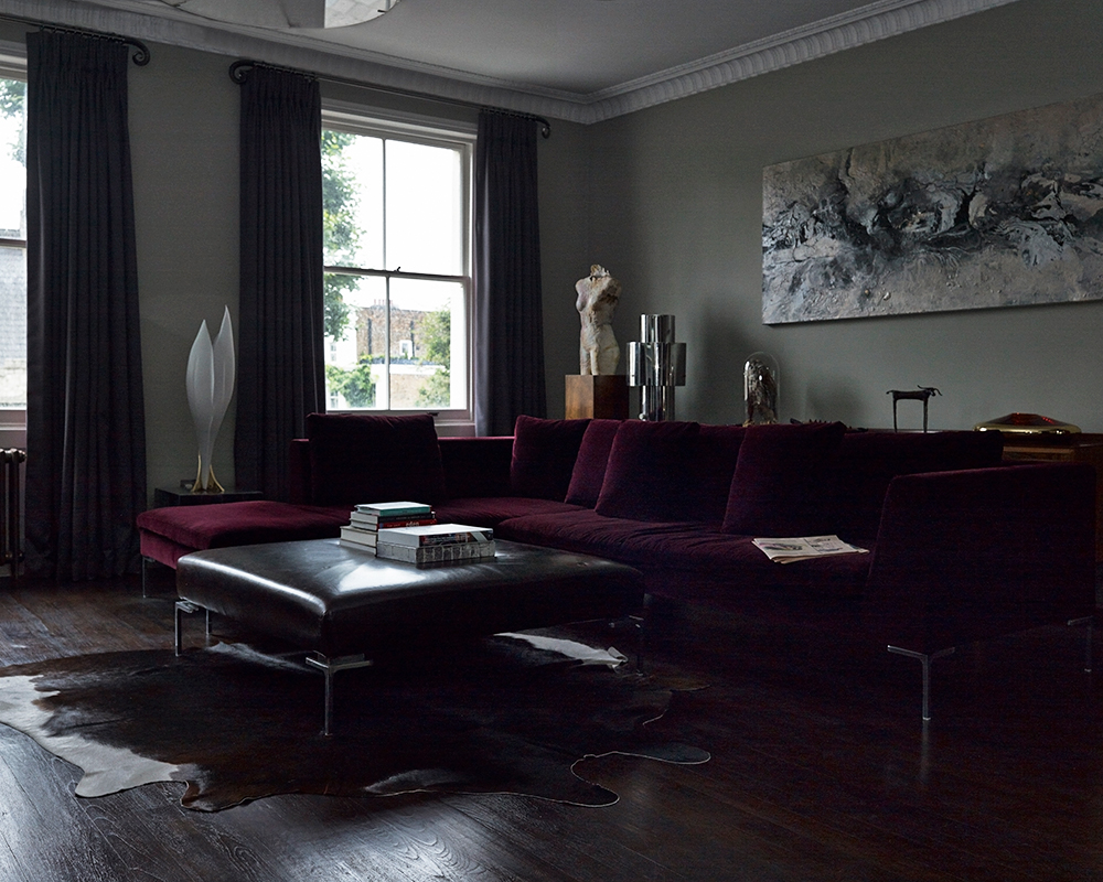
Living room
On the first floor, a wall was removed to create a generous living area where a clever mix of tones and contrasting shapes link the three functions of the pace – cooking, eating and entertaining – together.
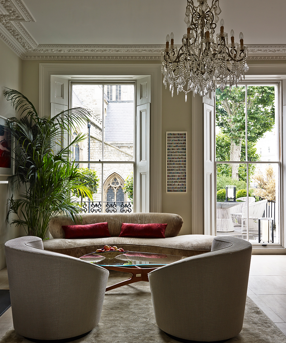
Dining room
Designed for entertaining, a glamorous dining area was created in the L-shaped room with a specially commissioned banquette to maximise space and seating.

Kitchen
Stained kitchen units carefully designed to echo the style of the owners’ favoured 20th-century antiques link the kitchen with the adjacent dining and sitting area on the first floor.
A wall was removed to create an L-shaped space that allows the kitchen to flow into the living and dining area.
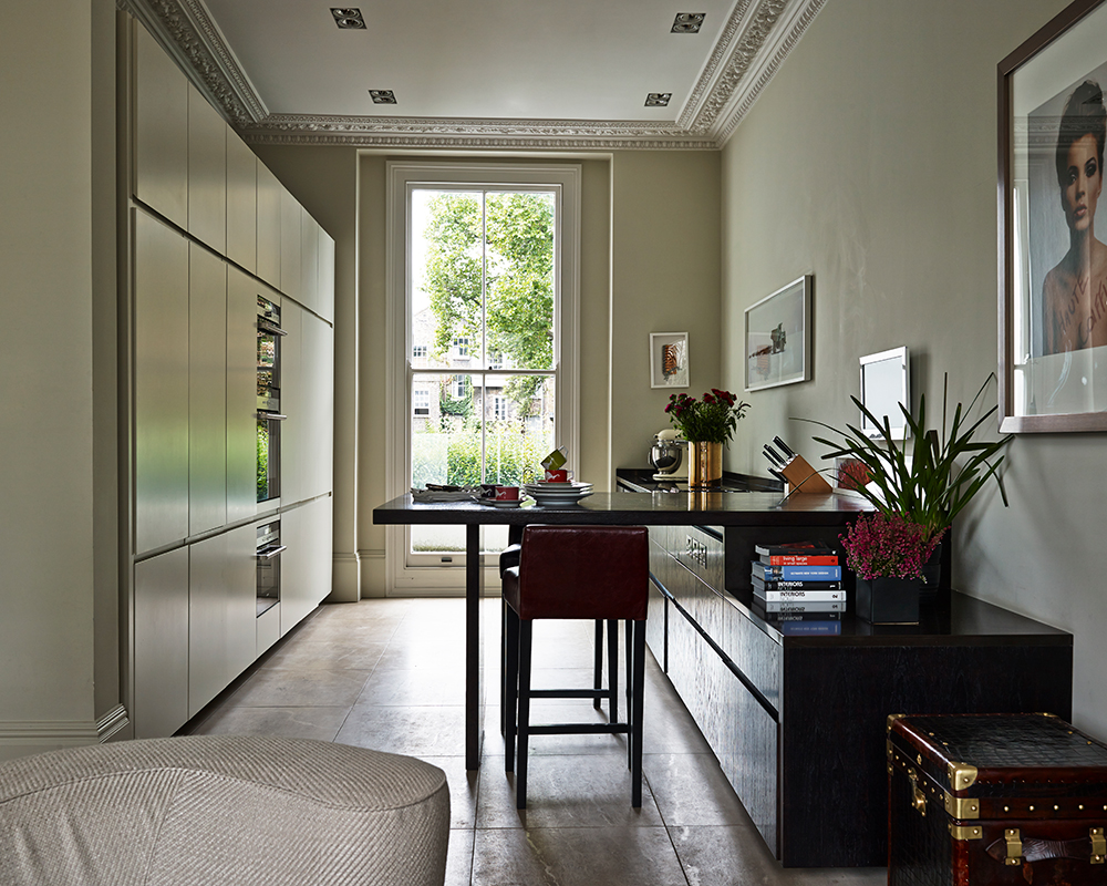
Entrance hall
A specially commissioned lighting installation by designer Alex Randall in the hall sets the Gothic tone for this dramatic townhouse.
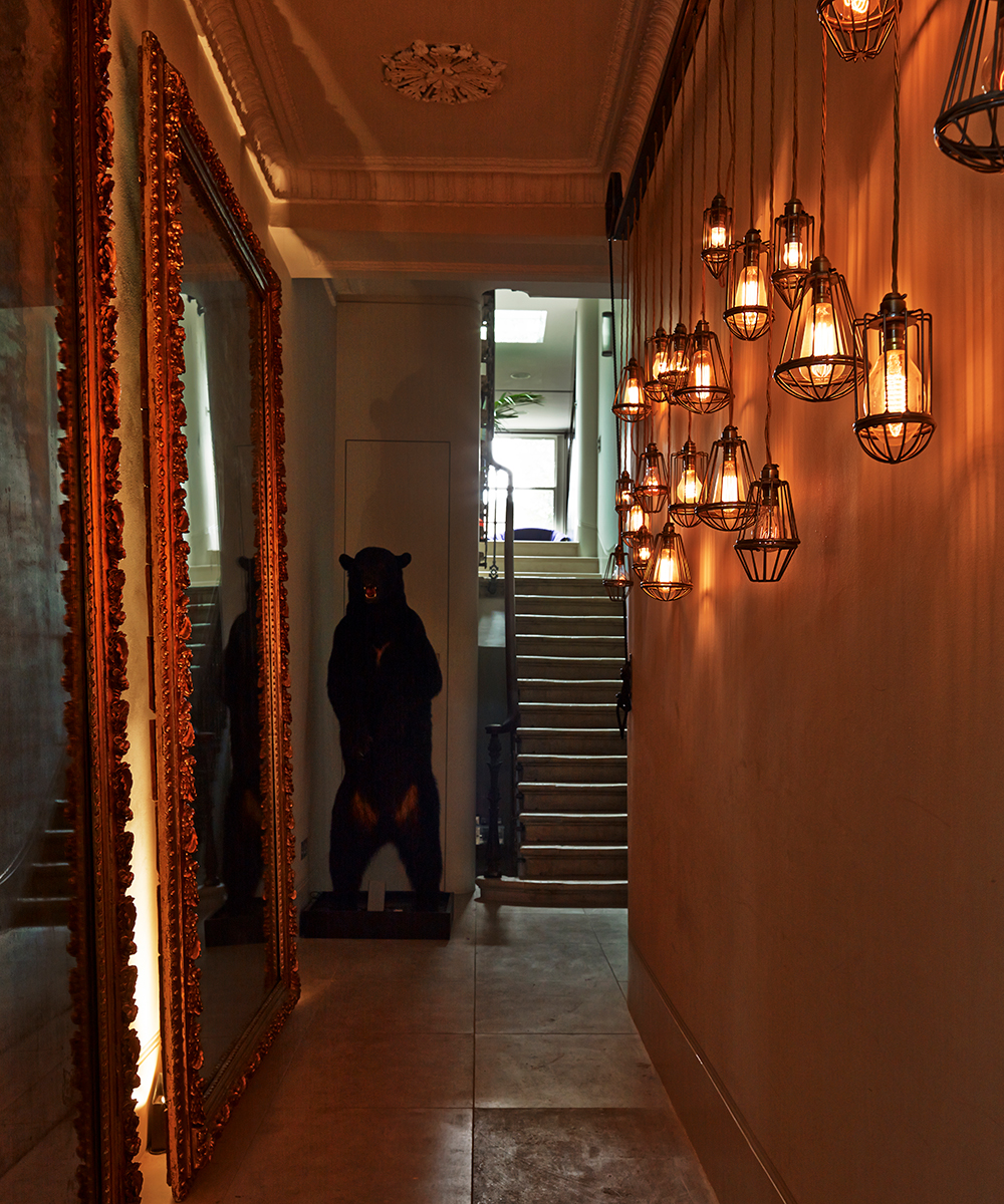
Cloak room
On the first floor landing, a bedroom and bathroom were removed to create a riveting space that, only at second glance, proves to be a cloakroom with 16-foot-long fish tank running along one wall.
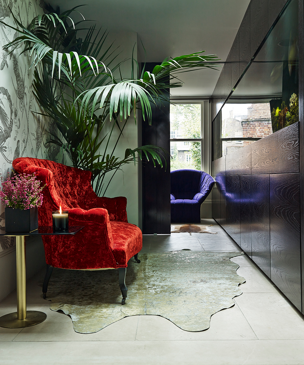
Sitting room
On the second floor, a dramatic sitting room filled with the owners’ favourite artworks and American 20th-century furniture combines two areas: the study, and the 'evening room'.
Home office
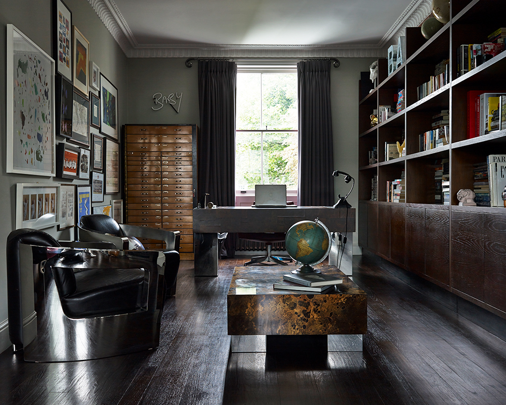
Combining artworks sourced from fairs and local dealers with the owners’ favoured mid-Century American furniture, the second floor library leads to the decadent sitting room.
Main bedroom
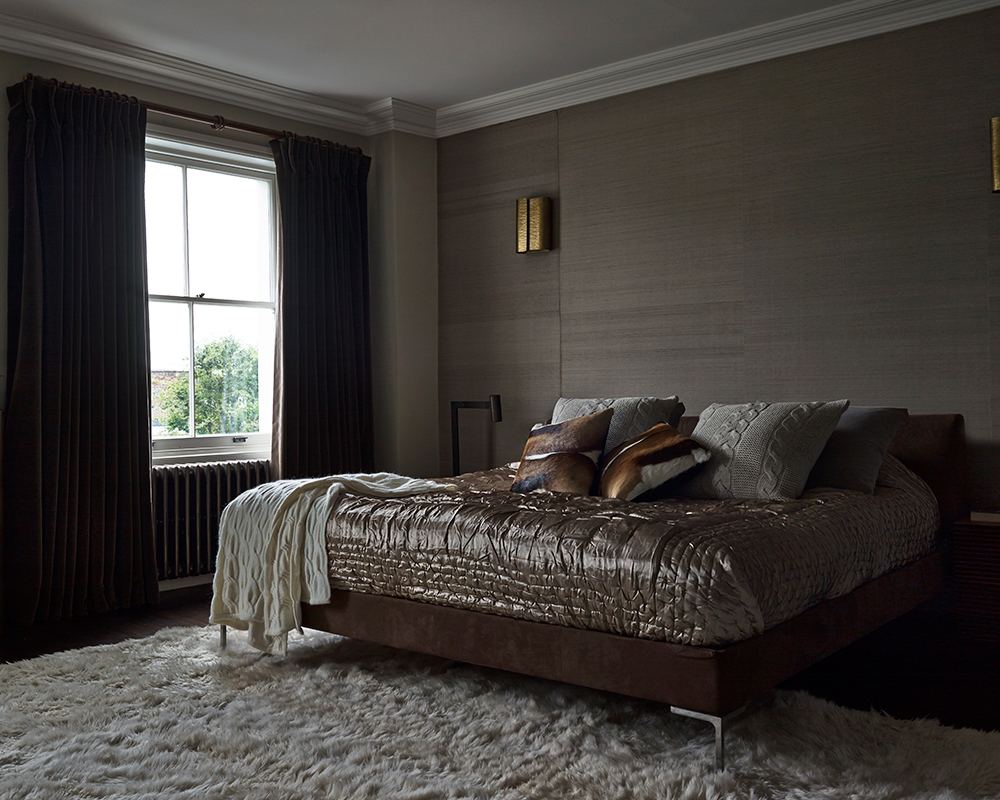
The third floor is devoted to homeowner’s dramatic bedroom and bathroom. Original cornicing and architraves have been preserved as the background for a mix of commissioned and antique pieces.
Photography/ David Cleveland

Jennifer is the Digital Editor at Homes & Gardens. Having worked in the interiors industry for several years in both the US and UK, spanning many publications, she now hones her digital prowess on the 'best interiors website' in the world. Multi-skilled, Jennifer has worked in PR and marketing and occasionally dabbles in the social media, commercial, and the e-commerce space. Over the years, she has written about every area of the home, from compiling houses designed by some of the best interior designers in the world to sourcing celebrity homes, reviewing appliances, and even writing a few news stories or two.
-
 Should you dry your clothes outside if you have hayfever? Allergy specialists warn sufferers to steer clear of this 'major trigger'
Doing so can trigger asthma, coughing, itchy eyes and more
By Sophie Warren-Smith
-
 Lenny Kravitz says design is 'just like music' – and the stunning materials of this bedroom embody this laidback luxe approach
Rich textures and opulent finishes come together in a Los Angeles bedroom designed by the musician – it's ultra-chic, but relaxed
By Sophie Edwards