Design house: Bold and decorative London townhouse, designed by Studio Indigo
Strong shades enhance the elegant lines of this London townhouse

In 2015, when the homeowner acquired his Kensington townhouse from his parents, who were returning to Sweden, it was one of the last on the street to be updated for modern living.
'It was in a time warp,’ he recalls of the Eighties decor, 'but I felt very fortunate to get my hands on it.' In fact, the owner’s brother had recently sold his next-door property and the new owners were keen to renovate, so the two households hired the same architect to 'kill two birds with one stone'.
- See some of the world's best homes – beautiful properties from around the globe
See: more inspiring house tours in our Spaces section
The property
'The house had deteriorated over the years and was in need of complete repair and restoration,' says architect Mike Fisher of Studio Indigo. The homeowner had worked with Mike on previous commercial projects and was impressed with his ability to define space. 'Mike is a master at dealing with staircases. He also recognises that less is often more. Most architects try to maximise the square footage, while he looks at the quality of the space,’ says the owner.
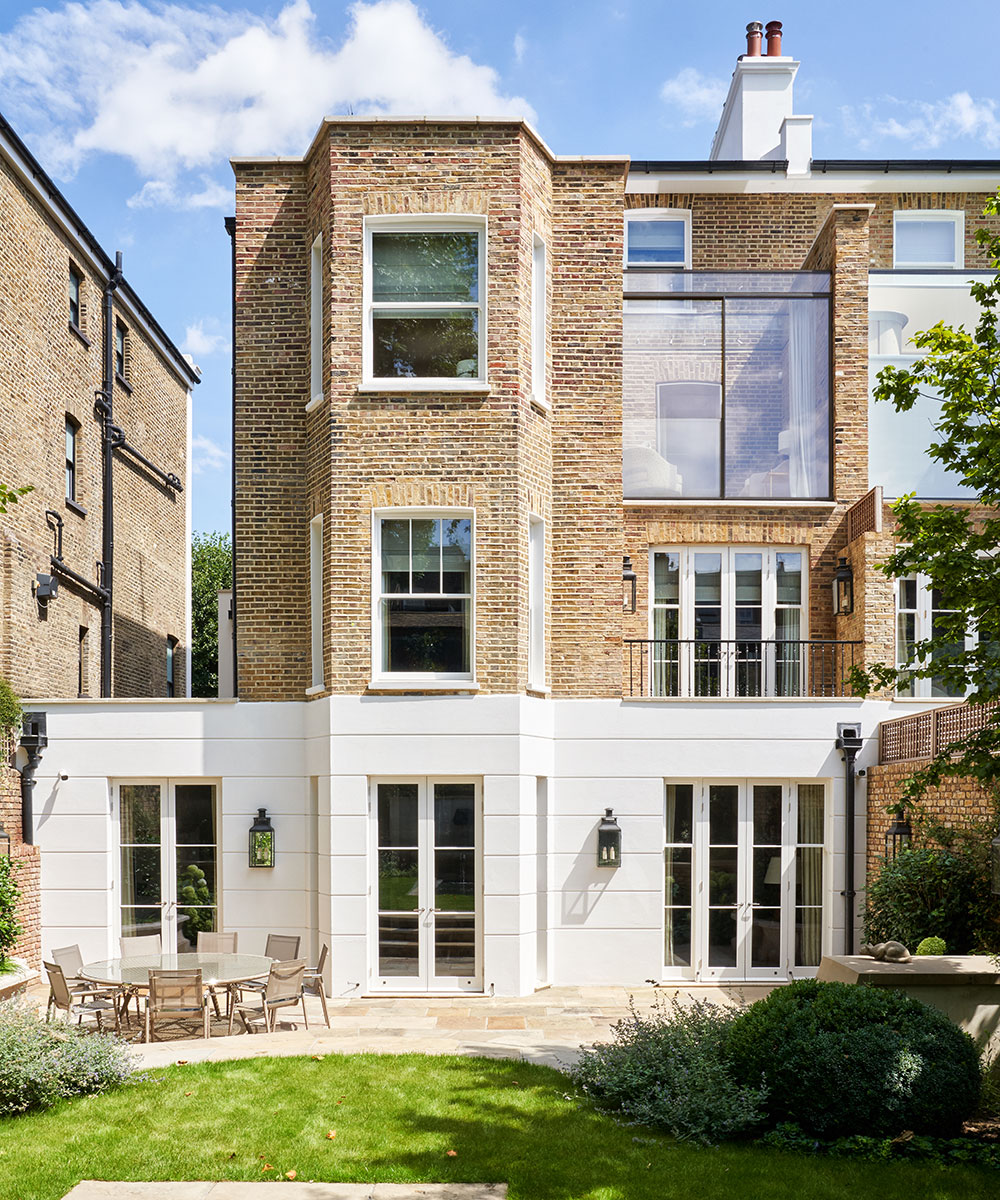
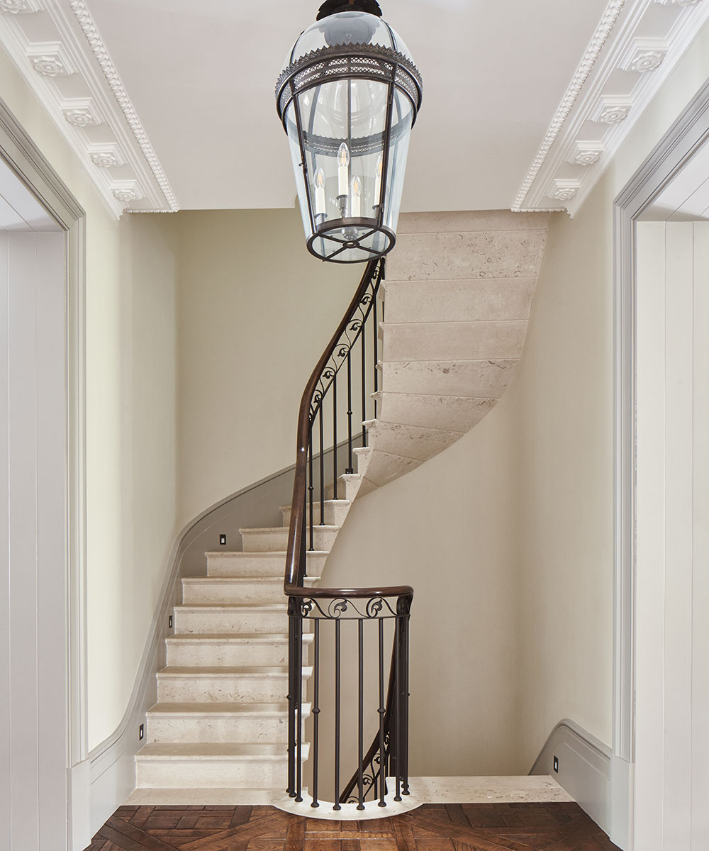
While in the past, people preferred larger rooms at the front of the house, Mike observed that modern living demands that the larger rooms be at the back. Accordingly, with Liam Saxby as project manager, he gutted and reconfigured the house, adding a central 'mini grand' staircase. Walls were removed to leave two large rooms on each floor, while door heights were raised and the landings made wider. 'The whole house has become more logical and flowing,' says the homeowner.
Eager to move in, along with his partner, the owner insisted that the restoration take under two years, and started the planning process about nine months before taking ownership. We did end up moving into a building site, which is something I can't recommend, but it was certainly worth it in the long run,’ he says. In terms of cosmetics, the owner was very clear on his brief to interior designer Christiana Syrris, also of Studio Indigo. 'I wanted it to be rich in color and texture; too much of what you see in London for a long time has been pretty monochrome. I also wanted it to be homely and have character.'
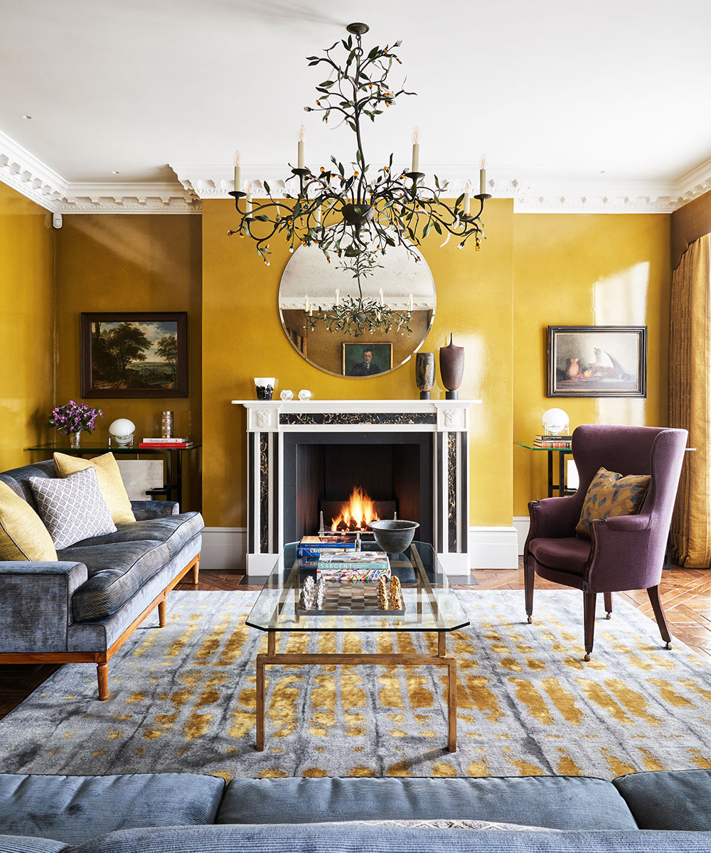
Christiana embraced her mission heartily, with the most obvious example of her fearless use of color being the saturated and rich mustard hue of the sitting room. 'I was very nervous about it,’ admits Mike. 'In theory, it looked great on the moodboard but when it went on the wall I thought it looked too strong, but Christiana convinced me.’
Sign up to the Homes & Gardens newsletter
Design expertise in your inbox – from inspiring decorating ideas and beautiful celebrity homes to practical gardening advice and shopping round-ups.
The completed room is a confident combination of color and texture, with the lacquered walls the perfect backdrop for owner’s art collection.
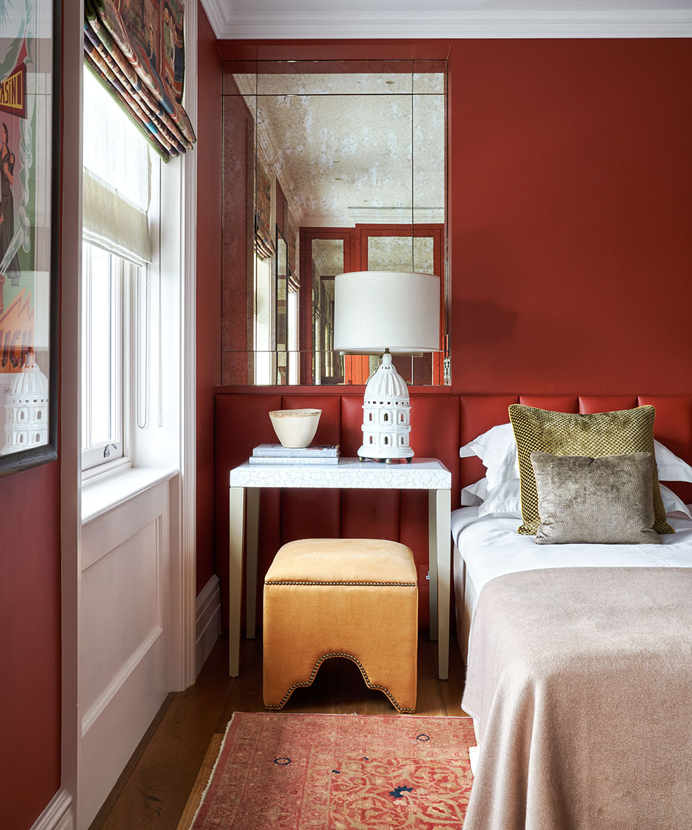
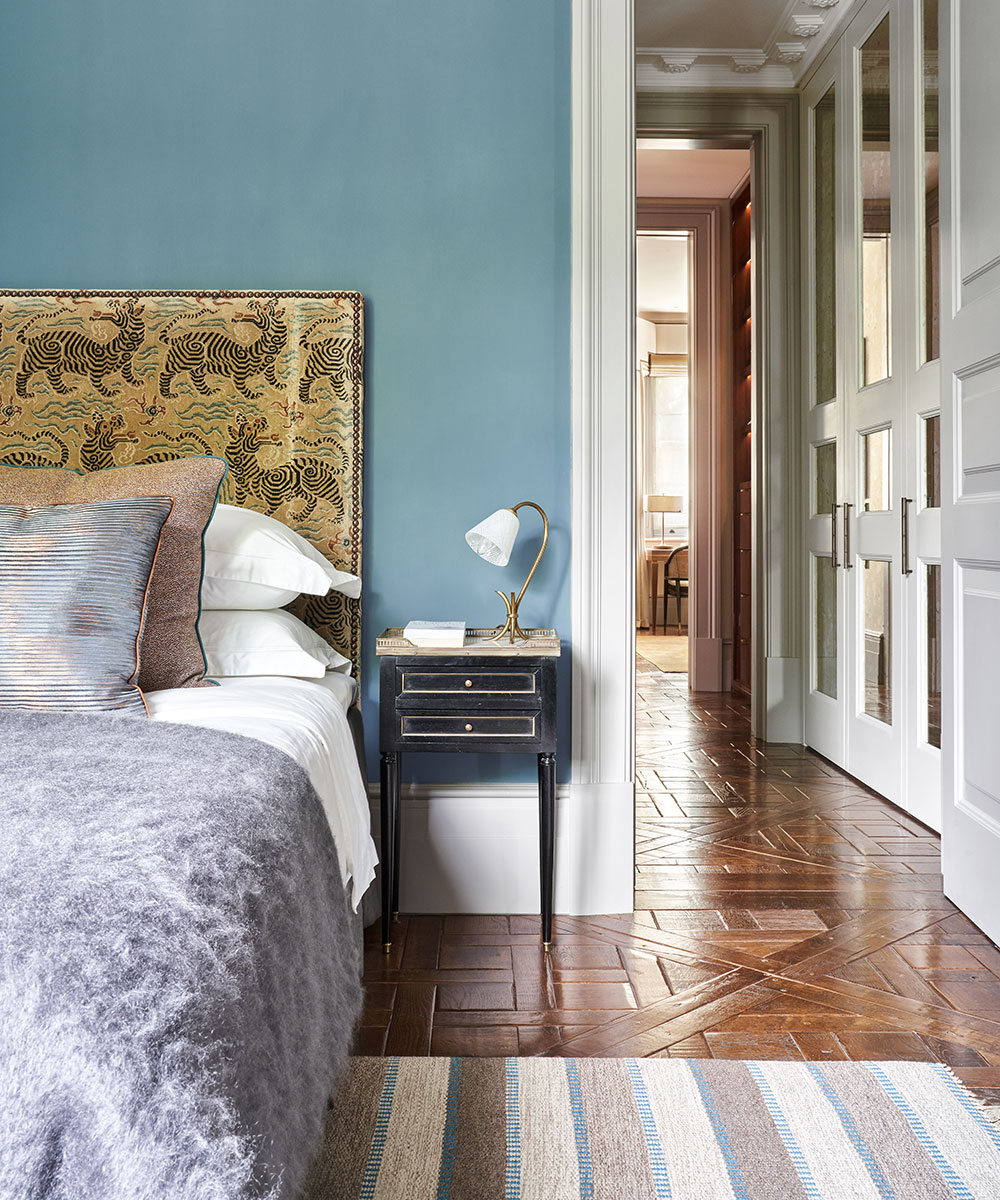
Elsewhere, each room's paint choice gives it its own clear sense of identity: Scandinavian blues recall the owner’s Swedish upbringing, green Verde Alpi marble in the bathroom looks masculine and elegant, while bold Moroccan red enhances a guest bedroom.
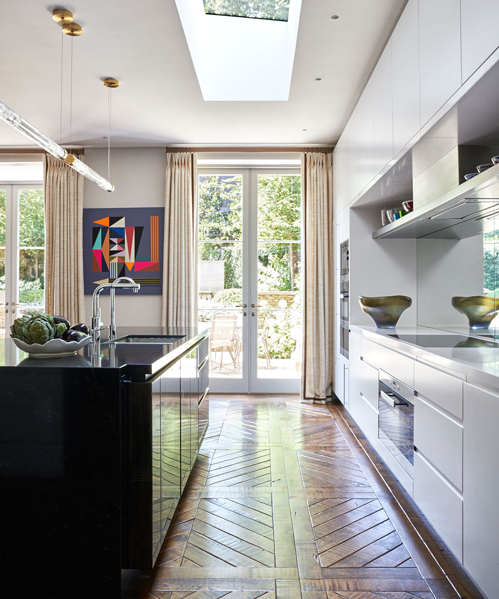
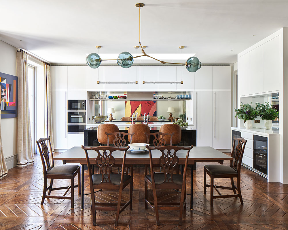
The owner’s love of entertaining was a big factor in the planning of the house's renovation. The kitchen has been conceived as the main living area with the dining room, furnished with inherited Chippendale chairs, reserved for more formal occasions. Downstairs, Crittal windows divide a wine cellar from a gym, cinema, spa and soundproofed 'nightclub'.
Keen to share the achievement of the restoration, the homeowner threw a party after he moved in, inviting 100 guests. 'The party went on well into the night; I feel privileged to have these wonderful spaces and that they all get used.’
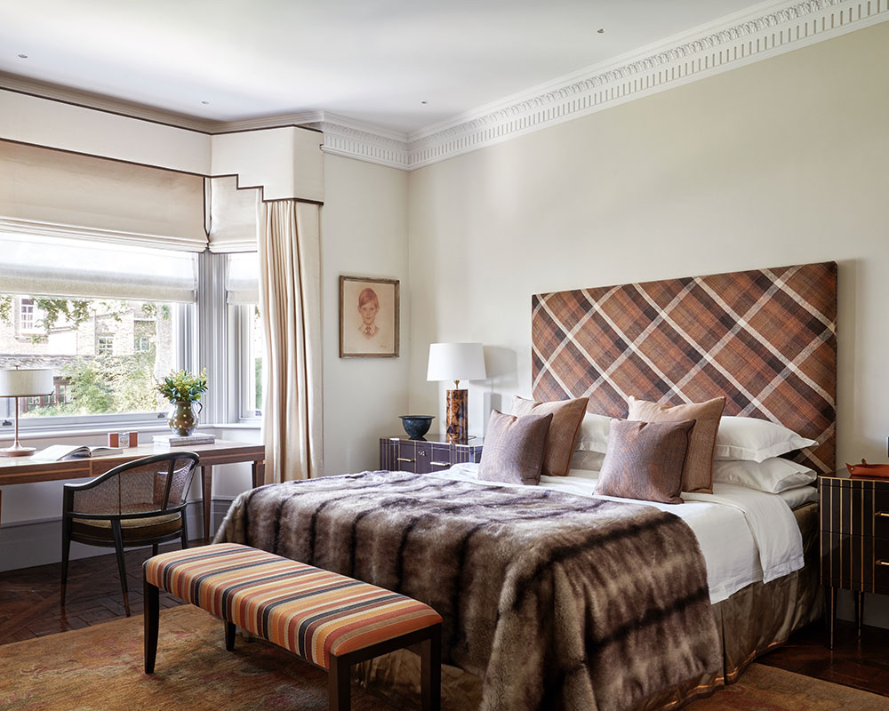
Once slumbering, this Kensington townhouse has clearly been awoken and now is filled with new life.
See: An urban London home that is smart, contemporary and bold
Living room
The walls were inspired by the curtain fabric and are lacquered to reflect the light. ‘I thought: let’s push boundaries,’ says designer Christina Syrris of Studio Indigo.
The elegant chest of drawers and portrait of the owner’s father look striking against the mustard walls.
The lustrous wall treatment in a bold mustard shade was commissioned from decorative artists Mathew Bray and Matthew Collins, specialists in creating unique surface finishes. The extra lustre from the lacquer reflects the light from the nearby window and echoes the sheen of the surfaces that feature elsewhere in the scheme.
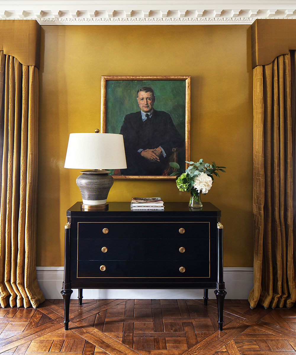
Hallway
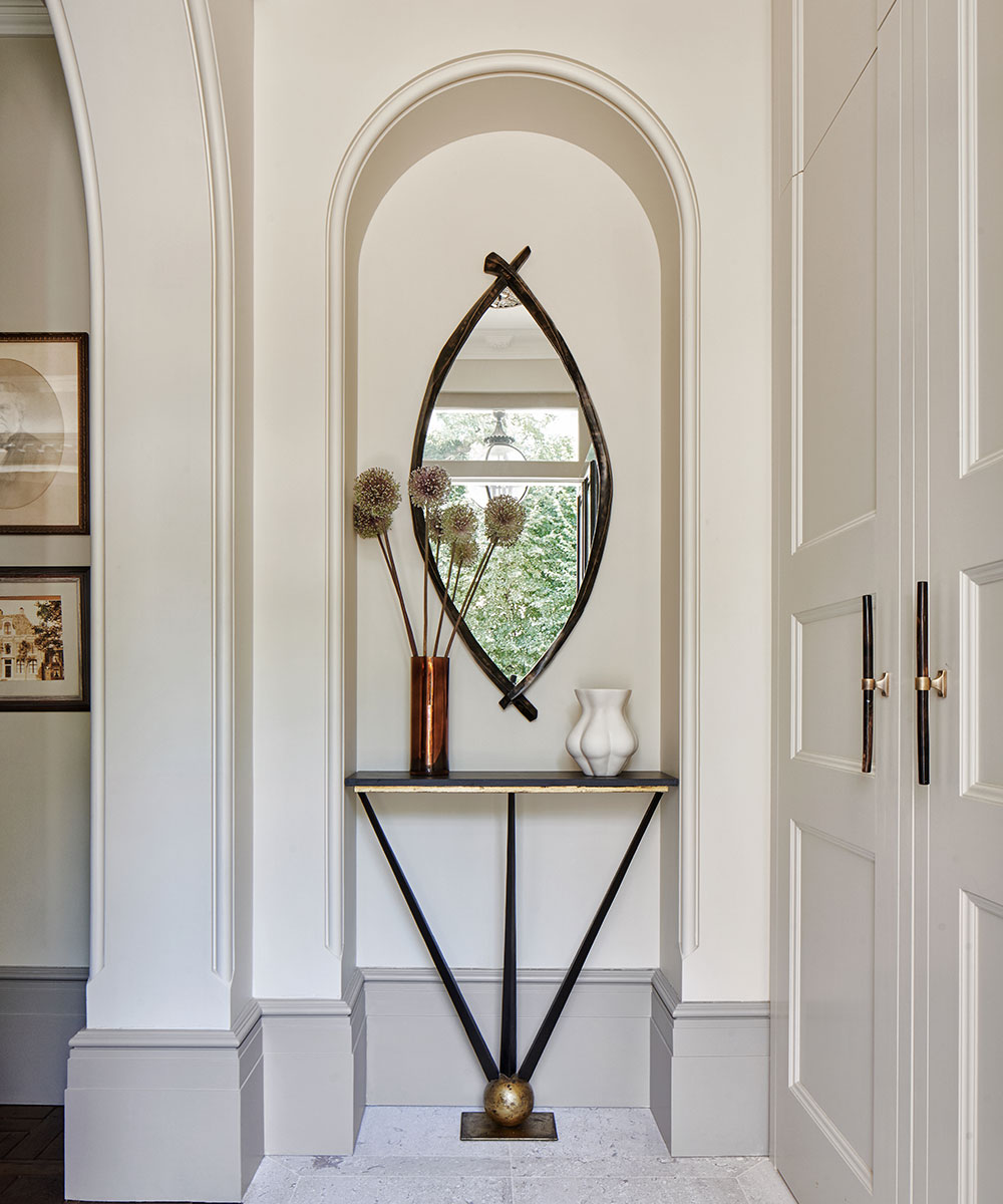
The homeowner suggested using grey for the woodwork. 'You would see this in 18th-century Swedish houses; it creates a nice contrast.’
Kitchen
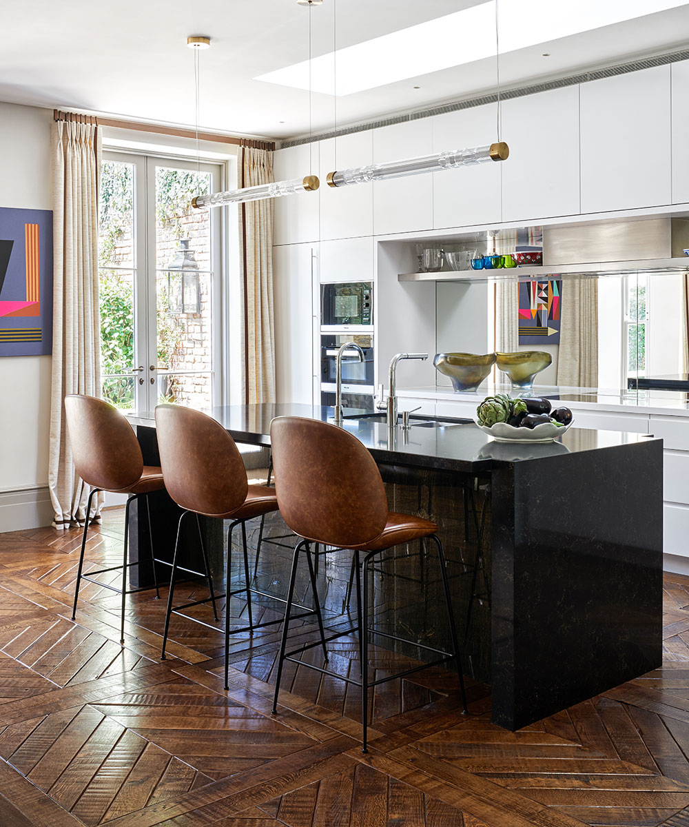
The space was planned to be the social hub of the house; the mirrored splashback cleverly enables the homeowner to engage with his guests while he is cooking.
The classic flooring used throughout this house gives a sense of history and authenticity. Sourced from Walking on Wood, the elegant herringbone pattern that features on the lower ground floor and kitchen was chosen for its contemporary feel and to distinguish the lower floors from the more traditional Versailles parquet used upstairs.
See: A perfectly peaceful mid-Victorian terrace in London
Conservatory
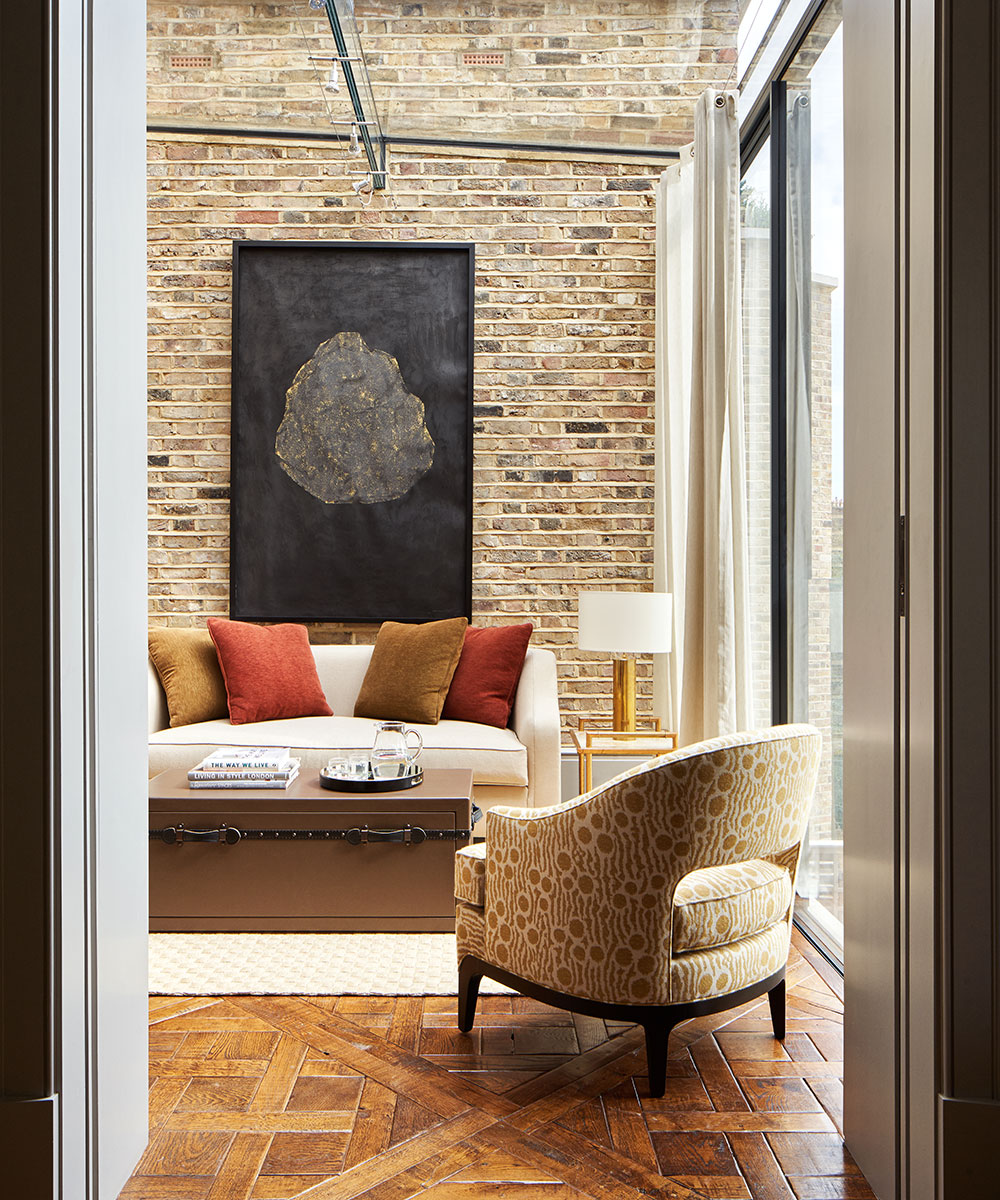
Previously an open terrace off the main bedroom, this area has been transformed into a contemporary space with a glass ceiling.
Hallway
A neo-classical niche and elegant console table make a striking statement here.

Garden
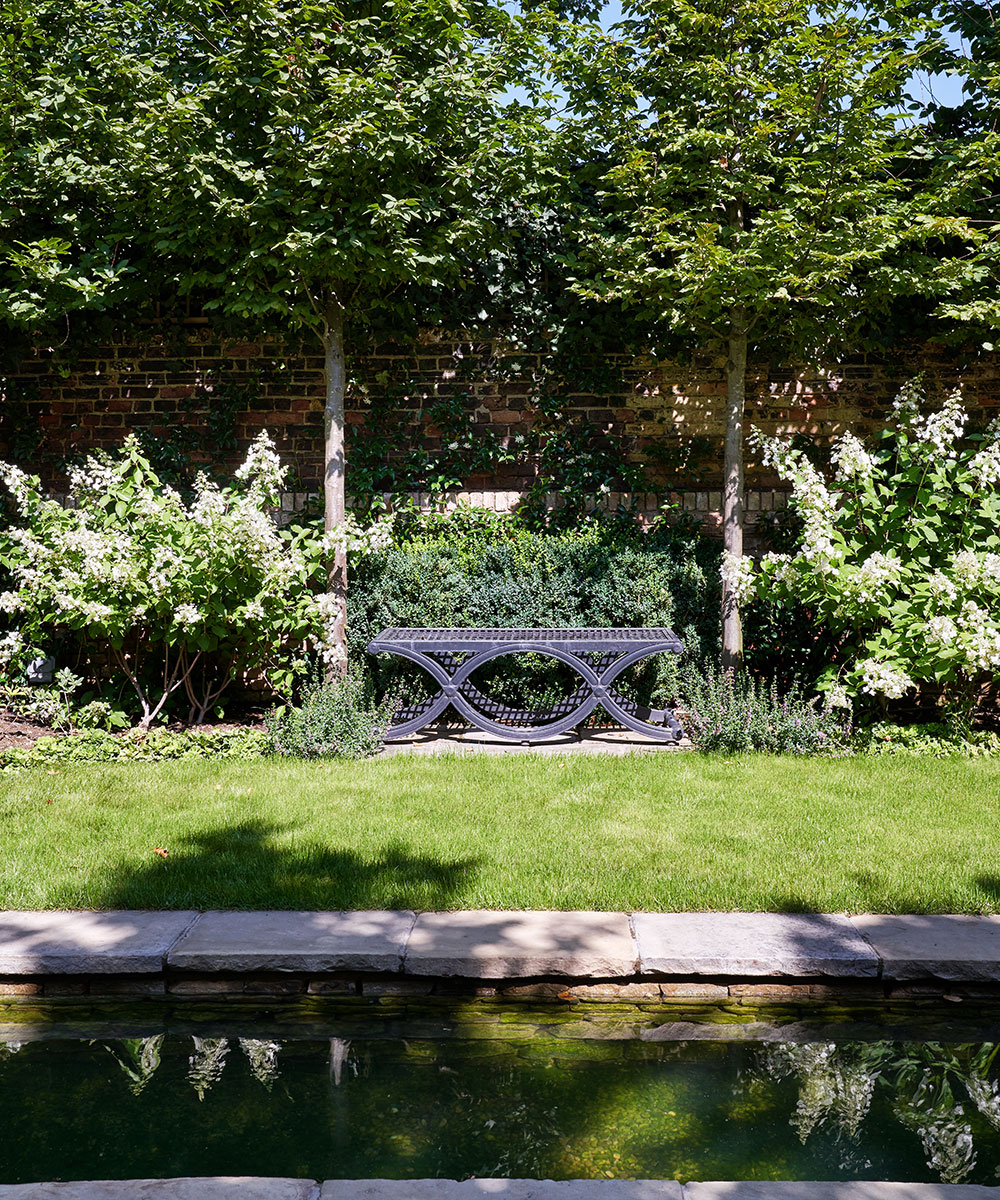
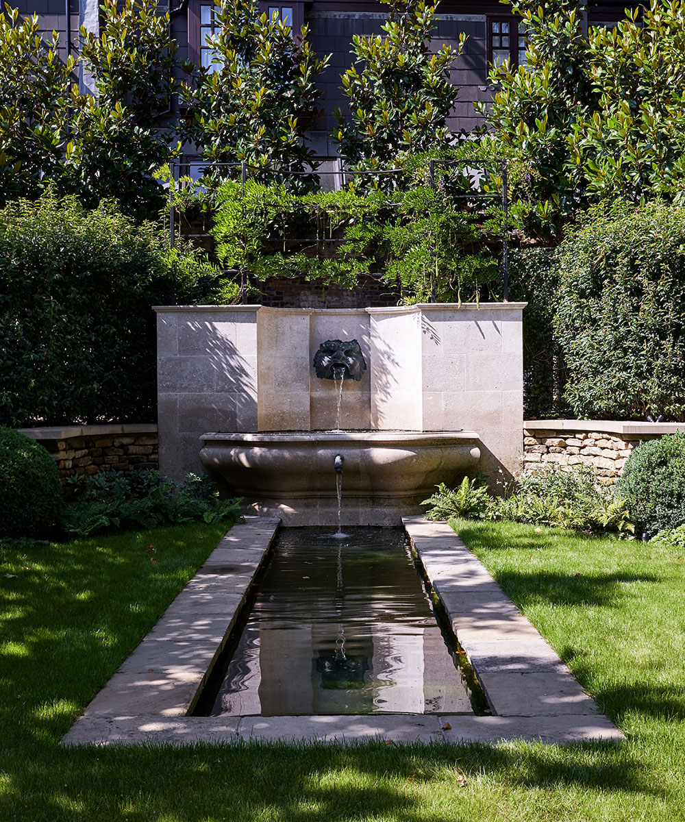
Exterior architect lain MacDonald transformed the garden, with this formal water feature as the focal point. 'The space is perfectly suited to entertaining,’ the owner says.
Guest bedroom
The upholstered headboard stretches across the wall behind the beds so that they can either be used as twins or make into a double.
Bedroom
This Scandinavian blue was inspired by the owner’s Swedish roots.
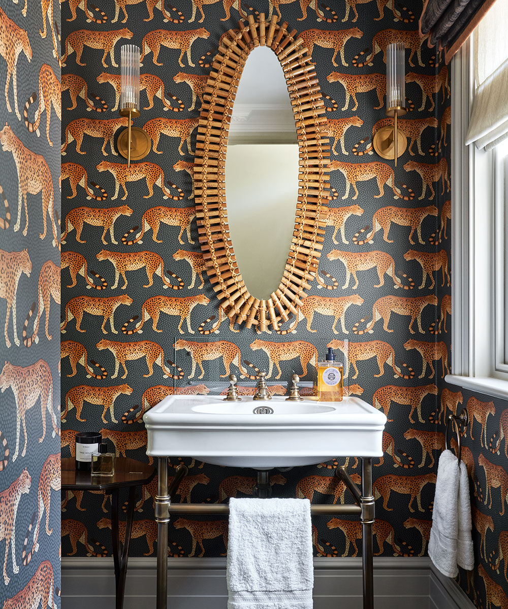
Downstairs bathroom
Striking wallpaper creates a pleasant surprise when guests open the door onto this small space.
Photography/ Jan Baldwin

Jennifer is the Digital Editor at Homes & Gardens. Having worked in the interiors industry for several years in both the US and UK, spanning many publications, she now hones her digital prowess on the 'best interiors website' in the world. Multi-skilled, Jennifer has worked in PR and marketing and occasionally dabbles in the social media, commercial, and the e-commerce space. Over the years, she has written about every area of the home, from compiling houses designed by some of the best interior designers in the world to sourcing celebrity homes, reviewing appliances, and even writing a few news stories or two.
-
 Gardeners are putting pasta in bird feeders this spring – but there is one important warning you need to know before following suit
Cooked pasta can be a nutritious snack for birds, but serving it in the wrong way could cause them harm
By Tenielle Jordison
-
 What is an estate sale? Everything you need to know about how they work and what to expect, whether you are holding one yourself or shopping second-hand gems
It pays to know exactly what you are getting into when shopping at estate sales
By Ciéra Cree