Design house: A Belgravia home full of personality and warmth
This gutsy renovation of a dilapidated Belgravia home has infused it with strong personality and warmth

Top of interior architect Irene Gunter’s list of dream ingredients for a project are high ceilings and beautiful windows – neither of which this small property in London’s Belgravia possessed. But she is not one to shy away from a challenge: ‘When you are compromised in both those departments, it makes your mind work harder to come up with more creative solutions,’ she says.
- See some of the world's best homes – beautiful properties from around the globe
The property
This house was certainly going to put Irene’s ingenuity to the test. When she first visited, water was pouring through the roof right to the basement, where the living and sleeping quarters were laid out in ‘such a whirlwind of interconnecting rooms that it was almost impossible to make sense of it’. The ground floor, which now accommodates the kitchen and living area, was ‘a weird, ginormous hallway that was incredibly dingy’, while she likens the staircase to something out of an Austrian chalet.
Irene’s first step was to enlist a structural engineer to see how she could maximise every inch of space. ‘We ended up keeping only the facade,’ she says of the six-month build that entailed reconfiguring the basement, digging into the vaults in order to create two en-suite bedrooms and a further bathroom.
A huge roof light was installed to pull daylight into the kitchen, and permission was obtained to add on to the first floor to house a third bedroom.
The brief for the interior was ‘fun’. ‘My client wanted to make it eclectic, personal and off the beaten track,’ says Irene. ‘This isn’t typical of thestyle in Belgravia, but then neither is the house.’
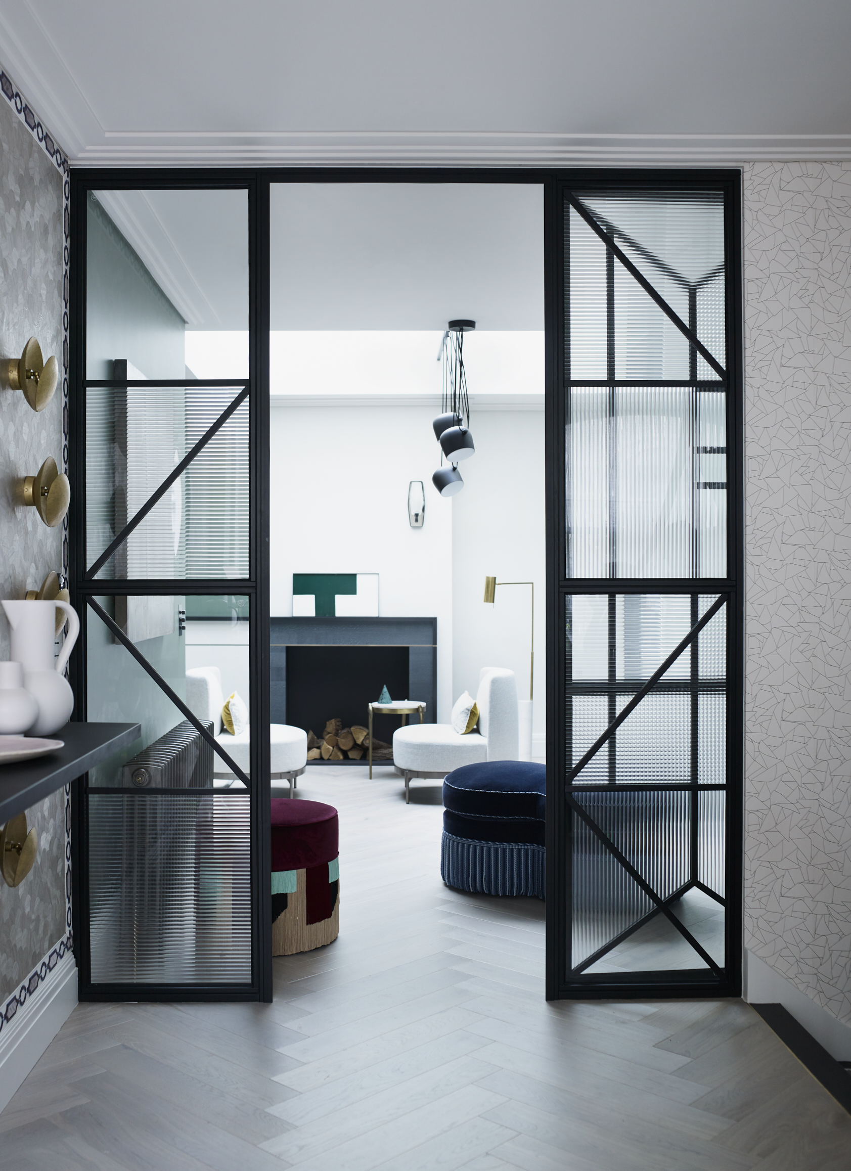
Irene’s love of unusual wall treatments is evident upon entering the hallway, where intricately designed wood-veneer panels are framed by aboldly patterned braid. A Crittall-style ironwork partition with inserts in a mix of clear and reeded glass separates this area from the living space. ‘I wanted to get as much light as possible into the entrance, to make it feel more generous,’ says Irene.
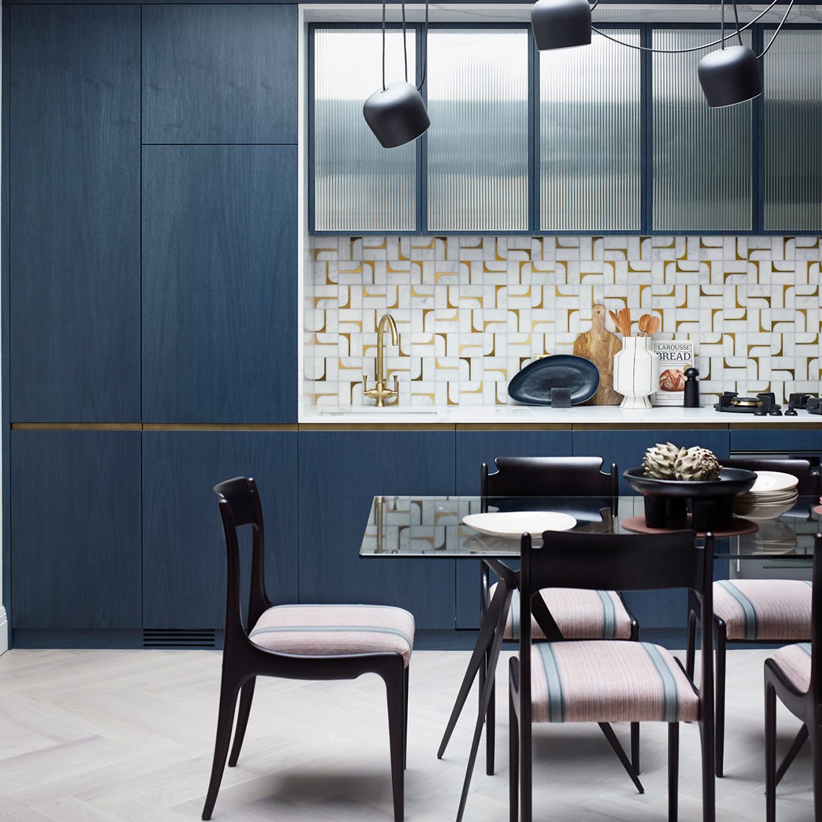
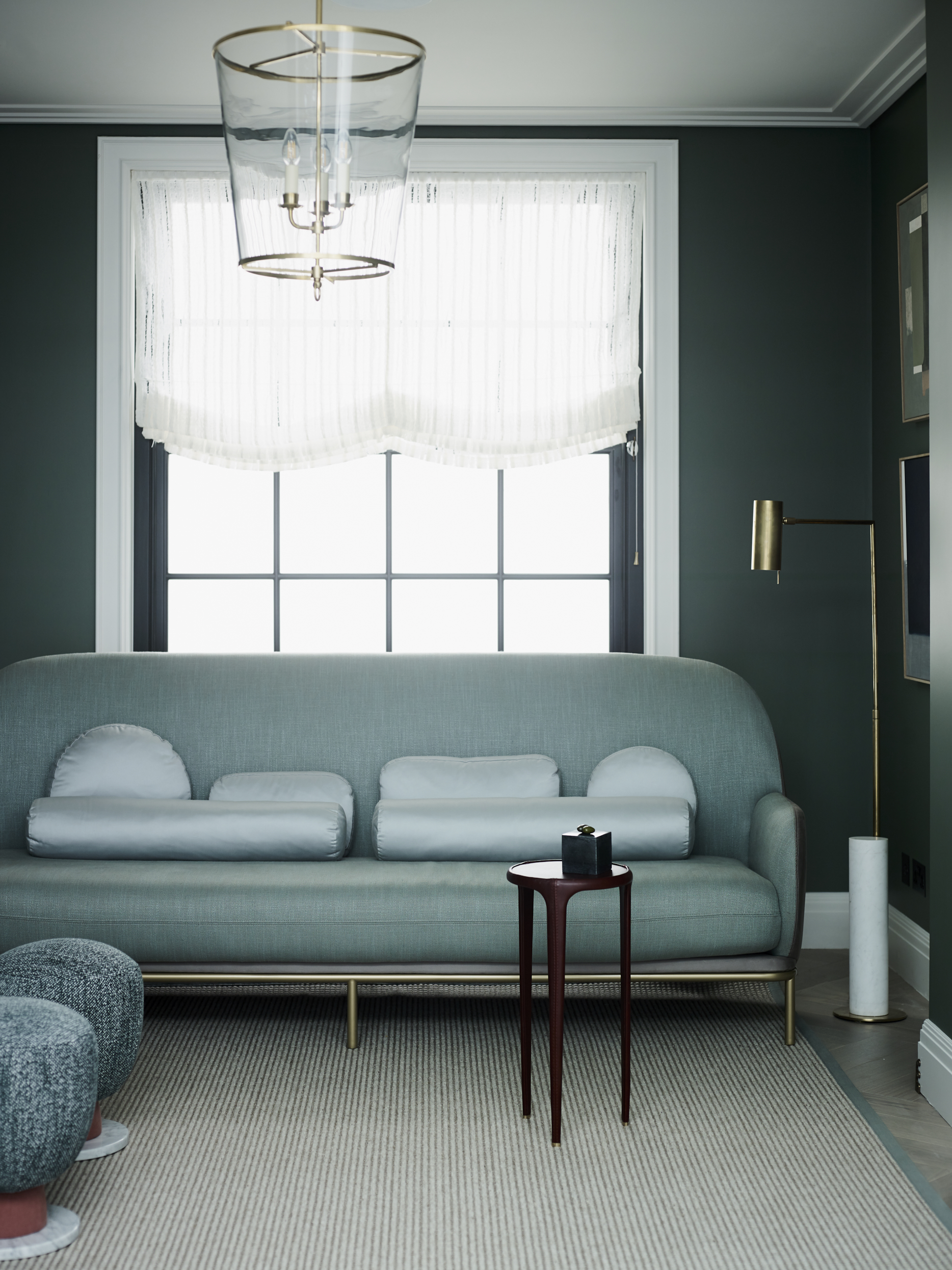
The Gunter & Co color palette tends towards warm, comfortable tones, and Irene opted for walls in an earthy green to give the sitting room a cosy feel. She came up with a fireplace design to divide this space from the kitchen, with cabinetry in a blue-stained wood veneer. ‘Being able to see the wood grain gives the doors a wonderful depth,’ she adds.
Design expertise in your inbox – from inspiring decorating ideas and beautiful celebrity homes to practical gardening advice and shopping round-ups.
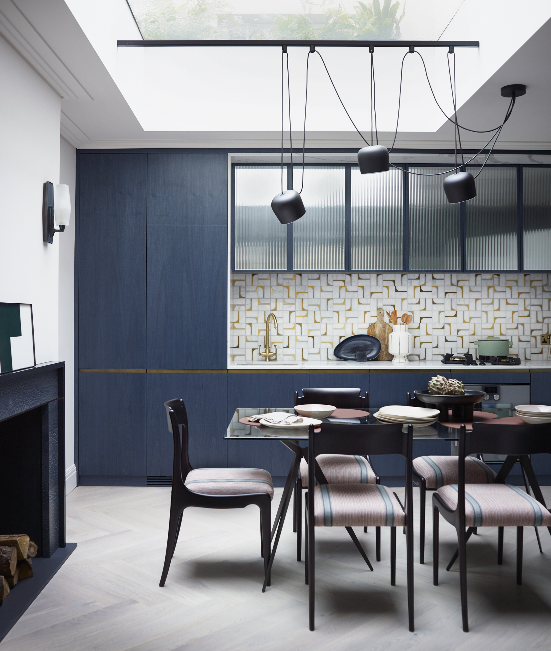
In this home, every piece was chosen to enhance the sense of space, from the slender-arm sofa to the glass dining table that helps to keep an open feel in the relatively compact room. There are luxurious details aplenty, but Irene has been mindful to use expensive finishes sparingly. ‘We loved a mosaic tile that was hugely costly, so we found a small area where we could really show it off,’ she says of the kitchen splashback.
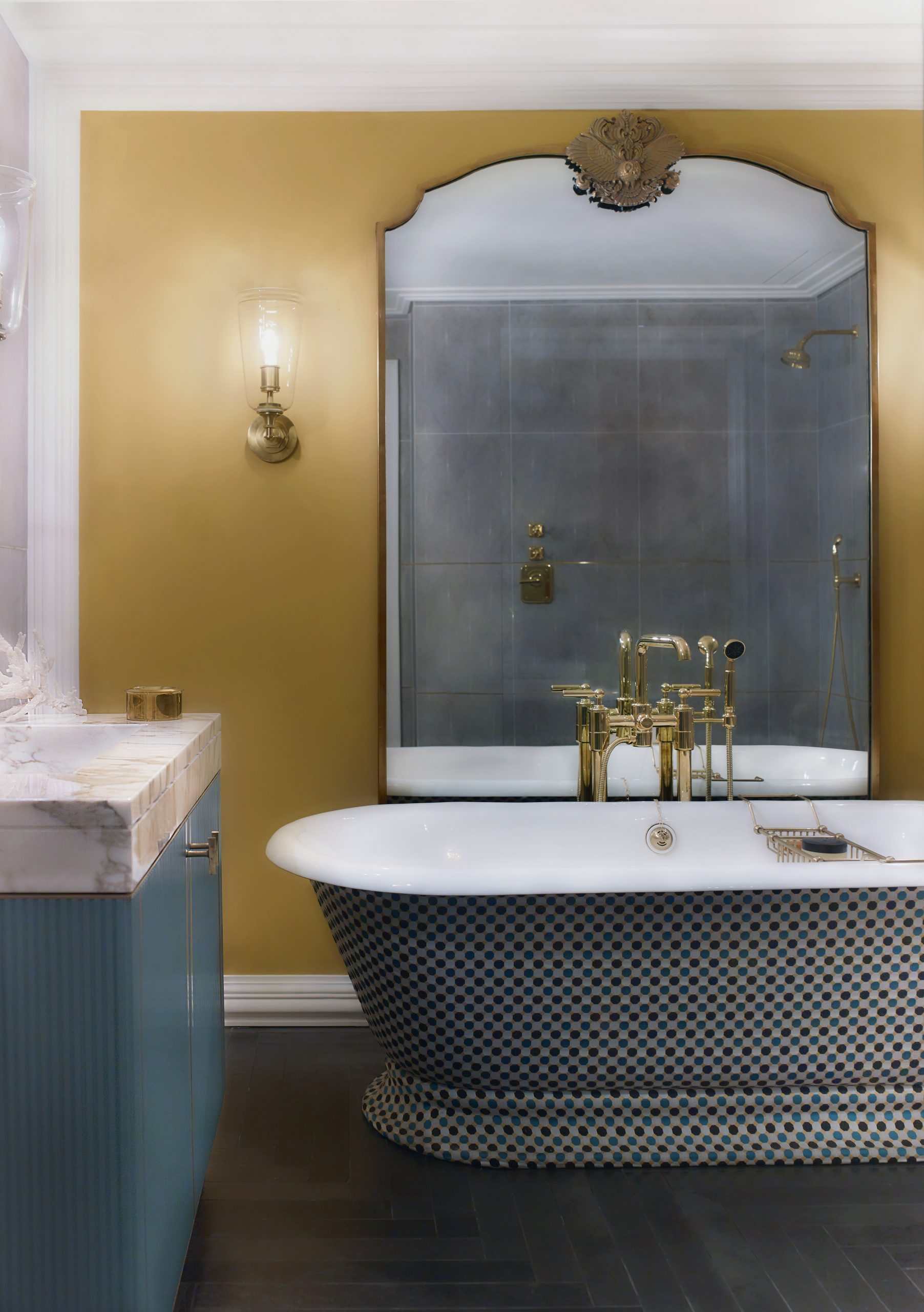
Downstairs, the sleeping quarters exude warmth and character, thanks to layers of color, pattern and texture. Clever details mitigate the limited number of windows on this level. ‘In the master bathroom,
I would have framed the bath against a window, but a large mirror is the second best thing – it gives the illusion of perspective,’ says Irene, who chose a striking mustard yellow for the walls and had the exterior of the bath covered in a colorful fabric. ‘Any textiles you can get into a bathroom are important as they help soften the hard surfaces,’ she notes.
There are a couple of details that Irene believes worked particularly well. ‘I love the sheer linen blind fabric in the sitting room; it lets in light yet is warm and textural,’ she says. ‘And painting the window frames black on the inside makes a big difference – it’s courageous and adds a contemporary touch. I will happily replicate this idea for the rest of my life.’
Living room
A bespoke partition allows light to flow freely and its structure setsthe tone for the decor.
See: An elegant and handsome 21st-century listed house in London
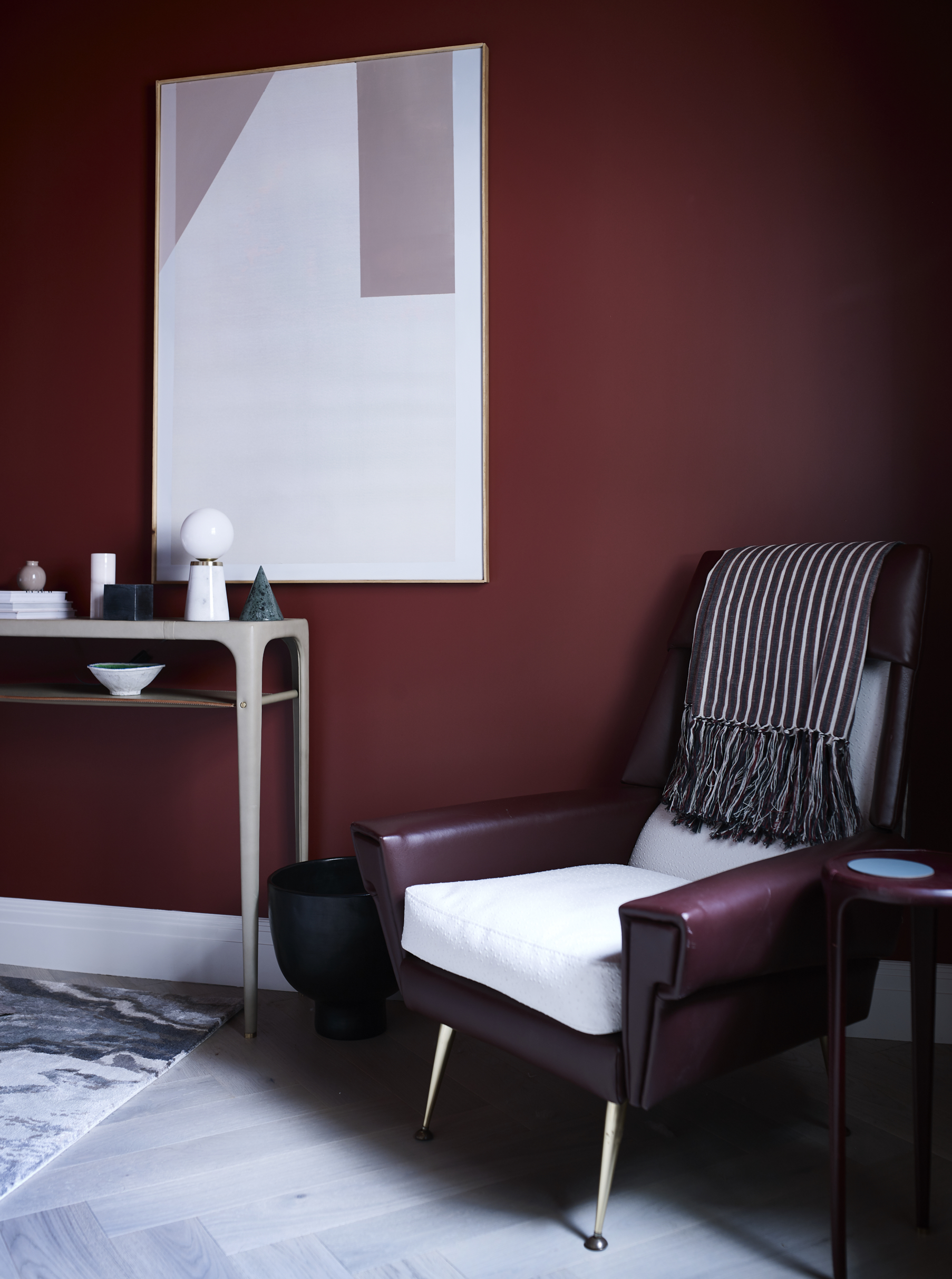
Irene has avoided pattern to keep this space calm. Elegant profiles and touches of brass are smart defining elements.
Kitchen
A steel beam was added to the roof light to hang this statement pendant. The 1950s Italian chairs have been reupholstered and French polished toa gleaming finish.
Staircase
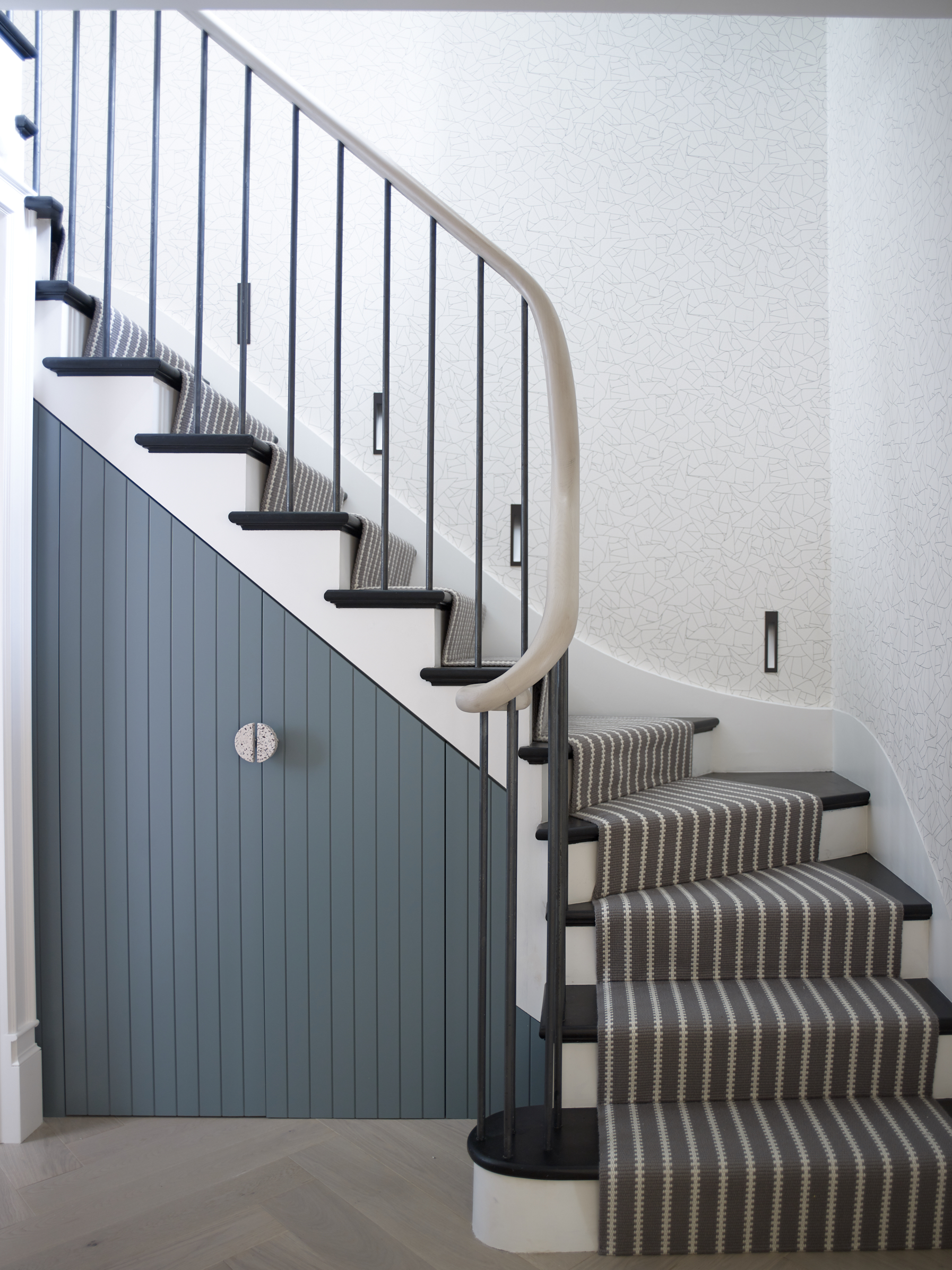
A tactile wooden handrail and striped runner enhance this clean-lined design. The washing machine is tucked away in the under-stairs cupboard.
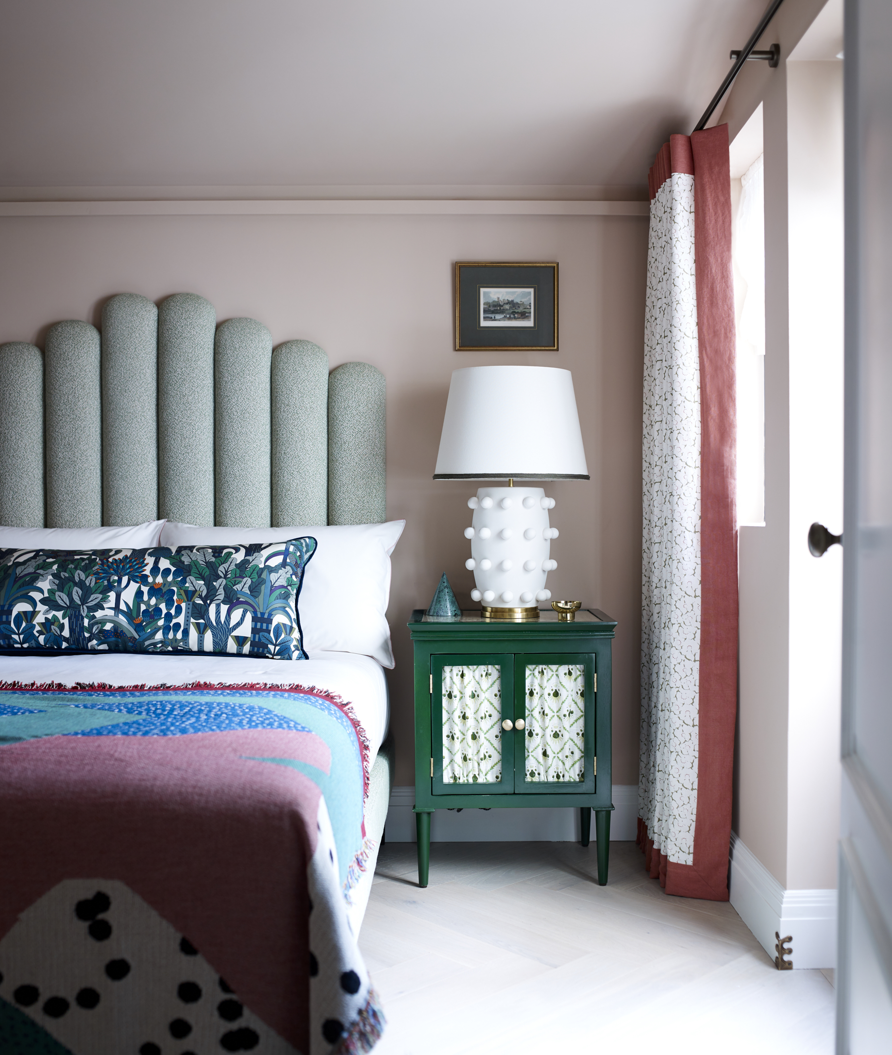
Bedroom
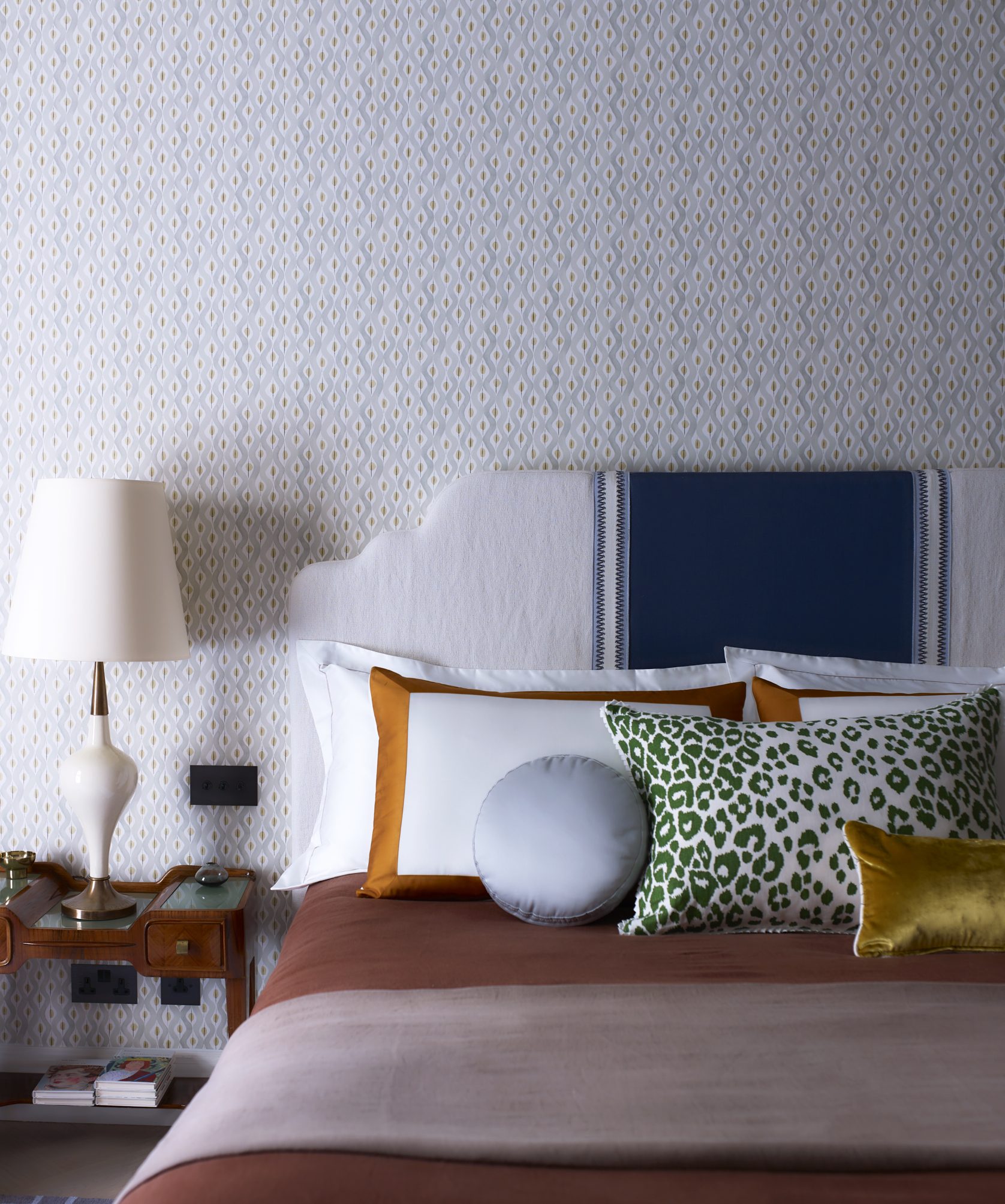
Soft pink walls make a soothing backdrop for mismatched patterns and Irene’s ‘ladyfinger’ headboard design.
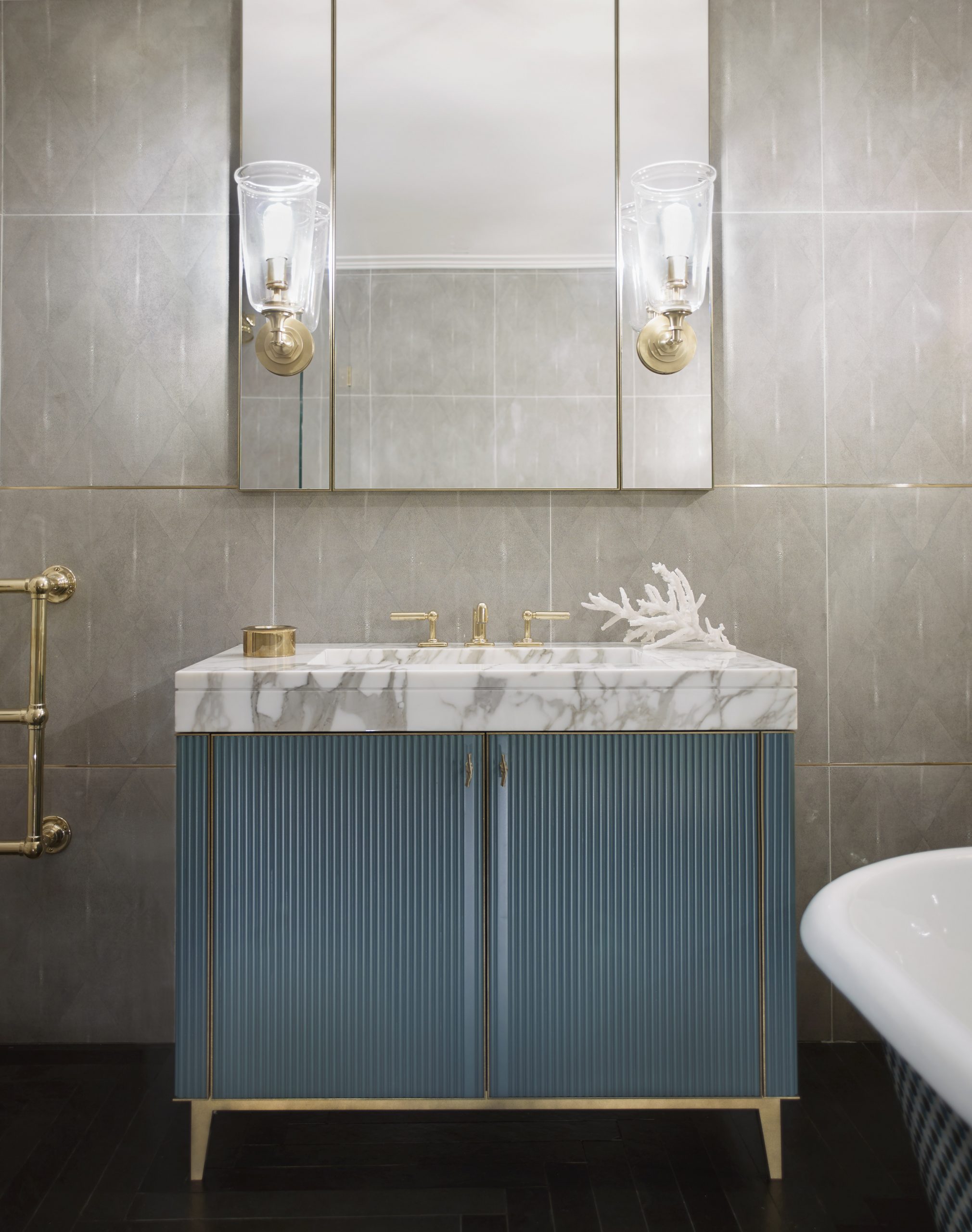
Master bathroom
Topped with elegant Calacatta Oro marble, the bespoke vanity unit features reeded fronts and liquid metal detailing. Metal trim has also been used between the shagreen-effect tiles.
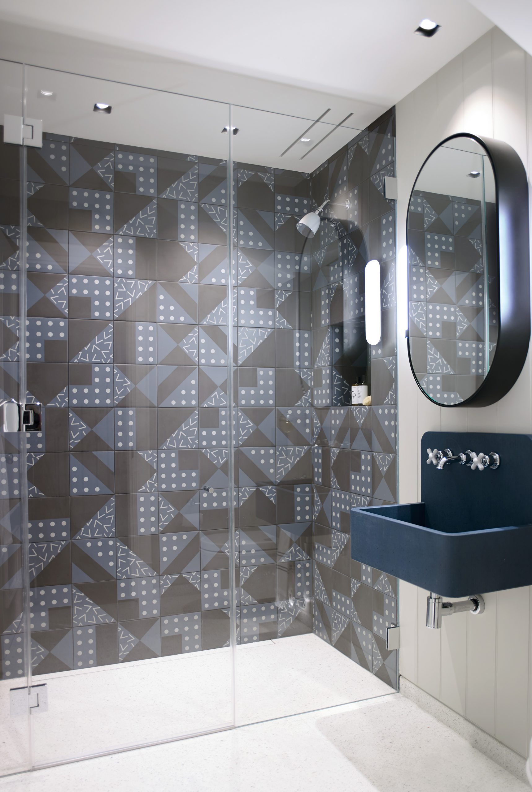
Guest bathroom
The tile pattern is modern and dynamic, with its deep-blue tone echoed in the cast-concrete basin.
Master bathroom
A large mirror adds depth to the scheme and offsets the magnificent fabric-covered bath.
Photography/Mary Wadsworth

Interiors have always been Vivienne's passion – from bold and bright to Scandi white. After studying at Leeds University, she worked at the Financial Times, before moving to Radio Times. She did an interior design course and then worked for Homes & Gardens, Country Living and House Beautiful. Vivienne’s always enjoyed reader homes and loves to spot a house she knows is perfect for a magazine (she has even knocked on the doors of houses with curb appeal!), so she became a houses editor, commissioning reader homes, writing features and styling and art directing photo shoots. She worked on Country Homes & Interiors for 15 years, before returning to Homes & Gardens as houses editor four years ago.