Design house: Architecture and landscape take centre stage in this Seattle residence
An exceptional landscape provides the perfect canvas for this architectural masterpiece.

This large wooded site is on a small bay on Lake Washington in the Washington Park neighbourhood of Seattle. The property enjoys sweeping views of Lake Washington and the Cascade Mountains, which were well suited for the client’s collection of specimen trees.
We talk to Stuart Silk Architects about the design project.
THE PROPERTY
The client’s dream was to find a waterfront property with perfect exposure that would allow them to build a garden that could accommodate these woodland treasures.
Loving the calming effect of water – outings rowing along its shores, and viewing the nearby eagles, otters, and blue herons – the couple was fond of Japanese gardens because of their serenity and beauty.
For over twenty years they had amassed an impressive collection of plants which they lovingly cared for and painstakingly pruned, consistent with the traditions of Japanese landscaping. For them, the garden was as important as the home.
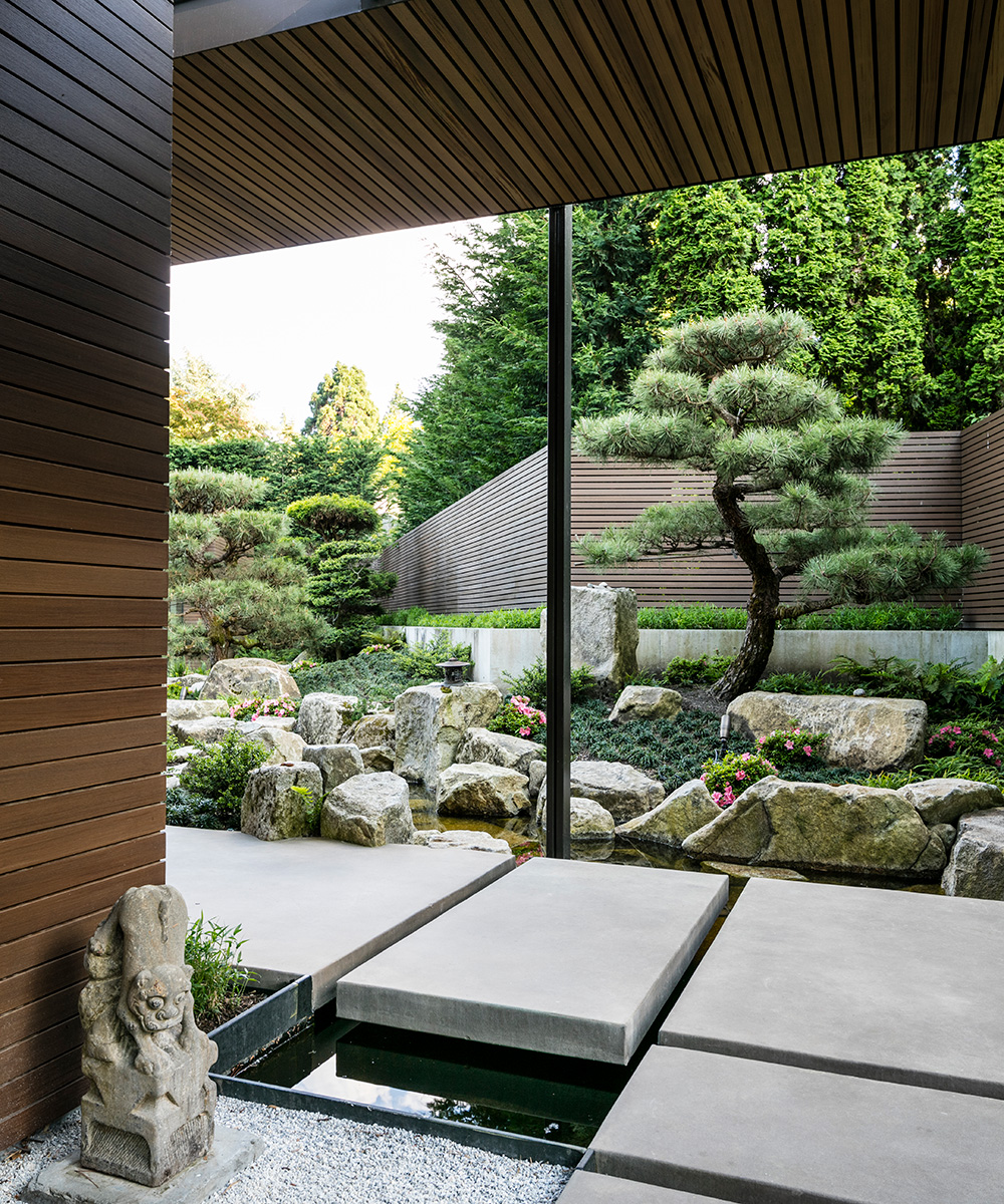
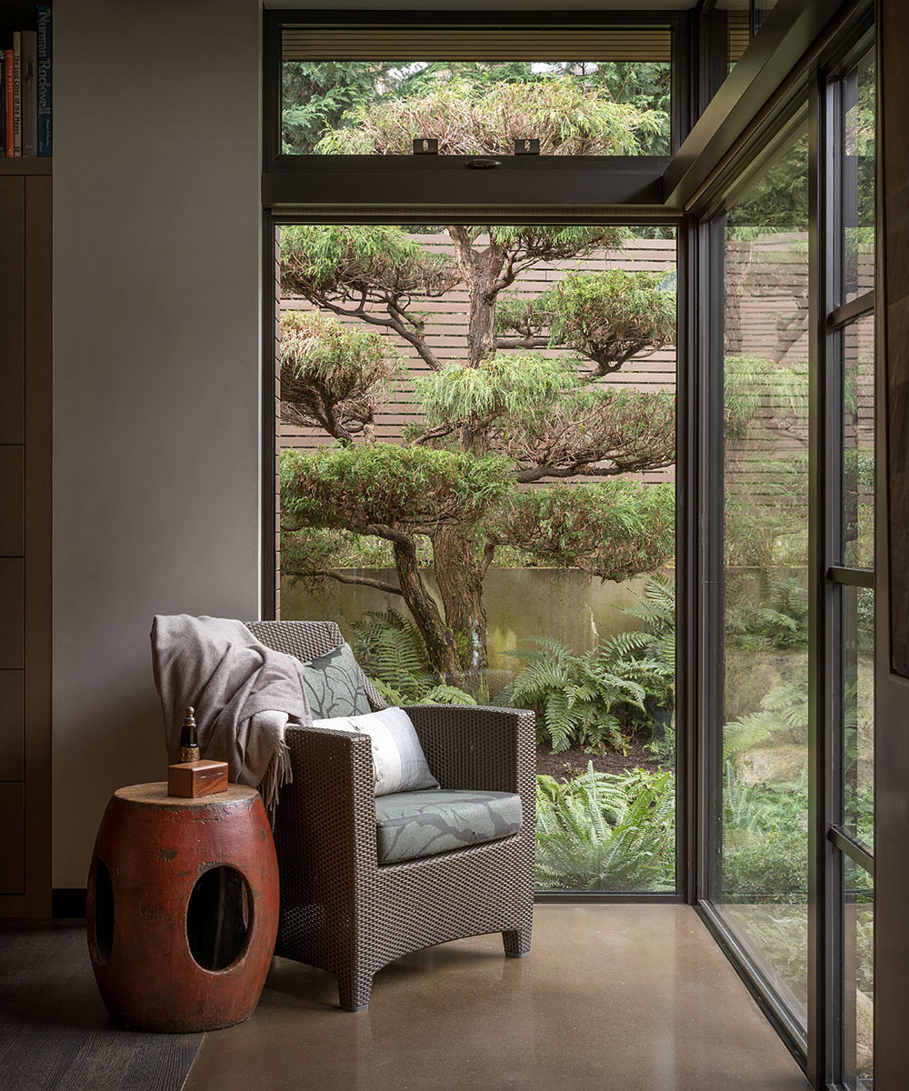
'The garden is conceived as a series of framed views, or composed vignettes. The first of these is the fountain at the door that opens into the courtyard, which then unfolds as a series of views as you progress to the home's formal entry. From inside the home, each window also provides framed vignettes, including composed views of sculpted trees, water and a rock formation. The intent is to create individual scenes that calm and inspire from any view point from the home,' says Richard Hartlage, principal and founder of Land Morphology.
GARDEN
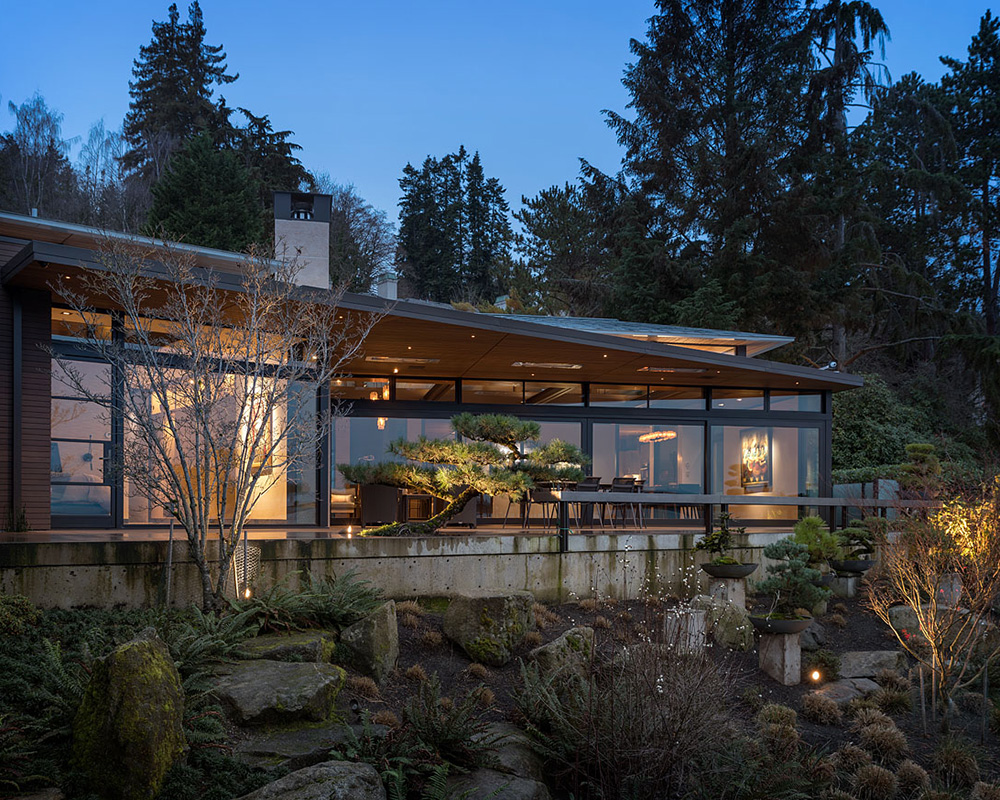
The design seeks to merge garden and property. In response, the home is conceived as a collection of one-story pavilions with the garden at its centre. The house surrounds the garden to create an experience that is sanctuary-like and has a sense of stillness and calm.
Sign up to the Homes & Gardens newsletter
Design expertise in your inbox – from inspiring decorating ideas and beautiful celebrity homes to practical gardening advice and shopping round-ups.
'The garden is heavily influenced by Japanese garden style, and features loose interpretations of several classic styles including Tea Garden, Stroll Garden and Temple Garden,' explains Richard.
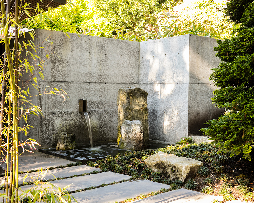
The house was designed on one floor because the owners didn't want the inconvenience of steps. The challenge however was how to integrate a single level house with a sloping site. In the end, having everything on one plane connected by the covered terrace is one of the home’s most dramatic features and signature appeals.
The garden is divided into two principal rooms connected by a water course that falls from the street towards the lake and represents a journey from the mountain to the sea. 'The pavilions,' notes Stuart Silk, 'are connected by a covered walkway that runs most of the length of the property knitting the pavilions together. The interplay between garden and structures weaves a complex relationship between inside and outside space. The result is a living experience that is filled with surprise and delight as the garden reveals its many secrets.'
The question became: is the garden the foil for the architecture or is the architecture the foil for the garden? Architecturally, the desire was for the home to capture the essence of traditional Japanese buildings without mimicking familiar imagery or details: to be an reinterpretation of Japanese principles as viewed through the lens of modern Pacific Northwest sensibility. The result is a home that is strongly horizontal, richly tactile, creatively detailed, craft centric, rhythmic, and textural.
LIVING ROOM
Each pavilion has its own separate function: living areas, bedrooms, art studio and garage. Consistent throughout is the low-angled hip roof which is a characteristic of traditional Japanese homes. Long overhanging eaves meet in a minimally designed knife-like edge. Each roof is clad in zinc shingles which invoke the feel of the ancient roofs and which will continue to patina over time to a lustrous grey tone.
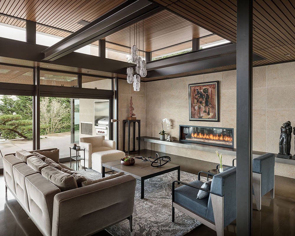
'To prevent the home from being too dark on the inside,' notes Stuart, 'we lifted each roof up on ultra-thin steel posts to create space for a continuous band of clerestory windows. Each roof seems to defy gravity.'
The sun’s direct rays are shielded by the overhanging eves producing a soft even glow while allowing the winter sun to warm the interior. Pairs of ultra-thin steel columns support the roof as well as the covered walkway, somewhat reminiscent of Japanese post and beam structures. Large clerestory glass panels help connect inside to outside and visibility through the buildings and enhance the illusion of the floating ceiling planes.
KITCHEN
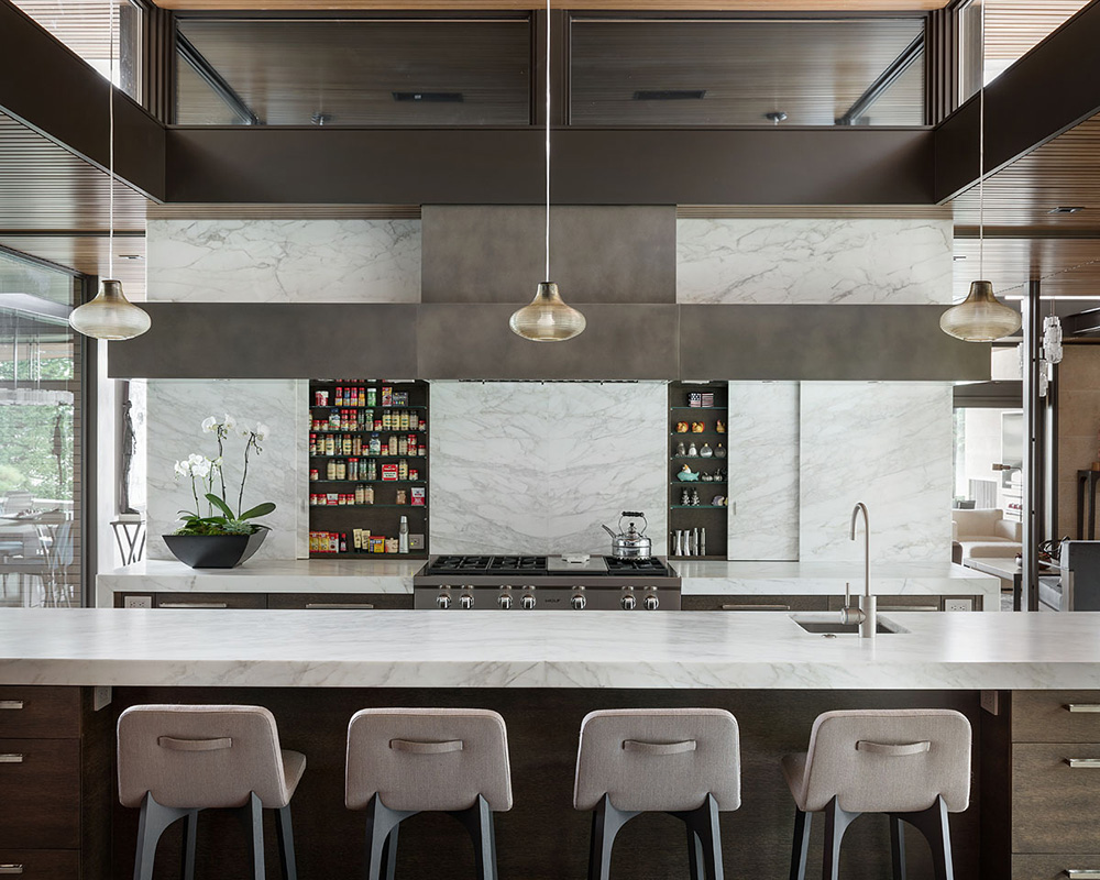
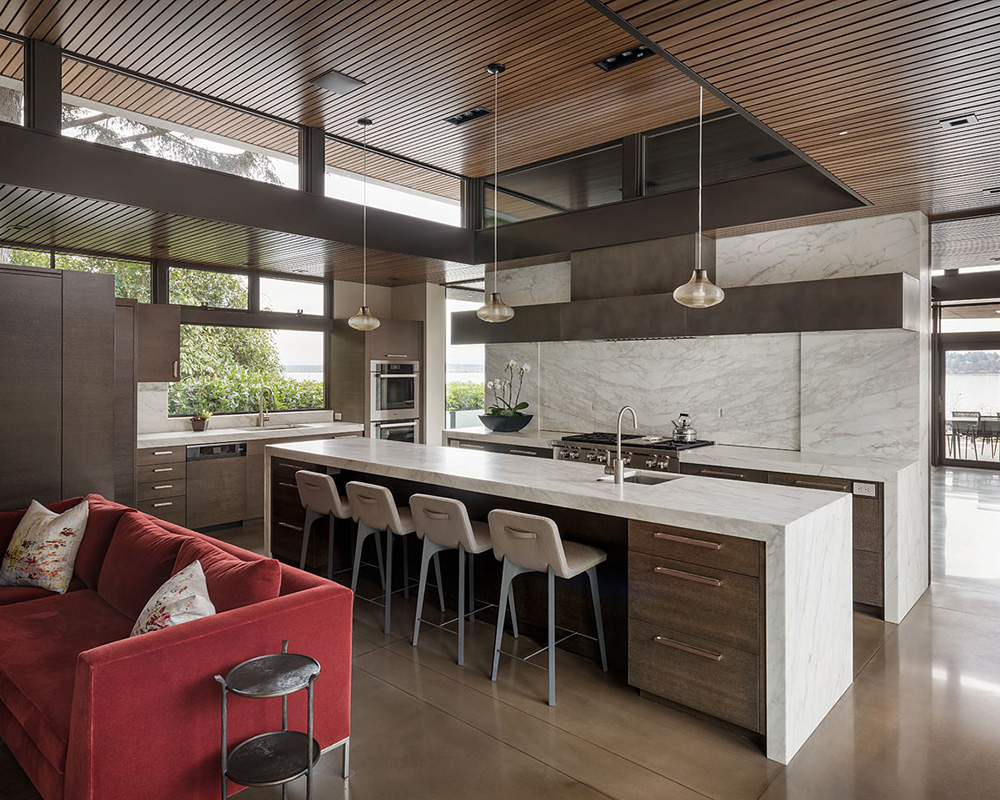
Due to the weather in the Northwest, there are limited months during which one can enjoy outdoor living. To extend the time one can enjoy the indoor/outdoor living, large overhangs were integrated into the design.
The exterior terrace was designed with an ultra-thin fourteen-foot-deep cantilevered roof. This dramatic gravity defying cantilever allowed us to eliminate all columns which allowed unobstructed views of the lake and mountains. This was a challenge to achieve from a structural standpoint resulting in much debate between the owner, architect, and structural engineer to get it right. The clients won the day by insisting on the removal of the columns which proved to be one of the best design decisions made and the most important feature for the liveability of the house by extending outdoor living from early spring all the way to late fall.
DINING ROOM
MEDIA ROOM
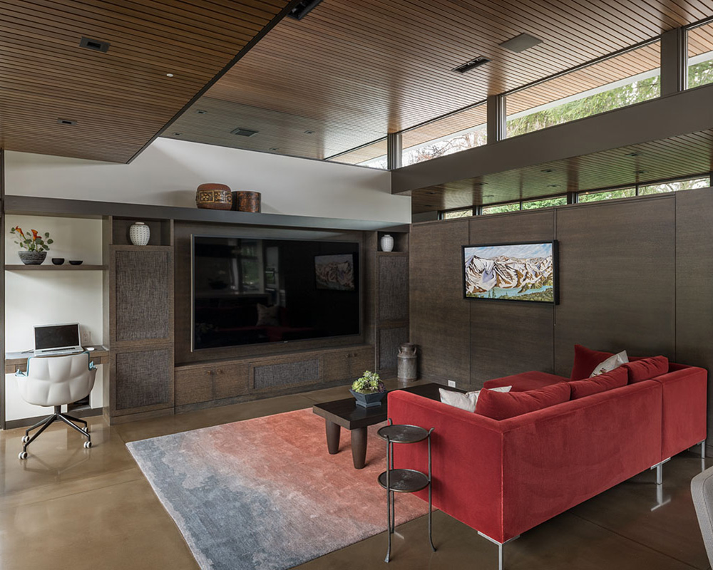
Nothing is more important in designing a garden house than to have excellent visibility from within. Particular attention was given to position the guest house for viewing the garden from the south with the sun at the back. This required cutting back and retaining the hill. Floor to ceiling glass was also used extensively throughout the home to frame each unique view of the garden as almost a painting. The energy codes were carefully negotiated to make for an efficient thermal dwelling.
HOME OFFICE
See:Design house: Mid-century modern home near Palm Springs, designed by Stuart Silk Architects
GUEST HOUSE
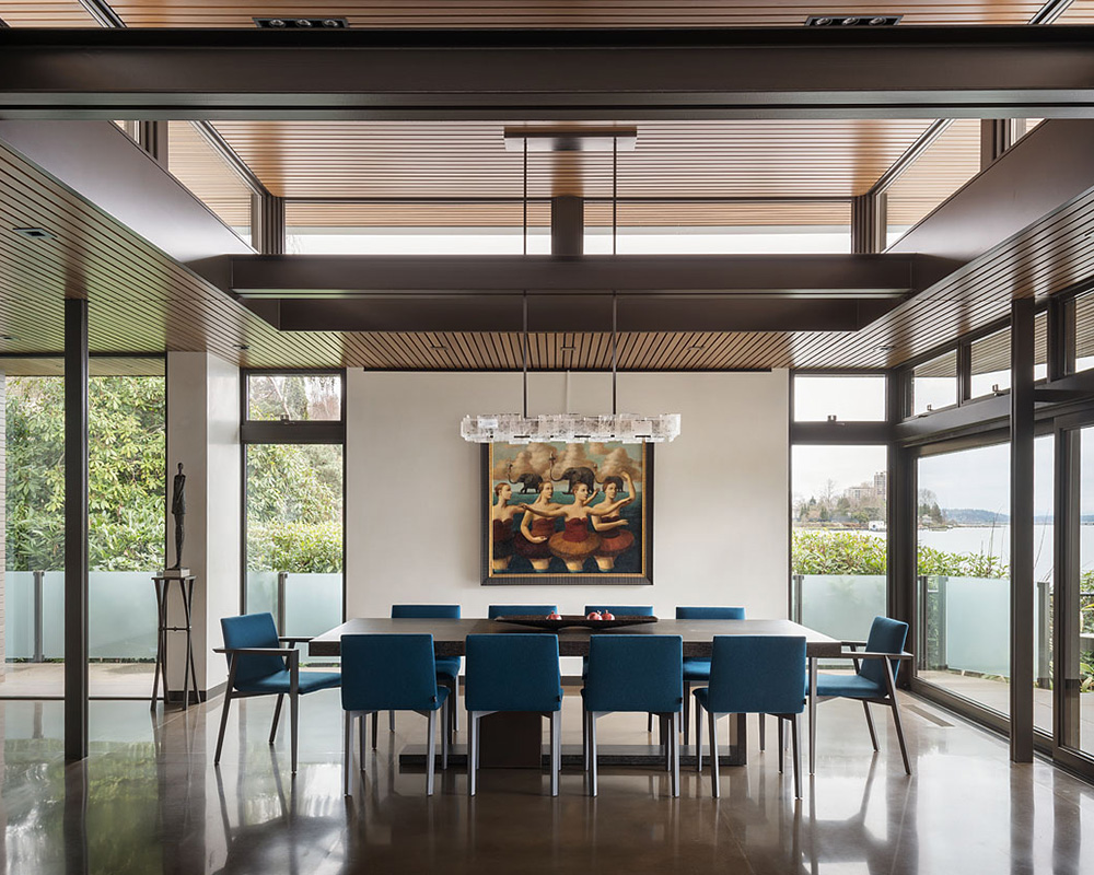
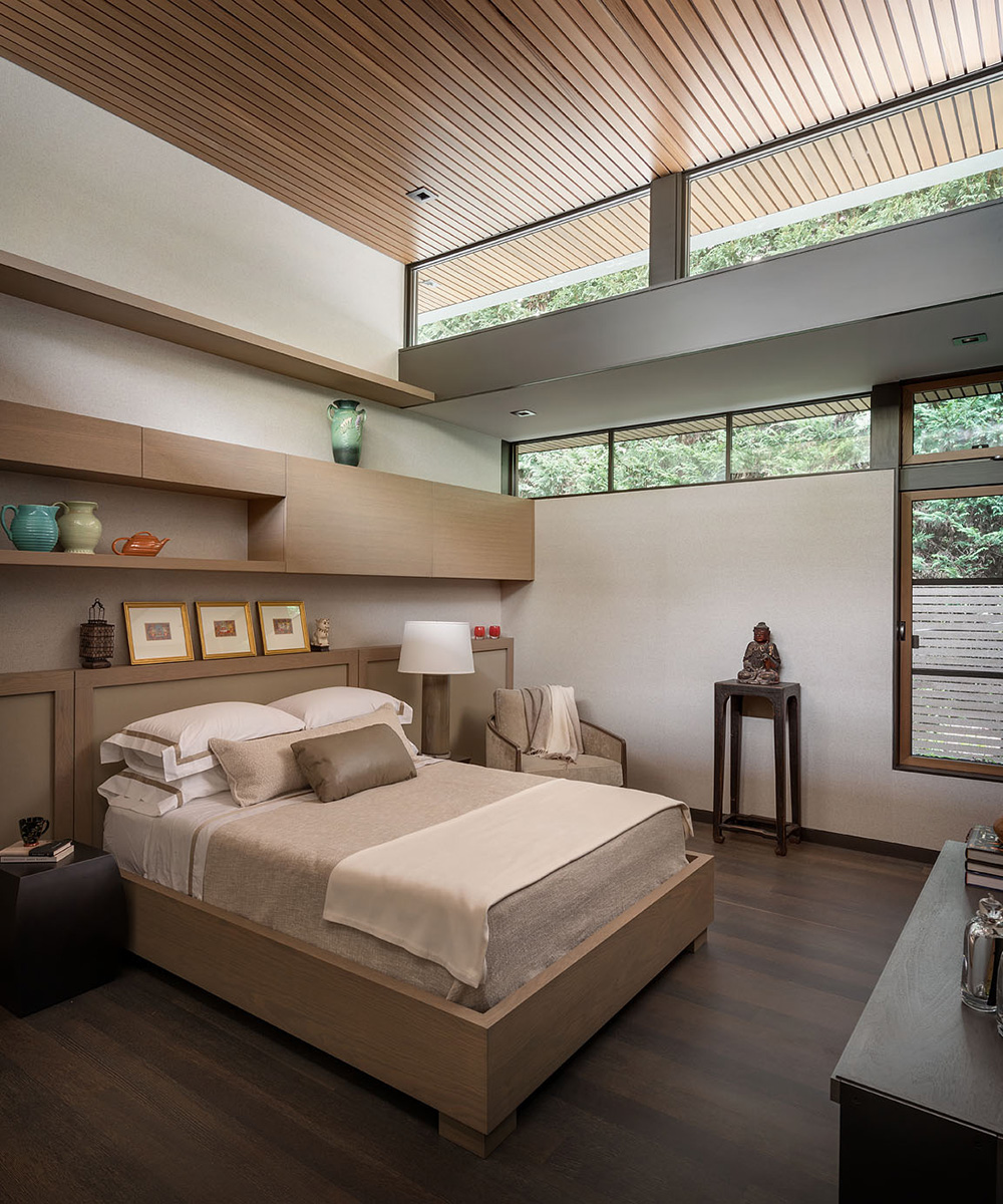
The ceiling is clad with cedar planks, employed for its beauty and for its sound absorption to allow our clients to have large gatherings comfortably. No exposed nails were used in the ceilings. Each plank is separated by a half inch to allow sound to be absorbed into the sound insulation in the cavity above.
BATHROOM
See:Design house: A Mid-century modern home, overlooking Lake Washington
BEDROOM
EXTERIOR
The house is quiet even with many people. We created several tactile details including oversized oak doors with a cerused finish and a six-inch wide textured vertical steel panels on the strike side. Pocket doors were used extensively to maximize transparency and space. Several of the double doors are dual activated and are reminiscent of Japanese Shoji doors.
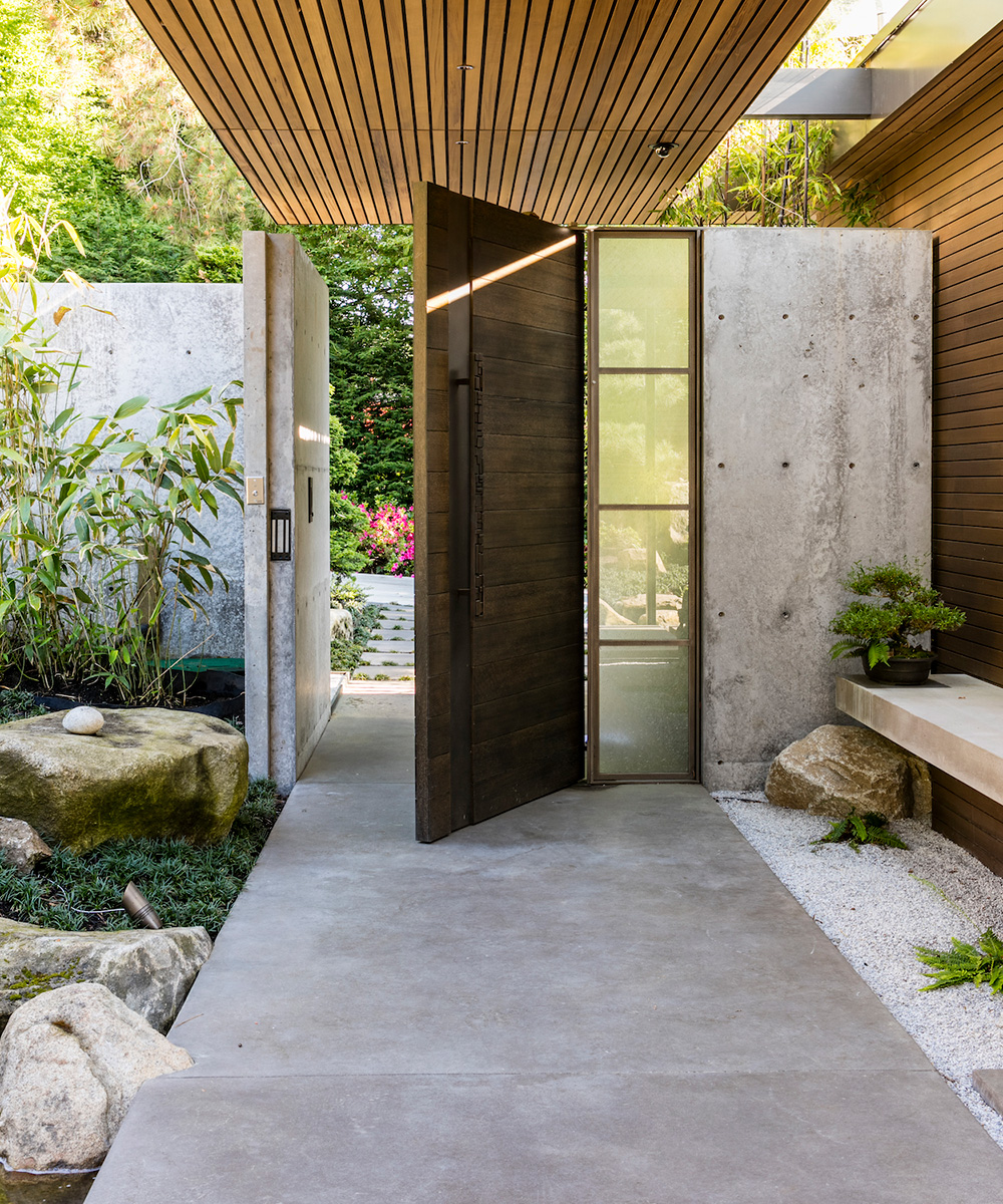
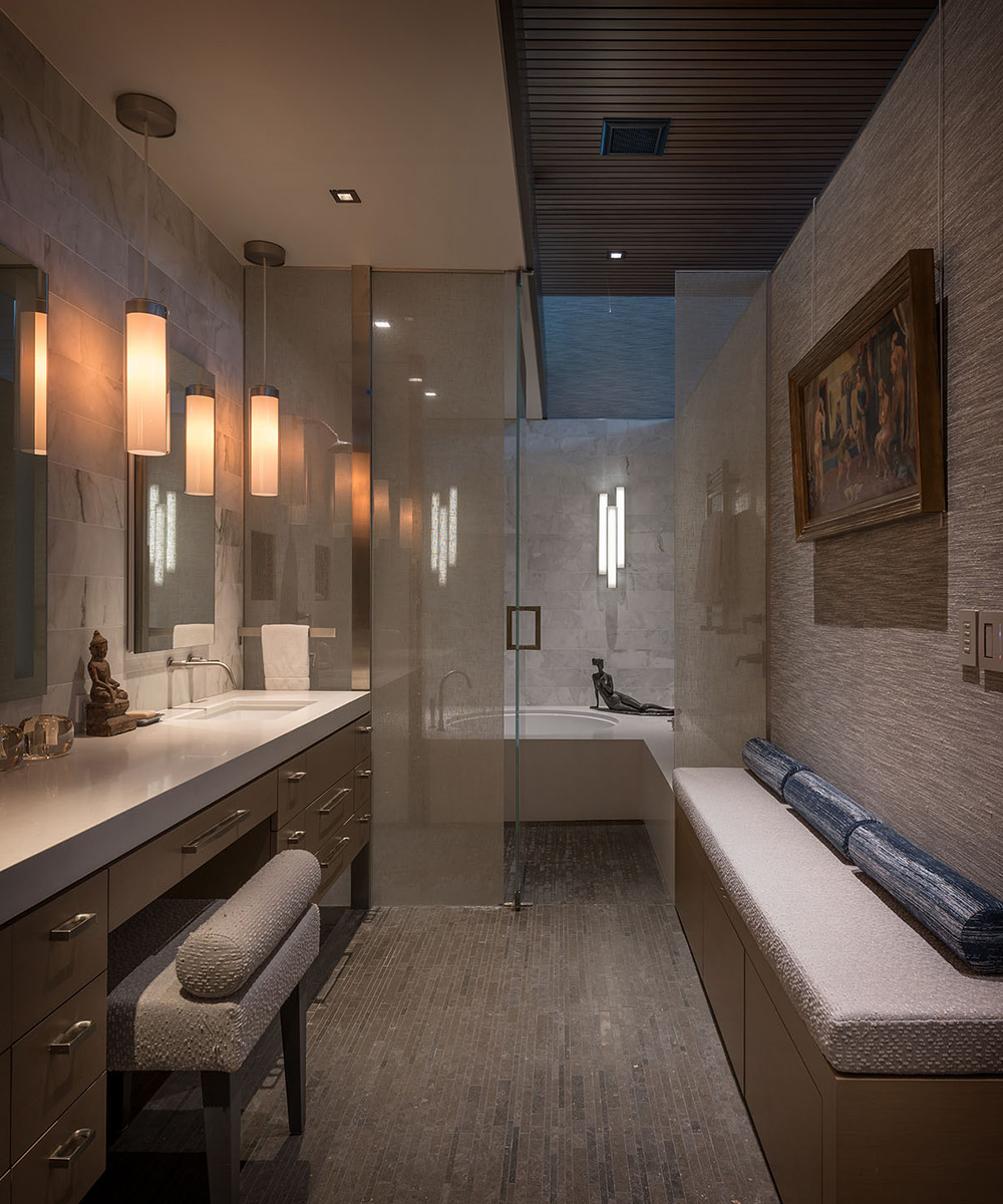
The main doors use a unique handle that mimics the owners wedding rings. The clients are avid art collectors and, given the desire for direction visual connections to nature, it was challenging to provide walls to display their collection without sacrificing view lines. Art lighting and overall lighting was a priority and the clients worked directly with the design architects to ensure a wonderful lighting experience.
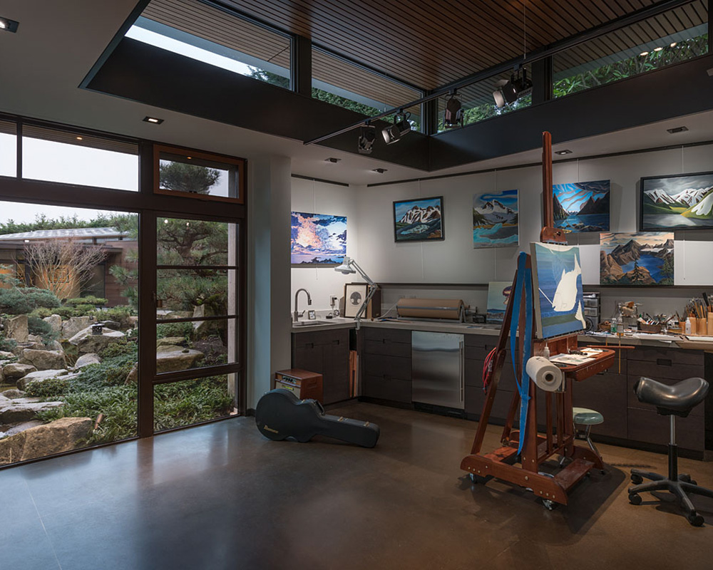
ART STUDIO
The client’s art studio is strategically positioned at the nexus of the two gardens. Like the captain at the bow of a ship, the clients can see both garden courtyards, the water course and the home. The water feature wraps around and embraces this pavilion and, as one of the greatest inspirations, provides inspiration every day.
Architecture/ Stuart Silk ArchitectsInterior Architecture and Finish Selections/ Stuart Silk ArchitectsInterior Furnishings/ Sechrist DesignLandscape Architecture/ Land MorphologyConstruction/ Mercer BuildersStructural Engineer/ Quantum Consulting EngineersCivil/ D.R. Strong Consulting EngineersWaterproofing/ B.E.E. Consulting, LLCPhotography/ Aaron Leitz

Jennifer is the Digital Editor at Homes & Gardens. Having worked in the interiors industry for several years in both the US and UK, spanning many publications, she now hones her digital prowess on the 'best interiors website' in the world. Multi-skilled, Jennifer has worked in PR and marketing and occasionally dabbles in the social media, commercial, and the e-commerce space. Over the years, she has written about every area of the home, from compiling houses designed by some of the best interior designers in the world to sourcing celebrity homes, reviewing appliances, and even writing a few news stories or two.
-
 Anna Kendrick's favorite coffee maker is the first machine to make iced beverages that are 'just as cold as a coffee shop' – it's currently under $200
The actress uses this smart machine to make perfect mocha frappes straight out of her kitchen – it's a summer 2025 must-have
By Hannah Ziegler
-
 Put your 'purgatory place' and 'dust detective' in play – 6 expert tricks professional organizers use to effortlessly edit down belongings
Stress-free streamlining is entirely within sight
By Andy van Terheyden