Design house: A striking Devon home that blends tradition and modernity, designed by Field Day Studio
This characterful and warm redesign takes inspiration from its natural surroundings overlooking Dartmouth, with views towards the sea and the rolling wooded hills
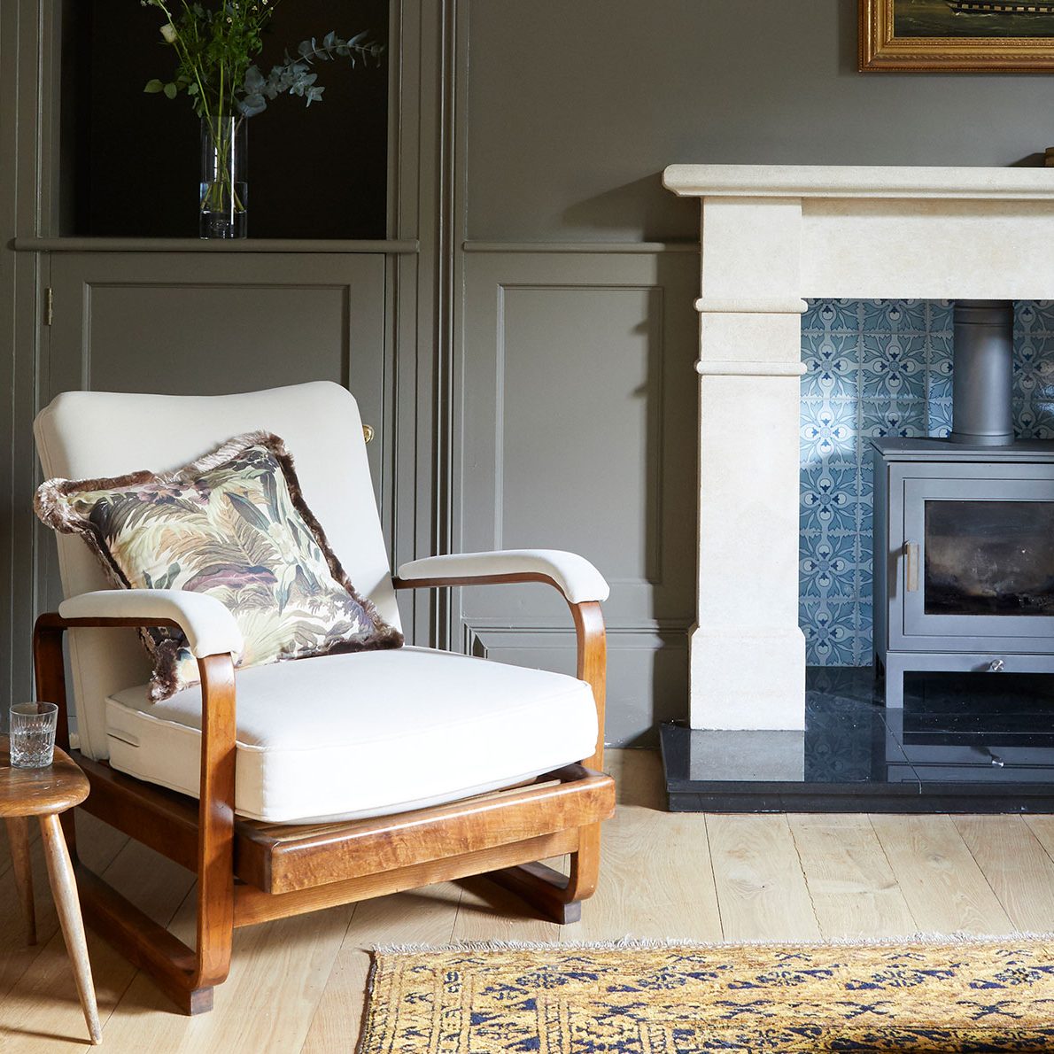

A sense of being rooted in nature – its colours, textures and the ever-changing play of light – is at the heart of a comprehensive redesign carried out by Jess Gibbons and Kat Turner of Field Day Studio.
‘We wanted to reflect the house’s wonderful views of both the land and the sea,’ says Jess. In part, this is expressed in the colour palette: ‘We blended softer pastels with earthier, more dramatic deep tones to help the scheme feel organic and natural,’ she adds.
See this house in Dorset is a treasure trove of beautiful objects
The property
For this project, the designers used colours by Paint & Paper Library. ‘Their pigments seemed to perfectly capture the tonal variations of the area’s scenery,’ says Kat. Nuanced off-whites and airy blues echo the coastal aspect, while shades of moss, olive, rich brown and burgundy express the undulating hillsides.
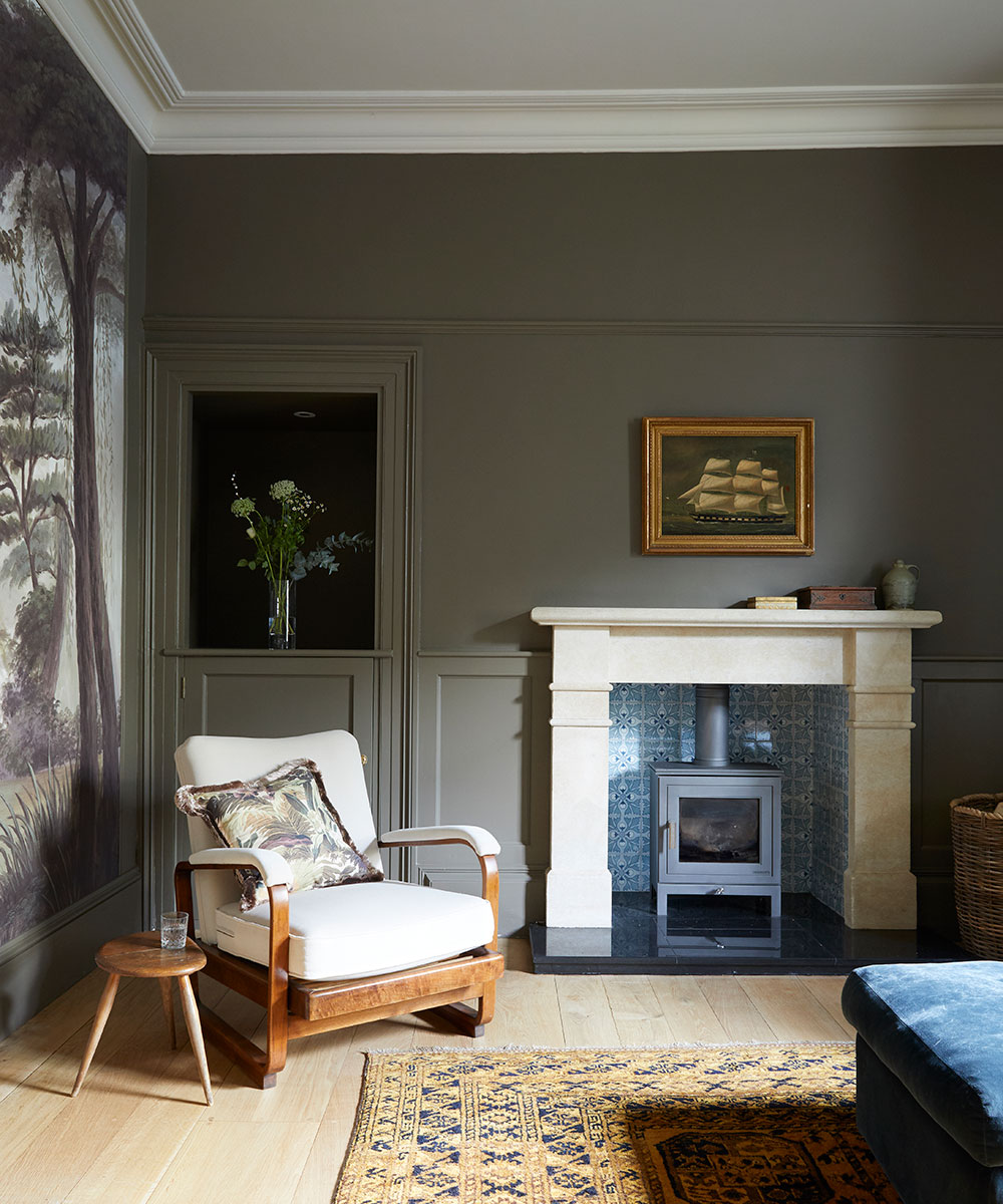
The colour palette also relates to the way in which the family uses the rooms, particularly on the ground floor. In the kitchen and garden room, which benefit from plenty of direct sun during the day, hues from the lighter end of the spectrum come into their own. Then, on the other side of the house, there is a discernible shift of mood. ‘In the quieter spaces that are used in the evening, or that simply get less light, we went for more cosy, enveloping tones,’ says Kat. For example, in the living room, the earthy Heath by Paint & Paper Library feels deeply contemplative.
Hallway
The hallway is now cast in Hornblende, a grey-tinged green that acts as a muted foil to the brighter and darker living spaces. ‘We wanted to highlight the interplay of the colours in the palette, creating views through from one space to another,’ explains Kat.
When they set old against new, dark against light and rough against smooth, these designers are in their element. ‘We love creating visual tension,’ says Jess. ‘In this instance, the owners wanted us to bring in a more modern feel while keeping the character and warmth of their home.’ Importantly, contrasts are never employed wilfully, or as a shock tactic. Instead, the effect is more gradual – and all the more enduring.
Sign up to the Homes & Gardens newsletter
Design expertise in your inbox – from inspiring decorating ideas and beautiful celebrity homes to practical gardening advice and shopping round-ups.
See ourAn elegantly renovated 17th-century farmhouse in Dorset, designed by Sims Hilditch
Living room
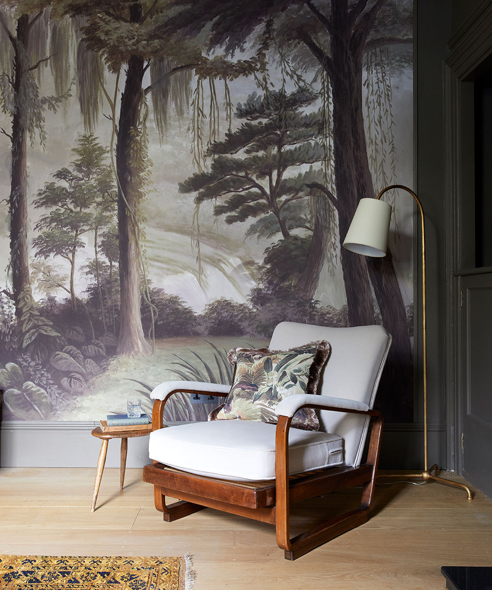
A much-loved family sofa has been reupholstered in a grey check but, to ensure things don’t look overly traditional, it’s deftly partnered with a tropical wall mural. A dark paint shade on the walls is given an unexpected lift by blue ceramic tiles inside the fireplace, which are arts & crafts originals sourced by Jess and Kat.
Kitchen diner
Texture also plays an important role in this home. In the light-filled kitchen-diner, a splashback of zellige tiles behind the cooker extends to the full height of the room. Their watery, luminescent surface contrasts with the denser dark grain of American black walnut in the form of cabinets. These, in turn, are inset with panels of handwoven willow, made by basket weaver and sculptor Hilary Burns.
The designers were keen to tap into the area’s thriving artisan-maker culture and commissioned the units from Dartmouth-based cabinetmakers Shawstephens, with simple handles forged by a local blacksmith. ‘Including crafted details was really important to both the owners and ourselves,’ says Kat.
Rather than go for a standard paint shade on the kitchen units, the designers suggested a soft dusky pink. The family love it because it acts as a subtle reference to the red-tinged clay soil of the area, but it also adds an on-trend contemporary design note.
Perched above this town where the hills dip down to meet the sea, this house already had more than a hint of enchantment to it. But the real alchemy is in the way tradition and modernity and light and shade have been drawn together into one cohesive whole.
DINING AREA
Natural, crafted textures feature in both this space and the kitchen, creating a harmonious feel.
LIBRARY
The interplay of dynamic colours is one of the details that make this house so unique.
BEDROOM
The découpage cabinet was chosen as it’s a nod to the home’s coastal setting.
Photography/ Paul Massey
Interior designer/ Field Day

Jennifer is the Digital Editor at Homes & Gardens. Having worked in the interiors industry for several years in both the US and UK, spanning many publications, she now hones her digital prowess on the 'best interiors website' in the world. Multi-skilled, Jennifer has worked in PR and marketing and occasionally dabbles in the social media, commercial, and the e-commerce space. Over the years, she has written about every area of the home, from compiling houses designed by some of the best interior designers in the world to sourcing celebrity homes, reviewing appliances, and even writing a few news stories or two.
-
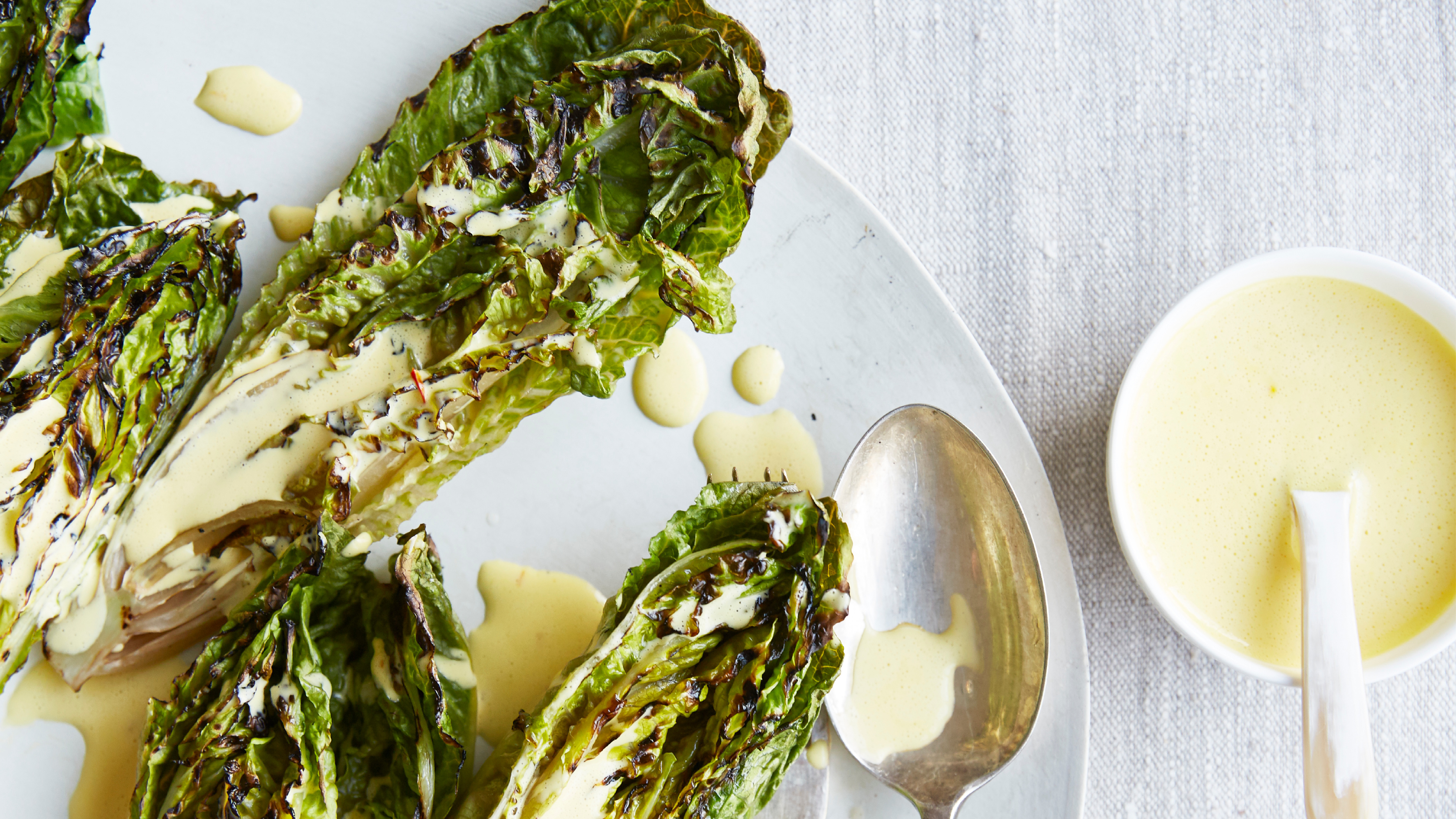 Charred little gem with saffron dressing
This recipe with charred little gem is both easy to make and sure to impress guests. It's the perfect side for fresh spring menus
By Alice Hart
-
 Grilled asparagus with herb and pickled red onion
This grilled asparagus couldn't be easier, and it's a wonderful way to get the best flavor from our favorite spring veg. It's perfect alongside fish or lamb
By Alice Hart