Design house: A merry and bright Arts and Crafts home in Norfolk
The use of color and clever design have transformed this Arts and Crafts property on a budget, making it the perfect setting for sharing family Christmases for years to come
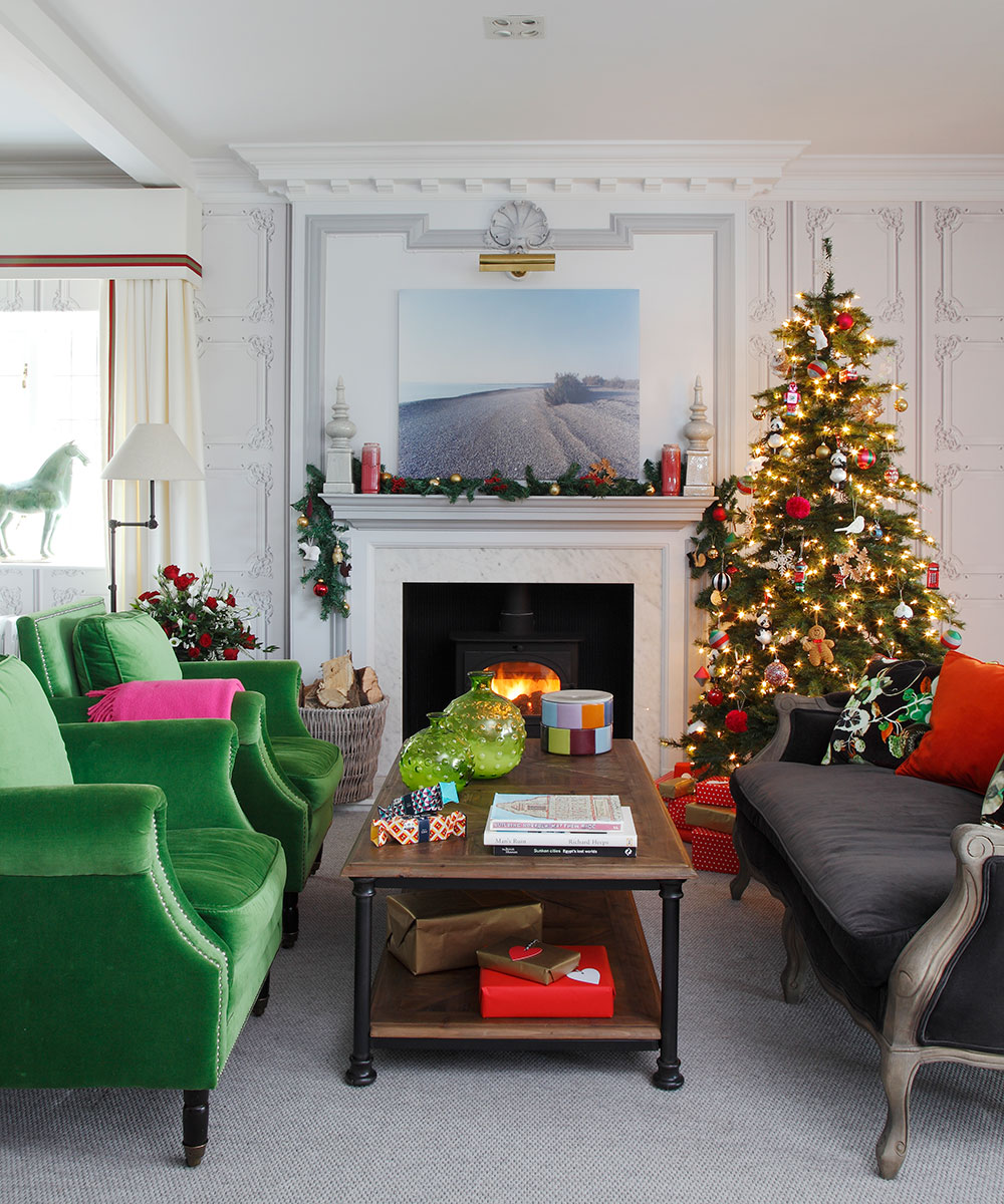

Last Christmas was particularly special for the owners of this home and their two small children. Special because, for the first time, the traditional family rituals of hanging ornaments on the tree and leaving a mince pie out for Father Christmas took place in their new, freshly decorated five-bedroom Arts and Crafts house in the Norfolk countryside.
See: our Spaces section for more inspiring house tours
‘The size of the house took some getting used to,’ says the owner, ‘but the children were thrilled to have their own bedrooms, as they had had to share until then. Now they have a room each, plus a playroom where they can spread out all their toys. They can chase each other all over the house. ‘For us, the best thing is that we are now able to have friends and family to stay in comfort. Last year, we enjoyed some lovely lunches in the dining room, which we hadn’t been able to do before.’
Alongside their London base, the family has had a house in the country since the days before their children were born. ‘The first cottage was beautiful,’ the owner recalls, ‘but once we started a family, and friends began to do the same, it felt smaller and smaller every time people came to stay.’ Originally, the couple had their hearts set on staying in the same village, ‘but my parents saw this house, which is about five miles away, and encouraged us to take a look’, says the owner.
- See some of the world's best homes – beautiful properties from around the globe
The property
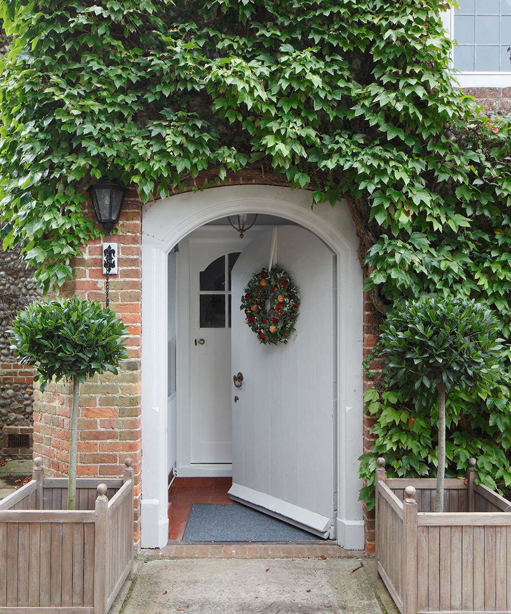
Positioned at the top of a hill and surrounded by landscaped gardens with stunning views that take in rolling fields, woods and three churches, the capacious red-brick and flint turn-of-the-century building immediately captured their hearts. ‘It felt like a happy home. We sensed it had enjoyed many years of fun and laughter.’ The house was in good condition, with a pleasing and practical layout, but it was in need of a cosmetic update, which the owner confesses ‘filled me with horror’.
Looking for a bit of support, she sought help from interior designer Stephen Ryan, after seeing his work at a friend’s house in London. ‘What he had created for them was fun and made fantastic use of color. I love color, and have colorful clothes, but I’m rather a nervous decorator, so our house in London is mainly white.’
Stephen responded to the couple’s brief with a playful and witty yet unpretentious decorating scheme that runs from brights in emerald green, fuchsia pink and cobalt blue to delicate pastel shades of lilac and yellow and grey. ‘I wanted it to be jolly, a bit funky and right for a young family,’ says Stephen. ‘They were easy-going clients; there was very little I showed them that they didn’t like. Most challenging was the budget, which had to cover both the main house and the guest coach house.’
Sign up to the Homes & Gardens newsletter
Design expertise in your inbox – from inspiring decorating ideas and beautiful celebrity homes to practical gardening advice and shopping round-ups.
Thanks to Stephen’s skill, there is no evidence of cost cutting, however, and the owner found the process enjoyable. ‘I didn’t like the thought of having to make hundreds of decisions,’ she says, ‘but working with someone like Stephen, who could imagine the whole room and treat the house holistically, meant I could trust my choices. His vision was critical in making this a wonderful family home.’
Sitting room
This eye-catching scheme by Stephen Ryan, stephenryan design.com, was designed to bring a contemporary twist to the traditional country-house look, with panel-effect wallpaper by French company Koziel and brightly upholstered seating. This modern take on the French rococo bombe commode, topped with a pair of chequered pots, makes a lively focal point. ‘Stephen has shown me that small items make the place feel homely and fun to live in,’ says the owner.

Entrance hall
Pieces such as the side table, which Stephen describes as “looking Gothic and slightly mad”, and the artwork in the sitting room, made of paper folded into little springs, add notes of dramatic interest.
Kitchen
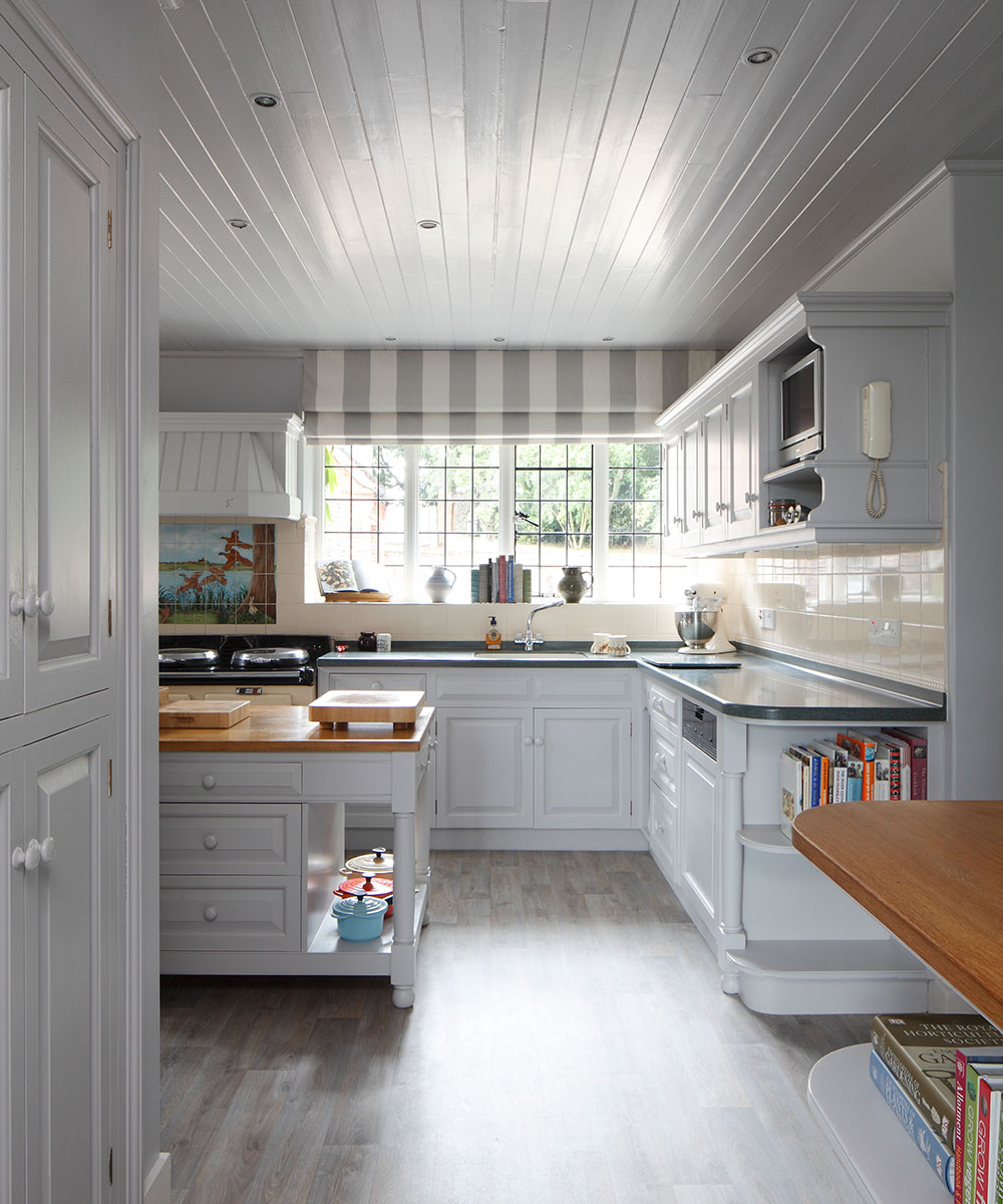
‘The couple didn’t want to rip out the kitchen as it was solid wood and perfectly functional, if a little tired,’ says Stephen. ‘So we painted the walls, ceiling and cabinets in a color that I call Christian Dior grey, as it’s the same shade as that brand’s packaging.’
Breakfast room
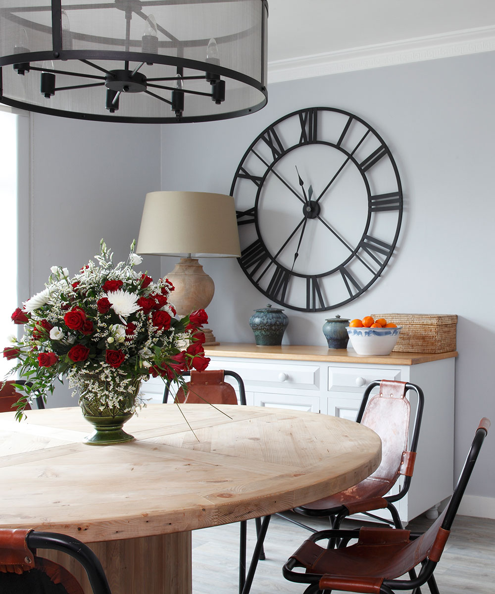
‘We had very few specific requests, but one was for a round table in here, which we find very convivial,’ says the owner. The unfinished wood adds rustic note that is tempered by the industrial feel of the iron-framed chairs, chandelier and oversized clock.
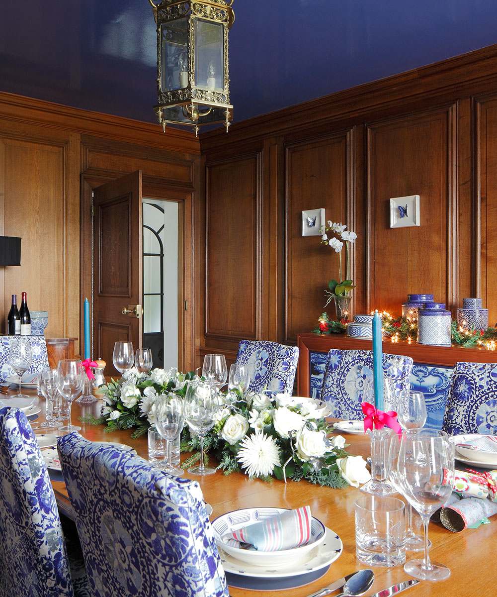
Dining room
The rich blue lacquer effect that Stephen has used on the ceiling stands in bold contrast to the warm tones of the original panelling, while a collection of blue and white ceramics neatly echoes the dining chairs, which were reupholstered in Iznik by Andrew Martin.
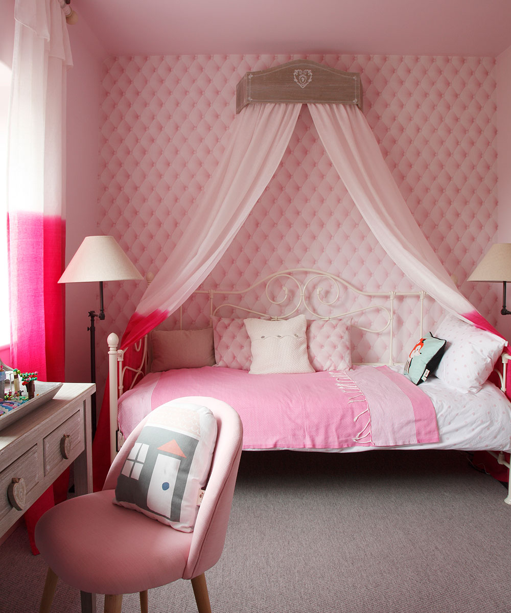
Girl's bedroom
‘Our daughter loves her pink scheme,’ says the owner. ‘It’s not what I would want but Stephen read her very well.’
Boy's bedroom
Stephen bought a roll of navy blue denim fabric for this room. He used some of it for curtains and the rest he backed with paper and applied below the dado rail to create a look that is smart yet casual.
Main bedroom
Like the sitting room, this space has been decorated with wallpaper that mimics panelling, although its design is less ornate. The couple particularly love the view and opening the windows in the morning to hear the birds singing.
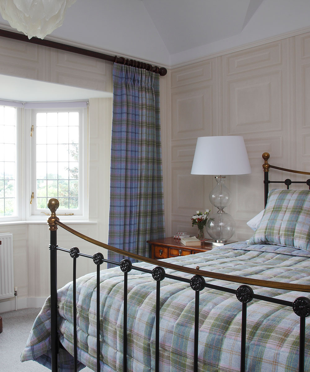
Guest bedroom
There is plenty of color upstairs, too, but in more subdued, restful tones. This delicate tartan scheme is accented by a pretty silver églomisé table lamp.
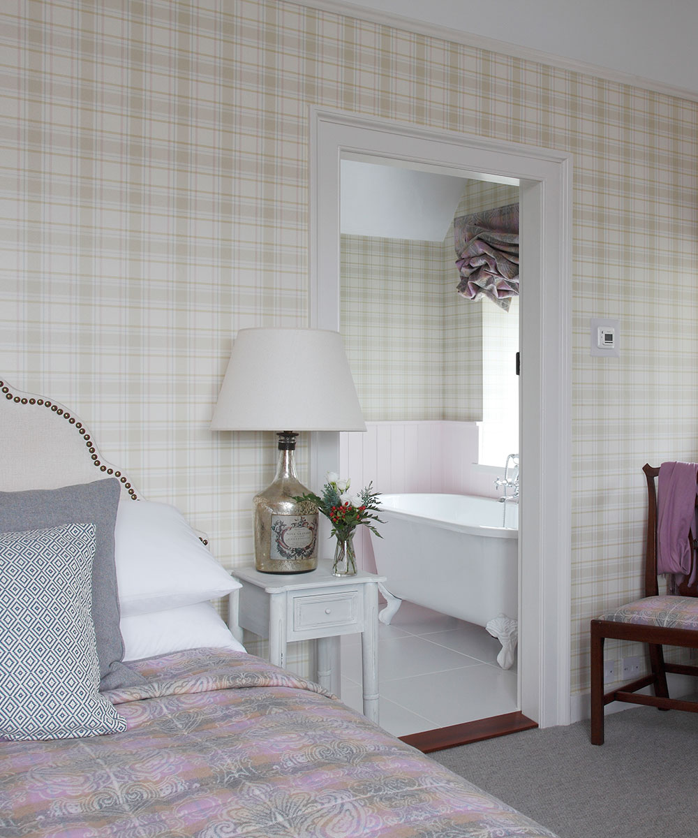
Main bathroom
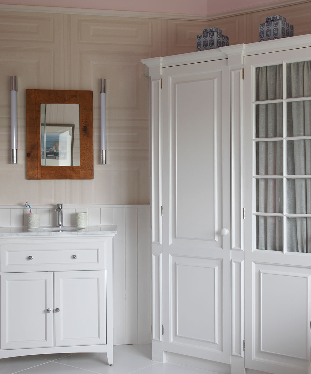
The owner was happy to sacrifice a surfeit of cupboards in here to make a feature of those that they kept. The glazed doors have been lined with gathered fabric, which gives a softer look more akin to a living space.
Photography /James Balston

Jennifer is the Digital Editor at Homes & Gardens. Having worked in the interiors industry for several years in both the US and UK, spanning many publications, she now hones her digital prowess on the 'best interiors website' in the world. Multi-skilled, Jennifer has worked in PR and marketing and occasionally dabbles in the social media, commercial, and the e-commerce space. Over the years, she has written about every area of the home, from compiling houses designed by some of the best interior designers in the world to sourcing celebrity homes, reviewing appliances, and even writing a few news stories or two.
-
 Charred little gem with saffron dressing
This recipe with charred little gem is both easy to make and sure to impress guests. It's the perfect side for fresh spring menus
By Alice Hart
-
 Grilled asparagus with herb and pickled red onion
This grilled asparagus couldn't be easier, and it's a wonderful way to get the best flavor from our favorite spring veg. It's perfect alongside fish or lamb
By Alice Hart