How to display – show off artwork, ornaments and cherished finds
Bring character and charm to your home with our gallery of imaginative ways to display

Knowing how to display your favorite pieces of art – whether paintings or objets – is key to giving them the spotlight they deserve. The key is to give them the space to be seen, to pick a focal point for them in a room – perhaps over or on a mantelpiece, centrally on a set of shelves or at the end of a long hallway.
Secondary to that when learning how to display is to ensure that the piece is properly lit. Since your artwork will spend about half its time in artificial light, properly illuminating it will make it more beautiful and ensure you are seeing its true colors, as you would in the best natural light. Artwork that isn’t evenly lit, won't be shown off to its best advantage.
Read on to discover our top tips for displaying at home.
- See: How to choose art for your home – curate a beautiful collection
Displaying pictures
There are many ways to display pictures – most typically on a wall.
As interior designer Kit Kemp shows when displaying art, grouping pictures can be extremely effective way to display art – although there is a technique to getting it right.
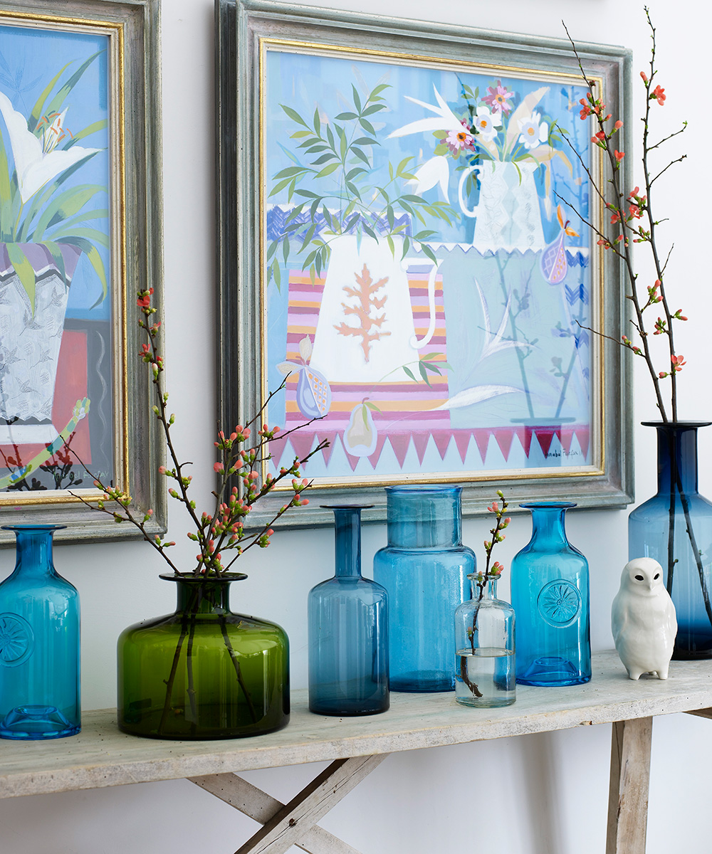
Wall-hung paintings can also work in tandem with a display of complementary objets. These colored glass bottles were selected to match the hues and theme of the images above. Glass ornaments work particularly well as they don’t detract from the main feature.
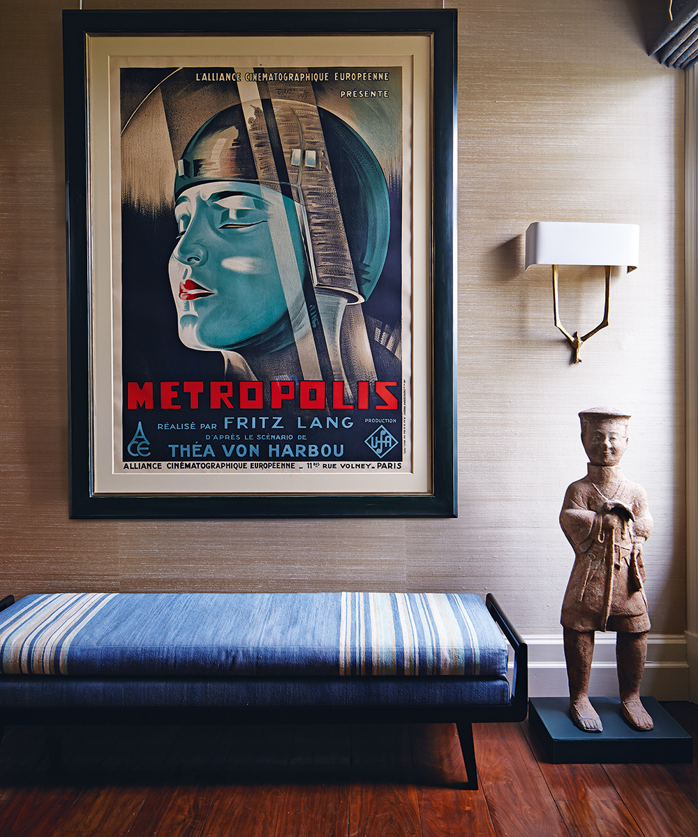
Before hanging a group of pictures, arrange them on the floor. You don’t need to use a tape measure for precise spacing, as the tension will always be a bit different when they are hanging from a wire. A lot of the look will be down to instinct, but a good guide is to put the strongest image at the top.
Don’t hang pictures too high – we call it the Cape Canaveral syndrome, as you end up having to look up and the pictures appear like they are about to take off. In rooms with fewer pictures, try hanging them lower. Finally, remember that not everything has to be in a frame.
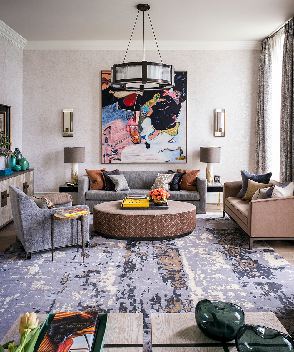
Pick frames according to the picture. A frame chosen to suit your artwork (see above) unquestionably looks better than one that has been selected to suit the décor of the room. That approach can be too contrived.
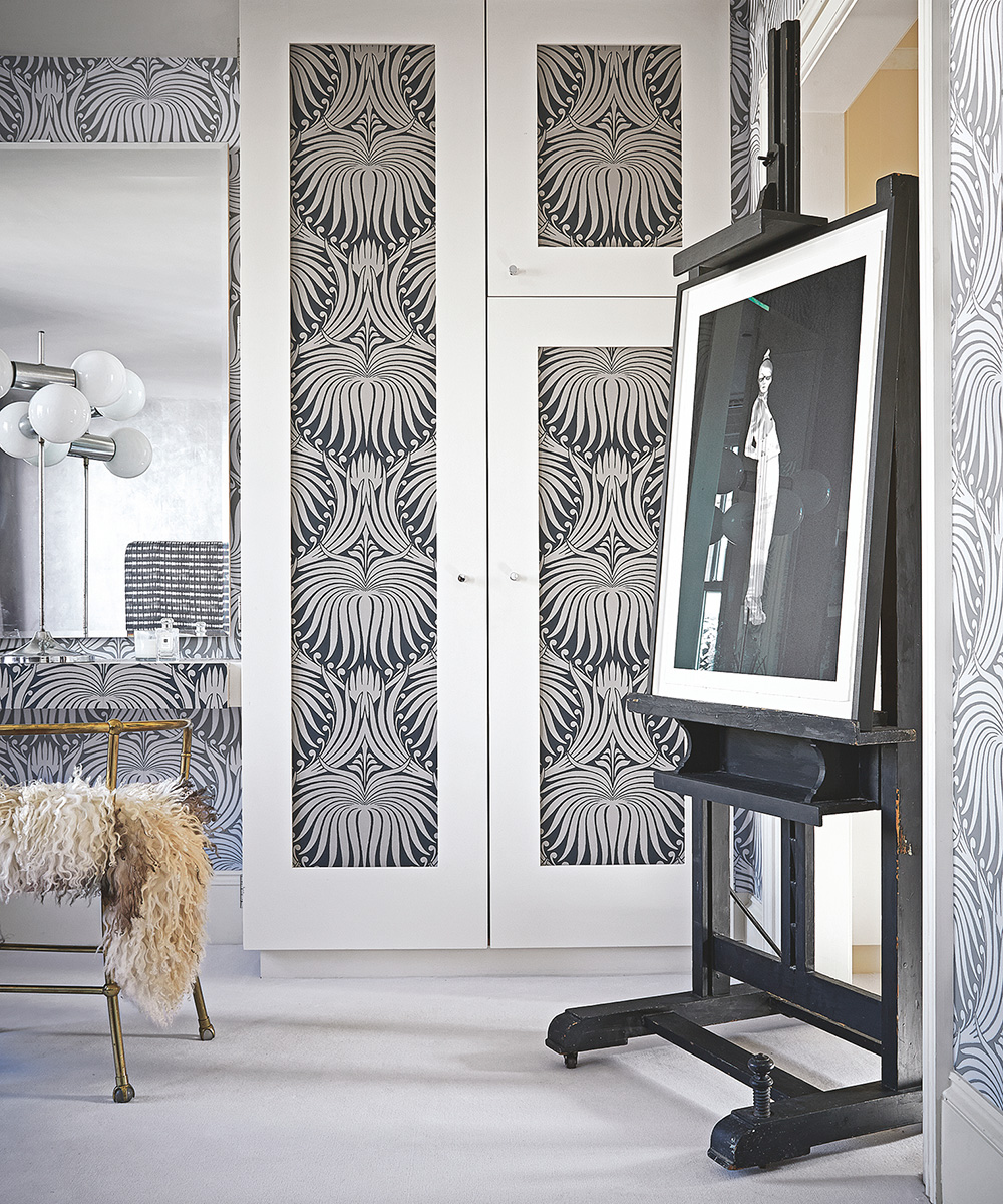
If you have a particular picture that you really want to draw attention to, displaying it separately is the best way. This screen print by Joanna Ham from Nelly Duff Gallery (above) is given special treatment with a large-scale artist’s easel. Table-top and floor easels are the most portable way of display artworks.
Displaying objects

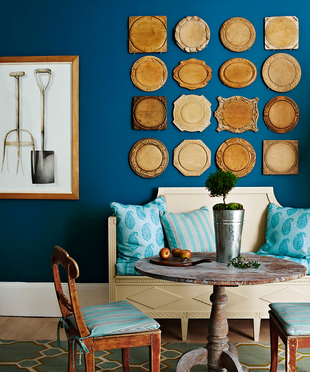
A simple and appealing idea for a rustic look, this cluster of vintage chopping boards in a neat symmetrical arrangement pops out against the deep-blue wall. The woods echo the various tones of the furnishings to unify the farmhouse-style scheme.
Key to displaying objects are these tips for success:
1. Ensure the display is positioned centrally on a wall if hung, or on a shelf or windowsill if standing independently.
2. Consider the background color – the bigger the contrast, the more chance the objects will have to be shown off.
3. Hang pieces at eye level – just as you would with pictures, objects, from bread boards to hats to books, look best with the central point of the display at eye level.
4. Create a theme – above, there's a consistent theme – but it needn't be that every piece has the same function or even proportions, it might be that you link your display through color or material.
5. Ensure the lighting is good – as we have said before, spotlighting or backlighting a display can increase its impact dramatically.
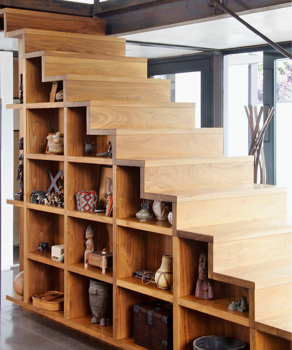
6. Pick unused space to display – even the area under the stairs (above) can offer an opportunity for imaginative display – and, in fact, create a surprise. When selecting groups of objects, look for ways in which they might work together through a theme, medium or origin, as has been done here with the curated collection of African artefacts.
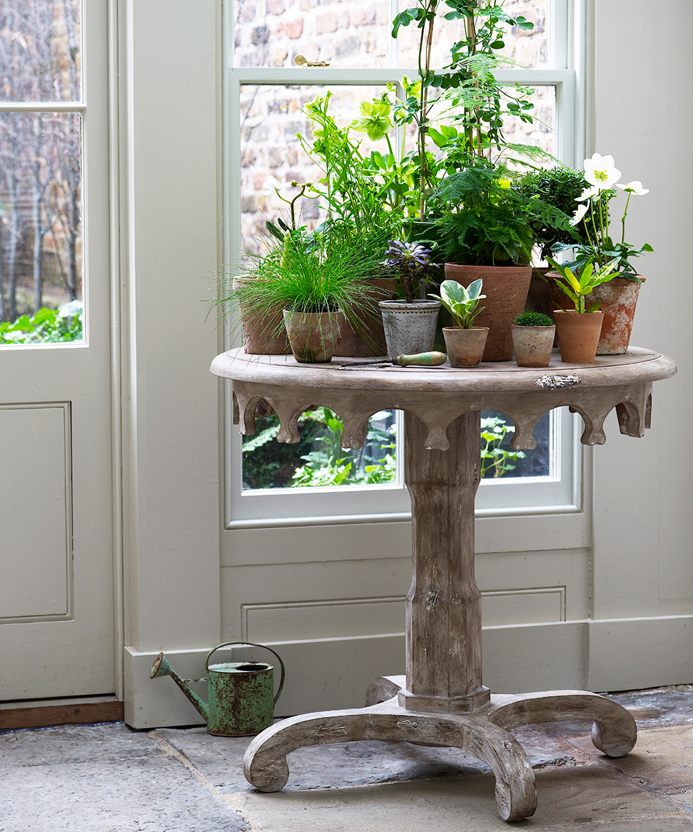
7. Use tabletops for display – a rarely used dining table is the perfect spot, as is a console in a hallway or an occasional table in a living space. When putting together a tabletop display of greenery, concentrate on a clear size hierarchy of both plant and pot. This will prevent a muddle of green and achieve a natural look, ideal for a hallway, bright corner or conservatory.
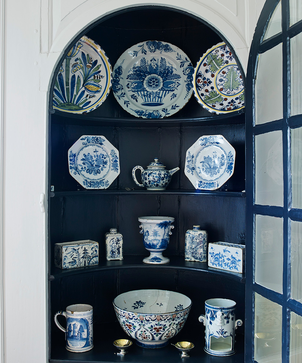
8. Create a display with pattern. Displays of classic blue and white china always stand the test of time. For a more informal, contemporary feel, mix a variety of pieces and patterns from different dinner services. A dark blue background will allow their silhouettes to shine.
Sign up to the Homes & Gardens newsletter
Design expertise in your inbox – from inspiring decorating ideas and beautiful celebrity homes to practical gardening advice and shopping round-ups.

Jennifer is the Digital Editor at Homes & Gardens. Having worked in the interiors industry for several years in both the US and UK, spanning many publications, she now hones her digital prowess on the 'best interiors website' in the world. Multi-skilled, Jennifer has worked in PR and marketing and occasionally dabbles in the social media, commercial, and the e-commerce space. Over the years, she has written about every area of the home, from compiling houses designed by some of the best interior designers in the world to sourcing celebrity homes, reviewing appliances, and even writing a few news stories or two.
-
 Zooey Deschanel and Jonathan Scott's breakfast nook is an innovative, effective use of kitchen space – it turns a 'dead area' into a cafe-style corner
Jonathan and Zooey have situated an eccentric yet elegant dining area in what may have been an otherwise underused corner
By Hannah Ziegler Published
-
 6 things you should never throw in the trash – and what to do for safe disposal instead
From batteries to space heaters, experts reveal what not to throw
By Andy van Terheyden Published