Design house: This city apartment is a masterclass in color
This Fitzrovia apartment is a consummate lesson in using bold color to inject character into a new build, while creating a harmonious setting for the owner’s collection of antique furniture and ceramics
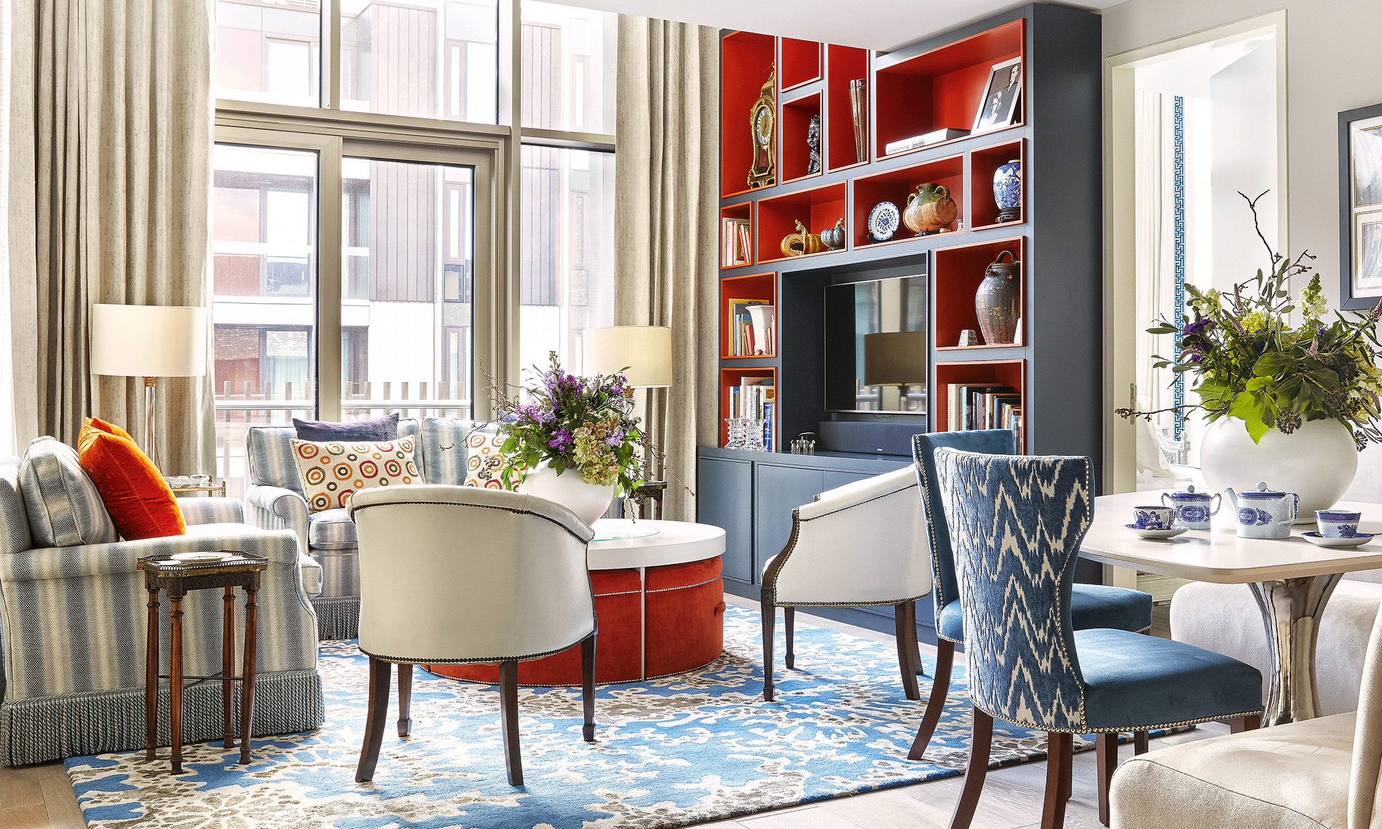

The owner of Creake Abbey, the rural retail destination in north Norfolk, had very specific needs for her London bolthole. ‘It had to be in W1, have parking and be secure so I can lock it and leave.’ After nearly three yearsof searching, she settled on Fitzroy Place, a development started by the Candy brothers and completed by Exemplar, in partnership with Aviva Investors on the site of what had once been Middlesex Hospital.
- See more: World's best homes – our page dedicated to fabulous properties
The property
This apartment has personal resonance for the owner as she purchased it with the proceeds from selling her parents’ apartment in Grosvenor Square and filled it with furniture taken from their former home. Her childhood memories of growing up in the Colefax & Fowler-designed apartment with huge windows and high ceilings, are so strong, her own home could be termed as a modern imitation.
'Soon after I bought this apartment, my mother said to me: ‘I hope you won't make the mistake of not getting a designer to help you.’ I knew she was right. I confess to being a bit square and safe, so I needed someone to push me. Emma Deterding of Kelling Designs was the ideal person to help with that, particularly with color, and, golly, how this apartment sings with color,' she explains.
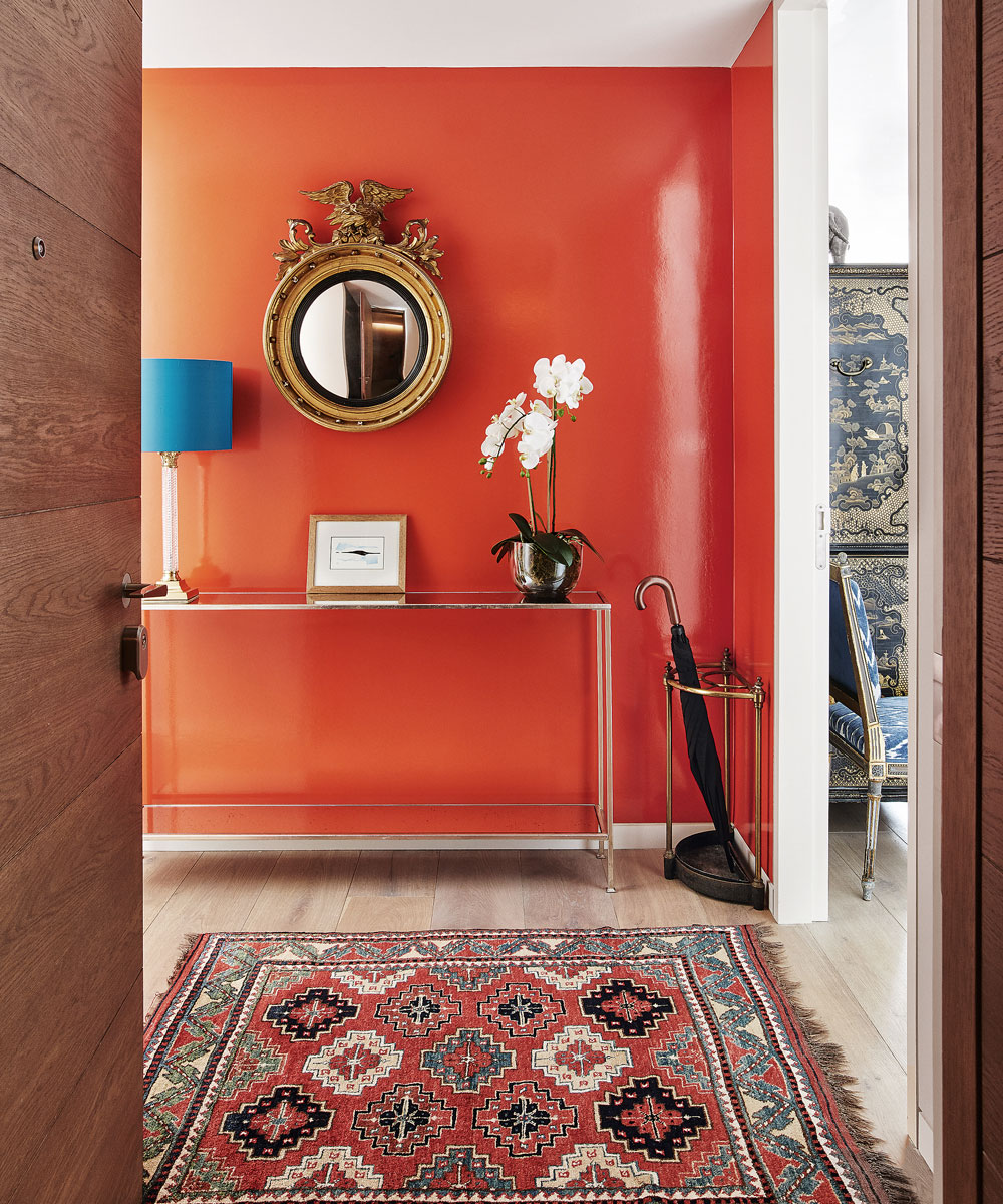
Hallway
The glossy orange wall and eye-catching blue of the lamp shade make the entrance hall set the scene for the rest of the scheme. ‘I was keen to find a contemporary way of showing off antique pieces that have been given to me, such as the mirror and lamp,’ says the owner.
Living room
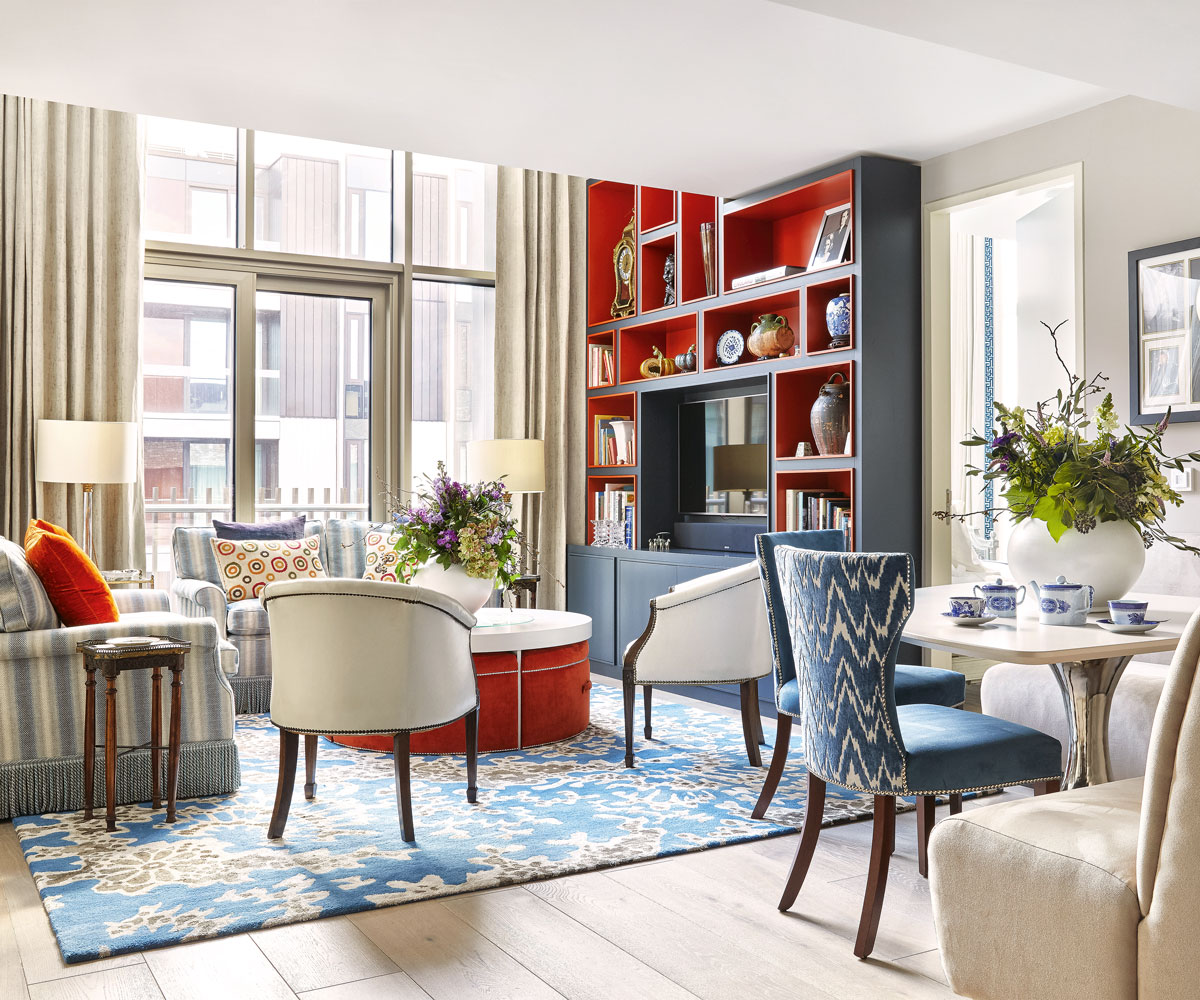
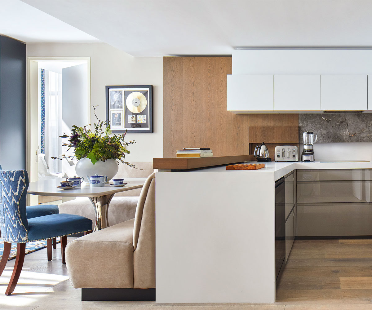
The owners white tub chairs were once her mother’s. The stud detailing and shape of the legs inspired designer Emma to incorporate the same details into the chairs she designed for the bespoke dining table.
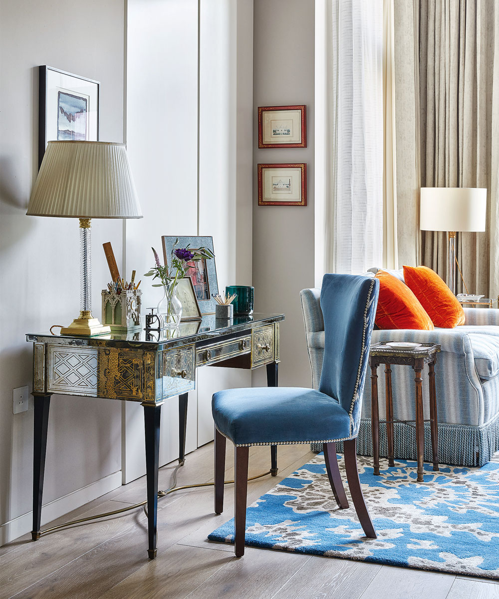
‘My parents’ apartment in Grosvenor Square was designed by Colefax & Fowler and in the French style of Louis XIV,’ she says.‘My apartment couldn’t accommodate a lot of the furniture we had there, however, as the pieces were too big or overly decorative, but this desk made the grade.’
Kitchen and dining room
‘Emma designed the practical yet creative dining chairs as a response to my need for a dining table,’ says the owner.
Sign up to the Homes & Gardens newsletter
Design expertise in your inbox – from inspiring decorating ideas and beautiful celebrity homes to practical gardening advice and shopping round-ups.
Children's bedroom
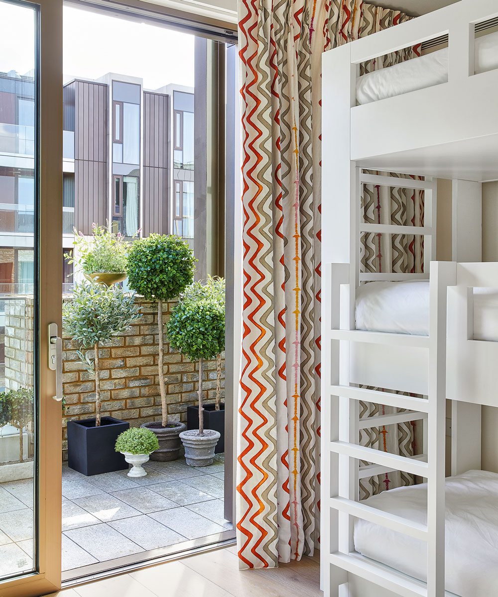
The curtain fabric is a Kit Kemp design from her favourite hotel, Charlotte Street. ‘Kit’s use of colour has inspired so many people to be bolder in their interior design choices and this pattern contains the accent colours that we’ve used in the apartment,’ says Emma.
Guest bedroom
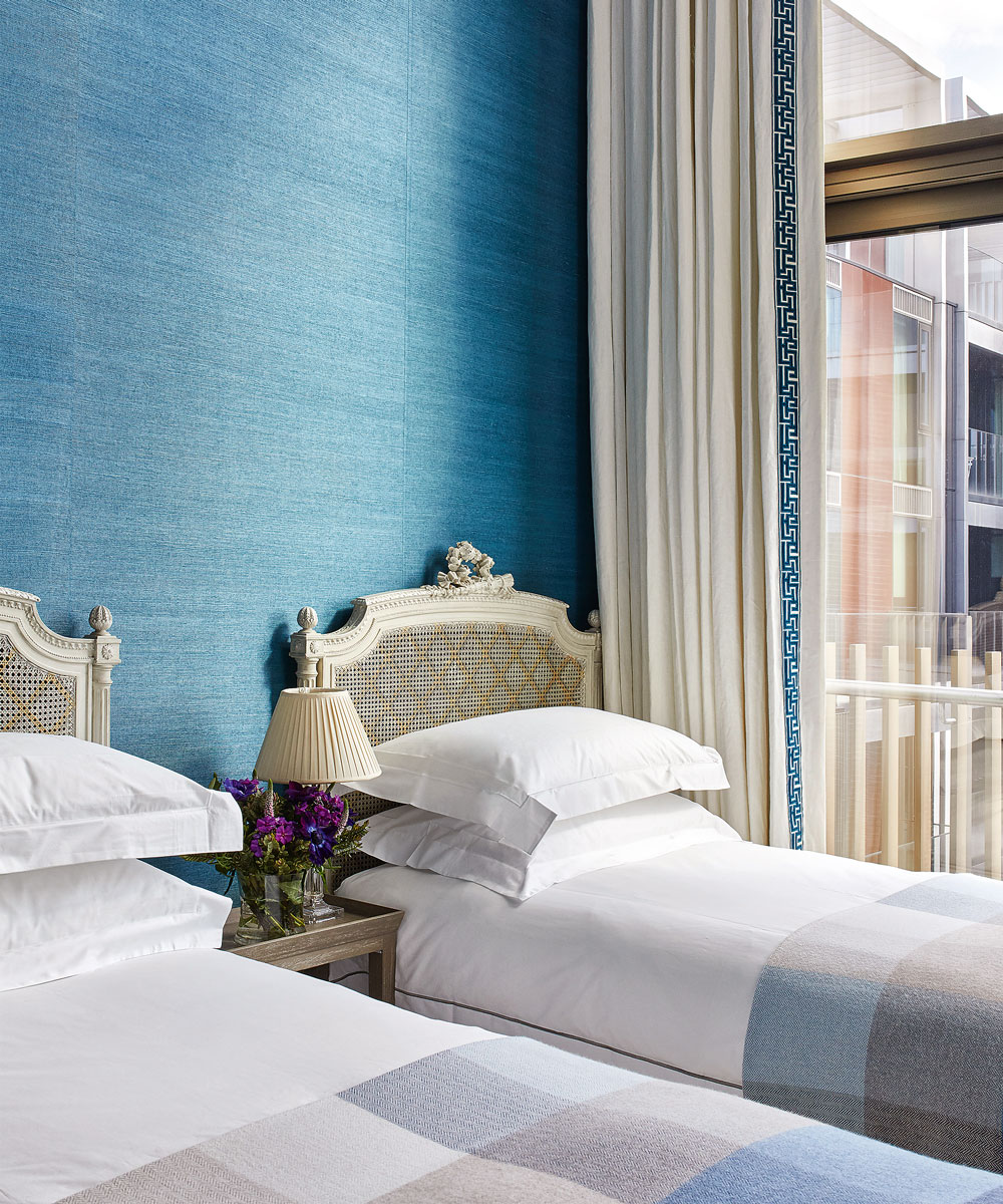
The wall color was inspired by a picture of a blue sofa in a large windowed, high-rise building that Artemis had shown to Emma. ‘This shade is virtually identical to the corporate colours that I use for Creake Abbey, but I didn’t connect them till afterwards,’ she explains.
Bathroom
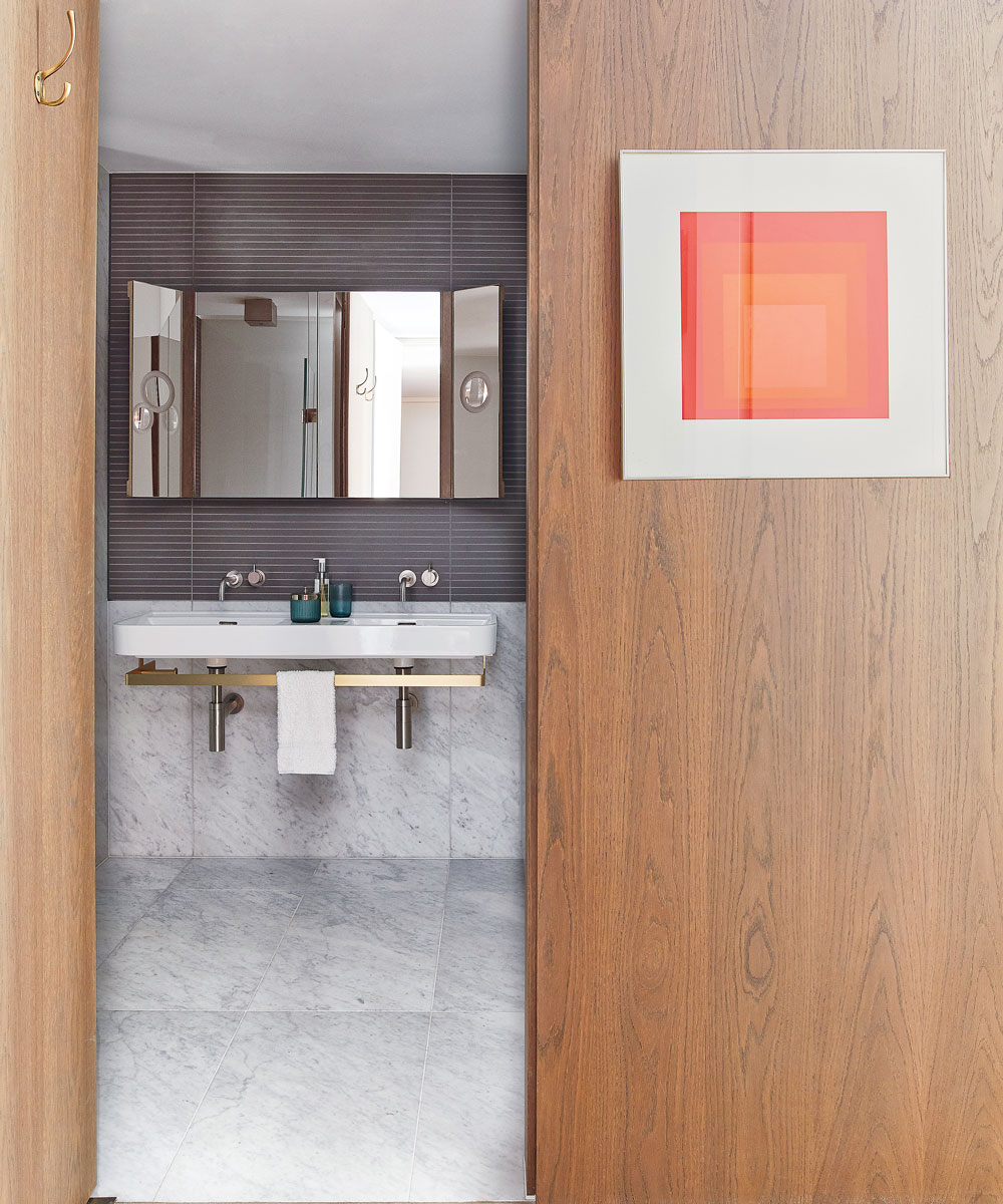
The wood panelling, flooring and bathrooms were part of the developers’ standard fit, she recalls. ‘I had no say over it, but I could see that the fittings were of good-quality Italian design without too much bling, soI didn’t worry about it.’
Main bedroom
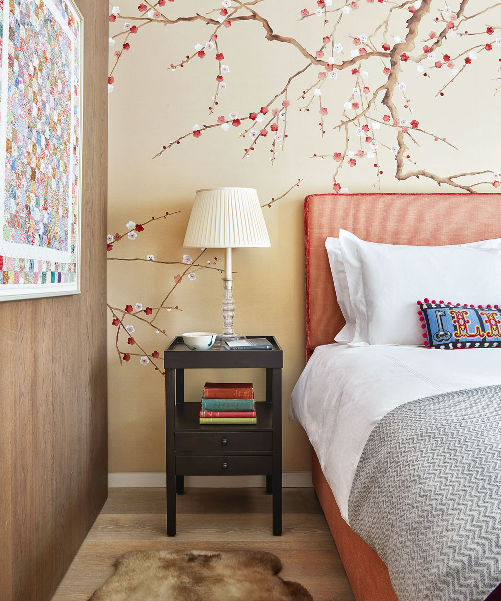
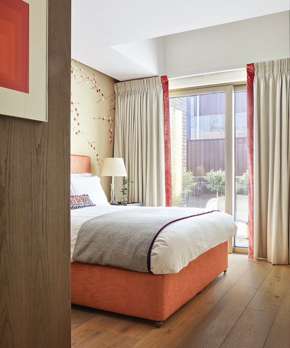
‘I always dreamed of having a wall lined with a de Gournay print. I fell in love with this one for its texture. It gives me absolute joy to see that pattern,’ she explains.
Although not quite a penthouse, her apartment is on the eighth floor and the lightwell above the window is a welcome extra, throwing additional natural light into the room.
Photography ⁄ Davide Lovatti
Interior Design ⁄ Kelling Designs

Jennifer is the Digital Editor at Homes & Gardens. Having worked in the interiors industry for several years in both the US and UK, spanning many publications, she now hones her digital prowess on the 'best interiors website' in the world. Multi-skilled, Jennifer has worked in PR and marketing and occasionally dabbles in the social media, commercial, and the e-commerce space. Over the years, she has written about every area of the home, from compiling houses designed by some of the best interior designers in the world to sourcing celebrity homes, reviewing appliances, and even writing a few news stories or two.
-
 Charred little gem with saffron dressing
This recipe with charred little gem is both easy to make and sure to impress guests. It's the perfect side for fresh spring menus
By Alice Hart
-
 Grilled asparagus with herb and pickled red onion
This grilled asparagus couldn't be easier, and it's a wonderful way to get the best flavor from our favorite spring veg. It's perfect alongside fish or lamb
By Alice Hart