The worst home office paint colors – the shades that make you less productive
The colors you’re surrounded by while working from home can impact your work – are you accidentally sabotaging yourself?
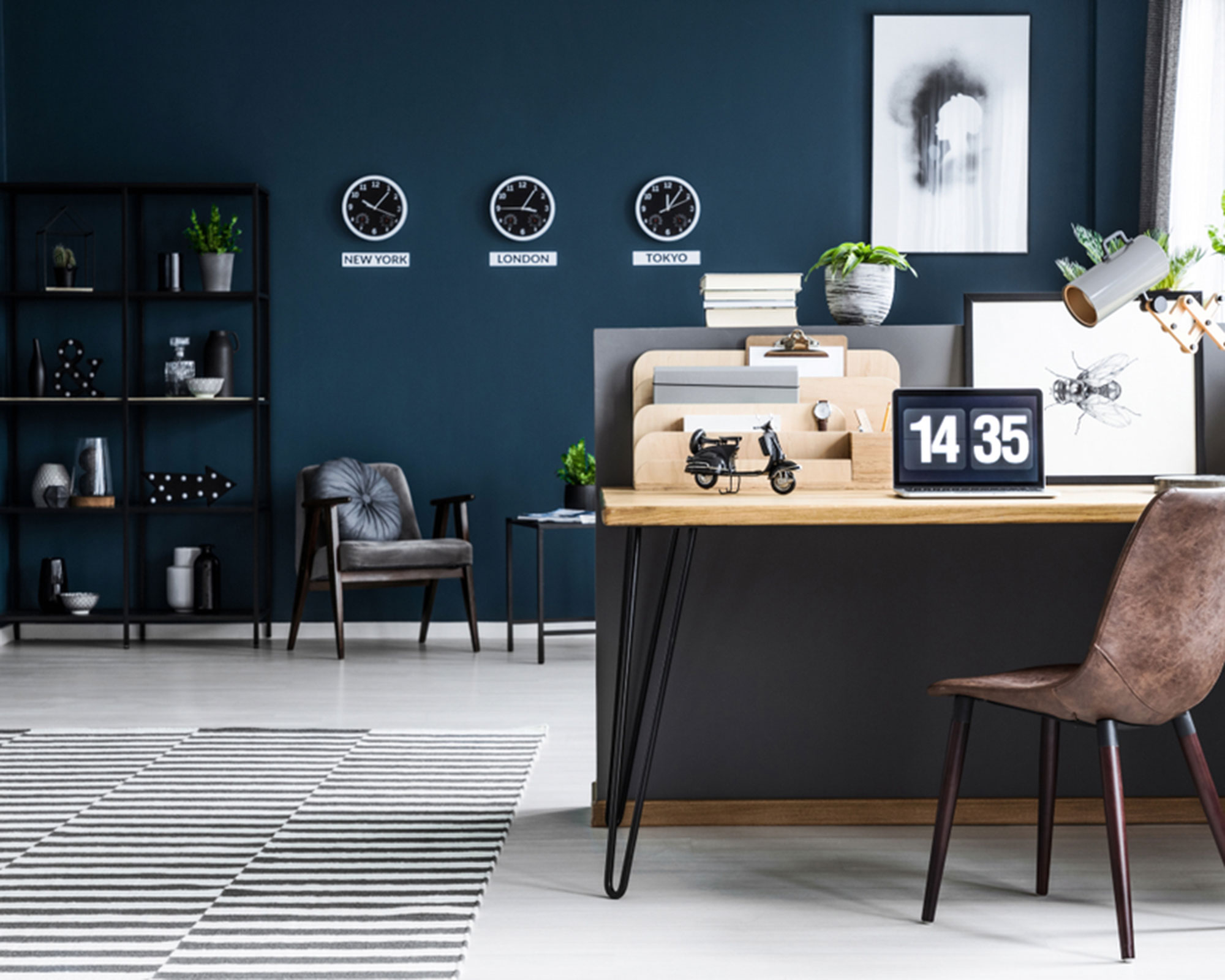

As so many of us are working from home this year, we’ve had to carve out new mini office in our personal spaces.
Whether you’ve got a full blown home office, or are perched at the kitchen table, the colors around you can benefit or detract from your work. Home office paint colors are key to creativity, productivity and overall wellbeing.
Psychologist and Wellbeing Consultant, Lee Chambers, breaks down which home office paint colors to avoid, and which we should be introducing – something to add to your list of home office ideas.
For more color advice and to learn all about how color theory works, our definitive guide on the color wheel is really useful.
1. Neutral
Photography/Manolo Yllera
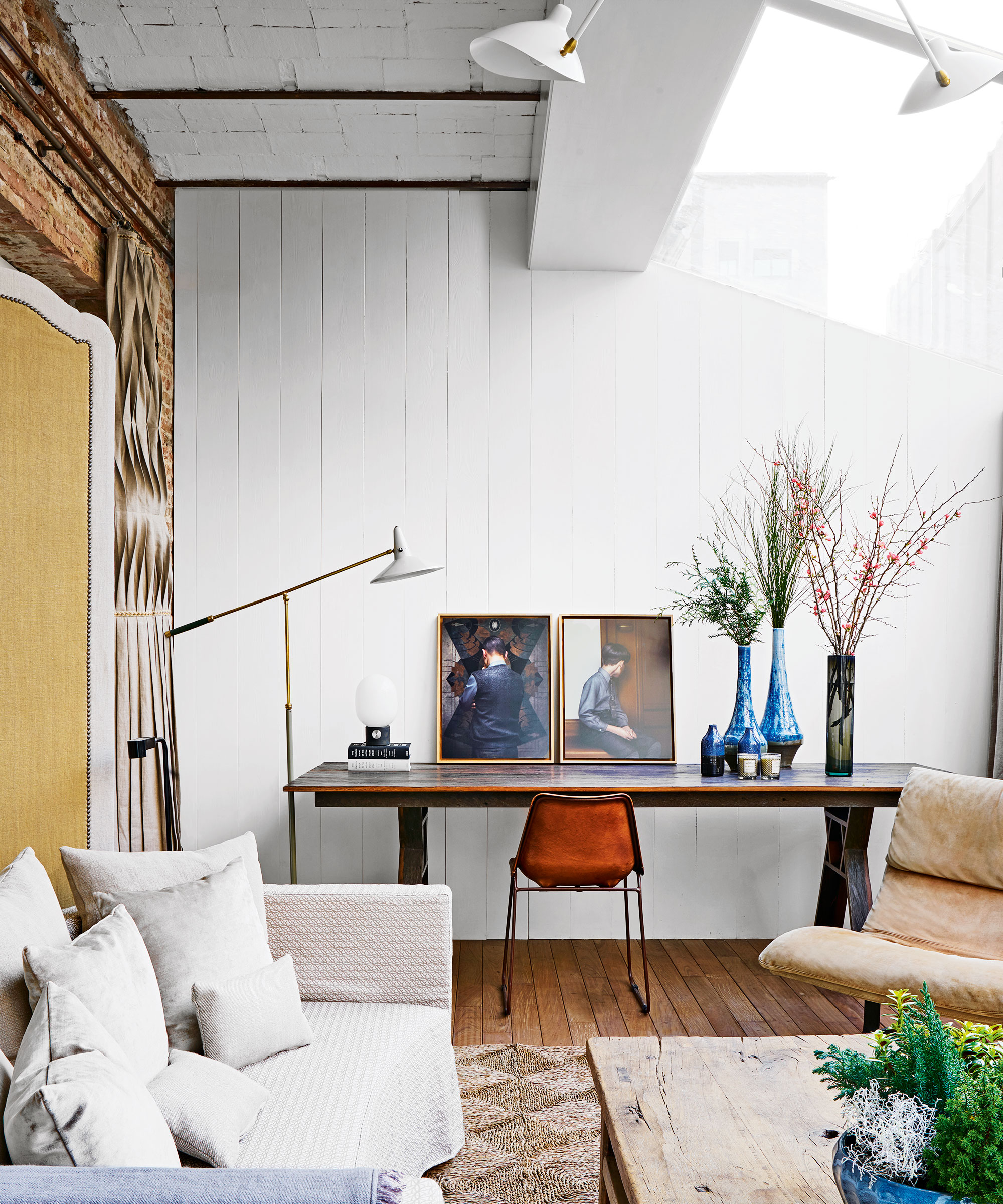
With over 50% of people working from home in neutral shades of white, beige and gray you might expect this to have a positive impact on your work.
However, Lee notes that, ‘a University of Texas study concluded that offices without a splash of color, especially those in neutral white, grey and beige tended to induce some sad and depressive feelings, especially for females.’
2. Yellow

The bright and cheerful shades in the yellow spectrum are seen in plenty of kitchens and living rooms – popular places to sit when working from home.
Sign up to the Homes & Gardens newsletter
Design expertise in your inbox – from inspiring decorating ideas and beautiful celebrity homes to practical gardening advice and shopping round-ups.
‘Yellow backgrounds increase information retention, which is helpful for highlighting key learnings and important information,’ says Lee.
‘If you have a creative job, yellow is definitely a solid choice, but be mindful of the overuse of yellow as a background and as a space, as it does induce eye fatigue.’
3. Blue
Photography/Sarah Hogan
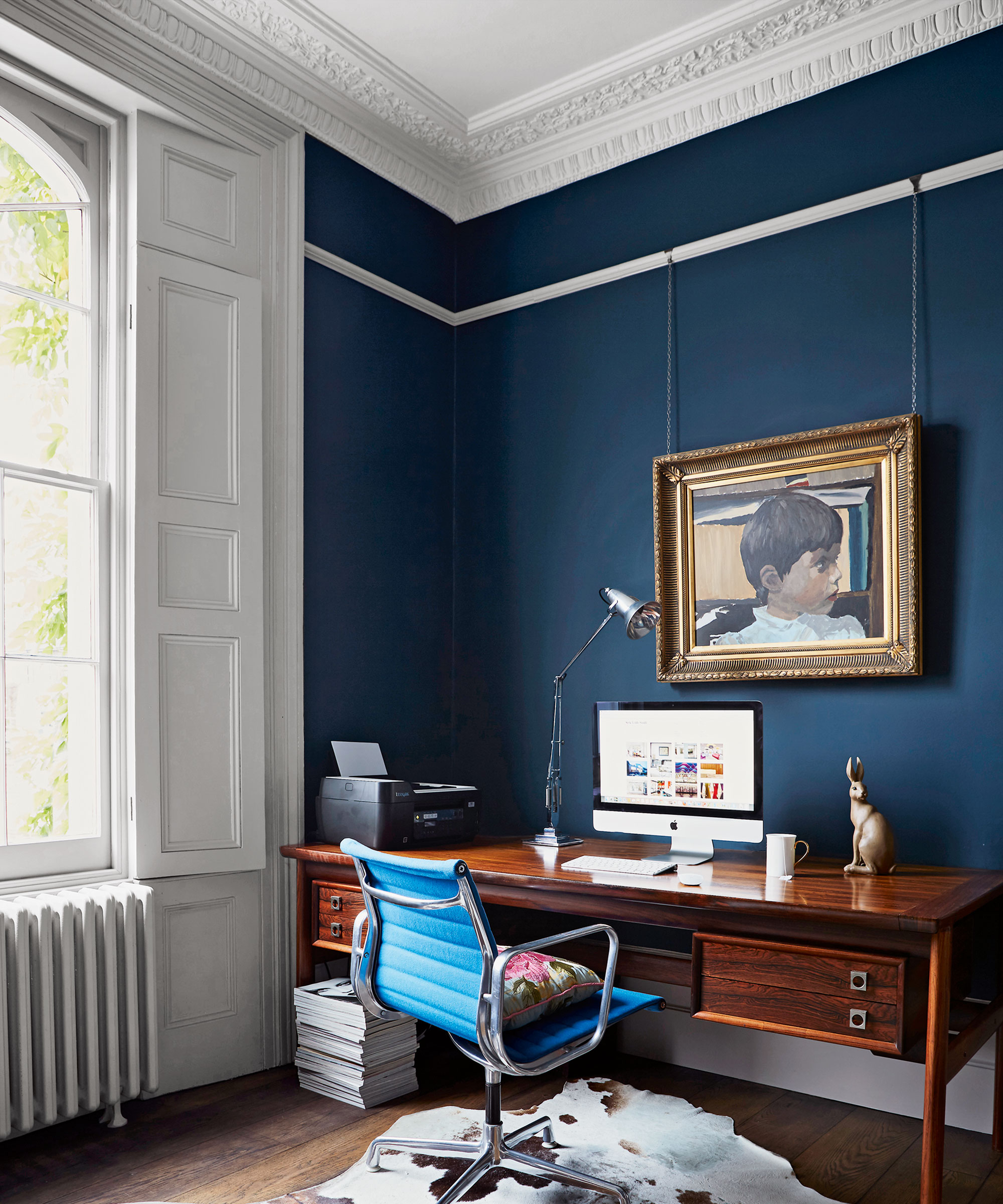
Blue is the world’s most popular ‘favorite color’ so many of us may have painted our walls in a blue tone, but is it a good choice for a home office paint color?
‘Blue is known as the official color of productivity. It promotes calm concentration and emotional balance that helps to keep you in a state of flow,’ says Lee.
‘However, too much blue can leave you a little too relaxed and blunt your innovative streak, so consider adding some warm colour accents.’
4. Orange
Photography/Michael Sinclair
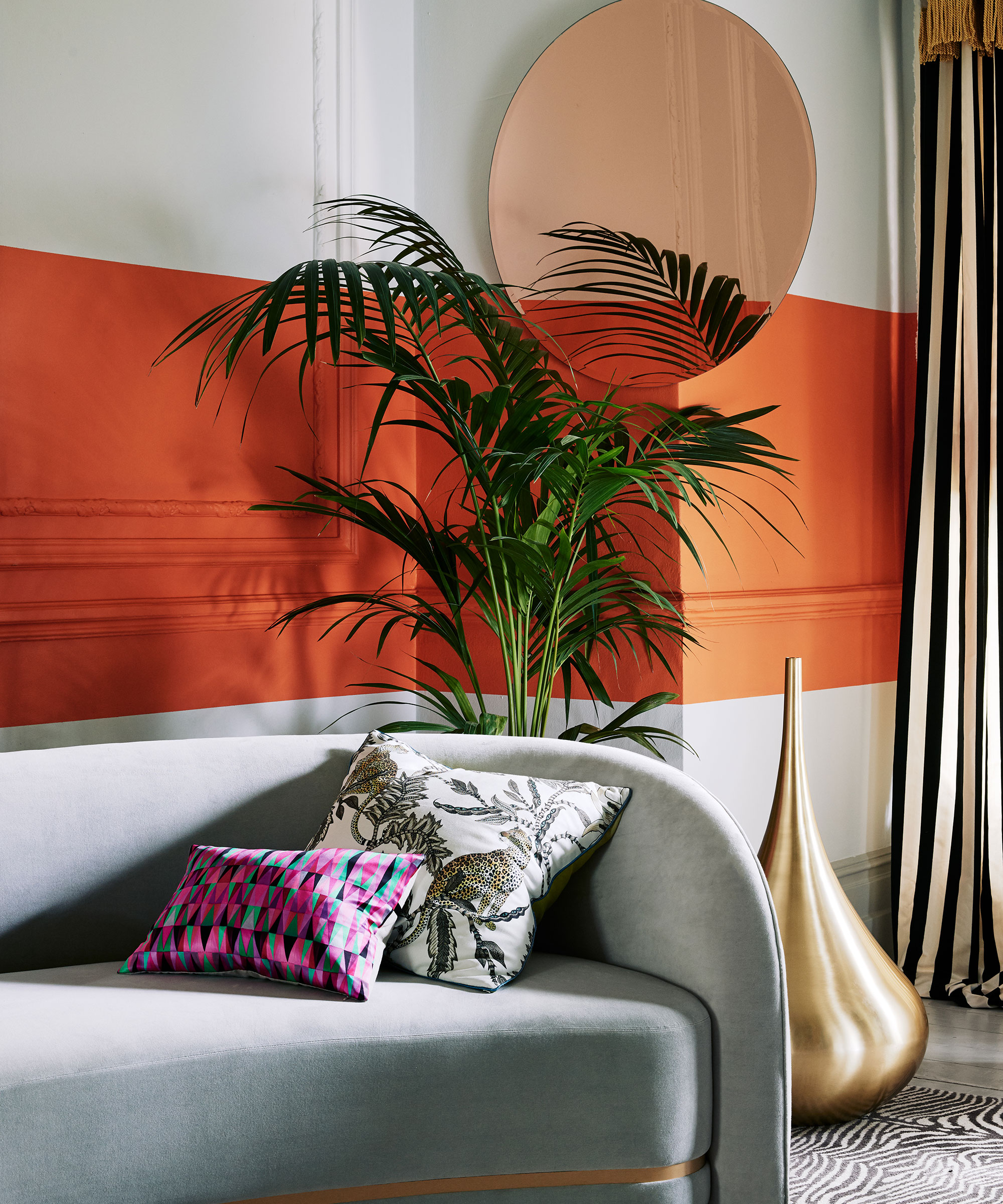
A perhaps surprising 17% of people work in a room painted in orange. Lee notes that for men, especially this can be an issue.
‘The color orange is especially detrimental to men when it comes to boosting productivity. However, if you opt for a peachier shade, that can be perceived as happy and welcoming.’
5. Red
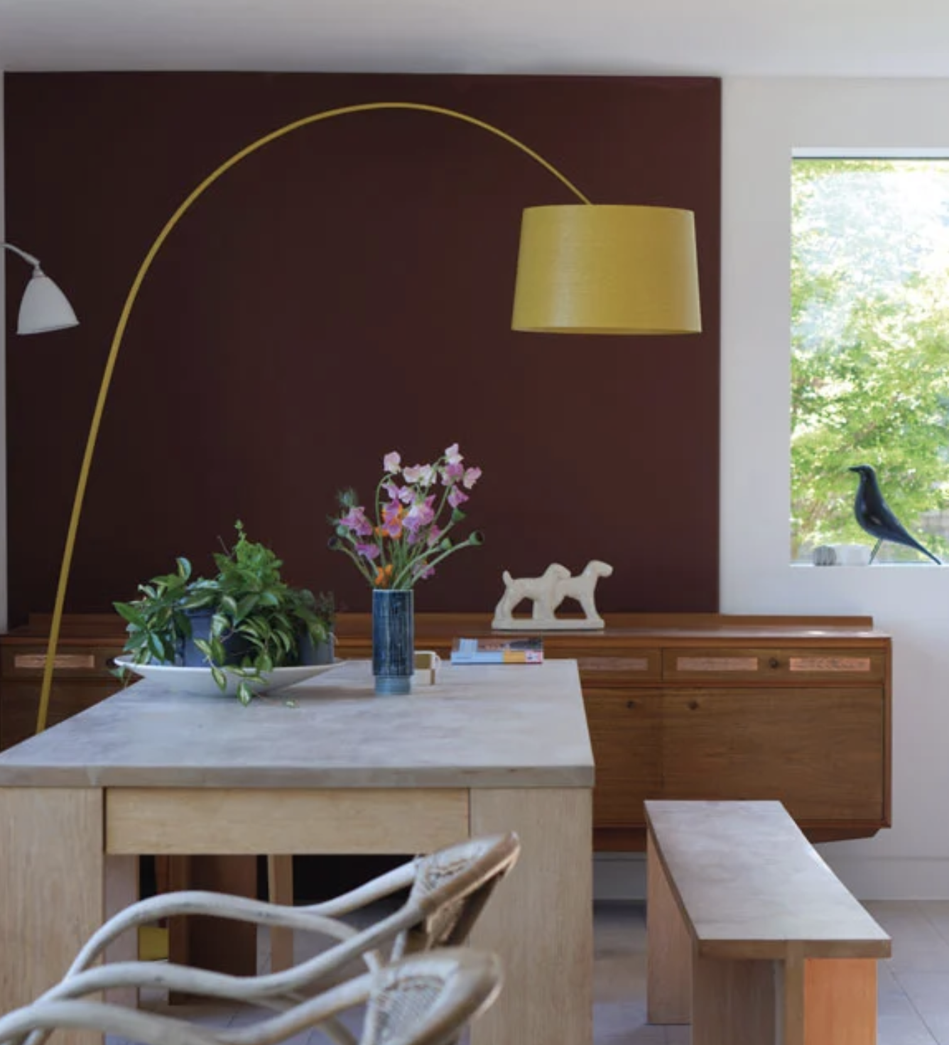
Photography/Matthew Williams
The color of passion and energy, red can be a dramatic shade in any room, but is it right for a working from home space?
‘Red is a powerful, vibrant color, and is very situational in its use for productivity gains,’ advises Lee. ‘Studies have found the emotive and passionate fire of red raises blood flow and heart rate. This is great for physical tasks, like a little natural energy bar.’
However, you should be wary before going all in with red tones. ‘For a home office, red can very easily become overstimulating, causing us to lose focus and concentration, and gradually feel volatile, increasing the potential for mistakes or conflict.’
Instead of opting for a bright, bold shade, choose a more muted one, such as this beautiful Deep Reddish Brown by Farrow & Ball.

Thea Babington-Stitt is a Content Editor at Future. She has been an interiors journalist for nearly 10 years and has held positions at LivingEtc, Country Homes & Interiors and Homes & Gardens. Currently, she is writing for Ideal Home and Style At Home's websites and magazines.
-
 I always get my small space storage from Wayfair – and these discounted $35 stackable Martha Stewart storage boxes are the perfect fix for my tiny vanity
I'm going vertical for tiny space storage success with this Early Way Day 2025 bargain
By Punteha van Terheyden
-
 These are the colors that just don't work with purple – 4 shades to sheer clear of if you want to bring this on trend color into your home
Why some colors sabotage purple, and how to get it right every time.
By Sophia Pouget de St Victor