These are the key paint trends for 2024, according to designers
Redefine the way you use paint and color at home and explore the very latest paint trends for 2024
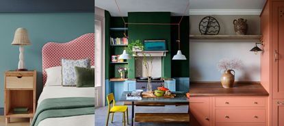
- 1. Warmer neutral paints
- 2. Red and terracotta tones
- 3. Darker stains for wood
- 4. Caramels that verge on yellow
- 5. Pale blues
- 6. Peachy pinks
- 7. Matte finishes
- 8. Soft brown shades
- 9. New approaches to color drenching
- 10. Closely consider shades and tones
- 11. Clay tones
- 12. The fifth wall
- 13. Restful greens
- 14. Mixing and matching unexpected paint colors
Paint trends are possibly the most fickle of all interior design trends. Similar to color trends, the 'in' shades and finishes, and techniques change so much with each season. However, paint trends are also ideal for experimenting and switching up your home, usually without a huge expense or effort. Painting a room, or even just a wall in an on-trend hue is far less of a commitment than investing in an on-trend couch or the newest style of kitchen cabinets.
So while it can be tricky to know whether to commit to broader interior design trends, paint trends are easy to dabble in. They also do say a lot about the mood of the interior design world and you can get a sense of what things are looking like for early 2024 from these trends. There are a lot of warm, cocooning neutrals going on that are more earthy and linked with that trend, brown paints are looking huge for this year. Red is taking over. And in terms of finishes glossy looks and darker stains are what designers are seeing a lot of right now.
The paint trends we are loving in 2024
We've teamed up with a host of color experts and interior designers to bring you exciting paint trends in the year ahead. Get your brushes at the ready…
1. Warmer neutral paints
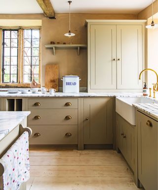
'Warm tones are back and grey is out for 2024!' says Lina Galvao co-founder of Curated Nest. 'This has been a gradual transition over past few years. We're seeing lots of "comforting" warm neutrals (the color of the year for 4 major paint companies are warm neutrals) take the design world by storm. Warmer and darker woods, richer brown tones, warm greens continue, soft shades of pink and yellow (sophisticated pastels).'
'We saw a lot of greige paints at HP Market in the Fall – approachable option for those who aren't ready for full on brown. Decorating with warm neutrals requires layering and texture to be successful and we'll see more designers experimenting with that.' she adds.
2. Red and terracotta tones
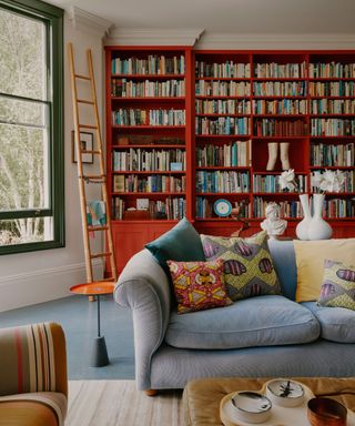
Decorating with red is seeing a resurgence in 2024. And why it might sound bold, trends like the 'Unexpected Red Theory' make a strong case for bringing in red in just small amounts to lift a room. Used in this way, this once shied away from primary shade can work even in an all-neutral scheme.
And when used in larger amounts, it's terracotta paints that are the way to go. As Lina explains, 'Europe's Maison & Objet and other shows saw an abundance of red tones, typically muted "burnt" red. Desert tones, terracotta, etc. Likely influenced by the current fall fashion trend, we'll keep watching to see if it comes to the US in interiors.' We are sure it will, this is such a surprisingly livable paint color, a rusty red can honestly act almost like a neutral.
Sign up to the Homes & Gardens newsletter
Design expertise in your inbox – from inspiring decorating ideas and beautiful celebrity homes to practical gardening advice and shopping round-ups.
3. Darker stains for wood
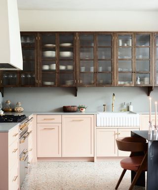
'We are seeing much moodier kitchens and baths, going away from all white or two-tone which have dominated the last decade. Lots of darker stains on wood and mixing darker woods with lighter,' continues Lina.
Darker stains are definitely a paint trend on the rise for 2024. Those very pale woods associated with minimalism and Scandinavian decor will always be timeless, but there is a decided shift towards darker stains, and even warmer stains that have been shunned for so long are creeping back into kitchen trends too.
4. Caramels that verge on yellow
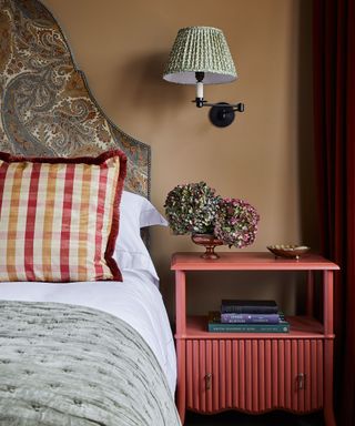
In order to make a space feel more grounded and inviting, many of us are moving away from colder neutrals such as gray, and exploring those with more depth, color and influence from the natural world.
Interior designer Natalia Miyar says, 'delicate pinks, soft neutrals and warm browns are great to use if you want to achieve a natural, modern and uncluttered aesthetic, and they make any room feel cozy and comforting.'
Above, this rich caramel hue definitely belongs to the neutral color family, we think it packs a strong punch that blends well with natural materials, as well as patterned fabrics, to create a calm and relaxing space.
‘This sandy shade has such depth to it,' says Laura Stephens, founder, Laura Stephens Interior Design. 'It makes a room feel warm so is good for north-facing rooms and those that don’t get a lot of natural light. It works really well with both crisp whites and also colors closer in tone, such as burgundy and olive green. It also makes stronger colors like a royal blue pop against it. It’s so versatile.’
5. Pale blues
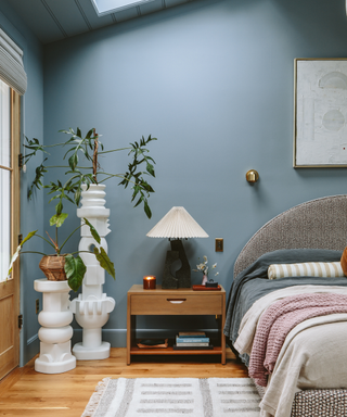
Blues have dominated the Colors of the Year for 2024, – Sherwin-Williams' Upward, Benjamin Moore's Blue Nova, Valspa's Renew Blue just to name a few. But while in recent years it's been all about dark navy blues, paint trends for 2024 are looking to favour paler, mid blues that can behave almost like a neutral when paired with the right shades.
Emily Henderson's bedroom reveal earlier this year solidified the growing love for lighter blues. In her remodel she used Debonair by Sherwin Williams, and while yes it's a gray-toned blue that goes against so many of the other paint trends we are seeing for 2024 that lean warm, not how this blue pairs perfectly with warm tones too.
6. Peachy pinks
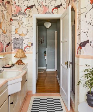
Peach Fuzz was of course Pantone's Color of the Year, so it's no surprise that this pale orangey pink has an impact on paint trends in interior design.
'Using peach in interior design brings a playful vibe to your space. It’s cheerful, full of energy and is an upbeat accent color to try,' says Laura Chappetto Flynn of Element Design Network. 'Interested in incorporating Pantone’s Color of the Year into your home but afraid of it looking too 90s? Try grounding Peach Fuzz with a deep color - rich navy, deep green, and chocolate brown being our favorite pairings.'
We have also seen peachy tones used as part of a neutral scheme which makes it feel far more grown up and sophisticated. Layer it with creams, whites, and greiges for an on-trend tonal look.
7. Matte finishes
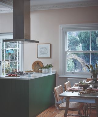
Matte paints have always been a very stylish choice, however they are rarely the most practical choice since they are prone to scuffs. However in 2024 there are plenty of new paint technologies to mean matte just got more practical.
'Matte paint finishes, once avoided in high-traffic areas due to concerns over durability, can now be confidently applied in almost any space. Innovative products like Scuff X by Benjamin Moore demonstrate this advancement,' explains designer Kati Curtis. 'We've recently used this paint throughout our entire new office, including on kitchen cabinets and in bathrooms, finding it incredibly resilient against the wear and tear of daily use. This marks a significant shift in material application, allowing for a broader expression of design without sacrificing practicality.'
8. Soft brown shades
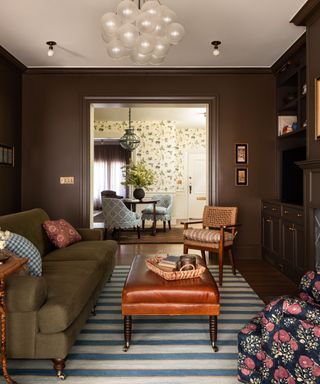
'We’re continuing to see consumers opting for shades with an inherent warmth. The embracing of decorating with brown is a continuation of the trend we have seen in recent years, shifting away from cooler grey interiors to a warmer palette of natural hues that deliver comforting, soothing schemes,' explains Ruth Mottershead, Creative Director of Little Greene.
'The earthy yet refined nature of brown shades makes them the perfect backdrop to the natural materials currently being incorporated in contemporary interiors, including wicker, rattan, warm woods and stone finishes. Gone are the associations of dated 1970s interiors, drab or dull spaces, browns are re-taking their rightful place in contemporary interiors,' she adds.
This room designed by Heidi Caillier uses one of the best brown paints – Farrow & Ball's Salon Drab. It's rich and warm and pairs well with both warm and cool schemes.
9. New approaches to color drenching
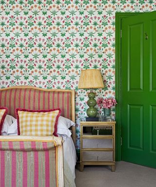
Color drenching has been on trend for years and the shades being used just keep getting bolder and bolder. For 2024, designers are predicting that paint will take the backseat slightly and instead be used as a pop of color combined with walls and ceilings filled with pattern.
As Ruth explains, 'Rather than a single color trend, we feel 2024 will see a reinterpretation of the Color Drenching trend. This contemporary, cohesive approach delivers high impact by painting woodwork, radiators, ceilings, and doors in the same color as the walls, we feel this will be adopted in wallpapers too with tonal designs being paired with coordinating woodwork and skirting. It’s always fantastic to see trends that banish the habitual white skirting and doors and embrace color and pattern!'
10. Closely consider shades and tones
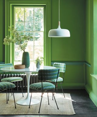
'Carefully curated color pairings are key to unlocking the potential in our homes,' explains Helen Shaw of Benjamin Moore. 'They simultaneously lift a space by adding energy to a scheme, whilst changing the relationship between spaces depending on where you apply the finishes. From framing furniture through to adding depth, the relationship between the shades you choose is crucial.'
'Subtle monochromatic schemes are the most accessible and use shades of the same color to add slight contrast. Analogous schemes, which employ adjacent tones on the color wheel offer a more adventurous take, whilst complementary tones taken from opposite sides of the wheel always deliver drama whilst maintaining a sense of harmony.'
11. Clay tones
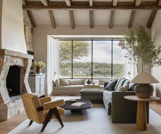
2024 is clearly all about earthy, muddied tones and clay-like shades are a very accessible way to lean into this paint trend. Plaster pinks, pale beiges, and really soft brown-tone grays are all very liveable and create soft, calming rooms as this space designed by Marie Flanigan proves.
'Many of us are drawn to clay tones, however, we also want to make our homes feel as bright and spacious as possible,' explains Patrick O'Donnell, color expert at Farrow & Ball. 'Using a lighter tone like Oxford Stone on the walls and the much stronger Tanner’s Brown on the trim instantly makes the walls feel lighter and the room feel bigger.'
'The warm tones of Jitney and Stirabout create an earthy, reassuring atmosphere. When used together, they create a harmonious space that’s easy on the eyes. The subtle balance of Jitney on the walls and lighter Stirabout on the panels, ceiling, and trim, resulting in a beguiling room with an ethereal quality – a wonderful, warm scheme for those who prefer neutral spaces.'
12. The fifth wall
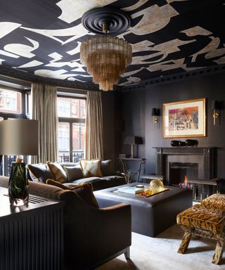
'There is a paint trend for a statement ceiling – painting the ceiling in a color related to the wall that isn’t white can create real impact,' explains Ruth. 'There are a number of ways to treat the ceiling – painting a ceiling the same color as the walls to achieve a complete, all-encompassed look is certainly becoming more popular. However, if a property has architecture and interest (such as dado rails and cornicing) then I would certainly consider painting the ceiling a different color, a shade to complement the walls and draw attention to the ceiling.'
Not only does this dark living room designed by Naomi Astley Clarke make a case for taking a black paint over every surface, it also demonstrates how a feature ceiling feels for more on trend for 2024 than an accent wall. It's unexpected, yet doesn't feel too 'trendy', pick the right palette and it's a trend-led yet timeless look.
13. Restful greens
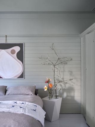
The natural world will always be one of the most favored and enduring influences for interior trends and the world of design.
Synonymous with nature, green is an incredibly soothing and versatile color. Working beautifully with other earthy colors and natural materials, it can also be paired with uplifting brights such as pink and purple, with green room ideas one of the most popular choices for the home.
‘This is a wonderful color that works well all through the year and is ideal if you are trying to bring an element of nature or a heritage feel into a more contemporary city home,' says Emma Sims-Hilditch, founder and creative director, Sims Hilditch. 'It’s a restful and calming shade which not only works well on cabinetry but also looks great on walls.’
What's more, green is generally considered the best color for a bedroom by paint experts for a calming, sleepy scheme.
14. Mixing and matching unexpected paint colors
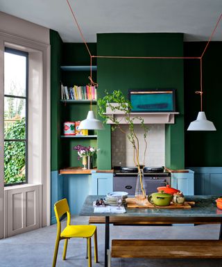
Andy Greenall from Paint & Paper Library says, 'Both consumers and designers are turning to color combinations that add drama and intrigue to a space, from neutrals in graduating shades which flow between rooms, to more dramatic color pairings.'
A great option to explore for colorful room ideas, embracing more unique color pairings and color combinations can make for a more eclectic and individual look, rich with colorful visual interest – make sure to look to the color wheel to find further guidance on choosing the right colors for your home.
Who says blue and green must never be seen? This modern kitchen has been painted in Farrow & Ball's Beverly green and Kittiwake blue. The two shades establish a playful, stylish contrast, and lift this functional and practical area of the home with a fun and lively feel.
There's something for everyone in the paint trends of 2024, from calming earthy neutrals and deep rich browns, to unusual analogous color schemes and new approaches to color drenching. The thing about paint is, in most instances, it's easy to experiment with and you can have fun with color without needing to invest a lot or do any large overhauls. Paint is one of the best ways to dabble in new trends.
I am the Head of Interiors at Homes & Gardens. I started off in the world of journalism in fashion and luxury travel and then landed my first interiors role at Real Homes and have been in the world of interior design ever since. Prior to my role at H&G I was the digital editor at Livingetc, from which I took a sabbatical to travel in my self-converted van (not as glamorous as decorating a home, but very satisfying). A year later, and with lots of technical DIY lessons learned I am back to writing and editing, sometimes even from the comfort of my home on wheels.
- Zara StaceyManaging Editor
-
 This designer just revealed how she makes new stone flooring look original – it's all about the layout
Create an authentic scheme with this tried-and-tested floor layout
By Molly Malsom Published
-
 How to make a kitchen look organized, even when it's not – 5 quick tricks to create the illusion of order
If you don’t have time to fully declutter and organize, these quick patch-job tricks could be perfect
By Chiana Dickson Published