Design house: A small, cosy home in New England, designed by Tyler Karu Design
Step inside a bright, compact home with plenty of personality.

Tyler Karu Design + Interiors works with both residential and commercial clients to create their ideal living space through renovation, reimagination and innovative design. Her New England home is the perfect example of how to use a small space more efficiently.
'What drew me to the home initially was the location,' says Tyler Karu. 'At the end of the street is a causeway to a small island for pedestrian traffic only. It’s one of the most beautiful, peaceful spots on Maine and to be able to walk there daily was very appealing.'

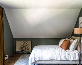
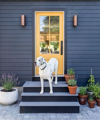
'The house itself was very simple architecturally. I opted to work with the simplicity taking the entire exterior black (save for yellow doors and red house numbers) and opening the interior as much as possible,' explains Tyler. 'The first floor has an open floor plan that makes the small size feel functional and spacious. We got more square footage out of the second floor by removing the roof and adding a dormer. We ended up with a large master bedroom, a sizeable guest room and home office.
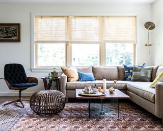
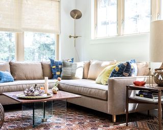
LIVING ROOM
'I wanted the living room to have a warm, inviting vibe,' recalls Tyler. 'Everything in the room is collected and well-thought-out. I did purchase the sofa specifically for the home because the scale had to be perfect. There’s plenty of seating but its not very deep of very high ensuring it doesn’t overwhelm the room.'
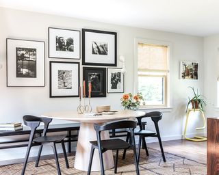
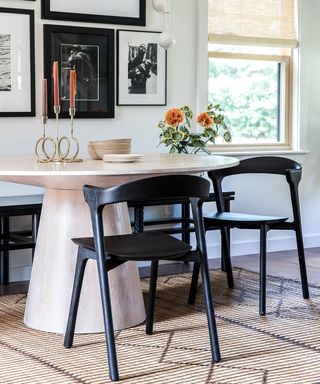
DINING ROOM
'In every home I have lived in I designate a wall for my great uncle Leon Levinstein’s photography,' says Tyler. 'His work is so striking and emotive and I was excited to make it the backdrop for the dining room. I situated a long bench against the wall to move the table out of the middle of the room to make the space feel larger. I kept the palette very neutral to allow the gallery wall to remain the focal point.'
SeeDesign house: A small, space-saving house in New York, designed by Corine Maggio
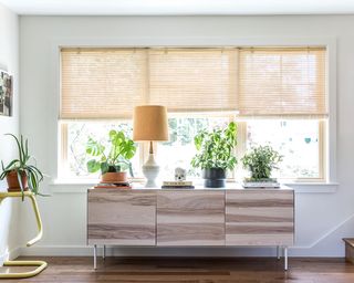
HALLWAY
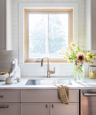
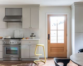
KITCHEN
SeeDesign house: Small, elegant home with smart storage, designed by Heidi Caillier
Sign up to the Homes & Gardens newsletter
Design expertise in your inbox – from inspiring decorating ideas and beautiful celebrity homes to practical gardening advice and shopping round-ups.
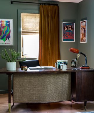
HOME OFFICE
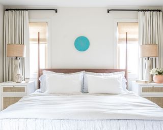
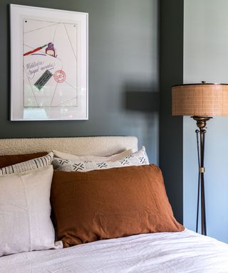
MAIN BEDROOM
'My firm has a custom furniture line that we have developed for our clients – this bed is now a part of the collection. Even though the room is small, it doesn’t overwhelm the space. It adds an element of sculpture, and complements the high ceilings.
I like having a bright, sun-filled master bedroom rather than a moody space, so we worked with a mix of natural materials rather than layer colour to create a comfortable vibe.'
BATHROOM
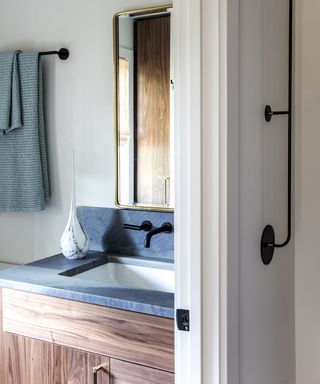
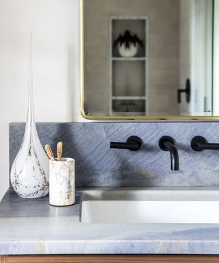
'The master bathroom is all about smart storage and maximising space. I designed a vanity that suited our storage needs and while our shower is small in square footage, I chose beautiful Waterworks tile to make it feel more luxurious despite its size.'
LOFT BEDROOM
EXTERIOR
Photography/ Erin Little
Interior design/ Tyler Karu Design + Interiors

Jennifer is the Digital Editor at Homes & Gardens. Having worked in the interiors industry for several years in both the US and UK, spanning many publications, she now hones her digital prowess on the 'best interiors website' in the world. Multi-skilled, Jennifer has worked in PR and marketing and occasionally dabbles in the social media, commercial, and the e-commerce space. Over the years, she has written about every area of the home, from compiling houses designed by some of the best interior designers in the world to sourcing celebrity homes, reviewing appliances, and even writing a few news stories or two.
-
 Amber Lewis just launched her new collection with Loloi rugs – and each design 'blurs the line between vintage and new'
The Molly Collection is made up of 9 vintage-inspired rugs that Amber has designed in collaboration with renowned brand Loloi
By Eleanor Richardson Published
-
 Have you refreshed your mantel for spring yet? These 9 spring garlands are sure to add some new season joy to your home
Swap out winter decor for a fresh, floral touch with these spring garlands for your mantel
By Charlotte Olby Published