Design house: Small, elegant home with smart storage, designed by Heidi Caillier

Design expertise in your inbox – from inspiring decorating ideas and beautiful celebrity homes to practical gardening advice and shopping round-ups.
You are now subscribed
Your newsletter sign-up was successful
Want to add more newsletters?
Originally built in 1916, this small home in Phinney Ridge, Seattle is delightfully charming.
The owner wanted to keep as much as the original character intact. ‘All of the original millwork has been left untouched and we knew it was a detail we needed to work with rather than against,’ explains interior designer Heidi Caillier.
‘The client initially brought us onboard to just refresh their living room, dining room and hall but, after our initial visit, we expanded our thought process to the kitchen and adjacent living space.
Article continues belowSee ourDesign house: A small, space-saving house in Los Angeles, designed by Stefani Stein
KITCHEN
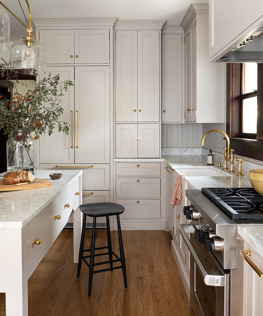
‘We gutted the kitchen and opened up the living room to an enclosed exterior porch to make it a bit larger and createa nook,’ says Heidi. ‘The kitchen is small so we aimed to create a space that felt appropriate to the style and size of the house.’
The old layout had was awkward and not at all practical. ‘It had a range cooker on a peninsula and a tight dining area by the windows,’ recalls Heidi.
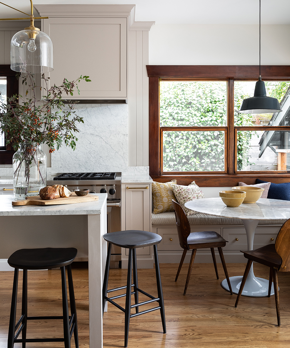
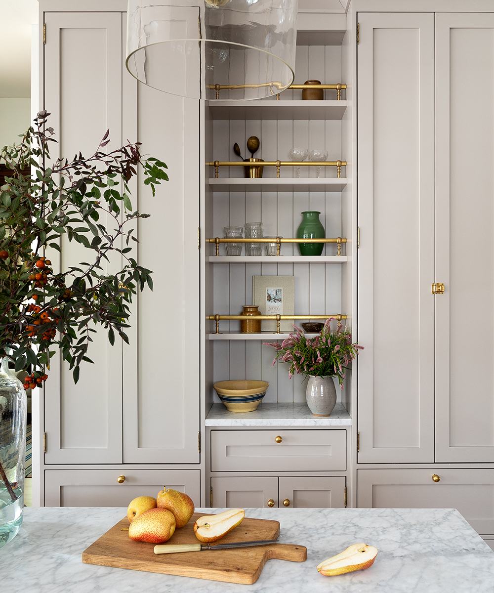
In a kitchen this small, everything inch matters in terms of functionality. ‘The layout was fairly tricky, and I knew I wanted to get an island in the space, but it had to feel open and not cramped.’
Design expertise in your inbox – from inspiring decorating ideas and beautiful celebrity homes to practical gardening advice and shopping round-ups.
DINING ROOM
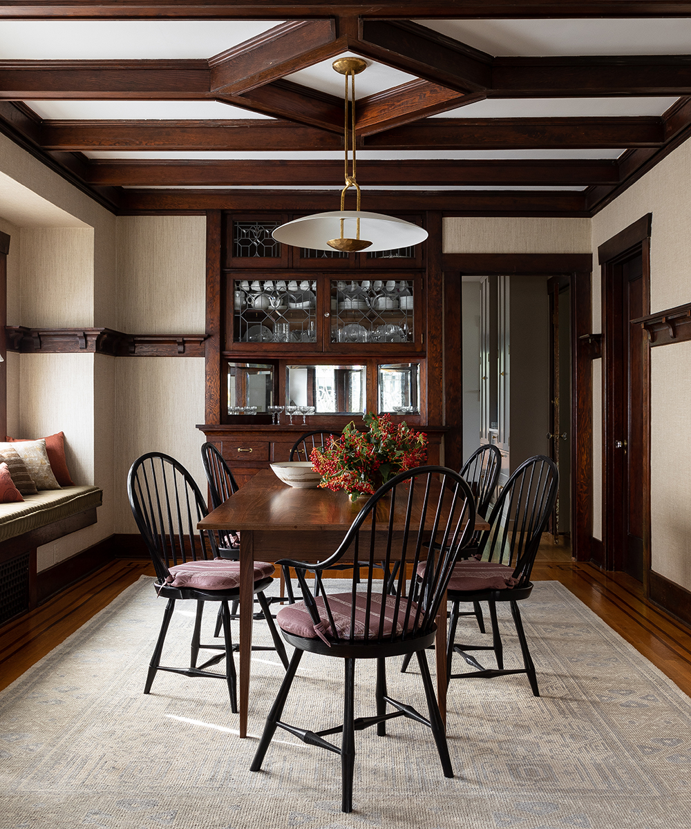
‘We had to work with the existing woodwork in the dining room, so my idea was to find ways to brighten and richen the space without taking away from the history of the property,’ says Heidi. ‘The linen wall covering is the perfect foil to the woodwork.’
‘We’ve used simple, well-made pieces from our favourite furniture makers. It needed some warmth to pull the scheme together, so we added plum cushions on the dining chairs.’ The modern light fixture makes the space feel unpredictable and exciting.
LIVING ROOM
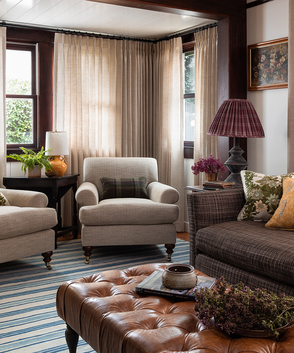
Has the living room is on the same level, I wanted the same to feel warm and cosy. ‘The addition of a waiting area created a perfect nook for two armchairs.’
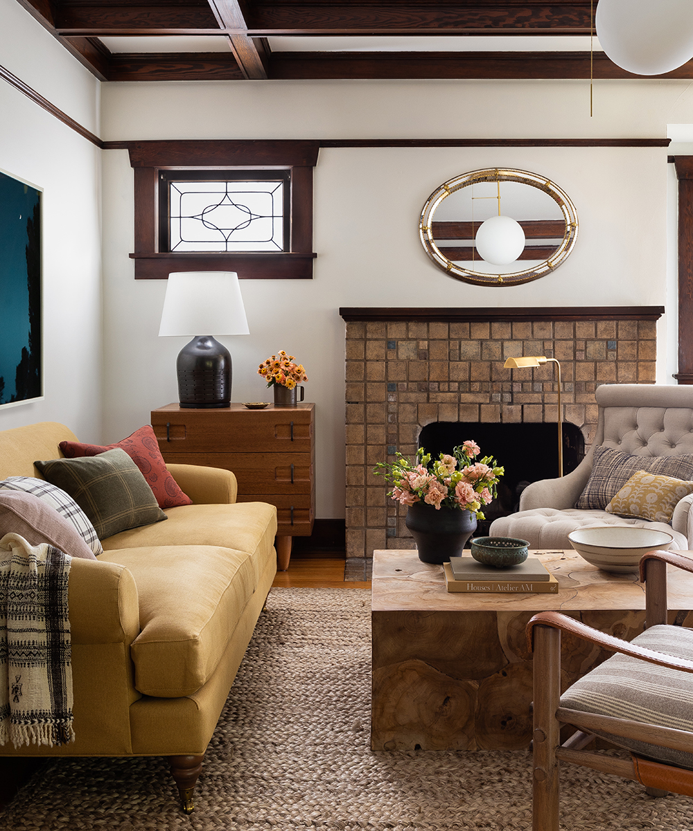
LIVING ROOM
‘We originally propers the green floral you see on the pillows as the sofa fabric but the client was worries that her sons wouldn’t be so keen, so we introduced it in a smaller dose,’ says Heidi.
‘The lines of the furnishings feel both contemporary and classic, which the owner loved. We designed the rug and had it custom-made – it really brightens up the room.’ This is a space you could relax in for hours.
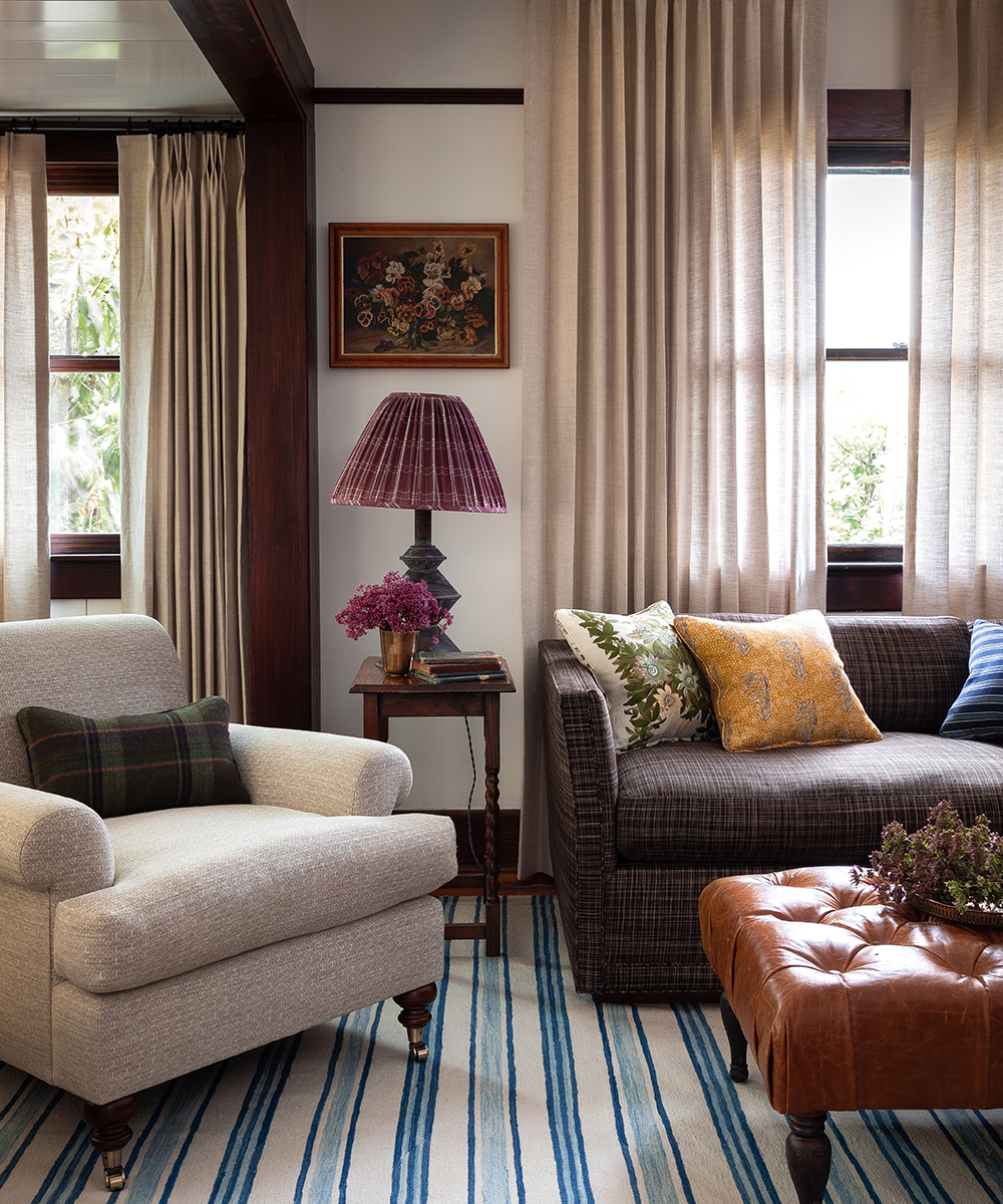
‘We painted everything in the front in Benjamin Moore Simply White to brighten and contrast with the woodwork,’ says Heidi.
Photography/ Haris Kenjar

Jennifer is the Digital Editor at Homes & Gardens, bringing years of interiors experience across the US and UK. She has worked with leading publications, blending expertise in PR, marketing, social media, commercial strategy, and e-commerce. Jennifer has covered every corner of the home – curating projects from top interior designers, sourcing celebrity properties, reviewing appliances, and delivering timely news. Now, she channels her digital skills into shaping the world’s leading interiors website.