The three golden rules for pairing colors – interiors expert Geraldine Tan shares her secrets
The founder of award-winning interiors blog Little Big Bell shares her rules for pairing colors and making unlikely combinations work
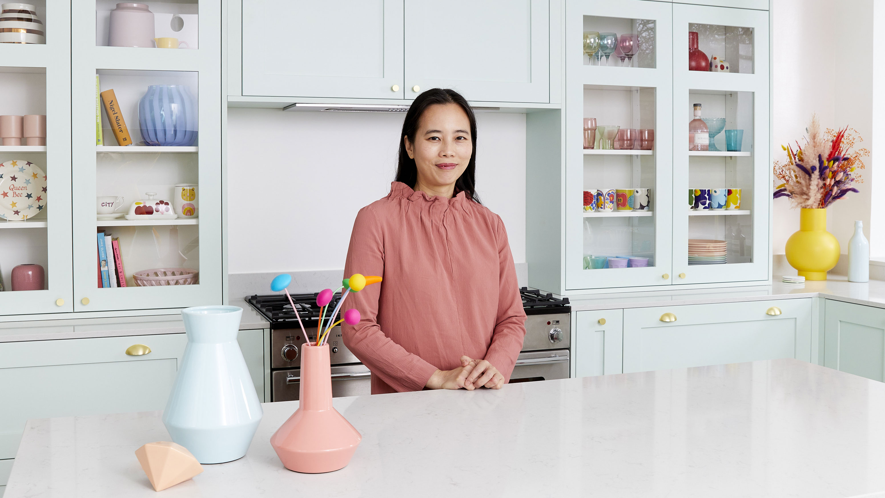

When it comes to being bold with color there are few who know how to get it right more than Geraldine Tan, creator of the award-winning interiors blog Little Big Bell. The interiors expert has shared her golden rules for pairing colors together, including her tips to avoid color clashing and achieving a crisp coherent finish.
See: Paint trends 2021 – the 17 colors you need for the ultimate wonder walls
As a medical consultant working in A&E during the day, Geraldine has honed her design skills as a stylist, founder of the award-winning blog Little Big Bell, and an Instagram content creator to become an established part of the interior design community. She has been invited to judge twice at Paris' Maison et Objet fair and was also one of the five founding contributors for Instagram’s @design account.
Geraldine Tan's golden rules for pairing colors
If you are a fan of color – but want to push your interiors that step further with bold pairings – Geraldine has shared her three secrets to elevate your home.
1. There is no such thing as clashing colors
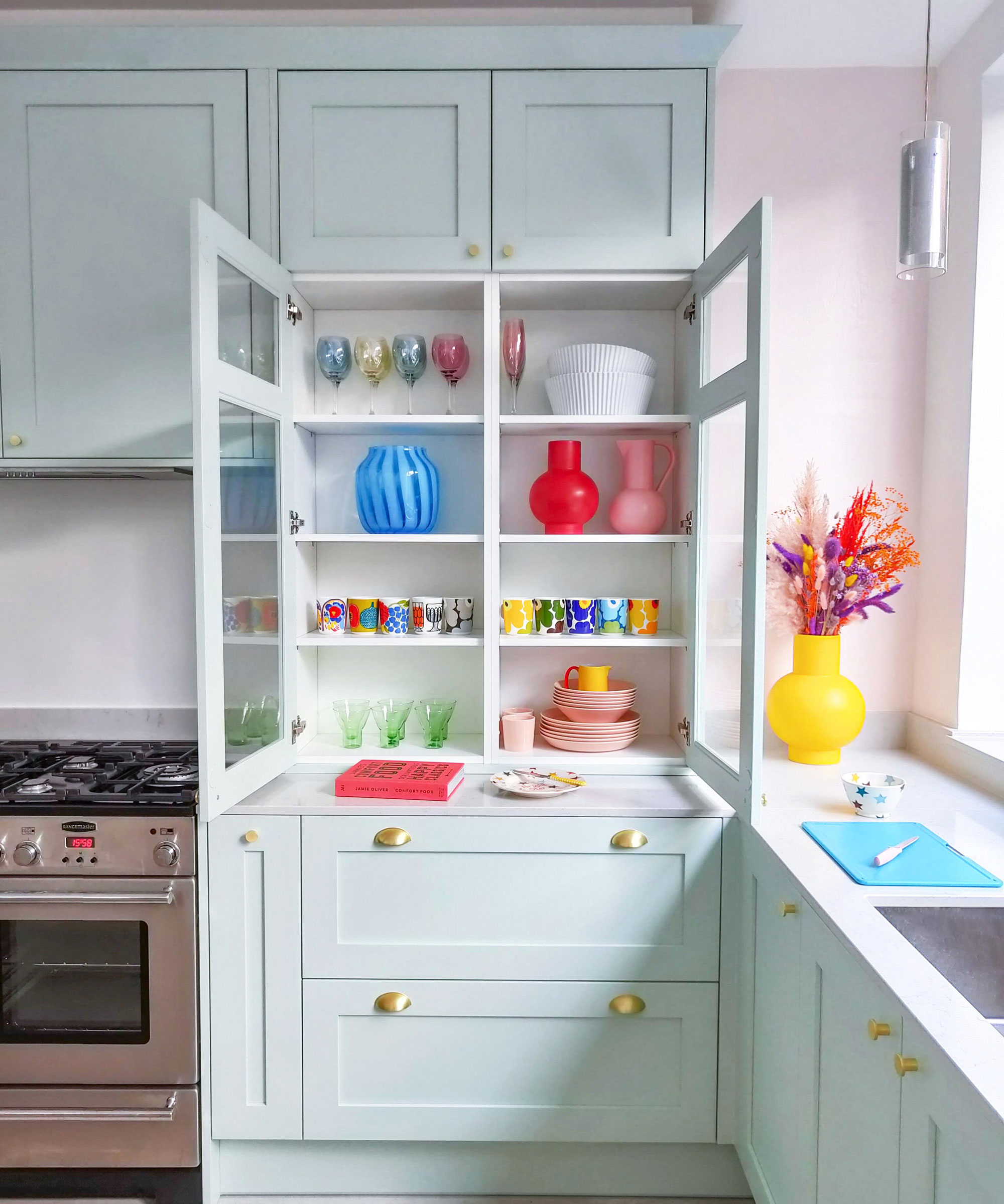
It might come as a surprise to many who subscribe to the color wheel method for pairing colors, but according to Geraldine, there is no such thing as clashing. The interiors expert believes that any color pairing can work in a space, it is all a matter of the amount of color you use and intensity.
'I firmly believe that there isn't a color clash, it is just the amount of color that you use,' explains Geraldine.
'What you might see as a color clash can actually go together if you use them in different quantities. Also if the intensity of a color is very far apart, so really light pastel hues and then a super dark color, it might look too much together in huge quantities but if it is separated by neutral tones I think you can still use it.'
Sign up to the Homes & Gardens newsletter
Design expertise in your inbox – from inspiring decorating ideas and beautiful celebrity homes to practical gardening advice and shopping round-ups.
2. Divide the room into three sections

Image shot on OPPO Find X3 Neo
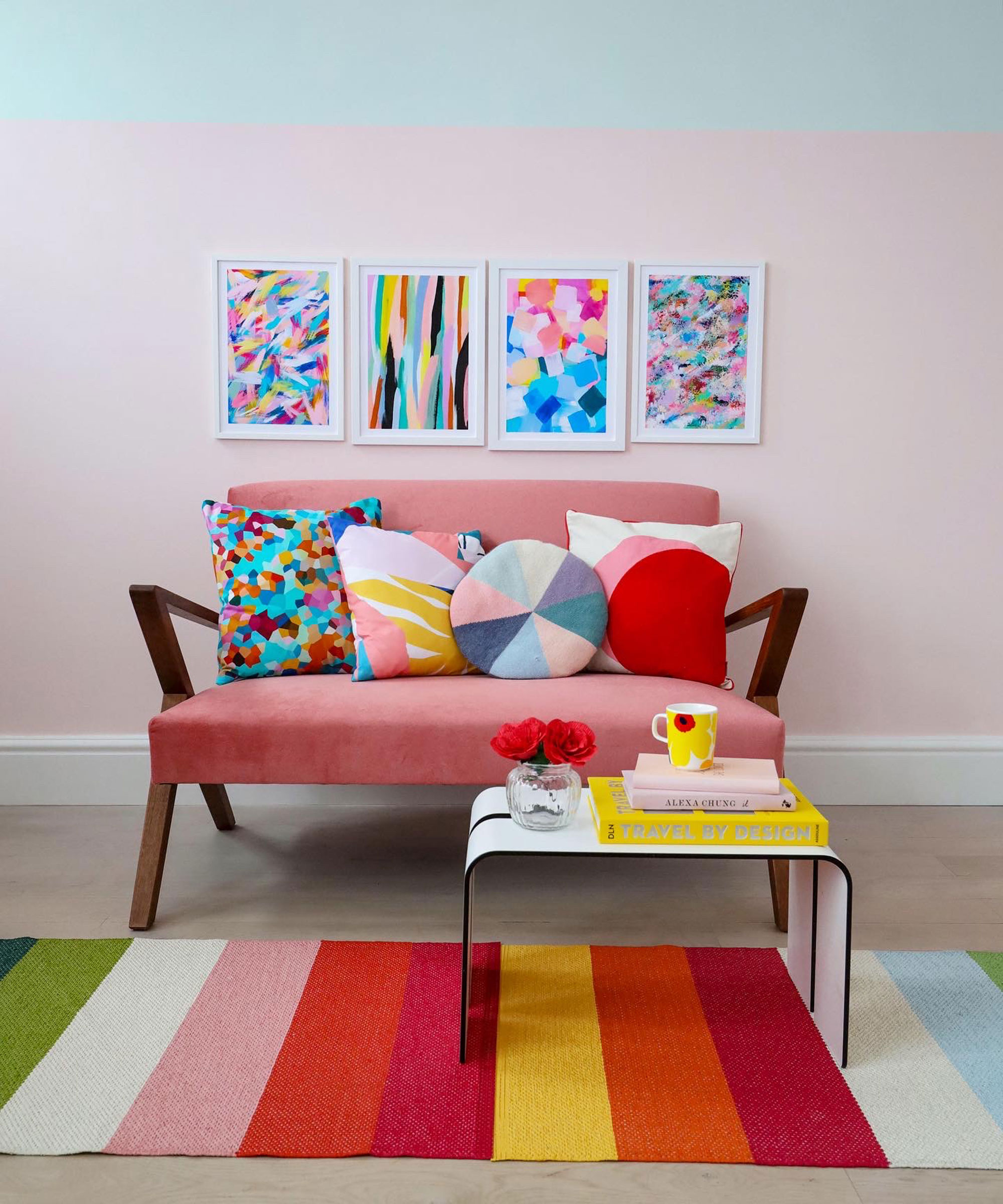
While many people like to think about the 60-30-10 rule when using color in their home, Geraldine has a more flexible tip for creating a coherent scheme. She recommends thinking about the room through a lens and considering the background, midground, and foreground of a room.
'If you want to use a color in the background in some art prints, say you have a blue wall and some art prints that have some cherries on it and lemon. Then you have a sofa that is pink. To make that area look uniform perhaps you add a cushion that will complement the color of the cherries, maybe have a throw which has yellow lines in it,' she explains.
'In the foreground, it might be like a rug which may have sort of speckles of this color on it. If you have these colors in the foreground, midground, and background, there is no such thing as color clash. Your eyes will look top-down and it will create this coherent and aesthetically pleasing image.'
3. Incorporate neutral elements
Part of Geraldine's success with using bold and creative color pairings is her use of neutrals too. A colorful space doesn't need to go overboard with every inch of the room painted and dyed.
Geraldine suggests incorporating neutral elements to really make the colorful elements of a room stand out and look crisp. 'Having white or another neutral I think is very important when you decorate with color,' she explains.
'I think if you go overboard with colors on your wall on your doors then your sofa, it feels like too much and cluttered.'
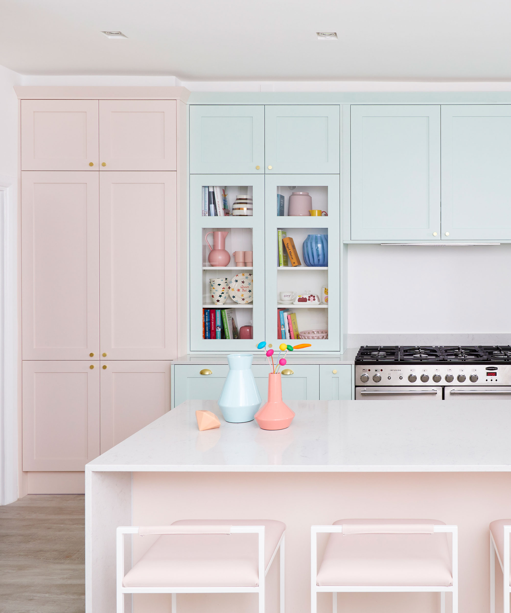
Howdens 'Chilcomb Kitchen'
See: Living room color schemes – the best color ideas for living spaces
Geraldine is currently a member of the OPPO Color Counsel, which has been created the celebrate the launch of the OPPO Find X3 series. It is the world's first smartphone to display and capture a billion colors, perfect for showing off bold color pairings on Instagram.
The OPPO Color Counsel will also be available for free consultations for anyone wanting to add a little more color to their lives.

Rebecca has been working as a homes and interiors journalist for over four years. She first discovered her love of interiors while interning at Harper's Bazaar and Town & Country during my Masters in Magazine Journalism at City, University of London. After graduating she started out as a feature writer for Women's Weekly magazines, before shifting over to online journalism and joining the Ideal Home digital team covering news and features. She is passionate about shopping for well-crafted home decor and sourcing second-hand antique furniture where possible.
-
 Plants never to grow next to fruit trees
Expert advice on which plants to keep away from fruit trees to encourage a healthy harvest
By Jacky Parker Published
-
 Martha Stewart's tips for arranging daffodils are unbelievably simple and effective – it's the only flower advice you need this springtime
Martha shows us that we can create gorgeous bouquets of this seasonal flower by simply trimming the stems and placing them in specific vases
By Hannah Ziegler Published