Rule of three – 10 ways interior designers use this magic number in their schemes
The key to great groupings, with inspiration from the experts


To make an impact with a decorative display, the magic number is definitely three. Grouping three objects is a technique the top interior designers employ frequently to make the items they collect together a feature worth attention.
Why does this odd number have the winning edge over the classical, symmetrical pairing? While this can look fabulous, the power of a group of three is that it’s visually appealing – in other words it’s an eye-catcher.
Read on to see how the best designers employ this strategy to brilliant effect (and why other odd numbers can do a great job, too.)
See: Interior design tips – decorating secrets for the world's top experts
1. Make it shapely
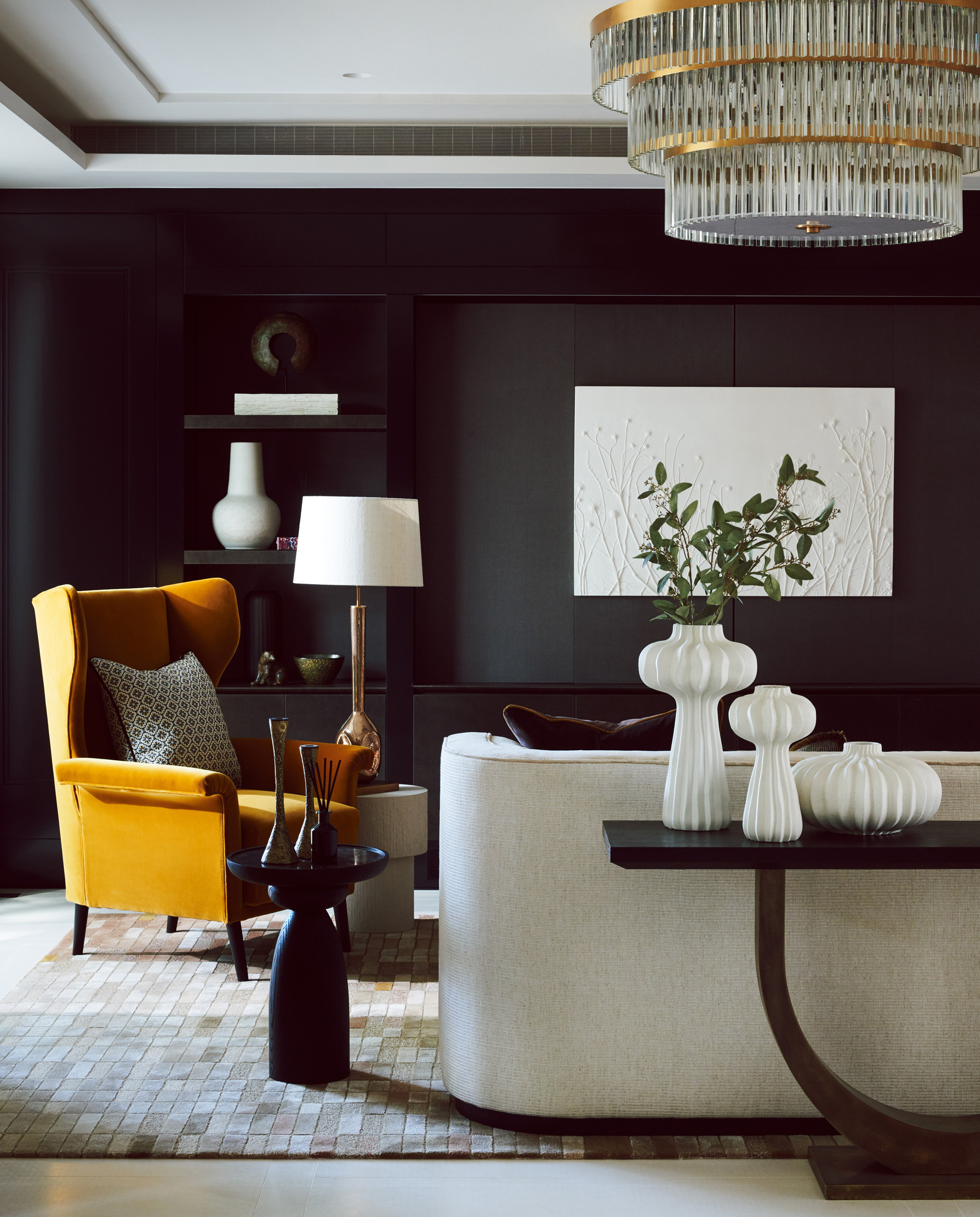
Curvaceous vases make an appealing focal point in this living room design from Charu Gandhi of Elicyon (London, UK), a Kensington-based design studio creating interior couture for discerning clients around the world.
The pyramidal arrangement leads the eye around the group of three – and it’s a shape that’s frequently employed by designers exploiting the power of three.
The side table also features a group of three with slim silhouettes and darker tones creating attractive contrast with the vases.
Sign up to the Homes & Gardens newsletter
Design expertise in your inbox – from inspiring decorating ideas and beautiful celebrity homes to practical gardening advice and shopping round-ups.
From Andrew Martin Interior Designer Review Vol.24, £45.
2. Pile up cushions
A post shared by Beata Heuman (@beataheuman)
A photo posted by on
UK-based interior designer Beata Heuman has made this sofa look extra inviting with three cushions propped against the bolster at one end. Rather than pattern and color popping against a plain backdrop, this time the effect is reversed with the plain white finish of the group standing out against the colorful hues and mixed motifs behind them.
3. Try it with artwork
A post shared by Kit Kemp’s Design Thread (@kitkempdesignthread)
A photo posted by on
Creative director and co-owner of Firmdale Hotels Kit Kemp multiplied the magic number and used three groups of three to make a display from a series of prints. The result is as impactful as a large-scale work of art with the images closely associated so the whole reads as one. The folk-inspired images are available as part of her Kit Kemp at Bergdorf Goodman collection.
4. Decorate a tabletop
A post shared by SOPHIE PATERSON (@sophiepatersoninteriors)
A photo posted by on
For a sophisticated take on creating a group of three, follow the lead of UK interior designer Sophie Paterson. Aligned in the centre of the table these vases have a more formal effect than a triangular and more closely grouped display would. But the organic shape of the foliage softens the look and helps attract the gaze.
5. Bring it to a bedside
A post shared by Gunter & Co Interiors (@gunterandco)
A photo posted by on
While the exquisite table lamp is undoubtedly the star of the show on this bedside table, it’s still part of a group of three objects along with the beautiful glass and a book in this bedroom from London-based interior designers Gunter & Co.
6. Dress up a reading area
A post shared by Marika Meyer (@marikameyerinc)
A photo posted by on
Interior designer Marika Meyer has added the finishing touches to this oh-so enviable home library with a display on the side table that follows the classic pyramid shape to draw the eye to each of the elements in the display. And what better than a just laid down volume for the lowest item of the three on show?
7. Beautify a dining area
A post shared by Joyce Downing Pickens (@jdpinteriors)
A photo posted by on
Three simple white pieces dress the table of the dining space in a project by LA-based JDP Interiors. Height is provided by the slim vase with foliage repeating the color of the inviting banquette. The seating was inspired by a custom sofa by Arthur Elrod from the 1960s.
8. Highlight pattern
A post shared by S A L V E S E N G R A H A M (@salvesengraham)
A photo posted by on
London-based design studio Salvesen Graham decorated the walls of this California home with a group of three patterned plates. They’re hung low allowing the patterns and color to fall into eye line and to create a link between the display and the cabinet on one side and the chair on the other. The hues of the furniture and soft furnishings and the wall display echo one another, too.
9. Play with scale
A post shared by Kelly Hoppen CBE (@kellyhoppen)
A photo posted by on
In this living space London-based interior designer Kelly Hoppen has made use of groupings of three at different scales. The row of amazing pendant lights have a soft shape that contrasts with the angular forms of the seating. On a smaller scale is the combination of vases and a candle on the side table that employs a pyramid shape to draw attention to all the items.
10. Contrast with a pair
A post shared by JEFF ANDREWS / DESIGN (@jeffandrewsdsgn)
A photo posted by on
In this grand hallway from LA based Jeff Andrews a group of three sculptural vases is set against a classic pairing in the form of statues. It’s a strategy that makes the space less formal than one where symmetry is to the fore.
It’s easy to replicate the technique on a smaller scale on walls shelves or in cubbies, combining pairs of objects against threes – or even larger groups of odd numbers if the items are small scale – to bring dynamism to the display.

Sarah is a freelance journalist and editor. Previously executive editor of Ideal Home, she’s specialized in interiors, property and gardens for over 20 years, and covers interior design, house design, gardens, and cleaning and organizing a home for Homes & Gardens. She’s written for websites, including Houzz, Channel 4’s flagship website, 4Homes, and Future’s T3; national newspapers, including The Guardian; and magazines including Future’s Country Homes & Interiors, Homebuilding & Renovating, Period Living, and Style at Home, as well as House Beautiful, Good Homes, Grand Designs, Homes & Antiques, LandLove and The English Home among others. It’s no big surprise that she likes to put what she writes about into practice, and is a serial house renovator.
-
 5 surprising but brilliant ways to clean with old socks – from perfectly buffing stainless steel to deterring pests naturally and more
Tackle dust in tricky corners, clean your mirrors and even banish bad odors with those rogue single socks
By Andy van Terheyden Published
-
 How to grow astilbe – expert advice on cultivating this shade-tolerant flowering perennial
Shade-tolerant and pest-resistant - astilbe are hardy and tough perennials that can thrive in many settings
By Ellen Wells Published