
Color masters Pantone recently has announced Veri Peri as their Color of the Year 2022. The ‘periwinkle blue hue’ with vivid red undertones has since become the most talked-about shade of the season – and it’s not going anywhere fast.
Pantone’s Executive Director, Leatrice Eiseman, praised the shade for its trustworthiness and ability to provoke a ‘novel perspective’ in the year ahead – but what does this mean for our decorating ideas?
Naturally, this color trend-setter is set to make waves in all rooms – from a statement wall to a piece of accent furniture. However, while the shade has approval in the interior world, we asked, how will this affect your space psychologically? And what tone will the shade set for all who pass through your home?
The psychological meaning behind Pantone’s Color of the Year 2022

According to Psychologist and Wellbeing Consultant Lee Chambers, the therapeutic blues of Veri Peri provides stability after a ‘turbulent year’ – as it offers a ‘feeling of calming confidence that we have a reliable platform to build upon.’
Behind the scenes, the violet undertones bring a level of energy and reinvigoration that give us permission to start stepping out and expressing ourselves again, unrestricted and unbound,’ Lee says.
The Psychologist adds that Pantone’s paint idea offers a sense of warmth whilst ‘conveying a subtle optimism and a vision for the future of finding solutions’ – so naturally, we’re racing to bring the hue into our homes.

‘More than ever, Very Peri represents an agile and flexible world where even the coolest of colors needs to bring some heat as the boundaries are blurred, and individuals step out to create their optimal ways of living,’ he adds.
Plus, color consultant and therapist Suzy Chiazzari emphasizes Lee’s suggestion that Pantone’s announcement ‘reflects the changing times we are living through’ – and so is an apt addition to your decorating ideas for 2022.
‘Indigo is linked to our higher mind and intuition, and violet is a powerful color that taps into our creative spirit,’ she adds.

Has psychology changed the way you see Pantone’s Color of the Year 2022? If anything, we think we love it that little bit more...

-
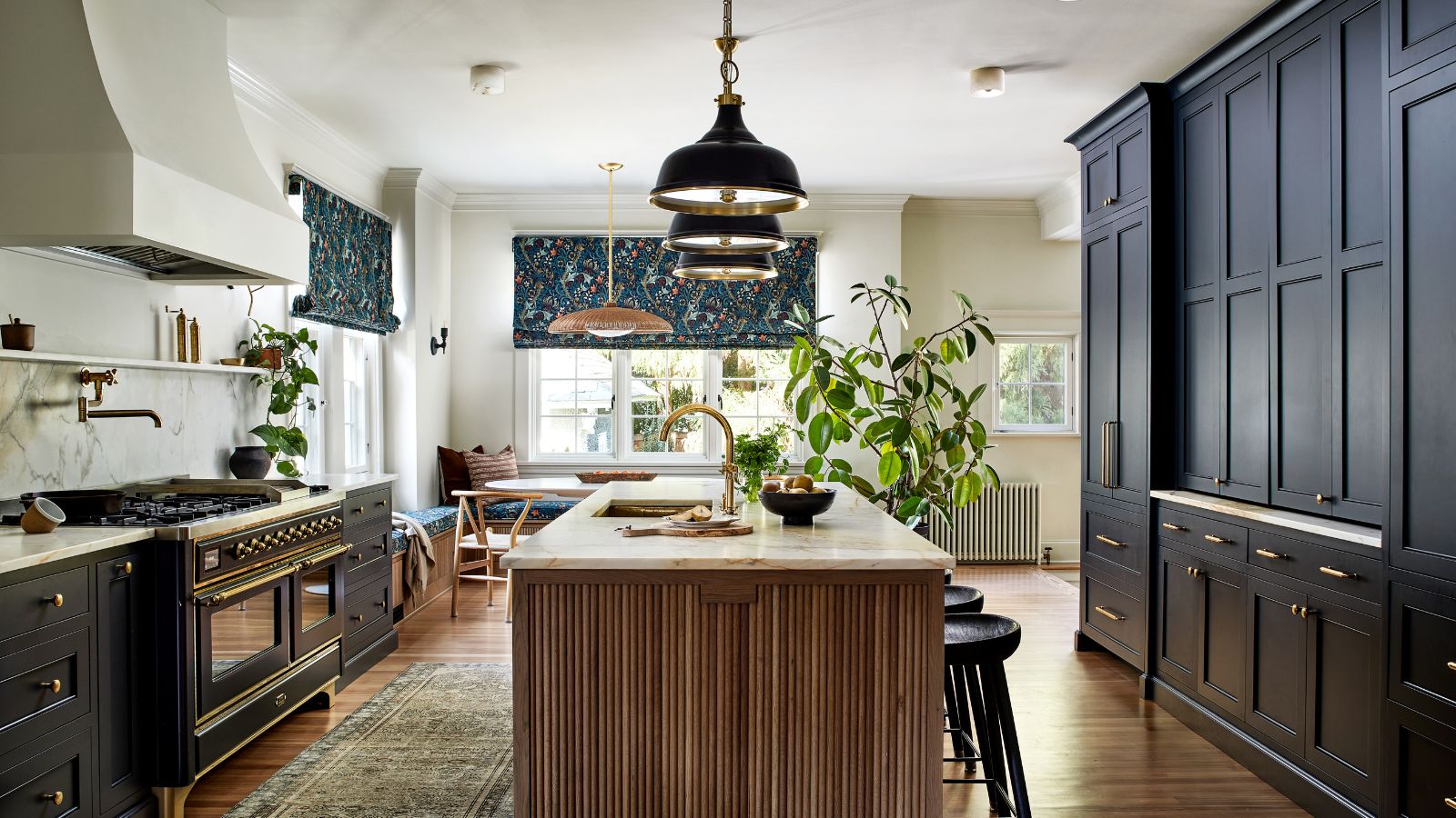 This once-dated kitchen is now a timeless space with the coziest details – and its the classic color palette that's made it a chic, welcoming space
Warming colors and natural materials combine to create this enduringly classic kitchen scheme
-
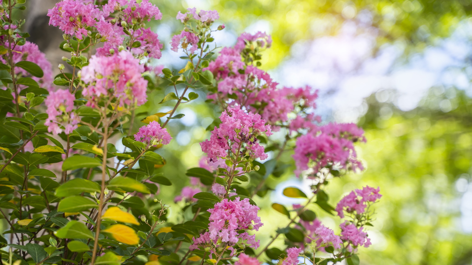 How to grow crepe myrtle in pots – and transform even the smallest of yards with dazzling flowers this summer
Growing crepe myrtles in pots will inject splashes of brilliant color into your outside space

