The biggest paint trends of 2025 – 17 stylish ways to decorate with paint, according to designers
Explore the latest interior paint trends for 2025, from paint finishes to trending colors
- 1. Brown paints
- 2. Limewash walls
- 3. Color drenching
- 4. Matte finishes
- 5. Matching paint colors to wallpaper
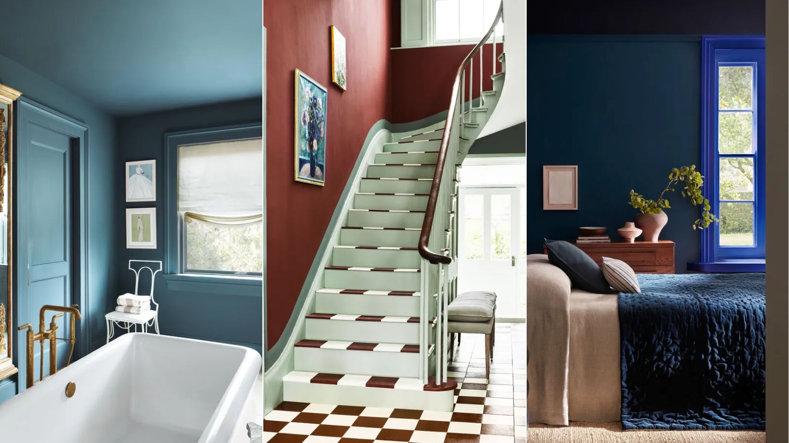
- 6. Saturated colors
- 7. Painted staircases
- 8. Rich shades of purple
- 9. Contrasting paint finishes
- 10. Painting woodwork a contrasting color
- 11. Deep reds and terracotta tones
- 12. Darker stains for wood
- 13. Caramels that verge on yellow
- 14. Closely considered shades and tones
- 15. Clay tones
- 16. The fifth wall
- 17. Mixing and matching unexpected paint colors

Paint trends are constantly evolving, offering a whole host of creative ways to elevate our homes, from the latest paint finishes to trending colors.
The beauty of decorating with paint is that it's generally less commitment than other design choices. If you paint the walls and later regret it, it's a (fairly) easy fix compared to changing the style of your kitchen, for example.
For 2025, interior designers are championing lots of stylish paint ideas to suit many decorating styles, whether that's dramatic maximalism or modern and minimalist. Read on to learn the top paint trends for 2025, going hand-in-hand with the latest interior design trends, as explained by interior designers.
Paint trends for 2025 – 17 stylish ideas
We've teamed up with a host of color experts and interior designers to bring you exciting paint trends in the year ahead. Get your paintbrushes at the ready…
1. Brown paints
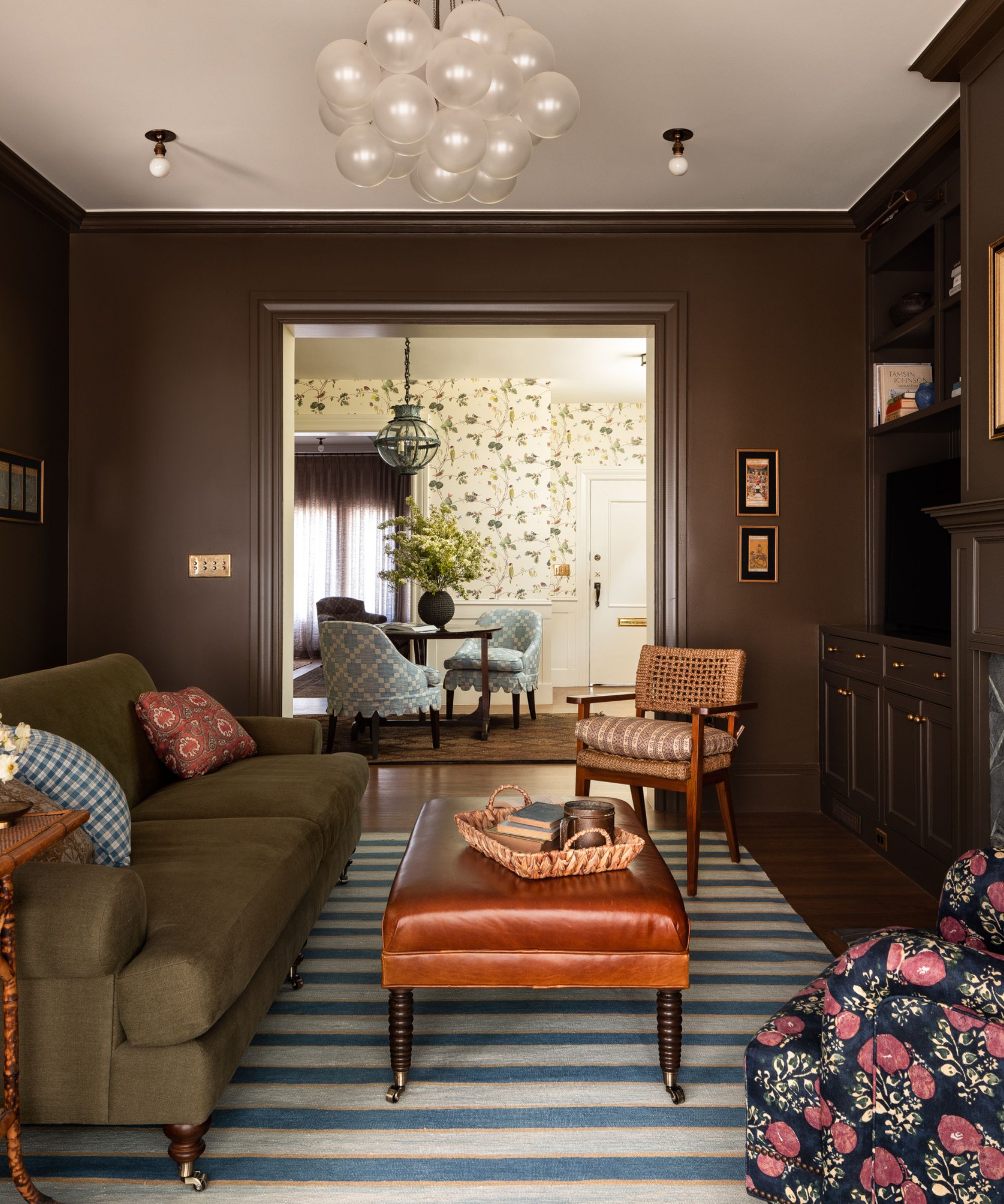
Decorating with brown is predicted to endure as an elevated way of decorating with neutrals in 2025. These rich and deep shades are a timeless way to add drama to the home, without veering into the world of colorful hues.
This room designed by Heidi Caillier uses one of the best brown paints – Farrow & Ball's Salon Drab. It's rich and warm and pairs well with both warm and cool color schemes.
Below, paint and color expert Annie Sloan shares two of her favorite brown paints to help you on your way with your brown room ideas:
Sign up to the Homes & Gardens newsletter
Design expertise in your inbox – from inspiring decorating ideas and beautiful celebrity homes to practical gardening advice and shopping round-ups.
'Coco: Inspired by the warm pigment, Burnt Umber, this is a classic color that has long been used in decorative work. Equally wonderful in bright or dark rooms, this color is very easy to use.
'Honfleur: A rich chocolate brown that works best in rooms with natural light so that its coffee tones can be fully appreciated.'
'Complex, earth browns work beautifully with soft pastels – baby pink Antoinette or pale Louis Blue will contrast perfectly,' Annie continues. 'I love earthy browns with cool or neutral cream tones (anything too warm risks looking yellow) for a very plush and luxurious 70s feel. Use some pure black too for structure and focus.'
Alternatively, Annie adds that you can pair brown paints with bolder colors for a vibrant scheme: 'I love rich browns with bright colors, it just works. Warm tones such as a vivid red, a bright modern orange, or a warm bold pink such as Scandinavian Pink will give a wonderful regal effect. It’s also perfectly contrasted with cool natural colors; bright greens and blues will sing against brown.'
2. Limewash walls
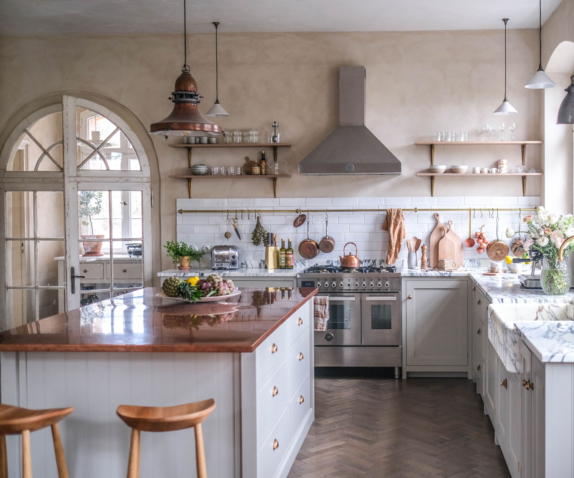
When it comes to paint finishes, the limewashing trend is one to look out for in 2025. 'Limewashing transforms plain walls into soft, textured works of art,' explains designer Jessika Gatewood of Gatewood Designs. 'It’s a centuries-old technique that’s making a big comeback, adding a natural, layered vibe to spaces.'
'Limewash creates a soft, cloud-like texture with subtle variations that add depth and movement,' adds Melissa Read, creative director at Studio Burntwood.
'Ideal for a relaxed, organic feel, it pairs beautifully with natural materials like wood, linen, and stone. Our tips for limewash walls would be to test before you commit to a large space as limewash typically dries lighter. It is also a perfect technique for walls that have imperfections – it adds to the charm. I would avoid using this technique in spaces such as bathrooms and kitchens unless it's properly sealed,' Melissa advises.
3. Color drenching
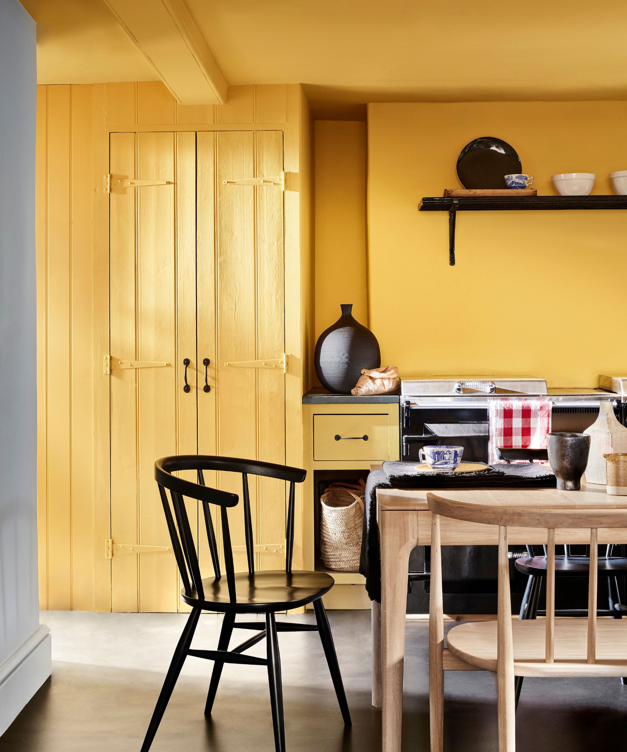
Color drenching is nothing new for the year ahead, but its appeal is expected to stay. This year has proven just how effective this simple paint trick is; making small rooms appear larger while creating a more cohesive feel.
'This bold technique uses a single shade across walls, ceilings, skirting, doors, and even furniture for an immersive look,' explains Melissa Read. 'It’s perfect for making small spaces appear larger, creating a cozy atmosphere, or adding drama.'
'Be mindful of finishes – I would opt for a matte on the walls and an eggshell on all woodwork. This technique is better for small spaces; powder rooms, hallways, and studies are ideal for this technique, as the monochrome palette creates cohesion without feeling overwhelming. If you want to elevate it further, paint the ceiling!' says Melissa.
4. Matte finishes
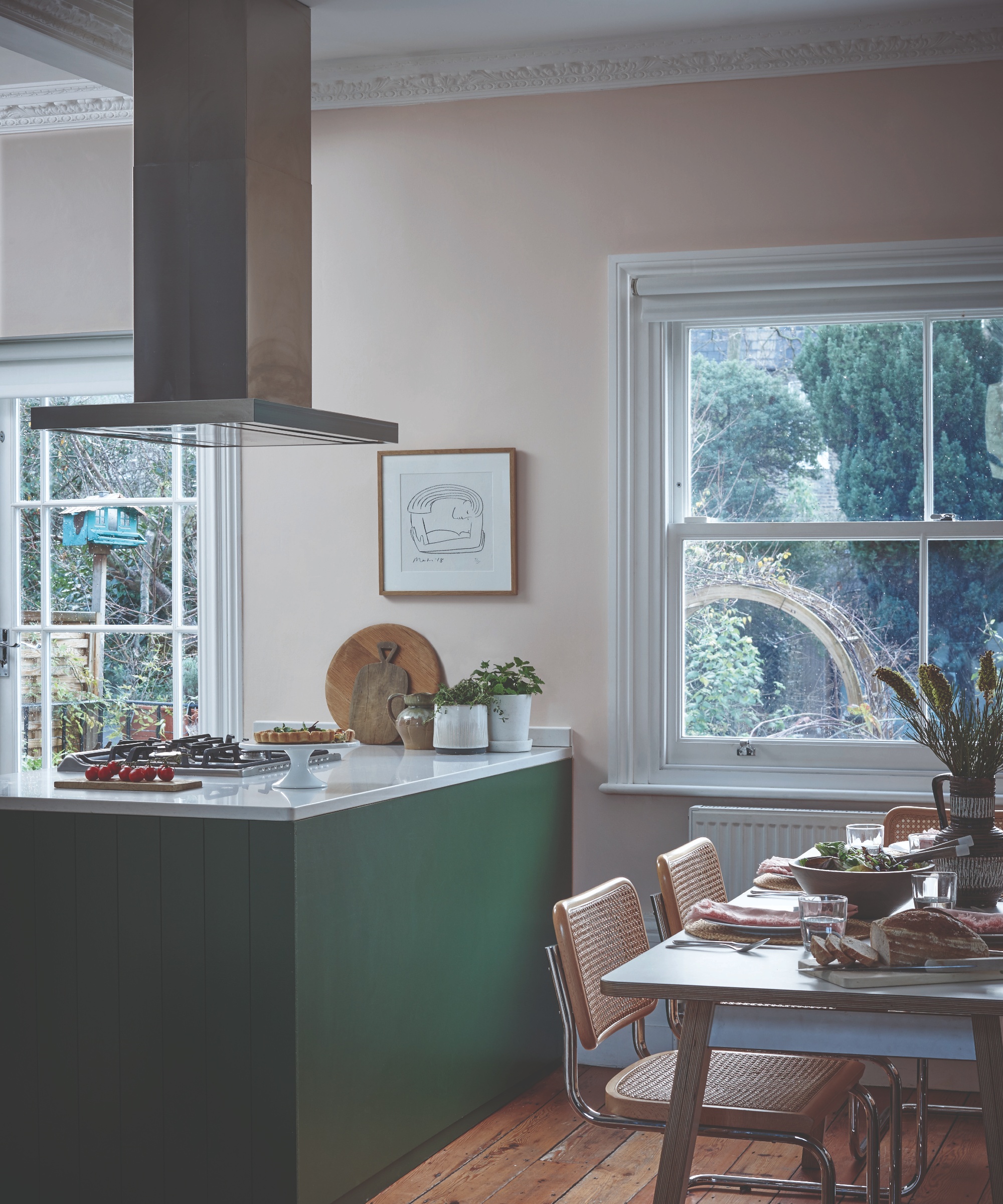
While the right paint finishes for your room will come down to the specific space and its use, designers predict to see more appeal in 2025 for matte paints.
'Matte paint finishes, once avoided in high-traffic areas due to concerns over durability, can now be confidently applied in almost any space. Innovative products like Scuff X by Benjamin Moore demonstrate this advancement,' explains designer Kati Curtis.
'Flat matte paints, like those from Farrow & Ball, absorb light to create a velvety, modern finish,' adds Melissa Read.
'They’re perfect for achieving a refined, understated look and are ideal for highlighting architectural details. Perfect for larger rooms and durable for high-traffic areas or family homes, many matte options are washable. I would opt for bold colors in this finish – deeply pigmented hues like burgundy or forest greens work beautifully,' says Melissa.
5. Matching paint colors to wallpaper
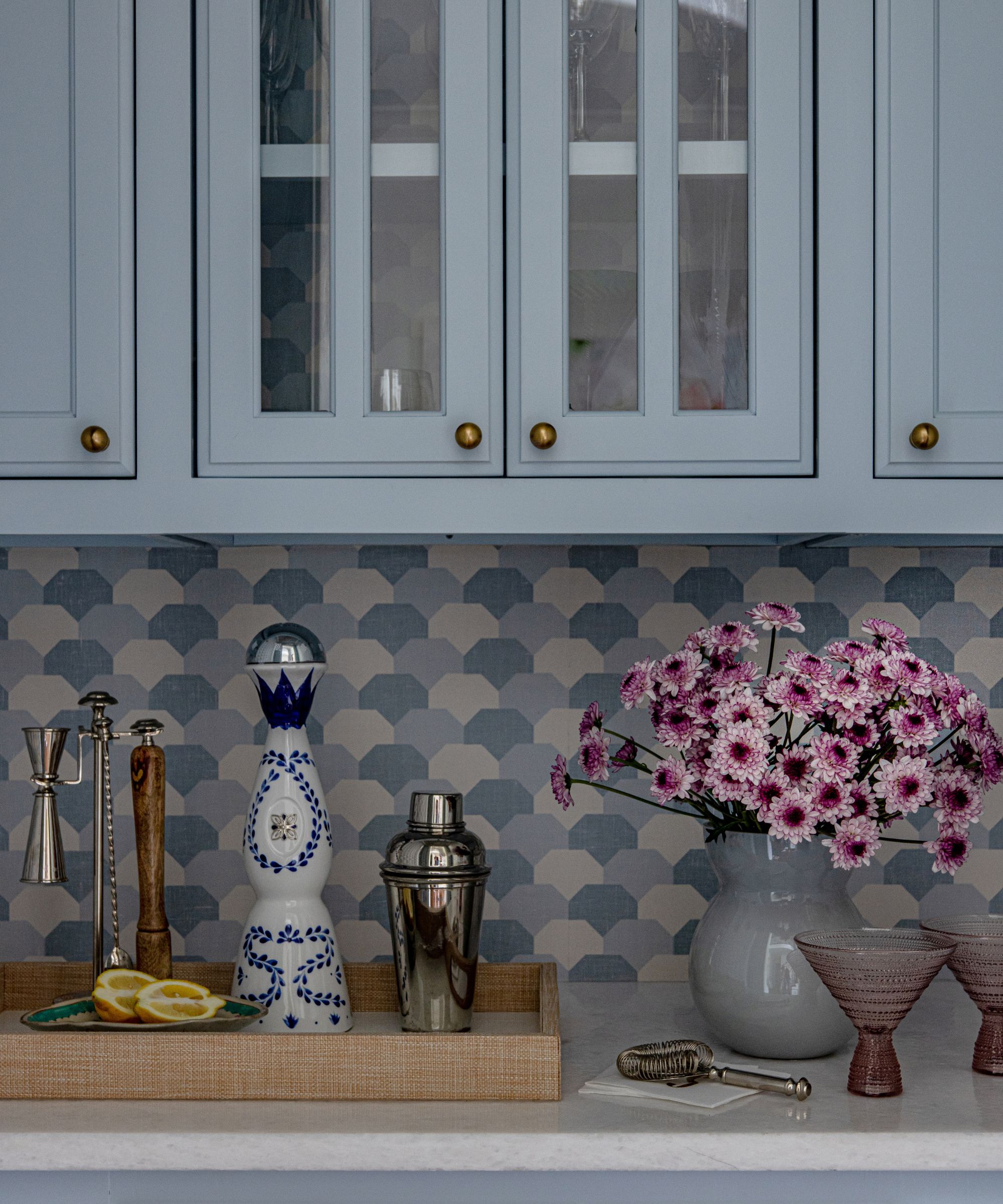
'For 2025, a standout trend is matching paint colors to wallpaper for a seamless, tailored look,' says interior designer Sarah Hargrave.
'By pulling a dominant or subtle tone directly from the wallpaper, you create a harmonious, layered design. In a recent project, we painted bar cabinetry to match the soft slate blue in Thibaut's Hidden Hills wallpaper pattern. This approach brings a sense of cohesion to the space, making the design feel intentional and polished.'
'A matched paint color extends the wallpaper’s visual impact while ensuring the palette feels cohesive. It’s a designer’s secret for creating a big impact in smaller spaces like bars, powder rooms, or breakfast nooks,' adds Sarah.
6. Saturated colors
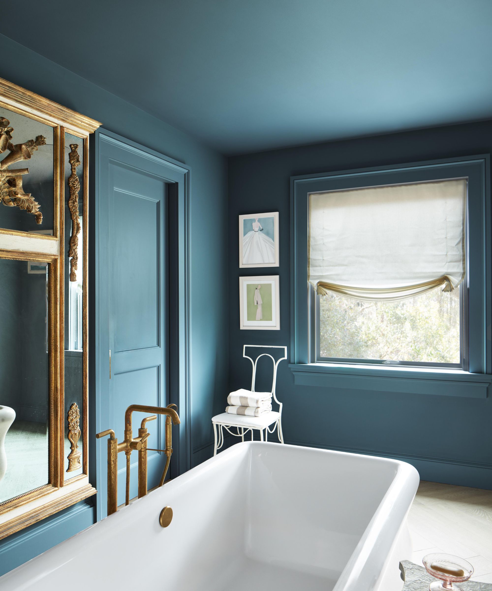
Rich colors are expected to come to the fore in 2025, especially jewel-tone variations of blue paints and green paints.
'We are most excited about the resurgence of rich, saturated colors,' shares Carly Filbin of Blue Jay Interiors. 'We are seeing these colors in powder rooms, foyers, laundry rooms, and dining rooms, and we love all of them! Some examples include Sherwin-Williams’ Seaworthy, Benjamin Moore’s Jojoba, and Sherwin Williams’ Emerald Series in Westhaven.'
'If you love a color and it brings you joy when you see it, don't be afraid to try it! When a paint color takes center stage, consider how the overall design can complement it and give it space to be appreciated. Rich colors add so much character and depth to spaces, and we couldn't be more thrilled with this trend,' says Carly.
7. Painted staircases
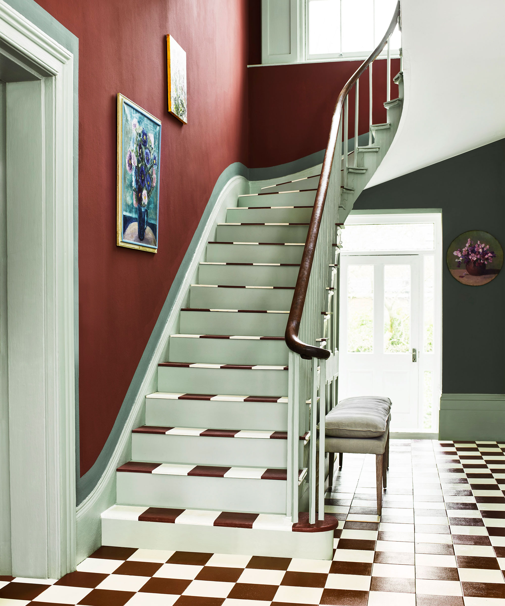
'I'm really into a boldly painted stair for 2025,' says interior designer Bethany Adams of Bethany Adams Interiors. 'Whether it's the riser, the step, or the whole staircase, paint can have such an impact on this feature in your home. It has the power to modernize the antique or soften the modern. It really is a powerful tool in a designer's arsenal.'
Here, the light green staircase harmonizes with the rest of the entryway, matching the painted trim and adding a playful twist instead to the space.
8. Rich shades of purple
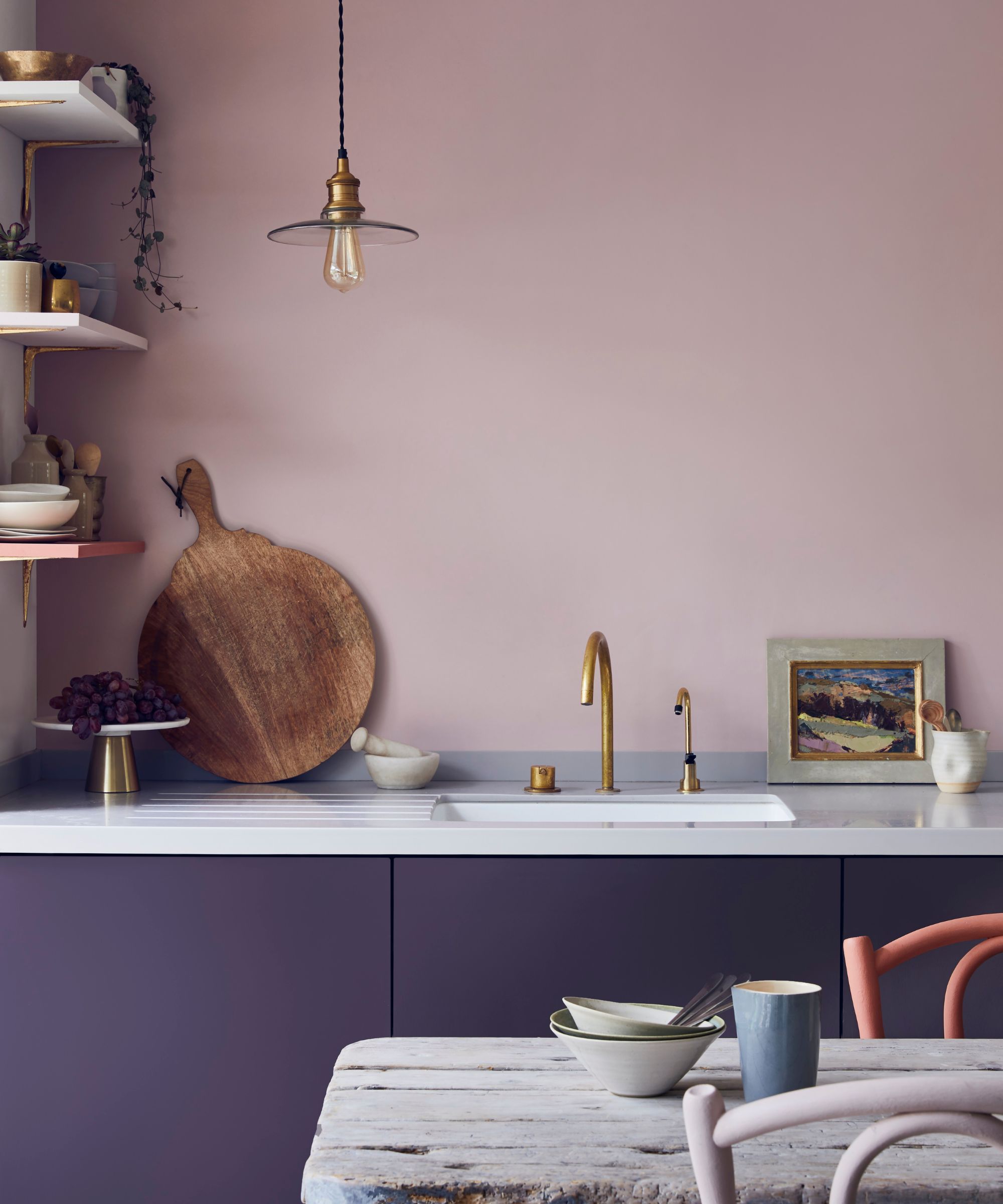
A key color trend for 2025 thanks to its popularity across this year's Color of the Year reveals, purple is a trending hue to embrace right now, and designers say it's a stylish way to make a statement:
'I think deep, saturated colors will be a huge trend in 2025,' says Chicago-based designer Andrea Goldman. 'Richly pigmented shades of purple – like aubergine, maroon, and eggplant – will find their way into many more spaces. We’ve seen clients move away from neutral tones in favor of these colors to make statements, especially for cabinetry, wet bars, and other spaces where one might want to add a bold element.'
9. Contrasting paint finishes
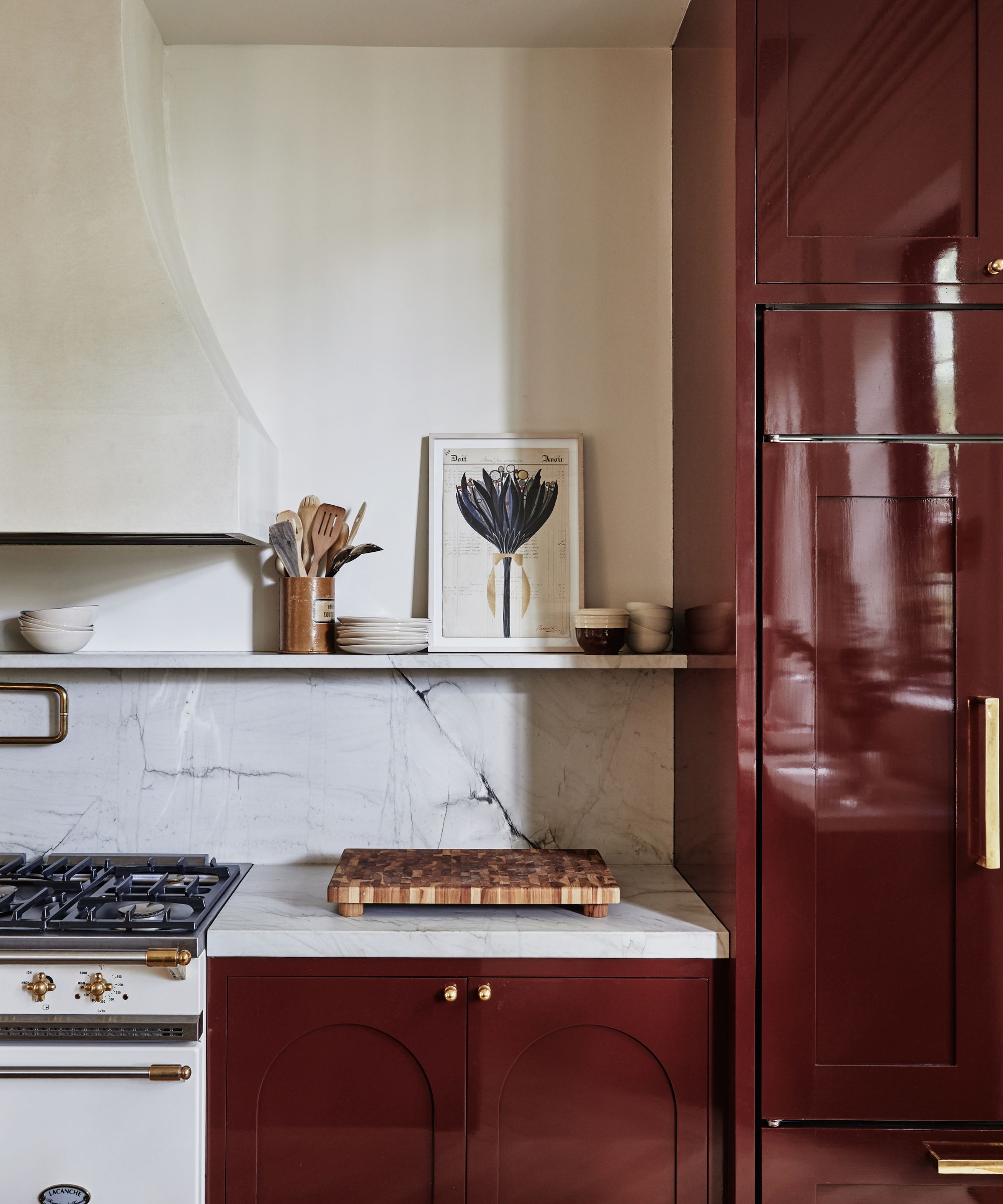
'Another trend we’ll see in 2025 is the intentional use of different paint finishes to create an impact,' adds Andrea Goldman.
'We’ve seen a rise in the use of lacquered finishes in spaces to make a bold statement. In addition to this, we’ve also begun to incorporate varying finishes in a monochromatic space to create dimension. An example could be using a flat white paint for a wall and ceiling while using a lacquered finish of the same hue for the trim, which adds more texture and interest to a space.'
Here, the gloss-painted kitchen cabinets create an elevated and sophisticated look – a simple way to add visual interest to your existing color palette.
10. Painting woodwork a contrasting color
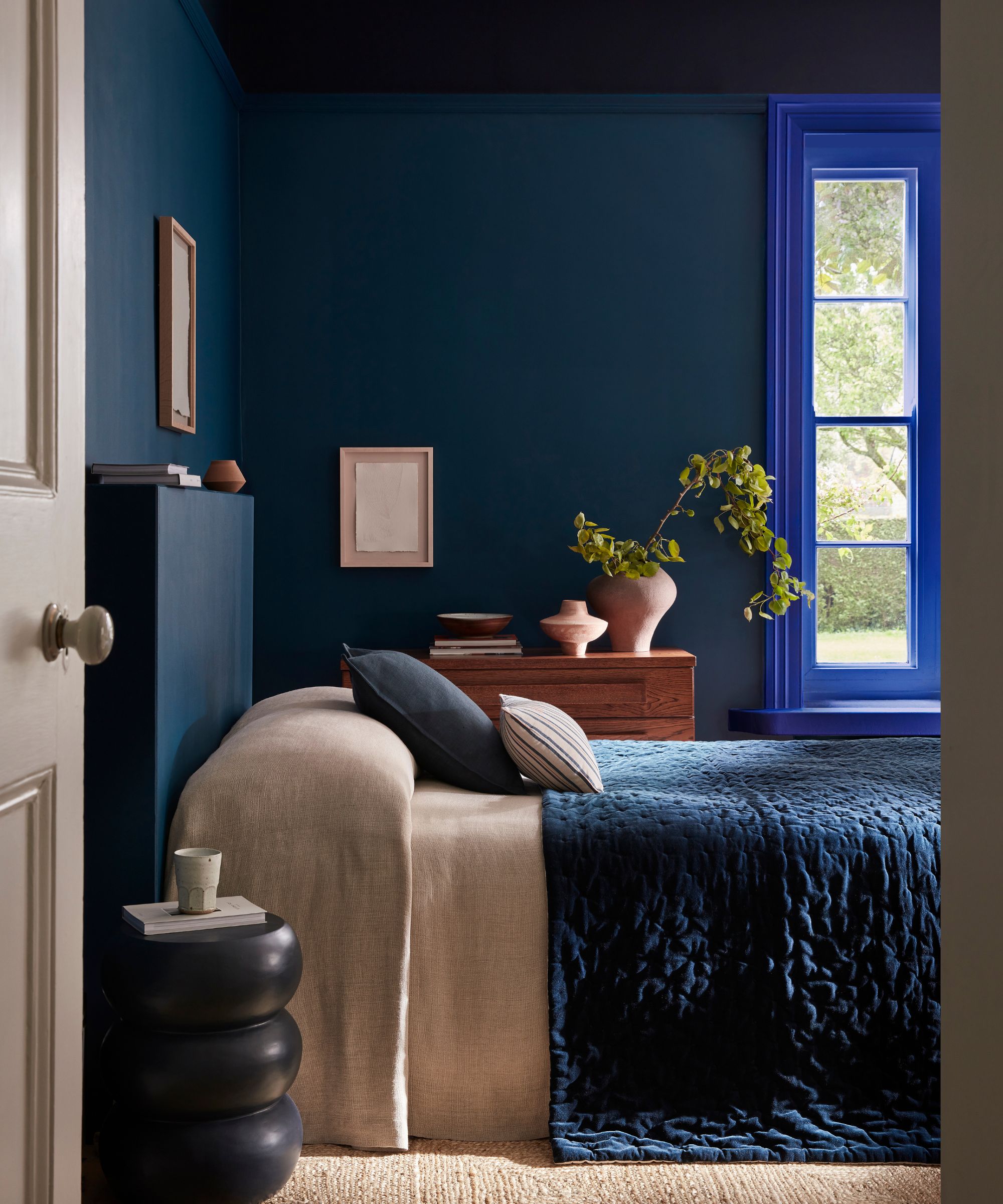
Another way to add depth and interest to your rooms in 2025 is to paint any woodwork, doors, or trim details in a different color to the walls, suggests Jessika Gatewood:
'This approach draws attention to architectural details like trim and doors, adding depth and character without overwhelming the space. A soft beige, warm taupe, or calming gray works beautifully with white walls to create a timeless, tailored look.
'It’s a fresh alternative to standard white trim, giving a polished and intentional design vibe. It lets you introduce subtle color into a room without committing to a full wall of it. Plus, it’s versatile – whether you lean classic, modern, or somewhere in between, this technique works!'
11. Deep reds and terracotta tones
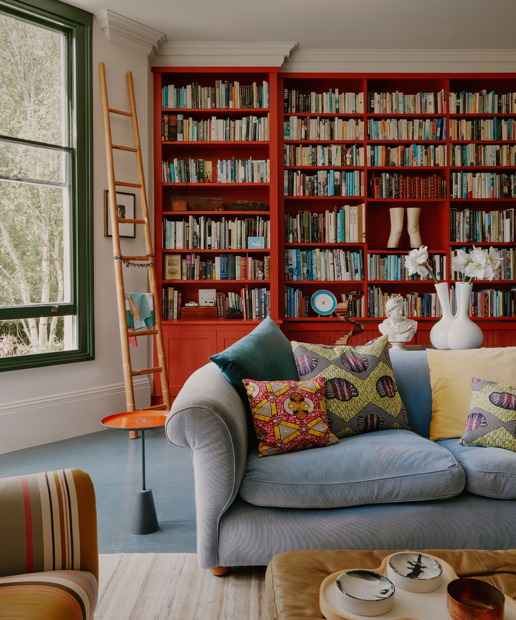
Decorating with red isn't going anywhere in 2025 – a color trend that dominated 2024. And why it might sound bold, trends like the 'Unexpected Red Theory' make a strong case for bringing in red in just small amounts to lift a room. Used in this way, this once shied away from primary shade can work even in an all-neutral scheme.
For 2025, we expect to see more rich wine reds and burgundy hues take center stage: 'I am loving Farrow & Ball's Brinjal for powder bathrooms,' says Charlotte-based interior designer Alexis Warren. 'With the deep and rich aubergine color when used on walls, ceiling, and trim it can create a moody and sophisticated finish. I love how the color changes throughout the day with different lighting showcasing the depth of color. It is a color that will stand the test of time.'
However, terracotta paints make a good alternative to red paints if you don't want to go so bold. Shades such as Farrow & Ball's Red Earth and Benjamin Moore's Persimmon bring warmth to the walls, a great choice if you're looking to venture away from lighter tones in 2025.
12. Darker stains for wood

'We are seeing much moodier kitchens and baths, going away from all white or two-tone which have dominated the last decade. Lots of darker stains on wood and mixing darker woods with lighter,' says Lina Galvao co-founder of Curated Nest.
Darker stains are definitely a paint trend expected to shine in 2025. Those very pale woods associated with minimalism and Scandinavian decor will always be timeless, but there is a decided shift towards darker stains, and even warmer stains that have been shunned for so long are creeping back into kitchen trends too.
13. Caramels that verge on yellow
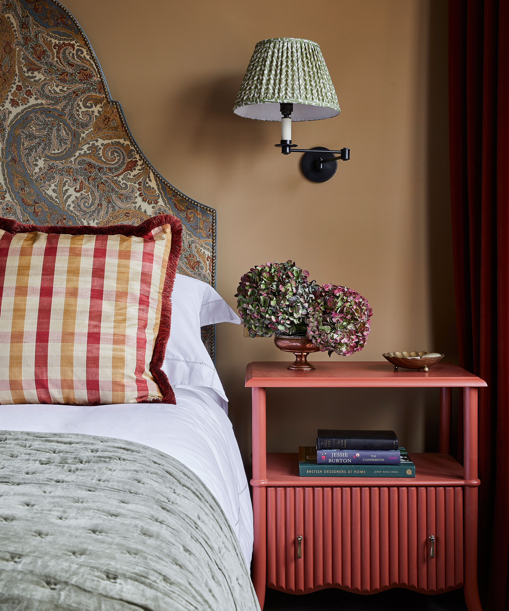
In order to make a space feel more grounded and inviting, many of us are moving away from colder neutrals such as gray, and exploring those with more depth, color, and influence from the natural world.
Interior designer Natalia Miyar says, 'Delicate pinks, soft neutrals and warm browns are great to use if you want to achieve a natural, modern and uncluttered aesthetic, and they make any room feel cozy and comforting.'
Above, this rich caramel hue definitely belongs to the neutral color family, we think it packs a strong punch that blends well with natural materials, as well as patterned fabrics, to create a calm and relaxing space.
‘This sandy shade has such depth to it,' says Laura Stephens, founder, Laura Stephens Interior Design. 'It makes a room feel warm so is good for north-facing rooms and those that don’t get a lot of natural light. It works really well with both crisp whites and also colors closer in tone, such as burgundy and olive green. It also makes stronger colors like a royal blue pop against it. It’s so versatile.’
14. Closely considered shades and tones
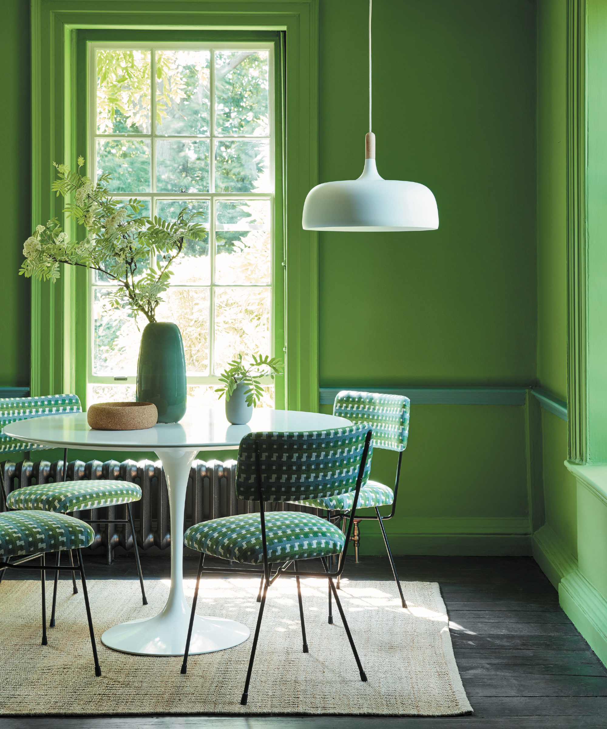
'Carefully curated color pairings are key to unlocking the potential in our homes,' explains Helen Shaw of Benjamin Moore. 'They simultaneously lift a space by adding energy to a scheme, whilst changing the relationship between spaces depending on where you apply the finishes. From framing furniture through to adding depth, the relationship between the shades you choose is crucial.'
'Subtle monochromatic schemes are the most accessible and use shades of the same color to add slight contrast. Analogous schemes, which employ adjacent tones on the color wheel offer a more adventurous take, whilst complementary tones taken from opposite sides of the wheel always deliver drama whilst maintaining a sense of harmony.'
15. Clay tones
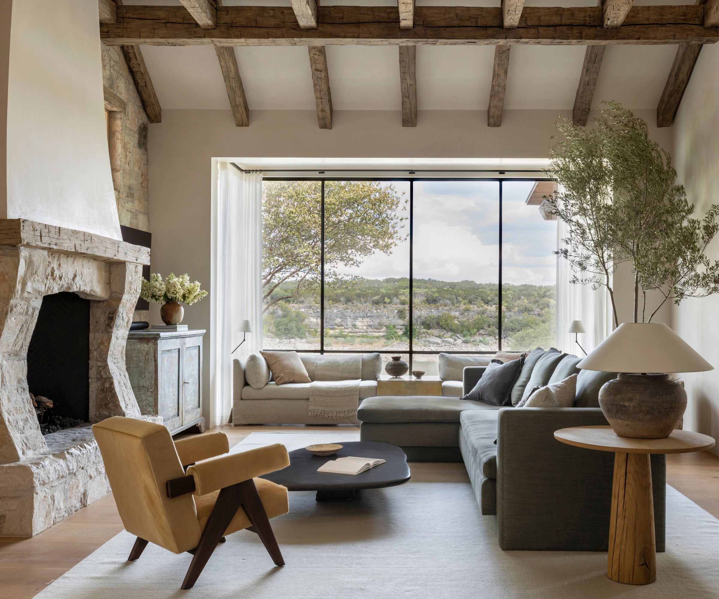
When it comes to light neutral rooms, 2025 is all about earthy, muddied tones and clay-like shades are a very accessible way to lean into this paint trend. Plaster pinks, pale beiges, and really soft brown-tone grays are all very liveable and create soft, calming rooms as this space designed by Marie Flanigan proves.
'Many of us are drawn to clay tones, however, we also want to make our homes feel as bright and spacious as possible,' explains Patrick O'Donnell, color expert at Farrow & Ball. 'Using a lighter tone like Oxford Stone on the walls and the much stronger Tanner’s Brown on the trim instantly makes the walls feel lighter and the room feel bigger.'
'The warm tones of Jitney and Stirabout create an earthy, reassuring atmosphere. When used together, they create a harmonious space that’s easy on the eyes. The subtle balance of Jitney on the walls and lighter Stirabout on the panels, ceiling, and trim, result in a beguiling room with an ethereal quality – a wonderful, warm scheme for those who prefer neutral spaces.'
16. The fifth wall
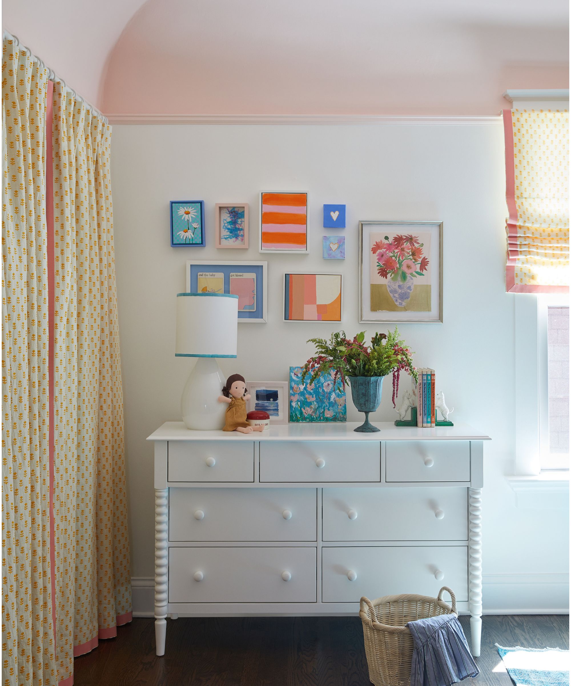
'I'm so excited that designers, and homeowners alike, are now open to painting ceilings,' says designer Meghan Jay, Meghan Jay Design. 'Gone are the days of plain white ceilings! This trend is particularly fun to try in kids' spaces where it might feel daunting, or overly kiddish, to paint all four walls a vibrant color. Adding a punch of color to a ceiling adds the right amount of playfulness while allowing the space to feel like it will stand the test of time.'
Interior designer Nureed Saeed also highlights this as a trend for 2025, adding: 'I love the unexpected element of paint on a ceiling, think of it as the fifth wall and don’t be afraid to have fun.'
17. Mixing and matching unexpected paint colors
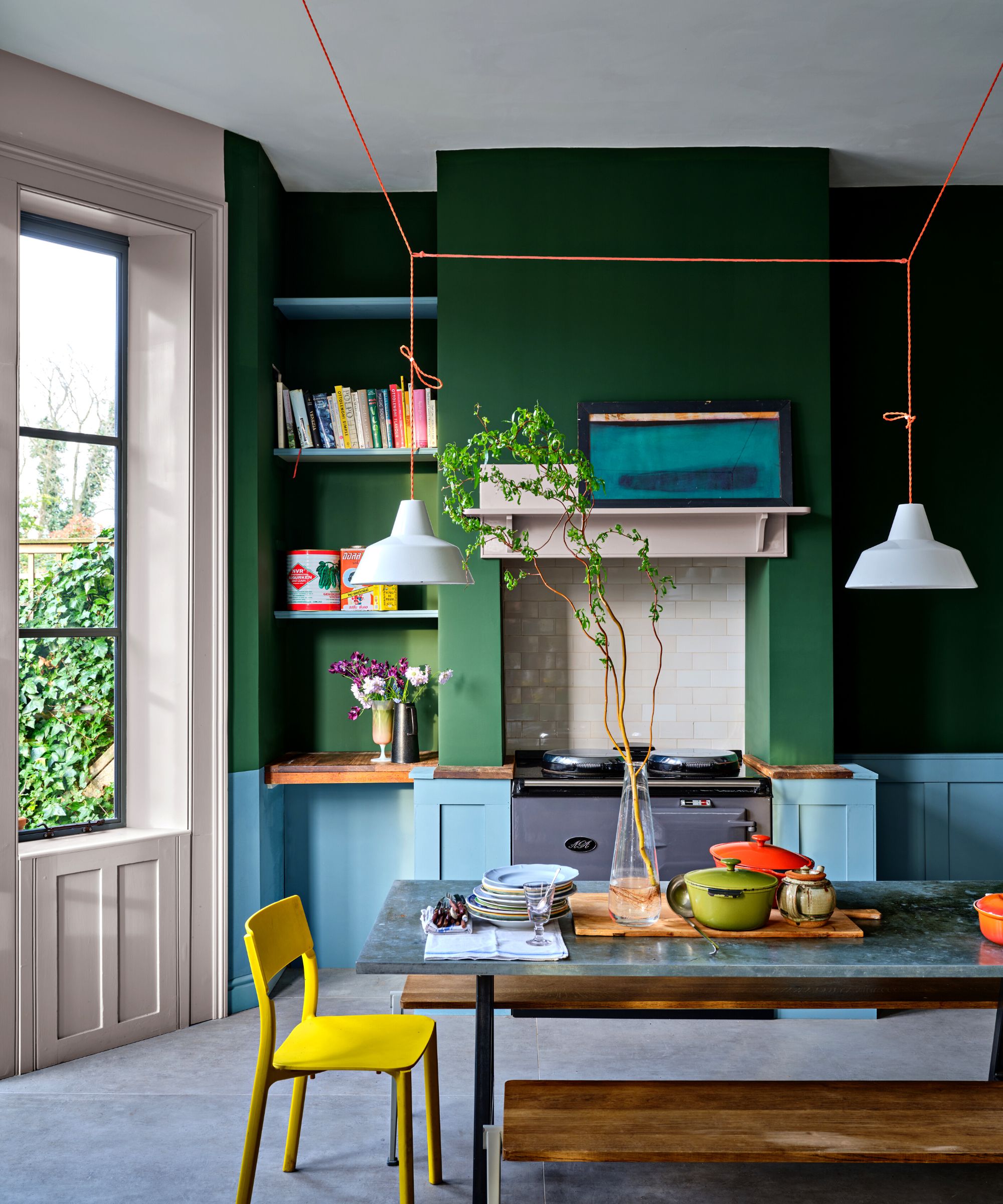
Andy Greenall from Paint & Paper Library says, 'Both consumers and designers are turning to color combinations that add drama and intrigue to a space, from neutrals in graduating shades which flow between rooms, to more dramatic color pairings.'
A great option to explore for colorful room ideas, embracing more unique color pairings and color combinations can make for a more eclectic and individual look, rich with colorful visual interest – make sure to look to the color wheel to find further guidance on choosing the right colors for your home.
Who says blue and green must never be seen? This modern kitchen has been painted in Farrow & Ball's Beverly green and Kittiwake blue. The two shades establish a playful, stylish contrast, and lift this functional and practical area of the home with a fun and lively feel.
Whether you like to keep things neutral and understated or bold and colorful, there's something for everyone in the top paint trends for 2025. Always remember to test your paint colors before committing, to see how the shade looks throughout the day as the light changes.

I am the Head of Interiors at Homes & Gardens. I started off in the world of journalism in fashion and luxury travel and then landed my first interiors role at Real Homes and have been in the world of interior design ever since. Prior to my role at H&G I was the digital editor at Livingetc, from which I took a sabbatical to travel in my self-converted van (not as glamorous as decorating a home, but very satisfying). A year later, and with lots of technical DIY lessons learned I am back to writing and editing, sometimes even from the comfort of my home on wheels.
- Zara StaceyContent Editor
- Emily MoormanContributing Writer
-
 'Sexy disco-era Italy meets Japanese farmhouse in the Brazilian jungle' was the description the interior designer gave this glass-walled modernist home
Offering a warm welcome that defies its stark, modernist lines, this archictectural gem is full of surprises
By Karen Darlow
-
 Are you making the most out of the estate sales in your area? These are the 5 most valuable items you should be shopping for
Vintage lovers and antique experts share the objects you should always look out for when you're exploring an estate sale
By Eleanor Richardson