

The appeal of green is clear – it is bold, versatile, and promotes a feeling of rejuvenation through its subtle connection to nature. This month, interior design doyenne Nina Campbell shared her tips with Homes & Gardens for using green in decor – including what you should avoid.
We have already noted the surge in interest in decorating with green this year – and it has been credited to the restrictions put in place over the last year. As Ruth Mottershead, Creative Director at the British-based paint manufacturers Little Greene, explains:
'Alongside the move towards warmer natural stone colors such as Travertine and Clay, green in all its hues has remained really popular for us, from bold, deep greens to earthy and more muted tones, we find ourselves craving colors that make us feel closer to the natural world.'
See: Green room ideas – discover the colors to always be seen

Despite its vast appeal, however, the vivid complexion of green means it is important to approach the color with caution and find the balance that is perfect for your home.
Nina Campbell: 3 ways to use green in interiors
Cue Nina Campbell. The globally-renowned interior designer's career took off in the late Sixties when she redesigned the famous London members' club Annabel's. Since then she has grown to become one of the biggest names in interior design.
So, who better to offer insight on how to inject green into your home – from your bedroom to your bathroom and beyond?
1. Blend different shades of green through furniture

'Almost all greens work together well, as long as you don't become too fussy in the overall room design,' opened Nina. The designer then urged us to 'throw chartreuse green into lots of schemes as an energizing accent: a cushion or lamp makes the whole room leap into activity.'
2. Contrast green with white for a fresh look

Similarly, Nina suggests blending green and white together, as it's a 'winning combination.'
'In fact. I'd say green is better just with white than any other color,' she added.
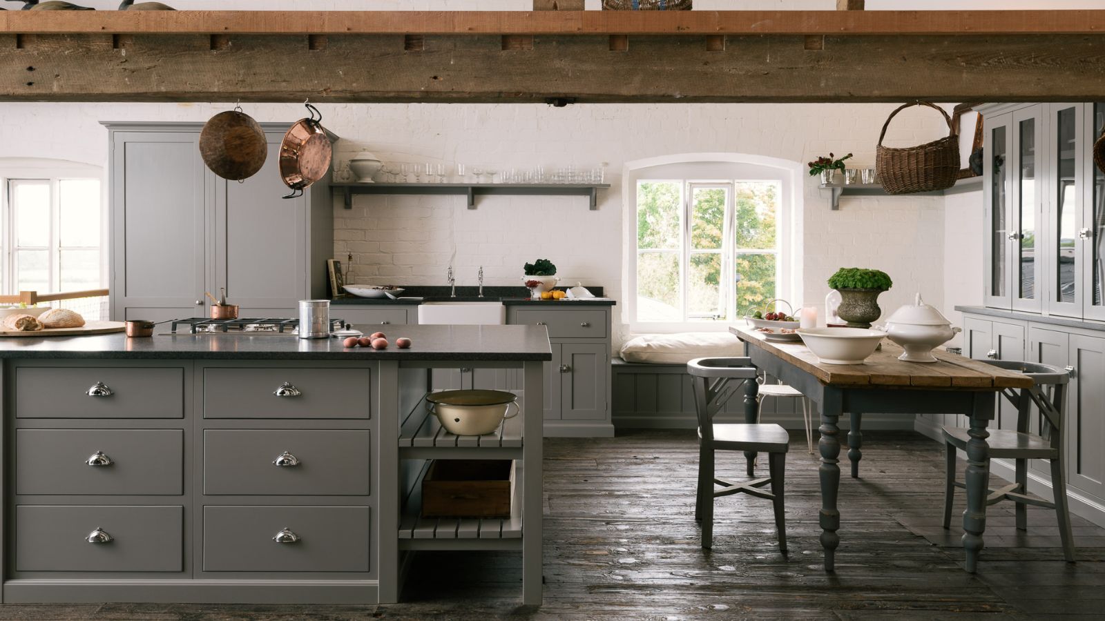
- See: Green kitchen ideas – inspiration for cabinets, walls and more
3. Use green to make a statement finishing touch
Nina suggests green is at its most powerful when used to add a finishing touch to a special piece of furniture or one specific area of your room.
'Go for a lacquer finish on dark green walls,' she stated before recommending a specific shade that will exquisitely finish your favorite furnishing.
'Use Invisible Green by Edward Bulmer as a wonderful color for pictures,' Nina suggested.
Nina Campbell: 3 ways not to use green in interior design
Ms Campbell was just as emphatic in what not to do when using green in your interiors. Here, she counsels on what to avoid.
1. Do not go overboard with green

While green can lift a room into an organic shrine of contemporary color, there is a fine line between that and looking too overbearing.
Nina offered her advice on staying clear of this territory, saying: 'Don't combine green walls with green carpet. It would just be too much.'
'You wouldn't want to paint a whole house green, but one room painted in this color, flowing into others that feature touches of green, gives a sense of recall,' Nina shared.
Instead, she suggested pairing the bold color with more neutral hues, such as 'wood or stone floors.'
2. Stay away from bright greens
'Don't choose a green that is too crude, such as stark emerald. It needs an intelligent undertone of black or umber,' she added. Nina also reminds us to 'weight' the floor by offsetting the green with 'a bold rug or a little piece of black furniture, perhaps.'
3. Avoid using solid green on bathroom walls
Finally, despite the color's durability, Nina suggests staying clear of green in the bathroom or powder room, as a 'solid green wall' is 'not so favorable to skin tones.'
See: Nina Campbell's interior design tips – they are as inspirational as you'd imagine
Though, as an alternative, she shared that 'green and white paper' across your bathroom walls 'can look pretty'.

-
 Barack and Michelle Obama's neutral accent chair is the perfect living room focal point – you can recreate their serene style in any-sized home
This designer-approved essential fits into every modern living room – it's beautiful enough to stand alone, while pairing well with your favorite cushion
-
 Should I choose a kitchen island or a kitchen table? This is the expert advice that helped me decide
It's all about how you use your space

