10 bedroom design mistakes to avoid – and Nina Campbell's tips on getting it right
The globally renowned designer shares the biggest bedroom design mistakes – and wise advice for getting a bedroom re-design spot on
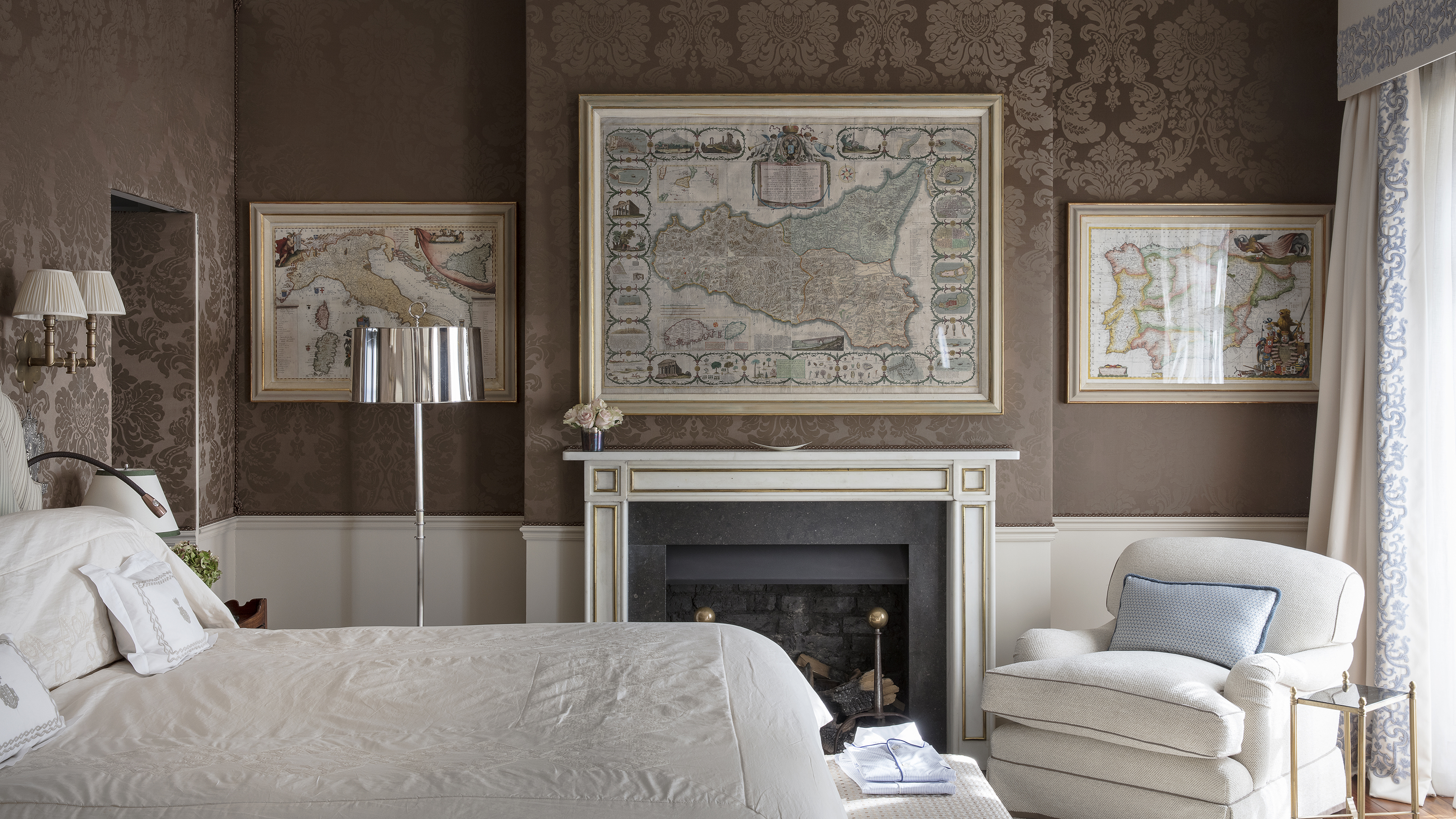

No one wants to make bedroom design mistakes. After all, it's the one place in our homes to which we retreat for rest and seclusion – and if we have unwittingly made a serious – or even minor – error in the design, it's going to jar.
See: Bedroom ideas – designs and inspiration for beautiful bedrooms
Nina Campbell to the rescue. We interviewed the world-renowned design recently and asked her for the dos and don'ts of bedroom design – and these are the mistakes she's highlighted as most commonly made, but so easy to avoid.
Bedroom design mistakes – and how to get it right
Helpfully, Nina's added a few well-guarded bedroom design secrets to help us to make our boudoirs beautiful, too.
1. Allowing clutter to spoil a restful mood
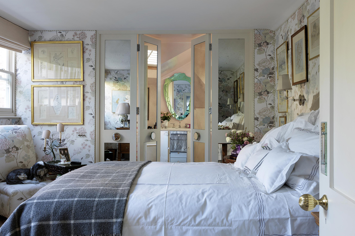
'It is important not to allow too much clutter to spoil a restful mood but, of course, bedrooms are the place for lovely memories and this is where I keep photographs of family and treasures given to me by my grandchildren, such as pictures they have drawn. The key is to keep them gathered in one spot, perhaps on a tray, but also to rotate them periodically,' says Nina.
Favorite art and treasured family photographs make Nina’s own bedroom (above) a space filled with happy memories.
See: Small bedroom storage ideas – for a practical, smart and versatile scheme
Sign up to the Homes & Gardens newsletter
Design expertise in your inbox – from inspiring decorating ideas and beautiful celebrity homes to practical gardening advice and shopping round-ups.
2. Getting bedside table lamp height wrong

Smart bedroom lighting ideas, such as bedside lamps, are key to getting your scheme right.
'Bedside tables should not be lower than the mattress,' says Nina. 'And f you have a mismatched pair they’ve got to be the same height as each other. I like to use a chest of drawers or a table on one side of the bed, if there is space, and having this the same height as the bedside table it keeps a sense of balance and order.'
3. Leaving your clothes in a guest bedroom
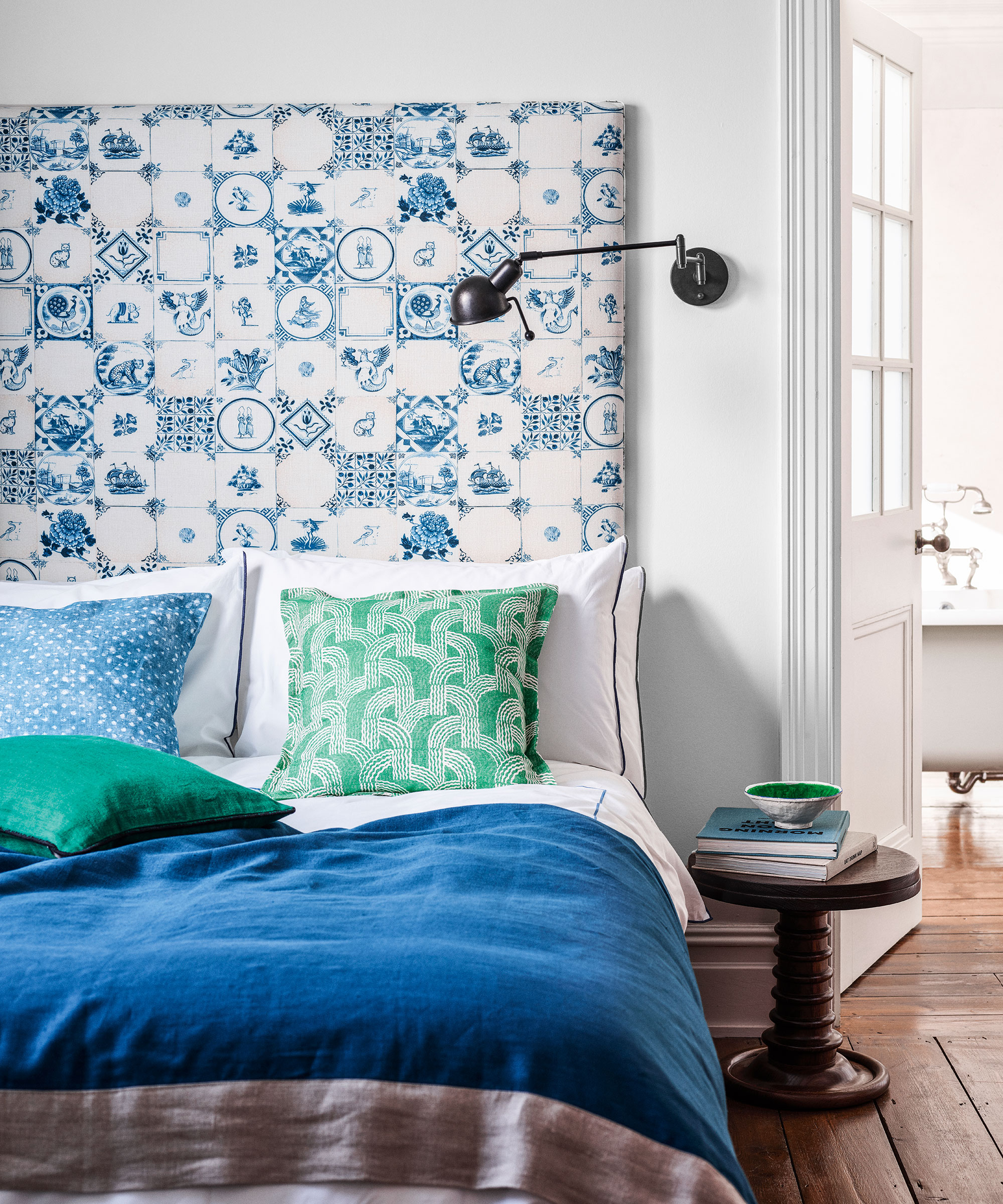
'Avoid leaving your own clothes in wardrobes in a guest bedroom,' advises Nina. 'That space should be for guests to hang their own things when they visit. If clothes are hanging in the spare bedroom and not worn, perhaps it’s time to take them to a charity shop.'
4. Choosing dust-attracting curtains
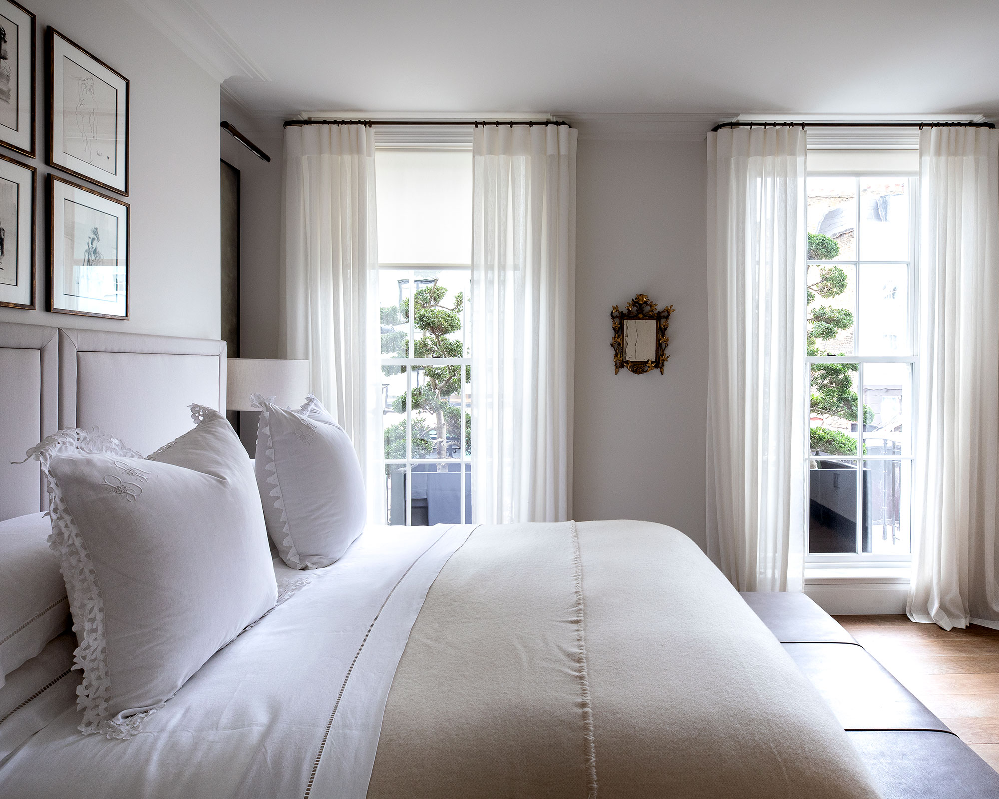
'One wants to feel that a bedroom isn’t full of dust, so I tend to avoid very voluminous curtains,' says Nina. 'Curtaining needs to be chosen in relation to the home location. In a city like London where the room looks onto a street, a sheer curtain or blind will soften the hardness of the view of buildings opposite during the day. In the country, a soft pelmet often feels appropriate.'
5. Not picking out the right headboard
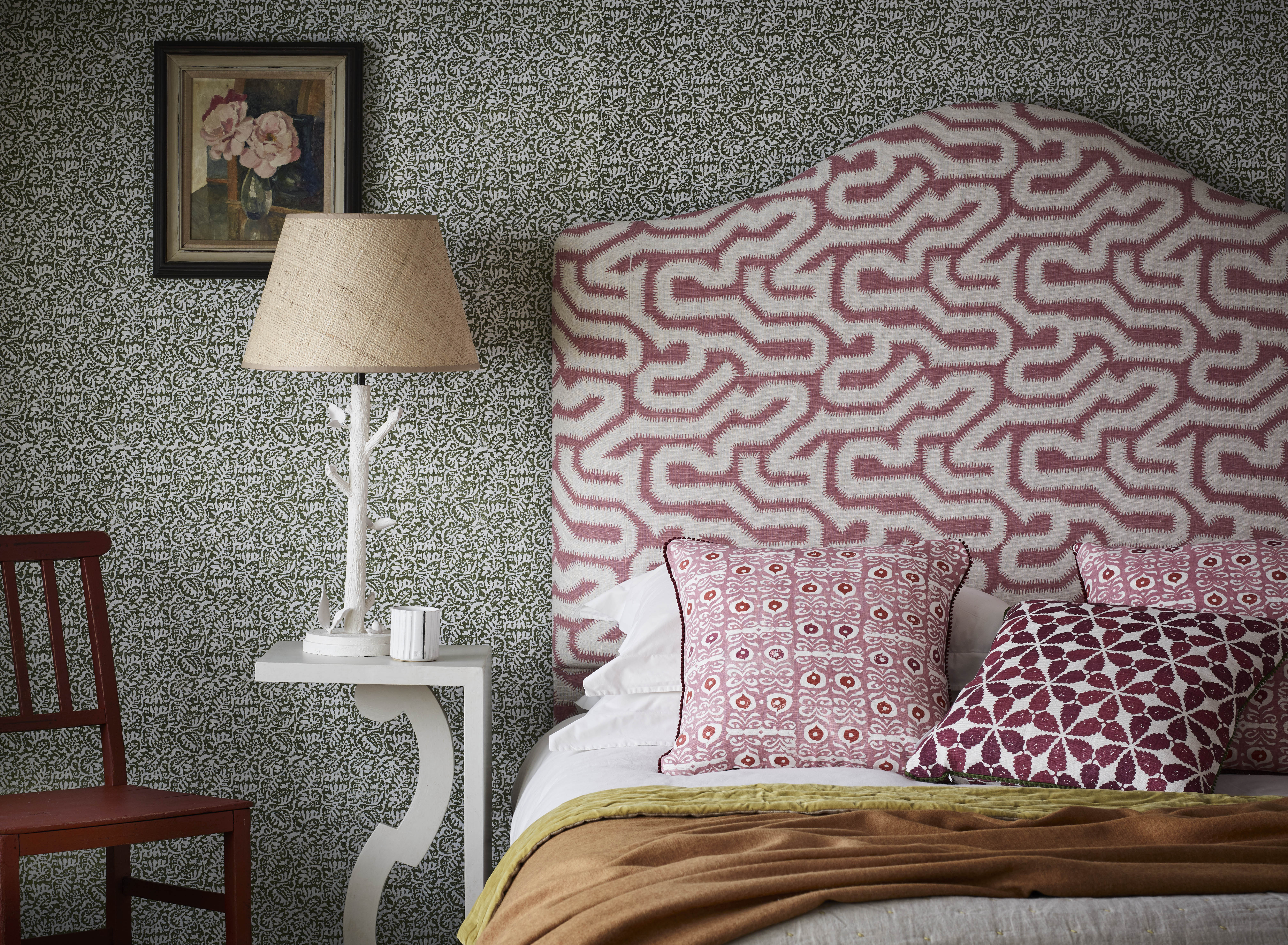
'An upholstered headboard idea is very important but it has to be kept pristine. A shaped headboard is very nice and loose covers can be helpful. Don’t choose a printed fabric to hide marks, you need to be aware of them and clean them!
'A shaped headboard is nice although some you see now are a little overwhelming. The headboard and the bed valance should be made in the same fabric for a cohesive look. I like to add a directional bead light or airline light fixed on or near the headboard to focus light where you need it. It also frees up space on a bedside table.'
6. Not adding an element of comfort
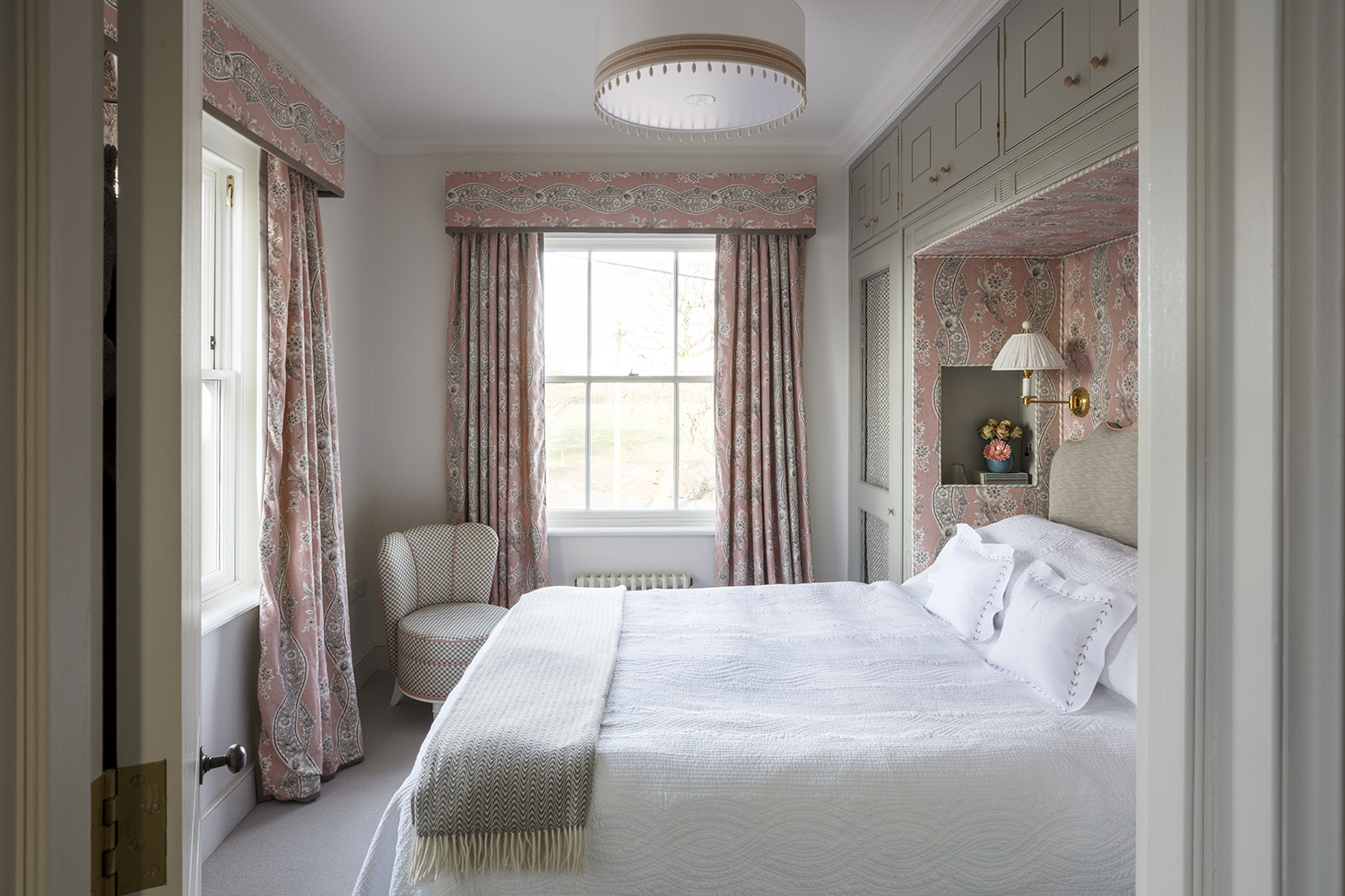
'If you have spare corner, place a comfortable armchair with a matching footstool there accompanied by a lovely blanket, a small table and lamp to create an inviting corner to read. Our Mabel chair is a good size.'
Minimizing clutter with well-planned storage is essential for a sense of ease and calm. The fabric lined niche is an elegant echo of the curtaining, which is made in Le Castellet from Turnell & Gigon. Image from Nina Campbell Interior Decoration: Elegance and Ease, published by Rizzoli.
See: Traditional bedroom ideas – ways to combine tradition, luxury and comfort
7. Not dressing the bed sufficiently
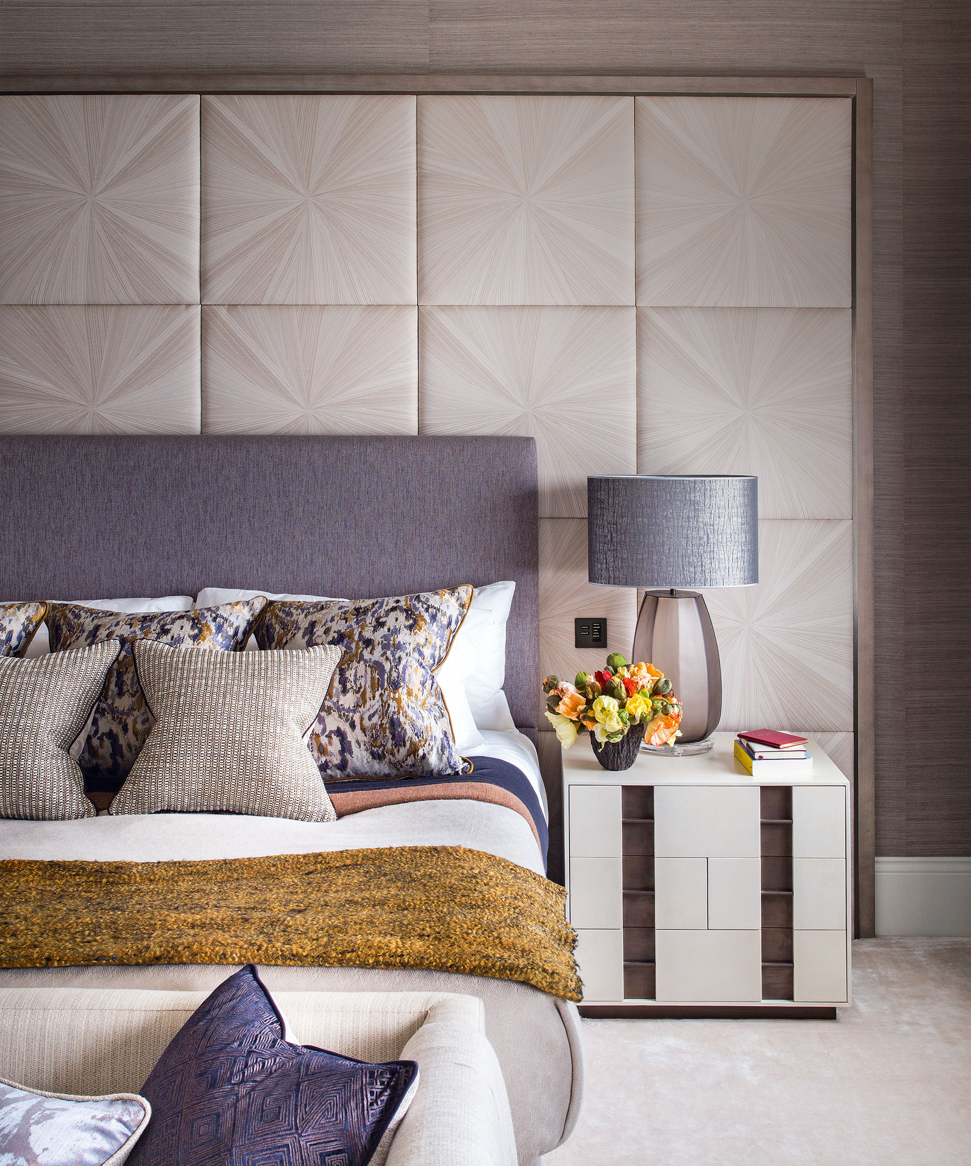
'Layers of pillows look very inviting,' says Nina. 'On my bed I like to use big, square pillows directly in front of the headboard, then layer these with rectangular "English" pillows and dress these with baby pillows. I like white linen which can be printed or embroidered. Porthault is my favourite source and I think Anne Singer’s collection with scalloped edges is delightful.'
See: How to dress a bed – a five-star hotel guide to layering
8. Not creating an inviting atmosphere in a guest room
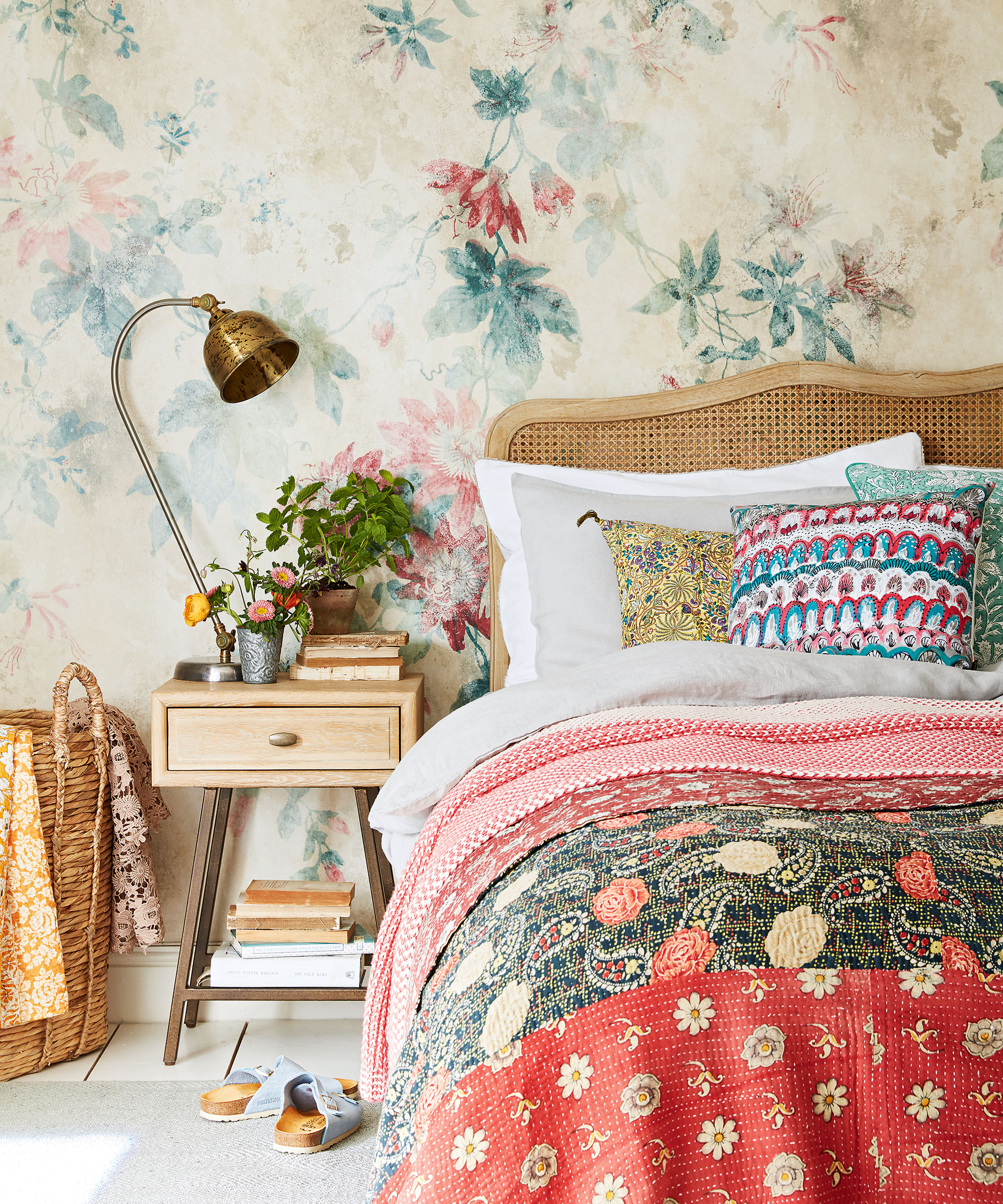
'In a guest bedroom it’s lovely to provide a pretty little tray and a jug of water, tissues and perhaps a book for the bedside table. A radio is jolly nice to include. A Roberts Radio comes in so many colors and it is lovely to switch on when getting ready in the morning.'
9. Not making space for a desk
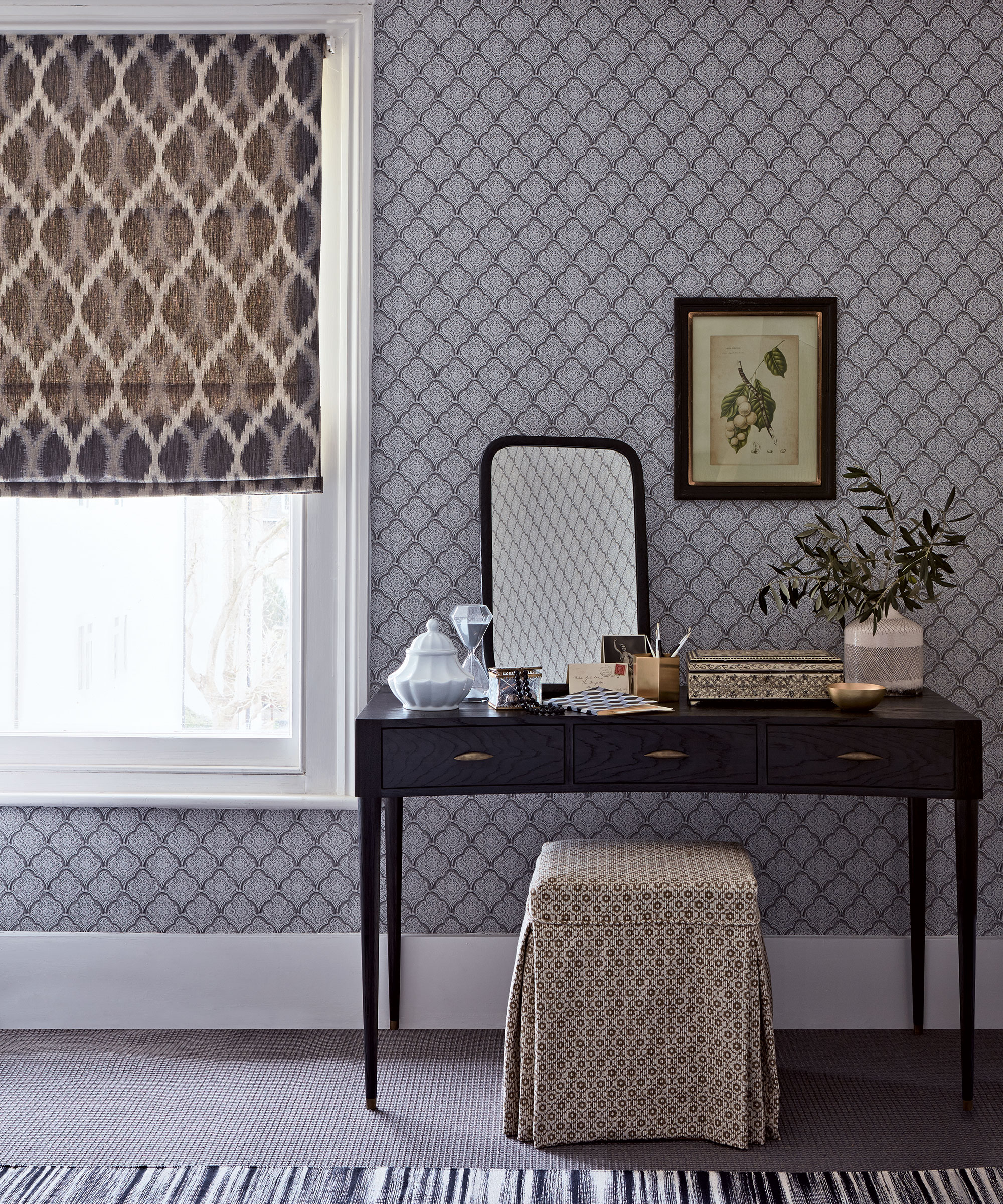
'If there is space I like to add a writing desk with writing paper. We have so little time to write letters these days and it can be restful to have the opportunity.'
10. Not getting the temperature right
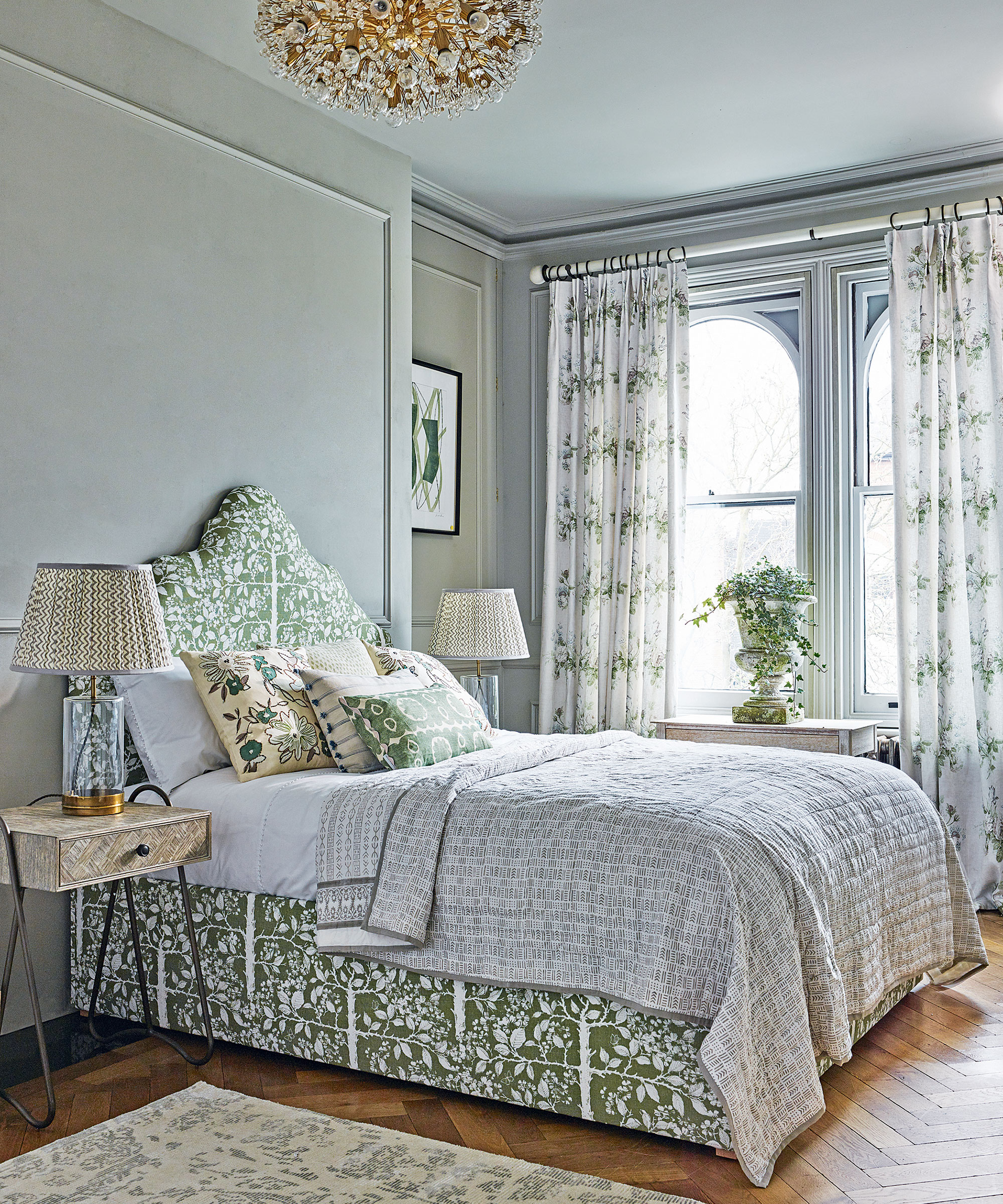
'It is important not to be too hot or too cool in a bedroom to be able to sleep well, so don’t forget the importance of temperature. I also want to have a window that opens. There is nothing worse than a bedroom that hasn’t been properly aired. It’s vital to have a flow of fresh air,' concludes Nina.

Interiors editor and brand consultant, Kerryn Harper-Cuss has worked on four interior magazines and edited three of these, most recently The English Home, where she was Editor-in-Chief of both its UK and US editions for almost 12 years. She now writes for a number of high caliber publications, moderates design seminars and is particularly delighted to pen profile features on world-class interior designers for a regular slot on the Homes & Gardens website.
-
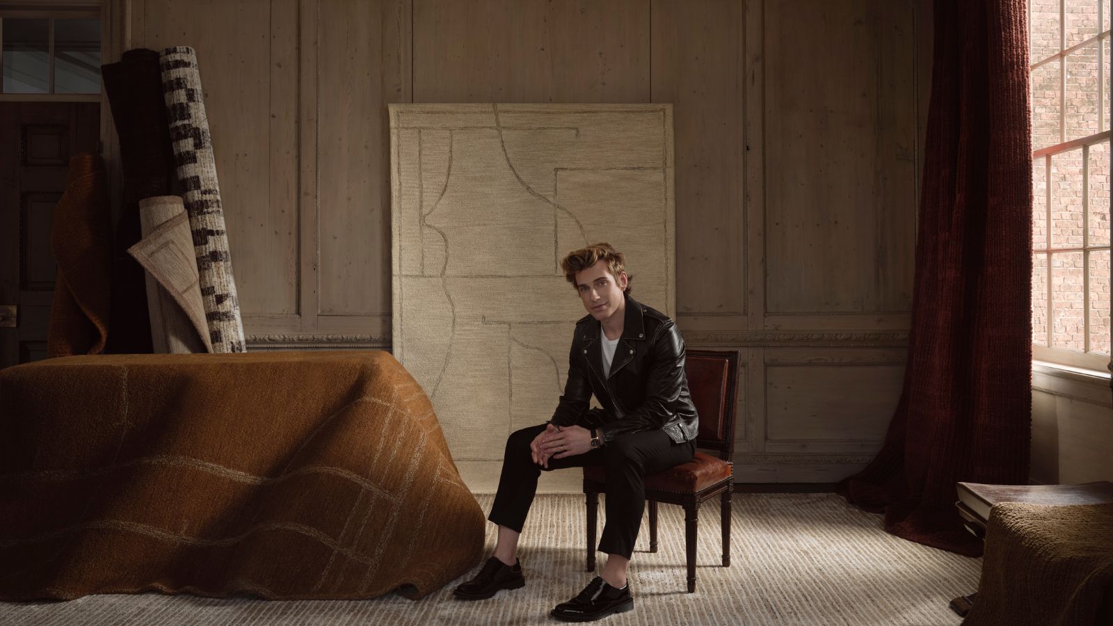 Jeremiah Brent's new NYC-inspired rug collection has got to be the easiest way to bring his modern Manhattan style into your own home
Jeremiah Brent has teamed up with Loloi Rugs to create a contemporary collection of home furnishings inspired by his city
By Eleanor Richardson
-
 I tried this one easy dishwasher trick and made the annoying need for manual drying a thing of the past
If you hate those little pools of water left on your cups and crockery, this towel trick is for you
By Punteha van Terheyden