Design house: Laid-back, neutral home in Utah, designed by Alice Lane Interior Design
Walk through this relaxed home in Utah.

This home belongs to Jessica Bennett, owner and design principal of Alice Lane Interior Design.
Her aim was to design a home worthy of the dreamiest vacation, and Jessica did just that. This beach house in the middle of the dessert is everything she could have hoped for.
See ourDesign house: A small, space-saving house in Los Angeles, designed by Stefani Stein
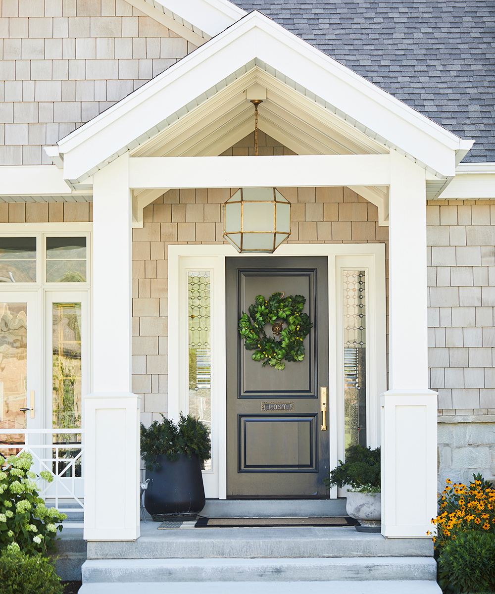
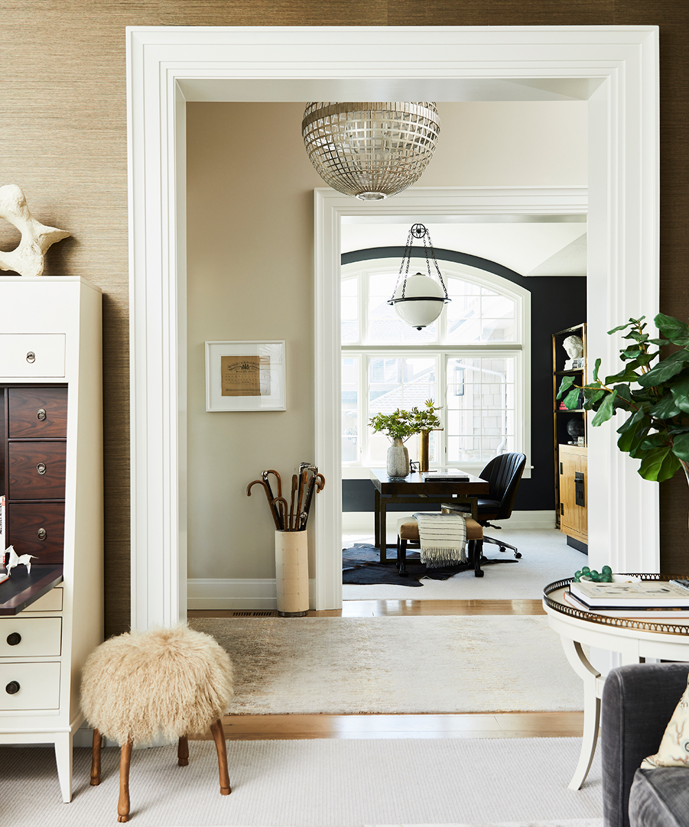
This is a truly transitional home, filled with antiquities, curious and found objects. This minimalist beach house has been truly dressed up.
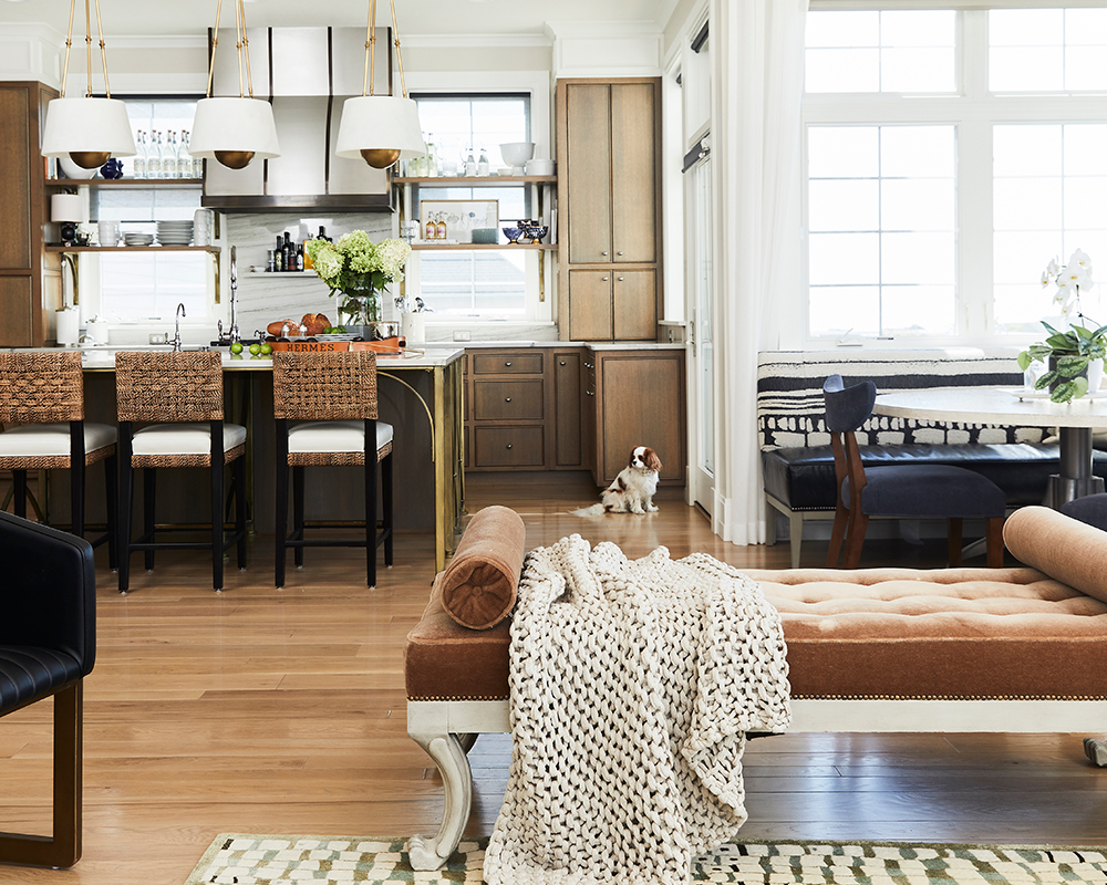
KITCHEN
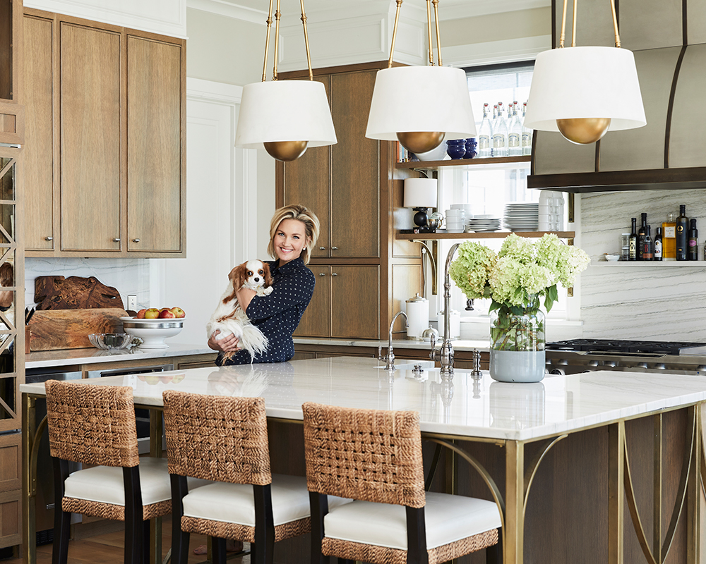
Jessica wanted the kitchen to feel original to her and not like so many of the white kitchens that Alice Lane was designing at the time.
The kitchen cabinetry is a rift sawn white oak which was chosen to reinforce the feeling of a laid-back beach house while giving it a modern edge, with a subtle bow to traditionalism. This look was inspired by interior designer Jeffrey Alan Marks’ home in Malibu.
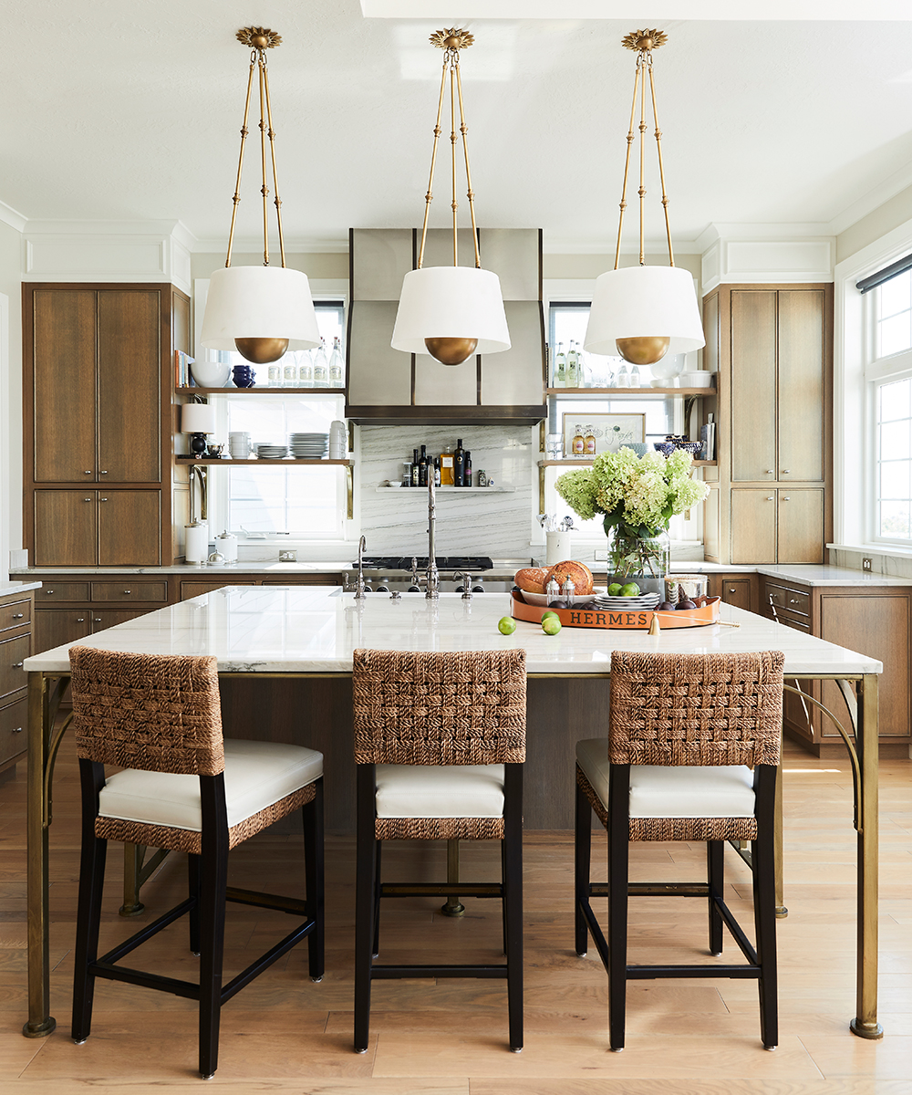
The countertops are Macaubas quartzite to create the look of the marble without the formality or maintenance. The quartzite runs all the way up the wall to enhance its effortless feel.
Sign up to the Homes & Gardens newsletter
Design expertise in your inbox – from inspiring decorating ideas and beautiful celebrity homes to practical gardening advice and shopping round-ups.
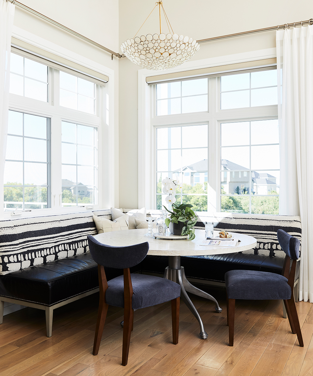
See ourDesign house: a modern and sophisticated East Coast residence, designed by Jamie Bush
FAMILY ROOM
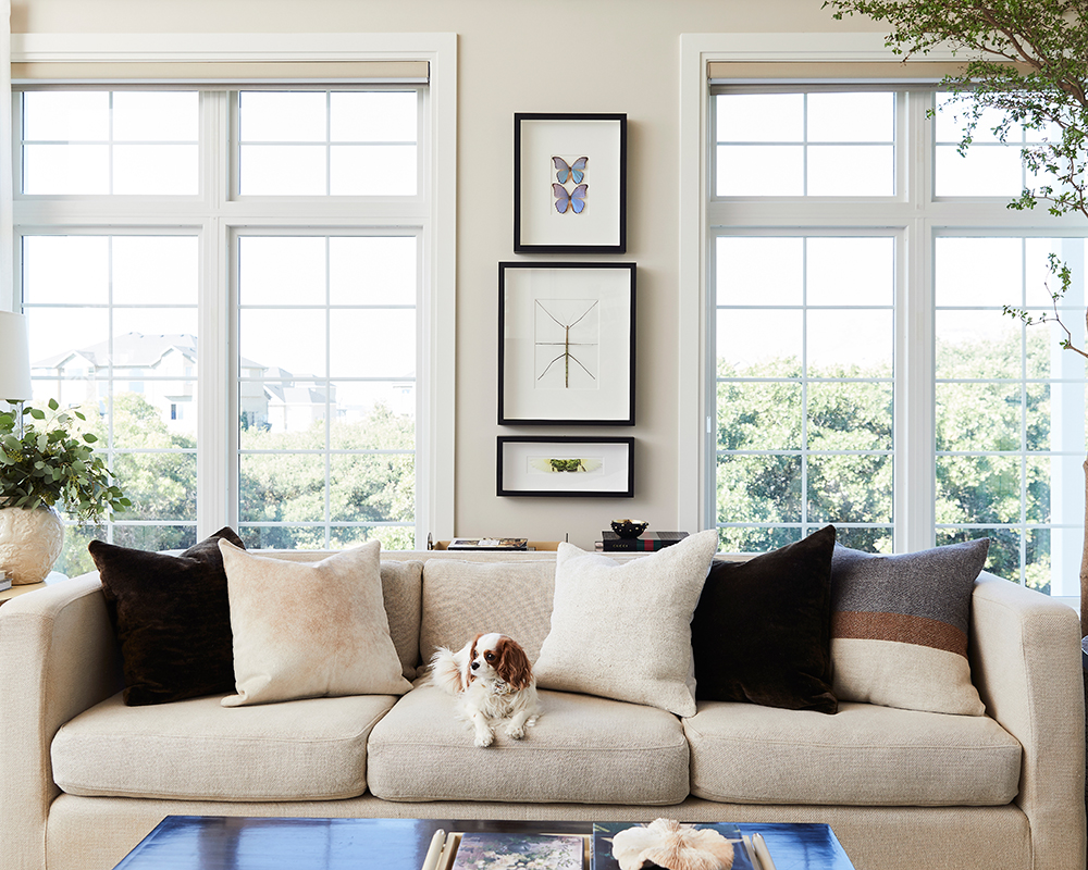
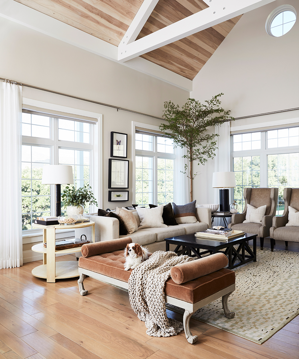
The family space feature and extra large sofa, perfect for lounging. Jessica brought her rug from her last home. It was created after a Gustav Klimt painting, and features organic rectangles and a refreshing colour palette.
LIVING ROOM
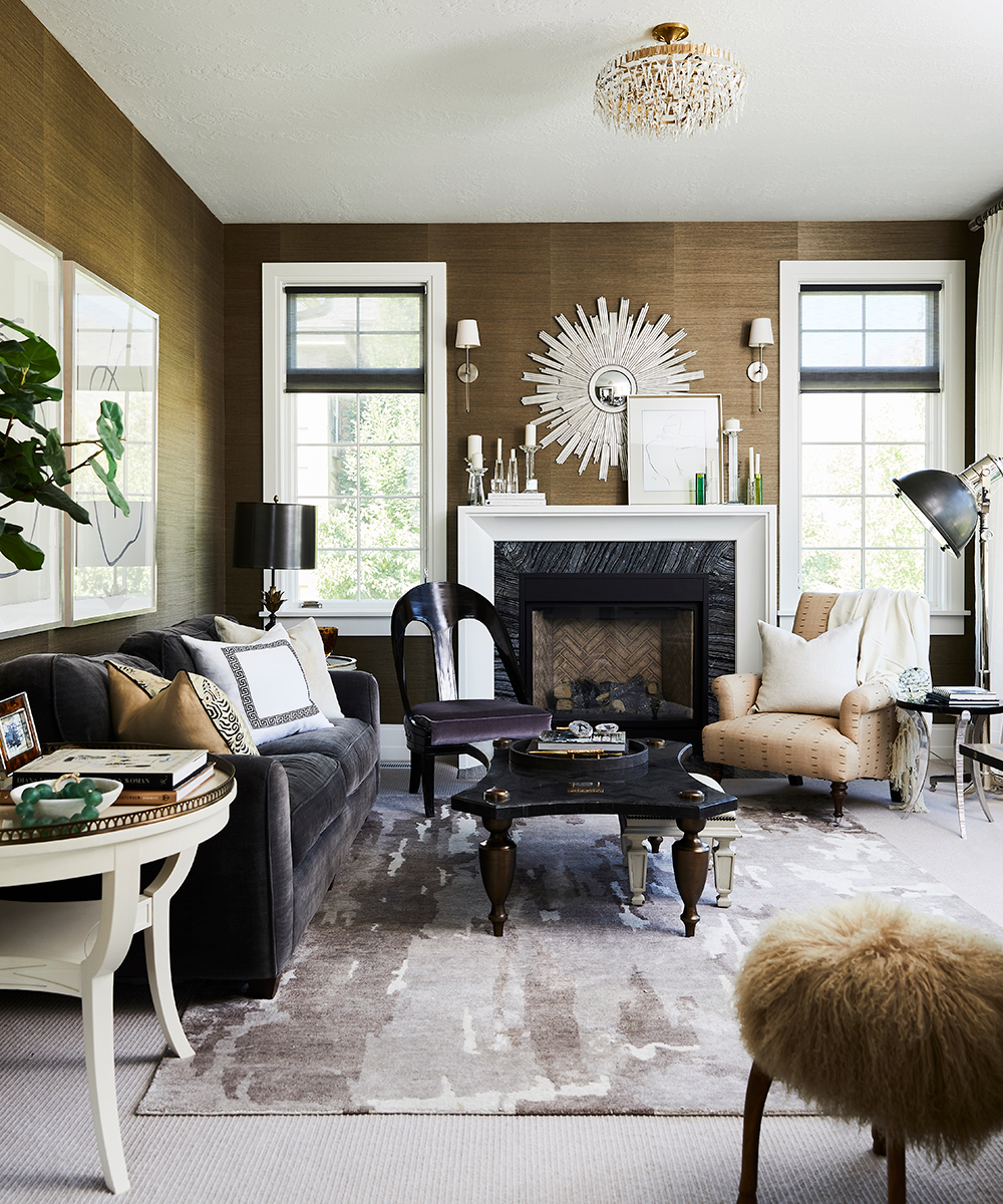
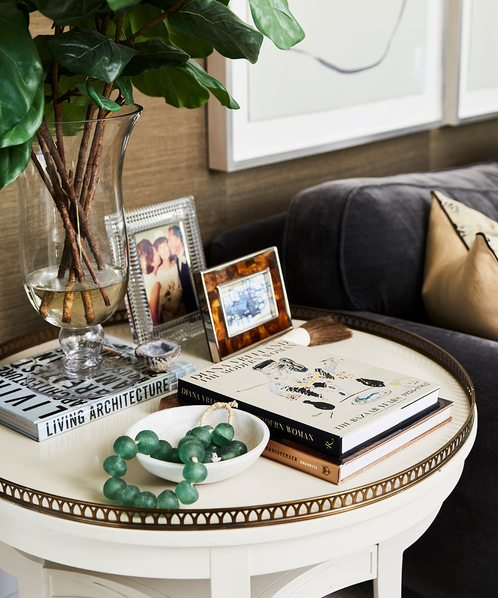
The warm colour palette in the living room is the perfect resting place for Jessica. The sofa is a firm favourite and has moved all over the country with her.
HOME OFFICE
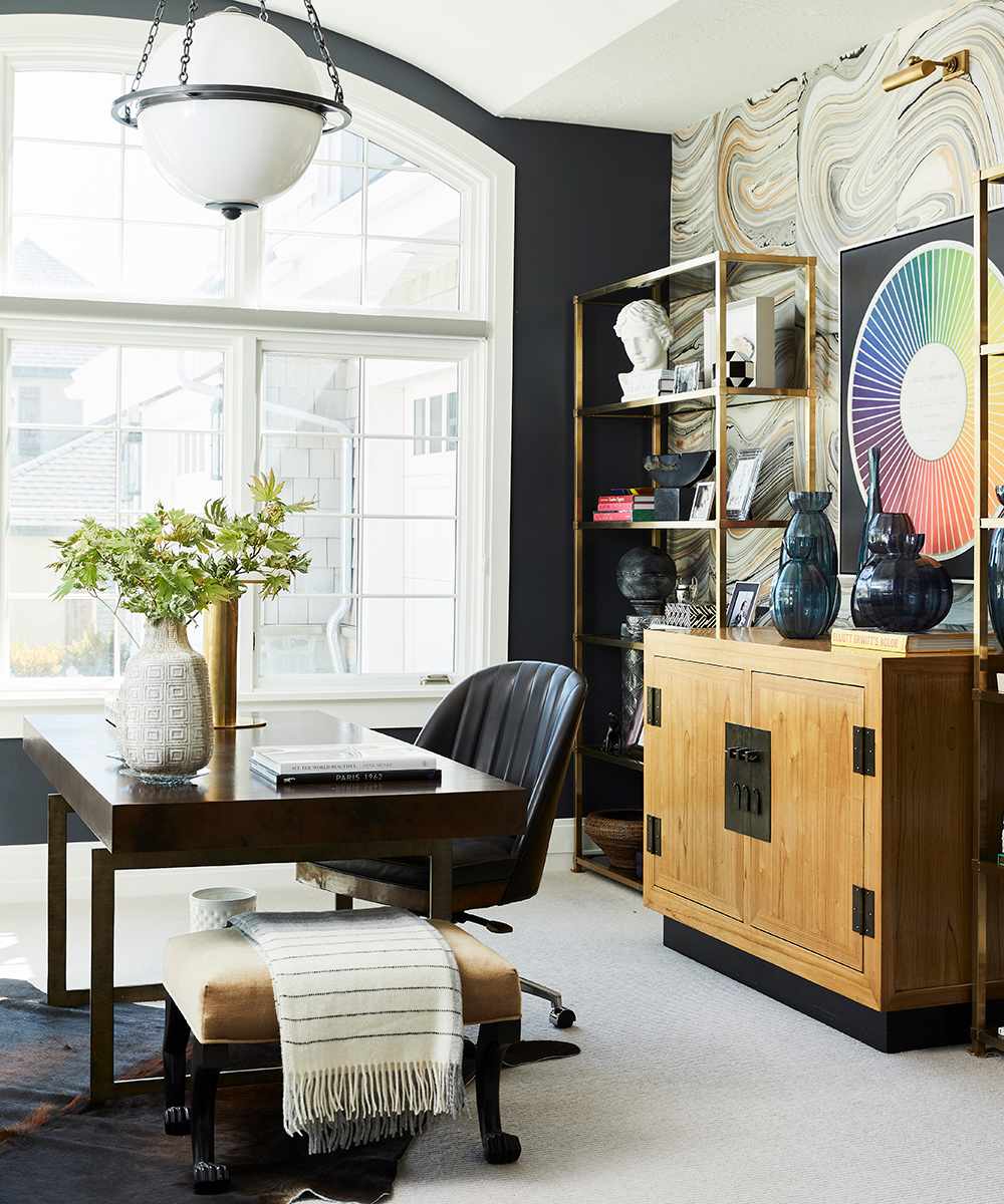
The home office is the moodiest room in the house. The walls are painted in a black navy colour scheme, yet the room still feels so bright and open because of the large windows.
For the walls behind the desk, Jessica wanted the wallpaper to look like the inside cover of an old book so she found individual pieces of art paper and had them installed as wallpaper.
BEDROOM
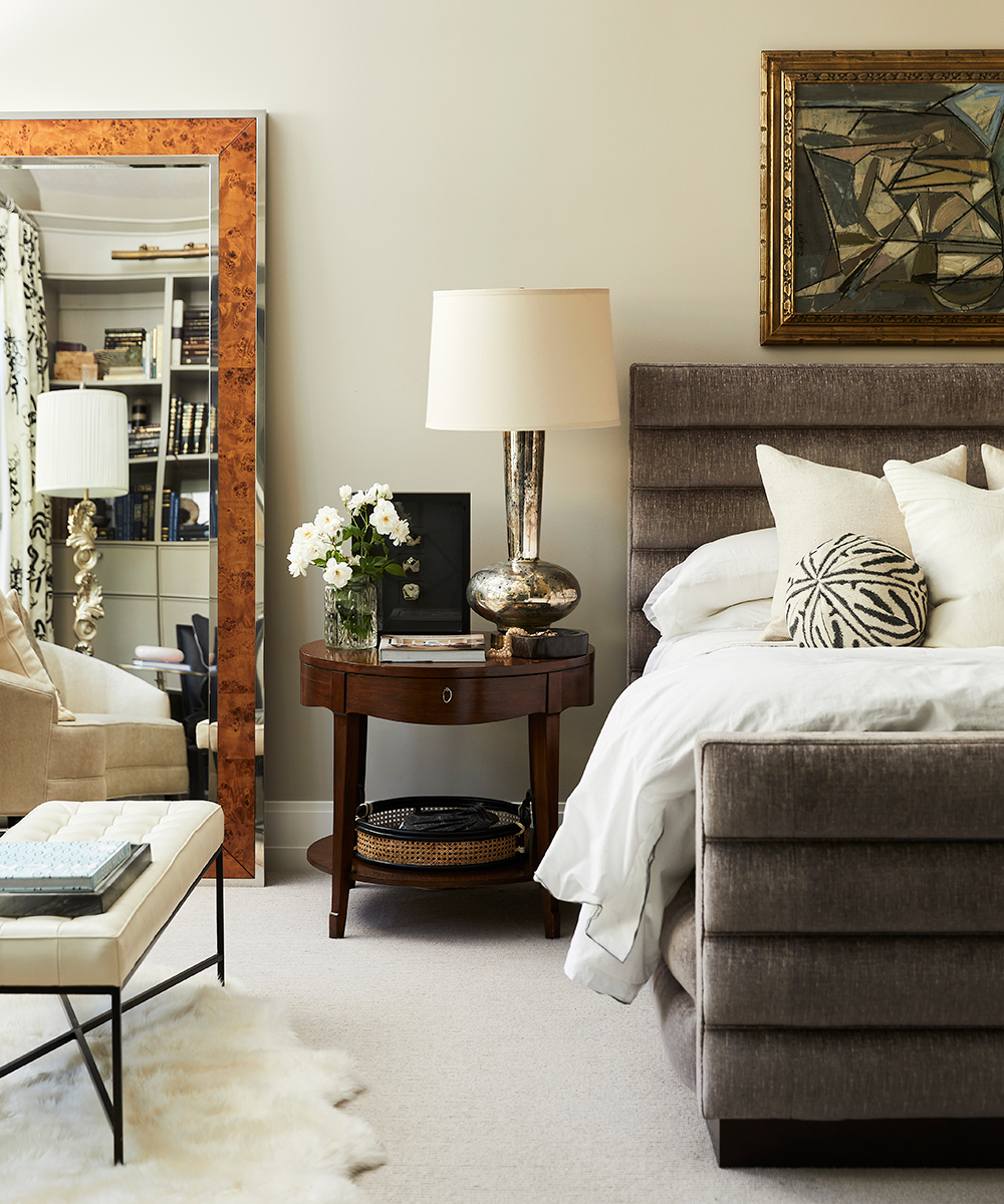
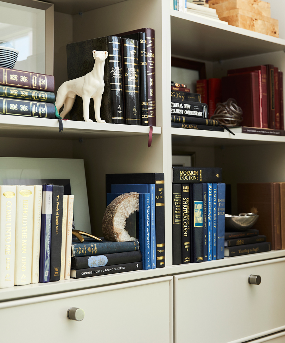
Bespoke cabinetry lines one side of the wall and has been styled with personal pieces the Jessica and her husband have collected throughout their lives together.
BATHROOM
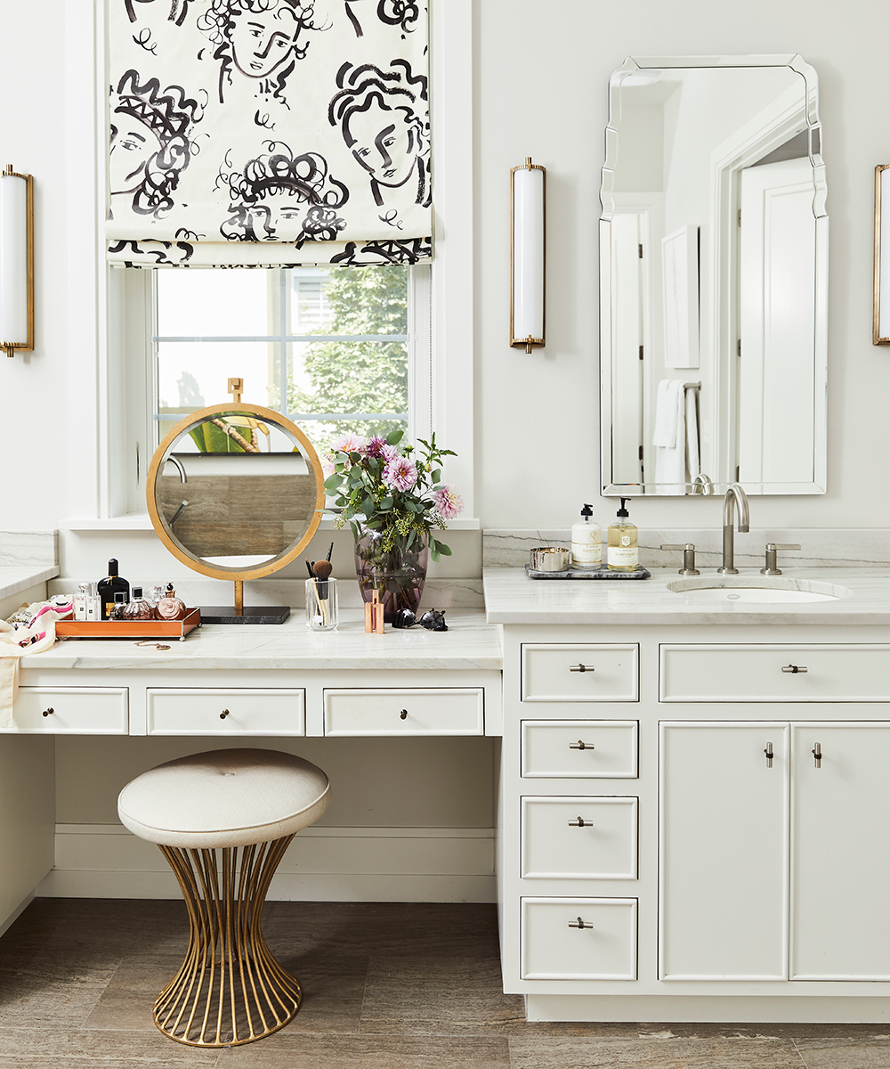
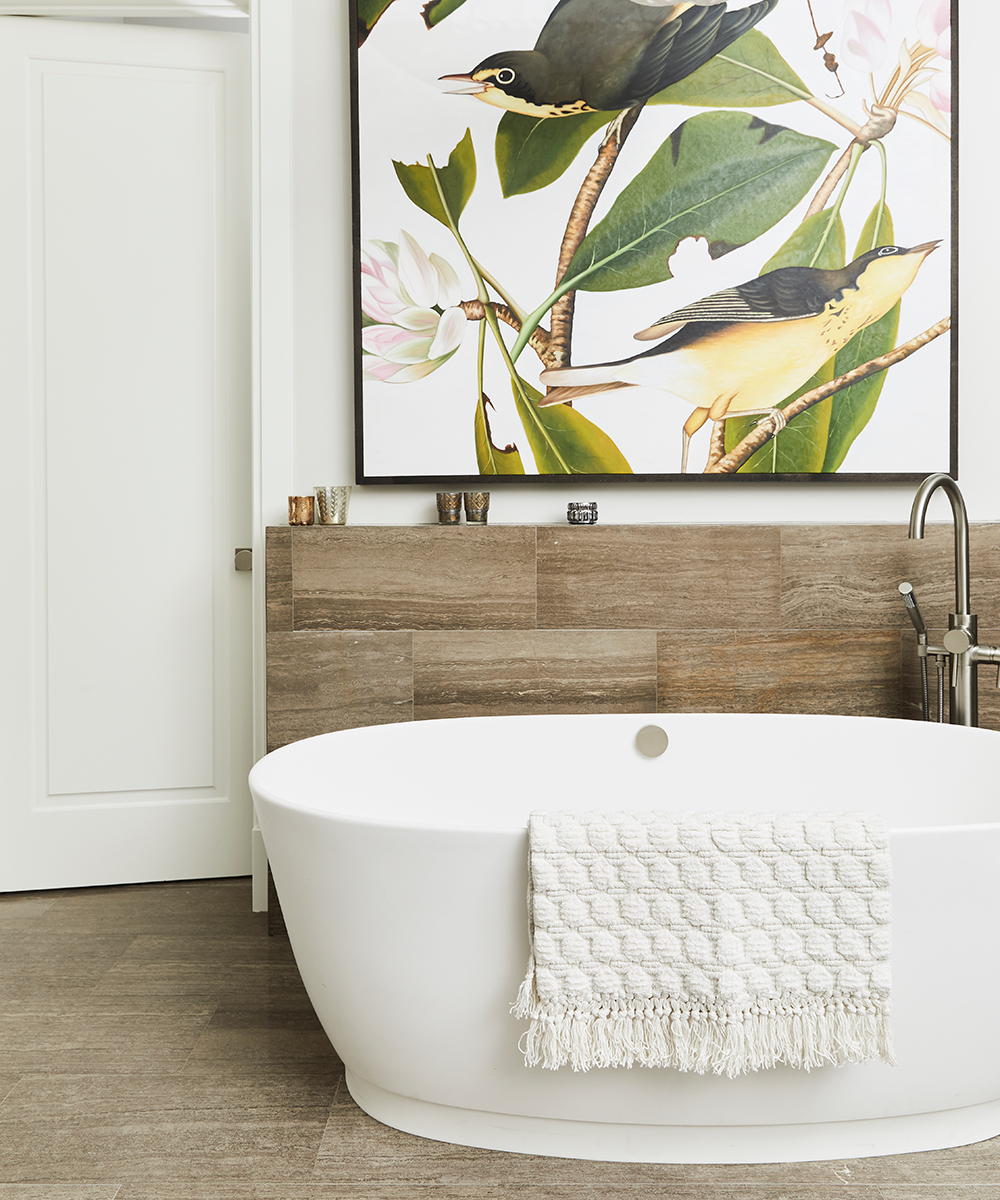
Jessica describes this space as a ‘dream’ to get ready in. The position of the window in relation to the dressing table means that light bounces around the room perfectly.
Photography/ Nicole Gerulat
Alice Lane Interior Design/ alicelaneinteriordesign.com

Jennifer is the Digital Editor at Homes & Gardens. Having worked in the interiors industry for several years in both the US and UK, spanning many publications, she now hones her digital prowess on the 'best interiors website' in the world. Multi-skilled, Jennifer has worked in PR and marketing and occasionally dabbles in the social media, commercial, and the e-commerce space. Over the years, she has written about every area of the home, from compiling houses designed by some of the best interior designers in the world to sourcing celebrity homes, reviewing appliances, and even writing a few news stories or two.
-
 Martha Stewart's intelligent cabinets 'take every inch into consideration' – their 'visually light' style will solve your small kitchen storage problems
'Every kitchen can be beautiful and functional, no matter what the size': 9 years since sharing her clever storage, Martha's cabinets are just as beautiful
By Megan Slack Published
-
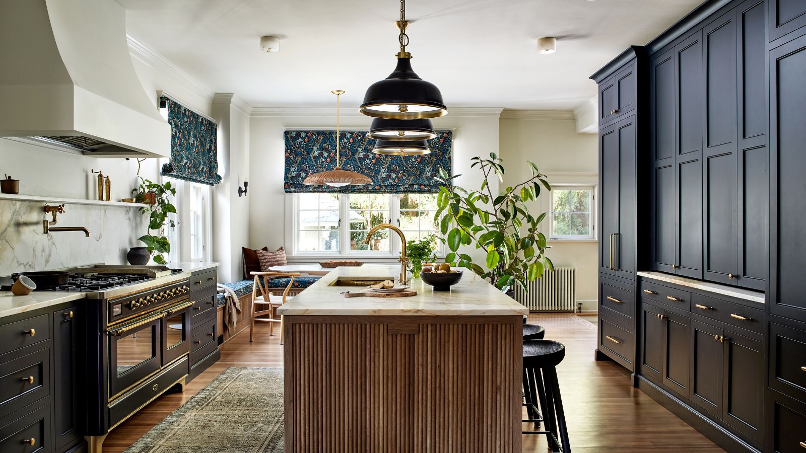 This once-dated kitchen is now a timeless space with the coziest details – and its the classic color palette that's made it a chic, welcoming space
Warming colors and natural materials combine to create this enduringly classic kitchen scheme
By Molly Malsom Published