Negative space in interior design – the technique professionals use to create perfect schemes
Negative space – or the areas in between objects – is a vitally important factor in successful interior design
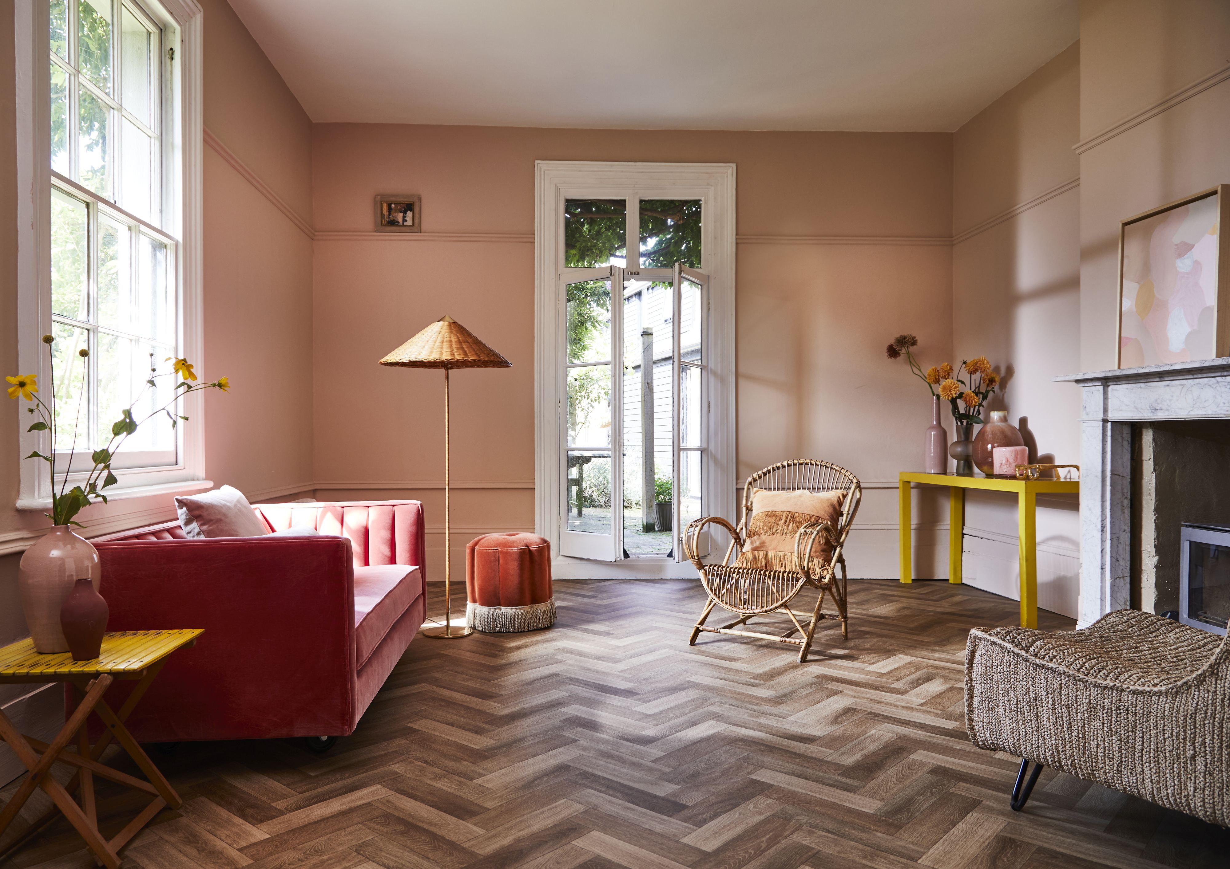

Negative space in interior design is like the breathing space we crave in life. The areas around objects are the negative space, and they can have practical value, allowing passage through the room, but they do far more than just allow free movement. The in-between of negative space is what makes a room feel comfortable and harmonious rather than cluttered and hectic.
In interior design, the areas of a room scheme where there’s an absence are as important as those where there are objects. This negative space allows us to see the chosen pieces clearly, and the eye to rest in between them.
To harness the benefits of negative space in every interior, take a look at this room-by-room guide.
See: Interior design tips – decorating secrets for the world's top experts
What is negative space in interior design?
Negative space in interior design is the empty space between two pieces of furniture, or between furniture and a wall, or around accessories. Negative space isn't a prescribed measurement (that depends on the proportions of a room and what is in it); nor is it just practical, providing thoroughfares from one part of a room to another or to another room entirely. It also allows a room to breathe and for furniture, furnishings and accessories to be showcased. Negative space is used to balanced 'positive space' to create a scheme that's balanced and comfortable to inhabit.
What does negative space create?
Negative space creates 'breathing room' within a room and a balanced feel. Too little negative space and a room will feel cluttered – and no single piece of furniture, however special, will be discernible. Too much negative space, and the room will feel under-furnished. Balance is key.
How do interior designers use negative space?
Designers use negative space to create perfectly balanced interiors that are furnished in a way that feels just right. These examples below will show you how to use negative space, room-by-room.
Sign up to the Homes & Gardens newsletter
Design expertise in your inbox – from inspiring decorating ideas and beautiful celebrity homes to practical gardening advice and shopping round-ups.
1. Create negative space in a kitchen by losing solid cabinetry
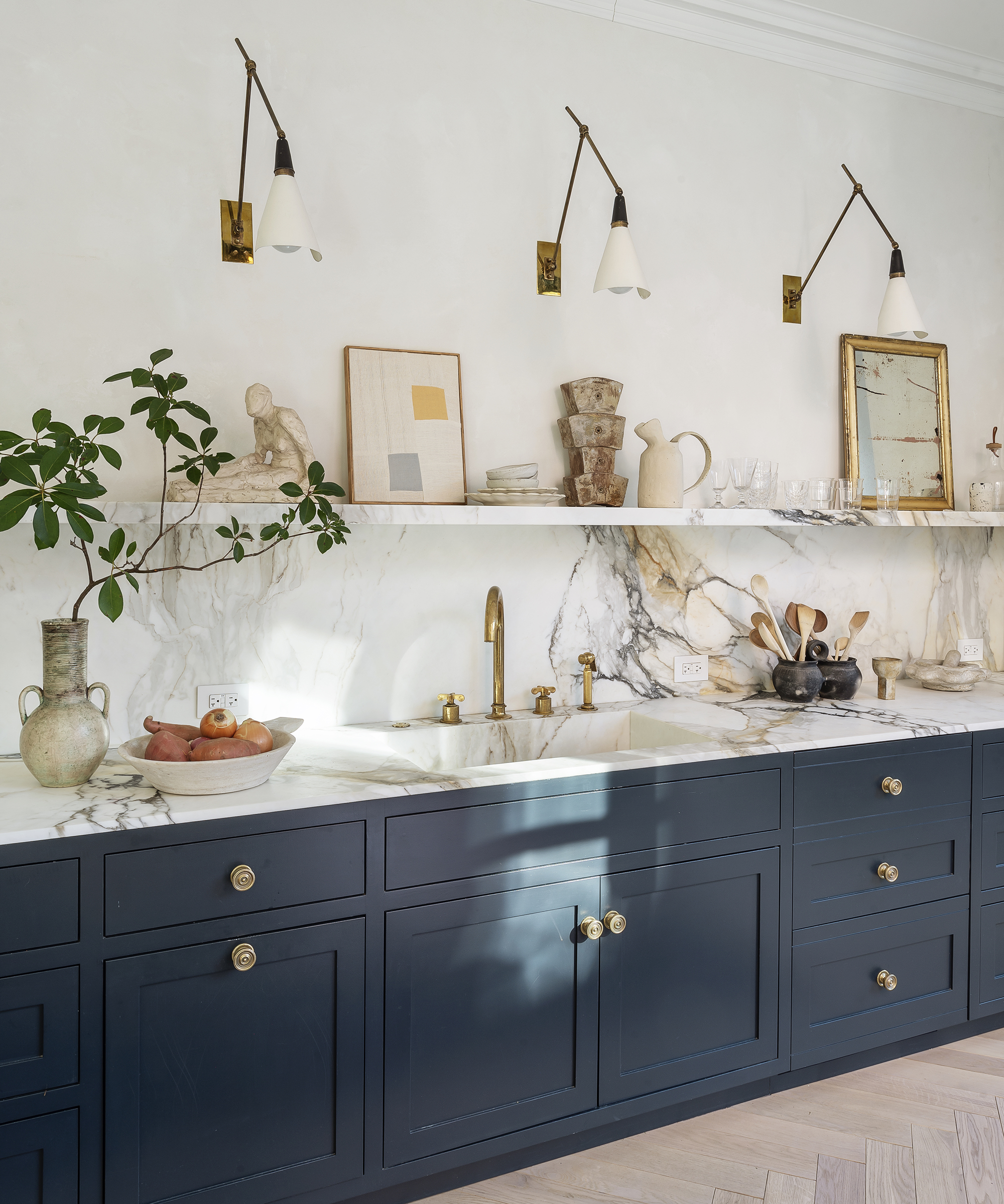
Kitchens need to maximize storage, but pack cabinets in everywhere possible and the room can feel cramped even when it’s large. For a more expansive feel, consider skipping wall-hung cabinetry to design negative space into the room.
The area above the countertop doesn’t have to be devoid of all objects, however. Fit shelving, and decorative accessories can be displayed and everyday items left easy to access. The space also provides the perfect location to hang elegant wall lights like these, which will draw the eye.
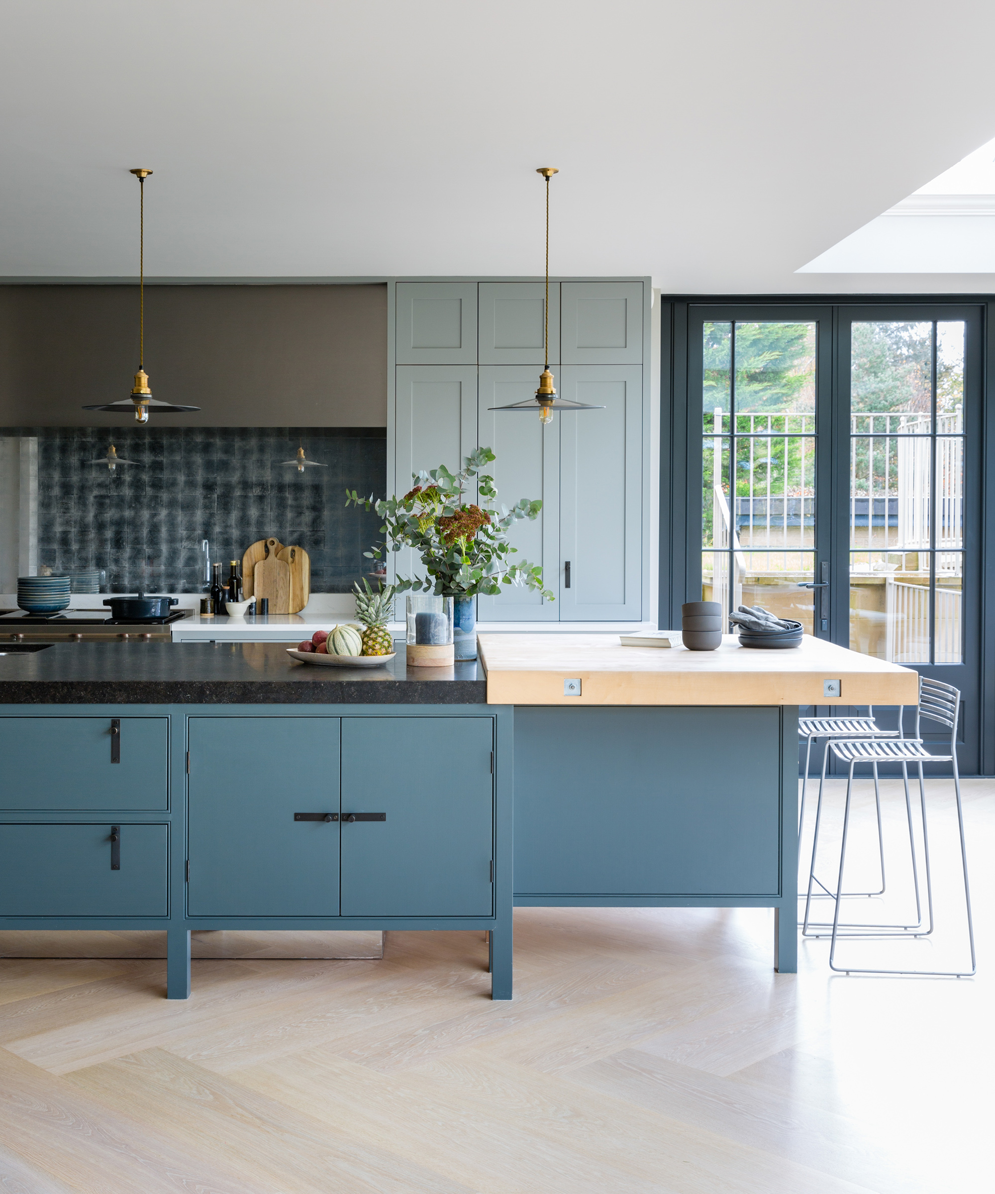
Choosing a kitchen island that is raised above the floor is another way to incorporate negative space into the room’s design. The island leaves a lighter impression than one that occupies the area to the floor and allows a long view through the room that focuses attention on the central feature.
The design of the bar stools makes use of negative space in this kitchen, too. Like the island they keep the view uncluttered and the spaces in their design emphasize the slim legs and narrow slats of the seats and backs.
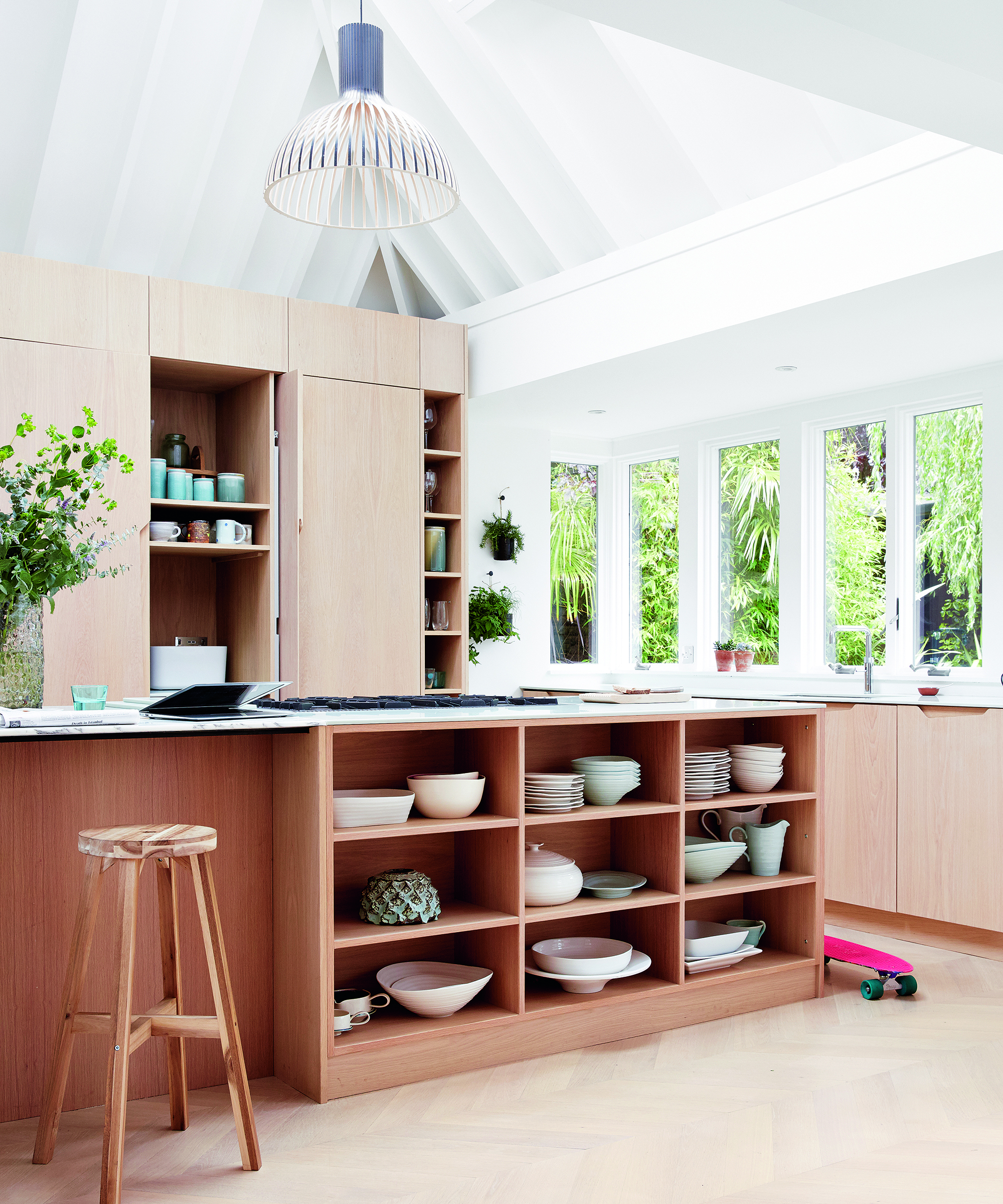
Making use of negative space in a design doesn’t require you to embrace minimalism if it’s not your favorite look. In this room, there’s plenty of decorative interest on offer from the open shelving on the island.
Areas without objects are still crucial for an effect that’s pleasing, though. Edit down displays like this, placing single objects or just a pair on some of the shelves to focus the eye on the most interesting pieces.
See: Kitchen ideas – decor and decorating ideas for all kitchens
2. Employ negative space for a bigger-looking bathroom
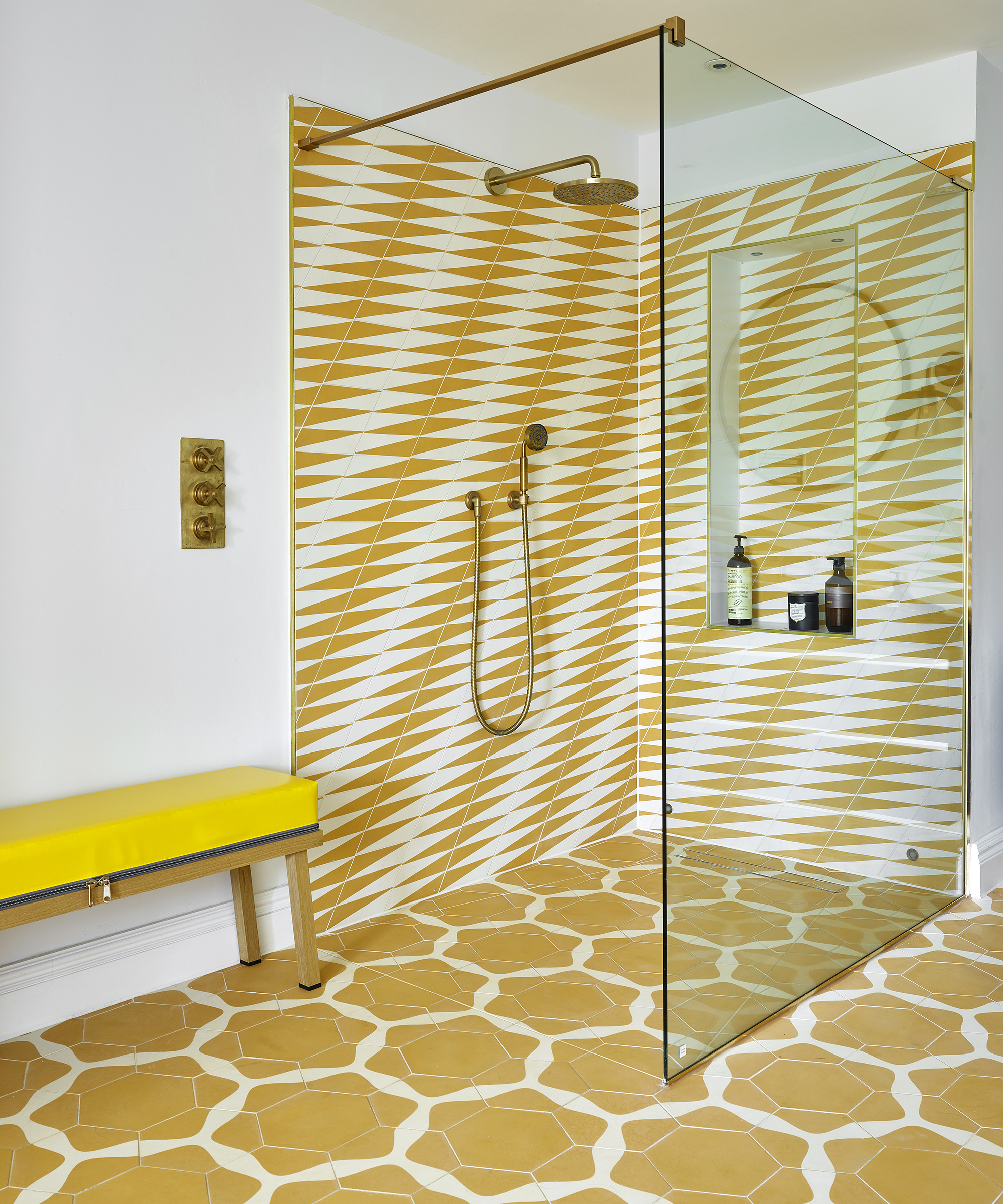
Patterned tiles are a fabulous way to exploit the power of negative space in a bathroom and make it a richly interesting room rather than a merely functional one. Here, the yellow parts of each of the two patterns are what catches the eye because of the bold color. But the white negative spaces form their own patterns, allowing the view to swap between the two and creating a dynamic effect.
There’s more negative space here, too. A pause in the form of white walls surrounds the two punchy elements of the room’s design to make it comfortable to spend time in.
And, of course, the near-invisible glass screen creates negative space with its lack of framing, allowing the eye to travel beyond it.
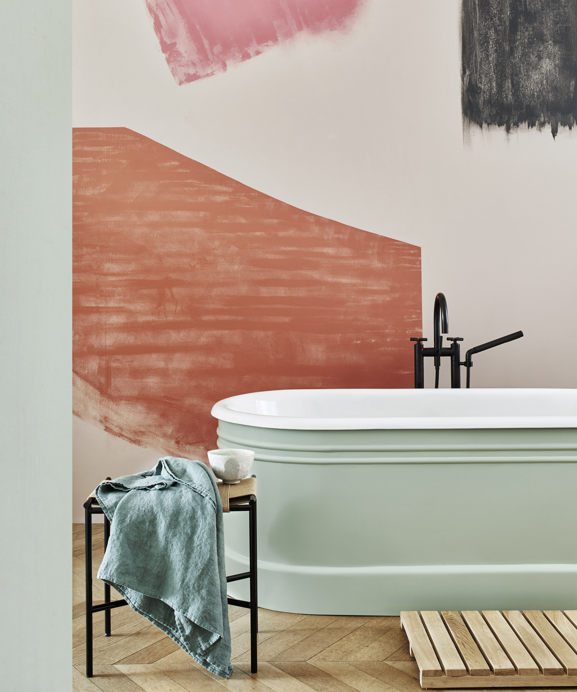
Negative space can allow bold decorative choices to be successful even in a bathroom of relatively modest size. The grand sweeps of color on the wall in this room are the focus, but the areas surrounding them are equally important giving the colors an outline and ensuring their grand proportion doesn’t overwhelm the room.
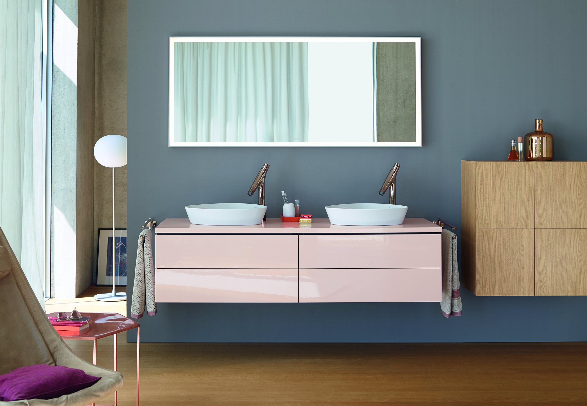
Choosing wall-hung furniture for the bathroom can boost the area of negative space. The result will be a more airy and restful atmosphere that will boost the room’s sanctuary credentials. The furniture itself can make an elegant focal point, and opting for an untypical bathroom color choice for this vanity assists in bringing attention to it.
Bear in mind that negative space doesn’t have to be white. The shapely faucets in this room stand out against the dark wall that makes this room welcoming and far from clinical.
See: Bathroom ideas – stylish decor ideas for all bathrooms
3. Factor negative space into a restful living room
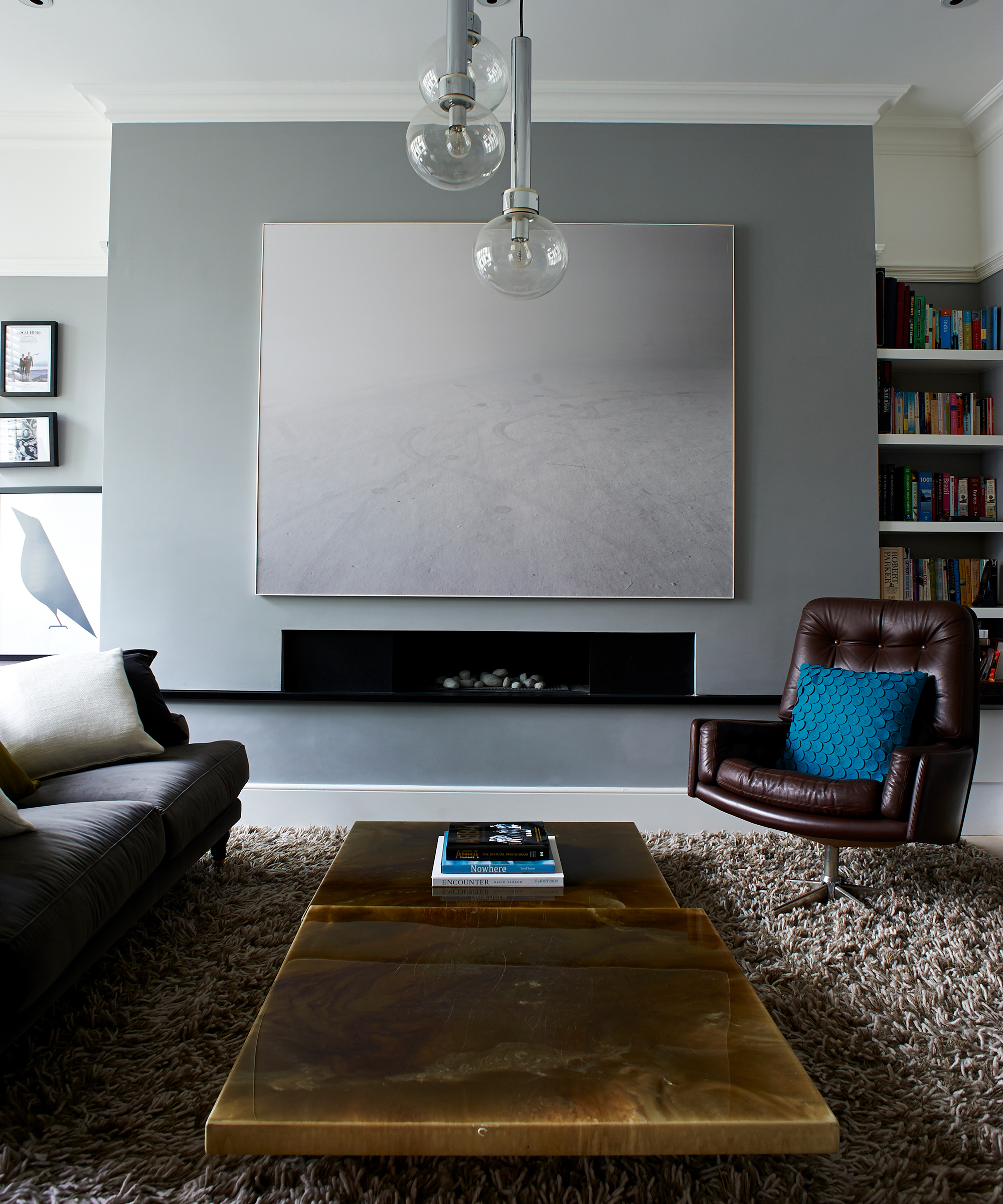
Going low with furniture in the living room can create the space that allows a focal point to shine. In this room, it’s a contemporary linear fireplace with striking artwork above. A higher coffee table would have compromised the view through, but this version helps lead the eye to the room’s central feature instead, and emphasizes the symmetry.
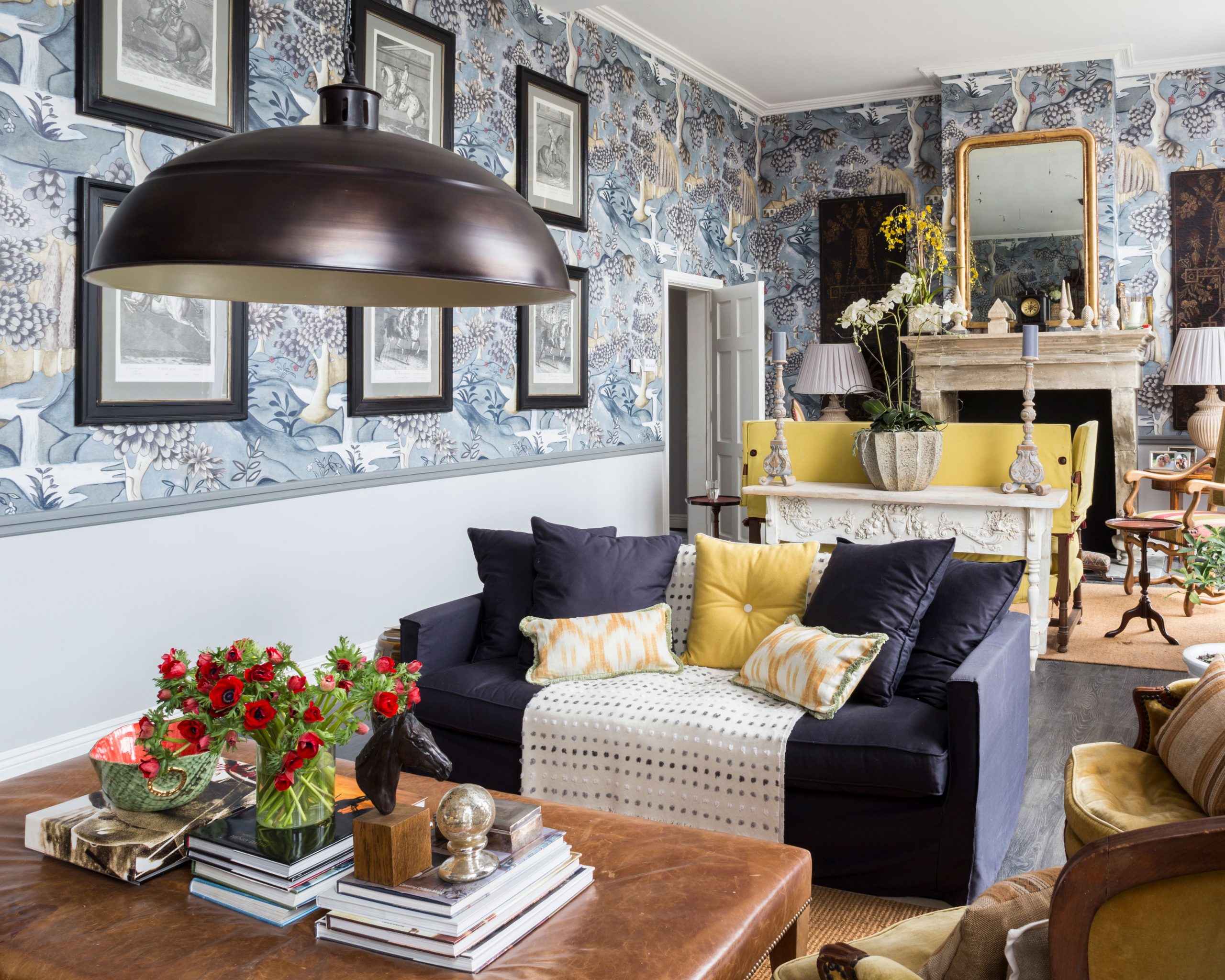
Even maximalists can benefit from designing a pause between the elements of their schemes. In this living room, the large repeat patterned wallpaper is balanced with a neutral wall color below dado level. This way, attention goes to the floorstanding pieces without competition from the wall, while the wallpaper’s motif is the standout feature at the higher level in the room.
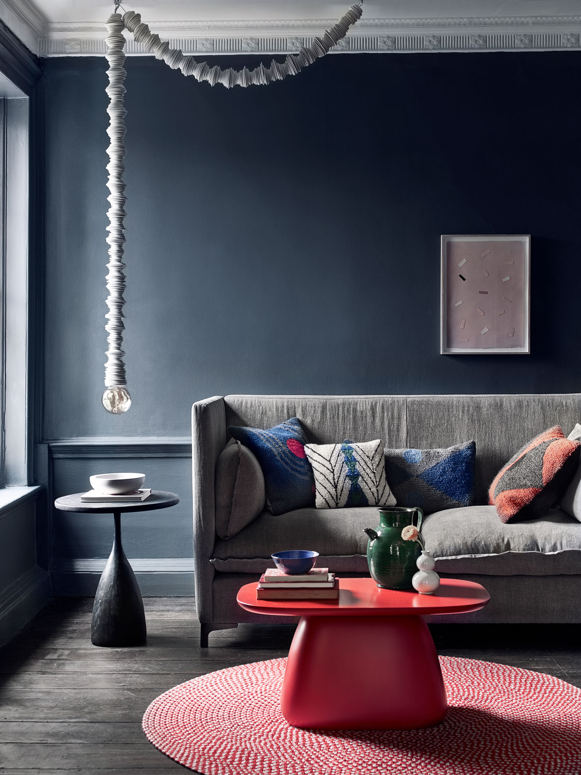
Clear the view to striking lighting to let it sing in a living room. Eliminating the objects that would attract the gaze around it is the key. In this room, the light stands out against the dark background of the wall, leaving the focus on its lines. The artwork above the sofa is deliberately scaled down to avoid impinging on any of the proportions of the shapely pendant.
See: Living room ideas – clever ways to decorate living spaces
4. Exploit negative space for a beautiful bedroom
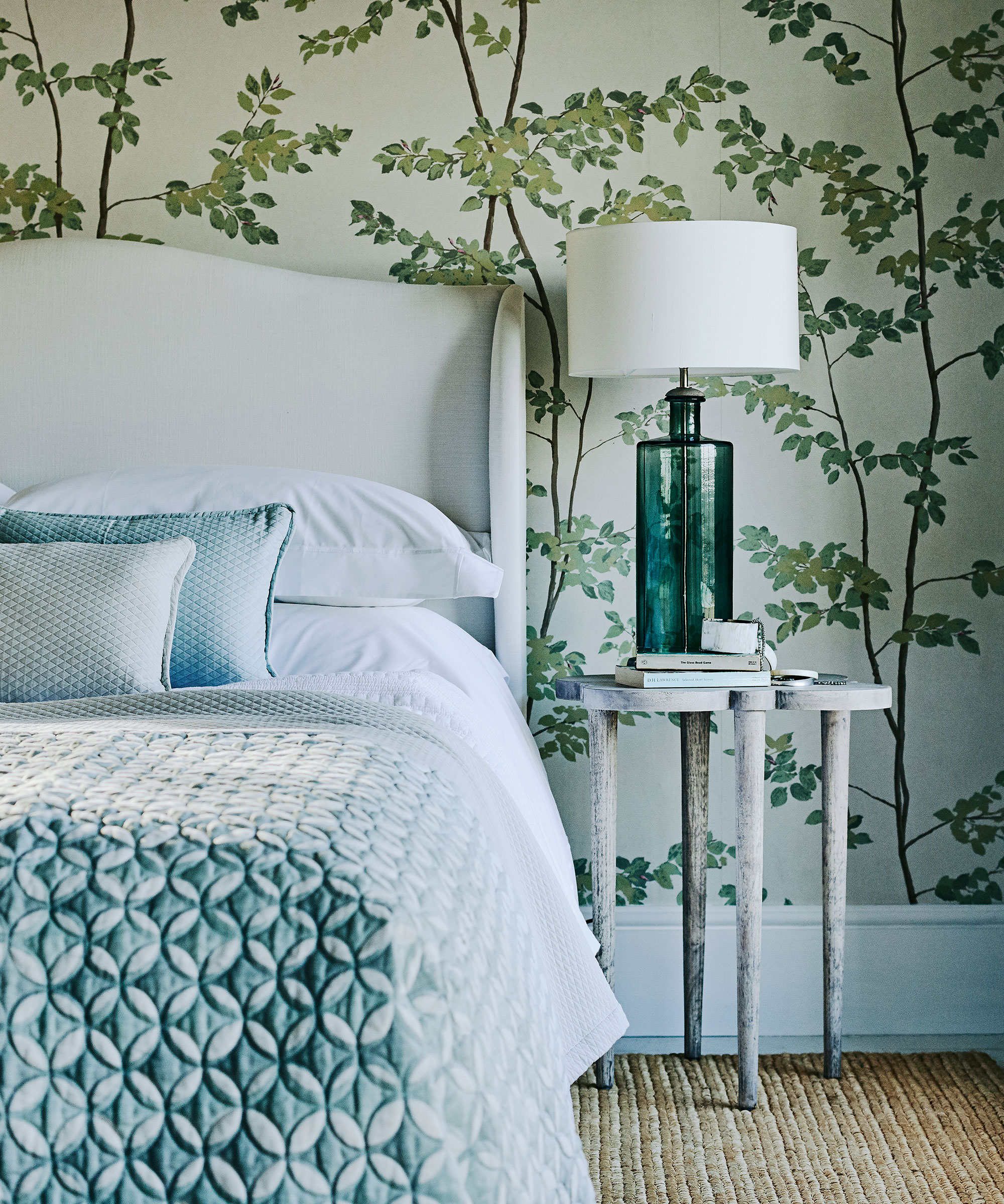
A restful bedroom scheme doesn’t require you to step away from patterned wallpaper. This botanical paper majors in negative space, but the design is nonetheless striking with branches ‘growing’ from floor to ceiling. Unlike within a geometric design, there’s no negative pattern for the eye to focus on here, but the wallpaper’s ground pulls the gaze to the natural motif, creating a soothing effect that’s perfect for a sleep space.
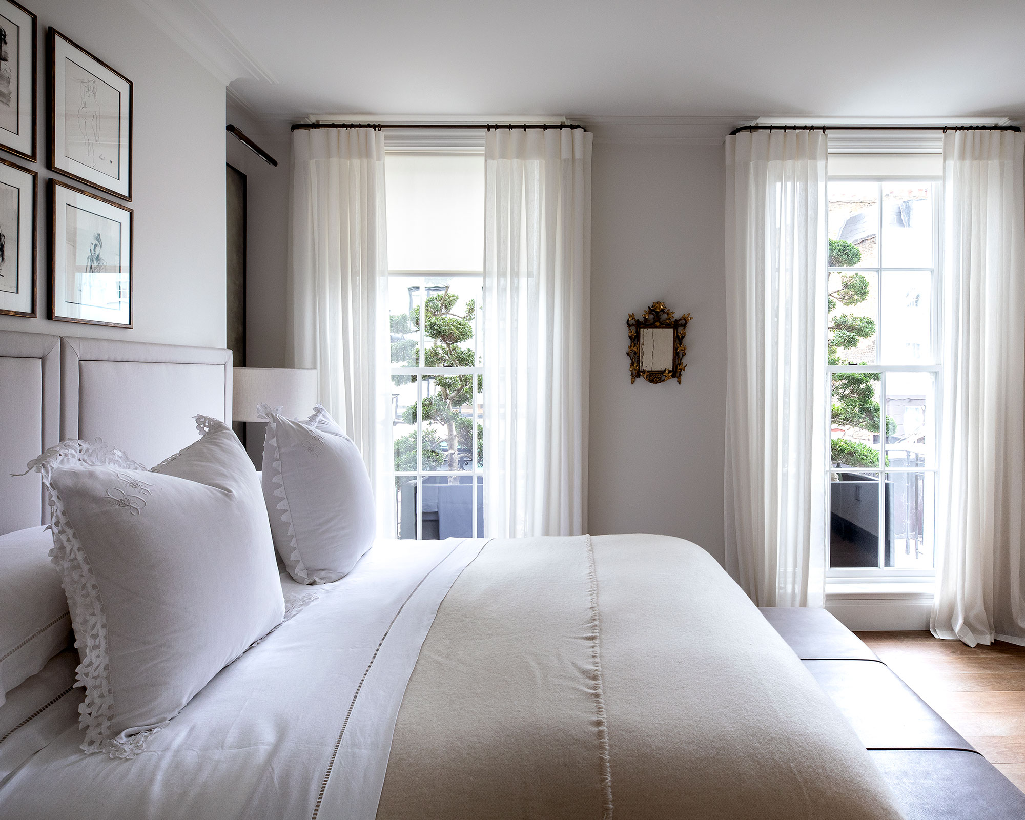
If the best thing about your bedroom is the view, clear the items that will tempt the eye to focus elsewhere and let it take the lion’s share of attention. In this room, the bed is simply dressed and the scheme is neutral, while color comes from the trees outside.
Drapes that are semi sheer provide a frame for the windows as well as privacy without ever completely concealing the vista, while the bed is high enough that the outlook is the star of the show even when lying down rather than standing.
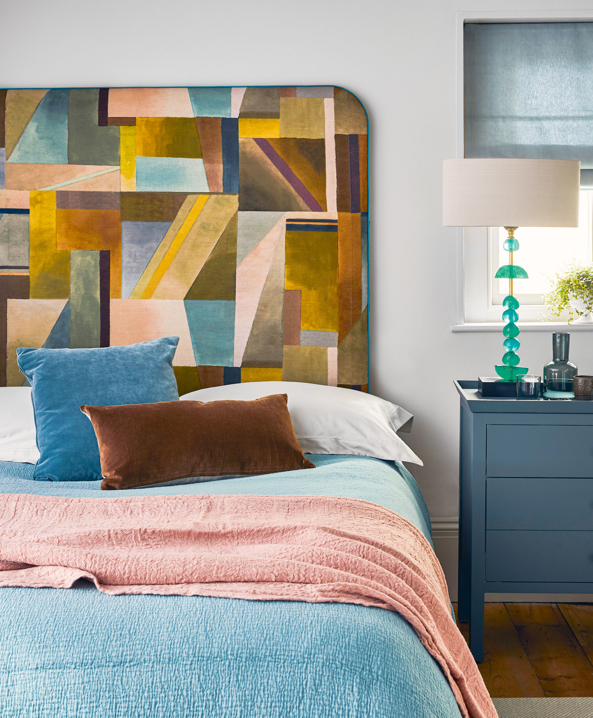
Let the bed capture attention without competition by leaving the space around the headboard unfilled. Pictures hung above will compete for the viewer’s gaze, as will bedside tables that are too close, but in this room there’s no question about where to look.
The effect is enhanced by the repetition of colors and textures between the headboard and the cushions that make the bed extra inviting.
See: Bedroom ideas – designs and inspiration for beautiful bedrooms
What is a negative shape?
A negative shape is quite literally the shape created by the negative space – or the gap between two or more objects, whether vases on a windowsill or an ornate mirror frame and the architraving above it. Negative shapes can be just as attractive as the objects – or positive shapes – themselves.

Sarah is a freelance journalist and editor. Previously executive editor of Ideal Home, she’s specialized in interiors, property and gardens for over 20 years, and covers interior design, house design, gardens, and cleaning and organizing a home for Homes & Gardens. She’s written for websites, including Houzz, Channel 4’s flagship website, 4Homes, and Future’s T3; national newspapers, including The Guardian; and magazines including Future’s Country Homes & Interiors, Homebuilding & Renovating, Period Living, and Style at Home, as well as House Beautiful, Good Homes, Grand Designs, Homes & Antiques, LandLove and The English Home among others. It’s no big surprise that she likes to put what she writes about into practice, and is a serial house renovator.
-
 5 surprising but brilliant ways to clean with old socks – from perfectly buffing stainless steel to deterring pests naturally and more
Tackle dust in tricky corners, clean your mirrors and even banish bad odors with those rogue single socks
By Andy van Terheyden Published
-
 How to grow astilbe – expert advice on cultivating this shade-tolerant flowering perennial
Shade-tolerant and pest-resistant - astilbe are hardy and tough perennials that can thrive in many settings
By Ellen Wells Published