These 10 Farrow & Ball colors are their most popular paints – from earthy neutrals to deep and dark shades
These versatile paints are used time after time – and for good reason

Emily Moorman
Farrow & Ball boasts a wide range of iconic paint colors which have become firm favorites among interior designers and homeowners alike. Known for their rich pigments and flattering shades, Farrow & Ball paints are continually embraced in the world of interior design.
From relaxed and earthy neutrals that provide a timeless backdrop throughout the home to moody shades of blue and green, you will no doubt already be familiar with some of their most widely used shades used for room color ideas.
‘The most important aspect of using color is to create spaces that are warm and welcoming for our friends and family – colors that make us feel proud of our homes,' explains Joa Studhome, Farrow & Ball Color Curator.
10 of the most popular Farrow & Ball paints
Here, we've rounded up the ten paint ideas that, according to Farrow & Ball, are among their most popular. If you're looking for some color inspiration to elevate your home in 2024, these paints are both sophisticated and versatile.
Every shade, no matter how muted or bold, feels deeply liveable and creates a warm and inviting home.
1. Setting Plaster
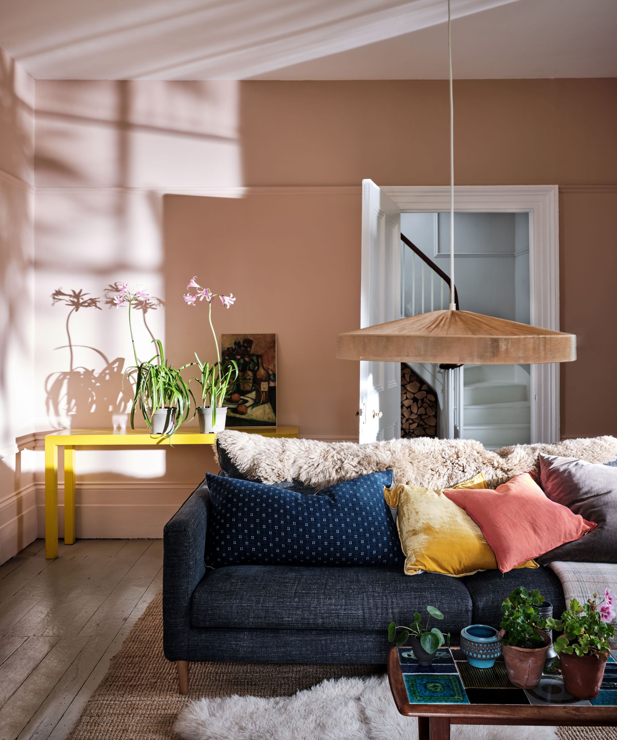
Taking inspiration from the color of freshly plastered walls, Setting Plaster is a dusty, earthy shade of pink that's earned its place as one of the brand's best-selling shades for decorating with neutrals.
'Gentle, dusty pinks like Setting Plaster are always a popular choice that can be used in every room and these shades have recently become the new neutral to use over grays,' says Charlotte Cosby, Creative Director at Farrow & Ball.
Sign up to the Homes & Gardens newsletter
Design expertise in your inbox – from inspiring decorating ideas and beautiful celebrity homes to practical gardening advice and shopping round-ups.
'It has an understated beauty which envelops a room to create a dreamy, soft environment, particularly when used across the ceiling and woodwork too.' We explore more pink room ideas in our dedicated feature.
2. Ammonite
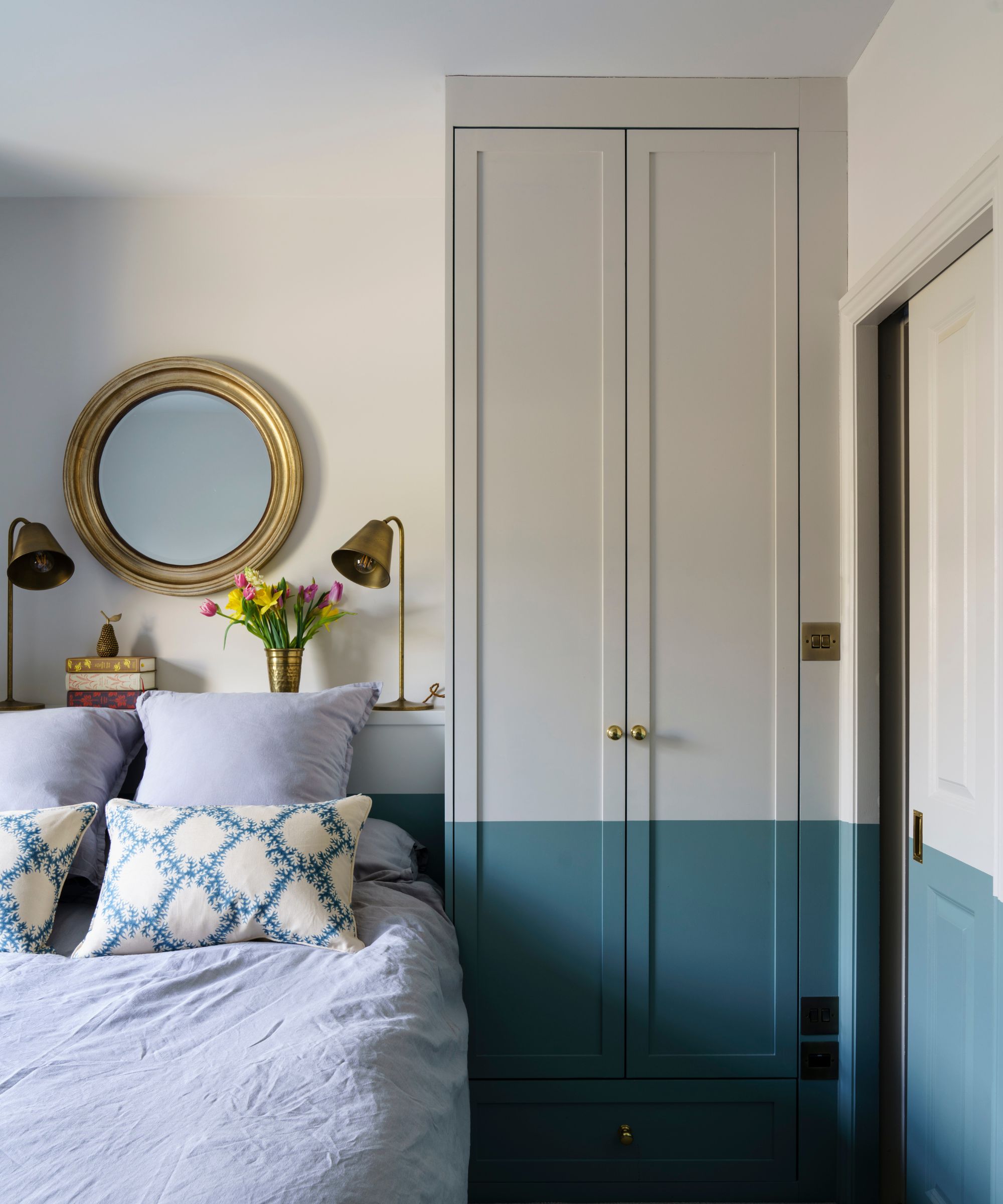
Ammonite is named after the treasured fossils often found on the Dorset coast in the UK. It is Farrow & Ball's most popular neutral – neither too warm nor too cool, and works in all rooms, no matter their orientation. There's a very subtle gray tone to it that is only noticeable if you pair it with a brighter white such as All White.
‘Ammonite has a fantastically understated quality,’ says Joa. ‘Its subtle gray tones create a hushed, calming feel. A lighter version of the ever-popular Cornforth White, it's brilliant for woodwork and ceilings in combination with darker walls.’
The beauty of Ammonite is that it works in both old and new properties, which is one of the reasons it's so popular. Farrow & Ball do recommend their ‘white and light tones’ primer and undercoat to get the best result.

As Farrow & Ball's Color Curator and author of titles including Recipes for Decorating and How to Decorate, it’s no surprise that Joa Studholme knows Farrow & Ball's palette and finishes inside and out. Joa has been with the brand or over 25 years – in that time, she’s developed color ranges and consulted on design projects all over the world, as well as helping countless color consultancy customers to transform their homes.
3. Railings

More blue than black, Railings is a softer alternative to decorating with black which is particularly suited to the ironwork it takes its name from. The bluer undertones of this dark hue transform rooms into dramatic and enveloping interior spaces. We love this color in studies and dining rooms, where it is wonderful for adding character and atmosphere.
Joa shares why Railings is such a good choice: ‘Despite its deep tone, Railings is extremely versatile and can be used throughout the house on both walls and woodwork. Its charm comes from being more blue than black and is the perfect softer alternative to pure black. Often used on staircases and kitchen islands as a darker accent to any Farrow & Ball color, it is also enduringly popular for smart but understated front doors in either Exterior Eggshell or Full Gloss.’
Yes it is dramatic, but you can make this color work in a room by teaming it with mid-toned wood, gray accessories and some beautiful textures.
4. Down Pipe
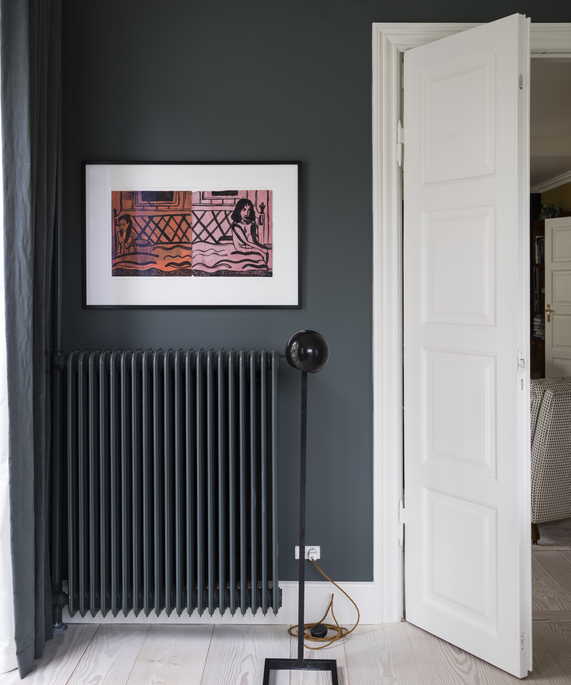
Down Pipe, a dark lead gray, has definite blue undertones to it which deepen the complexity of the finish. ‘Originally inspired by the color used to paint downpipes and guttering, it has been embraced for use inside the home with fanatical zeal,’ say Farrow & Ball color specialists. We think it's a wonderful contrast to Farrow & Ball's light neutrals.
‘Enduringly popular, Down Pipe can be used in many ways in the home,’ says Joa. ‘It has been adopted as the ‘go to’ color for stronger accent walls and intimate sitting rooms as well as on woodwork to create a slightly gritty, industrial feel, it has an unusual softness which means it is seldom overpowering.’
If you’re worried about this color feeling too dark, then remember you can add in white woodwork – which would look striking – and a white ceiling, the contrast alone would be a fabulous statement.
5. Sulking Room Pink
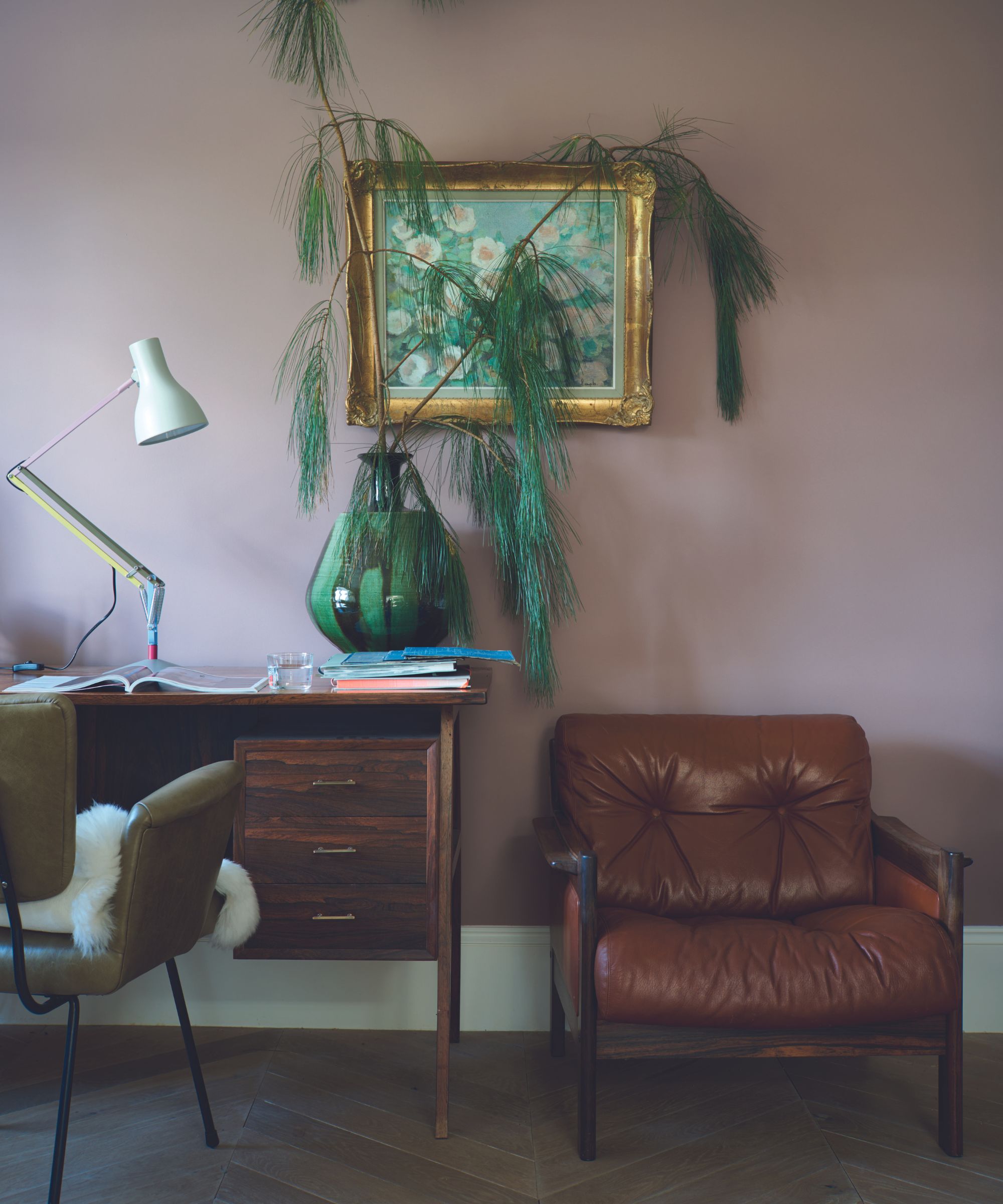
Named after the French word ‘bouder’ – to sulk, Sulking Room Pink is also evocative of the shade commonly used in boudoirs. It’s a dusky, muted rose that has warm tones as Joa mentions below:
‘Sulking Room Pink should not be seen as overtly pink, its powdery feel makes it incredibly soft and easy to use with complementary darker tones. This color has its roots firmly in the past but is the perfect tone for furniture and walls alike in the contemporary home.’
Great White is the Farrow & Ball recommended ‘white’ to go with Sulking Room Pink, it’s a white with a hint of lilac so it perfectly complements a fellow warming shade.
6. Hague Blue
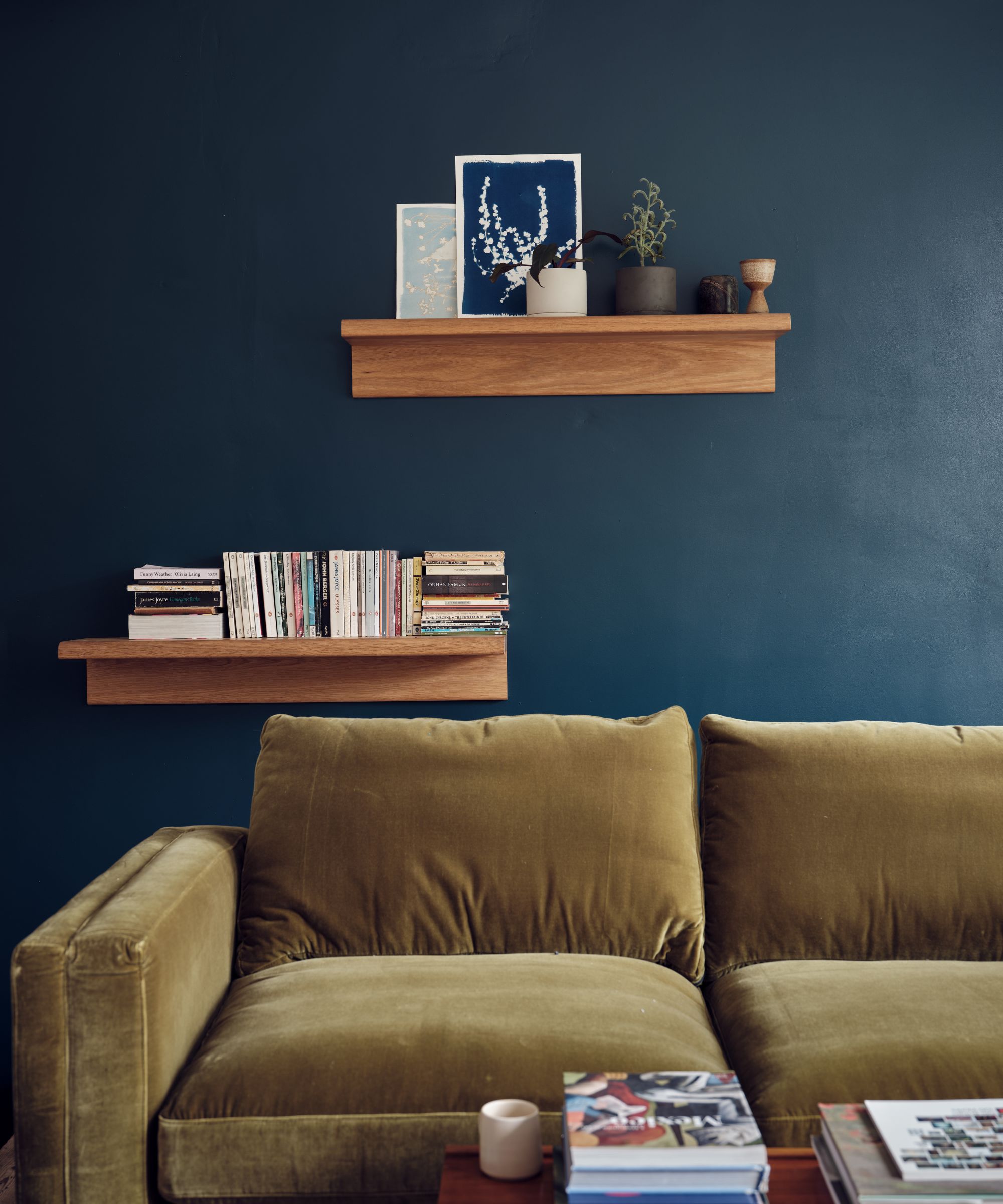
This strong blue takes its name from the fantastically colored woodwork much used by the Dutch, and still works wonderfully to ground skirtings or as an accent color. This blue has a green undertone which gives it warmth and makes it a great choice for rooms that are north- or east-facing and which receive cooler natural daylight.
‘Hague Blue oozes period grandeur and creates a really dramatic, glamorous feel. It’s very popular as an alternative to charcoal gray in living rooms or rooms that you end up in at the end of the day when you are no longer concerned with daylight,’ advises Joa. ‘It’s best not combined with white on woodwork or ceilings – it will feel far more sophisticated with the same color on the woodwork and a dark neutral like Shaded White on the ceiling.’
Darker shades can feel a little daunting to use for blue room ideas, but if you follow Joa’s advice above, it will work beautifully. Hague Blue will also look great with mid-toned grays and mahogany furniture.
7. Strong White
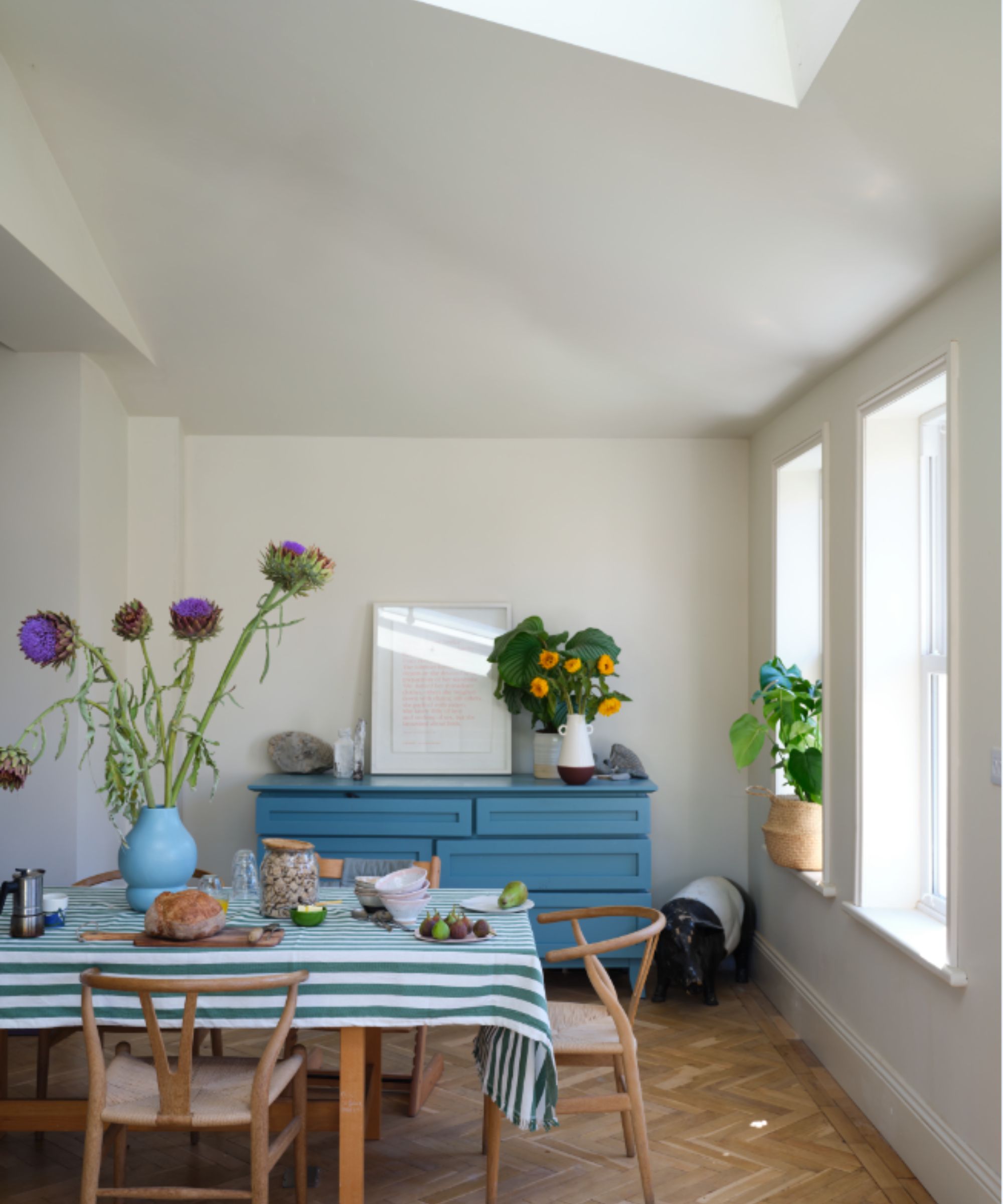
This cool white is both strong by name and strong by nature. The subtle urban feel of its light gray undertones adds a contemporary twist to period homes.
‘This gray-based Strong White adds a contemporary twist to period homes while staying in keeping with modern properties,’ explains Joa. ‘Particularly popular in kitchens where it can be used on both walls and woodwork for a fresh, but not stark look, it can be combined with warmer grays like Skimming Stone or Cornforth White for an effortlessly cohesive scheme.’
Strong White is a good option if you want to brighten up a room or give the illusion of space. It would work particularly well in a country cottage with small windows and will lift the room visually.
8. Green Smoke
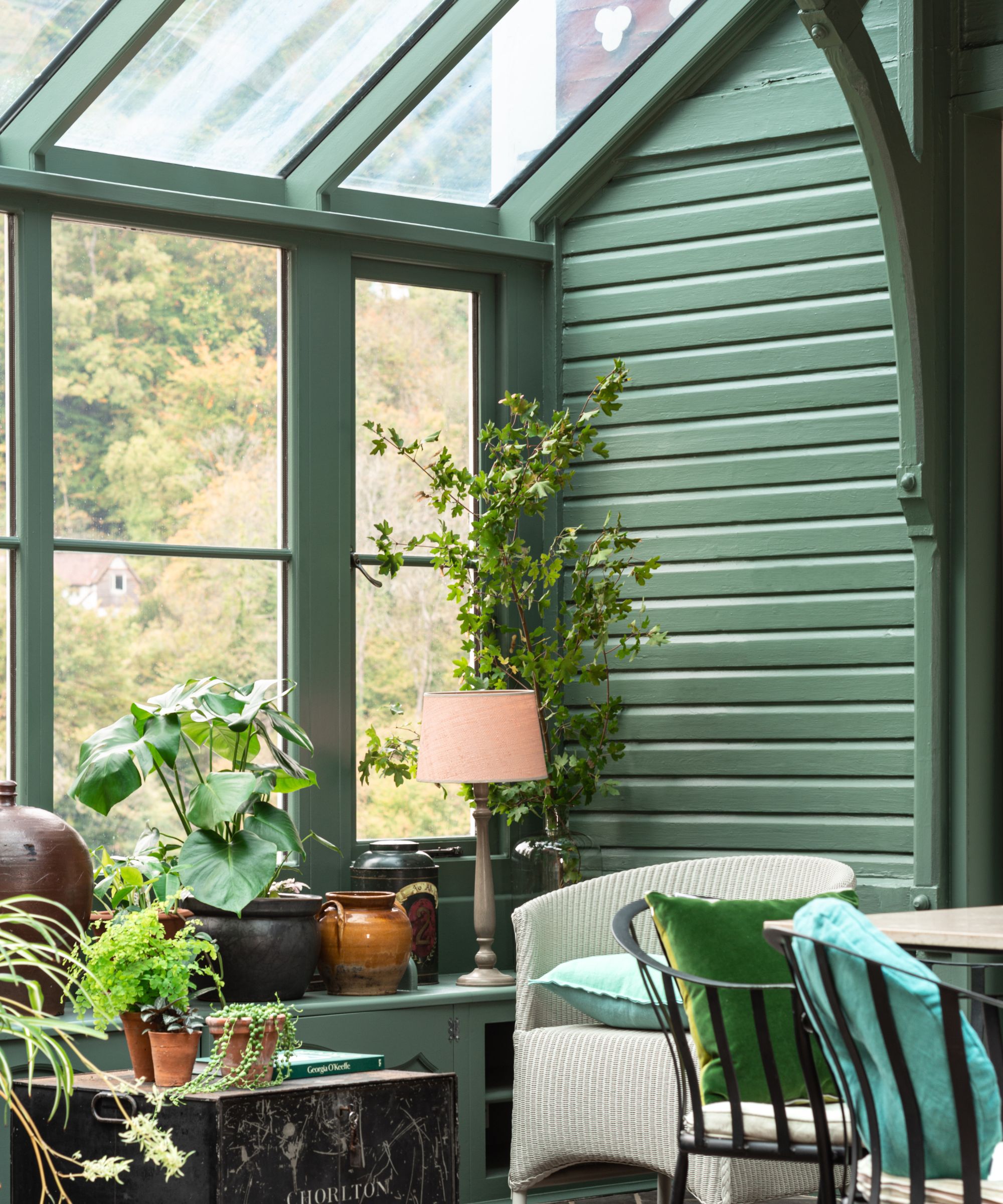
Taking reference from interior colors found in the late 19th century, Green Smoke is a slightly muted way of decorating with green that makes it incredibly liveable and easy to style throughout the home.
'This deep, smoky green with a touch of blue pigment has an irresistibly inviting deepness which looks particularly magical in candlelight, and when used in exterior spaces as it harmonizes so beautifully with the natural landscape,' says Charlotte. 'It will create a calm and serene atmosphere in every space no matter the aspect.'
9. Elephant's Breath
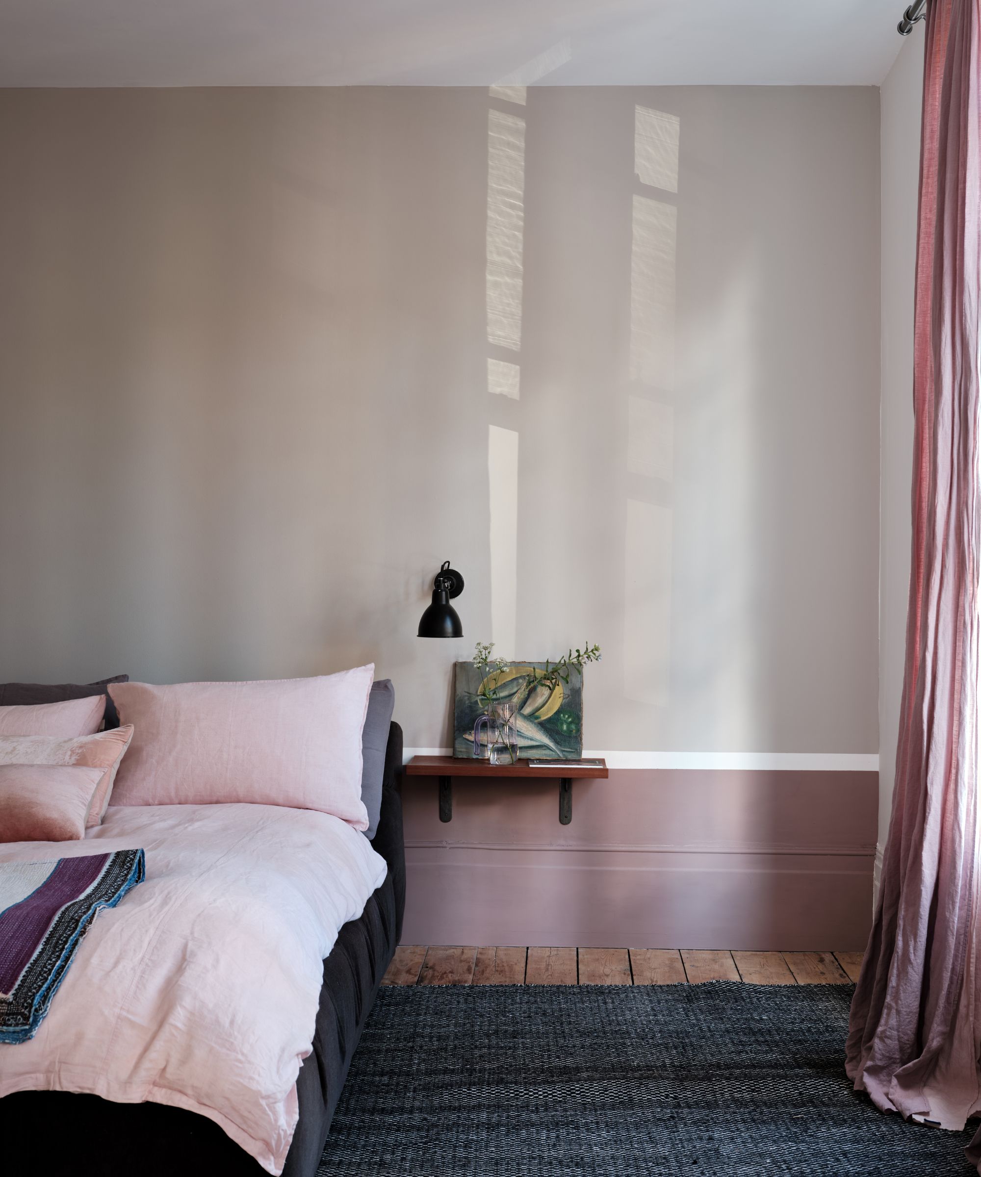
For decorating with gray, Elephant's Breath is one of the brand's most loved shades. Earning its place as one of interior designers' favorite Farrow & Ball paint colors, Elephant's Breath is a warm-toned gray that allows for a pared-back scheme while its warm tones give it a cozy feel.
'Mid-toned grays like Elephant’s Breath, with its particularly characterful name, are incredibly versatile,' says Charlotte. 'Elephant’s Breath has an uplifting warmth with a hint of magenta pigment, which in west-facing spaces can read as almost lilac.'
'This shade can appear deep and earthy when paired with sophisticated shades such as Sulking Room Pink or London Clay, or pair with Strong White for a softer sense of neutrality and calm.'
10. Stiffkey Blue
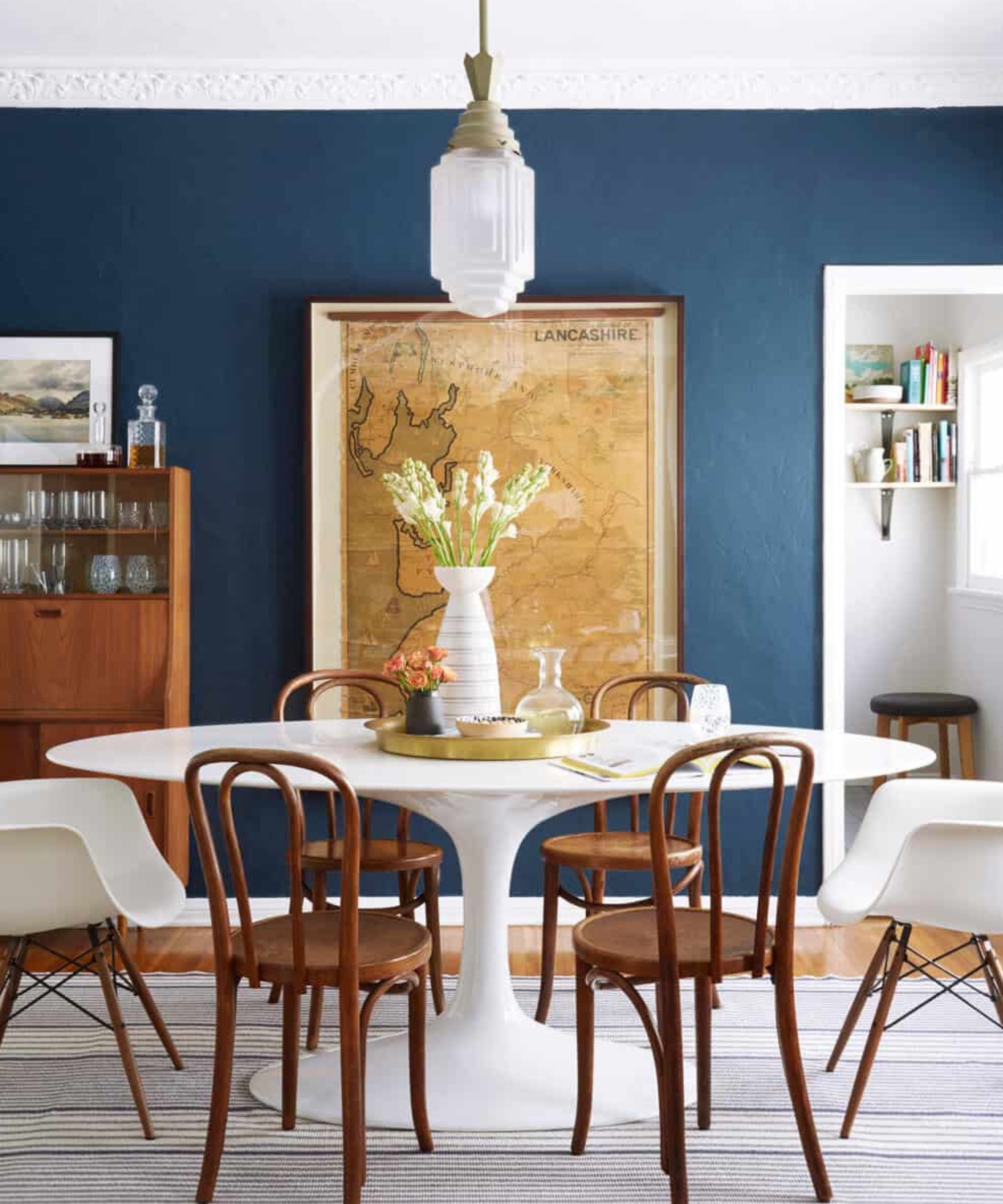
This inky blue is named after the Norfolk beach where the mud, along with the cockles, share a particular deep navy hue. Although traditional in feel, Stiffkey Blue is often used as an alternative to Down Pipe to create a richly dramatic space with a more contemporary finish.
'Stiffkey Blue manages to feel both dramatic and optimistic and has a somewhat more uncomplicated feel to it than other strong blues,’ says Joa. ‘Still charismatic in tone due to its unrivaled depth of color, it has a younger less sophisticated feel which creates rooms that feel somewhat more upbeat than other blues. Its fresher tone lends itself to rooms full of activity as well as spaces to relax in after a long day.’
This is an interesting color as it does change depending on the light, for example, when used in a well-lit space it will appear much bluer, and in a darker room, more of an indigo shade, so bear this in mind when you are choosing it.
FAQs
Why are Farrow & Ball's paints so popular?
Homes & Gardens is a big fan of Farrow & Ball paint – the color palette is simply beautiful and the quality of the paint is wonderful. We spoke to Charlotte Cosby, the company's head of creative, who explains why she thinks Farrow & Ball enjoys such great success.
'Our paints have high levels of pigment, rich resin binders, and high-quality ingredients, giving them a unique depth of color. We carefully source our ingredients from suppliers to ensure you’ll find only the highest quality in each tin. We have a thoughtfully created palette of colors in a range of interior and exterior, modern and traditional finishes. Our paint is meticulously tested, giving you the extraordinary color and long-lasting finish you expect every time.'
For more inspiration, Patrick O'Donnell, Farrow & Ball's International Brand Ambassador and color expert, took to Instagram to share a video to discuss three of the brand's 'most-loved' colors, we explore each shade in our dedicated feature: these are Farrow & Ball's current 'most loved' paints.

Jennifer is the Digital Editor at Homes & Gardens. Having worked in the interiors industry for several years in both the US and UK, spanning many publications, she now hones her digital prowess on the 'best interiors website' in the world. Multi-skilled, Jennifer has worked in PR and marketing and occasionally dabbles in the social media, commercial, and the e-commerce space. Over the years, she has written about every area of the home, from compiling houses designed by some of the best interior designers in the world to sourcing celebrity homes, reviewing appliances, and even writing a few news stories or two.
- Emily MoormanContributing Writer
-
 Victoria Beckham has a unique formula for perfect bedding: 'Very expensive sheets and cheap pillows' – you can follow her example from $15
Victoria revealed she goes for crisp, white bed sheets and pillows with neck support from Target – and you can shop similar buys at an ultra-low cost
By Hannah Ziegler Published
-
 I just discovered the best non-toxic product for getting rid of ants in your yard – and you probably already have it in your bathroom cupboard
This household item is an effective ant deterrent that doesn't leach harmful chemicals into your soil
By Tenielle Jordison Published