Design house: Mid-century modern home, designed by LeeAnn Baker Interiors
A love for mid-century modern and Danish furniture and lighting is evident in this design house.

'There’s a correlation between the way our home is furnished and the way we feel about ourselves when we’re in it,' explains LeeAnn Baker. 'I design beautifully understated and refined homes that elevate each client’s state of mind and perspective of the world around them, and that was evident in this design project.'
See ourDesign house: Luxury, seaside home in California, designed by Kelie Grosso of Maison Luxe
THE PROPERTY
The homeowners, a retired couple, were downsizing from their waterfront home and wanted something smaller.
'The couple wanted a comfortable home where they could relax in between workouts and travels,' says LeeAnn. They currently divide their time between Seattle and California, so a place that felt like home was of huge significance.
Natural materials, texture, and comfort were key in this Mid-century modern home.
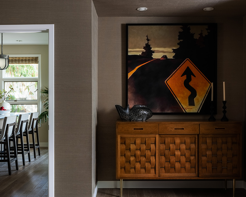
LIVING ROOM
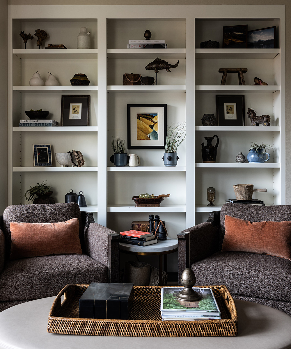
Snug seating, cosy reading spots and bare walls for their art collection can be seen throughout this property.
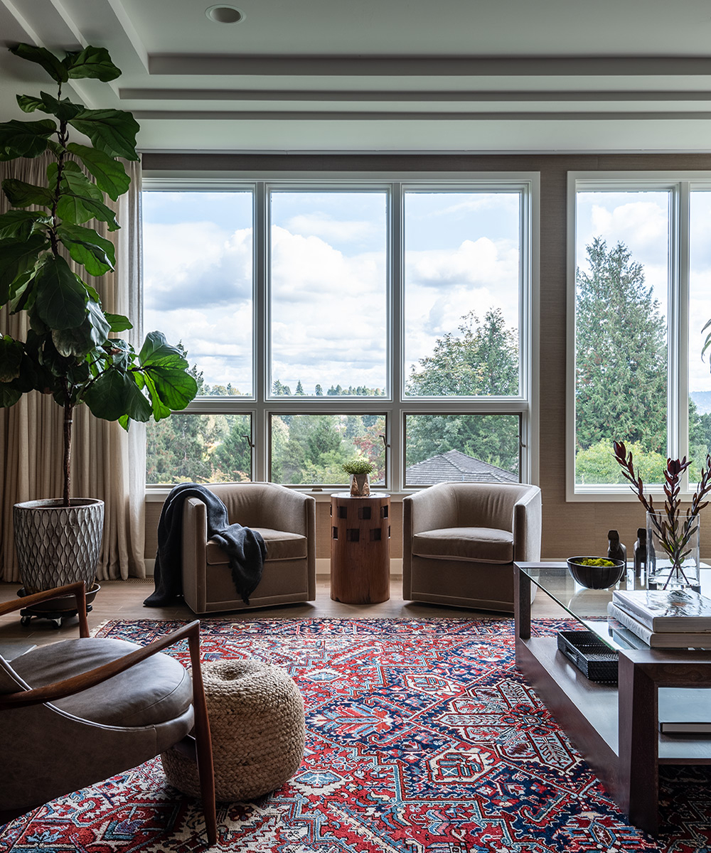
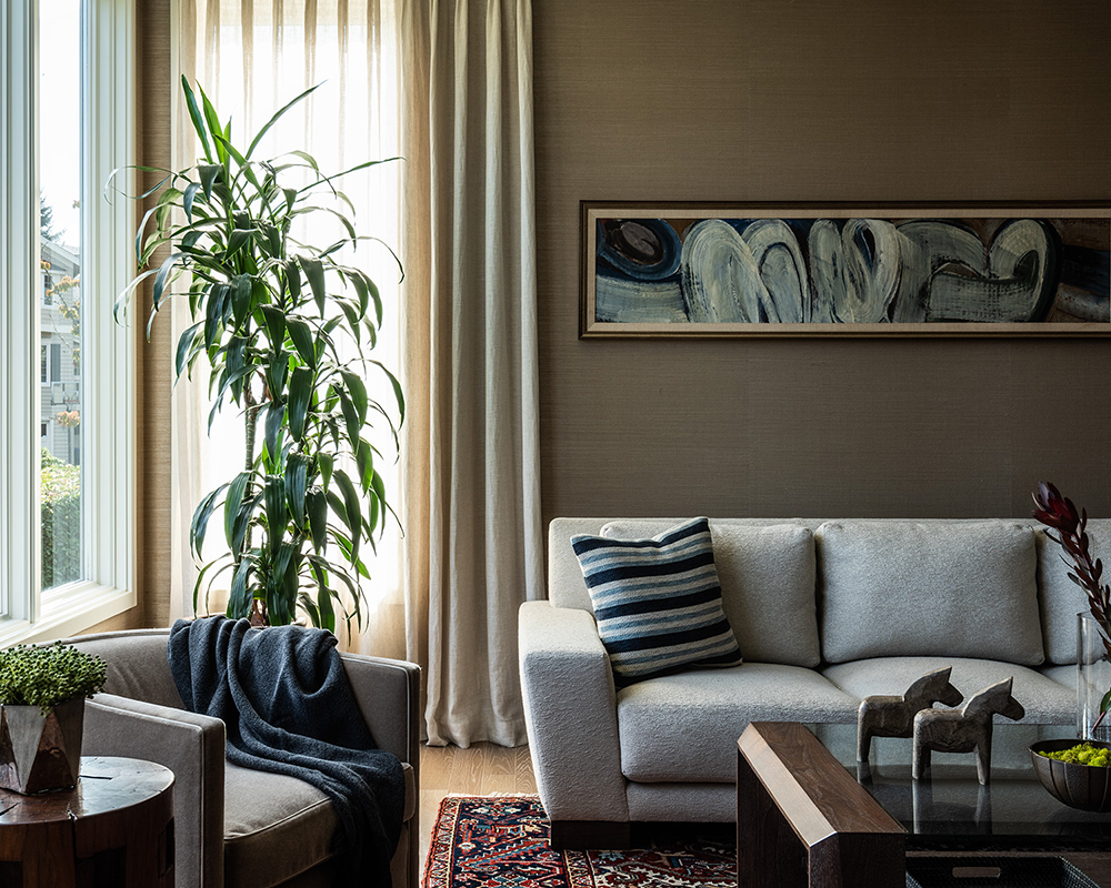
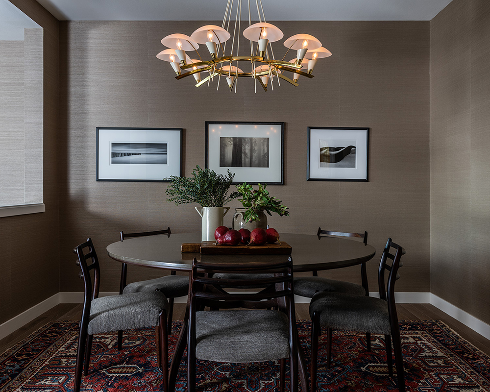
Stark Grasscloth wallpaper in the living room and dining room add warmth and texture to this open-plan space.
Sign up to the Homes & Gardens newsletter
Design expertise in your inbox – from inspiring decorating ideas and beautiful celebrity homes to practical gardening advice and shopping round-ups.
DINING ROOM
The dining chairs have been upholstered in Holly Hunt fabric, while the dining table had a Caesarstone top made to make it more user-friendly.
KITCHEN
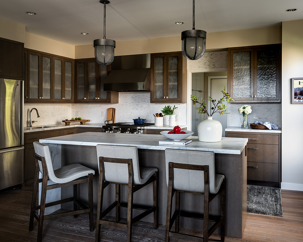
The Brazillian cherry floors were removed and custom-engineered floors with a textured finish were added to enhance a sense of grandeur.
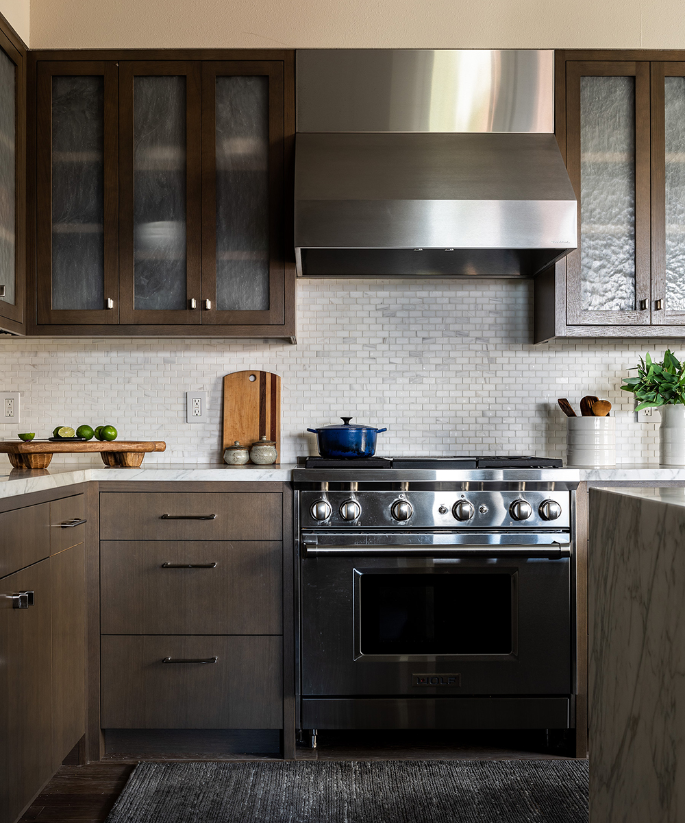
The kitchen has been designed with marble surfaces and an asymmetrical island. Both these options are easy to maintain, yet visually appealing.
ENTRANCE
STAIRCASE
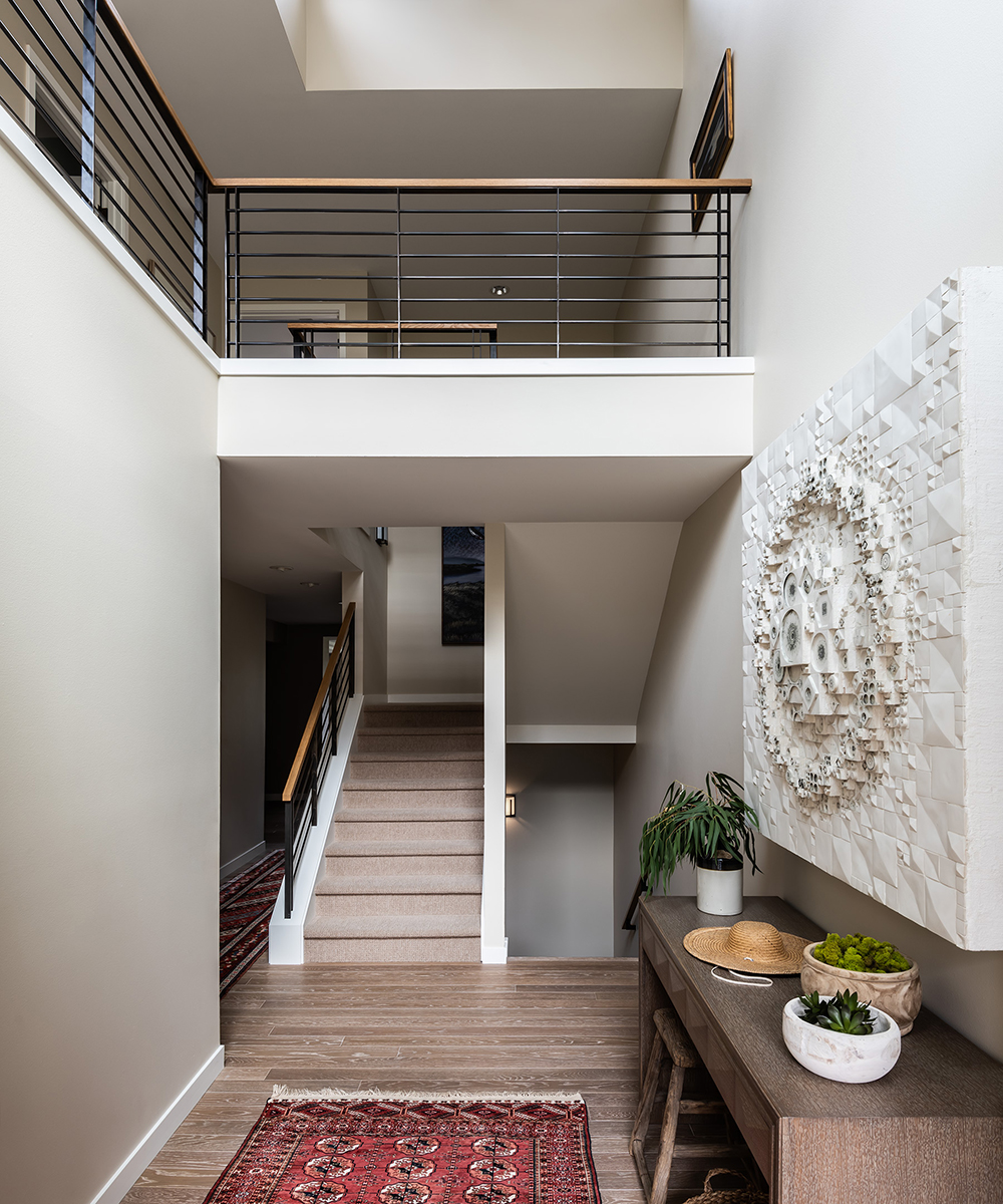
'We wanted to bring in light because it was so dark,' says LeeAnn. 'The pony walls in the hall and staircase were removed and we added a metal railing with a wood cap to let the light pour in from the two-story entrance and clerestory windows.'
LANDING
BEDROOM
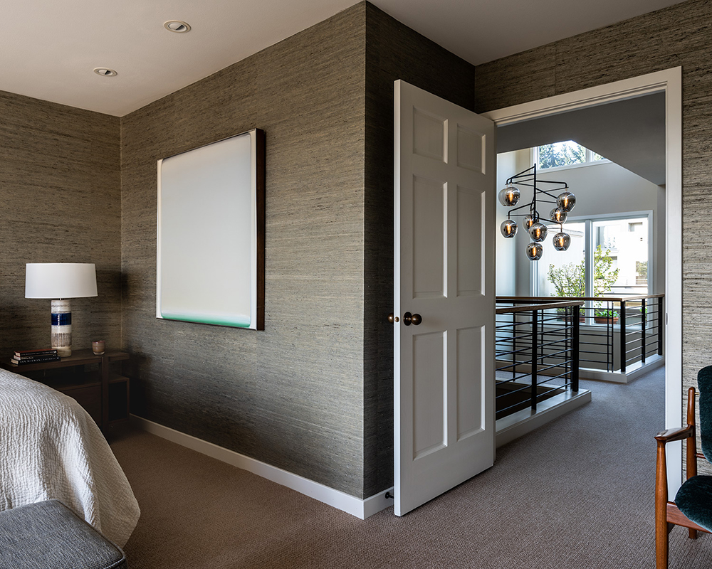
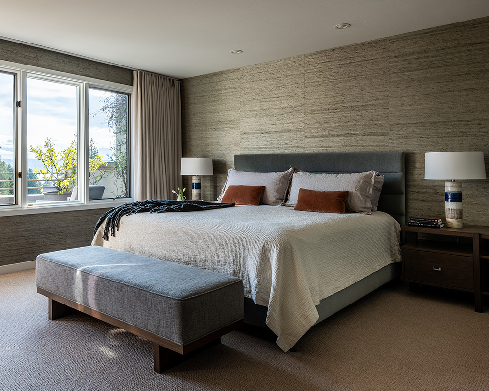
The textured walls add subtle interest to this laid-back, neutral space.
Photography/ Andrew Giammarco
Interior design/ LeeAnn Baker Interiors, leeannbaker.com

Jennifer is the Digital Editor at Homes & Gardens. Having worked in the interiors industry for several years in both the US and UK, spanning many publications, she now hones her digital prowess on the 'best interiors website' in the world. Multi-skilled, Jennifer has worked in PR and marketing and occasionally dabbles in the social media, commercial, and the e-commerce space. Over the years, she has written about every area of the home, from compiling houses designed by some of the best interior designers in the world to sourcing celebrity homes, reviewing appliances, and even writing a few news stories or two.
-
 Courtney Love's historic loft combines rock star luxury with raw New York bones – it's on the market for almost $9.5 million
The singer's former SoHo home features exposed brick walls, original wooden columns, a gas fireplace, and high ceilings – take the tour
By Hannah Ziegler
-
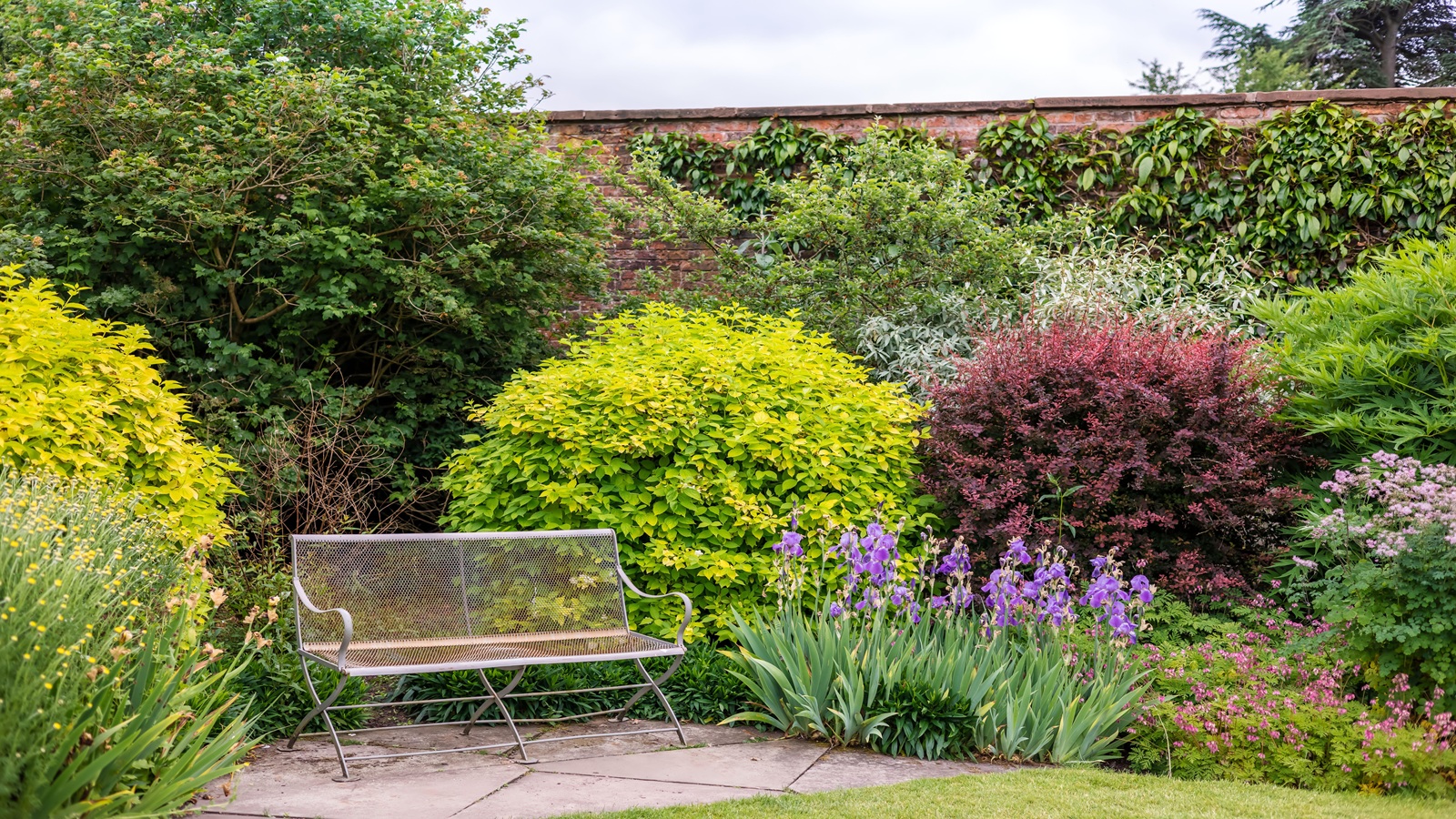 Triangular shaped garden ideas – landscape designers share 9 ingenious ways to redesign your corner plot
Expert tips for planning, planting and finessing a triangular shaped plot, so you can savour the space year round
By Jill Morgan