Matthew Williamson shares his interior design tricks and secrets with H&G
In our exclusive interview with world-renowned interior and fashion designer Matthew Williamson, he reveals his design secrets


Matthew Williamson is an award-winning British interior designer known for his fearless use of color and pattern. Matthew grew up in Manchester in the 1970s and says his passion for color, design and aesthetics was inspired by his mother's innate sense of taste. He graduated from Central Saint Martins in London with a degree in Fashion and Textile Design, and just two years later, his work was being stocked in Browns London and Barneys New York.
Over the years, he has worked with famed designer Dame Zandra Rhodes, models Kate Moss, Helena Christensen and Jade Jagger, and his creations have been worn by movie stars such as Gwyneth Paltrow, Sienna Miller and Kirsten Dunst.
In 2003, Matthew started collaborating with interiors brand The Rug Company, and since then has also worked with Osborne & Little, Vinterior, Pooky and Duresta, creating everything from rugs and wallpaper to lighting and furniture collections, which makes him a wonderful source of interior design tips.
Now, Matthew has launched his own website Matthew Williamson Design, which showcases his interior design projects and has a shoppable section for his wallpaper, lighting, rugs, accessories, stationery, and antiques and vintage buys.
To celebrate, we interviewed Matthew about his approach to interior design.
Q: You are renowned for mixing patterns – how to get it right in a room scheme?
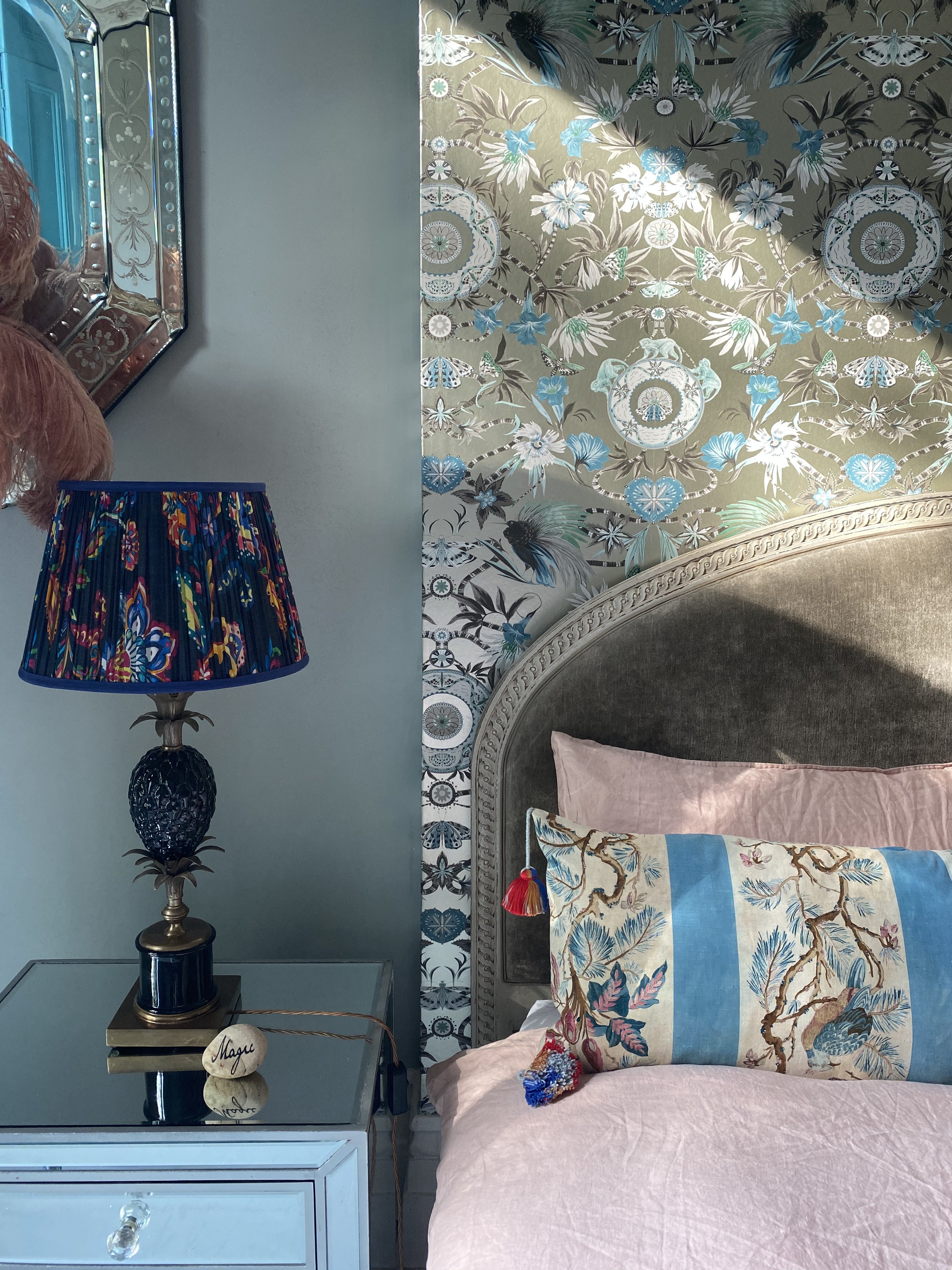
'I really don't believe there is a secret to getting pattern "right". Looking at interior design like it's some form of code to unlock may not be the right approach. It's about finding a pattern you love for the colors, the scale and the repeat, and working out what works well with it.
'It doesn't have to be an arduous process. Everyone can reel off their favorite food, travel destination or book, so why not shop around to find your favorite kind of pattern? It should feel pretty instinctive. Ikat prints, stars and peacock feathers are my longstanding favorites, and still find their way into my schemes and product designs.'
Sign up to the Homes & Gardens newsletter
Design expertise in your inbox – from inspiring decorating ideas and beautiful celebrity homes to practical gardening advice and shopping round-ups.
Q: How to avoid getting pattern combinations wrong?
'I think that where pattern is concerned, there is a danger of things looking old-fashioned. Sometimes, print combinations fail to complement each other, which can be hugely disappointing. As a general rule, vary the scale of the pattern while keeping the colors similar.'
Q: How do you get the color scheming right around intricate pattern choices?

'Usually, A particular color or pattern will feel right in a specific space. If a specific living room I'm working on lends itself to serene blues and greens, I'll look for patterns in the fabrics and wallcoverings. However, it could be that a room calls out for a leopard print, in which case the pattern will come first, then the color.'
Q: Where to start when choosing the main color for a room?
'It's all about being in the space and feeling it out. Generally, cooler colors are more relaxing, while warmer colors excite. Think about the kind of space you want to create and how you'll use it.
'For example, do you want your living room to feel like a serene enclave away from the hustle and bustle outside, or do you want it to feel as electric as the city that surrounds it? Do you want your bedroom to feel romantic and decadent, or channel the charm of an English country home? Working out the function of a space will inspire the color combinations you might like. It's important to trust your instinct.'
Q: How do you go about adding accent colors?
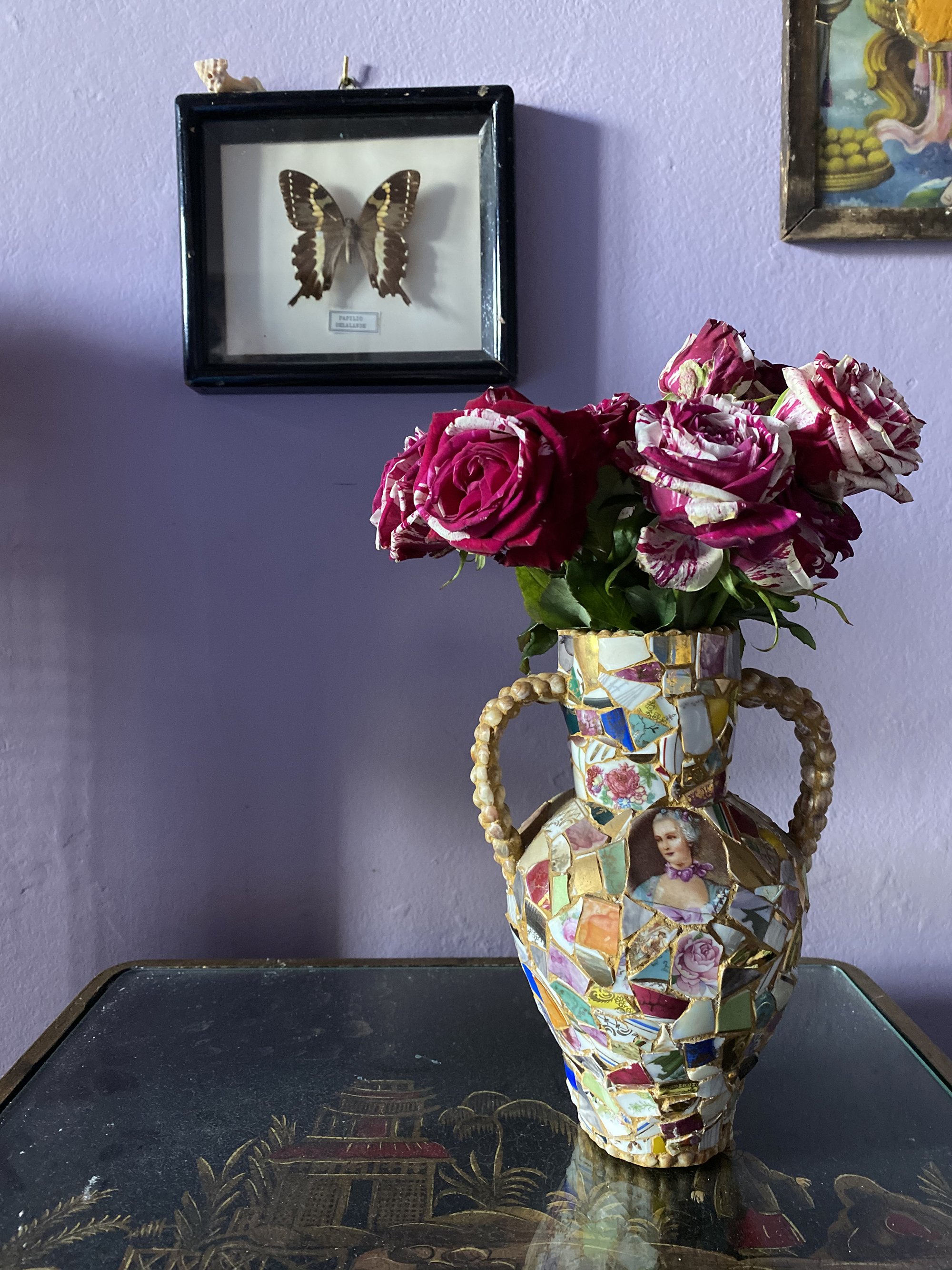
'I find color wheels so useful when choosing accent colors. If you want to create more of a tonal layering of colors, stick to tones around your main hue or for a more impactful space, choose colors that appear opposite one another.
'For example, a room that's predominantly green would be softened by the introduction of accents in aqua or pale blue. In turn, choosing a red or pink from other opposite side of the color wheel will give the space an exciting vibrancy.'
Q: What are the mistakes we make with color scheming?
'Don't overthink it and make things too complicated for yourself. I'm the first to advocate for bright colors and maximalist patterns, but be wary that a grounding color is essential in bringing these colors to life.'
Q: Your schemes are joyful – what are the classic design rules you're happy to break?
'It's not so much rule-breaking as expectation-breaking that excites me. For example, it has always been the 'done' thing to leave your ceiling painted white, but I see that as a huge wasted potential!'
Q You love to mix old and new – where do you shop?
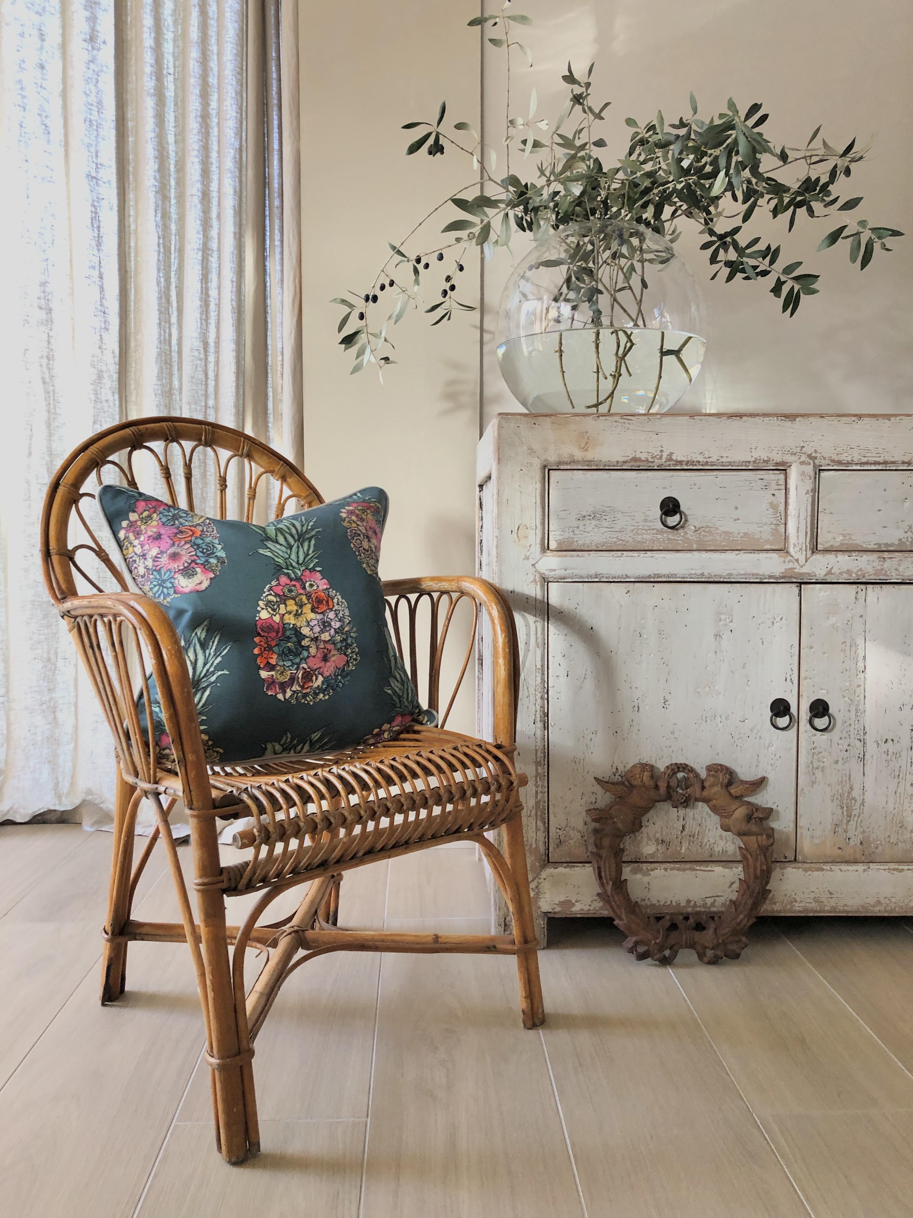
'I love the rub of old against new – the contrasts in style and texture bring a new level of uniqueness to a space. I love Renaissance London for antique lights and fireplaces, Brownrigg for decorative antique furniture and Mccully & Crane in Rye for some retro gems.'
Q: We love your collaboration with Pooky for lighting – what are your top lighting design tips?
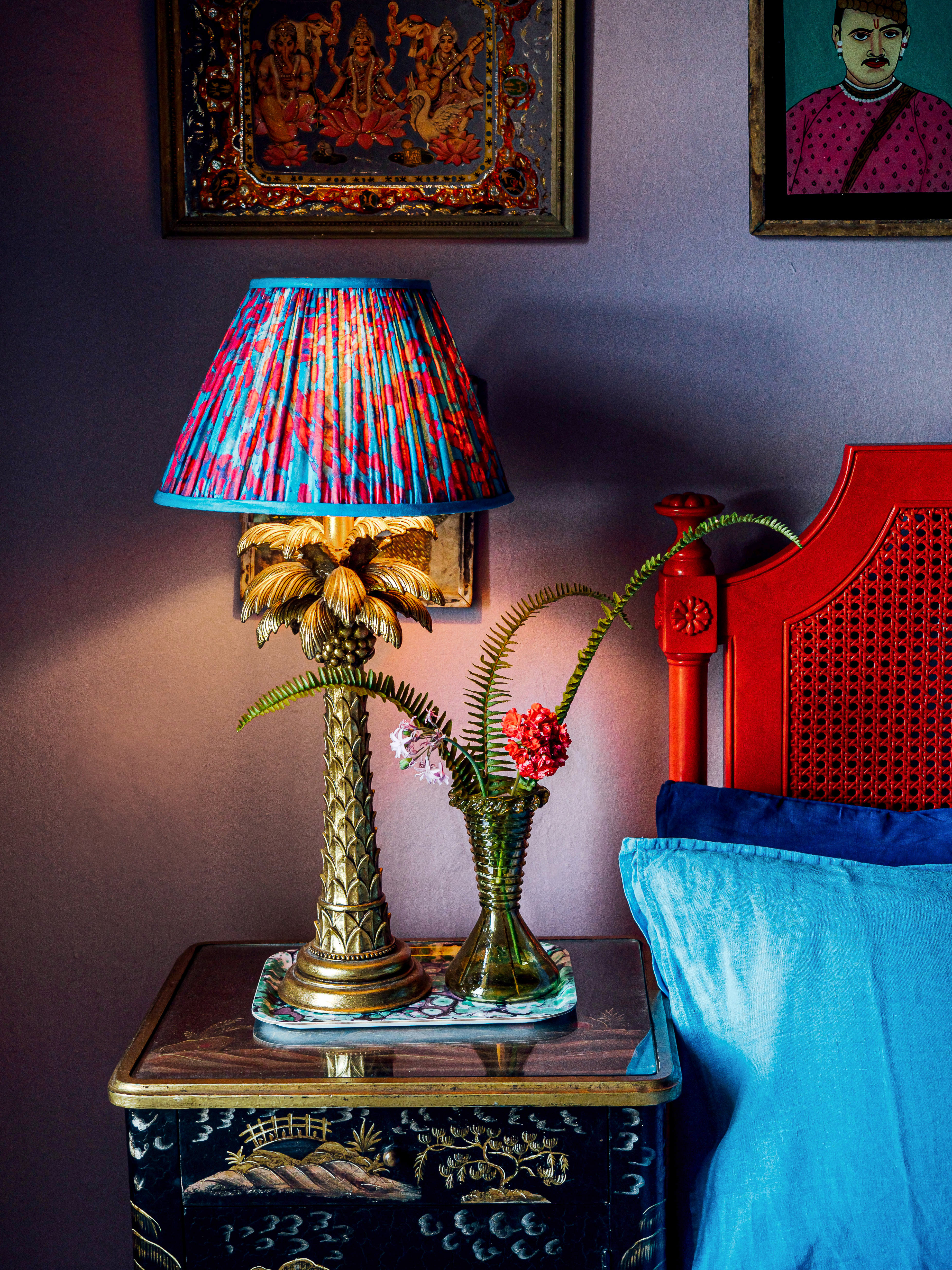
Matthew's collaboration with Pooky has resulted in lampshades in rich, jewel tones
'Thank you! My first tip would be to incorporate a decorative pendant light into the room, but use it rarely and if so, with a dimmer switch. The second rule would be to stick to using lamps to create an eye-level, flattering light to set the mood for an evening.
'And finally, don't be afraid to use color and pattern when it comes to lighting. A colorful, heavily patterned shade will give a new, unexpected quality to the light the bulb emits.'
Q: Can you explain your approach to using wallpaper?
'As with anything you bring into your home, be it a general sense of color or something as specific as a piece of furniture, you have to trust your instinct that it's right for the space. The same goes for wallpaper.
'If you find a pattern you love and feel a room in your home could benefit from it, give it a go. Wallpaper will always bring wow-factor to a room. Hanging wallpaper is like pasting character onto the walls. Using wallpaper in unusual places might include lining the inside of a bar cabinet, in the cupboard under the stairs or even on the ceiling.'
Q: Your rug range is inspired – what tricks do you use to make the most of rugs in a room?
'A beautiful rug can give you a palette or a sounding board for the rest of the room. You could pick out specific colors from the weave and take them onto the walls, into the soft furnishings and even up onto the ceiling for a dramatic look.
'There are so many inspirations for my new collection of rugs for Obeetee. Some stand-out favorites are Leopard Love, which is inspired by the slinky gait of the most iconic big cats, and Sunset Dreams and Sunrise Haze, which are artistic impressions of the rising and setting sun over Deia in Mallorca.'
Q: Interior Design Masters is back on UK TVs in 2021. What can we expect?
'I will be making an appearance! It is a wonderful watch for all aspiring interior designers – a broad spectrum of very talented contestants.'
Q: Has Covid-19 made you rethink how you live in your home – or the way you design for homes?
'Absolutely. It's taught me that space is such a luxury and every corner of every room counts. People are grappling with how to carve out more functionality from their homes, so it is my job as an interior designer to think laterally about multi-use spaces for work and play.'
Q: What are your trend predictions for 2021 onwards?
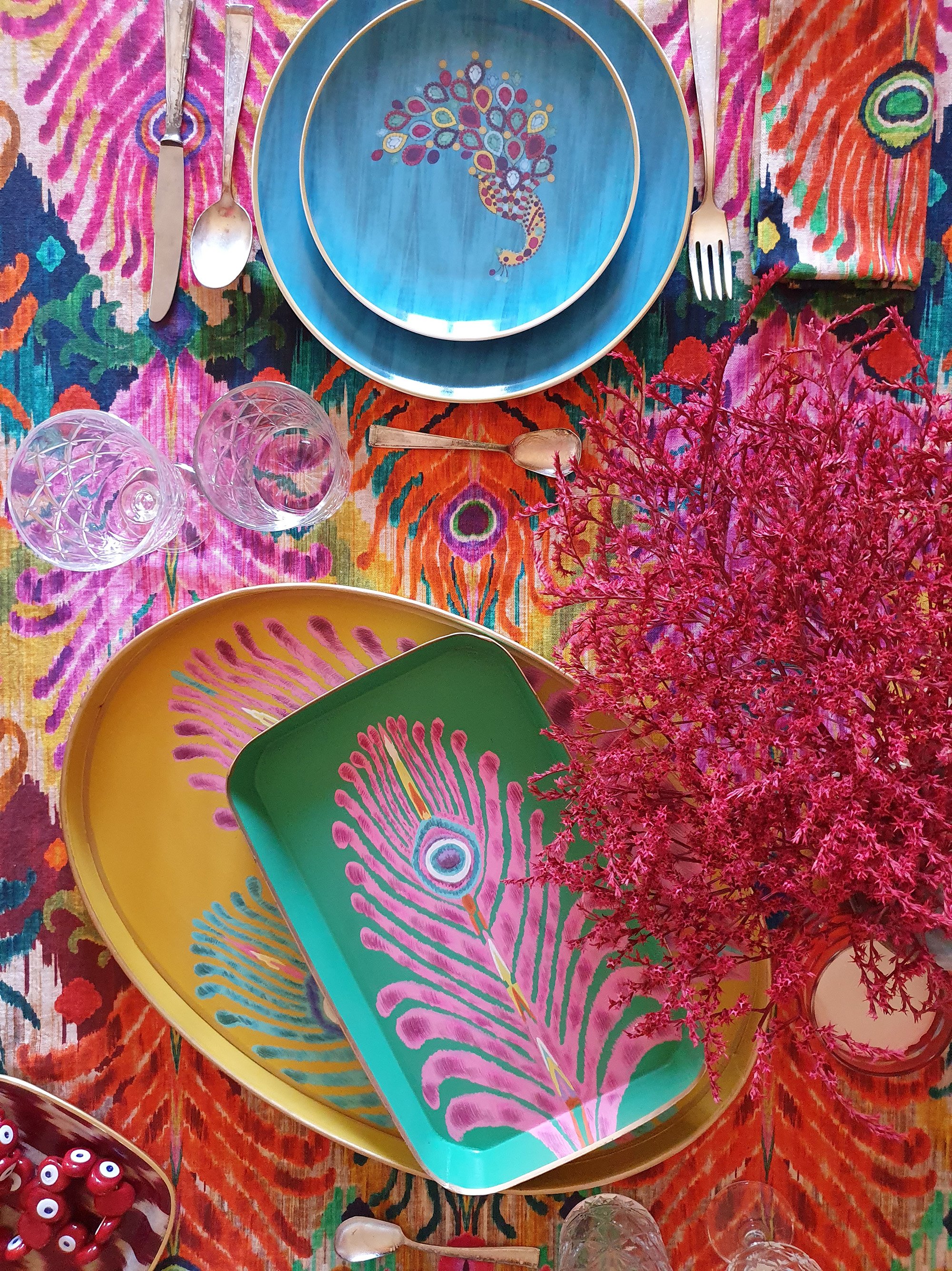
Matthew's joyful range of tableware, on sale on his website
'Not so much a trend prediction as a mode of buying that is here to stay, but I believe people will continue to buy fewer items but of better quality. They will take into consideration place of origin, the issue of cultural appropriation, manufacturing methods and employee welfare.
'All of these factors will be interrogated at a higher rate in 2021. In terms of color predictions, hopeful, joyful tones of lemon, watermelon and peachy pinks will dominate.'
See more: Interior design trends 2021 in our dedicated guide

Lucy Searle has written about interiors, property and gardens since 1990, working her way around the interiors departments of women's magazines before switching to interiors-only titles in the mid-nineties. She was Associate Editor on Ideal Home, and Launch Editor of 4Homes magazine, before moving into digital in 2007, launching Channel 4's flagship website, Channel4.com/4homes. In 2018, Lucy took on the role of Global Editor in Chief for Realhomes.com, taking the site from a small magazine add-on to a global success. She was asked to repeat that success at Homes & Gardens, where she has also taken on the editorship of the magazine.
-
 I’m an HVAC technician, and this is when I turn my AC on each year – plus 5 checks I always do beforehand
Save yourself an AC hassle by running my checks and turning it on before big heat hits
By Josh Mitchell Published
-
 This simple marble hack elevates my budget-friendly wooden kitchen countertops and prevents the dreaded water damage for way less than you’d think
This design trick looks expensive, solves a problem, and was the easiest decision I made during my kitchen reno
By Charlotte Olby Published