13 looks interior designers avoid – and how to decorate your rooms like a pro
Step away from that corner bath... and embrace the beauty of rooms like these
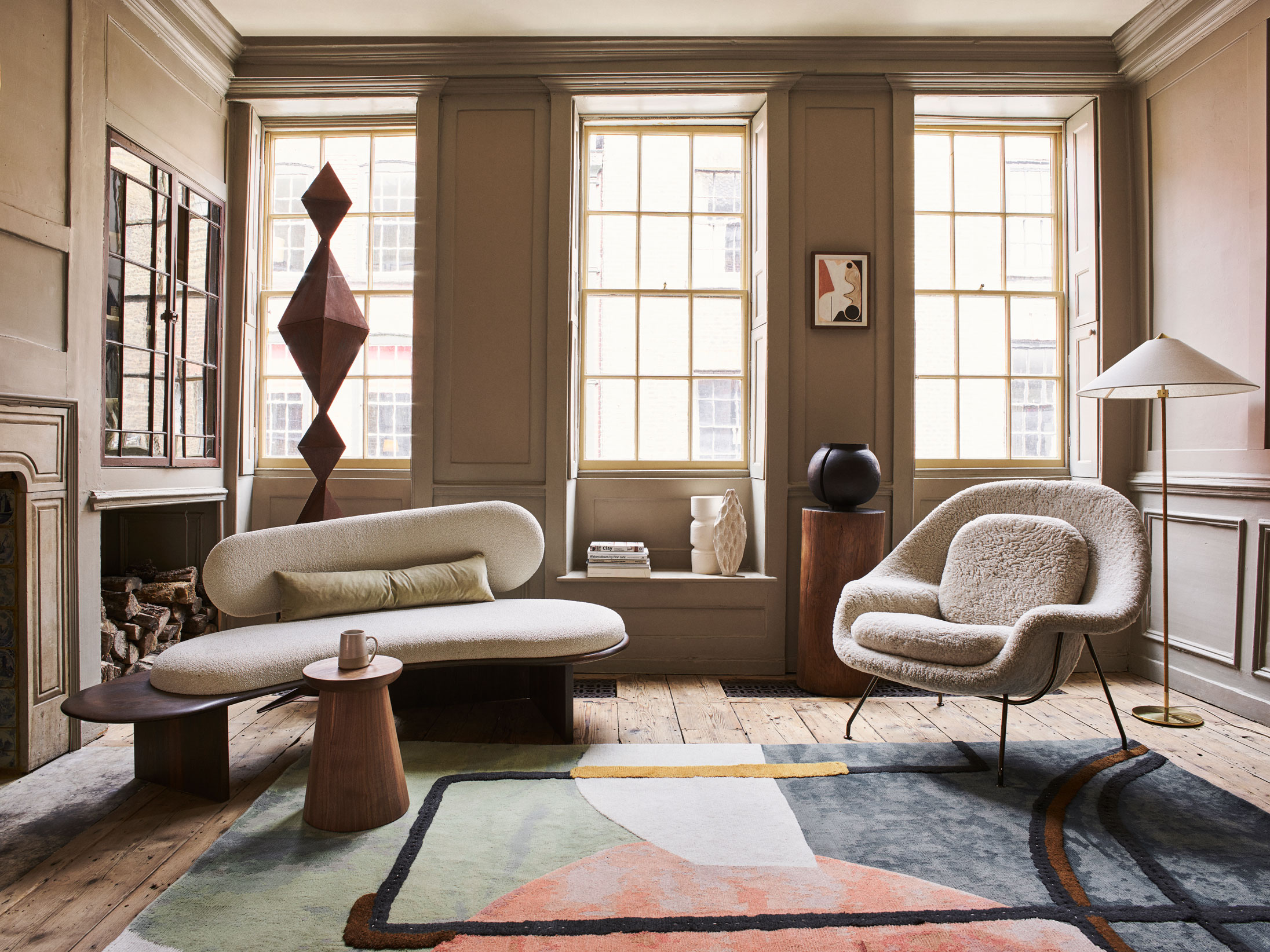

When we're looking to renovate a space, it can be easy to get carried away with a particular theme, or let your heart rule your head. Calling on the services of an interior designer means you can be politely steered in the right direction and potentially avoid having to redecorate again sooner than you'd planned.
We asked a host of designers to share their design no-nos – from corner baths to excessive animal print – so you have a heads-up on what not to do.
See: Interior design tips – decorating secrets for the world's top experts
1. Upcycling beautiful old furniture to reflect a faddy trend
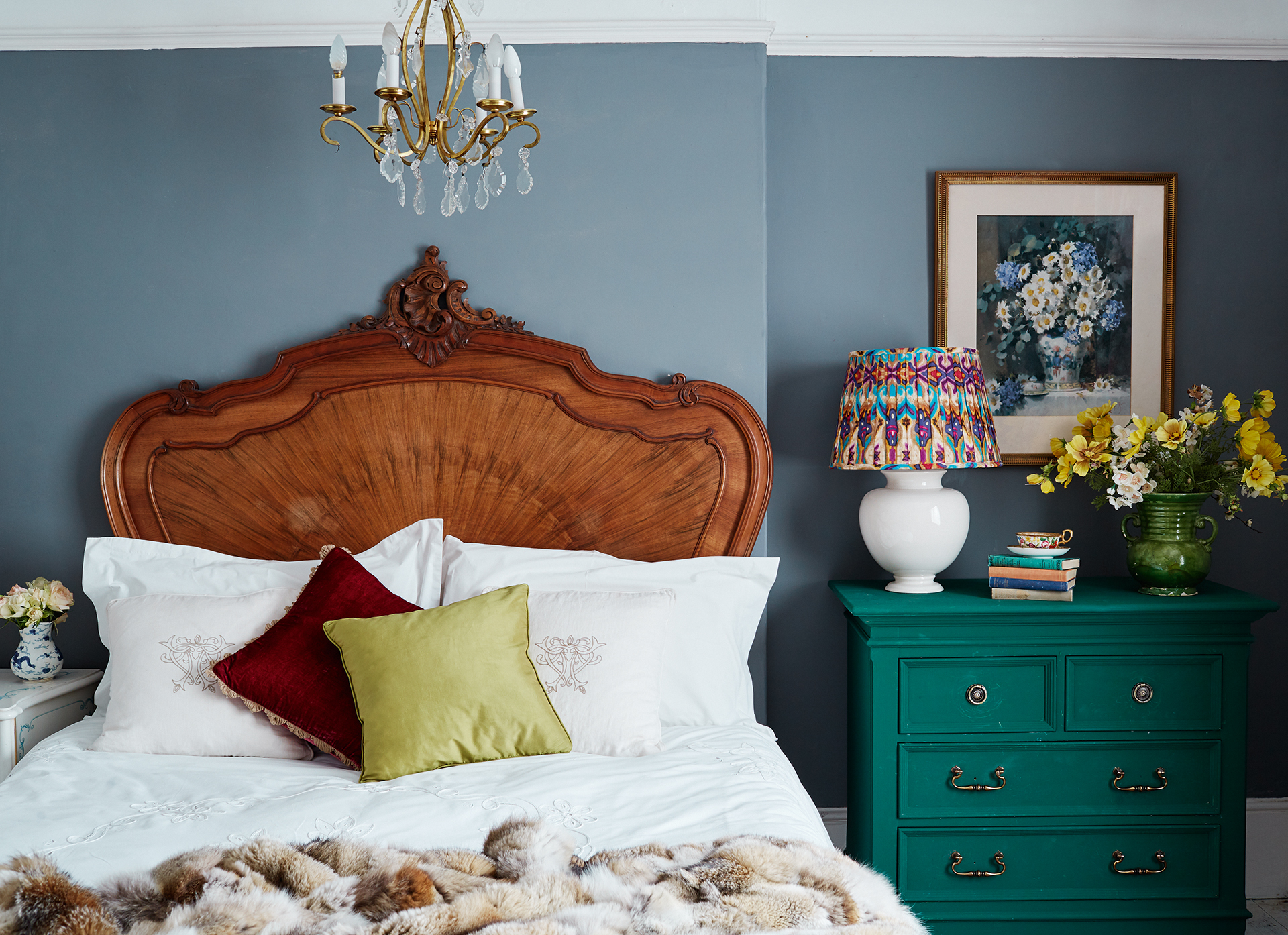
'We’re always asked by clients if they shouldn't use something in their design because it’s a trend and may go out of fashion soon,' says Athina Bluff, Founder and Senior Designer at Topology Interiors.
'Our answer is always, "if you love it, do it". Just as you wouldn't tell everyone to wear the same clothes, you should ignore what’s in and what’s not – just design for you and your family, or who’s going to use the space, as that’s when design truly reflects your own personality and style.
'That being said, one of the trends that really pains the purist side of me is the ‘upcycling’ of beautiful old furniture. I’m not talking about IKEA hacks here, and not when it’s just a lick of paint, more when a vintage piece of furniture is being covered in things like oversized lollypop sticks or a beautiful old vase is getting plastered with paint testers and bicarb.
'Don’t get me wrong, if this piece was destined for landfill then it’s a great way of giving it a new lease of life – however, I can’t help feel that as these are irreversible changes and you will tire of them super-fast, plus it doesn't give the piece any future longevity beyond this ‘trend’.
Sign up to the Homes & Gardens newsletter
Design expertise in your inbox – from inspiring decorating ideas and beautiful celebrity homes to practical gardening advice and shopping round-ups.
'If you want to upcycle an old piece of furniture, think of ways that your embellishments can easily be removed or how it can be repurposed into something else once these trends have had their day!'
See: Interior design trends – the top enduring looks for the year ahead
2. Adding neon or animal prints to classic country rooms
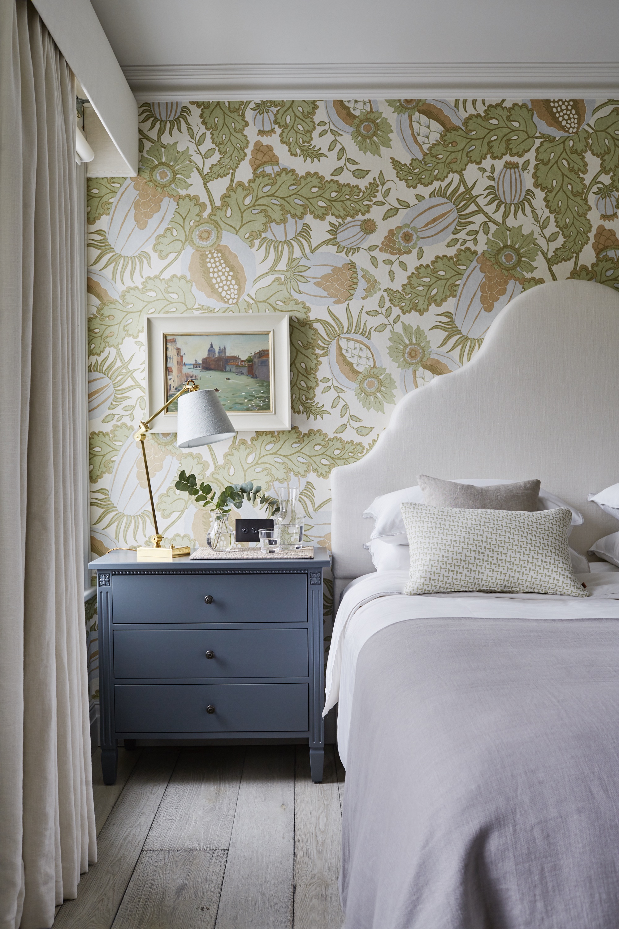
If you want to give your home a modern farmhouse or country style, try to avoid blasts of neon or out-there animal prints.
Take a leaf out of Emma Sims-Hilditch's design book. She says: 'At Sims Hilditch we aim to create interiors that are timeless, elegant, and built to last. For this reason, we usually try to steer clear of neon, or excessive animal print.'
3. Choosing corner baths
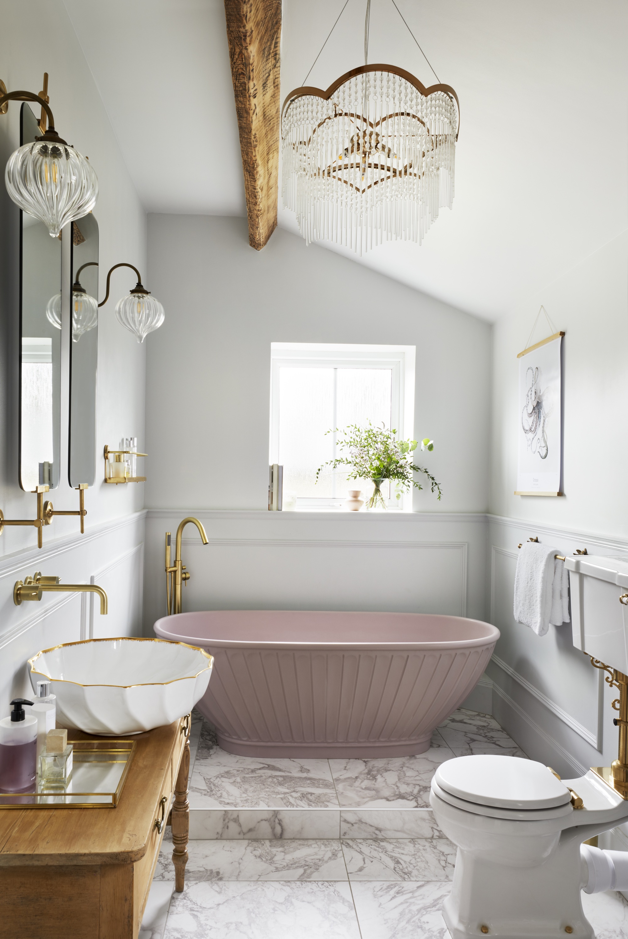
'Corner baths are quite possibly the most unfashionable item you can have in your bathroom,' says Barrie Cutchie, Design Director at BC Designs. 'They waste space, are often lacking in any sort of design, uncomfortable and they neither fit with modern nor traditional style.
'Baths should be about comfort and functionality, but just as important is aesthetics. We talk very much about baths being the focal point of a bathroom, but it should be for the right reasons, which a corner bath isn’t. If you’re wanting a double ended bath, opt for a model where taps can sit in the middle – either floor standing, wall or rim mounted. There are now so many bath options for homeowners to pick from that corner baths shouldn’t be on anyone’s radar!'
Instead, opt for a beautiful freestanding tub to add gravitas and luxury to any bathroom.
- See: Bathroom ideas – stylish decor ideas for all bathrooms
4. Placing a TV above a fireplace
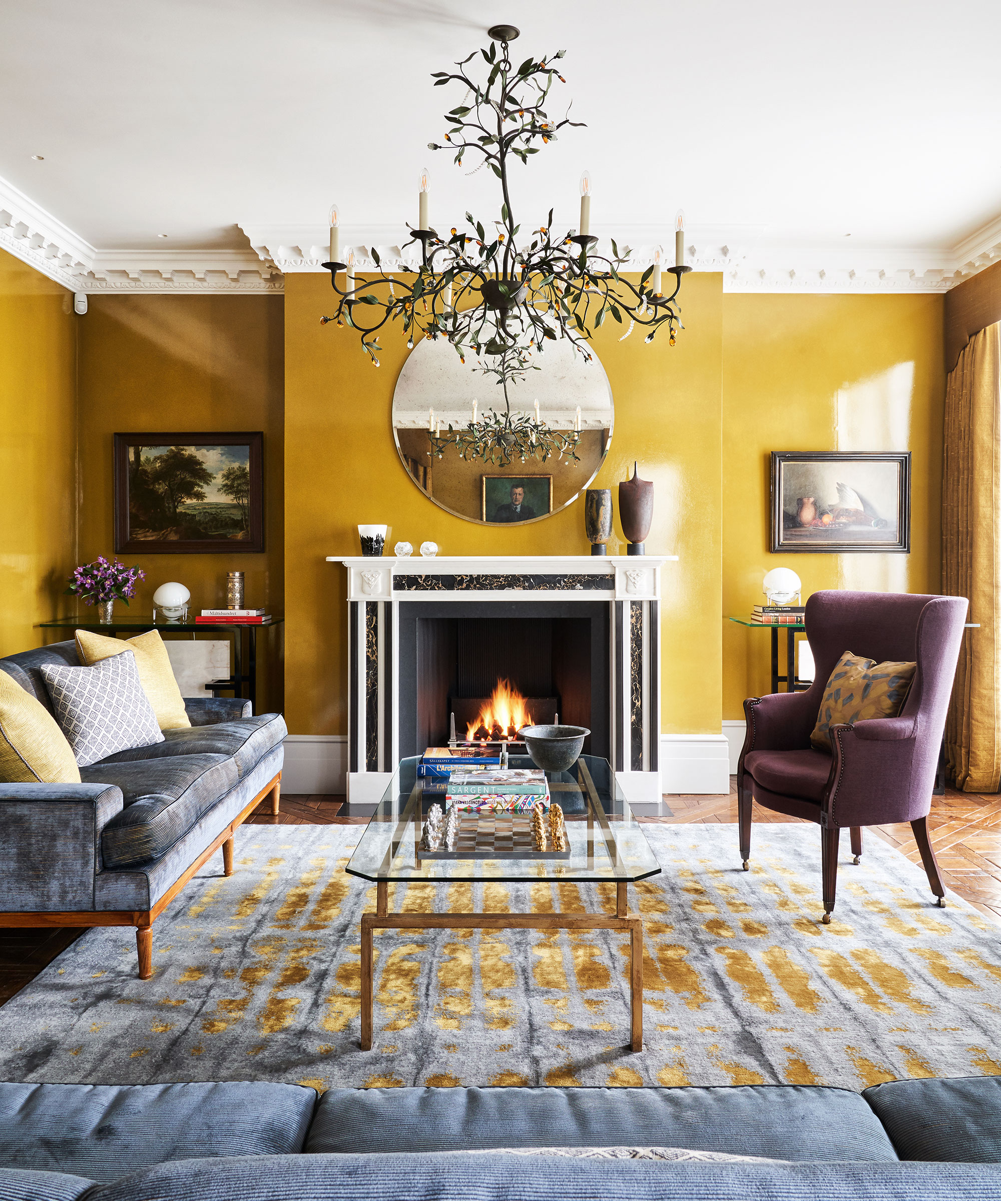
'I adore watching TV but one of the things that I hate to see in a living room, and what I’d recommend avoiding at all costs if you can, is when the TV is mounted on the wall above the fireplace,' says Charlie Marshall, Loaf Founder. 'I understand why it’s done as it’s a central area of the room but it feels as though the TV has taken over the space, and there are usually nicer features to showcase.
'If possible, put your TV on the left or right side of the fireplace, or ideally have it hidden inside a cabinet. There’s an opportunity here to fill that wall with something beautiful, such as a large mirror or painting.'
TVs in master suites are also becoming less popular, says Nick Cryer, founder of Berkeley Place. He muses: 'TVs in master bedrooms... We seldom do this nowadays. I think clients have realized that unless you have a huge TV, you cannot really see it from the bed. People are more connected to iPads and smart devices.'
5. Not calling time on oversized clocks
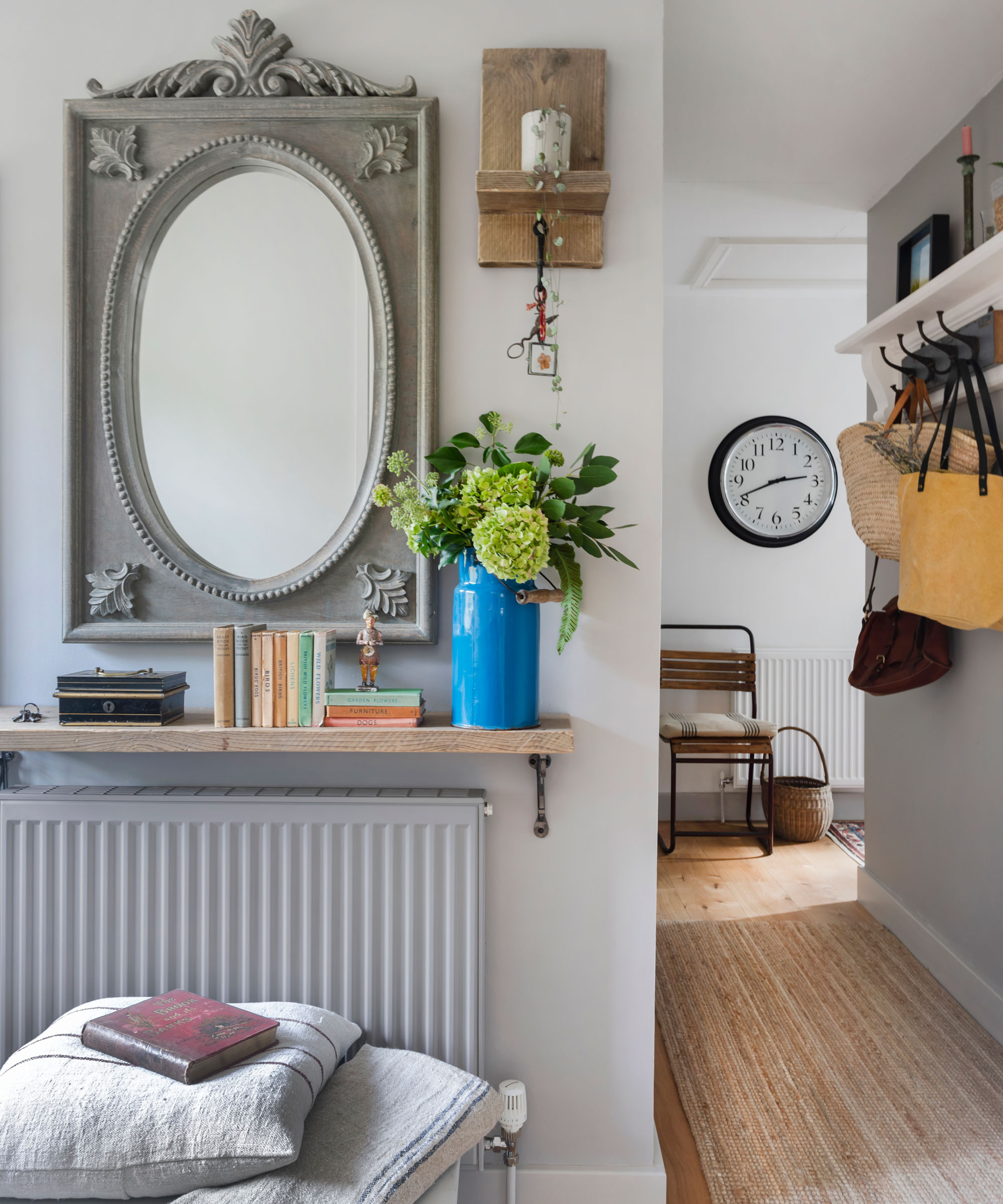
Many people bought into the statement clock trend, but it's had its time in the limelight, says Wayfair‘s resident style advisor, Nadia McCowan Hill.
She says: 'Many are calling time on these oversized tickers in favor of more subtle alternatives. The trend for loud and proud oversized clocks is on the wane, as we look to integrate our timekeepers into our interiors in a more discreet fashion.'
Making your clock part of a gallery wall or between artwork is a nice way to subtly use it in a scheme.
6. Showcasing short curtains
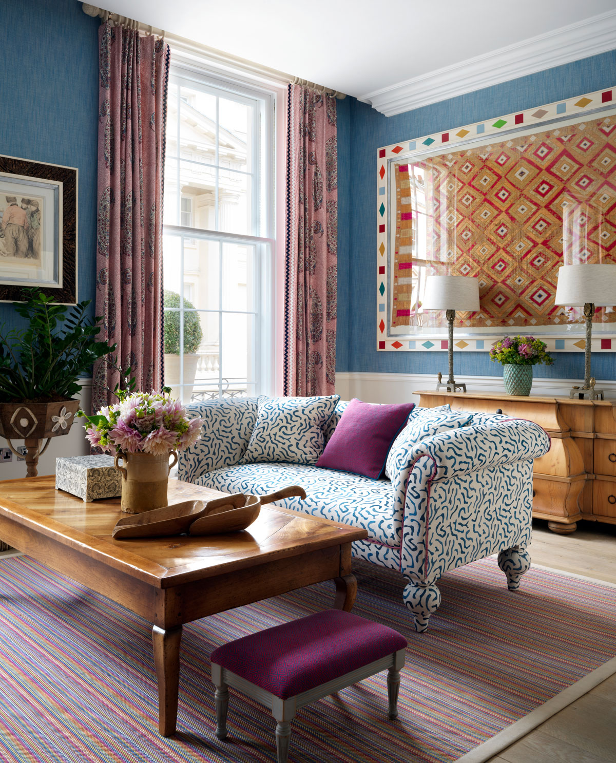
Fans of short curtains may be disappointed to hear that longer is generally aesthetically better.
Jenna Choate and Mariana Ugarte, co-founders of Interior Fox, explain: 'They feel dated and can make a window feel small and boxed in. Instead, opt for floor-to-ceiling curtains, ensuring there are no gaps.
‘This look adds height to a room while keeping a clean and simple aesthetic.'
See: Living room ideas – clever ways to decorate living spaces
7. Getting carried away with grey-washing
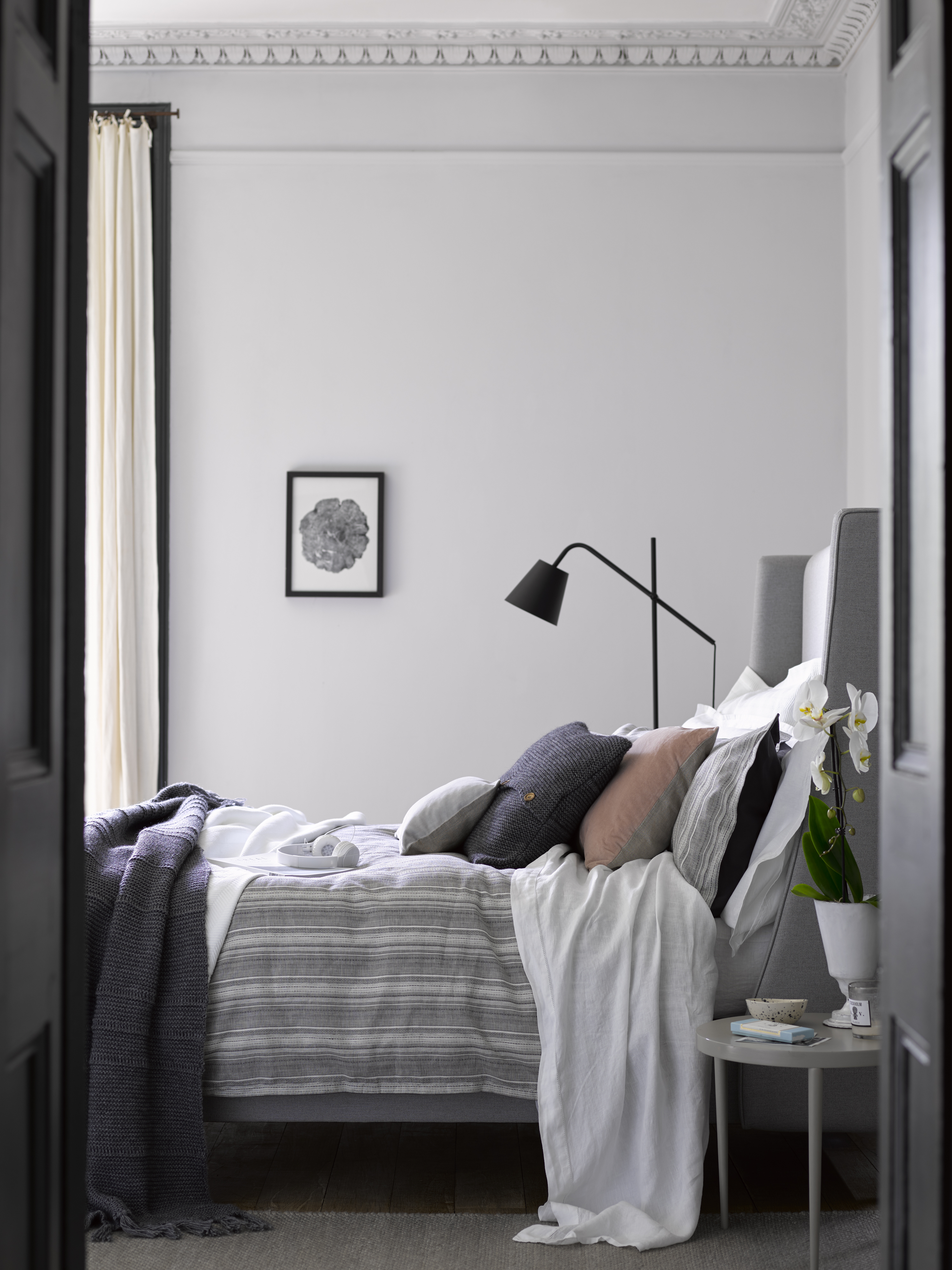
Camilla Clarke, Creative Director at Fitzrovia-based Albion Nord, warns not to follow trends too meticulously.
She explains: 'By following interior design trends to the letter, one runs the risk of losing a sense of personality in the home. However, avoiding trends at all costs denies the influence of contemporary design on our homes. The trick is to avoid the "quick fix" maxim associated with homeware trends and think about home decoration in a more nuanced way.
'For example, avoid 'grey-washing' in an attempt to channel Pantone's Ultimate Grey Color of the Year. Instead, introduce layers of neutrals, interspersed with tonal, textural accents that bring the sleekness of the color without sacrificing depth or tactility.'
- See: Grey living room ideas – inspiring neutral schemes that you'll love for years to come
8. Creating gallery walls without personality
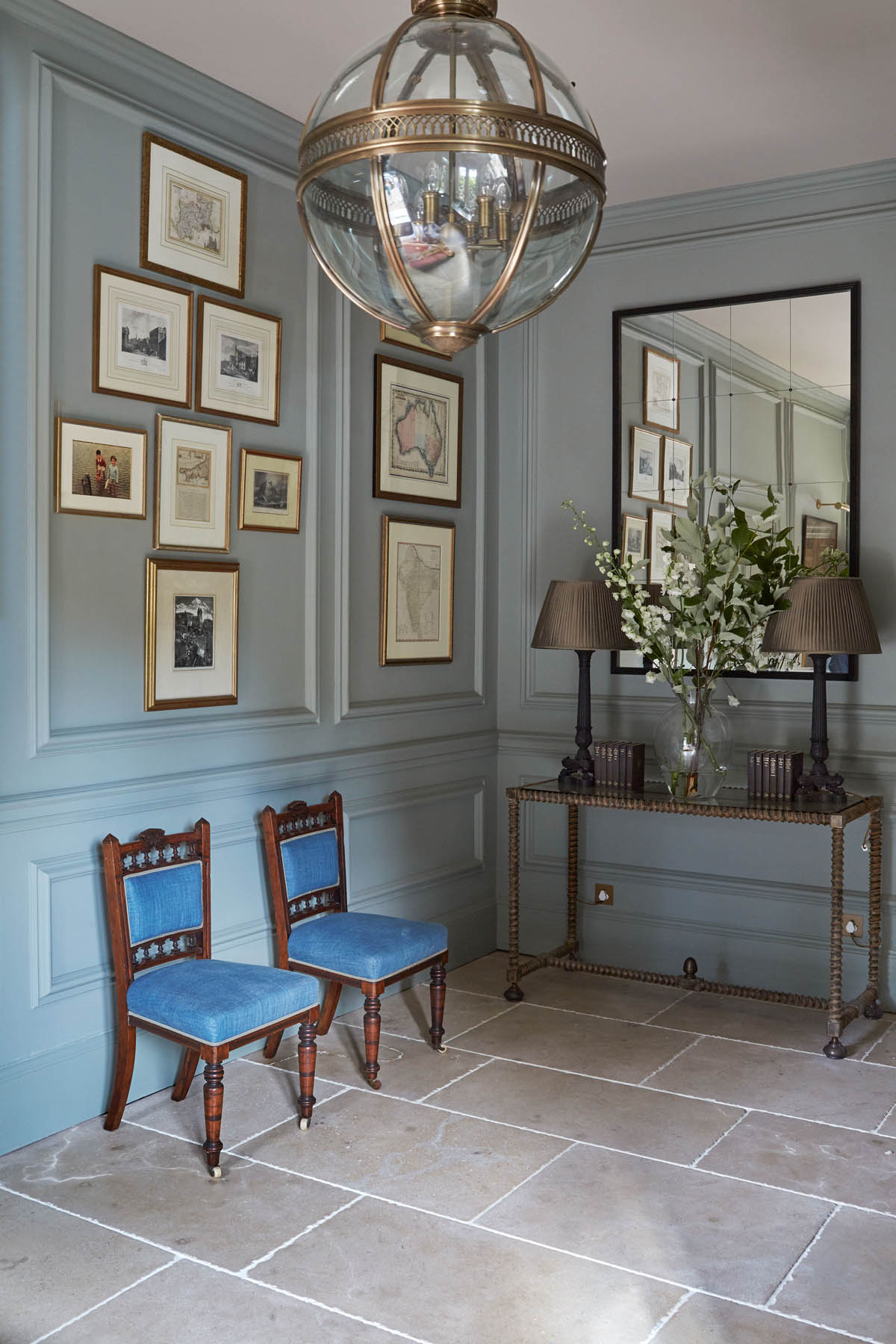
If you're looking to create a gallery wall for visual appeal, make sure it's full of character and things that are personal to you.
'There are many companies providing 'one-stop-shop' services where you can purchase prints and frames from the same vendor to get the look,' says Camilla.
'A far more appealing way to create your own gallery wall is to collect prints you love over time, visiting antique or vintage sellers for limited print runs or little framed oils. This way, your collection will be entirely unique, bringing a sense of your own personality to your home, rather than opting for "Insta-approved" artworks.'
- See: Gallery wall ideas – ways to display pictures and artwork in your home
9. Leaving white walls bare
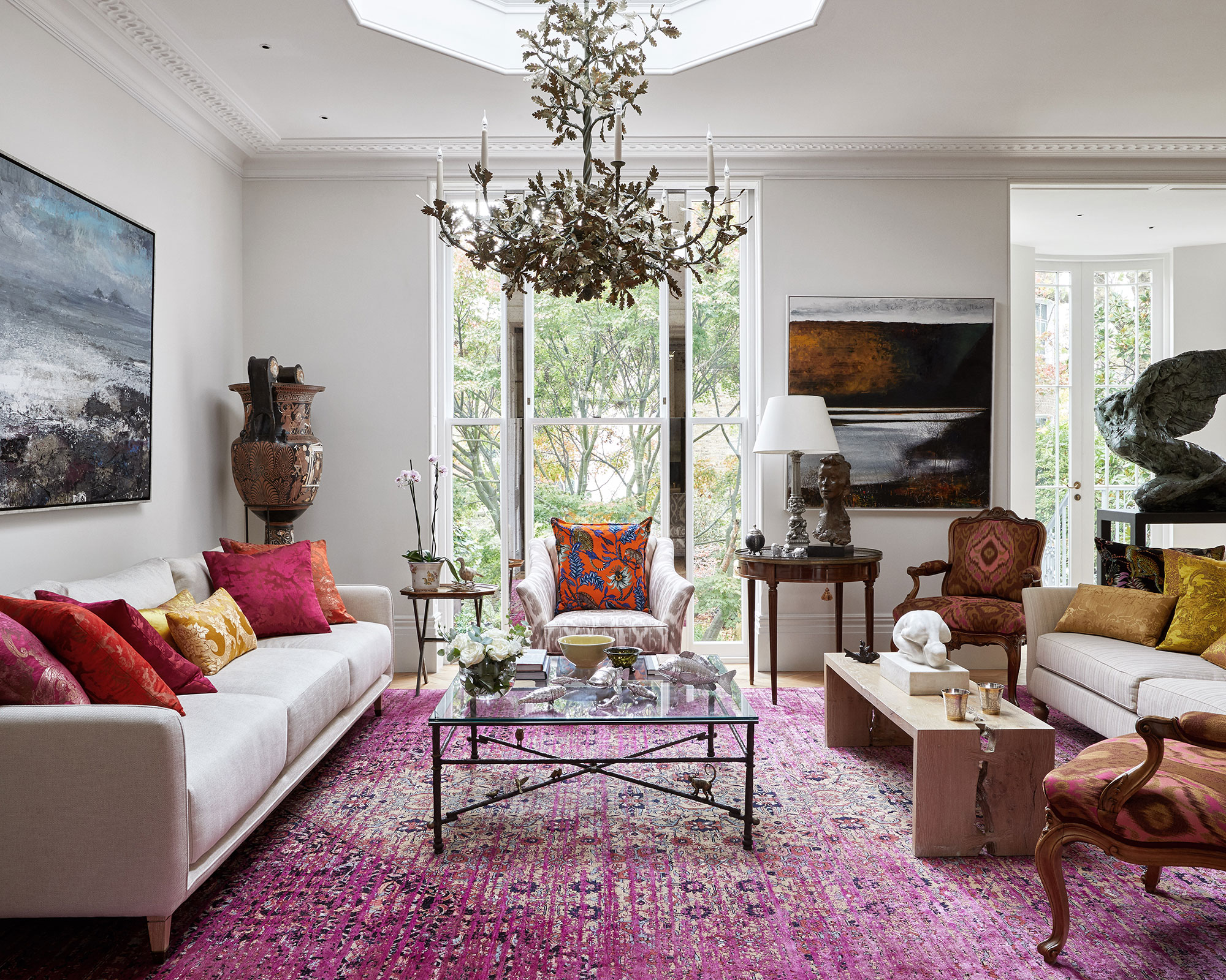
Don't leave your all-white walls bare and lacking character, says Tiffany Leigh, of Tiffany Leigh Designs.
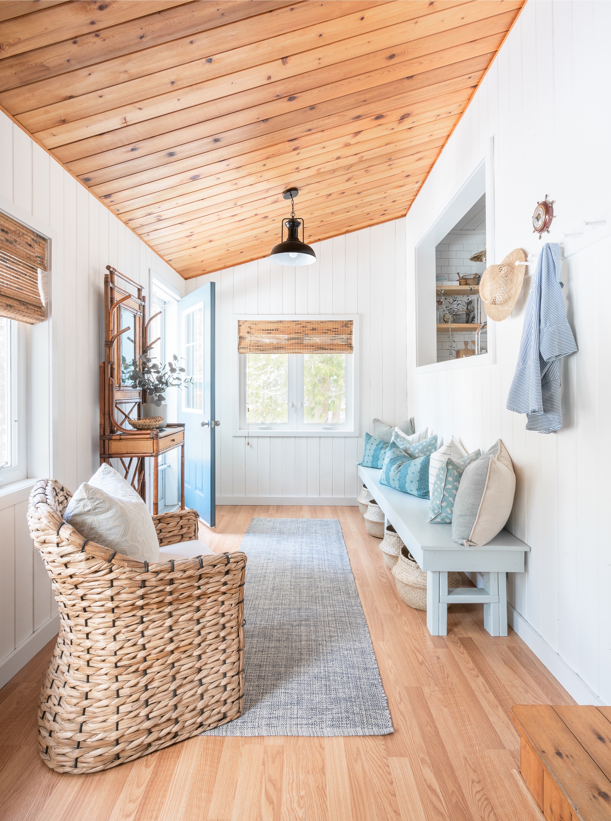
She says: 'While I think all-white walls is a trend that is here to stay, I think we will start seeing interest introduced to the white walls with textural elements like vertical shiplap or plaster-like finishes.'
10. Going overboard with Spanish tiles
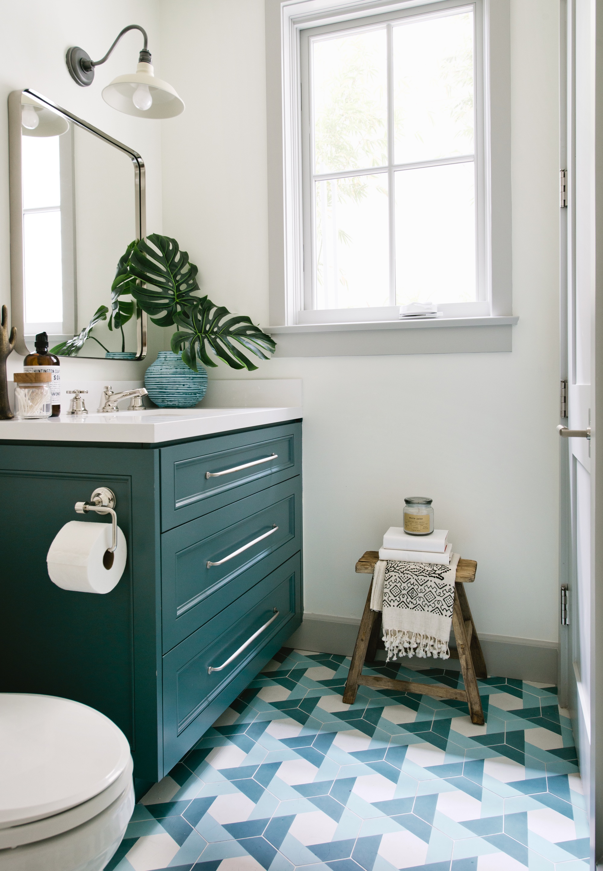
Don't get too carried away with your love affair with Spanish tiles, says Kate Lester, of Kate Lester Interiors.
She says: 'I think Spanish-inspired tiles are probably having their last moment this year. I expect pattern tiles to still be on point, but I am seeing a lot more geometric vibes recently.'
11. Sticking to an accent wall
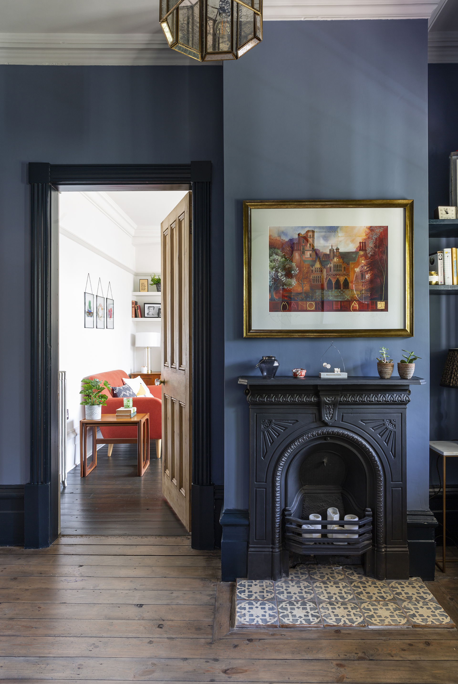
'No more accent walls in 2021!' says Kate Lester emphatically. 'If you are going to paint a color, go all in! I have been literally saying this for years, but maybe 2021 is the year everyone will stop being silly and listen to me.'
12. Staying too rustic
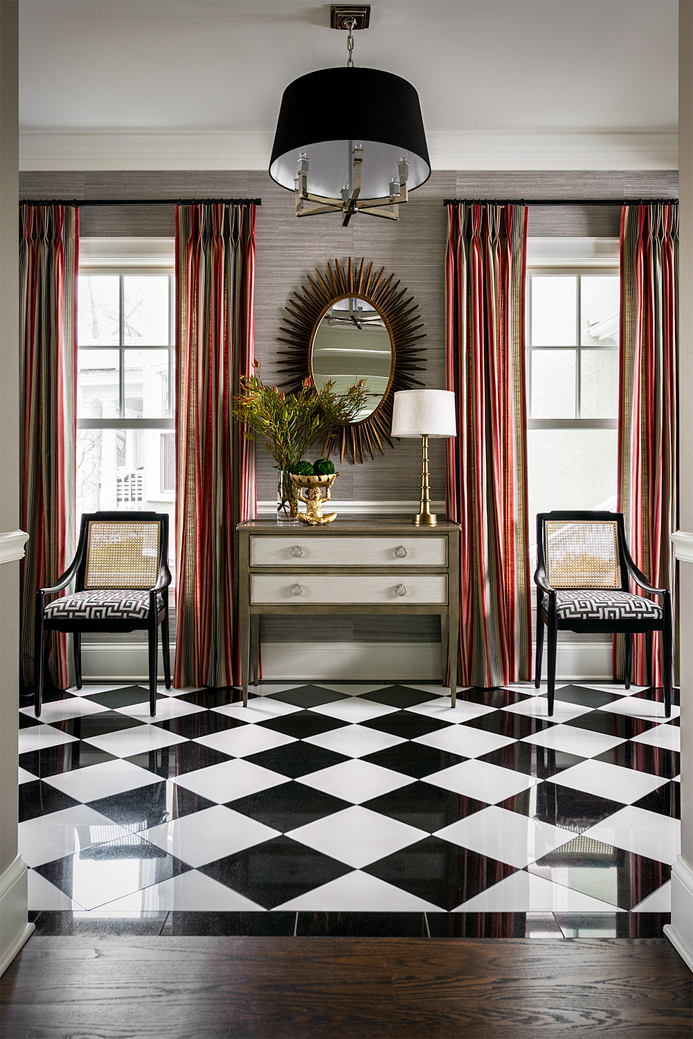
Sticking too literally to country or rustic themes can be a bugbear for some designers.
Mark Lavender, of M.Lavender Designs, says: 'I believe this look has become so overdone that it has become very ho-hum. I think people should start looking at more traditional styles with vibrant colors, prints and stripes.'
- See: Country decorating ideas – ways to bring stunning rustic style to your home
13. Overloading on recessed LEDs
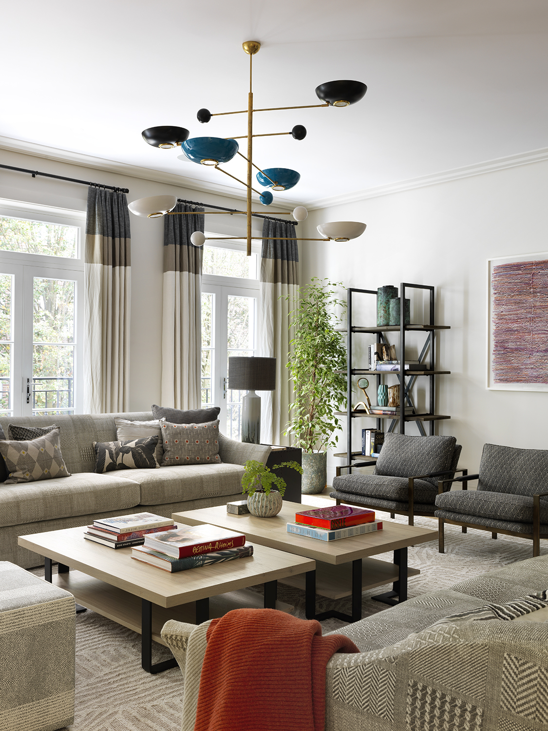
Favor could be turning on recessed LEDs, says Nick Cryer of Berkeley Place.
'We see far fewer LED recessed downlights scattered everywhere,' he says. 'Gone are the days when clients wanted 6-8 in every room and corridor.'
Instead, use lighting fixtures as a way to add color, pattern and texture to a room.

Ruth Doherty is an experienced digital writer and editor specializing in interiors, travel and lifestyle. With 20 years of writing for national sites under her belt, she’s worked for the likes of Livingetc.com, Standard, Ideal Home, Stylist and Marie Claire as well as Homes & Gardens.
-
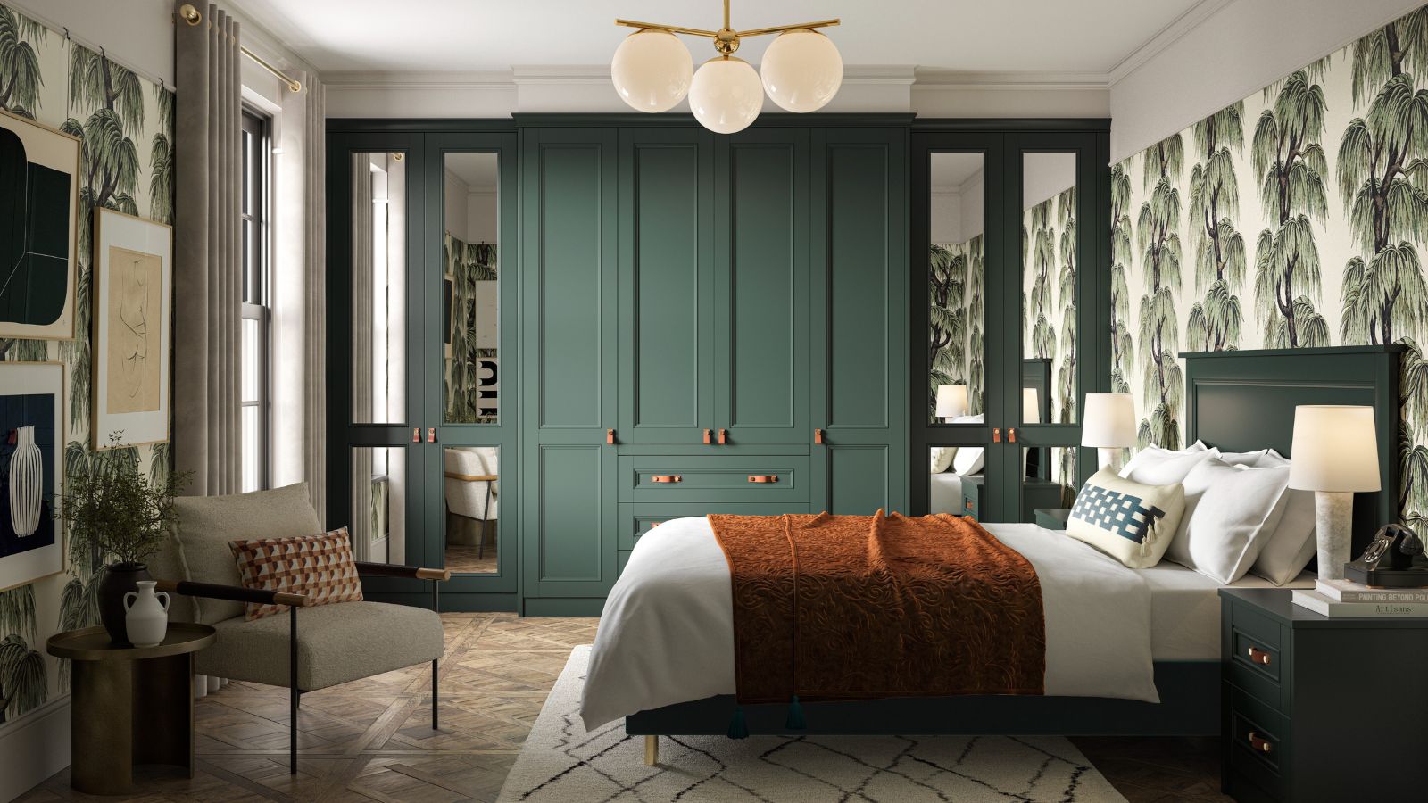 Is this the end of built-in bedroom furniture? Designers decide if this once-loved feature will in fact date your space
Will we be saying goodbye to built-in wardrobes, shelves, and drawers this year? We spoke with interior designers to see if this classic carpentry style will continue to be featured in bedrooms
By Eleanor Richardson
-
 These are the worst houseplants for beginners – experts reveal 5 difficult plants to avoid, plus easy alternatives to choose instead
Caring for these houseplants successfully requires a lot of of TLC
By Tenielle Jordison