Using line in interior design – 5 ways to use lines for a perfectly proportioned room
A basic principle of interior design, line can affect everything form, function, style and texture in a space...
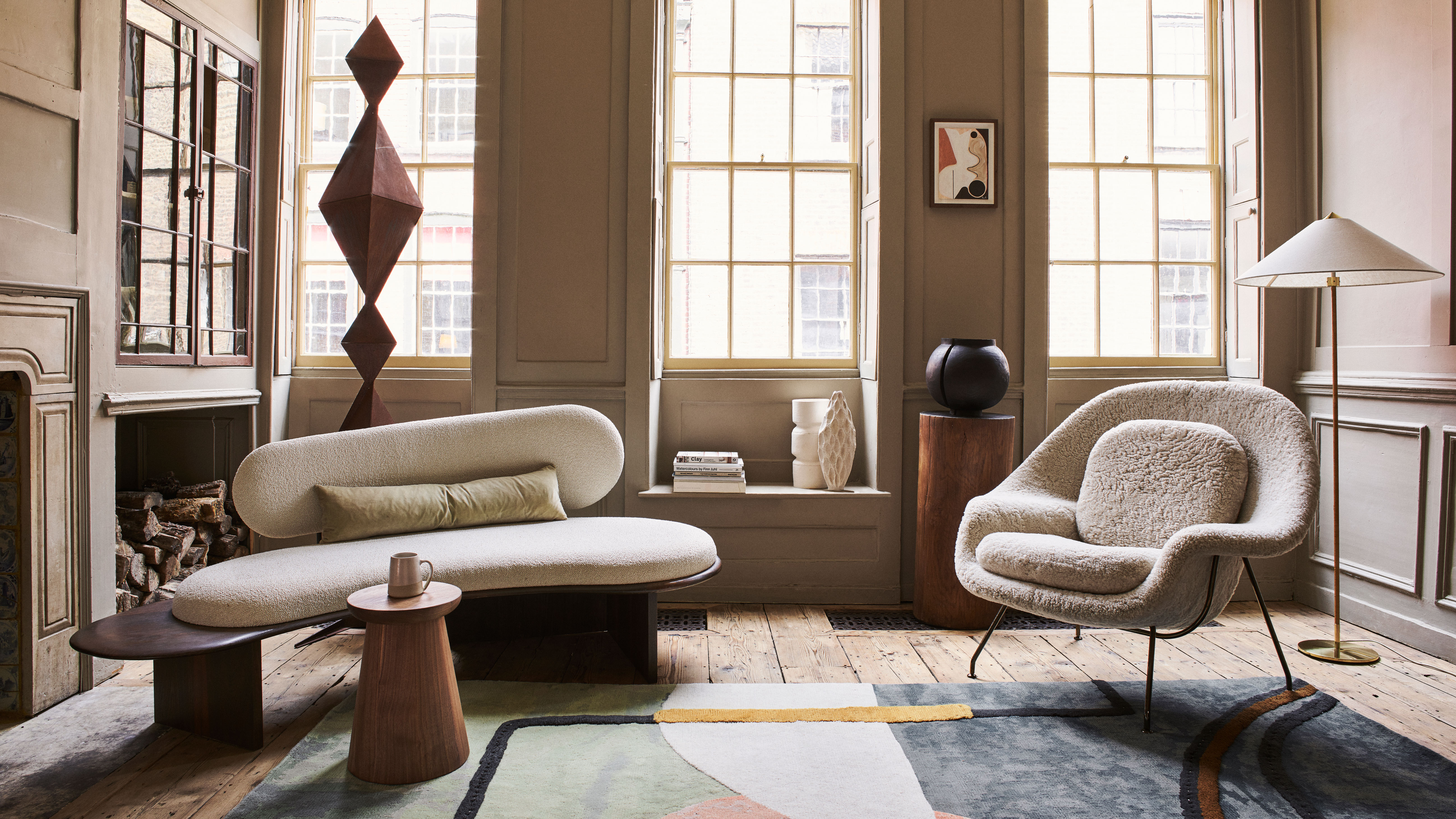

'Line' is one of the informal rules that interior designers will often follow when creating a room that's well-balanced, proportioned – and visually pleasing.
See: Interior design tips – decorating secrets for the world's top experts
What is line in interior design?
The different types of lines – vertical lines that extend up and down; horizontal lines that extend side to side; and dynamic lines (diagonal, curved or zigzag) can all help to unify as well as contrast, guiding the eye around the room and ensuring it's interesting as well as functional.
Barrie Cutchie, Design Director at BC Designs, says: 'Lines are part of the concept of form within interior design and are critical to the success of a design scheme. There is an argument that lines are at the heart of form and are characterized as either horizontal, vertical, diagonal and curved lines which all help to define shape and volume.
'As well as this, they are hugely important when it comes to texture – think the defined lines of fluted glass – or apparent texture such as marble where it appears to have texture and doesn’t.'
How do designers use line in interior design?
'Linear elements in interior design draw the eye, and can be used to manipulate the way we interpret a space,' says Tiffany Leigh, of Tiffany Leigh Design.
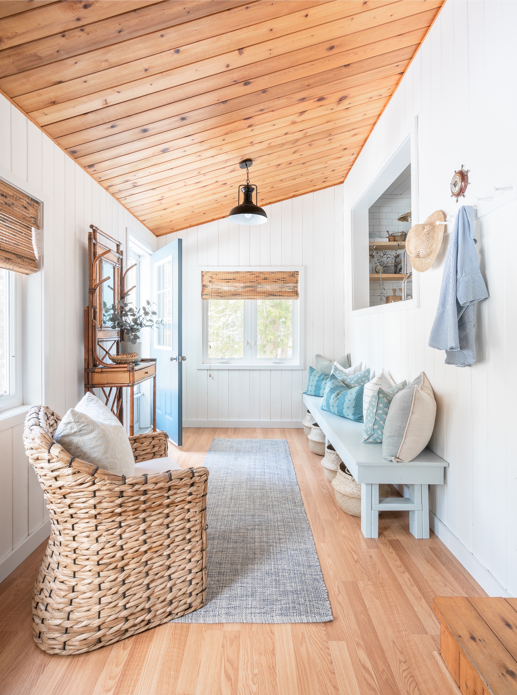
Furniture can be used to create horizontal lines, like tables and countertops, and give a space a sense of anchored stability. Vertical lines can help a room feel taller, and panelling, cladding and shiplap can all be used to enhance height.
Sign up to the Homes & Gardens newsletter
Design expertise in your inbox – from inspiring decorating ideas and beautiful celebrity homes to practical gardening advice and shopping round-ups.
Tiffany says: 'Want to make a space feel taller or emphasize a high ceiling? Use vertical lines to draw the eye up! Vertical tongue and groove panelling is one of our favorite linear elements to add to a space, drawing the eye up while adding architectural interest and texture to a space.'
Dynamic lines are often used to engage the eye and stimulate the senses, so are particularly good in accent pieces, like chevron on a rug or lampshade, or a parquet floor or tiled feature wall.
Dynamic lines should generally be kept to a minimum and not overpower vertical and horizontal lines, although this a guide only.
Discover some top tips how to use line in each room below.
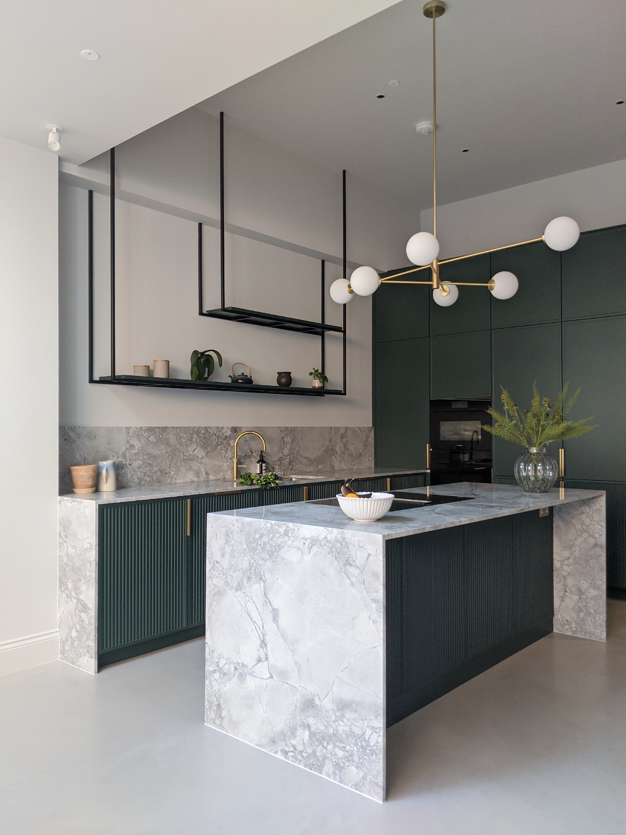
1. Use line to form zones in the kitchen
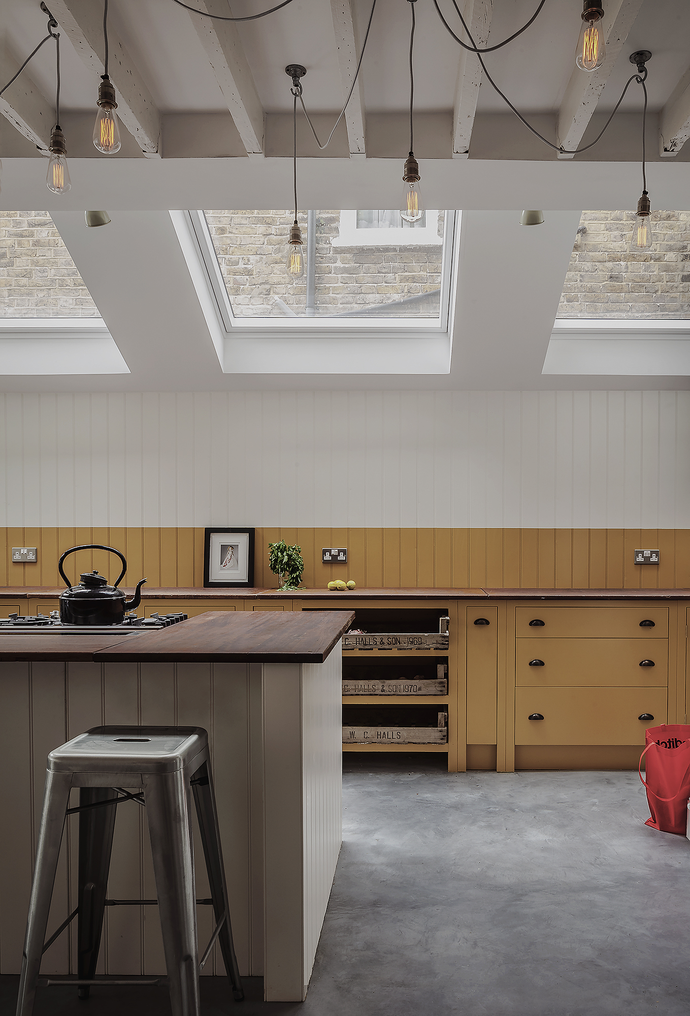
'When used carefully, lines help balance a kitchen, playing with the proportion of a space and helping to create zones,' says Adrian Bergman, Senior Designer at British Standard by Plain English.
'We often use a tide line paint effect, a painting technique that's now synonymous with British Standard, whereby the color of the cabinets extends above the worktop to eye level, creating one continuous line around the room.
'This technique works particularly well in rooms with high ceilings, as it lowers the focus and grounds the joinery, with the added benefit of adding color and personality to a space. The tide line can be tonal or contrasting colors, both create a very graphic quality adding real interest to the room.’
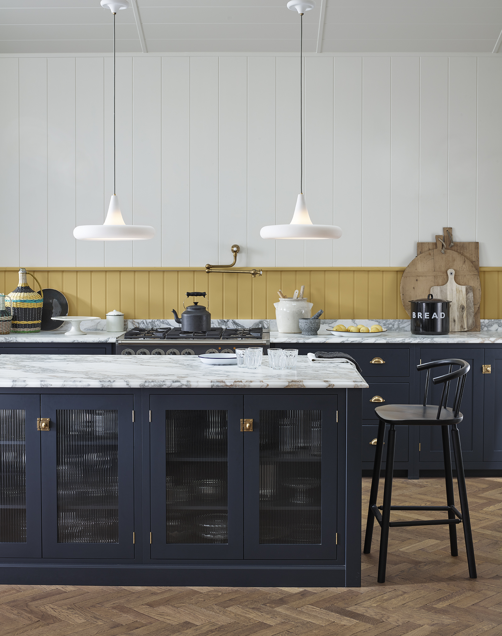
In the image below from Original BTC, lines are cleverly used to create zones; the slimline, short tongue and groove above the worktop adds a pop of color as well as a coziness that defines the work space. The vertical cladding lines are then widened and lengthened to create height.
Panelling on the cabinets helps to define the storage area, while fluted glass on the island does the same job but injects a different aesthetic as a contrast.
See: Kitchen ideas – decor and decorating ideas for all kitchens
Lines can also be used to add texture to a kitchen, through pattern on tiled splashbacks or fluting on cabinetry or glass, for example.
2. Create a spa-style bathroom with lines
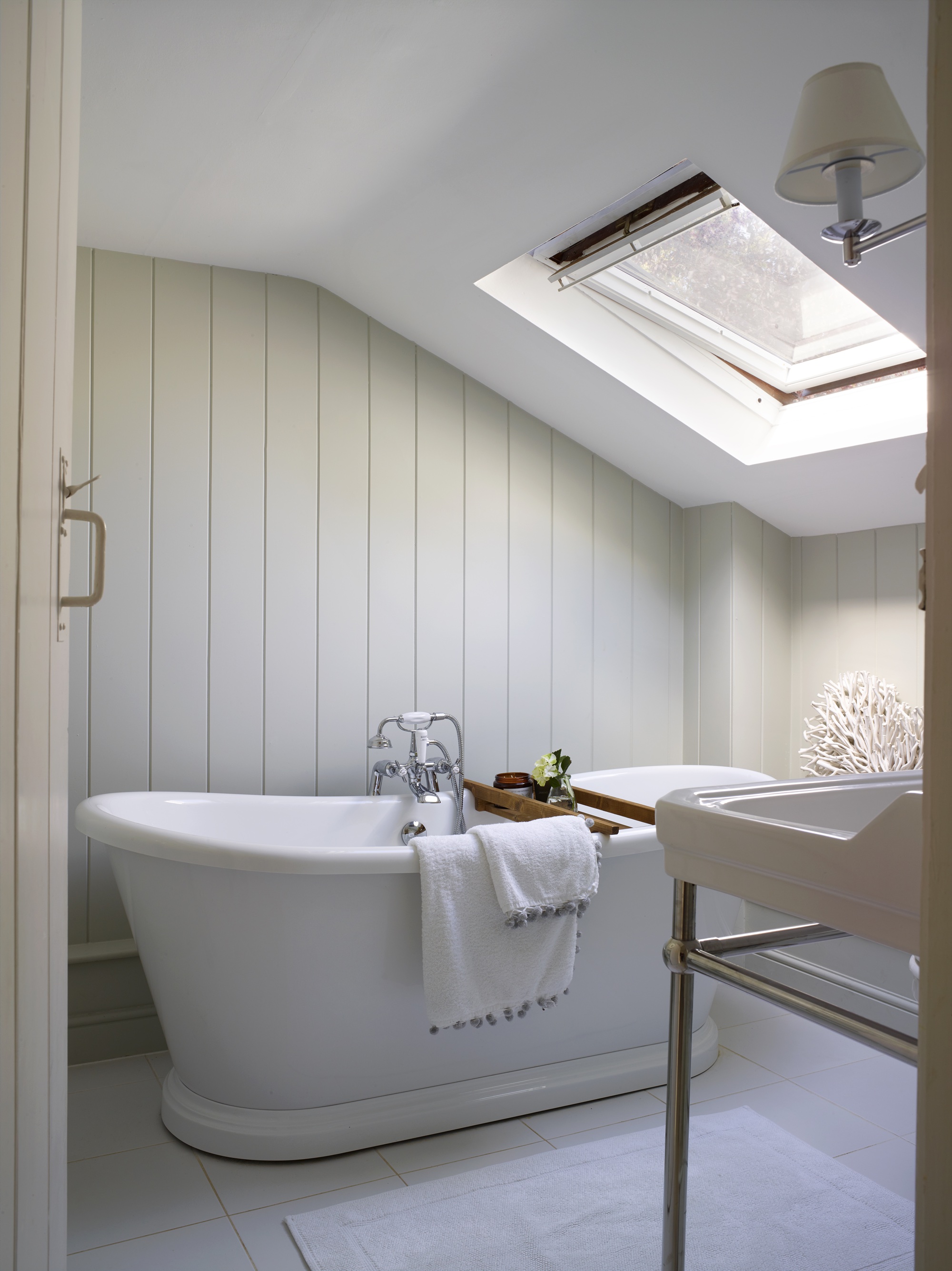
There has been a shift towards using dynamic lines to create a bathroom sanctuary, says Barrie Cutchie, explaining: 'Lines run throughout furniture, architectural elements and accessories that you choose, and we’ve seen a huge evolution in bathroom design from simple horizontal and vertical lines to lots of curves, which helps to soften a look; creating a much more relaxing environment – think spa-like bathroom trends.'
However, vertical and horizontal lines still have their place, and can be used to make a space feel cozier or larger. The curve of the freestanding bath above softens the vertical lines in the wall cladding, too.
Barrie says: 'You can also use lines to make a space feel bigger or small. An example is the use of tiles. If you have a long or narrow space, running tile lengthwise can make it feel bigger because the lines diminish into perspective. If you place the tiles running side to side, the room will look shorter but feel wider.'
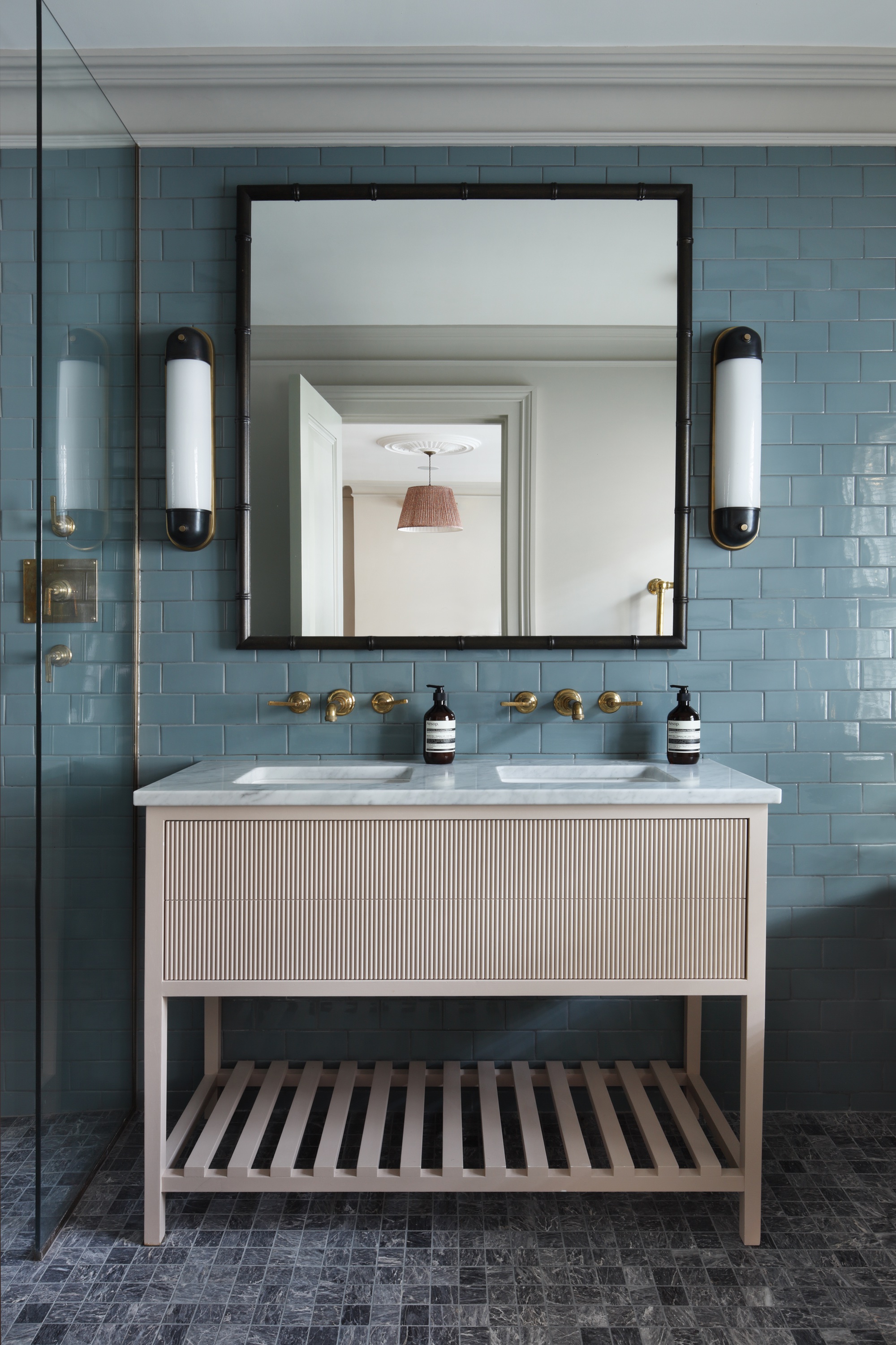
As is the same in any room, lines can also be harnessed to inject texture into a bathroom, from fluted lights, cabinets and vanity units, to rustic wooden wall cladding.
See: Bathroom ideas – stylish decor ideas for all bathrooms
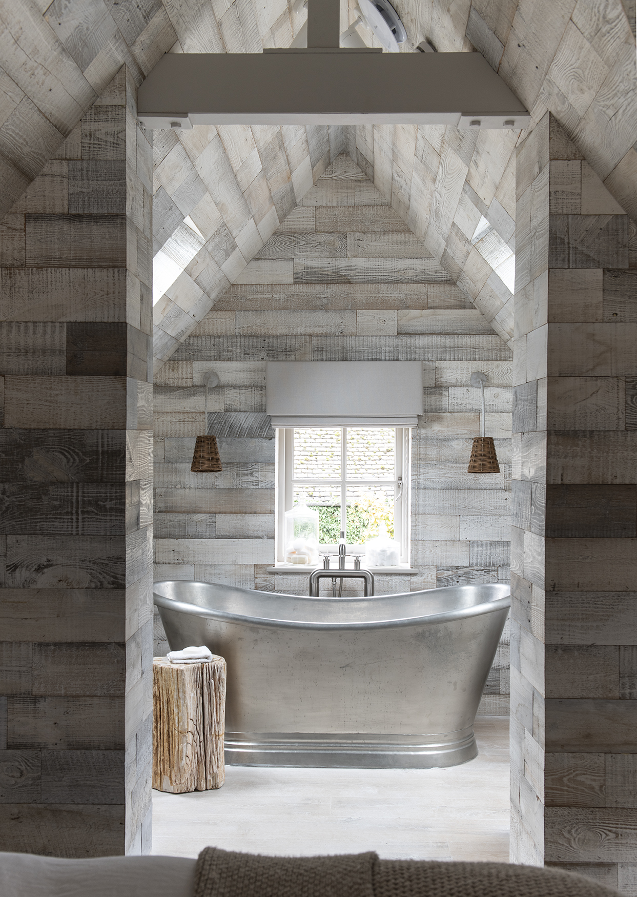
The beautiful wood cladding in the bathroom below, belonging to Bee Osborn, of Osborn Interiors, shows how the ceiling cladding gives the room length and, as there's already height but not much width, horizontal wall cladding makes it feel bigger, as well as adding warmth with the grainy texture.
Tiffany Leigh says: 'The direction we run hardwood in a room is carefully planned when thinking about line and what it will do to a space. Running hardwood parallel to long walls makes a space feel longer but narrower, perpendicular means wider but shorter.'
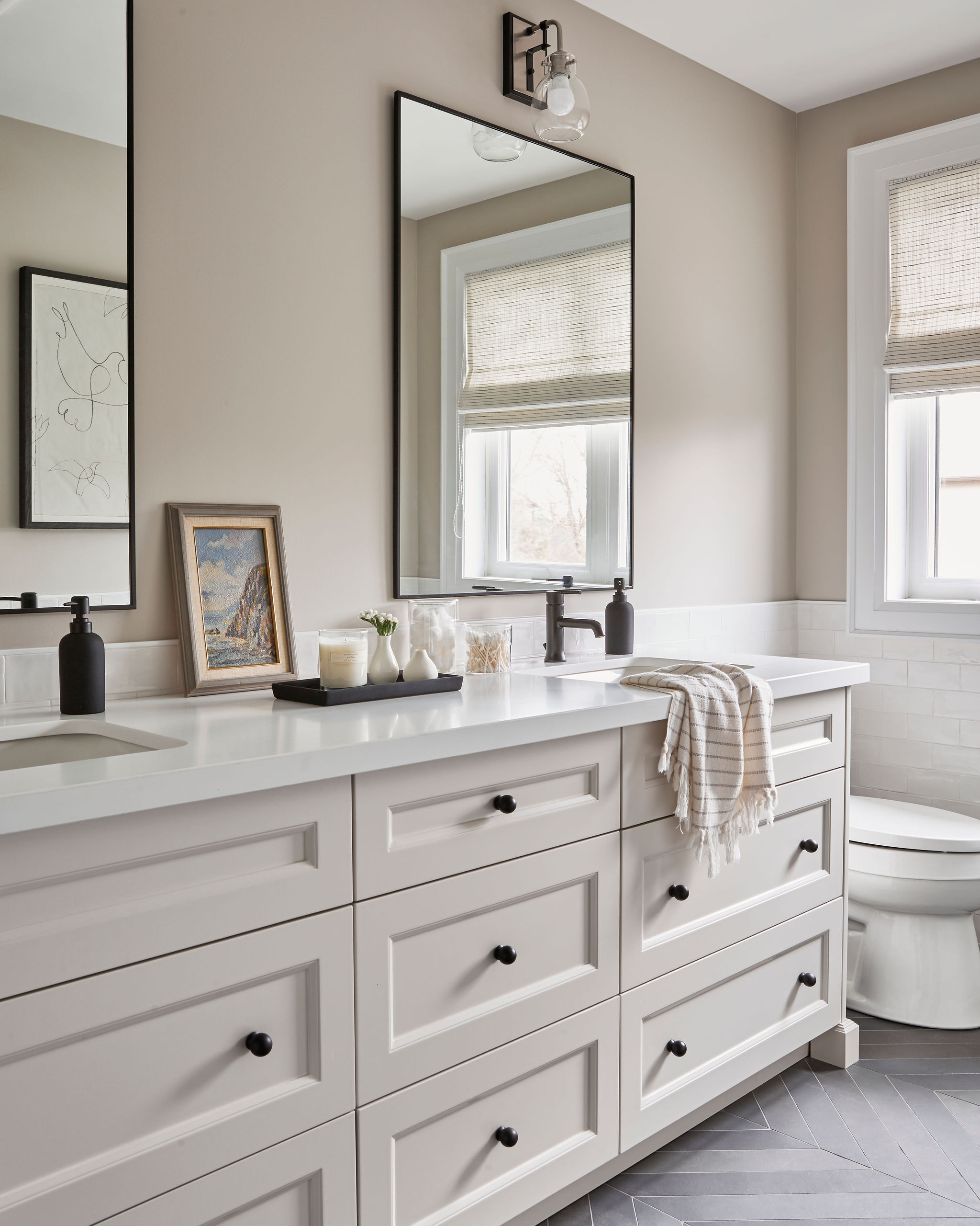
Tiffany also has a little line design style trick for the bathroom. She reveals: 'Want to make a space feel more intimate? Designers actually use a trick called 'breaking the line' to do this, where you break up a long, solid countertop with a hand towel draped over the end.'
3. Add color to the bedroom with painted lines
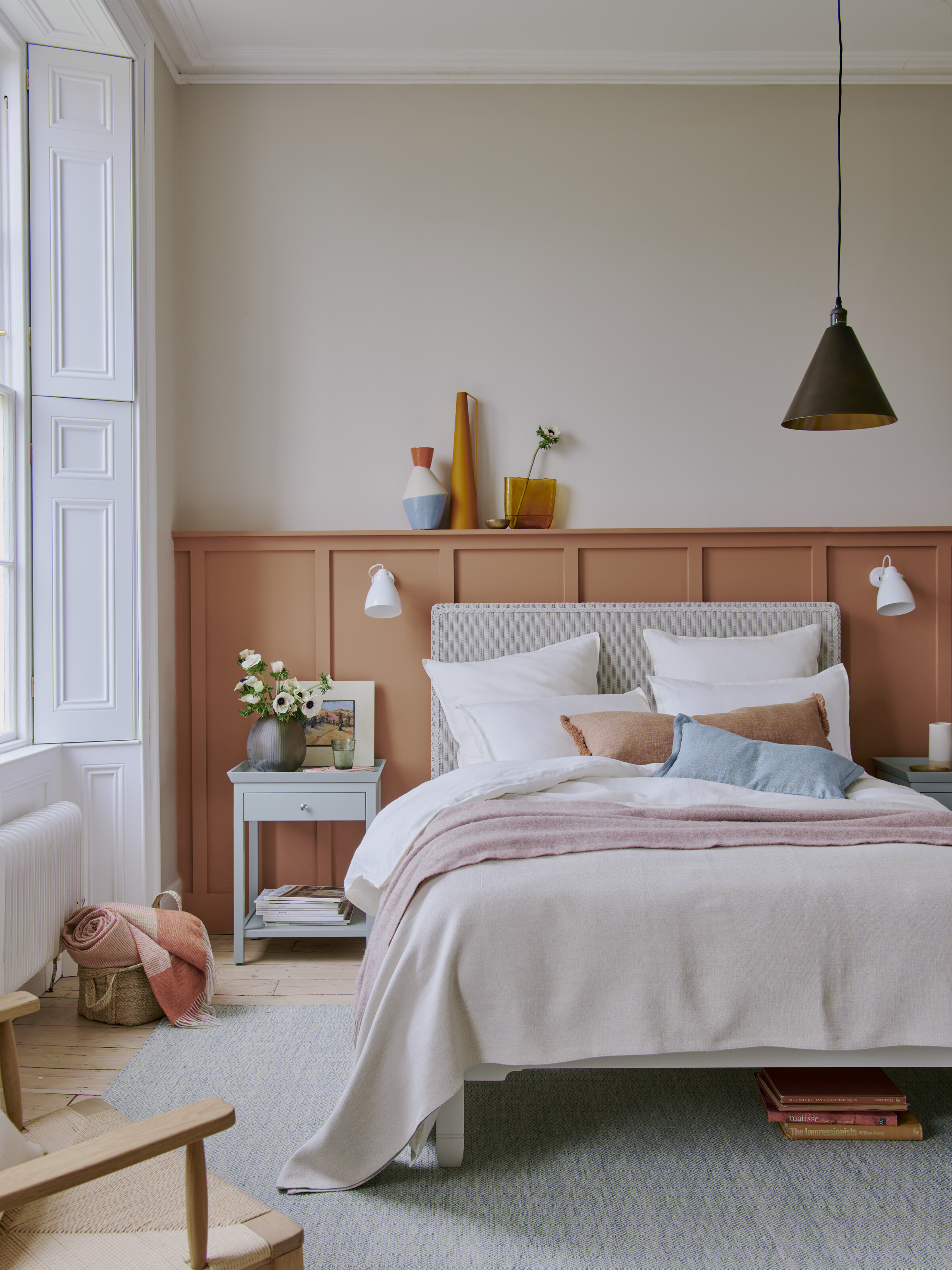
Annie Sloan explains that using paint to create lines in the bedroom can help to make a space feel larger, while also adding color and atmosphere.
She explains: 'The fundamental principles of using stripes to make a space look larger are simple: vertical stripes of any width will make walls appear taller, narrower stripes especially can give a high-ceilinged feel to a space. Horizontal stripes make the walls and the room appear wider. Especially at one or two third intervals up a wall, they create the feeling of a larger space whilst also being directional, and, crucially, easier to paint than vertical lines!'
Annie adds: 'It’s a great way to incorporate more color into your home when you can’t decide on a wall color or if you’d like to experiment with a statement shade without committing to a whole wall of color. Using contrasting colors will make a grand statement; use the brighter color at the top third of the wall to draw the eye upwards and create the illusion of height as well as width! Use tonal colors for a more subtle, contemporary nod to the trend.'
Painted panelling is also a stylish way to use line to create a timeless and elevated feel in the bedroom.
See: Bedroom ideas – designs and inspiration for beautiful bedrooms
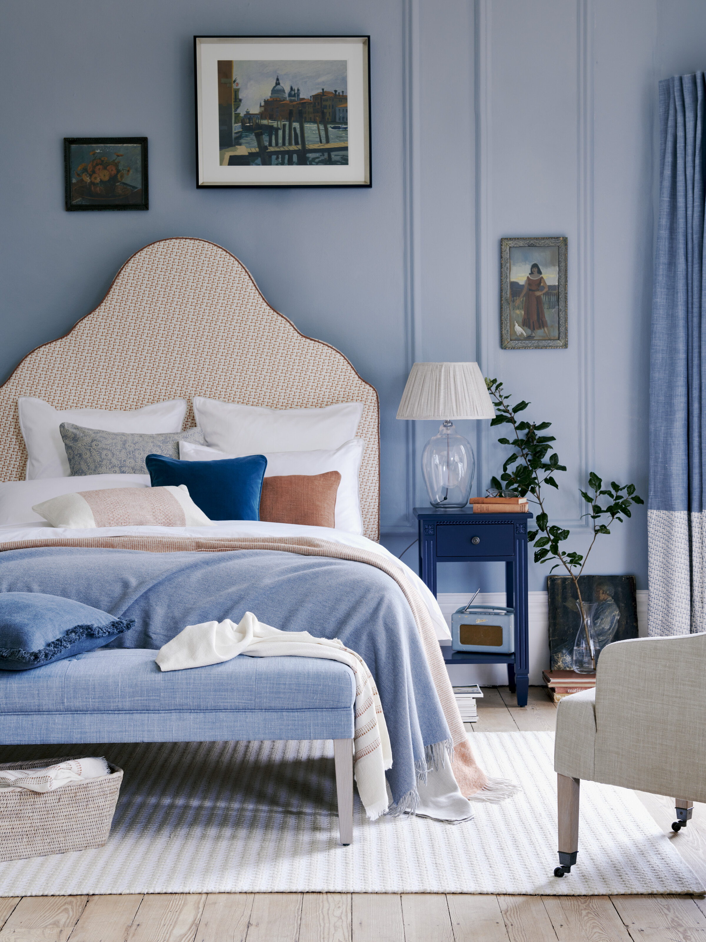
The bedroom above by Neptune perfectly shows how using different lines can guide your eye around the room; the rug stripes run parallel with the wooden flooring, leading the eye to the back of the room, where vertical panelling draws the eye upwards to appreciate the artwork. The dynamic lines in the curves of the headboard add extra interest for a varied and visually pleasing aesthetic.
4. Makes accent pieces pop with dynamic lines in the living room
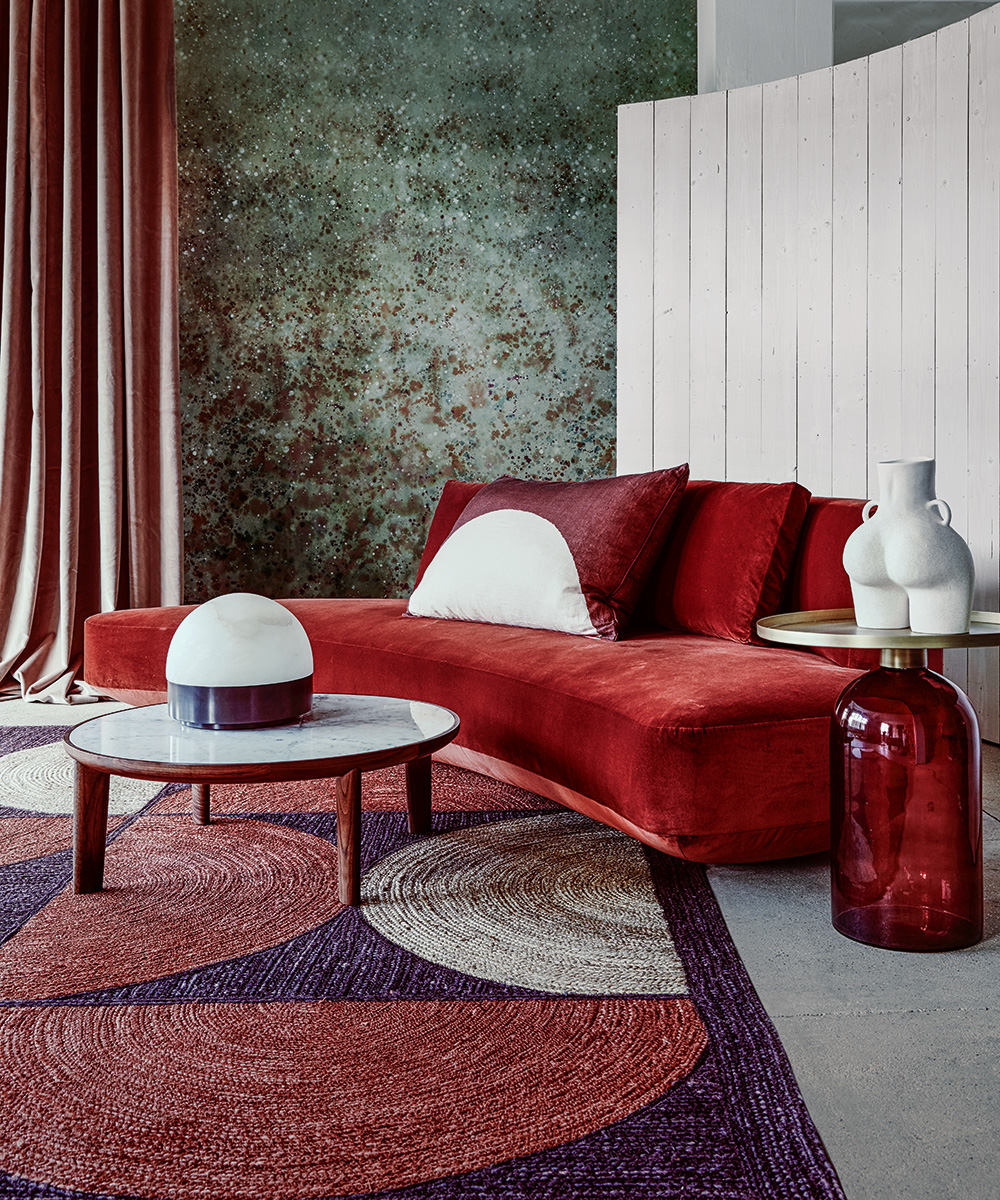
Dynamic lines, including curves, zigzags and chevrons, are a clever and easy way to bring a living room to life. A curved sofa is always a timeless and elegant choice and, in the image above, the round table, glass-blown lamp, half-circle rug and cheeky vase all soften the vertical lines of the full-height curtains and wall panelling for a vibrant room.

5. Adopt a mix of lines to add verve to a dining room
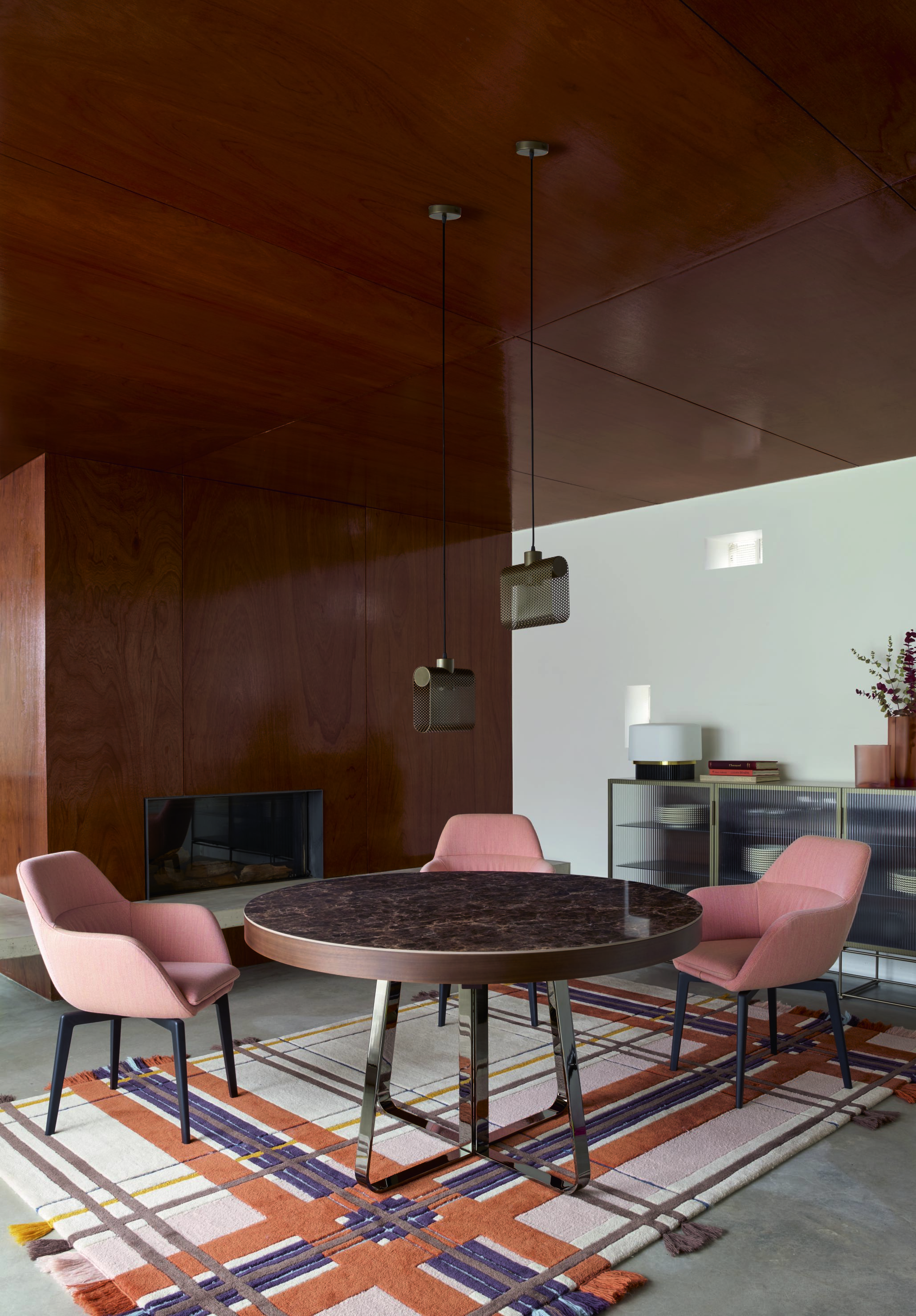
The above design by Ligne Roset offers an excellent example of how to mix vertical, horizontal and dynamic lines to give character to a dining room. The lines in the rug add depth, color and dynamism to the room, while the round table softens the statement. A fluted cabinet on the back wall also adds texture to the space.

Ruth Doherty is an experienced digital writer and editor specializing in interiors, travel and lifestyle. With 20 years of writing for national sites under her belt, she’s worked for the likes of Livingetc.com, Standard, Ideal Home, Stylist and Marie Claire as well as Homes & Gardens.
-
 I tried the Temptation Method to finally unpack the boxes I'd been ignoring after a stressful house move – I'm relieved it worked so well
With a pile of unpacked boxes clogging up my home office, it was time to get motivated
By Sophie Warren-Smith
-
 Martha Stewart's nostalgic gray-green kitchen cabinet color is having a revival – and I predict it will be a huge trend in 2026
A timeless choice for the future – there is a lot to love about a serene gray green
By Jennifer Ebert