10 layering steps that interior designers always follow for successful schemes
Follow these layering rules to create an interiors scheme that looks professionally designed
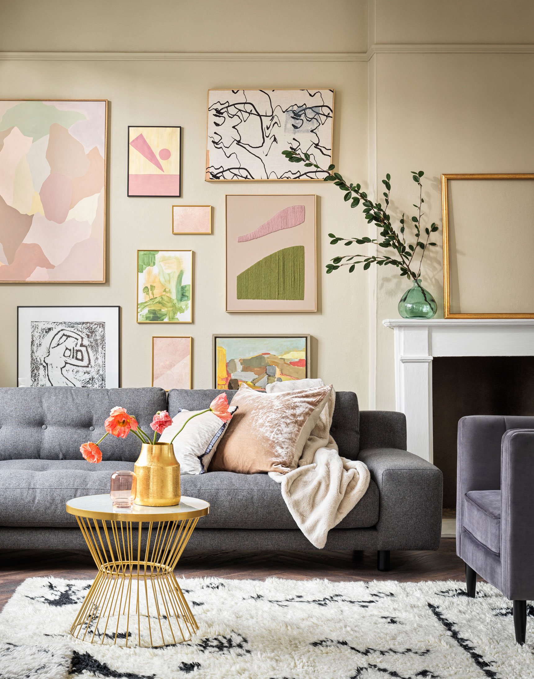

We all know that the secret to the success of a rich, characterful scheme is layering. So what is layering in interior – and how do you approach it? Well, each element in a space – paint, wallpaper, lighting, flooring, soft furnishings, furniture, artwork and accessories – is a layer.
The art of layering is to learn how to use each of these individually and make them work together cohesively – building a room from the ground up.
We look at the 10 key elements of layering below – use them to add depth and interest to your space.
See: Interior design tips – decorating secrets for the world's top experts
1. Choose your main color, over which to build layers
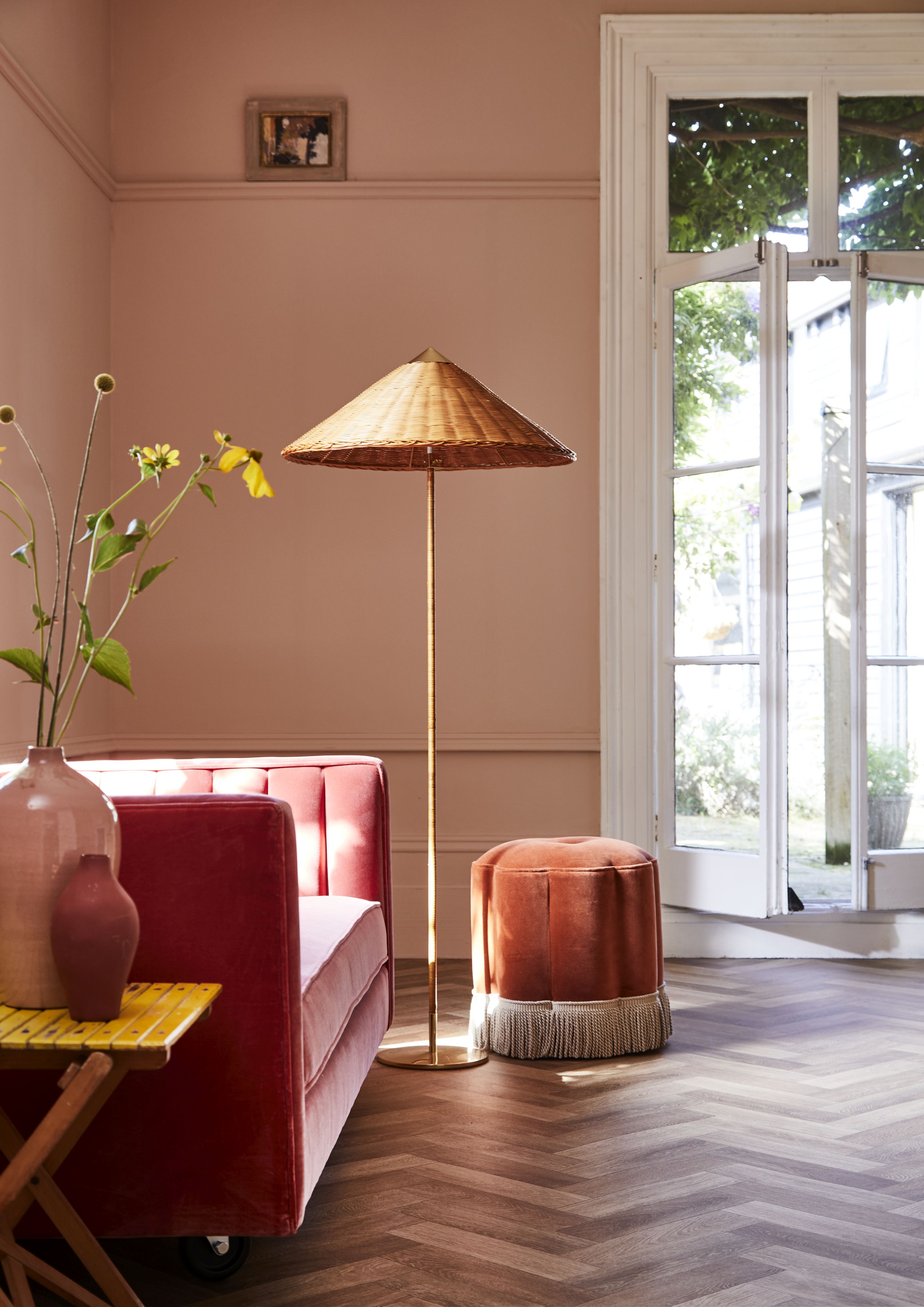
Color is the starting point of any scheme and the first layer to consider. We often mention that white creates a blank canvas, but any single color in a room also works in the same way. However, you can also successfully layer with color alone.
This coral-pink shade provides an earthy and warm background that is easy to build on with toning colors. Furniture in rust and rose pink add depth and create further layers. The pop of the yellow flowers and side table give the space an accent color that gives the overall look a vibrancy.
Flooring by Carpetright.
Sign up to the Homes & Gardens newsletter
Design expertise in your inbox – from inspiring decorating ideas and beautiful celebrity homes to practical gardening advice and shopping round-ups.
See: Living room ideas – clever ways to decorate living spaces
2. Recognize the importance of flooring in layering
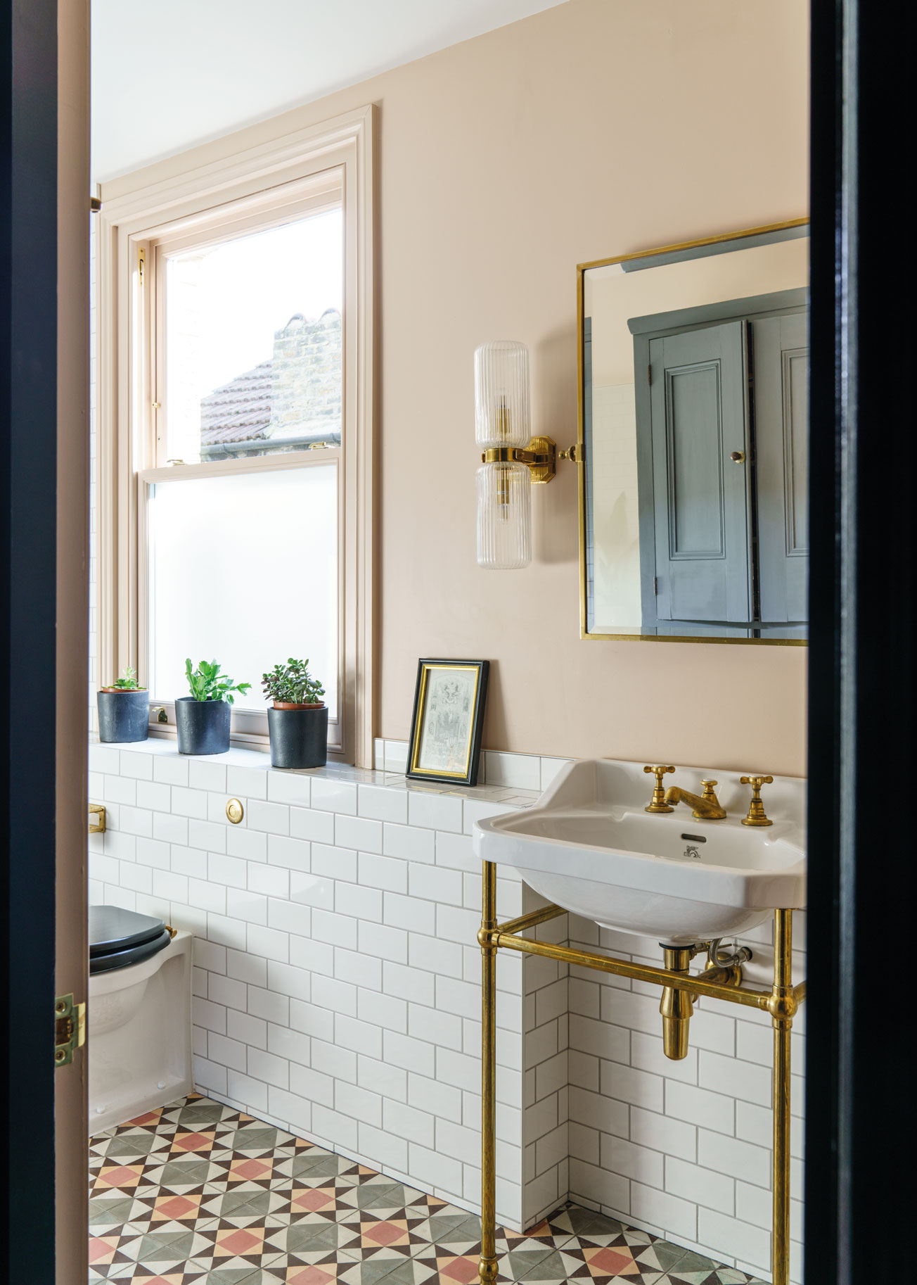
Whether you choose a plain or patterned floor, it’s still a key layer in the look of your room. If you choose a pattern then getting the balance right is really important as you want the floor to be the focal point – the main decorative aspect, so to speak.
There are essentially three main layers in this bathroom by Farrow & Ball: the paint color, the metro wall tiles and the floor. They each take up roughly a third of the space, but the first two are plain – and that’s why the patterned flooring works as the predominant layer.
3. Layer pattern over your main color
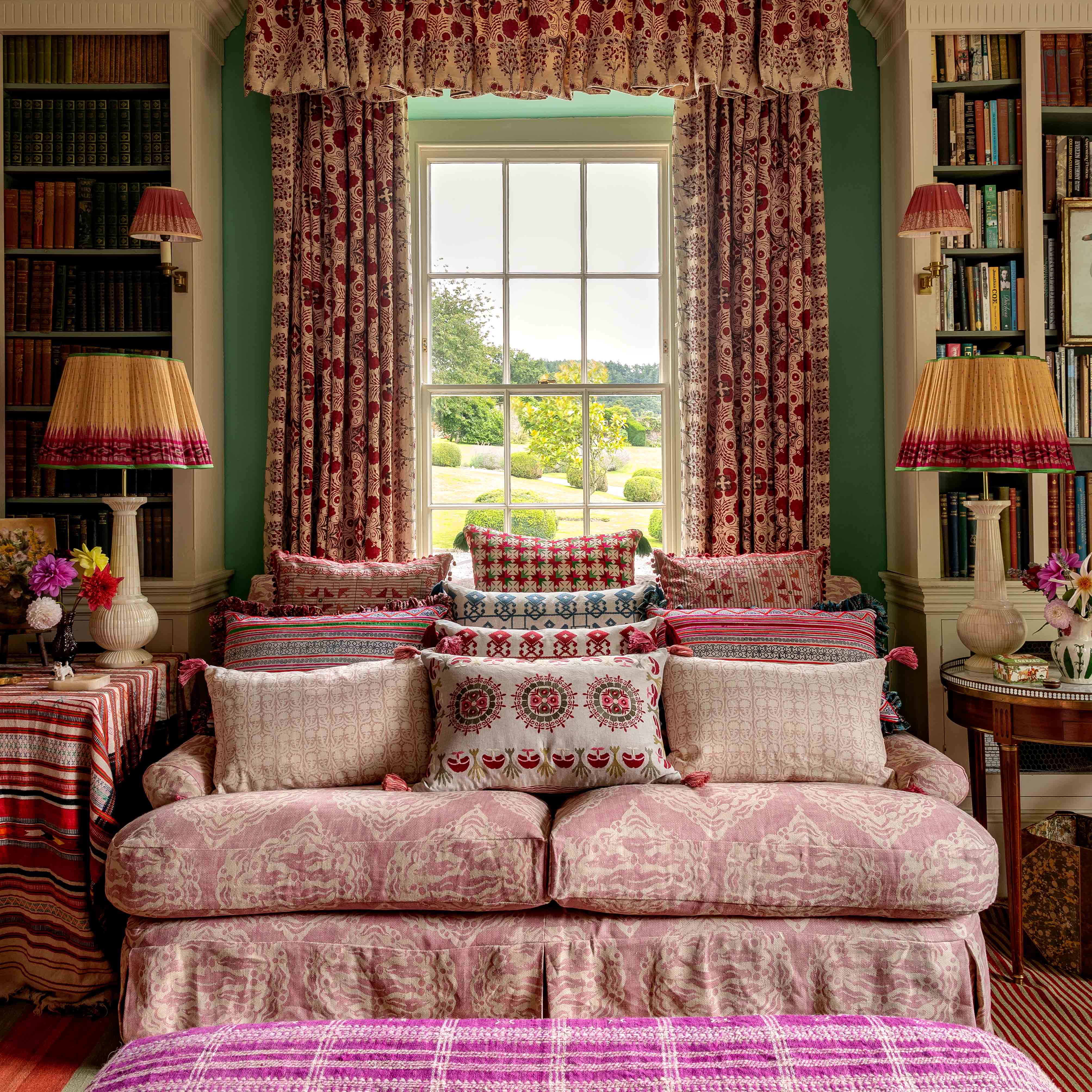
If your main surfaces – floors and walls – are plain, adding pattern is your next step. Founder and world renowned interior designer Penny Morrison is known for her beautiful harmonious spaces that have unexpected pieces, patterns and palettes. We asked Penny how to master the art of using pattern as a layer.
‘I love mixing and layering patterns within a similar color scheme. This can bring depth and harmony to a room while keeping things vibrant and interesting.’
Use your main, or most prevalent, color – pink in the room above – to hold the scheme together. It doesn’t matter if the shades range from pale to dark, as long as that’s the predominant color. Then, you can use different patterns and prints to create interest with that color as the common thread.
See Penny's masterclass on how to mix patterns in a room – our dedicated guide.
4. Use artwork on walls to add layering

The next step? Layering walls. Artwork on walls – or gallery walls – give life to plain painted walls and work very well for adding a layer of pattern and accent color if you’re not a fan of wallpaper. We asked Andrew Tanner, Home Design Manager at Habitat for his advice on how to make it work:
‘When framing artwork for a gallery wall or mantelpiece, a key consideration is whether to match frames or not. Matching frames can create a smart, uniform appearance, reminiscent of a modern art gallery. If you're after an eclectic look with heaps of character, opt for a mix of colored and textured designs.’
5. Layer flooring with rugs
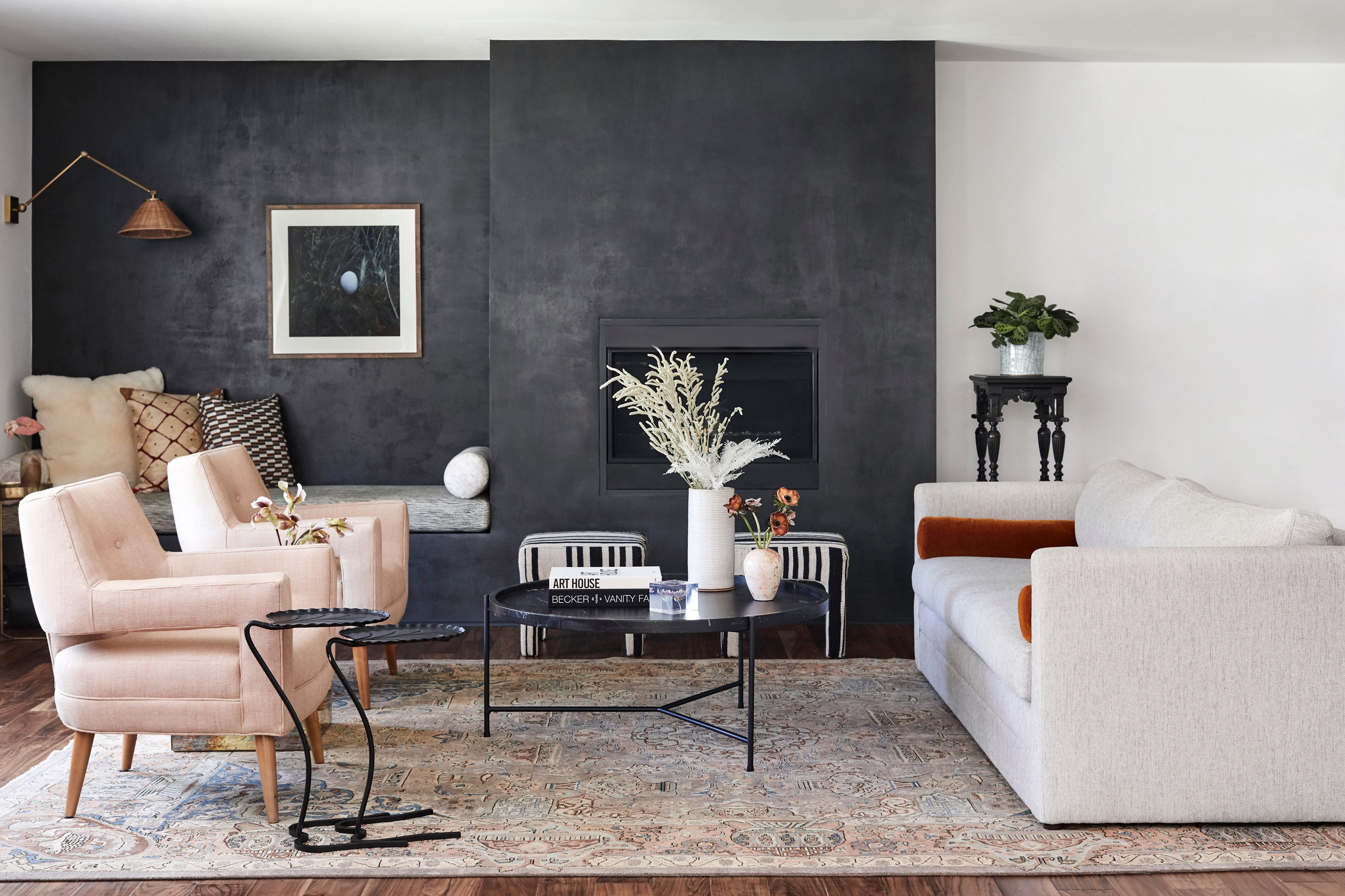
Rugs are another fabulous element that layer and finish a room as long as you choose a design that incorporates the colors from the rest of the scheme.
This chic and liveable Los Angeles home is designed by California-based interior designer Stefani Stein. The brief was to make the home more inviting without being busy, and to fulfil both of the couple’s requirements – one loved black, walnut and grey, the other longed for color.
Stefani layered these key elements and the end result is a super stylish Californian interior that complements the open plan architecture with natural textures and muted colors.
6. Layer windows with dressings
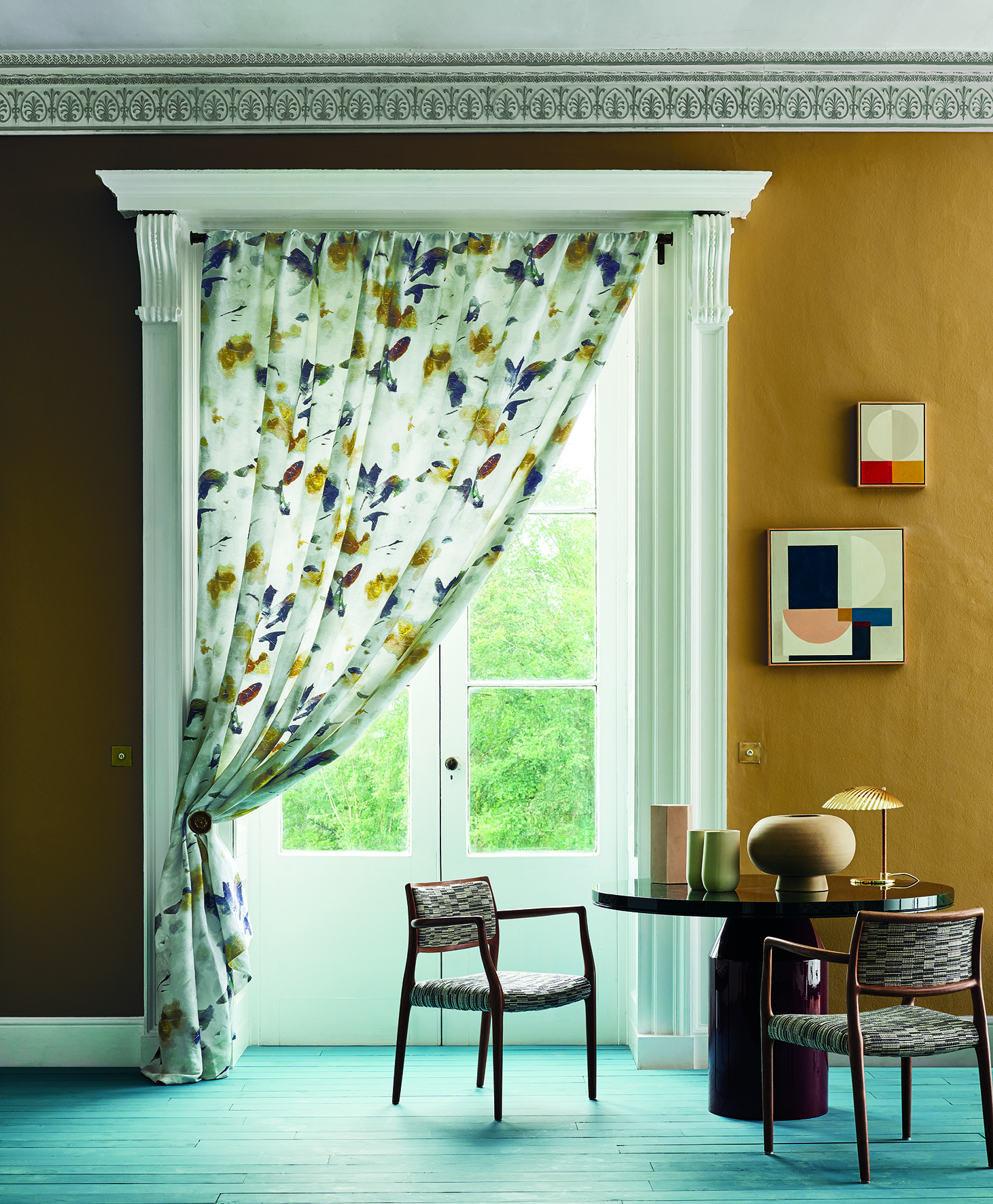
Window dressings allow you to pull the scheme together and are one of the final major layers to consider. Choose a print that encompasses the colors you have used on your walls and if the rest of the scheme is plain in color then you’ll be making a design statement with your drapes. If your window is large you can opt for a larger more dramatic print.
Window dressing by Black Edition.
7. Add layering with lighting
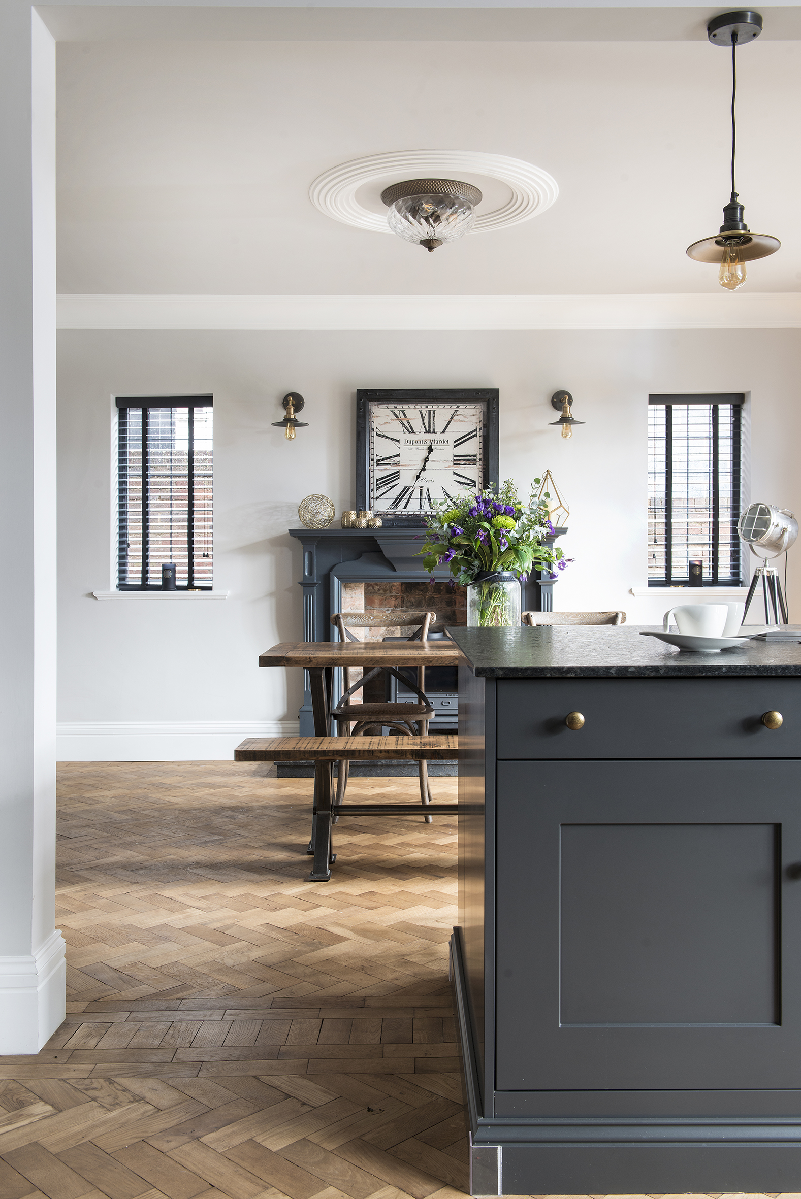
Lighting can often be neglected when pulling together a scheme – but it can add layering in a myriad of ways. Marketa Rypacek, Managing Director at Industville explains:
‘Often the biggest mistake made is thinking all one needs is a single overhead light for a room, but lighting should be approached in a layered manner. This ensures all the architectural and design features of the room are highlighted, from ceiling to floor.
'In order to accomplish a warm, welcoming and spacious room, you need to embrace the whole range of lighting sources available; pendant lights, recessed lights, chandeliers, track lighting, tall floor lamps, small table lamps, wall sconces, under cabinet lighting, and other spot lighting.
'The number one consideration for lighting any space, no matter what the size, scale or budget has to be a dimmer switch. Dimmer switches are a quick and cost-effective way of offering multiple lighting levels in a space, allowing the homeowner to set the tone and change the atmosphere of a room instantly.’
And, of course, the textures, materials and colors in your fittings add extra opportunities for you to add layers of accent shades and textures.
8. Add texture to create an extra element of layering
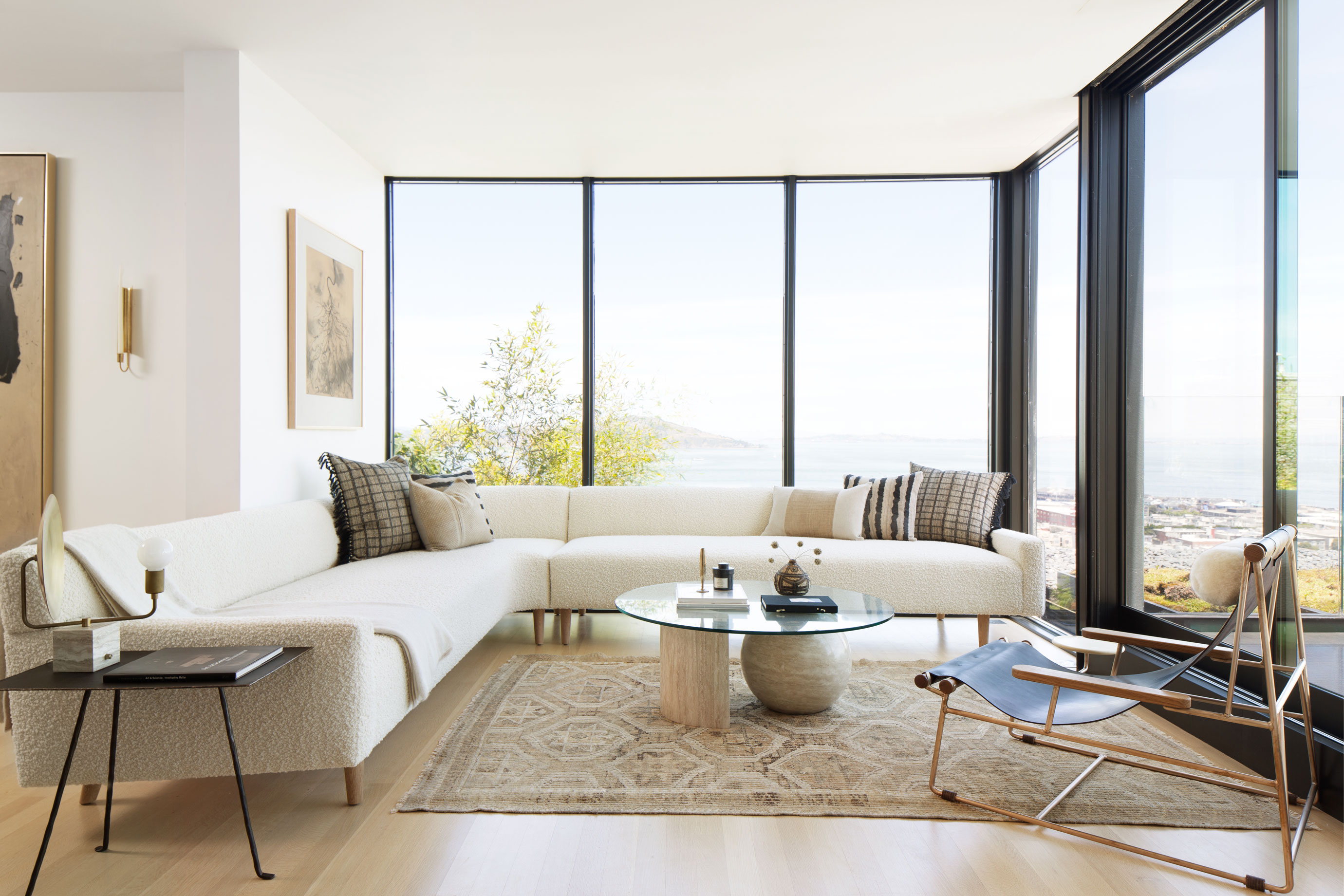
Whether your room is boldly colored or oh-so-neutral, texture is what will create a diverse and exciting scheme. And you can layer them too – take a bouclé sofa for example – it will be the focal point of your space but you can still layer it up with tactile cushions crafted from slubby linens that feature trims, buttons and tassels.
These aren’t the only textures you can use – a glass coffee table, leather and wood chair and a metal side table will all add desirable layers – as in the room above by JDP Interiors.
9. Make the most of shapes – and mix them up
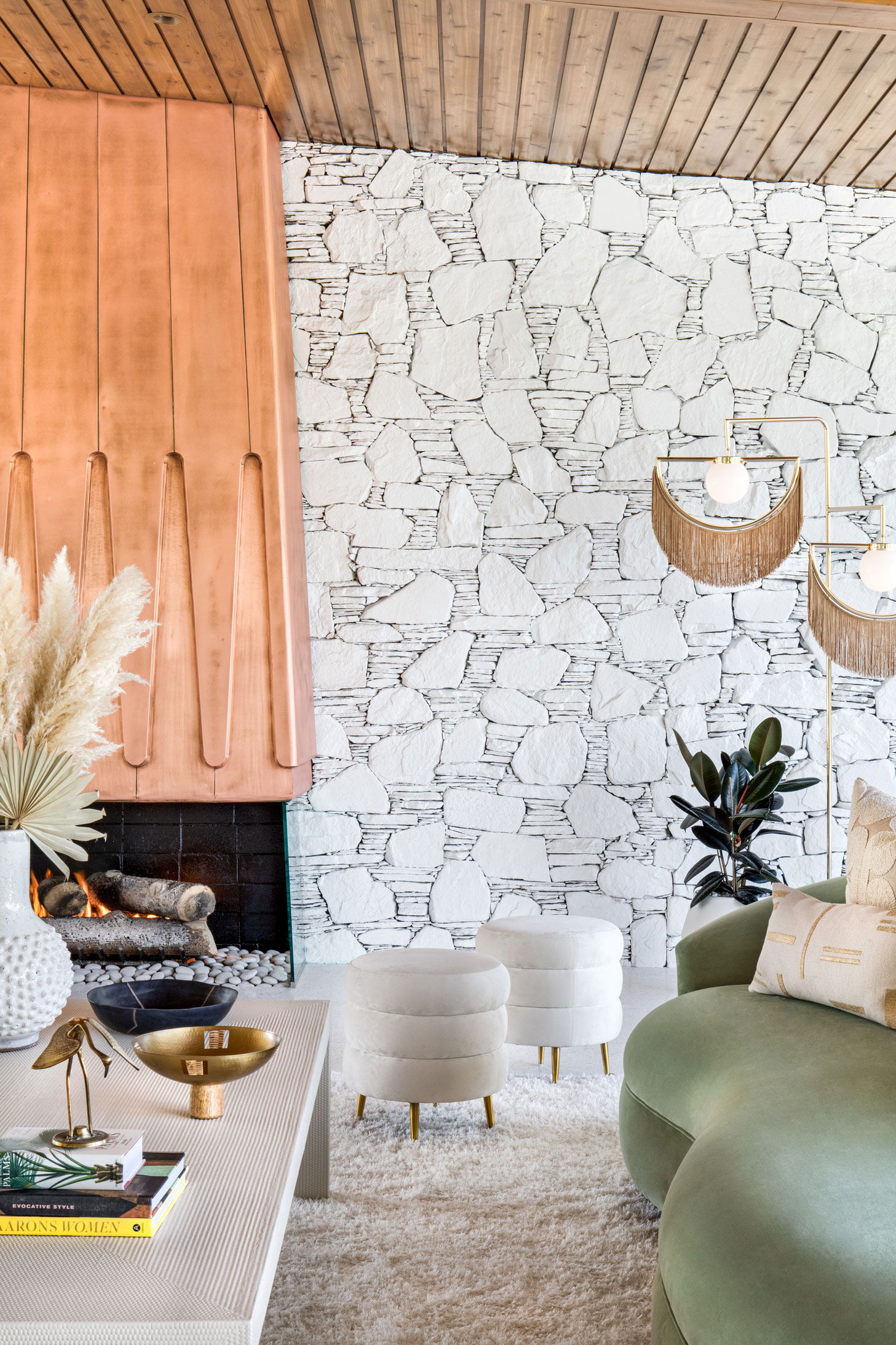
‘In design, we are always looking for ways to add depth and intrigue to the spaces we create,’ says California-based, Jen Samson. ‘This is often achieved by curating a space filled with beautiful textures and interesting shapes. Many times, this can come from both architecture as well as the furnishings.
'In this project, it truly was the melange of all these elements that gives this large room so much character. A perfect mix of soft curves and hard edges, linear details and abstract forms all harmoniously contributing to this space.'
We adore this finished space – the curvy sofa and stools, the angular coffee table, textured wall and deep pile carpet – this is layering shapes at its best.
10. Add accessories – the final layer
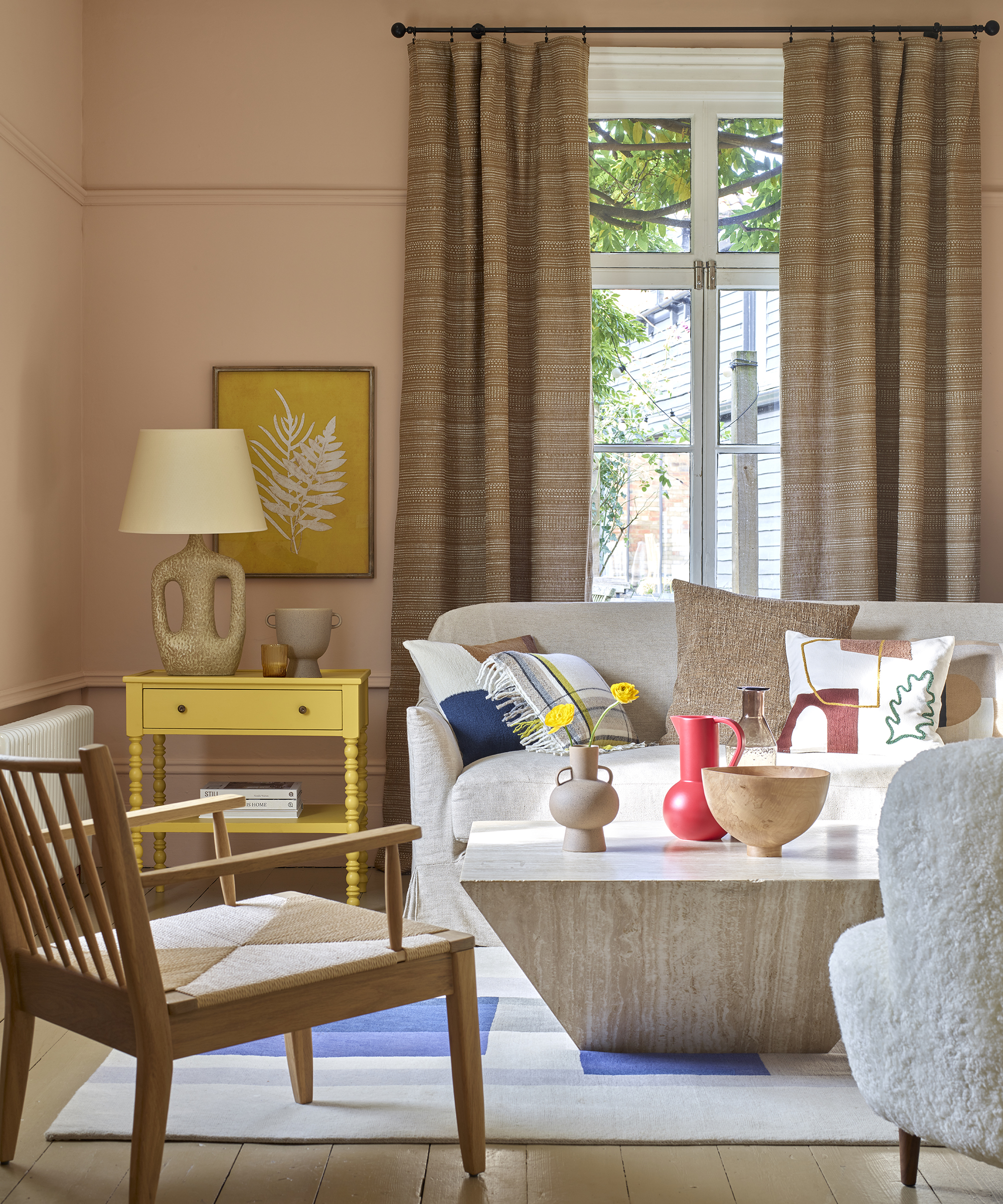
When all the above layers are in place you should have a room in your chosen color scheme that’s nearly finished. The last pieces of the puzzle are the accessories and they are perhaps one of the most important.
See: Symmetry in interior design – and how to harness it for small spaces
Vases, books, keepsakes, plants and flowers are those essential items that are the cherry on the cake. They represent you – the vase you bought from the flea market, or the flowers you had at your wedding or your most favorite coffee table book, bought on your last vacation. These pieces invoke memories and therefore add that most perfect final layer to your space.

Sophie has been an interior stylist and journalist for over 20 years and has worked for many of the main interior magazines during that time, both in-house and as a freelancer. On the side, as well as being the News Editor for indie magazine, 91, she trained to be a florist in 2019 and launched Flowers Inside My Head where she curates beautiful flowers for modern weddings and events. For Homes & Gardens, she writes features about interior design – and is known for having an eye for a beautiful room.
-
 9 things you can clean with glycerin – this cheap and natural cleaner is perfect for indoor and outdoor use
From patio furniture to silverware, this hydrating and gentle cleaning agent will work miracles
By Ciéra Cree Published
-
 Martha Stewart's houses – inside her most iconic properties, from Cantitoe Corners to Turkey Hill
The lifestyle guru built her legacy around her homes, some of which are the most recognized homes in modern American history – we explore her portfolio
By Megan Slack Published