Kit Kemp reveals the 3 colors that will make you happy – and a psychologist agrees
These hues will elevate your scheme & promote joy around your home – and they have been approved by science
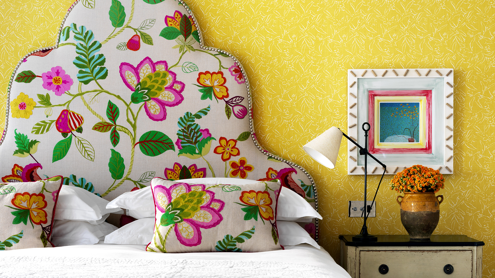

Interior designer Kit Kemp is instantly associatable with color – but amongst her most inspired color palette, three hues stand out as the most joyous of them all.
According to Kit's interior design tips, yellow, orange, and red will add vibrancy to your scheme – but their advantages don’t end there. Instead, they boast mental benefits that promote positive wellbeing throughout your scheme – and spark happiness in all who visit.
And while these tones have Kit’s seal of approval, they’re backed by science too.
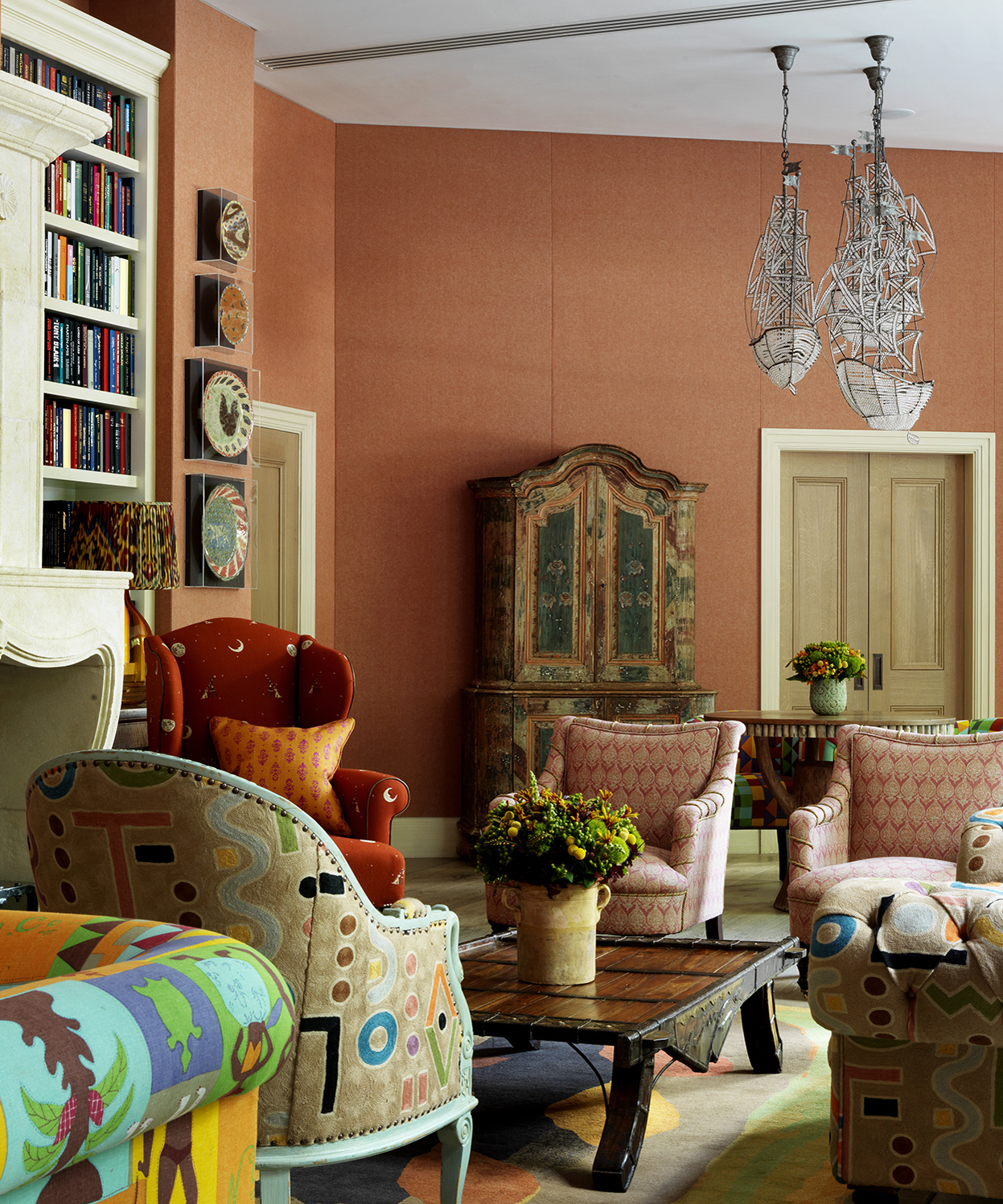
The colors that will make you happiest – according to Kit Kemp
In her blog, Kit shares her color recommendations alongside psychologist Lee Chambers who discusses her claims – so you can trust in their aesthetic and scientific qualities.
1. Yellow
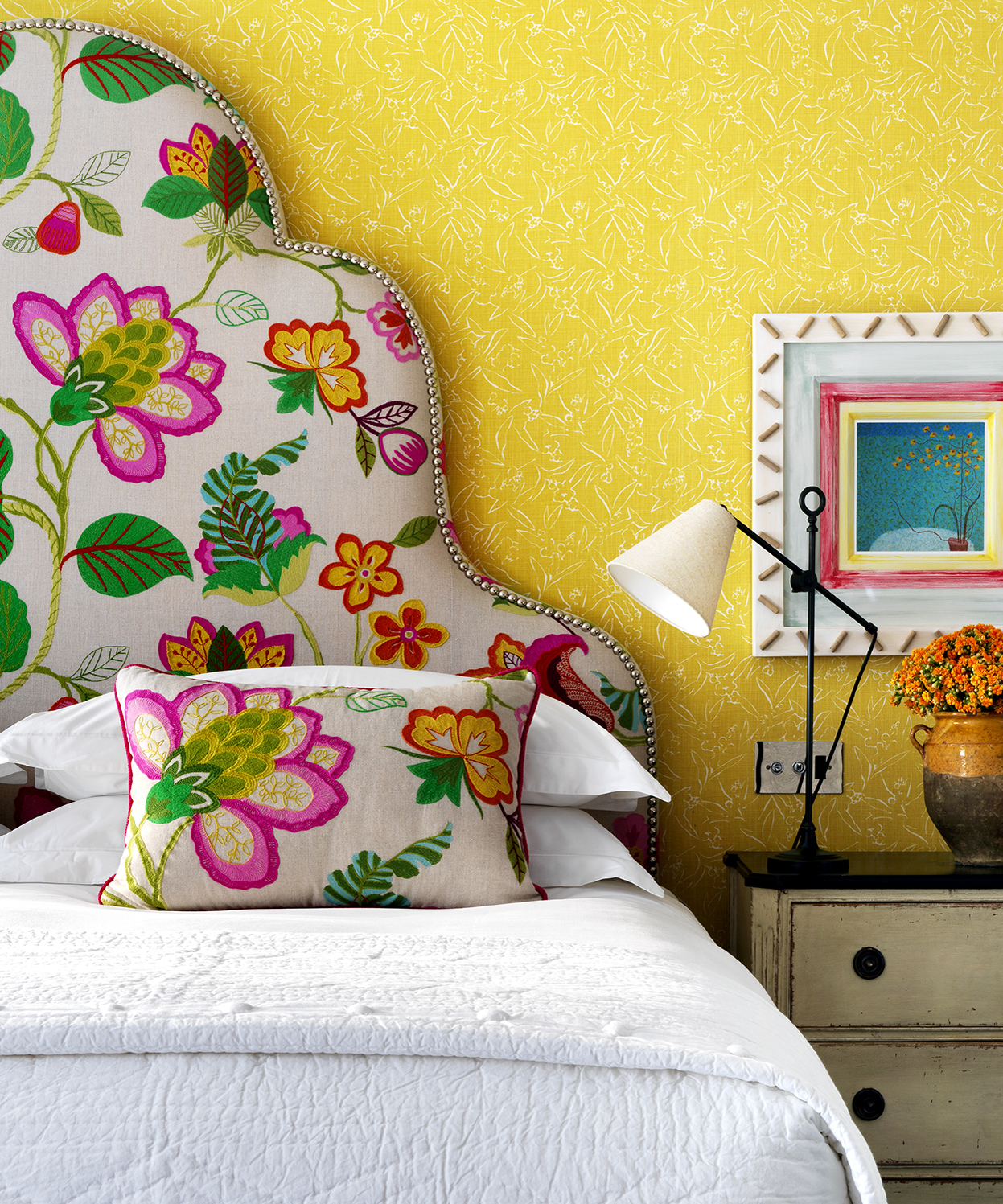
‘The color of the sun, this powerful hue is aligned with hierarchy and status, Kit shares in her discussion of one of the happiest colors on her palette. But what makes it so joyous – and how does she use it across her Firmdale Hotels?
‘Its enthusiasm and enlightenment are considered to be a cheerful lift for our mood, and I would certainly agree that walking through the door at the end of the day to a burst of yellow lifts my spirits,’ Kit shares.
‘In practical terms, yellow can counter the darkness of low-lit spaces, which is why I like to use it in dark rooms and on the lower floors of our hotels.’
Sign up to the Homes & Gardens newsletter
Design expertise in your inbox – from inspiring decorating ideas and beautiful celebrity homes to practical gardening advice and shopping round-ups.
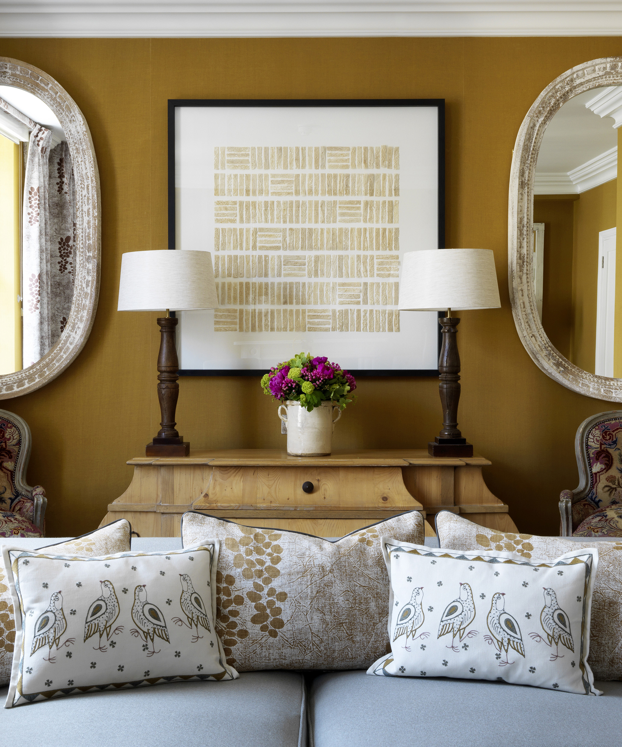
Using yellow – along with the other bright colors – is an instantaneous way to ‘brighten up our days,’ Lee agrees.
‘When it comes to Kit’s assessment of these warm, intense colors, she is certainly correct in amplifying how these colors can incite positive emotions – especially as the darkness of winter descends upon us,’ he says.
‘There is a cheerful and creative edge to yellow, and it can be applied in various spaces,’ Lee adds. However, when sharing his paint ideas, Lee reminds us to consider its intensity ‘as yellow is the most fatiguing color on our eyes and can cause irritability’ – especially if we view yellow for a prolonged period.
2. Orange
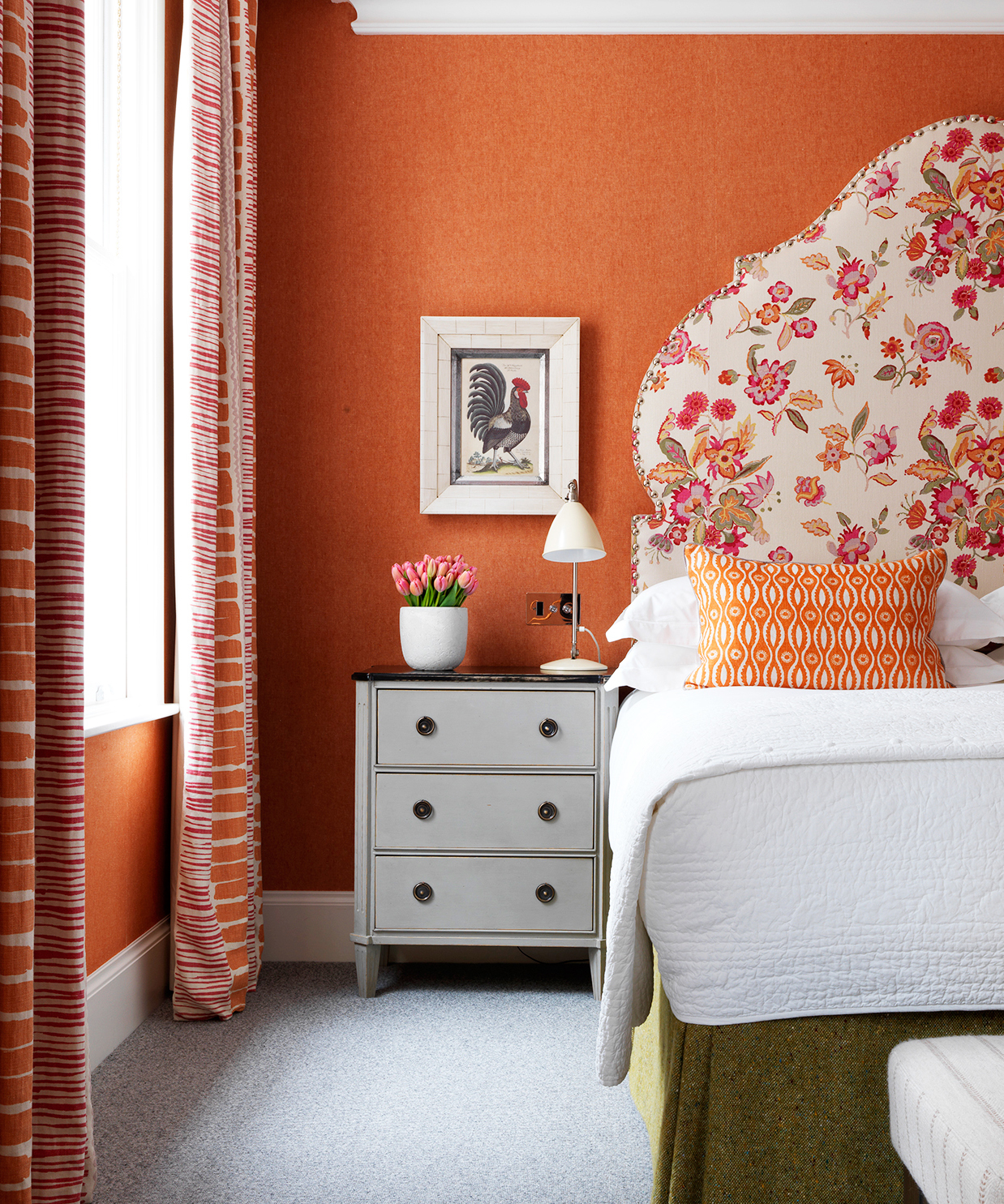
Similarly to yellow, Kit praises orange for its ‘energetic, spontaneous and [dynamacy]’ and she uses it in the same way – to ‘cheer up a darker room.’ However, when it comes to living room paint ideas, Kit warns that orange is not for everyone.
‘Before taking this step, consider its placement and whether you would be happy using it in a room used every day,’ she says. Her sentiments are emphasized by Lee, who agrees that orange ‘has a tendency to be loved or hated.’
‘It rarely seems to have a simple tolerance when it is overused in an environment, and finding a creative way to use it, especially if it resonates with you, is a positive challenge to undertake,’ he adds.
3. Red
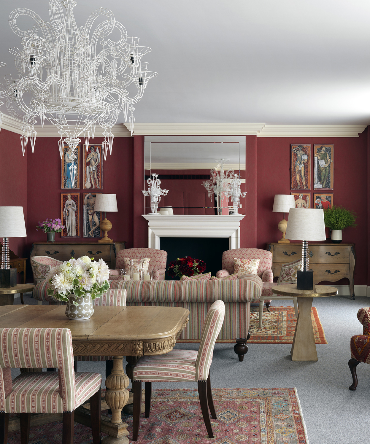
Among Kit’s three picks, red is arguably the most popular hue – through its bold tones should be reserved for a room where the passion and ‘heat’ are appropriate.
‘If you are looking for a calm environment for somewhere like a bedroom, perhaps it is not the most appropriate choice,’ Kit says. ‘However, it is a color that lends itself very well to libraries or dining rooms.’
Lee agrees with Kit’s easy paint ideas, suggesting that red ‘increases our heartbeat, encourages us to be social and makes us feel emboldened to action’ – meaning it should be reserved for a select few spaces in our homes.

‘Because of its pro-social qualities and mood-enhancing benefits, is it best used in spaces for entertaining and spaces where a little volatility can be a bonus,’ Lee adds.
‘Naturally, there are places where buzzing with fiery energy isn’t particularly productive. My advice is to use it sparingly in spaces where the main goal is to promote serenity and stability.’
These color trends are backed by individuals at the peak of the psychological – and the interior design world – so you have all the approval you need to start painting.

Megan is the Head of Celebrity Style News at Homes & Gardens, where she leads the celebrity/ news team. She has a history in interior design, travel, and news journalism, having lived and worked in New York, Paris, and, currently, London. Megan has bylines in Livingetc, The Telegraph, and IRK Magazine, and has interviewed the likes of Drew Barrymore, Ayesha Curry, Michelle Keegan, and Tan France, among others. She lives in a London apartment with her antique typewriter and an eclectic espresso cup collection, and dreams of a Kelly Wearstler-designed home.
-
 5 freezer cleaning mistakes you must avoid – or risk compromising your food quality and shortening the lifespan of your appliance
Avoid these blunders for a safer kitchen
By Seraphina Di Mizzurati
-
 What is an island bed? This clever garden design trick can add privacy and drama to any backyard
Create a long-lasting, low-maintenance and visually appealing island bed that also serves a purpose in the garden
By Sarah Wilson