Kelly Hoppen reveals 10 decorating secrets behind her signature East-meets-West look
Copy her elegant signature look with her interior design tips


Interior designer to the stars Kelly Hoppen OBE has long been known for her casual yet considered interiors, characterized by pops of natural texture, refined upholstery and, of course, a neutral palette. So who better to advise on how to combine the best of Western and Eastern design?

The rise of Wabi Sabi has ensured that the Orient is front and center of the decorating world and Interior design trends, but there is always a danger of overdoing things and ending up with a pastiche of a look. Follow Kelly's style rules, however, and you will be on track to pared-back perfection.
1. Incorporate a Chinoiserie print
A post shared by Kelly Hoppen CBE (@kellyhoppen)
A photo posted by on
This delicate blossom motif is lent opulence by its gold backdrop, but Kelly is careful to keep to a monochrome palette elsewhere. As she goes on to explain 'Pattern needs to be handled with restraint in an East-West style.'
2. Don't overindulge in pattern
A post shared by Kelly Hoppen CBE (@kellyhoppen)
A photo posted by on
'I rarely use more than one dominant pattern in a room and my choice will be discerning,' says Kelly, who will avoid chintzy florals or simple Provencal patterns in favour of jacquards or toile.
3. Create an element of surprise
A post shared by Kelly Hoppen CBE (@kellyhoppen)
A photo posted by on
Kelly is not known for her bold use of color, which is why the shots of red here are so unexpected. But they are hugely meaningful in an East-meets-West scheme – in China, red is traditionally symbolic of happiness.
4. Stick with a simple backdrop
A post shared by Kelly Hoppen CBE (@kellyhoppen)
A photo posted by on
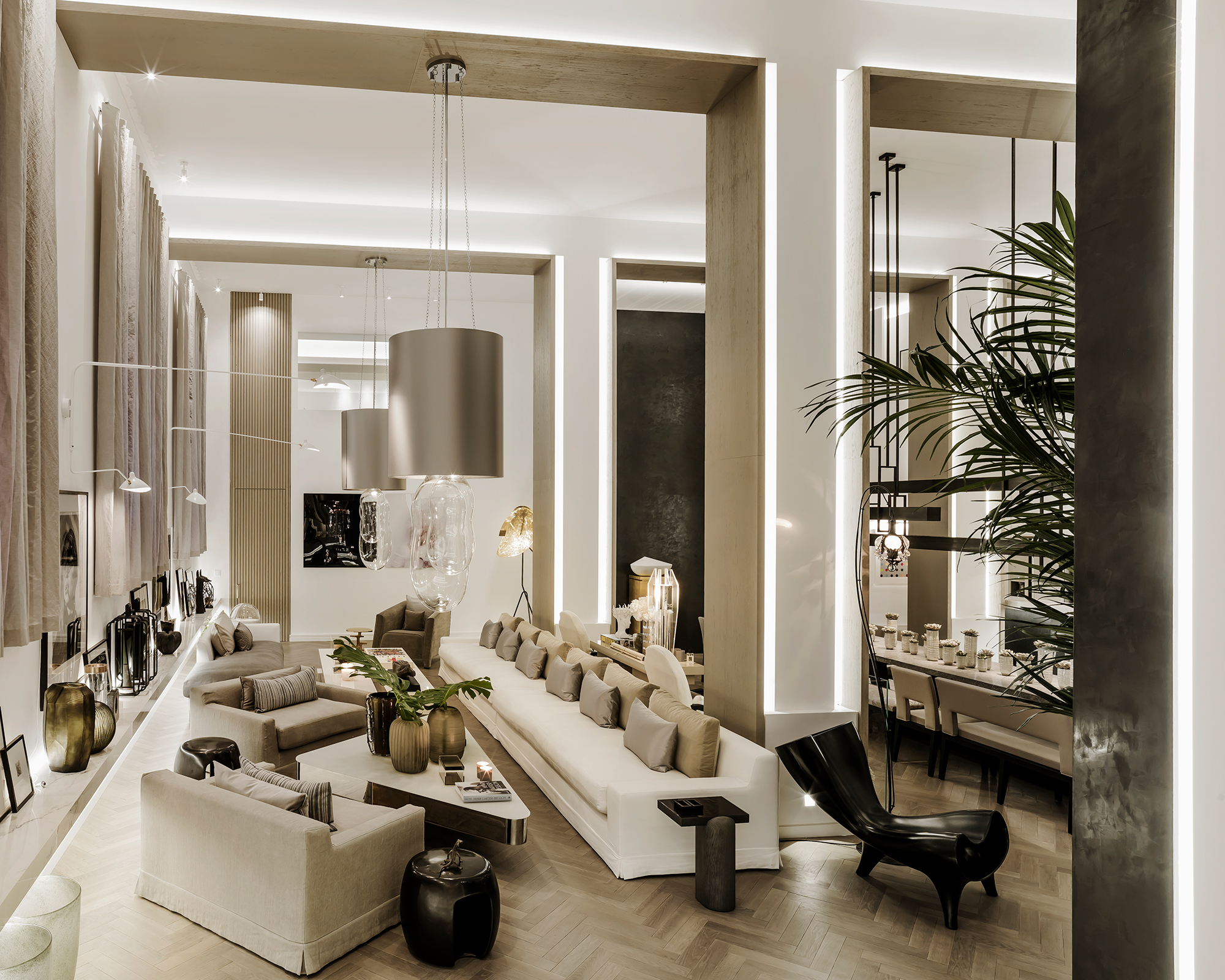
This is a signature look from Kelly, with its pleasing symmetry, strong lines and elegant upholstery. A clean palette offers the opportunity
5. Respect natural materials
A post shared by Kelly Hoppen CBE (@kellyhoppen)
A photo posted by on
'In Japan, there is a huge respect for the way that natural tones and textures work without adornment,' says Kelly, whose sparing use of colour allows such hues and weaves to shine.
Sign up to the Homes & Gardens newsletter
Design expertise in your inbox – from inspiring decorating ideas and beautiful celebrity homes to practical gardening advice and shopping round-ups.
6. Ensure hard-working living rooms exude comfort
A post shared by Kelly Hoppen CBE (@kellyhoppen)
A photo posted by on
'Living rooms are the workhorses of the modern home, often accommodating study, rest and play. However, whatever function they perform, they must always ooze comfort and conviviality. Layering texture and light are always key.'
7. Create balance
A post shared by Kelly Hoppen CBE (@kellyhoppen)
A photo posted by on
'Balance is important in a room and this can be achieved even if the furniture you have isn't symmetrical. See how the two armchairs balance the sofa.'
8. Combine the simple with the opulent
A post shared by Kelly Hoppen CBE (@kellyhoppen)
A photo posted by on
Mixing the opulent looks of the west with the simplicity of the east is a sure-fire route to success. Think clean pale wood panelled walls and doors and unfussy tiled flooring, enhanced by dramatic glass light fittings and door furniture, and upholstery with fine buttoned detailing.
This is Kelly's band table, part of her range of furniture with Andrew Martin.
9. Make sure your hallway has wow factor
A post shared by Kelly Hoppen CBE (@kellyhoppen)
A photo posted by on
'You get one chance to make an entrance and this mood and feel is the beginning of the experience as you continue into the home. The front door and entrance hall create the first impressions. Materials, colours, lighting, furniture and accessories can be used to create very different moods, from glamorous to cocooning, but the crucial thing is to make the space feel inviting.'
10. Play with over-sized scale
A post shared by Kelly Hoppen CBE (@kellyhoppen)
A photo posted by on
'Nothing beats the first impression with oversized scale. Whenever you have the opportunity, no matter how small or large the space is, take my advice and do it. It never lets you down. All I would say is, design with simplicity rather than overpowering. It’s impressive and explosive without being over-bearing.'
Find more of Kelly Hoppen's design tips and inspiration on Instagram @kellyhoppen

Amy Cutmore is Editor-in-Chief, Audience, across Future's Homes portfolio. A homes and interiors journalist of 20 years standing, she has spent much of that time writing about technology, appliances and kitchens. While other people count how many countries they've visited, Amy tots up how many countries' washing machine factories she's toured (it's eight by the way, from South Korea to Slovenia). She can't leave the house without a decent pair of noise-cancelling headphones, and is always ready to explain an acronym – be it QLED, DAB or HDMI.
-
 Anna Kendrick's favorite coffee maker is the first machine to make iced beverages that are 'just as cold as a coffee shop' – it's currently under $200
The actress uses this smart machine to make perfect mocha frappes straight out of her kitchen – it's a summer 2025 must-have
By Hannah Ziegler
-
 Put your 'purgatory place' and 'dust detective' in play – 6 expert tricks professional organizers use to effortlessly edit down belongings
Stress-free streamlining is entirely within sight
By Andy van Terheyden